

Fullscreen Carousel
Original · freefullscreen slideshow with captions
byWeb InnoventixReact + Tailwind
carfullscreencarousels
Copy prompt gives Claude Code, Cursor or v0 a ready-to-paste prompt that recreates this exact component.
npx shadcn@latest add https://webinnoventix.com/r/car-fullscreen.jsoncar-fullscreen.tsx
"use client";
import { useCallback, useEffect, useState, type CSSProperties } from "react";
import {
AnimatePresence,
motion,
useReducedMotion,
type Variants,
} from "motion/react";
type Slide = {
id: string;
src: string;
alt: string;
place: string;
coords: string;
title: string;
body: string;
};
const SLIDE_MS = 6500;
const SLIDES: Slide[] = [
{
id: "lofoten",
src: "/img/gallery/g08.webp",
alt: "Fishing boats returning to a snow-lined fjord under a deep blue winter sky",
place: "Lofoten Islands, Norway",
coords: "68.15°N 13.61°E",
title: "Where the Blue Hour Lingers",
body: "In February the sun barely clears the ridgeline. For twenty unhurried minutes the fjord holds a light you cannot find anywhere further south — cobalt water, pink granite, and the last boats coming in.",
},
{
id: "uyuni",
src: "/img/gallery/g14.webp",
alt: "A thin sheet of water on a salt flat perfectly reflecting the sky at dusk",
place: "Salar de Uyuni, Bolivia",
coords: "20.13°S 67.49°W",
title: "A Mirror Ten Thousand Years Wide",
body: "After the rains, a film of water turns the salt flat into a flawless reflection of the sky. Walk far enough from the shore and the horizon quietly dissolves — ground and cloud become the same thing.",
},
{
id: "kyoto",
src: "/img/gallery/g21.webp",
alt: "Red maple leaves framing a quiet wooden temple bridge at first light",
place: "Kyoto, Japan",
coords: "35.01°N 135.67°E",
title: "Momiji, the Season of Red Leaves",
body: "The maples at Tofuku-ji peak for barely a week. Locals arrive before dawn to have the wooden bridge, and the silence beneath it, entirely to themselves.",
},
{
id: "sossusvlei",
src: "/img/gallery/g27.webp",
alt: "Steep orange sand dunes glowing at sunrise above a pale desert pan",
place: "Sossusvlei, Namibia",
coords: "24.73°S 15.29°E",
title: "Dunes That Move While You Sleep",
body: "Big Daddy rises more than three hundred metres from the pan. Climb the windward ridge at first light, before the sand grows too hot to touch, and the whole desert turns to tangerine.",
},
{
id: "faroe",
src: "/img/gallery/g33.webp",
alt: "A waterfall dropping off a green sea cliff straight into the Atlantic ocean",
place: "Faroe Islands, Denmark",
coords: "62.12°N 7.24°W",
title: "The Waterfall That Falls Into the Sea",
body: "At Gásadalur the river never reaches a valley floor. It simply steps off the cliff edge and drops three hundred feet into the open Atlantic, misting the puffins on the way down.",
},
{
id: "banff",
src: "/img/gallery/g04.webp",
alt: "A turquoise glacial lake seen from a high viewpoint surrounded by pine forest",
place: "Banff, Canada",
coords: "51.42°N 116.18°W",
title: "Ice the Colour of Old Glass",
body: "Fed by glacial rock flour, Peyto Lake turns an improbable turquoise each July. From the upper viewpoint the entire valley looks poured from a single pane of green.",
},
];
const STYLES = `
@keyframes carfs-progress { from { width: 0%; } to { width: 100%; } }
@keyframes carfs-kenburns {
0% { transform: scale(1.05) translate3d(0, 0, 0); }
100% { transform: scale(1.16) translate3d(1.2%, -2%, 0); }
}
.carfs-kb {
animation: carfs-kenburns 9s ease-out both;
transform-origin: center;
}
.carfs-fill {
width: 0%;
animation: carfs-progress var(--carfs-duration, 6500ms) linear forwards;
}
@media (prefers-reduced-motion: reduce) {
.carfs-kb { animation: none; }
.carfs-fill { animation: none; width: 100%; }
}
`;
function ChevronLeftIcon() {
return (
<svg viewBox="0 0 24 24" fill="none" stroke="currentColor" strokeWidth={2} strokeLinecap="round" strokeLinejoin="round" className="h-5 w-5" aria-hidden="true">
<path d="M15 6l-6 6 6 6" />
</svg>
);
}
function ChevronRightIcon() {
return (
<svg viewBox="0 0 24 24" fill="none" stroke="currentColor" strokeWidth={2} strokeLinecap="round" strokeLinejoin="round" className="h-5 w-5" aria-hidden="true">
<path d="M9 6l6 6-6 6" />
</svg>
);
}
function PlayIcon() {
return (
<svg viewBox="0 0 24 24" fill="currentColor" className="h-4 w-4 translate-x-[1px]" aria-hidden="true">
<path d="M8 5v14l11-7z" />
</svg>
);
}
function PauseIcon() {
return (
<svg viewBox="0 0 24 24" fill="currentColor" className="h-4 w-4" aria-hidden="true">
<rect x="6" y="5" width="4" height="14" rx="1" />
<rect x="14" y="5" width="4" height="14" rx="1" />
</svg>
);
}
function PinIcon() {
return (
<svg viewBox="0 0 24 24" fill="none" stroke="currentColor" strokeWidth={1.8} strokeLinecap="round" strokeLinejoin="round" className="h-3.5 w-3.5 shrink-0" aria-hidden="true">
<path d="M12 21s-6-5.3-6-10a6 6 0 1112 0c0 4.7-6 10-6 10z" />
<circle cx="12" cy="11" r="2" />
</svg>
);
}
export default function CarFullscreen() {
const reduce = useReducedMotion();
const [index, setIndex] = useState(0);
const [direction, setDirection] = useState(1);
const [isPlaying, setIsPlaying] = useState(true);
const [cycle, setCycle] = useState(0);
const count = SLIDES.length;
const active = SLIDES[index];
const canAutoplay = !reduce;
const goTo = useCallback(
(next: number, dir: number) => {
setDirection(dir);
setIndex(((next % count) + count) % count);
setCycle((c) => c + 1);
},
[count],
);
const goNext = useCallback(() => goTo(index + 1, 1), [goTo, index]);
const goPrev = useCallback(() => goTo(index - 1, -1), [goTo, index]);
useEffect(() => {
if (!isPlaying || !canAutoplay) return;
const id = window.setTimeout(() => goTo(index + 1, 1), SLIDE_MS);
return () => window.clearTimeout(id);
}, [isPlaying, canAutoplay, index, goTo]);
const slideVariants: Variants = reduce
? {
enter: { opacity: 0 },
center: { opacity: 1 },
exit: { opacity: 0 },
}
: {
enter: (dir: number) => ({
opacity: 0,
x: dir > 0 ? "8%" : "-8%",
scale: 1.02,
}),
center: { opacity: 1, x: "0%", scale: 1 },
exit: (dir: number) => ({
opacity: 0,
x: dir > 0 ? "-8%" : "8%",
scale: 1.02,
}),
};
return (
<section className="relative w-full bg-slate-50 py-16 dark:bg-slate-950 sm:py-20 lg:py-24">
<style>{STYLES}</style>
<div className="mx-auto w-full max-w-6xl px-4 sm:px-6 lg:px-8">
<div className="mb-8 flex flex-col gap-5 sm:mb-10 sm:flex-row sm:items-end sm:justify-between">
<div>
<p className="inline-flex items-center gap-2.5 text-xs font-semibold uppercase tracking-[0.22em] text-indigo-600 dark:text-indigo-300">
<span aria-hidden="true" className="h-px w-7 bg-indigo-500/60" />
Meridian — Field Notes
</p>
<h2 className="mt-3 text-3xl font-semibold tracking-tight text-slate-900 dark:text-white sm:text-4xl">
Twelve months, six horizons
</h2>
<p className="mt-2 max-w-xl text-sm leading-relaxed text-slate-600 dark:text-slate-400 sm:text-base">
A year of chasing first light — captions from the field, in the
photographer’s own words.
</p>
</div>
<p className="hidden shrink-0 items-center gap-2 text-xs text-slate-500 dark:text-slate-400 sm:flex">
<kbd className="rounded border border-slate-300 bg-white px-1.5 py-0.5 font-mono text-[11px] text-slate-600 dark:border-slate-700 dark:bg-slate-900 dark:text-slate-300">
←
</kbd>
<kbd className="rounded border border-slate-300 bg-white px-1.5 py-0.5 font-mono text-[11px] text-slate-600 dark:border-slate-700 dark:bg-slate-900 dark:text-slate-300">
→
</kbd>
to navigate
</p>
</div>
<div
role="region"
aria-roledescription="carousel"
aria-label="Field notes photography slideshow"
tabIndex={0}
onKeyDown={(e) => {
if (e.key === "ArrowRight") {
e.preventDefault();
goNext();
} else if (e.key === "ArrowLeft") {
e.preventDefault();
goPrev();
} else if (e.key === "Home") {
e.preventDefault();
goTo(0, -1);
} else if (e.key === "End") {
e.preventDefault();
goTo(count - 1, 1);
} else if (
(e.key === " " || e.key === "Spacebar") &&
e.target === e.currentTarget &&
canAutoplay
) {
e.preventDefault();
setIsPlaying((p) => !p);
}
}}
style={{ "--carfs-duration": `${SLIDE_MS}ms` } as CSSProperties}
className="group relative aspect-[4/5] w-full overflow-hidden rounded-3xl bg-neutral-900 shadow-2xl shadow-slate-900/20 ring-1 ring-slate-900/10 focus:outline-none focus-visible:ring-2 focus-visible:ring-indigo-500 focus-visible:ring-offset-2 focus-visible:ring-offset-slate-50 dark:ring-white/10 dark:focus-visible:ring-offset-slate-950 sm:aspect-[16/10] lg:aspect-[16/9]"
>
<AnimatePresence initial={false} custom={direction}>
<motion.div
key={active.id}
custom={direction}
variants={slideVariants}
initial="enter"
animate="center"
exit="exit"
transition={
reduce
? { duration: 0.25 }
: { duration: 0.8, ease: [0.22, 1, 0.36, 1] }
}
className="absolute inset-0"
>
{/* eslint-disable-next-line @next/next/no-img-element */}
<img
src={active.src}
alt={active.alt}
loading="lazy"
draggable={false}
className="carfs-kb absolute inset-0 h-full w-full object-cover"
/>
<div
aria-hidden="true"
className="absolute inset-0 bg-gradient-to-t from-neutral-950/90 via-neutral-950/25 to-neutral-950/15"
/>
<div
aria-hidden="true"
className="absolute inset-0 bg-gradient-to-br from-neutral-950/45 via-transparent to-transparent"
/>
<div className="absolute inset-x-0 bottom-0 p-5 sm:p-8 lg:p-11">
<motion.div
initial={reduce ? { opacity: 0 } : { opacity: 0, y: 18 }}
animate={{ opacity: 1, y: 0 }}
transition={{
duration: 0.6,
delay: reduce ? 0 : 0.18,
ease: [0.22, 1, 0.36, 1],
}}
className="max-w-2xl"
>
<p className="flex flex-wrap items-center gap-x-2 gap-y-1 text-xs font-medium uppercase tracking-[0.18em] text-indigo-200">
<PinIcon />
{active.place}
<span aria-hidden="true" className="text-white/40">
·
</span>
<span className="font-mono text-[11px] normal-case tracking-normal text-white/70">
{active.coords}
</span>
</p>
<h3 className="mt-2.5 text-2xl font-semibold leading-tight text-white sm:text-3xl lg:text-[2.5rem]">
{active.title}
</h3>
<p className="mt-3 max-w-xl text-sm leading-relaxed text-neutral-200 sm:text-base">
{active.body}
</p>
</motion.div>
</div>
</motion.div>
</AnimatePresence>
{/* Top overlay: progress segments + counter + play/pause */}
<div className="pointer-events-none absolute inset-x-0 top-0 z-20 p-4 sm:p-6">
<div className="pointer-events-auto flex items-center gap-1.5">
{SLIDES.map((slide, i) => (
<button
key={slide.id}
type="button"
onClick={() => goTo(i, i > index ? 1 : -1)}
aria-label={`Go to slide ${i + 1}: ${slide.title}`}
aria-current={i === index ? "true" : undefined}
className="group/seg relative flex-1 rounded-full py-2.5 focus:outline-none focus-visible:ring-2 focus-visible:ring-white focus-visible:ring-offset-2 focus-visible:ring-offset-neutral-900"
>
<span className="block h-1.5 overflow-hidden rounded-full bg-white/25 transition group-hover/seg:bg-white/40">
{i < index ? (
<span aria-hidden="true" className="block h-full w-full rounded-full bg-white" />
) : i === index ? (
<span
key={`carfs-fill-${cycle}`}
aria-hidden="true"
className="carfs-fill block h-full rounded-full bg-white"
style={{
animationPlayState:
isPlaying && canAutoplay ? "running" : "paused",
}}
/>
) : (
<span aria-hidden="true" className="block h-full w-0 rounded-full bg-white" />
)}
</span>
</button>
))}
</div>
<div className="mt-4 flex items-center justify-between">
<div className="pointer-events-auto flex items-center gap-2 rounded-full bg-neutral-950/40 px-3 py-1.5 text-xs font-medium text-white/90 ring-1 ring-white/15 backdrop-blur">
<span className="tabular-nums">
{String(index + 1).padStart(2, "0")}
</span>
<span aria-hidden="true" className="text-white/40">
/
</span>
<span className="tabular-nums text-white/60">
{String(count).padStart(2, "0")}
</span>
</div>
<button
type="button"
onClick={() => setIsPlaying((p) => !p)}
disabled={!canAutoplay}
aria-pressed={isPlaying && canAutoplay}
aria-label={
!canAutoplay
? "Autoplay disabled by reduced motion setting"
: isPlaying
? "Pause slideshow"
: "Play slideshow"
}
className="pointer-events-auto inline-flex h-10 w-10 items-center justify-center rounded-full bg-neutral-950/40 text-white ring-1 ring-white/15 backdrop-blur transition hover:bg-neutral-950/65 focus:outline-none focus-visible:ring-2 focus-visible:ring-white focus-visible:ring-offset-2 focus-visible:ring-offset-neutral-900 disabled:cursor-not-allowed disabled:opacity-40"
>
{isPlaying && canAutoplay ? <PauseIcon /> : <PlayIcon />}
</button>
</div>
</div>
{/* Side navigation arrows */}
<button
type="button"
onClick={goPrev}
aria-label="Previous slide"
className="absolute left-3 top-1/2 z-20 inline-flex h-11 w-11 -translate-y-1/2 items-center justify-center rounded-full bg-neutral-950/40 text-white ring-1 ring-white/15 backdrop-blur transition hover:bg-neutral-950/65 focus:outline-none focus-visible:ring-2 focus-visible:ring-white focus-visible:ring-offset-2 focus-visible:ring-offset-neutral-900 sm:left-5"
>
<ChevronLeftIcon />
</button>
<button
type="button"
onClick={goNext}
aria-label="Next slide"
className="absolute right-3 top-1/2 z-20 inline-flex h-11 w-11 -translate-y-1/2 items-center justify-center rounded-full bg-neutral-950/40 text-white ring-1 ring-white/15 backdrop-blur transition hover:bg-neutral-950/65 focus:outline-none focus-visible:ring-2 focus-visible:ring-white focus-visible:ring-offset-2 focus-visible:ring-offset-neutral-900 sm:right-5"
>
<ChevronRightIcon />
</button>
<p className="sr-only" role="status" aria-live="polite">
{`Slide ${index + 1} of ${count}: ${active.title}, ${active.place}`}
</p>
</div>
</div>
</section>
);
}Dependencies
motion
Licence
Built by Web Innoventix. Free for personal and commercial use, no attribution required.
Built by Web Innoventix
Need a custom interface, a full website, or SEO that gets you cited by AI? We design, build and rank it end to end.
Get a free quoteSimilar components
Browse all →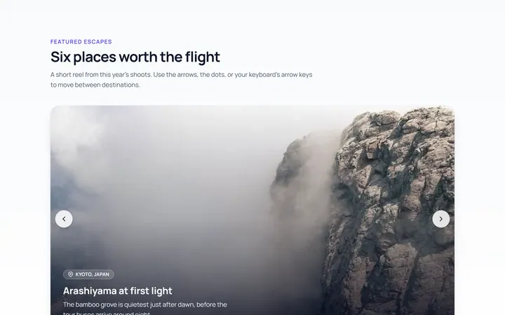
Basic Carousel
Originalbasic image carousel with arrows and dots
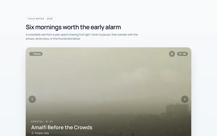
Fade Carousel
Originalcrossfade carousel
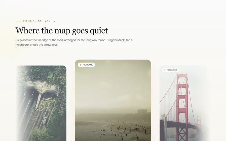
Cards Carousel
Originalpeeking card carousel
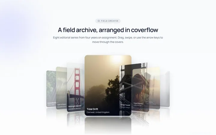
Coverflow Carousel
Original3D coverflow carousel
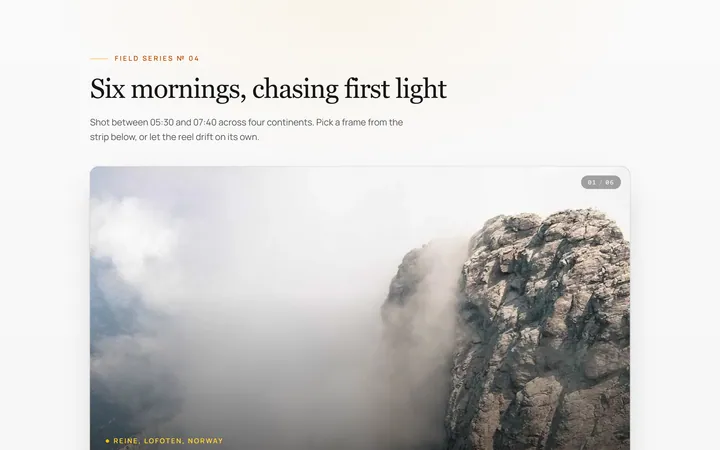
Thumbnails Carousel
Originalcarousel synced with thumbnails
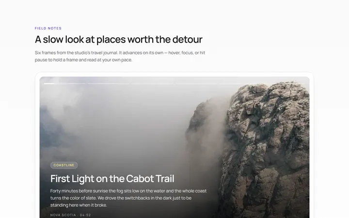
Autoplay Carousel
Originalautoplay carousel with progress and pause
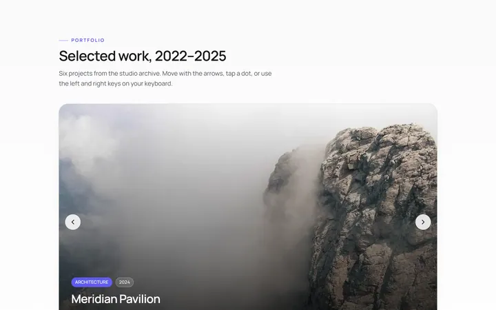
Dots Carousel
Originalcarousel with animated dot indicators
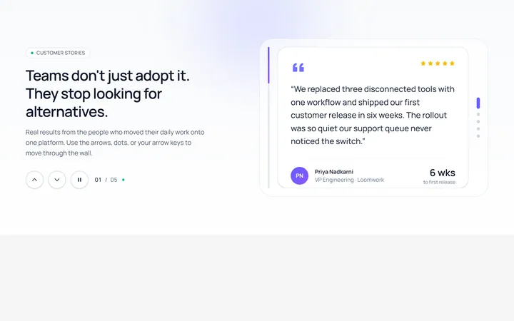
Vertical Carousel
Originalvertical carousel
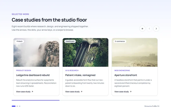
Multi Carousel
Originalmulti-item responsive carousel
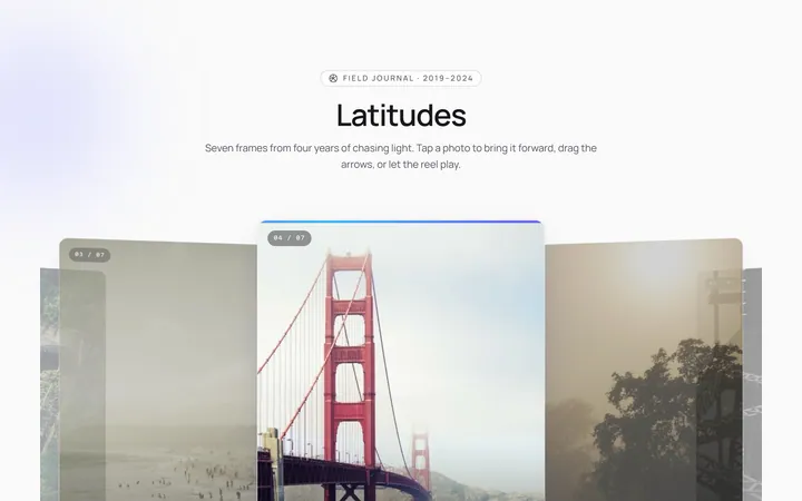
Center Focus Carousel
Originalcentre-focused scaling carousel
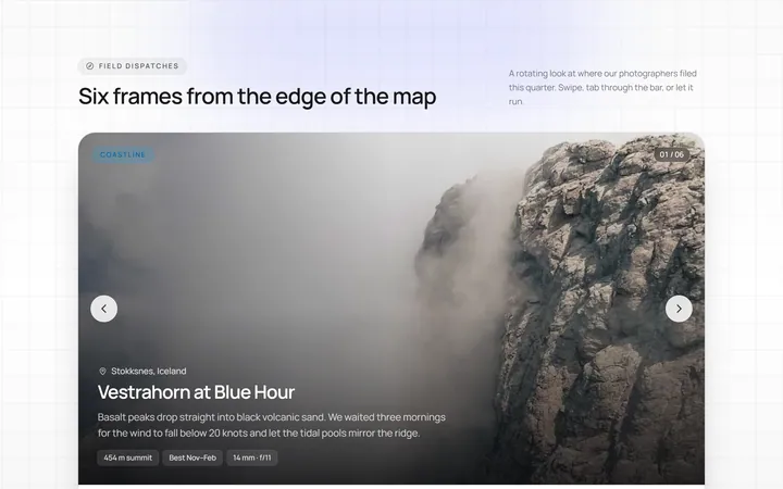
Progress Carousel
Originalcarousel with a progress bar
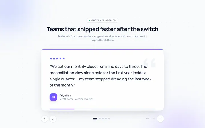
Testimonial Carousel
Originaltestimonial quote carousel