

Button Inline Loader
Original · freeinline button loading spinners
byWeb InnoventixReact + Tailwind
loadbuttoninlineloaders
Copy prompt gives Claude Code, Cursor or v0 a ready-to-paste prompt that recreates this exact component.
npx shadcn@latest add https://webinnoventix.com/r/load-button-inline.jsonload-button-inline.tsx
"use client";
import { useEffect, useRef, useState, type ReactElement } from "react";
import { AnimatePresence, motion, useReducedMotion } from "motion/react";
type Status = "idle" | "loading" | "success" | "error";
type Variant = "primary" | "contrast" | "outline" | "soft" | "sky" | "violet";
type SpinnerKind = "ring" | "dots" | "dual" | "bars" | "segment" | "orbit";
interface ButtonSpec {
id: string;
variant: Variant;
spinner: SpinnerKind;
spinnerName: string;
icon: ReactElement;
labels: Record<Status, string>;
}
function IconSave(): ReactElement {
return (
<svg viewBox="0 0 24 24" fill="none" stroke="currentColor" strokeWidth={1.7} strokeLinecap="round" strokeLinejoin="round" className="h-4 w-4">
<path d="M12 3v9" />
<path d="m8.5 8.5 3.5 3.5 3.5-3.5" />
<path d="M5 15v3a2 2 0 0 0 2 2h10a2 2 0 0 0 2-2v-3" />
</svg>
);
}
function IconBolt(): ReactElement {
return (
<svg viewBox="0 0 24 24" fill="none" stroke="currentColor" strokeWidth={1.7} strokeLinecap="round" strokeLinejoin="round" className="h-4 w-4">
<path d="M13 2.5 4.5 13H11l-1 8.5L19.5 10H13l1-7.5Z" />
</svg>
);
}
function IconMail(): ReactElement {
return (
<svg viewBox="0 0 24 24" fill="none" stroke="currentColor" strokeWidth={1.7} strokeLinecap="round" strokeLinejoin="round" className="h-4 w-4">
<rect x="3" y="5" width="18" height="14" rx="2" />
<path d="m3.5 7 8.5 6 8.5-6" />
</svg>
);
}
function IconSync(): ReactElement {
return (
<svg viewBox="0 0 24 24" fill="none" stroke="currentColor" strokeWidth={1.7} strokeLinecap="round" strokeLinejoin="round" className="h-4 w-4">
<path d="M20 11a8 8 0 0 0-13.7-5" />
<path d="M4 13a8 8 0 0 0 13.7 5" />
<path d="M18 3v3.5h-3.5" />
<path d="M6 21v-3.5h3.5" />
</svg>
);
}
function IconExport(): ReactElement {
return (
<svg viewBox="0 0 24 24" fill="none" stroke="currentColor" strokeWidth={1.7} strokeLinecap="round" strokeLinejoin="round" className="h-4 w-4">
<path d="M12 14V3" />
<path d="m8.5 6.5 3.5-3.5 3.5 3.5" />
<path d="M5 15v3a2 2 0 0 0 2 2h10a2 2 0 0 0 2-2v-3" />
</svg>
);
}
function IconCard(): ReactElement {
return (
<svg viewBox="0 0 24 24" fill="none" stroke="currentColor" strokeWidth={1.7} strokeLinecap="round" strokeLinejoin="round" className="h-4 w-4">
<rect x="3" y="5" width="18" height="14" rx="2" />
<path d="M3 10h18" />
<path d="M7 15h3" />
</svg>
);
}
function IconCheck(): ReactElement {
return (
<svg viewBox="0 0 24 24" fill="none" stroke="currentColor" strokeWidth={2.2} strokeLinecap="round" strokeLinejoin="round" className="h-4 w-4">
<path d="m5 12.5 4.4 4.4L19 7" />
</svg>
);
}
function IconAlert(): ReactElement {
return (
<svg viewBox="0 0 24 24" fill="none" stroke="currentColor" strokeWidth={1.9} strokeLinecap="round" strokeLinejoin="round" className="h-4 w-4">
<path d="M10.3 4 3.4 16a2 2 0 0 0 1.7 3h13.8a2 2 0 0 0 1.7-3L13.7 4a2 2 0 0 0-3.4 0Z" />
<path d="M12 9.5v4" />
<path d="M12 16.5h.01" />
</svg>
);
}
function RingSpinner(): ReactElement {
return (
<svg viewBox="0 0 24 24" fill="none" className="lbi-spin h-4 w-4">
<circle cx="12" cy="12" r="8.5" stroke="currentColor" strokeOpacity="0.25" strokeWidth="3" />
<path d="M12 3.5a8.5 8.5 0 0 1 8.5 8.5" stroke="currentColor" strokeWidth="3" strokeLinecap="round" />
</svg>
);
}
function OrbitSpinner(): ReactElement {
return (
<svg viewBox="0 0 24 24" fill="none" className="lbi-spin h-4 w-4">
<circle cx="12" cy="12" r="8" stroke="currentColor" strokeOpacity="0.22" strokeWidth="2" />
<circle cx="12" cy="4" r="2.3" fill="currentColor" />
</svg>
);
}
function DualSpinner(): ReactElement {
return (
<span className="relative inline-flex h-4 w-4">
<svg viewBox="0 0 24 24" fill="none" className="lbi-spin absolute inset-0 h-4 w-4">
<path d="M12 3a9 9 0 0 1 9 9" stroke="currentColor" strokeWidth="2.6" strokeLinecap="round" />
</svg>
<svg viewBox="0 0 24 24" fill="none" className="lbi-spin-rev absolute inset-0 h-4 w-4">
<path d="M12 21a9 9 0 0 1-9-9" stroke="currentColor" strokeWidth="2.6" strokeLinecap="round" strokeOpacity="0.5" />
</svg>
</span>
);
}
function DotsSpinner(): ReactElement {
return (
<span className="flex h-4 w-4 items-center justify-center gap-[3px]">
{[0, 1, 2].map((i) => (
<span key={i} className="lbi-bounce block h-1.5 w-1.5 rounded-full bg-current" style={{ animationDelay: `${i * 0.15}s` }} />
))}
</span>
);
}
function BarsSpinner(): ReactElement {
return (
<span className="flex h-4 w-4 items-center justify-center gap-[2px]">
{[0, 1, 2, 3].map((i) => (
<span key={i} className="lbi-bar block h-4 w-[2.5px] origin-center rounded-full bg-current" style={{ animationDelay: `${i * 0.12}s` }} />
))}
</span>
);
}
function SegmentSpinner(): ReactElement {
return (
<svg viewBox="0 0 24 24" className="h-4 w-4">
{Array.from({ length: 8 }).map((_, i) => (
<rect
key={i}
x="11"
y="2.5"
width="2"
height="5.5"
rx="1"
fill="currentColor"
transform={`rotate(${i * 45} 12 12)`}
className="lbi-fade"
style={{ animationDelay: `${i * 0.1}s` }}
/>
))}
</svg>
);
}
function renderSpinner(kind: SpinnerKind): ReactElement {
switch (kind) {
case "ring":
return <RingSpinner />;
case "dots":
return <DotsSpinner />;
case "dual":
return <DualSpinner />;
case "bars":
return <BarsSpinner />;
case "segment":
return <SegmentSpinner />;
case "orbit":
return <OrbitSpinner />;
}
}
const BUTTONS: ButtonSpec[] = [
{
id: "save",
variant: "primary",
spinner: "ring",
spinnerName: "Circular ring",
icon: <IconSave />,
labels: { idle: "Save changes", loading: "Saving…", success: "Saved", error: "Try again" },
},
{
id: "deploy",
variant: "contrast",
spinner: "dots",
spinnerName: "Bouncing dots",
icon: <IconBolt />,
labels: { idle: "Deploy to production", loading: "Deploying…", success: "Deployed", error: "Redeploy" },
},
{
id: "invite",
variant: "outline",
spinner: "dual",
spinnerName: "Dual arc",
icon: <IconMail />,
labels: { idle: "Send invite", loading: "Sending…", success: "Invite sent", error: "Resend" },
},
{
id: "sync",
variant: "soft",
spinner: "segment",
spinnerName: "Segment sweep",
icon: <IconSync />,
labels: { idle: "Sync workspace", loading: "Syncing…", success: "Up to date", error: "Retry sync" },
},
{
id: "export",
variant: "sky",
spinner: "bars",
spinnerName: "Equalizer bars",
icon: <IconExport />,
labels: { idle: "Export report", loading: "Exporting…", success: "Downloaded", error: "Re-export" },
},
{
id: "pay",
variant: "violet",
spinner: "orbit",
spinnerName: "Orbiting dot",
icon: <IconCard />,
labels: { idle: "Confirm payment", loading: "Processing…", success: "Payment confirmed", error: "Retry payment" },
},
];
function buttonClasses(variant: Variant, status: Status): string {
const base =
"relative inline-flex w-full items-center justify-center gap-2.5 rounded-xl px-5 py-3 text-sm font-semibold shadow-sm transition-colors duration-200 focus-visible:outline-none focus-visible:ring-2 focus-visible:ring-offset-2 focus-visible:ring-offset-white disabled:cursor-not-allowed dark:focus-visible:ring-offset-slate-900";
if (status === "success") return `${base} bg-emerald-600 text-white focus-visible:ring-emerald-500`;
if (status === "error") return `${base} bg-rose-600 text-white focus-visible:ring-rose-500`;
switch (variant) {
case "primary":
return `${base} bg-indigo-600 text-white hover:bg-indigo-500 focus-visible:ring-indigo-500`;
case "contrast":
return `${base} bg-slate-900 text-white hover:bg-slate-700 focus-visible:ring-slate-500 dark:bg-white dark:text-slate-900 dark:hover:bg-slate-200 dark:focus-visible:ring-slate-300`;
case "outline":
return `${base} border border-slate-300 bg-white text-slate-800 hover:bg-slate-50 focus-visible:ring-slate-400 dark:border-slate-700 dark:bg-slate-800 dark:text-slate-100 dark:hover:bg-slate-700`;
case "soft":
return `${base} bg-indigo-50 text-indigo-700 hover:bg-indigo-100 focus-visible:ring-indigo-400 dark:bg-indigo-500/10 dark:text-indigo-300 dark:hover:bg-indigo-500/20`;
case "sky":
return `${base} bg-sky-600 text-white hover:bg-sky-500 focus-visible:ring-sky-500`;
case "violet":
return `${base} bg-violet-600 text-white hover:bg-violet-500 focus-visible:ring-violet-500`;
}
}
function leadingFor(spec: ButtonSpec, status: Status): ReactElement {
if (status === "loading") return renderSpinner(spec.spinner);
if (status === "success") return <IconCheck />;
if (status === "error") return <IconAlert />;
return spec.icon;
}
export default function LoadButtonInline(): ReactElement {
const reduced = useReducedMotion() ?? false;
const [statuses, setStatuses] = useState<Partial<Record<string, Status>>>({});
const [outcome, setOutcome] = useState<"success" | "error">("success");
const [announce, setAnnounce] = useState("");
const timers = useRef<Record<string, number>>({});
useEffect(() => {
const store = timers.current;
return () => {
Object.values(store).forEach((t) => window.clearTimeout(t));
};
}, []);
const statusOf = (id: string): Status => statuses[id] ?? "idle";
const start = (spec: ButtonSpec): void => {
const { id } = spec;
window.clearTimeout(timers.current[`${id}:settle`]);
window.clearTimeout(timers.current[`${id}:reset`]);
setStatuses((prev) => ({ ...prev, [id]: "loading" }));
setAnnounce(spec.labels.loading);
timers.current[`${id}:settle`] = window.setTimeout(() => {
setStatuses((prev) => ({ ...prev, [id]: outcome }));
setAnnounce(outcome === "success" ? spec.labels.success : `${spec.labels.error} — action failed`);
timers.current[`${id}:reset`] = window.setTimeout(() => {
setStatuses((prev) => ({ ...prev, [id]: "idle" }));
}, 2000);
}, 1500);
};
const resetAll = (): void => {
Object.values(timers.current).forEach((t) => window.clearTimeout(t));
timers.current = {};
setStatuses({});
setAnnounce("Every action was reset to its starting state.");
};
const dur = reduced ? 0 : 0.18;
return (
<section className="relative w-full bg-slate-50 px-6 py-20 sm:py-24 dark:bg-slate-950">
<style>{`
@keyframes lbi-spin { to { transform: rotate(360deg); } }
@keyframes lbi-spin-rev { to { transform: rotate(-360deg); } }
@keyframes lbi-bounce { 0%, 80%, 100% { transform: translateY(0); opacity: .45; } 40% { transform: translateY(-4px); opacity: 1; } }
@keyframes lbi-bar { 0%, 100% { transform: scaleY(.35); opacity: .55; } 50% { transform: scaleY(1); opacity: 1; } }
@keyframes lbi-fade { 0% { opacity: 1; } 100% { opacity: .15; } }
@keyframes lbi-pulse { 0%, 100% { opacity: 1; } 50% { opacity: .4; } }
.lbi-spin { animation: lbi-spin .7s linear infinite; }
.lbi-spin-rev { animation: lbi-spin-rev .9s linear infinite; }
.lbi-bounce { animation: lbi-bounce 1s ease-in-out infinite; }
.lbi-bar { animation: lbi-bar .9s ease-in-out infinite; }
.lbi-fade { animation: lbi-fade .8s linear infinite; }
@media (prefers-reduced-motion: reduce) {
.lbi-spin, .lbi-spin-rev, .lbi-bounce, .lbi-bar, .lbi-fade {
animation: lbi-pulse 1.6s ease-in-out infinite !important;
}
}
`}</style>
<div className="mx-auto max-w-5xl">
<div className="flex flex-col gap-6 sm:flex-row sm:items-end sm:justify-between">
<div>
<span className="inline-flex items-center gap-2 rounded-full border border-indigo-200 bg-indigo-50 px-3 py-1 text-xs font-semibold text-indigo-700 dark:border-indigo-500/30 dark:bg-indigo-500/10 dark:text-indigo-300">
<span className="h-1.5 w-1.5 rounded-full bg-indigo-500" />
Loaders
</span>
<h2 className="mt-4 text-2xl font-bold tracking-tight text-slate-900 sm:text-3xl dark:text-white">
Inline button spinners
</h2>
<p className="mt-2 max-w-xl text-sm leading-relaxed text-slate-600 dark:text-slate-400">
Six drop-in loading states for async actions. Each button locks while it works, swaps its
icon for a spinner, then confirms the result — wired with{" "}
<code className="rounded bg-slate-200 px-1 py-0.5 font-mono text-[0.72rem] text-slate-700 dark:bg-slate-800 dark:text-slate-200">
aria-busy
</code>{" "}
and a polite live region so assistive tech keeps up.
</p>
</div>
<div className="flex flex-wrap items-center gap-3">
<fieldset className="min-w-0">
<legend className="sr-only">Simulated result on click</legend>
<div className="inline-flex rounded-lg border border-slate-200 bg-white p-1 dark:border-slate-700 dark:bg-slate-900">
{(["success", "error"] as const).map((opt) => (
<label key={opt} className="cursor-pointer">
<input
type="radio"
name="lbi-outcome"
value={opt}
checked={outcome === opt}
onChange={() => setOutcome(opt)}
className="peer sr-only"
/>
<span className="block rounded-md px-3 py-1.5 text-xs font-semibold text-slate-500 transition-colors peer-checked:bg-slate-900 peer-checked:text-white peer-focus-visible:ring-2 peer-focus-visible:ring-indigo-500 dark:text-slate-400 dark:peer-checked:bg-white dark:peer-checked:text-slate-900">
{opt === "success" ? "Resolve OK" : "Resolve error"}
</span>
</label>
))}
</div>
</fieldset>
<button
type="button"
onClick={resetAll}
className="rounded-lg border border-slate-200 bg-white px-3 py-2 text-xs font-semibold text-slate-600 transition-colors hover:bg-slate-50 focus-visible:outline-none focus-visible:ring-2 focus-visible:ring-slate-400 focus-visible:ring-offset-2 focus-visible:ring-offset-slate-50 dark:border-slate-700 dark:bg-slate-900 dark:text-slate-300 dark:hover:bg-slate-800 dark:focus-visible:ring-offset-slate-950"
>
Reset all
</button>
</div>
</div>
<div className="mt-10 grid grid-cols-1 gap-4 sm:grid-cols-2 lg:grid-cols-3">
{BUTTONS.map((spec) => {
const status = statusOf(spec.id);
return (
<div
key={spec.id}
className="flex flex-col gap-3 rounded-2xl border border-slate-200 bg-white p-4 dark:border-slate-800 dark:bg-slate-900"
>
<button
type="button"
onClick={() => start(spec)}
disabled={status !== "idle"}
aria-busy={status === "loading"}
className={buttonClasses(spec.variant, status)}
>
<span aria-hidden="true" className="relative inline-flex h-4 w-4 shrink-0 items-center justify-center">
<AnimatePresence mode="wait" initial={false}>
<motion.span
key={status}
className="absolute inset-0 flex items-center justify-center"
initial={reduced ? { opacity: 0 } : { opacity: 0, scale: 0.5, rotate: -45 }}
animate={reduced ? { opacity: 1 } : { opacity: 1, scale: 1, rotate: 0 }}
exit={reduced ? { opacity: 0 } : { opacity: 0, scale: 0.5, rotate: 45 }}
transition={{ duration: dur, ease: "easeOut" }}
>
{leadingFor(spec, status)}
</motion.span>
</AnimatePresence>
</span>
<span className="relative inline-flex items-center">
<AnimatePresence mode="wait" initial={false}>
<motion.span
key={status}
className="whitespace-nowrap"
initial={reduced ? { opacity: 0 } : { opacity: 0, y: 6 }}
animate={reduced ? { opacity: 1 } : { opacity: 1, y: 0 }}
exit={reduced ? { opacity: 0 } : { opacity: 0, y: -6 }}
transition={{ duration: dur, ease: "easeOut" }}
>
{spec.labels[status]}
</motion.span>
</AnimatePresence>
</span>
</button>
<div className="flex items-center justify-between px-1">
<span className="text-xs font-medium text-slate-500 dark:text-slate-400">{spec.spinnerName}</span>
<span className="rounded-full bg-slate-100 px-2 py-0.5 font-mono text-[10px] text-slate-500 dark:bg-slate-800 dark:text-slate-400">
{spec.spinner}
</span>
</div>
</div>
);
})}
</div>
<p className="mt-8 text-xs leading-relaxed text-slate-500 dark:text-slate-400">
Keyboard: focus any button and press Enter or Space. Buttons stay disabled while loading to
prevent double-submits, and the toggle above previews both the success and error return
states. Motion respects{" "}
<code className="rounded bg-slate-200 px-1 py-0.5 font-mono text-[0.72rem] text-slate-700 dark:bg-slate-800 dark:text-slate-200">
prefers-reduced-motion
</code>
.
</p>
</div>
<p role="status" aria-live="polite" className="sr-only">
{announce}
</p>
</section>
);
}Dependencies
motion
Licence
Built by Web Innoventix. Free for personal and commercial use, no attribution required.
Built by Web Innoventix
Need a custom interface, a full website, or SEO that gets you cited by AI? We design, build and rank it end to end.
Get a free quoteSimilar components
Browse all →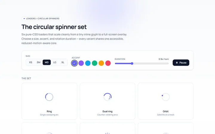
Spinner Set Loader
Originalset of circular spinners in sizes
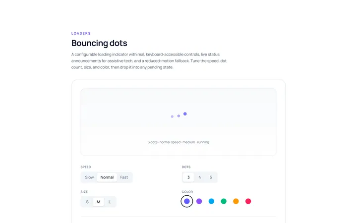
Dots Loader
Originalbouncing dots loader
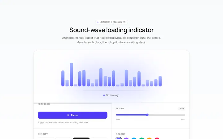
Bars Loader
Originalequalizer bars loader
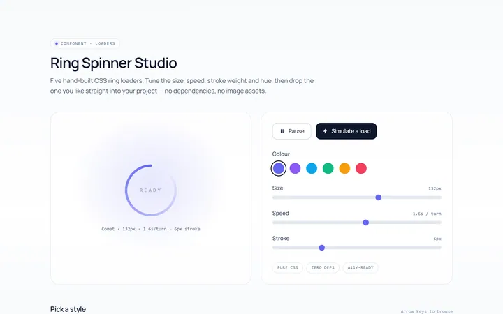
Ring Loader
Originalring spinner loader
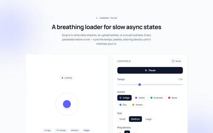
Pulse Loader
Originalpulsing circle loader
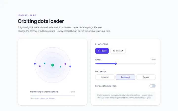
Orbit Loader
Originalorbiting dots loader
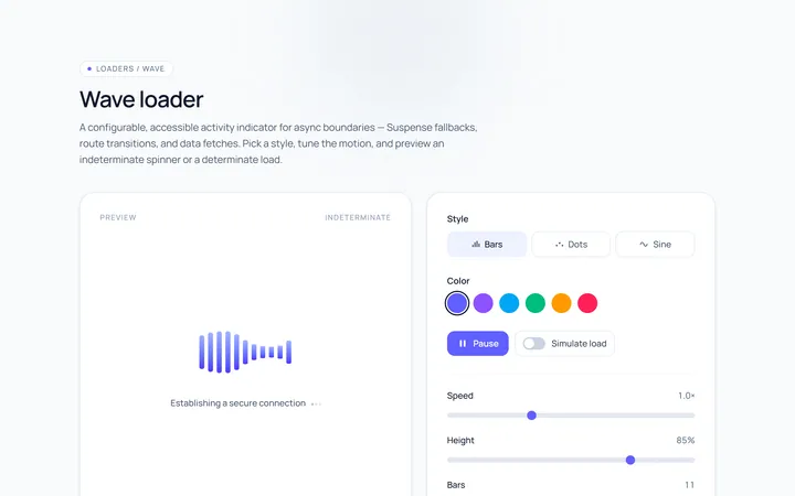
Wave Loader
Originalwave loader
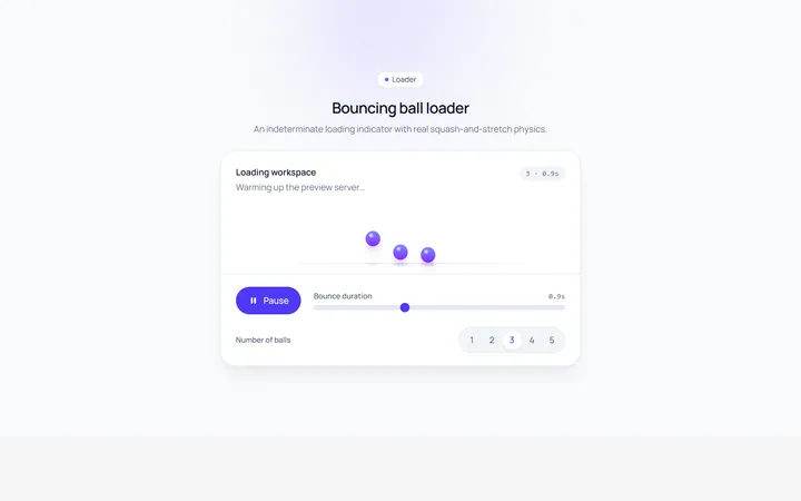
Bounce Loader
Originalbouncing ball loader
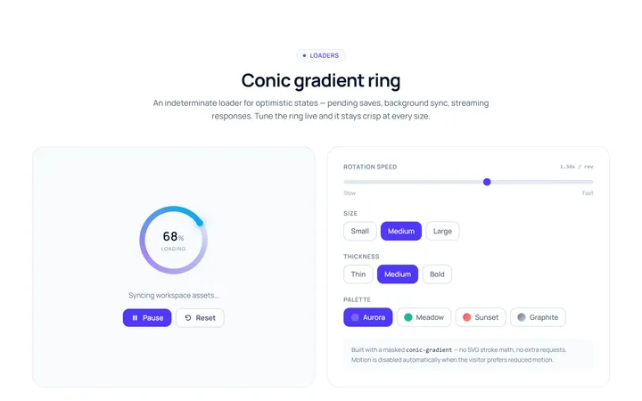
Gradient Ring Loader
Originalgradient conic ring spinner
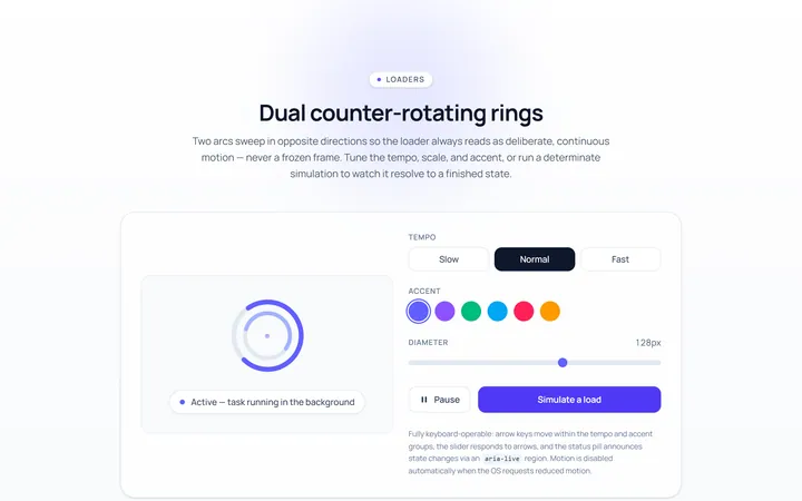
Dual Ring Loader
Originaldual counter-rotating rings
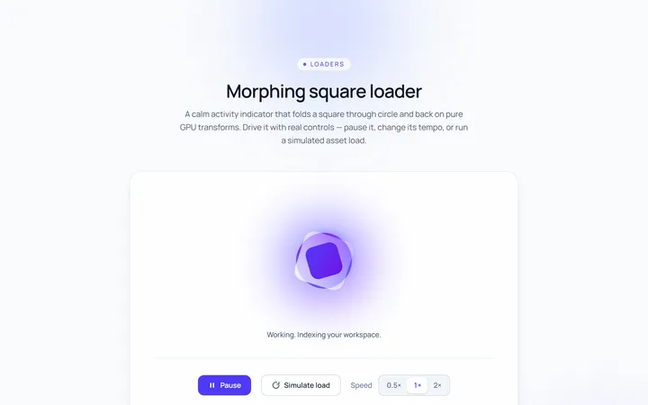
Square Loader
Originalmorphing square loader
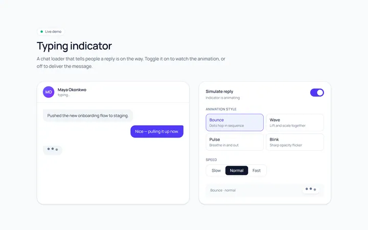
Typing Loader
Originaltyping indicator loader