

Sticky Shrink Navbar
Original · freenavbar that shrinks on scroll
Copy prompt gives Claude Code, Cursor or v0 a ready-to-paste prompt that recreates this exact component.
npx shadcn@latest add https://webinnoventix.com/r/navx-sticky-shrink.json"use client";
import {
useRef,
useState,
type KeyboardEvent as ReactKeyboardEvent,
type MouseEvent as ReactMouseEvent,
} from "react";
import {
AnimatePresence,
motion,
useMotionValueEvent,
useReducedMotion,
useScroll,
} from "motion/react";
type NavLink = { id: string; label: string; href: string };
const NAV_LINKS: NavLink[] = [
{ id: "platform", label: "Platform", href: "#platform" },
{ id: "solutions", label: "Solutions", href: "#solutions" },
{ id: "pricing", label: "Pricing", href: "#pricing" },
{ id: "docs", label: "Docs", href: "#docs" },
];
const RESOURCES: { label: string; desc: string; href: string }[] = [
{ label: "Documentation", desc: "Guides, tutorials & how-tos", href: "#docs" },
{ label: "API reference", desc: "REST endpoints & SDKs", href: "#docs" },
{ label: "Community", desc: "Forum, Discord & office hours", href: "#docs" },
{ label: "System status", desc: "Live uptime & incident log", href: "#docs" },
];
export default function NavxStickyShrink() {
const reduce = useReducedMotion();
const scrollRef = useRef<HTMLDivElement>(null);
const { scrollY, scrollYProgress } = useScroll({ container: scrollRef });
const [scrolled, setScrolled] = useState(false);
useMotionValueEvent(scrollY, "change", (latest) => {
const next = latest > 24;
setScrolled((prev) => (prev === next ? prev : next));
});
const [active, setActive] = useState<string>("platform");
const [mobileOpen, setMobileOpen] = useState(false);
const [resourcesOpen, setResourcesOpen] = useState(false);
const mobileBtnRef = useRef<HTMLButtonElement>(null);
const resourcesBtnRef = useRef<HTMLButtonElement>(null);
const resourcesWrapRef = useRef<HTMLDivElement>(null);
const resourceItemRefs = useRef<Array<HTMLAnchorElement | null>>([]);
function scrollToSection(id: string) {
const root = scrollRef.current;
const target = root?.querySelector<HTMLElement>(`[data-navx-section="${id}"]`);
target?.scrollIntoView({ behavior: reduce ? "auto" : "smooth", block: "start" });
}
function handleNavClick(e: ReactMouseEvent<HTMLAnchorElement>, id: string) {
e.preventDefault();
setActive(id);
setMobileOpen(false);
setResourcesOpen(false);
scrollToSection(id);
}
function closeResources(focusTrigger: boolean) {
setResourcesOpen(false);
if (focusTrigger) resourcesBtnRef.current?.focus();
}
function onResourcesTriggerKey(e: ReactKeyboardEvent<HTMLButtonElement>) {
if (e.key === "ArrowDown" || e.key === "Enter" || e.key === " ") {
e.preventDefault();
setResourcesOpen(true);
requestAnimationFrame(() => resourceItemRefs.current[0]?.focus());
} else if (e.key === "Escape") {
setResourcesOpen(false);
}
}
function onResourcesMenuKey(e: ReactKeyboardEvent<HTMLDivElement>) {
const items = resourceItemRefs.current.filter(
(el): el is HTMLAnchorElement => el !== null
);
if (items.length === 0) return;
const current = items.indexOf(document.activeElement as HTMLAnchorElement);
if (e.key === "ArrowDown") {
e.preventDefault();
items[(current + 1) % items.length]?.focus();
} else if (e.key === "ArrowUp") {
e.preventDefault();
items[(current - 1 + items.length) % items.length]?.focus();
} else if (e.key === "Home") {
e.preventDefault();
items[0]?.focus();
} else if (e.key === "End") {
e.preventDefault();
items[items.length - 1]?.focus();
} else if (e.key === "Escape") {
e.preventDefault();
closeResources(true);
} else if (e.key === "Tab") {
setResourcesOpen(false);
}
}
function onMobileMenuKey(e: ReactKeyboardEvent<HTMLDivElement>) {
if (e.key === "Escape") {
setMobileOpen(false);
mobileBtnRef.current?.focus();
}
}
const focusRing =
"focus-visible:outline-none focus-visible:ring-2 focus-visible:ring-indigo-500 focus-visible:ring-offset-2 focus-visible:ring-offset-white dark:focus-visible:ring-offset-slate-950";
const dur = reduce ? 0 : 0.18;
return (
<section className="relative w-full bg-slate-100 px-4 py-16 sm:py-24 dark:bg-slate-950">
<style>{`
@keyframes navx-sheen {
0% { transform: translateX(-140%); }
60% { transform: translateX(360%); }
100% { transform: translateX(360%); }
}
@keyframes navx-pulse {
0%, 100% { transform: scale(1); opacity: 1; }
50% { transform: scale(1.9); opacity: 0; }
}
.navx-sheen-bar { animation: navx-sheen 4.2s ease-in-out infinite; }
.navx-pulse-dot { animation: navx-pulse 2.4s ease-out infinite; }
@media (prefers-reduced-motion: reduce) {
.navx-sheen-bar { animation: none; }
.navx-pulse-dot { animation: none; }
}
`}</style>
<div className="mx-auto w-full max-w-6xl">
<div className="mb-6 flex flex-wrap items-end justify-between gap-3">
<div>
<p className="text-xs font-semibold uppercase tracking-[0.2em] text-indigo-600 dark:text-indigo-400">
Sticky shrink navbar
</p>
<h2 className="mt-1 text-lg font-semibold text-slate-900 dark:text-slate-100">
The bar condenses once you scroll
</h2>
</div>
<p className="max-w-xs text-sm text-slate-500 dark:text-slate-400">
Scroll inside the frame below. Past 24px the header shrinks, gains a
border, and reveals a progress line.
</p>
</div>
{/* Browser frame */}
<div className="overflow-hidden rounded-2xl border border-slate-200 bg-white shadow-2xl shadow-slate-900/10 dark:border-slate-800 dark:bg-slate-900 dark:shadow-black/40">
{/* Chrome toolbar */}
<div className="flex items-center gap-3 border-b border-slate-200 bg-slate-50 px-4 py-3 dark:border-slate-800 dark:bg-slate-900">
<div className="flex gap-1.5" aria-hidden="true">
<span className="h-3 w-3 rounded-full bg-rose-400" />
<span className="h-3 w-3 rounded-full bg-amber-400" />
<span className="h-3 w-3 rounded-full bg-emerald-400" />
</div>
<div className="mx-auto flex w-full max-w-sm items-center justify-center gap-1.5 rounded-md border border-slate-200 bg-white px-3 py-1 text-xs text-slate-500 dark:border-slate-700 dark:bg-slate-800 dark:text-slate-400">
<svg viewBox="0 0 24 24" className="h-3 w-3" fill="none" aria-hidden="true">
<rect x="5" y="11" width="14" height="9" rx="2" className="stroke-emerald-500" strokeWidth="1.8" />
<path d="M8 11V8a4 4 0 0 1 8 0v3" className="stroke-slate-400" strokeWidth="1.8" strokeLinecap="round" />
</svg>
app.halcyon.io/overview
</div>
</div>
{/* Scroll viewport */}
<div
ref={scrollRef}
className="relative h-[70vh] max-h-[620px] overflow-y-auto overscroll-contain scroll-smooth bg-white dark:bg-slate-950"
>
{/* ===== HEADER ===== */}
<header
className={[
"sticky top-0 z-40 w-full border-b backdrop-blur transition-all duration-300 ease-out motion-reduce:transition-none",
scrolled
? "border-slate-200/80 bg-white/80 shadow-sm shadow-slate-900/5 dark:border-slate-800/80 dark:bg-slate-950/80"
: "border-transparent bg-white/50 dark:bg-slate-950/40",
].join(" ")}
>
<nav
aria-label="Primary"
className={[
"mx-auto flex w-full max-w-6xl items-center justify-between gap-4 px-4 transition-all duration-300 ease-out motion-reduce:transition-none sm:px-6",
scrolled ? "py-2.5" : "py-4",
].join(" ")}
>
{/* Brand */}
<a
href="#platform"
onClick={(e) => handleNavClick(e, "platform")}
className={`group flex items-center gap-2.5 rounded-lg ${focusRing}`}
>
<span
className={[
"grid place-items-center rounded-xl bg-gradient-to-br from-indigo-500 via-violet-500 to-sky-500 text-white shadow-lg shadow-indigo-500/25 transition-all duration-300 ease-out motion-reduce:transition-none",
scrolled ? "h-8 w-8" : "h-10 w-10",
].join(" ")}
>
<svg
viewBox="0 0 24 24"
className={scrolled ? "h-4 w-4" : "h-5 w-5"}
fill="none"
aria-hidden="true"
>
<path
d="M4 15.5 9 6l3 5.5L15 6l5 9.5"
stroke="currentColor"
strokeWidth="2.2"
strokeLinecap="round"
strokeLinejoin="round"
/>
</svg>
</span>
<span
className={[
"font-semibold tracking-tight text-slate-900 transition-all duration-300 ease-out motion-reduce:transition-none dark:text-slate-50",
scrolled ? "text-base" : "text-lg",
].join(" ")}
>
Halcyon
</span>
</a>
{/* Desktop links */}
<div className="hidden items-center gap-1 lg:flex">
{NAV_LINKS.map((link) => {
const isActive = active === link.id;
return (
<a
key={link.id}
href={link.href}
aria-current={isActive ? "page" : undefined}
onClick={(e) => handleNavClick(e, link.id)}
className={[
"relative rounded-lg px-3 py-2 text-sm font-medium transition-colors",
focusRing,
isActive
? "text-slate-900 dark:text-white"
: "text-slate-500 hover:text-slate-900 dark:text-slate-400 dark:hover:text-white",
].join(" ")}
>
{link.label}
{isActive && (
<span className="absolute inset-x-3 -bottom-px h-0.5 rounded-full bg-gradient-to-r from-indigo-500 to-violet-500" />
)}
</a>
);
})}
{/* Resources dropdown */}
<div className="relative" ref={resourcesWrapRef}>
<button
ref={resourcesBtnRef}
type="button"
aria-haspopup="menu"
aria-expanded={resourcesOpen}
onClick={() => setResourcesOpen((v) => !v)}
onKeyDown={onResourcesTriggerKey}
onBlur={(e) => {
if (!resourcesWrapRef.current?.contains(e.relatedTarget as Node)) {
setResourcesOpen(false);
}
}}
className={[
"flex items-center gap-1 rounded-lg px-3 py-2 text-sm font-medium transition-colors",
focusRing,
resourcesOpen
? "text-slate-900 dark:text-white"
: "text-slate-500 hover:text-slate-900 dark:text-slate-400 dark:hover:text-white",
].join(" ")}
>
Resources
<svg
viewBox="0 0 24 24"
className={`h-4 w-4 transition-transform duration-200 ${
resourcesOpen ? "rotate-180" : ""
}`}
fill="none"
aria-hidden="true"
>
<path
d="m6 9 6 6 6-6"
stroke="currentColor"
strokeWidth="2"
strokeLinecap="round"
strokeLinejoin="round"
/>
</svg>
</button>
<AnimatePresence>
{resourcesOpen && (
<motion.div
role="menu"
aria-label="Resources"
onKeyDown={onResourcesMenuKey}
initial={{ opacity: 0, y: -6, scale: 0.98 }}
animate={{ opacity: 1, y: 0, scale: 1 }}
exit={{ opacity: 0, y: -6, scale: 0.98 }}
transition={{ duration: reduce ? 0 : 0.15, ease: "easeOut" }}
className="absolute right-0 top-full z-50 mt-2 w-72 origin-top-right rounded-xl border border-slate-200 bg-white p-1.5 shadow-xl shadow-slate-900/10 dark:border-slate-800 dark:bg-slate-900 dark:shadow-black/40"
>
{RESOURCES.map((item, i) => (
<a
key={item.label}
ref={(el) => {
resourceItemRefs.current[i] = el;
}}
role="menuitem"
href={item.href}
onClick={(e) => {
handleNavClick(e, "docs");
closeResources(true);
}}
className={`flex flex-col gap-0.5 rounded-lg px-3 py-2.5 text-sm transition-colors hover:bg-slate-100 dark:hover:bg-slate-800 ${focusRing}`}
>
<span className="font-medium text-slate-900 dark:text-slate-100">
{item.label}
</span>
<span className="text-xs text-slate-500 dark:text-slate-400">
{item.desc}
</span>
</a>
))}
</motion.div>
)}
</AnimatePresence>
</div>
</div>
{/* Actions */}
<div className="flex items-center gap-2">
<button
type="button"
className={`hidden rounded-lg px-3 py-2 text-sm font-medium text-slate-600 transition-colors hover:text-slate-900 sm:inline-flex dark:text-slate-300 dark:hover:text-white ${focusRing}`}
>
Sign in
</button>
<button
type="button"
className={[
"group relative inline-flex items-center overflow-hidden rounded-full bg-slate-900 font-semibold text-white transition-all duration-300 ease-out motion-reduce:transition-none dark:bg-white dark:text-slate-900",
focusRing,
scrolled ? "px-3.5 py-1.5 text-sm" : "px-4 py-2 text-sm",
].join(" ")}
>
<span className="relative z-10">Start free</span>
{!reduce && (
<span
aria-hidden="true"
className="navx-sheen-bar pointer-events-none absolute inset-y-0 left-0 z-0 w-1/3 bg-gradient-to-r from-transparent via-white/25 to-transparent dark:via-slate-900/20"
/>
)}
</button>
{/* Hamburger */}
<button
ref={mobileBtnRef}
type="button"
aria-label={mobileOpen ? "Close menu" : "Open menu"}
aria-expanded={mobileOpen}
aria-controls="navx-mobile-menu"
onClick={() => setMobileOpen((v) => !v)}
className={`inline-flex h-9 w-9 items-center justify-center rounded-lg text-slate-700 transition-colors hover:bg-slate-100 lg:hidden dark:text-slate-200 dark:hover:bg-slate-800 ${focusRing}`}
>
<span className="relative block h-3.5 w-5" aria-hidden="true">
<span
className={`absolute left-0 block h-0.5 w-5 rounded-full bg-current transition-all duration-300 ${
mobileOpen ? "top-1.5 rotate-45" : "top-0"
}`}
/>
<span
className={`absolute left-0 top-1.5 block h-0.5 w-5 rounded-full bg-current transition-all duration-200 ${
mobileOpen ? "opacity-0" : "opacity-100"
}`}
/>
<span
className={`absolute left-0 block h-0.5 w-5 rounded-full bg-current transition-all duration-300 ${
mobileOpen ? "top-1.5 -rotate-45" : "top-3"
}`}
/>
</span>
</button>
</div>
</nav>
{/* Scroll progress */}
<motion.div
aria-hidden="true"
style={{ scaleX: scrollYProgress }}
className={[
"absolute inset-x-0 bottom-0 h-0.5 origin-left bg-gradient-to-r from-indigo-500 via-violet-500 to-sky-500 transition-opacity duration-300",
scrolled ? "opacity-100" : "opacity-0",
].join(" ")}
/>
{/* Mobile menu */}
<AnimatePresence>
{mobileOpen && (
<motion.div
id="navx-mobile-menu"
onKeyDown={onMobileMenuKey}
initial={{ height: 0, opacity: 0 }}
animate={{ height: "auto", opacity: 1 }}
exit={{ height: 0, opacity: 0 }}
transition={{ duration: dur, ease: "easeOut" }}
className="overflow-hidden border-t border-slate-200 bg-white lg:hidden dark:border-slate-800 dark:bg-slate-950"
>
<div className="space-y-1 px-4 py-4">
{NAV_LINKS.map((link) => {
const isActive = active === link.id;
return (
<a
key={link.id}
href={link.href}
aria-current={isActive ? "page" : undefined}
onClick={(e) => handleNavClick(e, link.id)}
className={[
"block rounded-lg px-3 py-2.5 text-sm font-medium transition-colors",
focusRing,
isActive
? "bg-slate-100 text-slate-900 dark:bg-slate-800 dark:text-white"
: "text-slate-600 hover:bg-slate-100 dark:text-slate-300 dark:hover:bg-slate-800",
].join(" ")}
>
{link.label}
</a>
);
})}
<a
href="#docs"
onClick={(e) => handleNavClick(e, "docs")}
className={`block rounded-lg px-3 py-2.5 text-sm font-medium text-slate-600 transition-colors hover:bg-slate-100 dark:text-slate-300 dark:hover:bg-slate-800 ${focusRing}`}
>
Resources
</a>
<div className="flex items-center gap-2 pt-2">
<button
type="button"
className={`flex-1 rounded-full border border-slate-200 px-4 py-2 text-sm font-medium text-slate-700 dark:border-slate-700 dark:text-slate-200 ${focusRing}`}
>
Sign in
</button>
<button
type="button"
className={`flex-1 rounded-full bg-slate-900 px-4 py-2 text-sm font-semibold text-white dark:bg-white dark:text-slate-900 ${focusRing}`}
>
Start free
</button>
</div>
</div>
</motion.div>
)}
</AnimatePresence>
</header>
{/* ===== CONTENT ===== */}
<main className="mx-auto w-full max-w-5xl px-5 sm:px-8">
{/* Hero */}
<section
data-navx-section="platform"
className="scroll-mt-24 py-16 sm:py-20"
>
<span className="inline-flex items-center gap-2 rounded-full border border-slate-200 bg-slate-50 px-3 py-1 text-xs font-medium text-slate-600 dark:border-slate-800 dark:bg-slate-900 dark:text-slate-300">
<span className="relative flex h-2 w-2">
<span className="navx-pulse-dot absolute inline-flex h-full w-full rounded-full bg-emerald-500" />
<span className="relative inline-flex h-2 w-2 rounded-full bg-emerald-500" />
</span>
Live event stream
</span>
<h1 className="mt-5 max-w-2xl text-4xl font-semibold tracking-tight text-slate-900 sm:text-5xl dark:text-slate-50">
See what your product is actually doing.
</h1>
<p className="mt-4 max-w-xl text-base leading-relaxed text-slate-600 dark:text-slate-400">
Halcyon turns raw events into dashboards your engineers, PMs,
and execs all read the same way — no SQL, no data team, no
waiting on a nightly job.
</p>
<div className="mt-7 flex flex-wrap items-center gap-3">
<button
type="button"
className={`rounded-full bg-slate-900 px-5 py-2.5 text-sm font-semibold text-white transition-transform hover:-translate-y-0.5 dark:bg-white dark:text-slate-900 ${focusRing}`}
>
Start free
</button>
<button
type="button"
className={`rounded-full border border-slate-300 px-5 py-2.5 text-sm font-semibold text-slate-800 transition-colors hover:bg-slate-100 dark:border-slate-700 dark:text-slate-100 dark:hover:bg-slate-900 ${focusRing}`}
>
Book a demo
</button>
</div>
<p className="mt-4 text-xs text-slate-500 dark:text-slate-500">
No credit card · 30-day event history on the free plan
</p>
</section>
{/* Solutions */}
<section
data-navx-section="solutions"
className="scroll-mt-24 border-t border-slate-100 py-14 dark:border-slate-900"
>
<h2 className="text-2xl font-semibold tracking-tight text-slate-900 dark:text-slate-100">
Built for the questions you actually ask
</h2>
<div className="mt-8 grid gap-4 sm:grid-cols-3">
{[
{
title: "Funnels",
body: "Watch where sign-ups drop off, step by step, and segment by anything.",
tint: "from-indigo-500 to-violet-500",
},
{
title: "Retention",
body: "Cohort grids that show whether last month's fix actually moved the needle.",
tint: "from-emerald-500 to-sky-500",
},
{
title: "Session replay",
body: "Jump from a broken funnel straight to the exact session that failed.",
tint: "from-amber-500 to-rose-500",
},
].map((card) => (
<div
key={card.title}
className="rounded-2xl border border-slate-200 bg-slate-50/60 p-5 dark:border-slate-800 dark:bg-slate-900/60"
>
<span
className={`inline-grid h-10 w-10 place-items-center rounded-xl bg-gradient-to-br ${card.tint} text-white`}
>
<svg viewBox="0 0 24 24" className="h-5 w-5" fill="none" aria-hidden="true">
<path
d="M4 19V9m5 10V5m5 14v-7m5 7V8"
stroke="currentColor"
strokeWidth="2.2"
strokeLinecap="round"
/>
</svg>
</span>
<h3 className="mt-4 text-base font-semibold text-slate-900 dark:text-slate-100">
{card.title}
</h3>
<p className="mt-1.5 text-sm leading-relaxed text-slate-600 dark:text-slate-400">
{card.body}
</p>
</div>
))}
</div>
</section>
{/* Pricing */}
<section
data-navx-section="pricing"
className="scroll-mt-24 border-t border-slate-100 py-14 dark:border-slate-900"
>
<h2 className="text-2xl font-semibold tracking-tight text-slate-900 dark:text-slate-100">
Pricing that scales with events, not seats
</h2>
<div className="mt-8 grid gap-4 sm:grid-cols-3">
{[
{ name: "Free", price: "$0", note: "Up to 10k events / mo" },
{ name: "Team", price: "$29", note: "Per member, billed yearly", featured: true },
{ name: "Enterprise", price: "Custom", note: "SSO, SLA & residency" },
].map((tier) => (
<div
key={tier.name}
className={[
"rounded-2xl border p-5",
tier.featured
? "border-indigo-300 bg-indigo-50/70 ring-1 ring-indigo-200 dark:border-indigo-500/40 dark:bg-indigo-500/10 dark:ring-indigo-500/30"
: "border-slate-200 bg-white dark:border-slate-800 dark:bg-slate-900",
].join(" ")}
>
<p className="text-sm font-medium text-slate-500 dark:text-slate-400">
{tier.name}
</p>
<p className="mt-2 text-3xl font-semibold text-slate-900 dark:text-slate-50">
{tier.price}
</p>
<p className="mt-1 text-xs text-slate-500 dark:text-slate-400">
{tier.note}
</p>
</div>
))}
</div>
</section>
{/* Docs */}
<section
data-navx-section="docs"
className="scroll-mt-24 border-t border-slate-100 py-14 dark:border-slate-900"
>
<h2 className="text-2xl font-semibold tracking-tight text-slate-900 dark:text-slate-100">
Ship your first event in five minutes
</h2>
<p className="mt-3 max-w-lg text-sm leading-relaxed text-slate-600 dark:text-slate-400">
Drop the snippet in, name your event, and it shows up in the
live stream instantly. Everything else is queryable from there.
</p>
<pre className="mt-6 overflow-x-auto rounded-xl border border-slate-800 bg-slate-950 p-4 text-xs leading-relaxed text-slate-200 dark:border-slate-700">
<code>{`import { track } from "@halcyon/sdk";
track("checkout_completed", {
plan: "team",
amount: 29,
currency: "usd",
});`}</code>
</pre>
</section>
<footer className="border-t border-slate-100 py-10 text-sm text-slate-500 dark:border-slate-900 dark:text-slate-500">
© 2026 Halcyon Analytics · Made for teams who ship on Fridays.
</footer>
</main>
</div>
</div>
</div>
</section>
);
}Dependencies
Licence
Built by Web Innoventix. Free for personal and commercial use, no attribution required.
Built by Web Innoventix
Need a custom interface, a full website, or SEO that gets you cited by AI? We design, build and rank it end to end.
Get a free quoteSimilar components
Browse all →
Centred Logo Navbar
OriginalA three-column navbar with the brand logo centred between the primary links and the account actions, wrapped in a soft rounded card.
Left Logo Navbar With CTA
OriginalA classic left-aligned logo navbar with centred navigation links and a prominent pill call-to-action button on the right.
Navbar With Dropdown Menu
OriginalA navbar featuring a JS-free product dropdown built with native details and summary, revealing a two-item mega-menu panel with icons.
Glass Transparent Navbar
OriginalA frosted glass navbar floating over a colourful gradient hero backdrop, using backdrop blur and translucent borders for a modern overlay header.
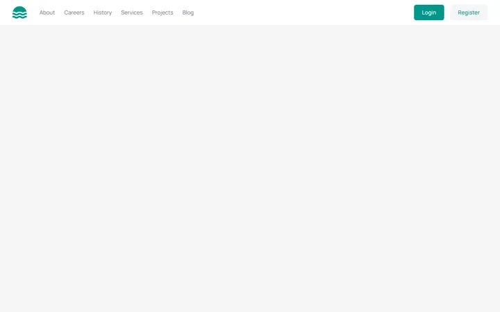
Responsive Navbar with Mobile Menu
MITA marketing site header with a logo, inline nav links, login/register buttons, and a working hamburger toggle that reveals a stacked mobile menu below the md breakpoint. Fully keyboard/ARIA accessible with light and dark variants.
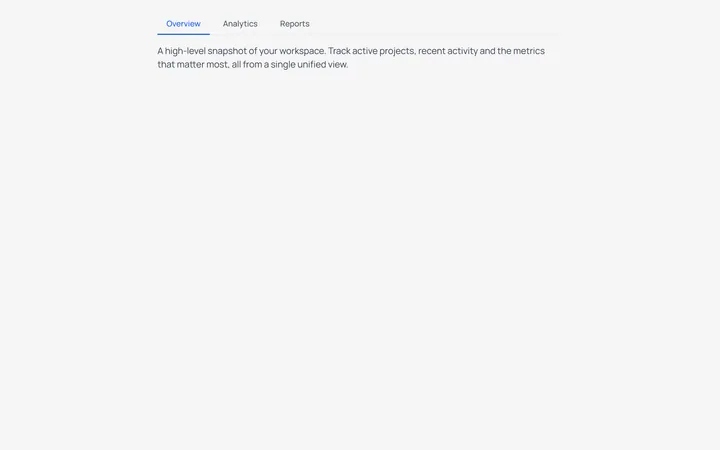
Underline Tabs
MITAn accessible underline-style tab switcher with a bottom-border active indicator and a live content panel. State-driven with proper role=tablist/tab/tabpanel and aria-selected wiring, styled for light and dark modes.
Split Button Dropdown Menu
MITA split-button control with a chevron trigger that opens a divided action menu, including a destructive delete item. Closes on outside-click and Escape, with a rotating chevron and full ARIA menu roles for both light and dark themes.
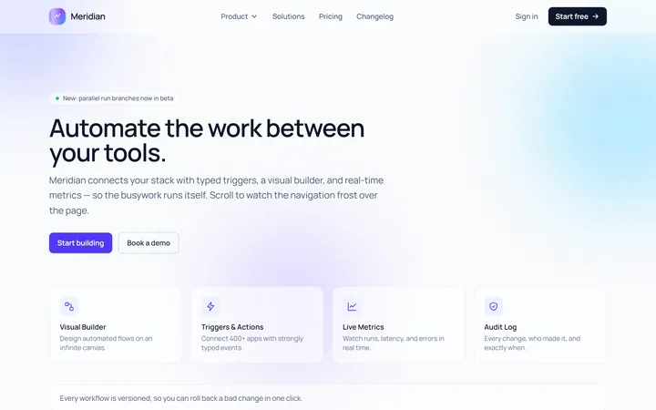
Glass Navbar
Originalglassmorphic sticky navbar
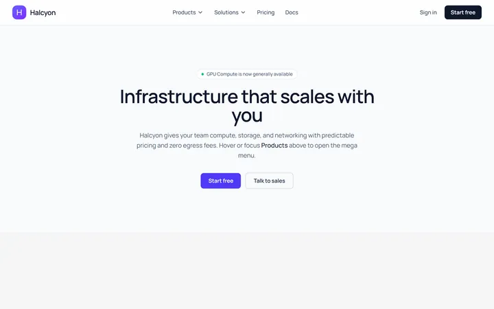
Mega Navbar
Originalnavbar with a mega dropdown
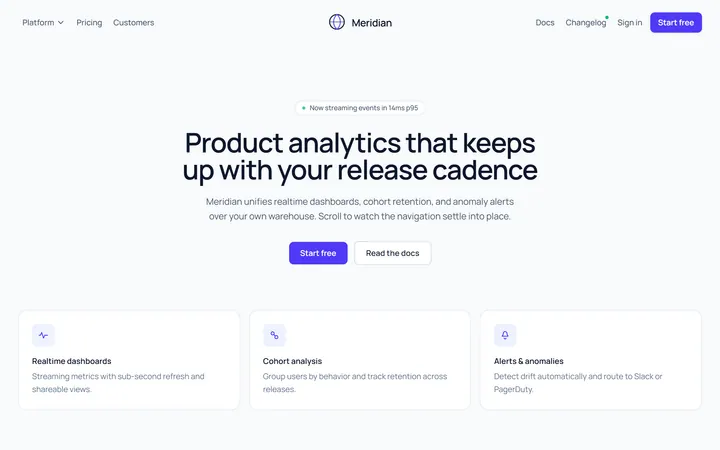
Centered Logo Navbar
Originalnavbar with centred logo and split links
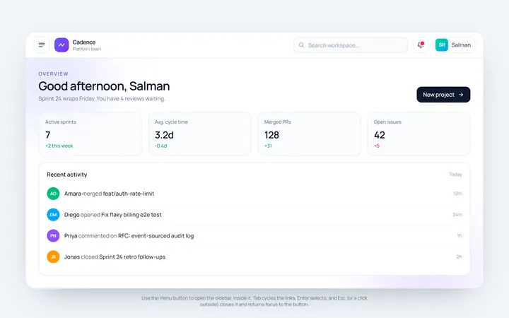
Sidebar Toggle Navbar
Originalnavbar with a sidebar toggle
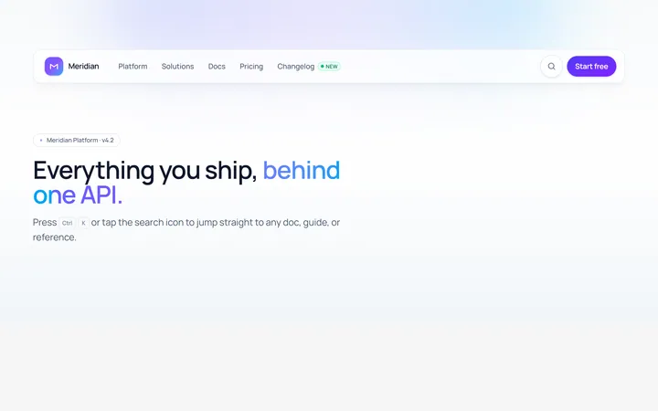
Search Navbar
Originalnavbar with an expanding search