

Emoji Rating
Original · freeemoji reaction rating
Copy prompt gives Claude Code, Cursor or v0 a ready-to-paste prompt that recreates this exact component.
npx shadcn@latest add https://webinnoventix.com/r/rate-emoji.json"use client";
import { useId, useRef, useState, type KeyboardEvent } from "react";
import { AnimatePresence, motion, useReducedMotion } from "motion/react";
type Variant = "terrible" | "poor" | "okay" | "good" | "amazing";
type Reaction = {
variant: Variant;
label: string;
score: number;
text: string;
hover: string;
ring: string;
prompt: string;
};
const REACTIONS: readonly Reaction[] = [
{
variant: "terrible",
label: "Terrible",
score: 1,
text: "text-rose-600",
hover: "group-hover:text-rose-600",
ring: "ring-rose-500/60",
prompt: "We genuinely let you down. What went wrong so we can fix it?",
},
{
variant: "poor",
label: "Poor",
score: 2,
text: "text-rose-400",
hover: "group-hover:text-rose-400",
ring: "ring-rose-400/60",
prompt: "Not our best work. Where did we fall short?",
},
{
variant: "okay",
label: "Okay",
score: 3,
text: "text-amber-500",
hover: "group-hover:text-amber-500",
ring: "ring-amber-500/60",
prompt: "Just okay is a signal. What would have made it better?",
},
{
variant: "good",
label: "Good",
score: 4,
text: "text-emerald-500",
hover: "group-hover:text-emerald-500",
ring: "ring-emerald-500/60",
prompt: "Glad it worked out. Anything we could still sharpen?",
},
{
variant: "amazing",
label: "Amazing",
score: 5,
text: "text-emerald-600",
hover: "group-hover:text-emerald-600",
ring: "ring-emerald-600/60",
prompt: "You made our day. What did you love the most?",
},
];
const MAX = 280;
export default function RateEmoji() {
const reduce = useReducedMotion();
const uid = useId();
const headingId = `${uid}-heading`;
const commentId = `${uid}-comment`;
const [value, setValue] = useState<number | null>(null);
const [hovered, setHovered] = useState<number | null>(null);
const [comment, setComment] = useState("");
const [submitted, setSubmitted] = useState(false);
const [popKey, setPopKey] = useState(0);
const [live, setLive] = useState("");
const refs = useRef<Array<HTMLButtonElement | null>>([]);
const select = (i: number) => {
setValue(i);
setPopKey((k) => k + 1);
setLive(`Selected ${REACTIONS[i].label}, ${REACTIONS[i].score} out of 5`);
};
const focusAt = (i: number) => {
refs.current[i]?.focus();
};
const onKey = (e: KeyboardEvent<HTMLButtonElement>, i: number) => {
let next = i;
switch (e.key) {
case "ArrowRight":
case "ArrowDown":
next = (i + 1) % REACTIONS.length;
break;
case "ArrowLeft":
case "ArrowUp":
next = (i - 1 + REACTIONS.length) % REACTIONS.length;
break;
case "Home":
next = 0;
break;
case "End":
next = REACTIONS.length - 1;
break;
default:
return;
}
e.preventDefault();
select(next);
focusAt(next);
};
const reset = () => {
setSubmitted(false);
setValue(null);
setHovered(null);
setComment("");
setLive("The form was reset. Choose a reaction.");
};
const submit = () => {
if (value === null) return;
setSubmitted(true);
setLive(
`Feedback sent. You rated us ${REACTIONS[value].label}, ${REACTIONS[value].score} out of 5.`,
);
};
const shown = hovered ?? value;
const selected = value !== null ? REACTIONS[value] : null;
return (
<section
className="relative w-full overflow-hidden bg-zinc-50 px-4 py-16 text-zinc-900 sm:py-24 dark:bg-zinc-950 dark:text-zinc-100"
aria-labelledby={headingId}
>
<style>{`
@keyframes reemojiFloat {
0%, 100% { transform: translate3d(0, 0, 0); }
50% { transform: translate3d(0, -18px, 0); }
}
@keyframes reemojiPulse {
0%, 100% { opacity: .35; transform: scale(1); }
50% { opacity: .95; transform: scale(1.35); }
}
@keyframes reemojiPop {
0% { transform: scale(.55); opacity: 0; }
60% { transform: scale(1.12); opacity: 1; }
100% { transform: scale(1); opacity: 1; }
}
.reemoji-float { animation: reemojiFloat 9s ease-in-out infinite; }
.reemoji-float-slow { animation: reemojiFloat 13s ease-in-out infinite; }
.reemoji-pulse { animation: reemojiPulse 2.4s ease-in-out infinite; }
.reemoji-pop { animation: reemojiPop .5s cubic-bezier(.34,1.56,.64,1) both; }
@media (prefers-reduced-motion: reduce) {
.reemoji-float,
.reemoji-float-slow,
.reemoji-pulse,
.reemoji-pop { animation: none !important; }
}
`}</style>
{/* atmosphere */}
<div aria-hidden="true" className="pointer-events-none absolute inset-0 overflow-hidden">
<div className="reemoji-float absolute -left-24 -top-24 h-72 w-72 rounded-full bg-indigo-400/20 blur-3xl dark:bg-indigo-500/10" />
<div className="reemoji-float-slow absolute -bottom-32 -right-16 h-80 w-80 rounded-full bg-emerald-400/20 blur-3xl dark:bg-emerald-500/10" />
</div>
<div className="relative mx-auto max-w-2xl">
<div className="rounded-[28px] border border-zinc-200/80 bg-white/90 p-6 shadow-xl shadow-zinc-950/5 backdrop-blur-sm sm:p-10 dark:border-zinc-800 dark:bg-zinc-900/80 dark:shadow-black/40">
<AnimatePresence mode="wait" initial={false}>
{submitted && selected ? (
<motion.div
key="thanks"
initial={reduce ? false : { opacity: 0, y: 10 }}
animate={reduce ? {} : { opacity: 1, y: 0 }}
exit={reduce ? {} : { opacity: 0, y: -10 }}
transition={{ duration: 0.3 }}
className="flex flex-col items-center text-center"
>
<div className={`reemoji-pop h-24 w-24 ${selected.text}`}>
<Face variant={selected.variant} />
</div>
<h2 id={headingId} className="mt-6 text-2xl font-semibold tracking-tight">
Thanks for the honesty.
</h2>
<p className="mt-2 max-w-sm text-sm leading-relaxed text-zinc-500 dark:text-zinc-400">
We logged your reaction as{" "}
<span className={`font-semibold ${selected.text}`}>{selected.label}</span> ({selected.score}/5).
{comment.trim().length > 0
? " Your note is on its way to the team that can act on it."
: " Every tap steers what we build next."}
</p>
<button
type="button"
onClick={reset}
className="mt-8 inline-flex items-center gap-2 rounded-full border border-zinc-300 px-5 py-2.5 text-sm font-medium text-zinc-700 transition-colors hover:bg-zinc-100 focus-visible:outline-none focus-visible:ring-2 focus-visible:ring-indigo-500 focus-visible:ring-offset-2 focus-visible:ring-offset-white dark:border-zinc-700 dark:text-zinc-200 dark:hover:bg-zinc-800 dark:focus-visible:ring-offset-zinc-900"
>
<svg viewBox="0 0 24 24" fill="none" aria-hidden="true" className="h-4 w-4">
<path
d="M3.5 12a8.5 8.5 0 1 1 2.4 5.9M3.5 12V7m0 5h5"
stroke="currentColor"
strokeWidth="1.8"
strokeLinecap="round"
strokeLinejoin="round"
/>
</svg>
Change my answer
</button>
</motion.div>
) : (
<motion.div
key="rate"
initial={reduce ? false : { opacity: 0, y: 10 }}
animate={reduce ? {} : { opacity: 1, y: 0 }}
exit={reduce ? {} : { opacity: 0, y: -10 }}
transition={{ duration: 0.3 }}
>
<div className="flex items-center gap-2">
<span className="reemoji-pulse inline-block h-2 w-2 rounded-full bg-emerald-500" />
<span className="text-xs font-semibold uppercase tracking-[0.18em] text-zinc-400 dark:text-zinc-500">
Live feedback
</span>
</div>
<h2
id={headingId}
className="mt-3 text-2xl font-semibold tracking-tight sm:text-3xl"
>
How was your experience?
</h2>
<p className="mt-2 max-w-md text-sm leading-relaxed text-zinc-500 dark:text-zinc-400">
One tap tells us a lot. Your honest reaction helps us repair what is
broken and double down on what already works.
</p>
{/* radiogroup */}
<div
role="radiogroup"
aria-labelledby={headingId}
className="mt-8 flex items-end justify-between gap-1.5 sm:gap-3"
>
{REACTIONS.map((r, i) => {
const isActive = value === i;
return (
<button
key={r.variant}
ref={(el) => {
refs.current[i] = el;
}}
type="button"
role="radio"
aria-checked={isActive}
aria-label={`${r.label}, ${r.score} out of 5`}
tabIndex={value === null ? (i === 0 ? 0 : -1) : isActive ? 0 : -1}
onClick={() => select(i)}
onKeyDown={(e) => onKey(e, i)}
onPointerEnter={() => setHovered(i)}
onPointerLeave={() => setHovered(null)}
className={`group relative flex flex-1 flex-col items-center rounded-2xl px-1 py-2 transition-all duration-200 hover:-translate-y-1 focus-visible:outline-none focus-visible:ring-2 focus-visible:ring-indigo-500 focus-visible:ring-offset-2 focus-visible:ring-offset-white dark:focus-visible:ring-offset-zinc-900 ${
isActive
? `bg-zinc-50 ring-2 ring-offset-2 ring-offset-white dark:bg-zinc-800/60 dark:ring-offset-zinc-900 ${r.ring}`
: ""
}`}
>
<motion.span
key={isActive ? `pop-${popKey}` : `idle-${i}`}
animate={
!reduce && isActive
? { scale: [1, 1.25, 0.92, 1] }
: { scale: 1 }
}
transition={{ duration: 0.42, ease: "easeOut" }}
className={`block h-11 w-11 transition-colors duration-200 sm:h-14 sm:w-14 ${
isActive ? r.text : `text-zinc-300 dark:text-zinc-600 ${r.hover}`
}`}
>
<Face variant={r.variant} />
</motion.span>
<span
className={`mt-2 hidden text-[11px] font-medium sm:block ${
isActive
? "text-zinc-700 dark:text-zinc-200"
: "text-zinc-400 dark:text-zinc-500"
}`}
>
{r.label}
</span>
</button>
);
})}
</div>
{/* current label readout */}
<div className="mt-5 flex min-h-[1.75rem] items-center justify-center">
{shown !== null ? (
<span className="inline-flex items-center gap-2 rounded-full bg-zinc-100 px-3 py-1 text-xs font-medium text-zinc-600 dark:bg-zinc-800 dark:text-zinc-300">
<span className={`h-1.5 w-1.5 rounded-full bg-current ${REACTIONS[shown].text}`} />
{REACTIONS[shown].label} · {REACTIONS[shown].score}/5
</span>
) : (
<span className="text-xs text-zinc-400 dark:text-zinc-500">
Tap or use the arrow keys to rate
</span>
)}
</div>
{/* follow-up */}
<AnimatePresence initial={false}>
{selected && (
<motion.div
key="followup"
initial={reduce ? false : { opacity: 0, height: 0 }}
animate={reduce ? {} : { opacity: 1, height: "auto" }}
exit={reduce ? {} : { opacity: 0, height: 0 }}
transition={{ duration: 0.28, ease: "easeOut" }}
className="overflow-hidden"
>
<div className="mt-4 border-t border-zinc-200 pt-6 dark:border-zinc-800">
<label
htmlFor={commentId}
className="block text-sm font-medium text-zinc-800 dark:text-zinc-200"
>
{selected.prompt}
</label>
<textarea
id={commentId}
value={comment}
maxLength={MAX}
rows={3}
onChange={(e) => setComment(e.target.value)}
placeholder="Tell us more (optional)"
className="mt-3 w-full resize-none rounded-2xl border border-zinc-300 bg-transparent px-4 py-3 text-sm text-zinc-900 placeholder:text-zinc-400 focus-visible:border-indigo-500 focus-visible:outline-none focus-visible:ring-2 focus-visible:ring-indigo-500/40 dark:border-zinc-700 dark:text-zinc-100 dark:placeholder:text-zinc-500"
/>
<div className="mt-3 flex items-center justify-between gap-3">
<span className="text-xs tabular-nums text-zinc-400 dark:text-zinc-500">
{comment.length}/{MAX}
</span>
<button
type="button"
onClick={submit}
className="inline-flex items-center gap-2 rounded-full bg-indigo-600 px-6 py-2.5 text-sm font-semibold text-white shadow-sm transition-colors hover:bg-indigo-500 focus-visible:outline-none focus-visible:ring-2 focus-visible:ring-indigo-500 focus-visible:ring-offset-2 focus-visible:ring-offset-white dark:focus-visible:ring-offset-zinc-900"
>
Send feedback
<svg
viewBox="0 0 24 24"
fill="none"
aria-hidden="true"
className="h-4 w-4"
>
<path
d="M5 12h14m-6-6 6 6-6 6"
stroke="currentColor"
strokeWidth="1.9"
strokeLinecap="round"
strokeLinejoin="round"
/>
</svg>
</button>
</div>
</div>
</motion.div>
)}
</AnimatePresence>
</motion.div>
)}
</AnimatePresence>
</div>
<p className="mt-4 text-center text-xs text-zinc-400 dark:text-zinc-600">
Anonymous · takes about five seconds · no account required
</p>
</div>
<div aria-live="polite" className="sr-only">
{live}
</div>
</section>
);
}
function Face({ variant }: { variant: Variant }) {
return (
<svg
viewBox="0 0 64 64"
fill="none"
aria-hidden="true"
className="h-full w-full"
>
<circle cx="32" cy="32" r="27" fill="currentColor" fillOpacity="0.12" />
<circle cx="32" cy="32" r="27" stroke="currentColor" strokeWidth="3" />
<FaceFeatures variant={variant} />
</svg>
);
}
function FaceFeatures({ variant }: { variant: Variant }) {
const stroke = {
stroke: "currentColor",
strokeWidth: 3,
strokeLinecap: "round" as const,
strokeLinejoin: "round" as const,
};
switch (variant) {
case "terrible":
return (
<>
<path d="M17 21 L27 25" {...stroke} />
<path d="M47 21 L37 25" {...stroke} />
<circle cx="23" cy="30" r="2.6" fill="currentColor" />
<circle cx="41" cy="30" r="2.6" fill="currentColor" />
<path d="M21 47 Q32 37 43 47" {...stroke} />
</>
);
case "poor":
return (
<>
<circle cx="23" cy="28" r="2.6" fill="currentColor" />
<circle cx="41" cy="28" r="2.6" fill="currentColor" />
<path d="M22 46 Q32 40 42 46" {...stroke} />
</>
);
case "okay":
return (
<>
<circle cx="23" cy="28" r="2.6" fill="currentColor" />
<circle cx="41" cy="28" r="2.6" fill="currentColor" />
<path d="M23 43 L41 43" {...stroke} />
</>
);
case "good":
return (
<>
<circle cx="23" cy="27" r="2.6" fill="currentColor" />
<circle cx="41" cy="27" r="2.6" fill="currentColor" />
<path d="M21 40 Q32 49 43 40" {...stroke} />
</>
);
case "amazing":
return (
<>
<path d="M18 28 Q23 22 28 28" {...stroke} />
<path d="M36 28 Q41 22 46 28" {...stroke} />
<path
d="M20 38 Q32 53 44 38 Z"
fill="currentColor"
fillOpacity="0.85"
{...stroke}
/>
</>
);
}
}Dependencies
Licence
Built by Web Innoventix. Free for personal and commercial use, no attribution required.
Built by Web Innoventix
Need a custom interface, a full website, or SEO that gets you cited by AI? We design, build and rank it end to end.
Get a free quoteSimilar components
Browse all →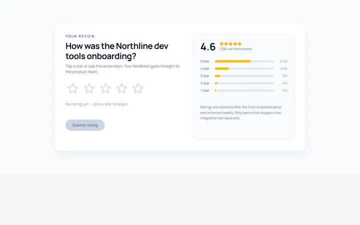
Stars Rating
Originalinteractive star rating
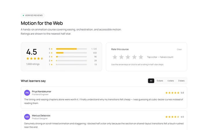
Stars Half Rating
Originalhalf-star rating display
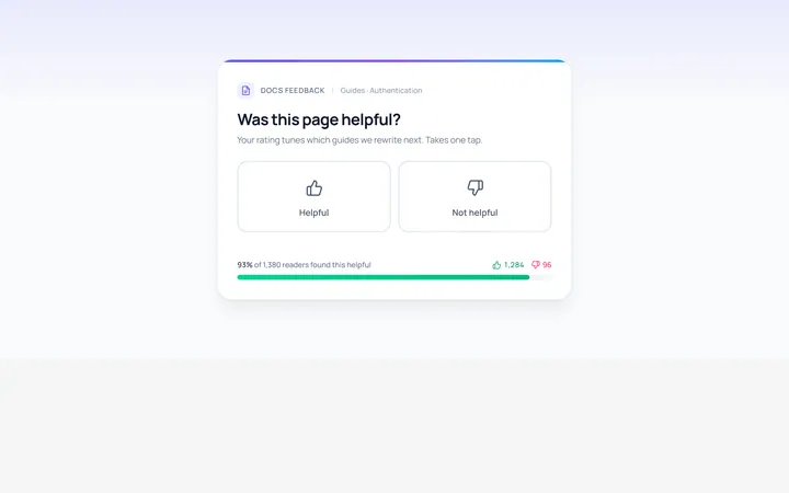
Thumbs Rating
Originalthumbs up/down rating
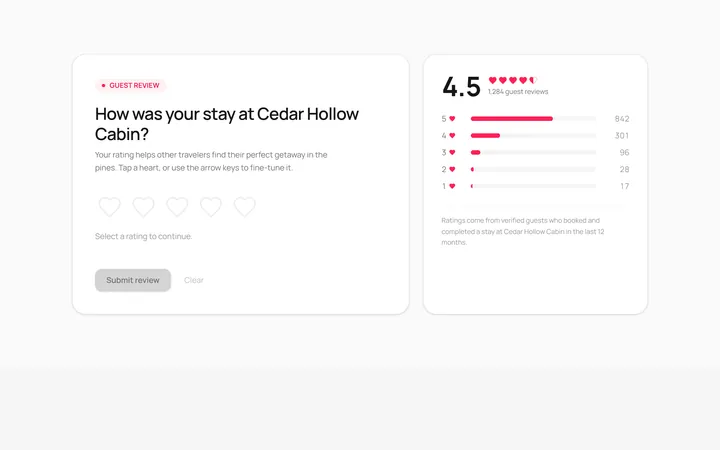
Hearts Rating
Originalheart rating
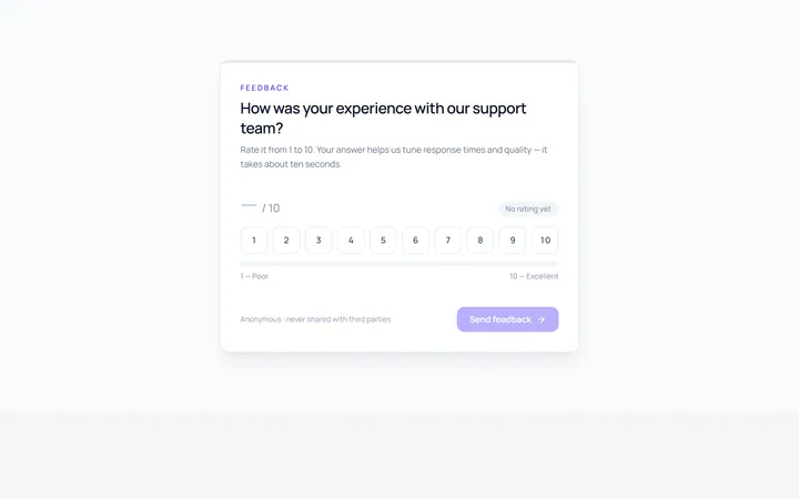
Scale Rating
Original1-10 numeric scale rating
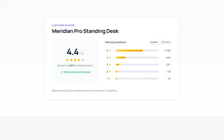
Summary Rating
Originalrating summary with distribution bars
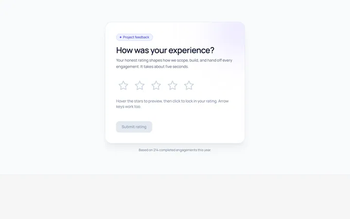
Interactive Rating
Originalhoverable star rating with label

Spotlight Hero
OriginalA centred hero with a soft radial spotlight, badge and dual call-to-action.

Split Hero
OriginalA two-column hero pairing a headline and CTAs with a product mock and social proof.

Gradient Spotlight Hero
OriginalA minimal centred hero with a soft gradient-mesh backdrop, announcement pill and dual call-to-action buttons.

App Preview Hero
OriginalA centred hero that pairs headline copy with a realistic product dashboard mock built entirely from markup, complete with browser chrome and a floating notification card.

Waitlist Capture Hero
OriginalA dark, focused hero with an inline email capture form and avatar social proof, ready for pre-launch waitlists.