

Summary Rating
Original · freerating summary with distribution bars
Copy prompt gives Claude Code, Cursor or v0 a ready-to-paste prompt that recreates this exact component.
npx shadcn@latest add https://webinnoventix.com/r/rate-summary.json"use client";
import { useState, useRef } from "react";
import type { KeyboardEvent as ReactKeyboardEvent } from "react";
import { motion, useReducedMotion } from "motion/react";
type Rating = { stars: number; count: number };
type ViewMode = "count" | "percent";
const RATINGS: Rating[] = [
{ stars: 5, count: 1783 },
{ stars: 4, count: 642 },
{ stars: 3, count: 231 },
{ stars: 2, count: 118 },
{ stars: 1, count: 73 },
];
const VIEW_MODES: { id: ViewMode; label: string }[] = [
{ id: "count", label: "Counts" },
{ id: "percent", label: "Percent" },
];
const STAR_PATH =
"M10 1.6l2.47 5.01 5.53.8-4 3.9.94 5.5L10 14.2l-4.95 2.6.95-5.5-4-3.9 5.53-.8z";
function StarSvg({ className }: { className?: string }) {
return (
<svg viewBox="0 0 20 20" fill="currentColor" className={className} aria-hidden="true">
<path d={STAR_PATH} />
</svg>
);
}
function AverageStars({ value }: { value: number }) {
const pct = Math.max(0, Math.min(100, (value / 5) * 100));
return (
<div
className="relative inline-flex"
role="img"
aria-label={`${value.toFixed(1)} out of 5 stars`}
>
<div className="flex gap-0.5 text-slate-300 dark:text-slate-600">
{[0, 1, 2, 3, 4].map((i) => (
<StarSvg key={i} className="h-5 w-5 shrink-0" />
))}
</div>
<div
className="absolute inset-y-0 left-0 flex gap-0.5 overflow-hidden text-amber-400"
style={{ width: `${pct}%` }}
aria-hidden="true"
>
{[0, 1, 2, 3, 4].map((i) => (
<StarSvg key={i} className="h-5 w-5 shrink-0" />
))}
</div>
</div>
);
}
export default function RateSummary() {
const prefersReduced = useReducedMotion();
const [view, setView] = useState<ViewMode>("count");
const [selected, setSelected] = useState<number | null>(null);
const radioRefs = useRef<(HTMLButtonElement | null)[]>([]);
const fmt = (n: number) => n.toLocaleString("en-US");
const total = RATINGS.reduce((sum, r) => sum + r.count, 0);
const weighted = RATINGS.reduce((sum, r) => sum + r.stars * r.count, 0);
const average = weighted / total;
const percentOf = (n: number) => Math.round((n / total) * 100);
const recommend = percentOf(
RATINGS.filter((r) => r.stars >= 4).reduce((sum, r) => sum + r.count, 0),
);
const active = selected !== null ? RATINGS.find((r) => r.stars === selected) : null;
const message = active
? `Showing ${fmt(active.count)} ${active.count === 1 ? "review" : "reviews"} rated ${active.stars} ${active.stars === 1 ? "star" : "stars"} — ${percentOf(active.count)}% of all reviews.`
: `Based on all ${fmt(total)} verified reviews from the last 12 months.`;
function onRadioKey(e: ReactKeyboardEvent<HTMLButtonElement>, idx: number) {
let next = idx;
if (e.key === "ArrowRight" || e.key === "ArrowDown") next = (idx + 1) % VIEW_MODES.length;
else if (e.key === "ArrowLeft" || e.key === "ArrowUp")
next = (idx - 1 + VIEW_MODES.length) % VIEW_MODES.length;
else if (e.key === "Home") next = 0;
else if (e.key === "End") next = VIEW_MODES.length - 1;
else return;
e.preventDefault();
setView(VIEW_MODES[next].id);
radioRefs.current[next]?.focus();
}
return (
<section className="relative w-full bg-gradient-to-b from-slate-50 to-white px-4 py-16 dark:from-slate-950 dark:to-slate-900 sm:px-6 sm:py-20 lg:py-24">
<style>{`
@keyframes ratesum-sheen-slide {
0% { transform: translateX(-120%); }
60% { transform: translateX(420%); }
100% { transform: translateX(420%); }
}
.ratesum-sheen { animation: ratesum-sheen-slide 3.4s cubic-bezier(0.4,0,0.2,1) infinite; }
@media (prefers-reduced-motion: reduce) {
.ratesum-sheen { animation: none; }
}
`}</style>
<div className="mx-auto max-w-3xl">
<div className="rounded-3xl border border-slate-200 bg-white p-6 shadow-sm dark:border-slate-800 dark:bg-slate-900 sm:p-8 lg:p-10">
<div className="flex flex-col gap-1.5">
<span className="text-xs font-semibold uppercase tracking-wider text-indigo-600 dark:text-indigo-400">
Customer reviews
</span>
<h2 className="text-2xl font-bold tracking-tight text-slate-900 dark:text-white sm:text-3xl">
Meridian Pro Standing Desk
</h2>
</div>
<div className="mt-8 grid gap-8 sm:grid-cols-[minmax(0,1fr)_minmax(0,1.45fr)] sm:gap-10">
{/* Summary */}
<div className="flex flex-col items-center justify-center gap-3 rounded-2xl bg-slate-50 p-6 text-center dark:bg-slate-800/50">
<div className="flex items-baseline gap-1.5">
<span className="text-5xl font-bold tracking-tight text-slate-900 dark:text-white">
{average.toFixed(1)}
</span>
<span className="text-lg font-medium text-slate-400 dark:text-slate-500">/ 5</span>
</div>
<AverageStars value={average} />
<p className="text-sm text-slate-500 dark:text-slate-400">
Based on{" "}
<span className="font-semibold text-slate-700 dark:text-slate-200">
{fmt(total)}
</span>{" "}
verified reviews
</p>
<div className="mt-1 inline-flex items-center gap-1.5 rounded-full bg-emerald-50 px-3 py-1 text-xs font-medium text-emerald-700 dark:bg-emerald-500/10 dark:text-emerald-400">
<svg viewBox="0 0 20 20" fill="currentColor" className="h-3.5 w-3.5" aria-hidden="true">
<path
fillRule="evenodd"
d="M16.7 5.3a1 1 0 010 1.4l-7.5 7.5a1 1 0 01-1.4 0L3.3 9.7a1 1 0 011.4-1.4l3.3 3.29 6.8-6.8a1 1 0 011.4 0z"
clipRule="evenodd"
/>
</svg>
{recommend}% recommend this desk
</div>
</div>
{/* Breakdown */}
<div>
<div className="mb-4 flex items-center justify-between gap-4">
<h3 className="text-sm font-semibold text-slate-700 dark:text-slate-300">
Rating breakdown
</h3>
<div
role="radiogroup"
aria-label="Show breakdown as"
className="inline-flex rounded-lg bg-slate-100 p-0.5 dark:bg-slate-800"
>
{VIEW_MODES.map((m, i) => {
const isActive = view === m.id;
return (
<button
key={m.id}
ref={(el) => {
radioRefs.current[i] = el;
}}
type="button"
role="radio"
aria-checked={isActive}
tabIndex={isActive ? 0 : -1}
onClick={() => setView(m.id)}
onKeyDown={(e) => onRadioKey(e, i)}
className={`rounded-md px-3 py-1 text-xs font-medium transition focus-visible:outline-none focus-visible:ring-2 focus-visible:ring-indigo-500 ${
isActive
? "bg-white text-slate-900 shadow-sm dark:bg-slate-700 dark:text-white"
: "text-slate-500 hover:text-slate-800 dark:text-slate-400 dark:hover:text-slate-200"
}`}
>
{m.label}
</button>
);
})}
</div>
</div>
<ul className="flex flex-col gap-1">
{RATINGS.map((r, i) => {
const pct = percentOf(r.count);
const isSel = selected === r.stars;
return (
<li key={r.stars}>
<button
type="button"
aria-pressed={isSel}
aria-label={`${r.stars} ${r.stars === 1 ? "star" : "stars"}: ${fmt(
r.count,
)} reviews, ${pct} percent.${
isSel ? " Selected. Activate to clear filter." : " Activate to filter reviews."
}`}
onClick={() =>
setSelected((prev) => (prev === r.stars ? null : r.stars))
}
className={`group flex w-full items-center gap-3 rounded-xl px-2 py-2 text-left transition focus-visible:outline-none focus-visible:ring-2 focus-visible:ring-indigo-500 focus-visible:ring-offset-2 focus-visible:ring-offset-white dark:focus-visible:ring-offset-slate-900 ${
isSel
? "bg-indigo-50 ring-1 ring-indigo-200 dark:bg-indigo-500/10 dark:ring-indigo-500/30"
: "hover:bg-slate-50 dark:hover:bg-slate-800/60"
}`}
>
<span className="flex w-10 shrink-0 items-center gap-1 text-sm font-medium text-slate-700 dark:text-slate-300">
{r.stars}
<StarSvg className="h-3.5 w-3.5 text-amber-400" />
</span>
<span className="relative h-2.5 flex-1 overflow-hidden rounded-full bg-slate-200 dark:bg-slate-700/70">
<motion.span
className="absolute inset-y-0 left-0 overflow-hidden rounded-full bg-gradient-to-r from-amber-300 to-amber-500 dark:from-amber-400 dark:to-amber-500"
initial={prefersReduced ? false : { width: 0 }}
animate={{ width: `${pct}%` }}
transition={
prefersReduced
? { duration: 0 }
: { duration: 0.9, delay: 0.1 + i * 0.08, ease: [0.22, 1, 0.36, 1] }
}
>
<span
className="ratesum-sheen pointer-events-none absolute inset-y-0 left-0 w-1/4 bg-gradient-to-r from-transparent via-white/50 to-transparent"
aria-hidden="true"
/>
</motion.span>
</span>
<span className="w-14 shrink-0 text-right text-sm font-medium tabular-nums text-slate-600 dark:text-slate-300">
{view === "count" ? fmt(r.count) : `${pct}%`}
</span>
</button>
</li>
);
})}
</ul>
</div>
</div>
<div className="mt-6 flex flex-col gap-2 border-t border-slate-100 pt-4 dark:border-slate-800 sm:flex-row sm:items-center sm:justify-between">
<p aria-live="polite" className="text-sm text-slate-500 dark:text-slate-400">
{message}
</p>
{selected !== null && (
<button
type="button"
onClick={() => setSelected(null)}
className="self-start rounded-lg border border-slate-200 px-3 py-1.5 text-xs font-medium text-slate-600 transition hover:bg-slate-50 focus-visible:outline-none focus-visible:ring-2 focus-visible:ring-indigo-500 dark:border-slate-700 dark:text-slate-300 dark:hover:bg-slate-800"
>
Clear filter
</button>
)}
</div>
</div>
</div>
</section>
);
}Dependencies
Licence
Built by Web Innoventix. Free for personal and commercial use, no attribution required.
Built by Web Innoventix
Need a custom interface, a full website, or SEO that gets you cited by AI? We design, build and rank it end to end.
Get a free quoteSimilar components
Browse all →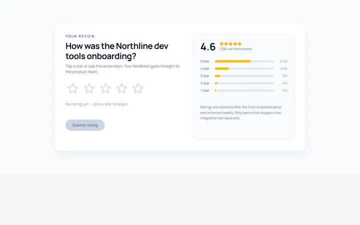
Stars Rating
Originalinteractive star rating
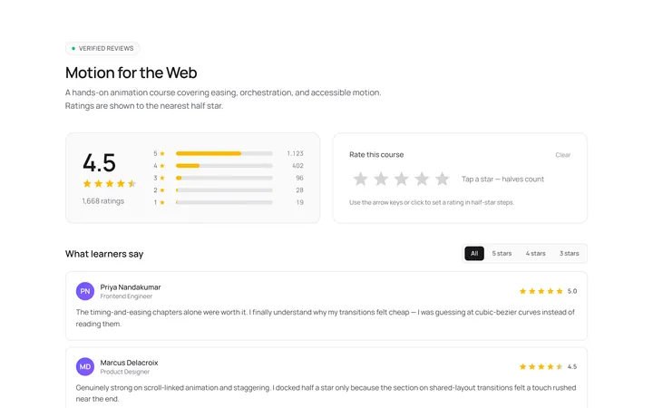
Stars Half Rating
Originalhalf-star rating display
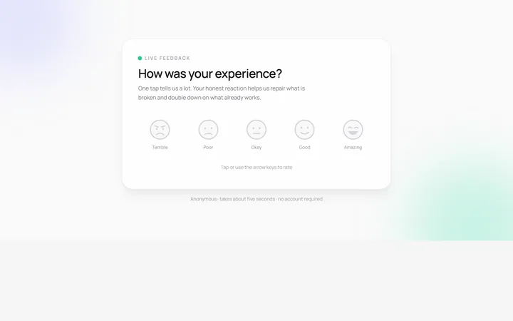
Emoji Rating
Originalemoji reaction rating
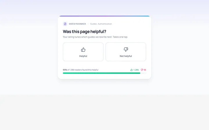
Thumbs Rating
Originalthumbs up/down rating
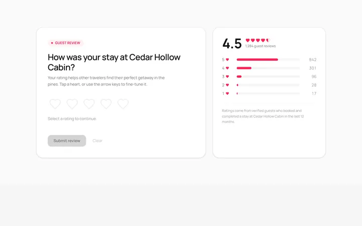
Hearts Rating
Originalheart rating
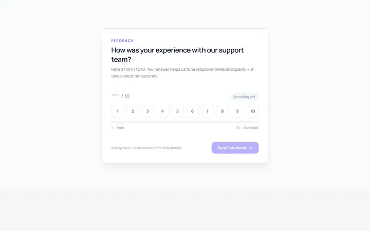
Scale Rating
Original1-10 numeric scale rating
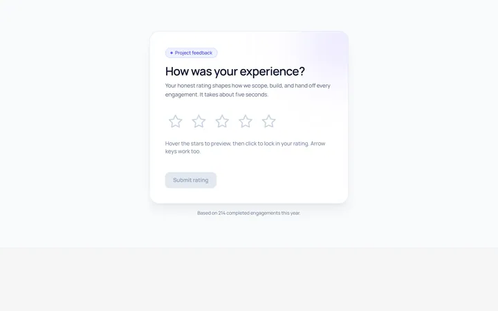
Interactive Rating
Originalhoverable star rating with label

Spotlight Hero
OriginalA centred hero with a soft radial spotlight, badge and dual call-to-action.

Split Hero
OriginalA two-column hero pairing a headline and CTAs with a product mock and social proof.

Gradient Spotlight Hero
OriginalA minimal centred hero with a soft gradient-mesh backdrop, announcement pill and dual call-to-action buttons.

App Preview Hero
OriginalA centred hero that pairs headline copy with a realistic product dashboard mock built entirely from markup, complete with browser chrome and a floating notification card.

Waitlist Capture Hero
OriginalA dark, focused hero with an inline email capture form and avatar social proof, ready for pre-launch waitlists.