

Stars Half Rating
Original · freehalf-star rating display
Copy prompt gives Claude Code, Cursor or v0 a ready-to-paste prompt that recreates this exact component.
npx shadcn@latest add https://webinnoventix.com/r/rate-stars-half.json"use client";
import { useId, useRef, useState, type KeyboardEvent } from "react";
import { motion, useReducedMotion } from "motion/react";
type Review = {
id: string;
name: string;
role: string;
rating: number;
body: string;
};
const MAX = 5;
const STEP = 0.5;
const DISTRIBUTION: { stars: number; count: number }[] = [
{ stars: 5, count: 1123 },
{ stars: 4, count: 402 },
{ stars: 3, count: 96 },
{ stars: 2, count: 28 },
{ stars: 1, count: 19 },
];
const TOTAL = DISTRIBUTION.reduce((sum, row) => sum + row.count, 0);
const AVERAGE = 4.5;
const REVIEWS: Review[] = [
{
id: "r1",
name: "Priya Nandakumar",
role: "Frontend Engineer",
rating: 5,
body:
"The timing-and-easing chapters alone were worth it. I finally understand why my transitions felt cheap — I was guessing at cubic-bezier curves instead of reading them.",
},
{
id: "r2",
name: "Marcus Delacroix",
role: "Product Designer",
rating: 4.5,
body:
"Genuinely strong on scroll-linked animation and staggering. I docked half a star only because the section on shared-layout transitions felt a touch rushed near the end.",
},
{
id: "r3",
name: "Lena Kovač",
role: "UX Developer",
rating: 4,
body:
"Clear examples, sensible defaults, no fluff. I'd have loved a full lesson on prefers-reduced-motion and focus management, but what's here is solid and practical.",
},
{
id: "r4",
name: "Tomás Reyes",
role: "Creative Technologist",
rating: 3.5,
body:
"A good foundation and the exercises are well paced. For the price I was hoping for deeper GPU-compositing and performance-profiling material rather than an overview.",
},
];
type FilterKey = "all" | "5" | "4" | "3";
const FILTERS: { key: FilterKey; label: string }[] = [
{ key: "all", label: "All" },
{ key: "5", label: "5 stars" },
{ key: "4", label: "4 stars" },
{ key: "3", label: "3 stars" },
];
function StarShape({ className }: { className: string }) {
return (
<svg viewBox="0 0 24 24" className={className} aria-hidden="true" focusable="false">
<path
d="M12 17.27 18.18 21l-1.64-7.03L22 9.24l-7.19-.62L12 2 9.19 8.62 2 9.24l5.46 4.73L5.82 21z"
fill="currentColor"
/>
</svg>
);
}
function StarDisplay({
value,
sizeClass = "h-5 w-5",
gapClass = "gap-0.5",
}: {
value: number;
sizeClass?: string;
gapClass?: string;
}) {
return (
<span
className={`inline-flex items-center ${gapClass}`}
role="img"
aria-label={`Rated ${value} out of ${MAX} stars`}
>
{[0, 1, 2, 3, 4].map((i) => {
const fill = Math.max(0, Math.min(1, value - i));
return (
<span key={i} className={`relative inline-block ${sizeClass}`}>
<StarShape
className={`absolute inset-0 ${sizeClass} text-zinc-300 dark:text-zinc-700`}
/>
<span
className="absolute inset-0 overflow-hidden"
style={{ width: `${fill * 100}%` }}
aria-hidden="true"
>
<StarShape className={`${sizeClass} text-amber-400`} />
</span>
</span>
);
})}
</span>
);
}
function StarRatingInput() {
const reduce = useReducedMotion();
const trackRef = useRef<HTMLDivElement>(null);
const [value, setValue] = useState(0);
const [hover, setHover] = useState<number | null>(null);
const labelId = useId();
const statusId = useId();
const shown = hover ?? value;
function snap(raw: number): number {
const s = Math.round(raw / STEP) * STEP;
return Math.max(0, Math.min(MAX, s));
}
function valueFromPointer(clientX: number): number {
const el = trackRef.current;
if (!el) return value;
const rect = el.getBoundingClientRect();
const ratio = (clientX - rect.left) / rect.width;
const ceiled = Math.ceil((ratio * MAX) / STEP) * STEP;
return Math.max(STEP, Math.min(MAX, ceiled));
}
function onKeyDown(e: KeyboardEvent<HTMLDivElement>) {
let next: number | null = null;
switch (e.key) {
case "ArrowRight":
case "ArrowUp":
next = snap(value + STEP);
break;
case "ArrowLeft":
case "ArrowDown":
next = snap(value - STEP);
break;
case "PageUp":
next = snap(value + 1);
break;
case "PageDown":
next = snap(value - 1);
break;
case "Home":
next = 0;
break;
case "End":
next = MAX;
break;
default:
return;
}
e.preventDefault();
setValue(next);
setHover(null);
}
const valueText =
value === 0
? "No rating selected"
: `${value} out of ${MAX} stars`;
return (
<div className="flex flex-col gap-4">
<div className="flex items-baseline justify-between">
<span
id={labelId}
className="text-sm font-medium text-zinc-700 dark:text-zinc-300"
>
Rate this course
</span>
<button
type="button"
onClick={() => {
setValue(0);
setHover(null);
}}
disabled={value === 0}
className="rounded text-xs font-medium text-indigo-600 hover:text-indigo-500 disabled:cursor-not-allowed disabled:text-zinc-400 focus-visible:outline-none focus-visible:ring-2 focus-visible:ring-indigo-500 focus-visible:ring-offset-2 focus-visible:ring-offset-white dark:text-indigo-400 dark:hover:text-indigo-300 dark:disabled:text-zinc-600 dark:focus-visible:ring-offset-zinc-900"
>
Clear
</button>
</div>
<div className="flex flex-wrap items-center gap-4">
<div
ref={trackRef}
role="slider"
tabIndex={0}
aria-labelledby={labelId}
aria-valuemin={0}
aria-valuemax={MAX}
aria-valuenow={value}
aria-valuetext={valueText}
onKeyDown={onKeyDown}
onPointerMove={(e) => setHover(valueFromPointer(e.clientX))}
onPointerLeave={() => setHover(null)}
onPointerDown={(e) => {
e.preventDefault();
(e.currentTarget as HTMLDivElement).focus();
setValue(valueFromPointer(e.clientX));
}}
className="inline-flex cursor-pointer touch-none select-none items-center gap-1 rounded-lg p-1 focus-visible:outline-none focus-visible:ring-2 focus-visible:ring-indigo-500 focus-visible:ring-offset-2 focus-visible:ring-offset-white dark:focus-visible:ring-offset-zinc-900"
>
{[0, 1, 2, 3, 4].map((i) => {
const fill = Math.max(0, Math.min(1, shown - i));
const active = fill > 0;
return (
<span
key={i}
className={`relative inline-block h-9 w-9 ${
active && !reduce ? "rsh-pop" : ""
}`}
>
<StarShape className="absolute inset-0 h-9 w-9 text-zinc-300 dark:text-zinc-700" />
<span
className="absolute inset-0 overflow-hidden"
style={{ width: `${fill * 100}%` }}
aria-hidden="true"
>
<StarShape className="h-9 w-9 text-amber-400 drop-shadow-[0_1px_2px_rgba(245,158,11,0.35)]" />
</span>
</span>
);
})}
</div>
{shown > 0 ? (
<motion.span
key={shown}
initial={reduce ? false : { scale: 0.7, opacity: 0 }}
animate={{ scale: 1, opacity: 1 }}
transition={reduce ? { duration: 0 } : { type: "spring", stiffness: 500, damping: 24 }}
className="inline-flex items-center gap-1 rounded-full bg-amber-100 px-3 py-1 text-sm font-semibold text-amber-700 dark:bg-amber-400/15 dark:text-amber-300"
>
{shown.toFixed(1)}
<span className="font-normal text-amber-600/80 dark:text-amber-300/70">
/ {MAX}
</span>
</motion.span>
) : (
<span className="text-sm text-zinc-500 dark:text-zinc-400">
Tap a star — halves count
</span>
)}
</div>
<p
id={statusId}
aria-live="polite"
className="text-xs text-zinc-500 dark:text-zinc-400"
>
{value === 0
? "Use the arrow keys or click to set a rating in half-star steps."
: `You selected ${value.toFixed(1)} stars. Left arrow lowers, right arrow raises.`}
</p>
</div>
);
}
export default function RateStarsHalf() {
const reduce = useReducedMotion();
const [filter, setFilter] = useState<FilterKey>("all");
const visibleReviews =
filter === "all"
? REVIEWS
: REVIEWS.filter((r) => Math.floor(r.rating) === Number(filter));
return (
<section className="relative w-full bg-white px-4 py-16 text-zinc-900 sm:px-6 sm:py-20 dark:bg-zinc-950 dark:text-zinc-50">
<style>{`
@keyframes rsh-pop {
0% { transform: scale(1); }
45% { transform: scale(1.22); }
100% { transform: scale(1); }
}
@keyframes rsh-rise {
0% { transform: translateY(8px); opacity: 0; }
100% { transform: translateY(0); opacity: 1; }
}
.rsh-pop { animation: rsh-pop 320ms ease-out; }
@media (prefers-reduced-motion: reduce) {
.rsh-pop { animation: none !important; }
}
`}</style>
<div className="mx-auto max-w-5xl">
<div className="max-w-2xl">
<span className="inline-flex items-center gap-2 rounded-full border border-zinc-200 bg-zinc-50 px-3 py-1 text-xs font-medium uppercase tracking-wide text-zinc-600 dark:border-zinc-800 dark:bg-zinc-900 dark:text-zinc-400">
<span className="h-1.5 w-1.5 rounded-full bg-emerald-500" />
Verified reviews
</span>
<h2 className="mt-4 text-2xl font-semibold tracking-tight text-zinc-900 sm:text-3xl dark:text-zinc-50">
Motion for the Web
</h2>
<p className="mt-2 text-sm leading-relaxed text-zinc-600 sm:text-base dark:text-zinc-400">
A hands-on animation course covering easing, orchestration, and
accessible motion. Ratings are shown to the nearest half star.
</p>
</div>
<div className="mt-10 grid grid-cols-1 gap-6 lg:grid-cols-2">
<div className="rounded-2xl border border-zinc-200 bg-zinc-50 p-6 sm:p-8 dark:border-zinc-800 dark:bg-zinc-900/60">
<div className="flex flex-col items-start gap-4 sm:flex-row sm:items-center sm:gap-8">
<div className="flex flex-col">
<span className="text-5xl font-semibold leading-none tracking-tight text-zinc-900 dark:text-zinc-50">
{AVERAGE.toFixed(1)}
</span>
<div className="mt-2">
<StarDisplay value={AVERAGE} sizeClass="h-5 w-5" />
</div>
<span className="mt-2 text-sm text-zinc-500 dark:text-zinc-400">
{TOTAL.toLocaleString()} ratings
</span>
</div>
<div className="w-full flex-1 space-y-2">
{DISTRIBUTION.map((row) => {
const pct = (row.count / TOTAL) * 100;
return (
<div key={row.stars} className="flex items-center gap-3">
<span className="flex w-8 shrink-0 items-center gap-1 text-xs tabular-nums text-zinc-600 dark:text-zinc-400">
{row.stars}
<StarShape className="h-3 w-3 text-amber-400" />
</span>
<div className="h-2 flex-1 overflow-hidden rounded-full bg-zinc-200 dark:bg-zinc-800">
<motion.div
className="h-full rounded-full bg-amber-400"
initial={reduce ? false : { width: 0 }}
whileInView={{ width: `${pct}%` }}
viewport={{ once: true, amount: 0.6 }}
transition={
reduce
? { duration: 0 }
: { duration: 0.7, ease: [0.22, 1, 0.36, 1] }
}
style={reduce ? { width: `${pct}%` } : undefined}
/>
</div>
<span className="w-12 shrink-0 text-right text-xs tabular-nums text-zinc-500 dark:text-zinc-400">
{row.count.toLocaleString()}
</span>
</div>
);
})}
</div>
</div>
</div>
<div className="rounded-2xl border border-zinc-200 bg-white p-6 sm:p-8 dark:border-zinc-800 dark:bg-zinc-900/30">
<StarRatingInput />
</div>
</div>
<div className="mt-10">
<div className="flex flex-wrap items-center justify-between gap-4">
<h3 className="text-lg font-semibold text-zinc-900 dark:text-zinc-50">
What learners say
</h3>
<div
className="inline-flex items-center gap-1 rounded-lg border border-zinc-200 bg-zinc-50 p-1 dark:border-zinc-800 dark:bg-zinc-900"
role="group"
aria-label="Filter reviews by rating"
>
{FILTERS.map((f) => {
const selected = filter === f.key;
return (
<button
key={f.key}
type="button"
aria-pressed={selected}
onClick={() => setFilter(f.key)}
className={`rounded-md px-3 py-1.5 text-xs font-medium transition-colors focus-visible:outline-none focus-visible:ring-2 focus-visible:ring-indigo-500 focus-visible:ring-offset-2 focus-visible:ring-offset-zinc-50 dark:focus-visible:ring-offset-zinc-900 ${
selected
? "bg-zinc-900 text-white dark:bg-zinc-100 dark:text-zinc-900"
: "text-zinc-600 hover:text-zinc-900 dark:text-zinc-400 dark:hover:text-zinc-100"
}`}
>
{f.label}
</button>
);
})}
</div>
</div>
<ul className="mt-4 space-y-3">
{visibleReviews.length === 0 ? (
<li className="rounded-xl border border-dashed border-zinc-300 bg-zinc-50 p-6 text-center text-sm text-zinc-500 dark:border-zinc-700 dark:bg-zinc-900/40 dark:text-zinc-400">
No reviews in this band yet.
</li>
) : (
visibleReviews.map((r) => (
<li
key={r.id}
className="rounded-xl border border-zinc-200 bg-white p-5 dark:border-zinc-800 dark:bg-zinc-900/40"
style={
reduce
? undefined
: { animation: "rsh-rise 360ms ease-out both" }
}
>
<div className="flex flex-wrap items-center justify-between gap-2">
<div className="flex items-center gap-3">
<span
aria-hidden="true"
className="flex h-9 w-9 items-center justify-center rounded-full bg-gradient-to-br from-indigo-500 to-violet-500 text-sm font-semibold text-white"
>
{r.name
.split(" ")
.map((p) => p[0])
.slice(0, 2)
.join("")}
</span>
<div>
<p className="text-sm font-medium text-zinc-900 dark:text-zinc-50">
{r.name}
</p>
<p className="text-xs text-zinc-500 dark:text-zinc-400">
{r.role}
</p>
</div>
</div>
<div className="flex items-center gap-2">
<StarDisplay value={r.rating} sizeClass="h-4 w-4" />
<span className="text-xs font-semibold tabular-nums text-zinc-600 dark:text-zinc-400">
{r.rating.toFixed(1)}
</span>
</div>
</div>
<p className="mt-3 text-sm leading-relaxed text-zinc-700 dark:text-zinc-300">
{r.body}
</p>
</li>
))
)}
</ul>
</div>
</div>
</section>
);
}Dependencies
Licence
Built by Web Innoventix. Free for personal and commercial use, no attribution required.
Built by Web Innoventix
Need a custom interface, a full website, or SEO that gets you cited by AI? We design, build and rank it end to end.
Get a free quoteSimilar components
Browse all →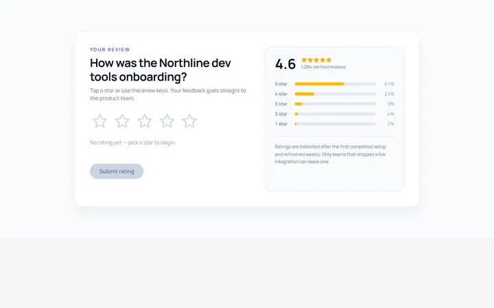
Stars Rating
Originalinteractive star rating

Emoji Rating
Originalemoji reaction rating

Thumbs Rating
Originalthumbs up/down rating
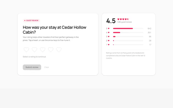
Hearts Rating
Originalheart rating

Scale Rating
Original1-10 numeric scale rating
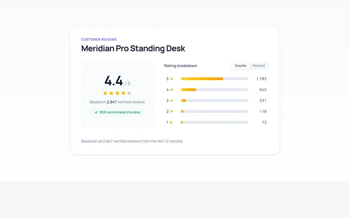
Summary Rating
Originalrating summary with distribution bars

Interactive Rating
Originalhoverable star rating with label

Spotlight Hero
OriginalA centred hero with a soft radial spotlight, badge and dual call-to-action.

Split Hero
OriginalA two-column hero pairing a headline and CTAs with a product mock and social proof.

Gradient Spotlight Hero
OriginalA minimal centred hero with a soft gradient-mesh backdrop, announcement pill and dual call-to-action buttons.

App Preview Hero
OriginalA centred hero that pairs headline copy with a realistic product dashboard mock built entirely from markup, complete with browser chrome and a floating notification card.

Waitlist Capture Hero
OriginalA dark, focused hero with an inline email capture form and avatar social proof, ready for pre-launch waitlists.