

Thumbs Rating
Original · freethumbs up/down rating
Copy prompt gives Claude Code, Cursor or v0 a ready-to-paste prompt that recreates this exact component.
npx shadcn@latest add https://webinnoventix.com/r/rate-thumbs.json"use client";
import { useId, useMemo, useState } from "react";
import { AnimatePresence, motion, useReducedMotion } from "motion/react";
type Vote = "up" | "down" | null;
const REASONS: Record<"up" | "down", string[]> = {
up: ["Clear and easy to follow", "Solved my problem", "Great code examples", "Well organized"],
down: ["Hard to follow", "Missing key details", "Inaccurate or outdated", "Not what I needed", "Too much jargon"],
};
const PROMPT: Record<"up" | "down", string> = {
up: "Nice — what worked well for you?",
down: "Sorry about that. What could be better?",
};
const BASE_UP = 1284;
const BASE_DOWN = 96;
function ThumbUpIcon({ className }: { className?: string }) {
return (
<svg viewBox="0 0 24 24" fill="none" stroke="currentColor" strokeWidth={1.75} strokeLinecap="round" strokeLinejoin="round" className={className} aria-hidden="true">
<path d="M7 10v11" />
<path d="M15 5.88 14 10h5.83a2 2 0 0 1 1.92 2.56l-2.33 8A2 2 0 0 1 17.5 22H4a2 2 0 0 1-2-2v-8a2 2 0 0 1 2-2h2.76a2 2 0 0 0 1.79-1.11L12 2a3.13 3.13 0 0 1 3 3.88Z" />
</svg>
);
}
function ThumbDownIcon({ className }: { className?: string }) {
return (
<svg viewBox="0 0 24 24" fill="none" stroke="currentColor" strokeWidth={1.75} strokeLinecap="round" strokeLinejoin="round" className={className} aria-hidden="true">
<path d="M17 14V3" />
<path d="M9 18.12 10 14H4.17a2 2 0 0 1-1.92-2.56l2.33-8A2 2 0 0 1 6.5 2H20a2 2 0 0 1 2 2v8a2 2 0 0 1-2 2h-2.76a2 2 0 0 0-1.79 1.11L12 22a3.13 3.13 0 0 1-3-3.88Z" />
</svg>
);
}
export default function RateThumbs() {
const reduce = useReducedMotion();
const uid = useId();
const commentId = `${uid}-comment`;
const questionId = `${uid}-question`;
const [vote, setVote] = useState<Vote>(null);
const [reasons, setReasons] = useState<string[]>([]);
const [comment, setComment] = useState("");
const [submitted, setSubmitted] = useState(false);
const [pulseKey, setPulseKey] = useState(0);
const up = BASE_UP + (vote === "up" ? 1 : 0);
const down = BASE_DOWN + (vote === "down" ? 1 : 0);
const total = up + down;
const pct = Math.round((up / total) * 100);
const totalLabel = useMemo(() => total.toLocaleString("en-US"), [total]);
function choose(next: "up" | "down") {
if (submitted) return;
if (vote !== next) {
setReasons([]);
setComment("");
}
setVote(next);
setPulseKey((k) => k + 1);
}
function toggleReason(r: string) {
setReasons((prev) => (prev.includes(r) ? prev.filter((x) => x !== r) : [...prev, r]));
}
function reset() {
setVote(null);
setReasons([]);
setComment("");
setSubmitted(false);
}
const ringBase =
"focus-visible:outline-none focus-visible:ring-2 focus-visible:ring-indigo-500 focus-visible:ring-offset-2 focus-visible:ring-offset-white dark:focus-visible:ring-offset-slate-900";
const activeVote = vote === "up" || vote === "down" ? vote : null;
return (
<section className="relative w-full overflow-hidden bg-slate-50 px-4 py-16 text-slate-900 sm:py-24 dark:bg-slate-950 dark:text-slate-100">
<style>{`
@keyframes rtthmb-pop {
0% { transform: scale(1) rotate(0deg); }
38% { transform: scale(1.32) rotate(-8deg); }
68% { transform: scale(0.9) rotate(3deg); }
100% { transform: scale(1) rotate(0deg); }
}
@keyframes rtthmb-ring {
0% { transform: scale(0.55); opacity: 0.5; }
100% { transform: scale(2); opacity: 0; }
}
@keyframes rtthmb-drift {
0% { transform: translateY(0) scale(0.9); opacity: 0; }
22% { opacity: 0.8; }
100% { transform: translateY(-34px) scale(1.05); opacity: 0; }
}
.rtthmb-pop { animation: rtthmb-pop 480ms cubic-bezier(.34,1.56,.64,1); }
.rtthmb-ring { animation: rtthmb-ring 640ms ease-out forwards; }
.rtthmb-drift { animation: rtthmb-drift 900ms ease-out forwards; }
@media (prefers-reduced-motion: reduce) {
.rtthmb-pop, .rtthmb-ring, .rtthmb-drift { animation: none !important; }
}
`}</style>
<div className="pointer-events-none absolute inset-x-0 top-0 h-40 bg-gradient-to-b from-indigo-500/10 to-transparent dark:from-indigo-500/10" />
<div className="relative mx-auto max-w-xl">
<div className="relative overflow-hidden rounded-3xl border border-slate-200 bg-white shadow-xl shadow-slate-900/5 dark:border-slate-800 dark:bg-slate-900 dark:shadow-black/40">
<div className="h-1 w-full bg-gradient-to-r from-indigo-500 via-violet-500 to-sky-500" />
<div className="p-6 sm:p-8">
{/* Header */}
<div className="flex items-center gap-2.5 text-xs font-semibold uppercase tracking-wider text-slate-500 dark:text-slate-400">
<span className="flex h-7 w-7 items-center justify-center rounded-lg bg-indigo-50 text-indigo-600 dark:bg-indigo-500/10 dark:text-indigo-300">
<svg viewBox="0 0 24 24" fill="none" stroke="currentColor" strokeWidth={1.75} strokeLinecap="round" strokeLinejoin="round" className="h-4 w-4" aria-hidden="true">
<path d="M4 4v16a2 2 0 0 0 2 2h12a2 2 0 0 0 2-2V8.5L15.5 2H6a2 2 0 0 0-2 2Z" />
<path d="M14 2v6h6" />
<path d="M8 13h8" />
<path d="M8 17h5" />
</svg>
</span>
<span>Docs feedback</span>
<span className="text-slate-300 dark:text-slate-600">/</span>
<span className="font-medium normal-case tracking-normal text-slate-400 dark:text-slate-500">Guides · Authentication</span>
</div>
<h2 id={questionId} className="mt-4 text-2xl font-bold tracking-tight text-slate-900 sm:text-[1.6rem] dark:text-white">
Was this page helpful?
</h2>
<p className="mt-1.5 text-sm text-slate-500 dark:text-slate-400">
Your rating tunes which guides we rewrite next. Takes one tap.
</p>
{/* Thumb buttons */}
<div role="group" aria-labelledby={questionId} className="mt-6 grid grid-cols-2 gap-3">
{(["up", "down"] as const).map((dir) => {
const selected = vote === dir;
const isUp = dir === "up";
const accentSelected = isUp
? "border-emerald-500 bg-emerald-50 text-emerald-700 dark:border-emerald-400/70 dark:bg-emerald-500/10 dark:text-emerald-300"
: "border-rose-500 bg-rose-50 text-rose-700 dark:border-rose-400/70 dark:bg-rose-500/10 dark:text-rose-300";
const accentIdle =
"border-slate-200 bg-white text-slate-600 hover:border-slate-300 hover:bg-slate-50 dark:border-slate-700 dark:bg-slate-800/60 dark:text-slate-300 dark:hover:border-slate-600 dark:hover:bg-slate-800";
const dimmed = activeVote && !selected ? "opacity-55" : "";
return (
<button
key={dir}
type="button"
onClick={() => choose(dir)}
aria-pressed={selected}
aria-label={isUp ? "Yes, this page was helpful" : "No, this page was not helpful"}
disabled={submitted}
className={`group relative flex flex-col items-center gap-2 rounded-2xl border-2 px-4 py-5 text-sm font-semibold transition-all duration-200 disabled:cursor-default ${selected ? accentSelected : accentIdle} ${dimmed} ${ringBase}`}
>
<span className="relative flex h-11 w-11 items-center justify-center">
{selected && !reduce && (
<span
key={pulseKey}
aria-hidden="true"
className={`rtthmb-ring absolute inset-0 rounded-full ${isUp ? "bg-emerald-400/40" : "bg-rose-400/40"}`}
/>
)}
<span key={`${pulseKey}-${dir}-${selected}`} className={selected ? "rtthmb-pop relative" : "relative"}>
{isUp ? <ThumbUpIcon className="h-7 w-7" /> : <ThumbDownIcon className="h-7 w-7" />}
</span>
</span>
<span>{isUp ? "Helpful" : "Not helpful"}</span>
</button>
);
})}
</div>
{/* Follow-up */}
<AnimatePresence initial={false} mode="wait">
{activeVote && !submitted && (
<motion.div
key={activeVote}
initial={reduce ? { opacity: 0 } : { opacity: 0, height: 0, y: -6 }}
animate={reduce ? { opacity: 1 } : { opacity: 1, height: "auto", y: 0 }}
exit={reduce ? { opacity: 0 } : { opacity: 0, height: 0, y: -6 }}
transition={reduce ? { duration: 0.15 } : { type: "spring", stiffness: 280, damping: 30 }}
className="overflow-hidden"
>
<div className="mt-6 border-t border-slate-100 pt-5 dark:border-slate-800">
<p className="text-sm font-medium text-slate-700 dark:text-slate-200">{PROMPT[activeVote]}</p>
<div role="group" aria-label="Reasons" className="mt-3 flex flex-wrap gap-2">
{REASONS[activeVote].map((r) => {
const on = reasons.includes(r);
return (
<button
key={r}
type="button"
onClick={() => toggleReason(r)}
aria-pressed={on}
className={`rounded-full border px-3 py-1.5 text-xs font-medium transition-colors ${
on
? "border-indigo-500 bg-indigo-500 text-white dark:border-indigo-400 dark:bg-indigo-500"
: "border-slate-200 bg-white text-slate-600 hover:border-indigo-300 hover:text-indigo-600 dark:border-slate-700 dark:bg-slate-800/60 dark:text-slate-300 dark:hover:border-indigo-400/60 dark:hover:text-indigo-300"
} ${ringBase}`}
>
{r}
</button>
);
})}
</div>
<div className="mt-4">
<label htmlFor={commentId} className="mb-1.5 block text-xs font-medium text-slate-500 dark:text-slate-400">
Anything else? <span className="font-normal text-slate-400 dark:text-slate-500">(optional)</span>
</label>
<textarea
id={commentId}
value={comment}
onChange={(e) => setComment(e.target.value)}
rows={3}
maxLength={280}
placeholder={activeVote === "up" ? "The SAML walkthrough saved me an hour…" : "Step 4 references a setting I couldn't find…"}
className={`w-full resize-none rounded-xl border border-slate-200 bg-white px-3.5 py-2.5 text-sm text-slate-800 placeholder:text-slate-400 dark:border-slate-700 dark:bg-slate-800/60 dark:text-slate-100 dark:placeholder:text-slate-500 ${ringBase}`}
/>
<div className="mt-1 text-right text-[0.7rem] tabular-nums text-slate-400 dark:text-slate-500">{comment.length}/280</div>
</div>
<div className="mt-2 flex items-center justify-end gap-2">
<button
type="button"
onClick={reset}
className={`rounded-lg px-3 py-2 text-sm font-medium text-slate-500 transition-colors hover:text-slate-800 dark:text-slate-400 dark:hover:text-slate-100 ${ringBase}`}
>
Clear
</button>
<button
type="button"
onClick={() => setSubmitted(true)}
className={`inline-flex items-center gap-1.5 rounded-lg bg-indigo-600 px-4 py-2 text-sm font-semibold text-white shadow-sm transition-colors hover:bg-indigo-500 active:bg-indigo-700 dark:bg-indigo-500 dark:hover:bg-indigo-400 ${ringBase}`}
>
Send feedback
<svg viewBox="0 0 24 24" fill="none" stroke="currentColor" strokeWidth={2} strokeLinecap="round" strokeLinejoin="round" className="h-4 w-4" aria-hidden="true">
<path d="M5 12h14" />
<path d="m13 6 6 6-6 6" />
</svg>
</button>
</div>
</div>
</motion.div>
)}
</AnimatePresence>
{/* Success */}
<AnimatePresence initial={false}>
{submitted && (
<motion.div
initial={reduce ? { opacity: 0 } : { opacity: 0, height: 0, y: -6 }}
animate={reduce ? { opacity: 1 } : { opacity: 1, height: "auto", y: 0 }}
exit={reduce ? { opacity: 0 } : { opacity: 0, height: 0 }}
transition={reduce ? { duration: 0.15 } : { type: "spring", stiffness: 280, damping: 30 }}
className="overflow-hidden"
>
<div className="mt-6 flex items-start gap-3 rounded-2xl border border-emerald-200 bg-emerald-50 p-4 dark:border-emerald-500/30 dark:bg-emerald-500/10">
<span className="mt-0.5 flex h-8 w-8 shrink-0 items-center justify-center rounded-full bg-emerald-500 text-white">
<svg viewBox="0 0 24 24" fill="none" stroke="currentColor" strokeWidth={3} strokeLinecap="round" strokeLinejoin="round" className="h-4 w-4" aria-hidden="true">
<motion.path
d="M20 6 9 17l-5-5"
initial={reduce ? { pathLength: 1 } : { pathLength: 0 }}
animate={{ pathLength: 1 }}
transition={reduce ? { duration: 0 } : { duration: 0.45, ease: "easeInOut" }}
/>
</svg>
</span>
<div className="min-w-0">
<p className="text-sm font-semibold text-emerald-800 dark:text-emerald-200">Thanks — that helps us improve this guide.</p>
<p className="mt-0.5 text-xs text-emerald-700/80 dark:text-emerald-300/80">
You rated it {vote === "up" ? "helpful" : "not helpful"}
{reasons.length > 0 ? ` · ${reasons.length} reason${reasons.length > 1 ? "s" : ""} noted` : ""}.
</p>
<button
type="button"
onClick={reset}
className={`mt-2 rounded-md text-xs font-semibold text-emerald-700 underline underline-offset-2 hover:text-emerald-900 dark:text-emerald-300 dark:hover:text-emerald-100 ${ringBase}`}
>
Change my answer
</button>
</div>
</div>
</motion.div>
)}
</AnimatePresence>
{/* Tally */}
<div className="mt-6 border-t border-slate-100 pt-5 dark:border-slate-800">
<div className="flex items-center justify-between text-xs font-medium text-slate-500 dark:text-slate-400">
<span>
<span className="font-semibold text-slate-700 dark:text-slate-200">{pct}%</span> of {totalLabel} readers found this helpful
</span>
<span className="flex items-center gap-3 tabular-nums">
<span className="inline-flex items-center gap-1 text-emerald-600 dark:text-emerald-400">
<ThumbUpIcon className="h-3.5 w-3.5" />
{up.toLocaleString("en-US")}
</span>
<span className="inline-flex items-center gap-1 text-rose-500 dark:text-rose-400">
<ThumbDownIcon className="h-3.5 w-3.5" />
{down.toLocaleString("en-US")}
</span>
</span>
</div>
<div className="mt-2 h-2 w-full overflow-hidden rounded-full bg-slate-100 dark:bg-slate-800">
<motion.div
className="h-full rounded-full bg-gradient-to-r from-emerald-400 to-emerald-500"
initial={false}
animate={{ width: `${pct}%` }}
transition={reduce ? { duration: 0 } : { type: "spring", stiffness: 200, damping: 28 }}
/>
</div>
</div>
</div>
</div>
{/* SR-only live announcement */}
<p aria-live="polite" className="sr-only">
{submitted
? "Feedback submitted. Thank you."
: vote === "up"
? "You rated this page helpful."
: vote === "down"
? "You rated this page not helpful."
: ""}
</p>
</div>
</section>
);
}Dependencies
Licence
Built by Web Innoventix. Free for personal and commercial use, no attribution required.
Built by Web Innoventix
Need a custom interface, a full website, or SEO that gets you cited by AI? We design, build and rank it end to end.
Get a free quoteSimilar components
Browse all →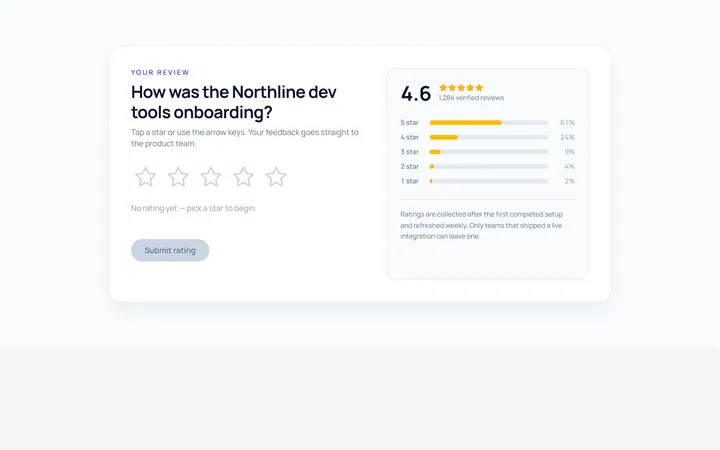
Stars Rating
Originalinteractive star rating
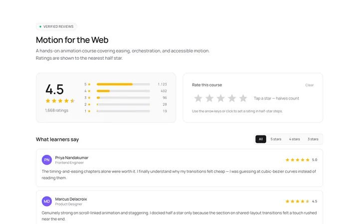
Stars Half Rating
Originalhalf-star rating display
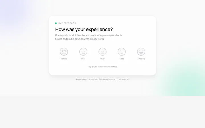
Emoji Rating
Originalemoji reaction rating
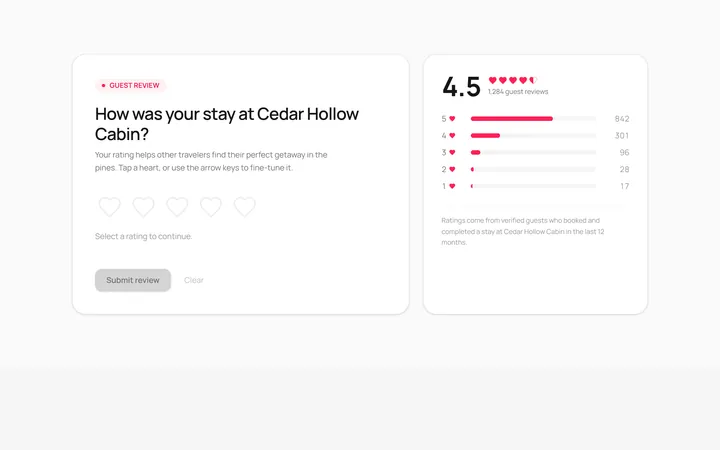
Hearts Rating
Originalheart rating
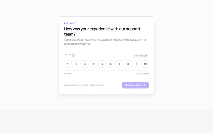
Scale Rating
Original1-10 numeric scale rating
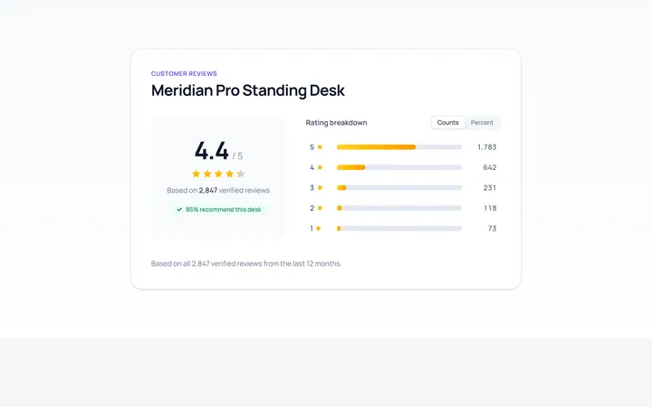
Summary Rating
Originalrating summary with distribution bars
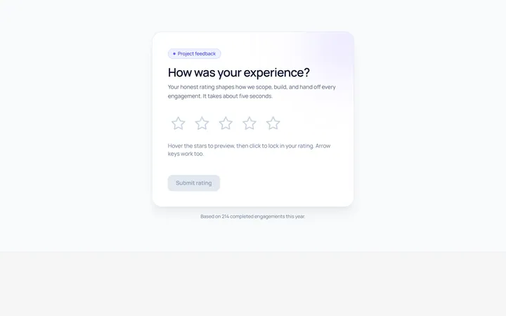
Interactive Rating
Originalhoverable star rating with label

Spotlight Hero
OriginalA centred hero with a soft radial spotlight, badge and dual call-to-action.

Split Hero
OriginalA two-column hero pairing a headline and CTAs with a product mock and social proof.

Gradient Spotlight Hero
OriginalA minimal centred hero with a soft gradient-mesh backdrop, announcement pill and dual call-to-action buttons.

App Preview Hero
OriginalA centred hero that pairs headline copy with a realistic product dashboard mock built entirely from markup, complete with browser chrome and a floating notification card.

Waitlist Capture Hero
OriginalA dark, focused hero with an inline email capture form and avatar social proof, ready for pre-launch waitlists.