

Hearts Rating
Original · freeheart rating
Copy prompt gives Claude Code, Cursor or v0 a ready-to-paste prompt that recreates this exact component.
npx shadcn@latest add https://webinnoventix.com/r/rate-hearts.json"use client";
import { useCallback, useId, useMemo, useRef, useState, type KeyboardEvent } from "react";
import { AnimatePresence, motion, useReducedMotion } from "motion/react";
const HEART_PATH =
"M12 21.35l-1.45-1.32C5.4 15.36 2 12.28 2 8.5 2 5.42 4.42 3 7.5 3c1.74 0 3.41.81 4.5 2.09C13.09 3.81 14.76 3 16.5 3 19.58 3 22 5.42 22 8.5c0 3.78-3.4 6.86-8.55 11.54L12 21.35z";
const RATINGS: { value: number; label: string; note: string }[] = [
{ value: 1, label: "Not for us", note: "We hoped for more." },
{ value: 2, label: "It was okay", note: "A few things missed." },
{ value: 3, label: "Solid stay", note: "Comfortable and clean." },
{ value: 4, label: "Really great", note: "We'd happily return." },
{ value: 5, label: "Absolutely loved it", note: "One of our best trips." },
];
const DISTRIBUTION: { stars: number; count: number }[] = [
{ stars: 5, count: 842 },
{ stars: 4, count: 301 },
{ stars: 3, count: 96 },
{ stars: 2, count: 28 },
{ stars: 1, count: 17 },
];
const BURST = [
{ dx: -28, dy: -34, scale: 0.55, rot: -24 },
{ dx: 0, dy: -46, scale: 0.8, rot: 0 },
{ dx: 28, dy: -34, scale: 0.55, rot: 24 },
{ dx: -18, dy: -20, scale: 0.42, rot: -40 },
{ dx: 18, dy: -20, scale: 0.42, rot: 40 },
];
function Heart({ fill, className }: { fill: number; className?: string }) {
const rawId = useId();
const gid = `rh-grad-${rawId.replace(/:/g, "")}`;
const clamped = Math.max(0, Math.min(1, fill));
return (
<svg viewBox="0 0 24 24" className={className} aria-hidden="true" focusable="false">
<defs>
<linearGradient id={gid} x1="0" y1="0" x2="1" y2="0">
<stop offset={clamped} stopColor="currentColor" />
<stop offset={clamped} stopColor="currentColor" stopOpacity="0" />
</linearGradient>
</defs>
<path d={HEART_PATH} fill={`url(#${gid})`} />
<path
d={HEART_PATH}
fill="none"
stroke="currentColor"
strokeWidth="1.4"
strokeOpacity="0.4"
strokeLinejoin="round"
/>
</svg>
);
}
export default function RateHearts() {
const reduce = useReducedMotion();
const [value, setValue] = useState(0);
const [hover, setHover] = useState<number | null>(null);
const [submitted, setSubmitted] = useState(false);
const [burst, setBurst] = useState<{ key: number; index: number } | null>(null);
const burstSeq = useRef(0);
const btnRefs = useRef<(HTMLButtonElement | null)[]>([]);
const display = hover ?? value;
const activeMeta = RATINGS.find((r) => r.value === display) ?? null;
const { total, average } = useMemo(() => {
const sum = DISTRIBUTION.reduce((acc, d) => acc + d.count, 0);
const weighted = DISTRIBUTION.reduce((acc, d) => acc + d.stars * d.count, 0);
return { total: sum, average: sum === 0 ? 0 : weighted / sum };
}, []);
const triggerBurst = useCallback((v: number) => {
burstSeq.current += 1;
setBurst({ key: burstSeq.current, index: v - 1 });
}, []);
const select = useCallback(
(v: number, focus: boolean) => {
const next = Math.max(1, Math.min(RATINGS.length, v));
setValue(next);
setSubmitted(false);
triggerBurst(next);
if (focus) {
requestAnimationFrame(() => btnRefs.current[next - 1]?.focus());
}
},
[triggerBurst],
);
const onKeyDown = useCallback(
(e: KeyboardEvent<HTMLDivElement>) => {
switch (e.key) {
case "ArrowRight":
case "ArrowUp":
e.preventDefault();
select((value || 0) + 1, true);
break;
case "ArrowLeft":
case "ArrowDown":
e.preventDefault();
select((value || 1) - 1, true);
break;
case "Home":
e.preventDefault();
select(1, true);
break;
case "End":
e.preventDefault();
select(RATINGS.length, true);
break;
default:
break;
}
},
[value, select],
);
const clear = useCallback(() => {
setValue(0);
setHover(null);
setSubmitted(false);
setBurst(null);
}, []);
return (
<section className="relative w-full bg-neutral-50 px-6 py-20 text-neutral-900 sm:py-24 dark:bg-neutral-950 dark:text-neutral-100">
<style>{`
@keyframes rh_pop {
0% { transform: scale(1); }
40% { transform: scale(1.28); }
70% { transform: scale(0.94); }
100% { transform: scale(1); }
}
@keyframes rh_barGrow {
from { transform: scaleX(0); }
to { transform: scaleX(1); }
}
@keyframes rh_fadeUp {
from { opacity: 0; transform: translateY(10px); }
to { opacity: 1; transform: translateY(0); }
}
@media (prefers-reduced-motion: reduce) {
.rh-anim-pop, .rh-anim-bar, .rh-anim-fade {
animation: none !important;
transform: none !important;
}
}
`}</style>
<div className="mx-auto max-w-5xl">
<div className="grid gap-6 lg:grid-cols-[1.5fr_1fr]">
{/* Interactive rating card */}
<div className="rounded-3xl border border-neutral-200 bg-white p-8 shadow-sm sm:p-10 dark:border-neutral-800 dark:bg-neutral-900">
<span className="inline-flex items-center gap-2 rounded-full bg-rose-50 px-3 py-1 text-xs font-semibold uppercase tracking-wide text-rose-600 dark:bg-rose-500/10 dark:text-rose-300">
<span className="h-1.5 w-1.5 rounded-full bg-rose-500" />
Guest review
</span>
<h2 className="mt-5 text-2xl font-semibold tracking-tight sm:text-3xl">
How was your stay at Cedar Hollow Cabin?
</h2>
<p className="mt-2 max-w-md text-sm leading-relaxed text-neutral-500 dark:text-neutral-400">
Your rating helps other travelers find their perfect getaway in the pines. Tap a heart, or
use the arrow keys to fine-tune it.
</p>
{!submitted ? (
<>
<div
role="radiogroup"
aria-label="Rate your stay from 1 to 5 hearts"
onKeyDown={onKeyDown}
onMouseLeave={() => setHover(null)}
className="mt-8 flex items-center gap-1.5 sm:gap-2"
>
{RATINGS.map((r, i) => {
const filled = display >= r.value;
const checked = value === r.value;
const focusable = checked || (value === 0 && i === 0);
return (
<button
key={r.value}
ref={(el) => {
btnRefs.current[i] = el;
}}
type="button"
role="radio"
aria-checked={checked}
aria-label={`${r.value} heart${r.value > 1 ? "s" : ""}, ${r.label}`}
tabIndex={focusable ? 0 : -1}
onClick={() => select(r.value, false)}
onMouseEnter={() => setHover(r.value)}
className="relative rounded-xl p-1 outline-none transition-transform duration-150 hover:scale-110 focus-visible:ring-2 focus-visible:ring-rose-500 focus-visible:ring-offset-2 focus-visible:ring-offset-white dark:focus-visible:ring-offset-neutral-900"
>
<Heart
fill={filled ? 1 : 0}
className={`h-9 w-9 sm:h-11 sm:w-11 ${
filled
? "text-rose-500"
: "text-neutral-300 dark:text-neutral-600"
} ${checked && !reduce ? "rh-anim-pop" : ""}`}
/>
{checked && !reduce && (
<span
className="pointer-events-none absolute inset-0 origin-center"
style={{ animation: "rh_pop 320ms ease-out" }}
/>
)}
{!reduce && burst?.index === i && (
<AnimatePresence>
<span
key={burst.key}
className="pointer-events-none absolute left-1/2 top-1/2 -translate-x-1/2 -translate-y-1/2"
>
{BURST.map((p, pi) => (
<motion.span
key={`${burst.key}-${pi}`}
initial={{ opacity: 0.9, x: 0, y: 0, scale: 0.3, rotate: 0 }}
animate={{ opacity: 0, x: p.dx, y: p.dy, scale: p.scale, rotate: p.rot }}
transition={{ duration: 0.7, ease: "easeOut" }}
className="absolute text-rose-400"
>
<Heart fill={1} className="h-4 w-4" />
</motion.span>
))}
</span>
</AnimatePresence>
)}
</button>
);
})}
</div>
<div aria-live="polite" className="mt-4 min-h-[2.75rem]">
{activeMeta ? (
<p className="text-sm">
<span className="font-semibold text-rose-600 dark:text-rose-300">
{activeMeta.label}
</span>
<span className="text-neutral-500 dark:text-neutral-400"> — {activeMeta.note}</span>
</p>
) : (
<p className="text-sm text-neutral-400 dark:text-neutral-500">
Select a rating to continue.
</p>
)}
</div>
<div className="mt-6 flex flex-wrap items-center gap-3">
<button
type="button"
disabled={value === 0}
onClick={() => setSubmitted(true)}
className="inline-flex items-center gap-2 rounded-xl bg-rose-600 px-5 py-2.5 text-sm font-semibold text-white shadow-sm outline-none transition-colors hover:bg-rose-500 focus-visible:ring-2 focus-visible:ring-rose-500 focus-visible:ring-offset-2 focus-visible:ring-offset-white disabled:cursor-not-allowed disabled:bg-neutral-300 disabled:text-neutral-500 dark:focus-visible:ring-offset-neutral-900 dark:disabled:bg-neutral-700 dark:disabled:text-neutral-400"
>
Submit review
</button>
<button
type="button"
disabled={value === 0}
onClick={clear}
className="inline-flex items-center rounded-xl px-3 py-2.5 text-sm font-medium text-neutral-500 outline-none transition-colors hover:text-neutral-900 focus-visible:ring-2 focus-visible:ring-rose-500 focus-visible:ring-offset-2 focus-visible:ring-offset-white disabled:cursor-not-allowed disabled:opacity-40 dark:text-neutral-400 dark:hover:text-neutral-100 dark:focus-visible:ring-offset-neutral-900"
>
Clear
</button>
</div>
</>
) : (
<div className="mt-8 rounded-2xl border border-emerald-200 bg-emerald-50 p-6 rh-anim-fade dark:border-emerald-500/20 dark:bg-emerald-500/10">
<div className="flex items-start gap-3">
<span className="mt-0.5 flex h-8 w-8 shrink-0 items-center justify-center rounded-full bg-emerald-500 text-white">
<svg viewBox="0 0 24 24" className="h-5 w-5" aria-hidden="true" focusable="false">
<path
d="M5 12.5l4 4 10-10"
fill="none"
stroke="currentColor"
strokeWidth="2.4"
strokeLinecap="round"
strokeLinejoin="round"
/>
</svg>
</span>
<div>
<p className="text-base font-semibold text-emerald-800 dark:text-emerald-200">
Thanks for rating your stay {value} out of 5.
</p>
<p className="mt-1 flex items-center gap-1 text-sm text-emerald-700 dark:text-emerald-300/90">
{RATINGS.map((r) => (
<Heart
key={r.value}
fill={value >= r.value ? 1 : 0}
className={`h-4 w-4 ${
value >= r.value ? "text-rose-500" : "text-emerald-700/30 dark:text-emerald-300/30"
}`}
/>
))}
<span className="ml-1.5">{RATINGS.find((r) => r.value === value)?.label}</span>
</p>
<button
type="button"
onClick={() => setSubmitted(false)}
className="mt-3 rounded-lg text-sm font-semibold text-emerald-700 underline-offset-4 outline-none hover:underline focus-visible:ring-2 focus-visible:ring-emerald-500 focus-visible:ring-offset-2 focus-visible:ring-offset-emerald-50 dark:text-emerald-300 dark:focus-visible:ring-offset-neutral-900"
>
Edit rating
</button>
</div>
</div>
</div>
)}
</div>
{/* Aggregate stats */}
<div className="rounded-3xl border border-neutral-200 bg-white p-8 shadow-sm dark:border-neutral-800 dark:bg-neutral-900">
<div className="flex items-end gap-3">
<span className="text-5xl font-bold tracking-tight tabular-nums">{average.toFixed(1)}</span>
<div className="pb-1.5">
<div
className="flex gap-0.5 text-rose-500"
role="img"
aria-label={`Average rating ${average.toFixed(1)} out of 5`}
>
{RATINGS.map((r) => (
<Heart
key={r.value}
fill={Math.max(0, Math.min(1, average - (r.value - 1)))}
className="h-4 w-4"
/>
))}
</div>
<p className="mt-1 text-xs text-neutral-500 dark:text-neutral-400">
{total.toLocaleString()} guest reviews
</p>
</div>
</div>
<ul className="mt-6 space-y-2.5">
{DISTRIBUTION.map((d, i) => {
const pct = total === 0 ? 0 : (d.count / total) * 100;
return (
<li key={d.stars} className="flex items-center gap-3 text-sm">
<span className="flex w-10 items-center gap-1 tabular-nums text-neutral-500 dark:text-neutral-400">
{d.stars}
<Heart fill={1} className="h-3 w-3 text-rose-500" />
</span>
<span className="relative h-2 flex-1 overflow-hidden rounded-full bg-neutral-100 dark:bg-neutral-800">
<span
className="rh-anim-bar absolute inset-y-0 left-0 origin-left rounded-full bg-rose-500"
style={{
width: `${pct}%`,
animation: reduce ? "none" : `rh_barGrow 700ms ease-out ${i * 90}ms both`,
}}
/>
</span>
<span className="w-12 text-right tabular-nums text-neutral-400 dark:text-neutral-500">
{d.count.toLocaleString()}
</span>
</li>
);
})}
</ul>
<p className="mt-6 border-t border-neutral-100 pt-4 text-xs leading-relaxed text-neutral-400 dark:border-neutral-800 dark:text-neutral-500">
Ratings come from verified guests who booked and completed a stay at Cedar Hollow Cabin in
the last 12 months.
</p>
</div>
</div>
</div>
</section>
);
}Dependencies
Licence
Built by Web Innoventix. Free for personal and commercial use, no attribution required.
Built by Web Innoventix
Need a custom interface, a full website, or SEO that gets you cited by AI? We design, build and rank it end to end.
Get a free quoteSimilar components
Browse all →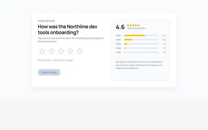
Stars Rating
Originalinteractive star rating
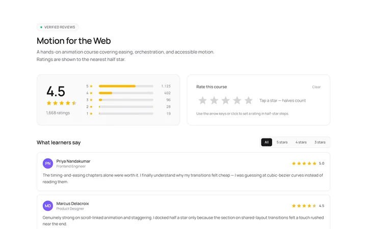
Stars Half Rating
Originalhalf-star rating display
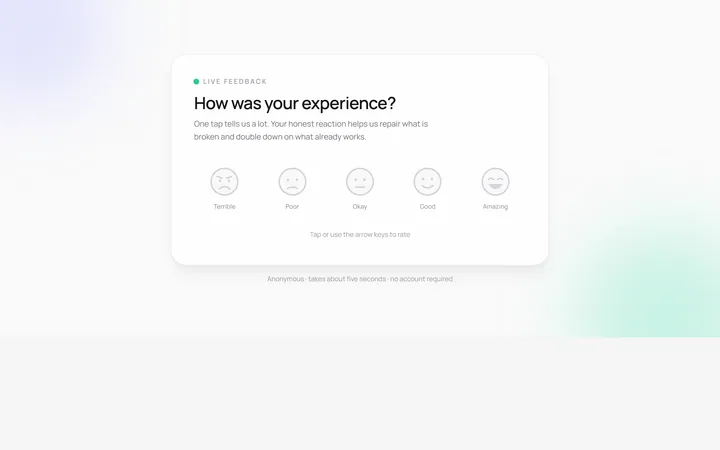
Emoji Rating
Originalemoji reaction rating
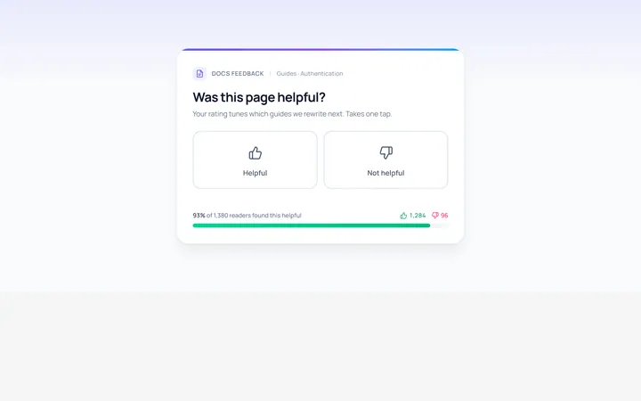
Thumbs Rating
Originalthumbs up/down rating
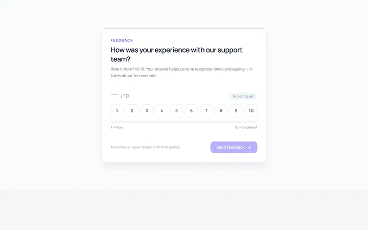
Scale Rating
Original1-10 numeric scale rating
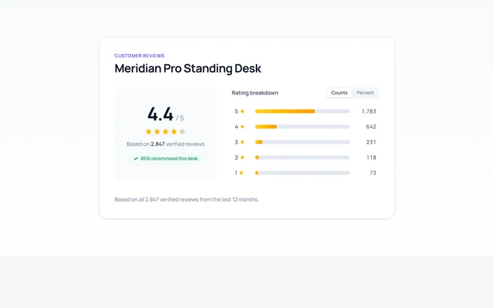
Summary Rating
Originalrating summary with distribution bars
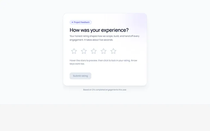
Interactive Rating
Originalhoverable star rating with label

Spotlight Hero
OriginalA centred hero with a soft radial spotlight, badge and dual call-to-action.

Split Hero
OriginalA two-column hero pairing a headline and CTAs with a product mock and social proof.

Gradient Spotlight Hero
OriginalA minimal centred hero with a soft gradient-mesh backdrop, announcement pill and dual call-to-action buttons.

App Preview Hero
OriginalA centred hero that pairs headline copy with a realistic product dashboard mock built entirely from markup, complete with browser chrome and a floating notification card.

Waitlist Capture Hero
OriginalA dark, focused hero with an inline email capture form and avatar social proof, ready for pre-launch waitlists.