

Dots Stepper
Original · freedot stepper
Copy prompt gives Claude Code, Cursor or v0 a ready-to-paste prompt that recreates this exact component.
npx shadcn@latest add https://webinnoventix.com/r/step-dots.json"use client";
import { type KeyboardEvent, useCallback, useId, useRef, useState } from "react";
import {
AnimatePresence,
motion,
useReducedMotion,
type Variants,
} from "motion/react";
type Step = {
id: string;
label: string;
caption: string;
heading: string;
body: string;
points: string[];
};
const STEPS: Step[] = [
{
id: "workspace",
label: "Workspace",
caption: "Name & region",
heading: "Create your workspace",
body: "Pick a name your team will recognize and the region closest to your users. Everything here can be changed later from Settings.",
points: [
'Workspace name — e.g. "Northwind Web"',
"Primary region — US East (Ohio)",
"Default timezone — America/New_York",
],
},
{
id: "repository",
label: "Repository",
caption: "Connect source",
heading: "Connect a repository",
body: "Link the Git provider that hosts your code. We request read-only access to list branches and never store a copy of your source.",
points: [
"GitHub, GitLab, or Bitbucket",
"Choose the default branch to deploy",
"Read-only OAuth — revoke access anytime",
],
},
{
id: "team",
label: "Team",
caption: "Invite people",
heading: "Invite your team",
body: "Add the people who will ship with you. Roles decide who can trigger production deploys and who can only open preview builds.",
points: [
"Admins manage billing and members",
"Developers push preview builds",
"Send up to 10 invites right now",
],
},
{
id: "deploys",
label: "Deploys",
caption: "Build & env",
heading: "Configure deploys",
body: "Tell us how to build the project and which environment variables to inject. Preview deploys run automatically on every pull request.",
points: [
"Build command — npm run build",
"Output directory — dist/",
"Add environment variables securely",
],
},
{
id: "launch",
label: "Launch",
caption: "Go live",
heading: "Review and go live",
body: "Everything checks out. Ship your first production build and we'll hand you a live URL in under a minute — automatic HTTPS included.",
points: [
"Production branch — main",
"Custom domain — add after launch",
"Rollbacks available for 30 days",
],
},
];
const panelVariants: Variants = {
enter: (d: number) => ({ opacity: 0, x: d * 28 }),
center: { opacity: 1, x: 0 },
exit: (d: number) => ({ opacity: 0, x: d * -28 }),
};
function CheckIcon() {
return (
<svg
viewBox="0 0 24 24"
fill="none"
stroke="currentColor"
strokeWidth={3}
strokeLinecap="round"
strokeLinejoin="round"
className="h-5 w-5"
aria-hidden="true"
>
<path d="M20 6 9 17l-5-5" />
</svg>
);
}
function ArrowIcon({ dir }: { dir: "left" | "right" }) {
return (
<svg
viewBox="0 0 24 24"
fill="none"
stroke="currentColor"
strokeWidth={2}
strokeLinecap="round"
strokeLinejoin="round"
className={`h-4 w-4 ${dir === "left" ? "" : "rotate-180"}`}
aria-hidden="true"
>
<path d="M19 12H5" />
<path d="m12 19-7-7 7-7" />
</svg>
);
}
export default function StepDots() {
const total = STEPS.length;
const uid = useId();
const reduce = useReducedMotion();
const [active, setActive] = useState(0);
const [focusIndex, setFocusIndex] = useState(0);
const [direction, setDirection] = useState(1);
const [done, setDone] = useState(false);
const btnRefs = useRef<Array<HTMLButtonElement | null>>([]);
const fraction = done ? 1 : active / (total - 1);
const percent = Math.round(fraction * 100);
const goTo = useCallback(
(i: number, dir: number) => {
setDirection(dir);
setDone(false);
setActive(i);
setFocusIndex(i);
},
[],
);
const next = useCallback(() => {
if (active === total - 1) {
setDirection(1);
setDone(true);
return;
}
goTo(active + 1, 1);
}, [active, total, goTo]);
const prev = useCallback(() => {
if (done) {
setDirection(-1);
setDone(false);
return;
}
if (active > 0) goTo(active - 1, -1);
}, [active, done, goTo]);
const reset = useCallback(() => {
setDirection(-1);
setDone(false);
setActive(0);
setFocusIndex(0);
}, []);
const onRailKeyDown = useCallback(
(e: KeyboardEvent<HTMLOListElement>) => {
let ni = focusIndex;
switch (e.key) {
case "ArrowRight":
case "ArrowDown":
ni = Math.min(total - 1, focusIndex + 1);
break;
case "ArrowLeft":
case "ArrowUp":
ni = Math.max(0, focusIndex - 1);
break;
case "Home":
ni = 0;
break;
case "End":
ni = total - 1;
break;
default:
return;
}
e.preventDefault();
setFocusIndex(ni);
btnRefs.current[ni]?.focus();
},
[focusIndex, total],
);
const current = STEPS[active];
const headingId = `${uid}-heading`;
const bodyId = `${uid}-body`;
return (
<section className="relative w-full overflow-hidden bg-slate-50 px-5 py-16 text-slate-900 sm:py-24 dark:bg-slate-950 dark:text-slate-100">
<style>{`
@keyframes sd_pulse {
0%, 100% { transform: scale(1); opacity: 0.55; }
50% { transform: scale(1.55); opacity: 0; }
}
@keyframes sd_sheen {
0% { transform: translateX(-120%); }
100% { transform: translateX(320%); }
}
.sd_pulse-ring { animation: sd_pulse 2.4s ease-out infinite; }
.sd_sheen { animation: sd_sheen 2.8s ease-in-out infinite; }
@media (prefers-reduced-motion: reduce) {
.sd_pulse-ring, .sd_sheen { animation: none !important; }
}
`}</style>
{/* atmospheric backdrop */}
<div
aria-hidden="true"
className="pointer-events-none absolute -top-24 left-1/2 h-72 w-[42rem] max-w-full -translate-x-1/2 rounded-full bg-gradient-to-tr from-indigo-300/40 via-violet-300/30 to-sky-200/30 blur-3xl dark:from-indigo-600/20 dark:via-violet-600/15 dark:to-sky-700/10"
/>
<div className="relative mx-auto w-full max-w-3xl">
<header className="mb-10 text-center sm:mb-12">
<p className="text-xs font-semibold uppercase tracking-[0.22em] text-indigo-600 dark:text-indigo-400">
Project setup
</p>
<h2 className="mt-3 text-2xl font-semibold tracking-tight text-slate-900 sm:text-3xl dark:text-white">
Get your first deploy live
</h2>
<p className="mt-3 text-sm text-slate-500 dark:text-slate-400">
{done
? "All steps complete · 100% done"
: `Step ${active + 1} of ${total} · ${percent}% complete`}
</p>
</header>
{/* dot rail */}
<div className="relative mb-10 px-1 sm:mb-12">
<div className="absolute left-5 right-5 top-5 h-1 -translate-y-1/2">
<div className="h-full w-full rounded-full bg-slate-200 dark:bg-slate-800" />
<motion.div
className="absolute inset-y-0 left-0 overflow-hidden rounded-full bg-gradient-to-r from-indigo-500 via-violet-500 to-indigo-400"
initial={false}
animate={{ width: `${fraction * 100}%` }}
transition={{
duration: reduce ? 0 : 0.5,
ease: [0.22, 1, 0.36, 1],
}}
>
{!reduce && fraction > 0 && (
<span className="sd_sheen absolute inset-y-0 left-0 w-1/3 bg-gradient-to-r from-transparent via-white/60 to-transparent" />
)}
</motion.div>
</div>
<ol
className="relative flex justify-between"
onKeyDown={onRailKeyDown}
aria-label="Setup progress"
>
{STEPS.map((s, i) => {
const isComplete = done || i < active;
const isCurrent = !done && i === active;
const stateLabel = isComplete
? "completed"
: isCurrent
? "current step"
: "not started";
return (
<li key={s.id} className="flex flex-col items-center">
<button
ref={(el) => {
btnRefs.current[i] = el;
}}
type="button"
onClick={() => goTo(i, i >= active ? 1 : -1)}
aria-current={isCurrent ? "step" : undefined}
aria-label={`Step ${i + 1}, ${s.label}: ${stateLabel}`}
tabIndex={i === focusIndex ? 0 : -1}
className={`relative flex h-10 w-10 items-center justify-center rounded-full border text-sm font-semibold transition-colors duration-300 focus-visible:outline-none focus-visible:ring-2 focus-visible:ring-indigo-500 focus-visible:ring-offset-2 focus-visible:ring-offset-slate-50 dark:focus-visible:ring-offset-slate-950 ${
isComplete
? "border-transparent bg-emerald-500 text-white shadow-sm shadow-emerald-500/30"
: isCurrent
? "border-indigo-500 bg-white text-indigo-600 shadow-sm dark:bg-slate-900 dark:text-indigo-300"
: "border-slate-300 bg-white text-slate-400 hover:border-slate-400 hover:text-slate-600 dark:border-slate-700 dark:bg-slate-900 dark:text-slate-500 dark:hover:border-slate-500 dark:hover:text-slate-300"
}`}
>
{isCurrent && !reduce && (
<span
aria-hidden="true"
className="sd_pulse-ring absolute inset-0 rounded-full ring-2 ring-indigo-500/60"
/>
)}
{isComplete ? <CheckIcon /> : <span>{i + 1}</span>}
</button>
<span
className={`mt-3 hidden w-16 text-center text-xs font-medium leading-tight transition-colors sm:block sm:w-20 ${
isCurrent
? "text-slate-900 dark:text-white"
: isComplete
? "text-emerald-600 dark:text-emerald-400"
: "text-slate-400 dark:text-slate-500"
}`}
>
{s.label}
<span className="mt-0.5 block text-[0.65rem] font-normal text-slate-400 dark:text-slate-500">
{s.caption}
</span>
</span>
</li>
);
})}
</ol>
</div>
{/* content panel */}
<div className="relative overflow-hidden rounded-2xl border border-slate-200/80 bg-white p-6 shadow-xl shadow-slate-900/5 sm:p-8 dark:border-slate-800 dark:bg-slate-900 dark:shadow-black/20">
<AnimatePresence mode="wait" custom={direction} initial={false}>
{done ? (
<motion.div
key="done"
custom={direction}
variants={panelVariants}
initial="enter"
animate="center"
exit="exit"
transition={{ duration: reduce ? 0 : 0.34, ease: "easeOut" }}
>
<div className="flex items-center gap-3">
<span className="flex h-11 w-11 shrink-0 items-center justify-center rounded-full bg-emerald-500 text-white shadow-sm shadow-emerald-500/30">
<CheckIcon />
</span>
<h3 className="text-xl font-semibold tracking-tight text-slate-900 sm:text-2xl dark:text-white">
You're all set
</h3>
</div>
<p className="mt-4 text-sm leading-relaxed text-slate-600 dark:text-slate-300">
Your workspace is live. The first production deploy is building
now — you'll get an email the moment it's ready to
share.
</p>
</motion.div>
) : (
<motion.div
key={current.id}
custom={direction}
variants={panelVariants}
initial="enter"
animate="center"
exit="exit"
transition={{ duration: reduce ? 0 : 0.34, ease: "easeOut" }}
role="group"
aria-labelledby={headingId}
aria-describedby={bodyId}
>
<p className="text-xs font-semibold uppercase tracking-[0.18em] text-indigo-600 dark:text-indigo-400">
{`Step ${active + 1} · ${current.label}`}
</p>
<h3
id={headingId}
className="mt-2 text-xl font-semibold tracking-tight text-slate-900 sm:text-2xl dark:text-white"
>
{current.heading}
</h3>
<p
id={bodyId}
className="mt-3 text-sm leading-relaxed text-slate-600 dark:text-slate-300"
>
{current.body}
</p>
<ul className="mt-5 space-y-2.5">
{current.points.map((p) => (
<li key={p} className="flex items-start gap-3 text-sm">
<span className="mt-0.5 flex h-5 w-5 shrink-0 items-center justify-center rounded-full bg-indigo-100 text-indigo-600 dark:bg-indigo-500/15 dark:text-indigo-300">
<svg
viewBox="0 0 24 24"
fill="none"
stroke="currentColor"
strokeWidth={2.5}
strokeLinecap="round"
strokeLinejoin="round"
className="h-3 w-3"
aria-hidden="true"
>
<path d="M20 6 9 17l-5-5" />
</svg>
</span>
<span className="text-slate-700 dark:text-slate-300">
{p}
</span>
</li>
))}
</ul>
</motion.div>
)}
</AnimatePresence>
</div>
{/* controls */}
<div className="mt-6 flex items-center justify-between gap-4">
<button
type="button"
onClick={prev}
disabled={active === 0 && !done}
className="inline-flex items-center gap-2 rounded-xl border border-slate-300 bg-white px-4 py-2.5 text-sm font-medium text-slate-700 transition-colors hover:bg-slate-100 focus-visible:outline-none focus-visible:ring-2 focus-visible:ring-indigo-500 focus-visible:ring-offset-2 focus-visible:ring-offset-slate-50 disabled:cursor-not-allowed disabled:opacity-40 dark:border-slate-700 dark:bg-slate-900 dark:text-slate-200 dark:hover:bg-slate-800 dark:focus-visible:ring-offset-slate-950"
>
<ArrowIcon dir="left" />
Back
</button>
{done ? (
<button
type="button"
onClick={reset}
className="inline-flex items-center gap-2 rounded-xl bg-slate-900 px-5 py-2.5 text-sm font-semibold text-white transition-colors hover:bg-slate-700 focus-visible:outline-none focus-visible:ring-2 focus-visible:ring-slate-500 focus-visible:ring-offset-2 focus-visible:ring-offset-slate-50 dark:bg-white dark:text-slate-900 dark:hover:bg-slate-200 dark:focus-visible:ring-offset-slate-950"
>
Start over
</button>
) : (
<button
type="button"
onClick={next}
className="inline-flex items-center gap-2 rounded-xl bg-gradient-to-r from-indigo-600 to-violet-600 px-5 py-2.5 text-sm font-semibold text-white shadow-sm shadow-indigo-600/25 transition-[filter,transform] hover:brightness-110 active:scale-[0.98] focus-visible:outline-none focus-visible:ring-2 focus-visible:ring-indigo-500 focus-visible:ring-offset-2 focus-visible:ring-offset-slate-50 dark:focus-visible:ring-offset-slate-950"
>
{active === total - 1 ? "Finish setup" : "Continue"}
<ArrowIcon dir="right" />
</button>
)}
</div>
{/* screen-reader live status */}
<div className="sr-only" role="status" aria-live="polite">
{done
? "Setup complete. All steps finished."
: `Step ${active + 1} of ${total}: ${current.heading}. ${percent} percent complete.`}
</div>
</div>
</section>
);
}Dependencies
Licence
Built by Web Innoventix. Free for personal and commercial use, no attribution required.
Built by Web Innoventix
Need a custom interface, a full website, or SEO that gets you cited by AI? We design, build and rank it end to end.
Get a free quoteSimilar components
Browse all →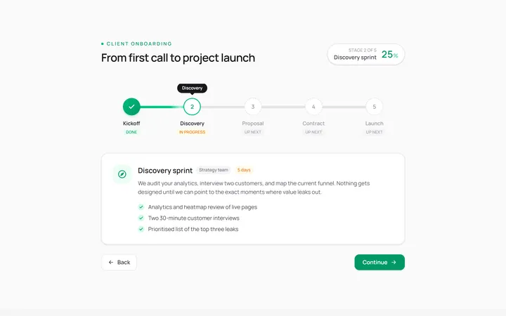
Horizontal Stepper
Originalhorizontal step indicator
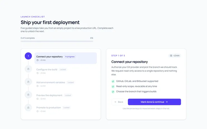
Vertical Stepper
Originalvertical stepper
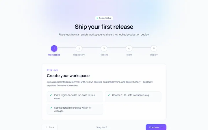
Numbered Stepper
Originalnumbered stepper with connectors
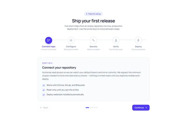
Icons Stepper
Originalicon stepper
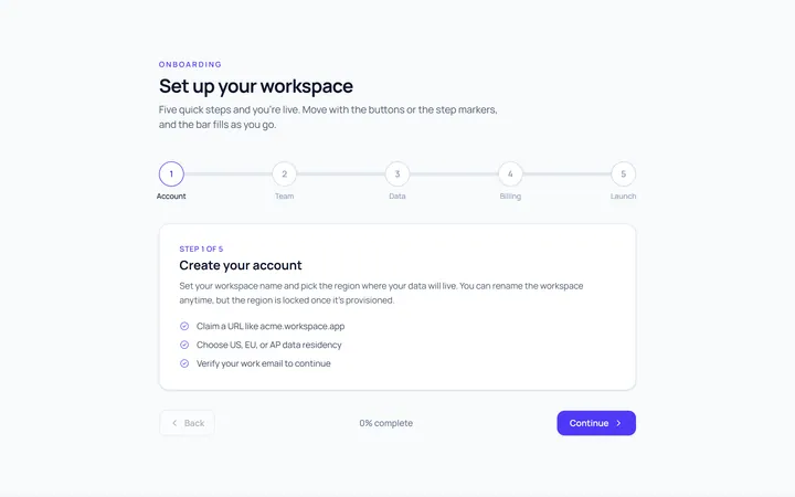
Progress Stepper
Originalstepper with progress fill
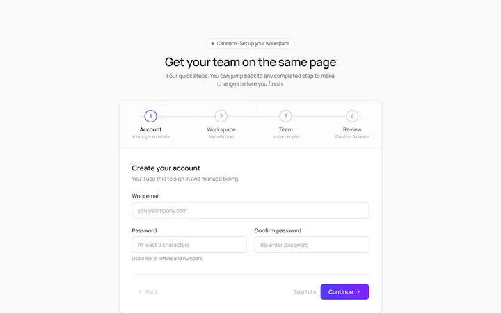
Wizard Stepper
Originalwizard stepper with next/back
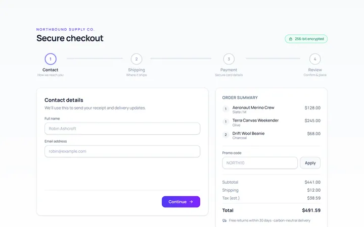
Checkout Stepper
Originalcheckout progress steps

Spotlight Hero
OriginalA centred hero with a soft radial spotlight, badge and dual call-to-action.

Split Hero
OriginalA two-column hero pairing a headline and CTAs with a product mock and social proof.

Gradient Spotlight Hero
OriginalA minimal centred hero with a soft gradient-mesh backdrop, announcement pill and dual call-to-action buttons.

App Preview Hero
OriginalA centred hero that pairs headline copy with a realistic product dashboard mock built entirely from markup, complete with browser chrome and a floating notification card.

Waitlist Capture Hero
OriginalA dark, focused hero with an inline email capture form and avatar social proof, ready for pre-launch waitlists.