

Vertical Stepper
Original · freevertical stepper
Copy prompt gives Claude Code, Cursor or v0 a ready-to-paste prompt that recreates this exact component.
npx shadcn@latest add https://webinnoventix.com/r/step-vertical.json"use client";
import { useRef, useState, type KeyboardEvent } from "react";
import { AnimatePresence, motion, useReducedMotion } from "motion/react";
type Step = {
title: string;
blurb: string;
duration: string;
points: string[];
};
type StepStatus = "done" | "current" | "ready" | "locked";
const STEPS: ReadonlyArray<Step> = [
{
title: "Connect your repository",
blurb:
"Authorize your Git provider and pick the branch we should track. We request read-only access to a single repository and nothing else.",
duration: "~2 min",
points: [
"GitHub, GitLab, and Bitbucket supported",
"Read-only scope, revocable at any time",
"Choose the branch that triggers builds",
],
},
{
title: "Configure the build",
blurb:
"Tell us how your app compiles. We detect most frameworks automatically, but every field stays yours to override.",
duration: "~3 min",
points: [
"Framework preset auto-detected on connect",
"Custom build command and output directory",
"Node version pinned for reproducible builds",
],
},
{
title: "Add environment variables",
blurb:
"Store the secrets and config your app reads at build and runtime. Values are encrypted at rest and never printed to logs.",
duration: "~4 min",
points: [
"Separate values per environment",
"Encrypted at rest with AES-256",
"Import an existing .env file in one paste",
],
},
{
title: "Preview the deployment",
blurb:
"Every commit gets an isolated preview URL, so you can review the real thing before it ever reaches your users.",
duration: "~5 min",
points: [
"A unique URL for every commit",
"Share previews with stakeholders",
"Run checks before you promote",
],
},
{
title: "Promote to production",
blurb:
"Attach your custom domain, issue a managed TLS certificate, and ship the build to production traffic with no downtime.",
duration: "~2 min",
points: [
"Automatic HTTPS via managed certificates",
"Instant rollback to any prior deploy",
"Zero-downtime atomic swap",
],
},
];
function CheckIcon({ className }: { className?: string }) {
return (
<svg
viewBox="0 0 20 20"
fill="none"
aria-hidden="true"
className={className}
>
<path
d="M4.5 10.5l3.2 3.2 7.8-8.4"
stroke="currentColor"
strokeWidth="2"
strokeLinecap="round"
strokeLinejoin="round"
/>
</svg>
);
}
function LockIcon({ className }: { className?: string }) {
return (
<svg viewBox="0 0 20 20" fill="none" aria-hidden="true" className={className}>
<rect
x="4.5"
y="8.5"
width="11"
height="8"
rx="2"
stroke="currentColor"
strokeWidth="1.7"
/>
<path
d="M7 8.5V6.5a3 3 0 016 0v2"
stroke="currentColor"
strokeWidth="1.7"
strokeLinecap="round"
/>
</svg>
);
}
function ArrowIcon({ className }: { className?: string }) {
return (
<svg viewBox="0 0 20 20" fill="none" aria-hidden="true" className={className}>
<path
d="M4 10h11m0 0l-4.5-4.5M15 10l-4.5 4.5"
stroke="currentColor"
strokeWidth="1.8"
strokeLinecap="round"
strokeLinejoin="round"
/>
</svg>
);
}
function ClockIcon({ className }: { className?: string }) {
return (
<svg viewBox="0 0 20 20" fill="none" aria-hidden="true" className={className}>
<circle cx="10" cy="10" r="7" stroke="currentColor" strokeWidth="1.6" />
<path
d="M10 6.2V10l2.6 1.7"
stroke="currentColor"
strokeWidth="1.6"
strokeLinecap="round"
strokeLinejoin="round"
/>
</svg>
);
}
function RocketIcon({ className }: { className?: string }) {
return (
<svg viewBox="0 0 24 24" fill="none" aria-hidden="true" className={className}>
<path
d="M14 4c3.5.3 6 2.8 6.3 6.3-2.1 3-5.2 5.4-8.8 6.5l-2.5-2.5C10.1 10.8 12 6.4 14 4z"
stroke="currentColor"
strokeWidth="1.6"
strokeLinejoin="round"
/>
<path
d="M9 15l-2-2-3 .8 1.2 1.2M9 15l0 4 2-.6"
stroke="currentColor"
strokeWidth="1.6"
strokeLinecap="round"
strokeLinejoin="round"
/>
<circle cx="15" cy="9" r="1.4" fill="currentColor" />
</svg>
);
}
const STATUS_LABEL: Record<StepStatus, string> = {
done: "Done",
current: "In progress",
ready: "Ready",
locked: "Locked",
};
const NODE_CLASS: Record<StepStatus, string> = {
done: "bg-emerald-500 text-white border-emerald-500",
current: "bg-indigo-600 text-white border-indigo-600",
ready:
"bg-white text-slate-700 border-slate-300 dark:bg-slate-900 dark:text-slate-200 dark:border-slate-600",
locked:
"bg-slate-100 text-slate-400 border-slate-200 dark:bg-slate-800 dark:text-slate-600 dark:border-slate-700",
};
const PILL_CLASS: Record<StepStatus, string> = {
done: "text-emerald-700 bg-emerald-50 ring-emerald-600/20 dark:text-emerald-300 dark:bg-emerald-500/10 dark:ring-emerald-400/20",
current:
"text-indigo-700 bg-indigo-50 ring-indigo-600/20 dark:text-indigo-300 dark:bg-indigo-500/10 dark:ring-indigo-400/20",
ready:
"text-slate-600 bg-slate-100 ring-slate-500/20 dark:text-slate-300 dark:bg-slate-800 dark:ring-slate-400/20",
locked:
"text-slate-400 bg-slate-50 ring-slate-400/20 dark:text-slate-500 dark:bg-slate-800/50 dark:ring-slate-500/20",
};
export default function StepVertical() {
const reduce = useReducedMotion();
const [current, setCurrent] = useState<number>(0);
const [completed, setCompleted] = useState<Set<number>>(() => new Set<number>());
const [roving, setRoving] = useState<number>(0);
const btnRefs = useRef<Array<HTMLButtonElement | null>>([]);
const total = STEPS.length;
const lastIndex = total - 1;
const doneCount = completed.size;
const percent = Math.round((doneCount / total) * 100);
const allDone = doneCount === total;
const isUnlocked = (i: number): boolean => i === 0 || completed.has(i - 1);
const statusOf = (i: number): StepStatus => {
if (completed.has(i)) return "done";
if (i === current) return "current";
if (isUnlocked(i)) return "ready";
return "locked";
};
const goTo = (i: number) => {
if (!isUnlocked(i)) return;
setCurrent(i);
setRoving(i);
};
const focusStep = (i: number) => {
setRoving(i);
btnRefs.current[i]?.focus();
};
const nextUnlocked = (from: number): number => {
for (let i = from + 1; i < total; i += 1) if (isUnlocked(i)) return i;
return from;
};
const prevUnlocked = (from: number): number => {
for (let i = from - 1; i >= 0; i -= 1) if (isUnlocked(i)) return i;
return from;
};
const firstUnlocked = (): number => {
for (let i = 0; i < total; i += 1) if (isUnlocked(i)) return i;
return 0;
};
const lastUnlocked = (): number => {
for (let i = total - 1; i >= 0; i -= 1) if (isUnlocked(i)) return i;
return 0;
};
const onKeyDown = (e: KeyboardEvent<HTMLButtonElement>, i: number) => {
switch (e.key) {
case "ArrowDown":
case "ArrowRight":
e.preventDefault();
focusStep(nextUnlocked(i));
break;
case "ArrowUp":
case "ArrowLeft":
e.preventDefault();
focusStep(prevUnlocked(i));
break;
case "Home":
e.preventDefault();
focusStep(firstUnlocked());
break;
case "End":
e.preventDefault();
focusStep(lastUnlocked());
break;
default:
break;
}
};
const completeAndAdvance = () => {
setCompleted((prev) => {
const next = new Set(prev);
next.add(current);
return next;
});
if (current < lastIndex) {
const target = current + 1;
setCurrent(target);
setRoving(target);
}
};
const goBack = () => {
if (current === 0) return;
const target = current - 1;
setCurrent(target);
setRoving(target);
};
const reset = () => {
setCompleted(new Set<number>());
setCurrent(0);
setRoving(0);
};
const active = STEPS[current];
const activeDone = completed.has(current);
const panelTransition = reduce
? { duration: 0 }
: { duration: 0.28, ease: [0.22, 1, 0.36, 1] as const };
return (
<section className="relative w-full bg-slate-50 px-4 py-16 text-slate-900 sm:py-24 dark:bg-slate-950 dark:text-slate-100">
<style>{`
@keyframes stepv-pulse {
0% { box-shadow: 0 0 0 0 rgba(79,70,229,0.45); }
70% { box-shadow: 0 0 0 8px rgba(79,70,229,0); }
100% { box-shadow: 0 0 0 0 rgba(79,70,229,0); }
}
.stepv-pulse { animation: stepv-pulse 2.2s ease-out infinite; }
@media (prefers-reduced-motion: reduce) {
.stepv-pulse { animation: none !important; }
}
`}</style>
<div className="mx-auto max-w-5xl">
<header className="mb-10">
<p className="text-xs font-semibold uppercase tracking-[0.18em] text-indigo-600 dark:text-indigo-400">
Launch checklist
</p>
<h2 className="mt-2 text-2xl font-bold tracking-tight text-slate-900 sm:text-3xl dark:text-white">
Ship your first deployment
</h2>
<p className="mt-2 max-w-xl text-sm text-slate-600 dark:text-slate-400">
Five guided steps take you from an empty project to a live production
URL. Complete each one to unlock the next.
</p>
<div className="mt-6 max-w-md">
<div className="flex items-center justify-between text-xs font-medium text-slate-500 dark:text-slate-400">
<span>
{doneCount} of {total} complete
</span>
<span aria-hidden="true">{percent}%</span>
</div>
<div
className="mt-2 h-2 w-full overflow-hidden rounded-full bg-slate-200 dark:bg-slate-800"
role="progressbar"
aria-valuemin={0}
aria-valuemax={100}
aria-valuenow={percent}
aria-label="Setup progress"
>
<motion.div
className="h-full rounded-full bg-gradient-to-r from-indigo-500 to-violet-500"
initial={false}
animate={{ width: `${percent}%` }}
transition={reduce ? { duration: 0 } : { duration: 0.5, ease: "easeOut" }}
/>
</div>
</div>
</header>
<div className="grid gap-6 md:grid-cols-2 md:gap-8">
{/* Stepper column */}
<ol
className="rounded-2xl border border-slate-200 bg-white p-4 shadow-sm sm:p-6 dark:border-slate-800 dark:bg-slate-900"
aria-label="Deployment steps"
>
{STEPS.map((step, i) => {
const status = statusOf(i);
const locked = status === "locked";
const isLastRow = i === lastIndex;
return (
<li key={step.title} className="flex gap-4">
<div
className="flex flex-col items-center self-stretch"
aria-hidden="true"
>
<span
className={`grid h-11 w-11 shrink-0 place-items-center rounded-full border text-sm font-semibold transition-colors ${NODE_CLASS[status]} ${
status === "current" && !reduce ? "stepv-pulse" : ""
}`}
>
{status === "done" ? (
<CheckIcon className="h-5 w-5" />
) : locked ? (
<LockIcon className="h-4 w-4" />
) : (
i + 1
)}
</span>
{!isLastRow && (
<span className="mt-2 flex w-[2px] min-h-[1.75rem] flex-1 overflow-hidden rounded-full bg-slate-200 dark:bg-slate-700">
<motion.span
className="block w-full origin-top rounded-full bg-emerald-400 dark:bg-emerald-500"
initial={false}
animate={{ scaleY: completed.has(i) ? 1 : 0 }}
transition={
reduce ? { duration: 0 } : { duration: 0.5, ease: "easeOut" }
}
style={{ height: "100%" }}
/>
</span>
)}
</div>
<button
type="button"
ref={(el) => {
btnRefs.current[i] = el;
}}
disabled={locked}
tabIndex={i === roving ? 0 : -1}
aria-current={i === current ? "step" : undefined}
onClick={() => goTo(i)}
onKeyDown={(e) => onKeyDown(e, i)}
className={`mb-2 flex-1 rounded-xl px-3 py-3 text-left transition-colors focus-visible:outline-none focus-visible:ring-2 focus-visible:ring-indigo-500 focus-visible:ring-offset-2 focus-visible:ring-offset-white dark:focus-visible:ring-offset-slate-900 ${
locked
? "cursor-not-allowed opacity-70"
: i === current
? "bg-indigo-50 dark:bg-indigo-500/10"
: "hover:bg-slate-100 dark:hover:bg-slate-800/60"
}`}
>
<span className="sr-only">{`Step ${i + 1} of ${total}: `}</span>
<span className="flex flex-wrap items-center gap-x-2 gap-y-1">
<span
className={`text-sm font-semibold ${
locked
? "text-slate-400 dark:text-slate-500"
: "text-slate-900 dark:text-white"
}`}
>
{step.title}
</span>
<span
className={`inline-flex items-center rounded-full px-2 py-0.5 text-[11px] font-medium ring-1 ring-inset ${PILL_CLASS[status]}`}
>
{STATUS_LABEL[status]}
</span>
</span>
<span
className={`mt-1 flex items-center gap-1.5 text-xs ${
locked
? "text-slate-400 dark:text-slate-600"
: "text-slate-500 dark:text-slate-400"
}`}
>
<ClockIcon className="h-3.5 w-3.5" />
{step.duration}
</span>
</button>
</li>
);
})}
</ol>
{/* Detail column */}
<div className="rounded-2xl border border-slate-200 bg-white p-6 shadow-sm sm:p-8 dark:border-slate-800 dark:bg-slate-900">
<AnimatePresence mode="wait" initial={false}>
{allDone ? (
<motion.div
key="all-done"
initial={{ opacity: 0, y: reduce ? 0 : 8 }}
animate={{ opacity: 1, y: 0 }}
exit={{ opacity: 0, y: reduce ? 0 : -8 }}
transition={panelTransition}
>
<span className="inline-flex h-12 w-12 items-center justify-center rounded-2xl bg-emerald-500 text-white">
<RocketIcon className="h-6 w-6" />
</span>
<h3 className="mt-4 text-xl font-bold tracking-tight text-slate-900 dark:text-white">
You are live.
</h3>
<p className="mt-2 text-sm text-slate-600 dark:text-slate-400">
All five steps are complete. Your project is building on every
push and serving production traffic over HTTPS. Nice work.
</p>
<button
type="button"
onClick={reset}
className="mt-6 inline-flex items-center gap-2 rounded-lg border border-slate-300 bg-white px-4 py-2.5 text-sm font-semibold text-slate-700 transition-colors hover:bg-slate-100 focus-visible:outline-none focus-visible:ring-2 focus-visible:ring-indigo-500 focus-visible:ring-offset-2 focus-visible:ring-offset-white dark:border-slate-600 dark:bg-slate-800 dark:text-slate-200 dark:hover:bg-slate-700 dark:focus-visible:ring-offset-slate-900"
>
Run through it again
</button>
</motion.div>
) : (
<motion.div
key={current}
role="region"
aria-live="polite"
aria-label={`Step ${current + 1}: ${active.title}`}
initial={{ opacity: 0, y: reduce ? 0 : 8 }}
animate={{ opacity: 1, y: 0 }}
exit={{ opacity: 0, y: reduce ? 0 : -8 }}
transition={panelTransition}
>
<div className="flex items-center justify-between">
<p className="text-xs font-semibold uppercase tracking-[0.16em] text-indigo-600 dark:text-indigo-400">
Step {current + 1} of {total}
</p>
<span className="inline-flex items-center gap-1.5 rounded-full bg-slate-100 px-2.5 py-1 text-xs font-medium text-slate-600 dark:bg-slate-800 dark:text-slate-300">
<ClockIcon className="h-3.5 w-3.5" />
{active.duration}
</span>
</div>
<h3 className="mt-3 text-xl font-bold tracking-tight text-slate-900 dark:text-white">
{active.title}
</h3>
<p className="mt-2 text-sm leading-relaxed text-slate-600 dark:text-slate-400">
{active.blurb}
</p>
<ul className="mt-5 space-y-2.5">
{active.points.map((point) => (
<li key={point} className="flex items-start gap-2.5">
<span className="mt-0.5 grid h-5 w-5 shrink-0 place-items-center rounded-full bg-emerald-100 text-emerald-600 dark:bg-emerald-500/15 dark:text-emerald-400">
<CheckIcon className="h-3.5 w-3.5" />
</span>
<span className="text-sm text-slate-700 dark:text-slate-300">
{point}
</span>
</li>
))}
</ul>
<div className="mt-8 flex items-center gap-3">
<button
type="button"
onClick={goBack}
disabled={current === 0}
className="inline-flex items-center gap-2 rounded-lg border border-slate-300 bg-white px-4 py-2.5 text-sm font-semibold text-slate-700 transition-colors hover:bg-slate-100 focus-visible:outline-none focus-visible:ring-2 focus-visible:ring-indigo-500 focus-visible:ring-offset-2 focus-visible:ring-offset-white disabled:cursor-not-allowed disabled:opacity-40 dark:border-slate-600 dark:bg-slate-800 dark:text-slate-200 dark:hover:bg-slate-700 dark:focus-visible:ring-offset-slate-900"
>
<ArrowIcon className="h-4 w-4 rotate-180" />
Back
</button>
<button
type="button"
onClick={completeAndAdvance}
className="inline-flex flex-1 items-center justify-center gap-2 rounded-lg bg-indigo-600 px-4 py-2.5 text-sm font-semibold text-white shadow-sm transition-colors hover:bg-indigo-500 focus-visible:outline-none focus-visible:ring-2 focus-visible:ring-indigo-500 focus-visible:ring-offset-2 focus-visible:ring-offset-white dark:focus-visible:ring-offset-slate-900"
>
{current === lastIndex
? "Finish setup"
: activeDone
? "Continue"
: "Mark done & continue"}
{current !== lastIndex && <ArrowIcon className="h-4 w-4" />}
</button>
</div>
<p className="mt-3 text-center text-xs text-slate-400 dark:text-slate-500">
Use the arrow keys to move between steps in the list.
</p>
</motion.div>
)}
</AnimatePresence>
</div>
</div>
</div>
</section>
);
}Dependencies
Licence
Built by Web Innoventix. Free for personal and commercial use, no attribution required.
Built by Web Innoventix
Need a custom interface, a full website, or SEO that gets you cited by AI? We design, build and rank it end to end.
Get a free quoteSimilar components
Browse all →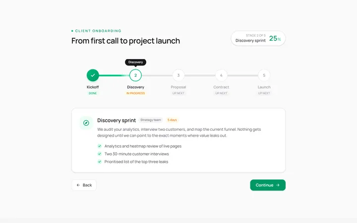
Horizontal Stepper
Originalhorizontal step indicator
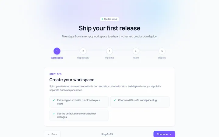
Numbered Stepper
Originalnumbered stepper with connectors
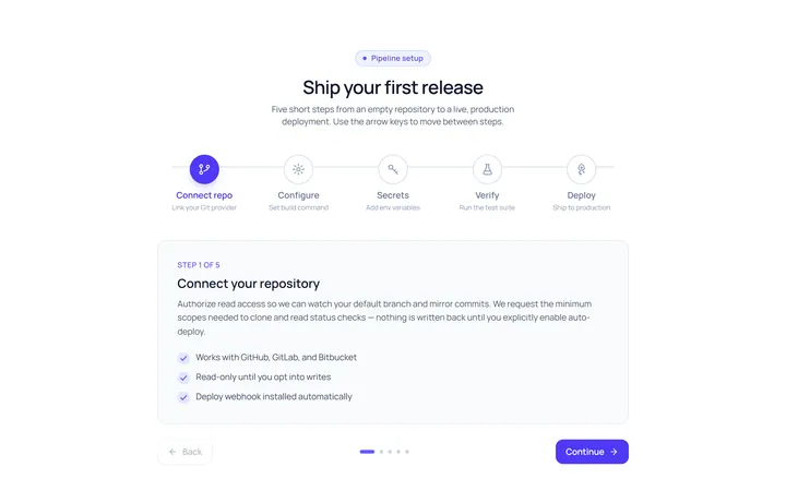
Icons Stepper
Originalicon stepper
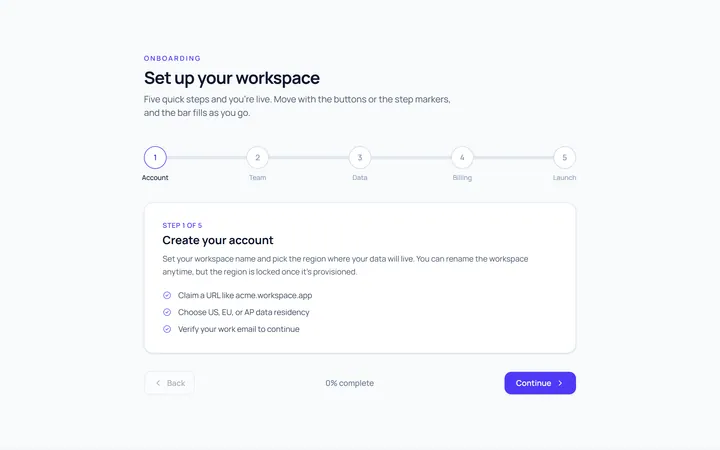
Progress Stepper
Originalstepper with progress fill
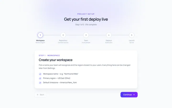
Dots Stepper
Originaldot stepper
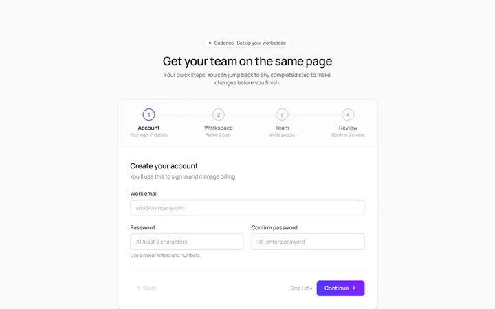
Wizard Stepper
Originalwizard stepper with next/back
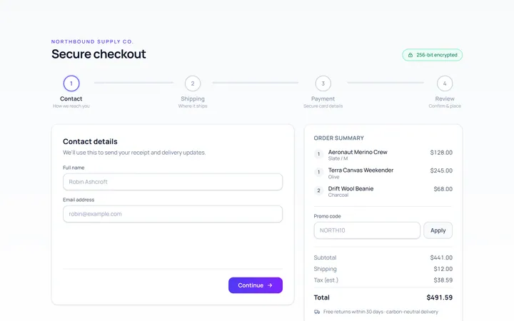
Checkout Stepper
Originalcheckout progress steps

Spotlight Hero
OriginalA centred hero with a soft radial spotlight, badge and dual call-to-action.

Split Hero
OriginalA two-column hero pairing a headline and CTAs with a product mock and social proof.

Gradient Spotlight Hero
OriginalA minimal centred hero with a soft gradient-mesh backdrop, announcement pill and dual call-to-action buttons.

App Preview Hero
OriginalA centred hero that pairs headline copy with a realistic product dashboard mock built entirely from markup, complete with browser chrome and a floating notification card.

Waitlist Capture Hero
OriginalA dark, focused hero with an inline email capture form and avatar social proof, ready for pre-launch waitlists.