

Icons Stepper
Original · freeicon stepper
Copy prompt gives Claude Code, Cursor or v0 a ready-to-paste prompt that recreates this exact component.
npx shadcn@latest add https://webinnoventix.com/r/step-icons.json"use client";
import {
useId,
useRef,
useState,
type ComponentType,
type KeyboardEvent,
type SVGProps,
} from "react";
import { AnimatePresence, motion, useReducedMotion } from "motion/react";
type IconType = ComponentType<SVGProps<SVGSVGElement>>;
type Step = {
id: string;
label: string;
caption: string;
Icon: IconType;
heading: string;
body: string;
points: string[];
};
function RepoIcon(props: SVGProps<SVGSVGElement>) {
return (
<svg
viewBox="0 0 24 24"
fill="none"
stroke="currentColor"
strokeWidth={1.8}
strokeLinecap="round"
strokeLinejoin="round"
aria-hidden="true"
{...props}
>
<circle cx="6" cy="6" r="2.4" />
<circle cx="6" cy="18" r="2.4" />
<circle cx="18" cy="7" r="2.4" />
<path d="M6 8.4v7.2" />
<path d="M18 9.4c0 4.2-4.2 3.4-7 6" />
</svg>
);
}
function CogIcon(props: SVGProps<SVGSVGElement>) {
return (
<svg
viewBox="0 0 24 24"
fill="none"
stroke="currentColor"
strokeWidth={1.8}
strokeLinecap="round"
strokeLinejoin="round"
aria-hidden="true"
{...props}
>
<circle cx="12" cy="12" r="3" />
<path d="M12 2.5v3M12 18.5v3M2.5 12h3M18.5 12h3M5.2 5.2l2.1 2.1M16.7 16.7l2.1 2.1M18.8 5.2l-2.1 2.1M7.3 16.7l-2.1 2.1" />
</svg>
);
}
function KeyIcon(props: SVGProps<SVGSVGElement>) {
return (
<svg
viewBox="0 0 24 24"
fill="none"
stroke="currentColor"
strokeWidth={1.8}
strokeLinecap="round"
strokeLinejoin="round"
aria-hidden="true"
{...props}
>
<circle cx="8" cy="8" r="3.6" />
<path d="M10.6 10.6 20 20" />
<path d="M17 17.5 19 15.5" />
<path d="M14 14.5 16 12.5" />
</svg>
);
}
function BeakerIcon(props: SVGProps<SVGSVGElement>) {
return (
<svg
viewBox="0 0 24 24"
fill="none"
stroke="currentColor"
strokeWidth={1.8}
strokeLinecap="round"
strokeLinejoin="round"
aria-hidden="true"
{...props}
>
<path d="M9 3h6" />
<path d="M10 3v6l-5 9a2 2 0 0 0 1.8 3h10.4a2 2 0 0 0 1.8-3l-5-9V3" />
<path d="M7 15h10" />
</svg>
);
}
function RocketIcon(props: SVGProps<SVGSVGElement>) {
return (
<svg
viewBox="0 0 24 24"
fill="none"
stroke="currentColor"
strokeWidth={1.8}
strokeLinecap="round"
strokeLinejoin="round"
aria-hidden="true"
{...props}
>
<path d="M12 3c3 1 5 4 5 8l-2.4 2.4H9.4L7 11c0-4 2-7 5-8Z" />
<circle cx="12" cy="9" r="1.4" />
<path d="M9.4 15.4 7 18" />
<path d="M14.6 15.4 17 18" />
<path d="M10 18c-1 1.4-1 3-1 3s1.6 0 3-1" />
</svg>
);
}
function CheckIcon(props: SVGProps<SVGSVGElement>) {
return (
<svg
viewBox="0 0 24 24"
fill="none"
stroke="currentColor"
strokeWidth={2.4}
strokeLinecap="round"
strokeLinejoin="round"
aria-hidden="true"
{...props}
>
<path d="M4.5 12.5 9.5 17.5 19.5 6.5" />
</svg>
);
}
function ArrowLeftIcon(props: SVGProps<SVGSVGElement>) {
return (
<svg
viewBox="0 0 24 24"
fill="none"
stroke="currentColor"
strokeWidth={1.9}
strokeLinecap="round"
strokeLinejoin="round"
aria-hidden="true"
{...props}
>
<path d="M13 5 6 12l7 7" />
<path d="M6 12h13" />
</svg>
);
}
function ArrowRightIcon(props: SVGProps<SVGSVGElement>) {
return (
<svg
viewBox="0 0 24 24"
fill="none"
stroke="currentColor"
strokeWidth={1.9}
strokeLinecap="round"
strokeLinejoin="round"
aria-hidden="true"
{...props}
>
<path d="M11 5l7 7-7 7" />
<path d="M18 12H5" />
</svg>
);
}
const STEPS: Step[] = [
{
id: "connect",
label: "Connect repo",
caption: "Link your Git provider",
Icon: RepoIcon,
heading: "Connect your repository",
body: "Authorize read access so we can watch your default branch and mirror commits. We request the minimum scopes needed to clone and read status checks — nothing is written back until you explicitly enable auto-deploy.",
points: [
"Works with GitHub, GitLab, and Bitbucket",
"Read-only until you opt into writes",
"Deploy webhook installed automatically",
],
},
{
id: "build",
label: "Configure",
caption: "Set build command",
Icon: CogIcon,
heading: "Configure the build",
body: "We detected a Node.js project and pre-filled sensible defaults. Confirm the install and build commands, then pick an output directory. You can override any of these per branch later from the pipeline settings.",
points: [
"Install: npm ci · Build: npm run build",
"Output directory: dist/",
"Node 20 LTS pinned for reproducible builds",
],
},
{
id: "env",
label: "Secrets",
caption: "Add env variables",
Icon: KeyIcon,
heading: "Add environment secrets",
body: "Store API keys and database URLs as encrypted secrets that are injected at build and runtime. Values are sealed at rest with AES-256 and never printed in logs — a masked preview is all that ever appears in the dashboard.",
points: [
"Scoped per environment: preview and production",
"AES-256 encryption at rest, masked in logs",
"Import a .env file or paste key/value pairs",
],
},
{
id: "test",
label: "Verify",
caption: "Run the test suite",
Icon: BeakerIcon,
heading: "Run tests before you ship",
body: "A dry run executes your test command in an isolated container that mirrors production. Deploys are blocked automatically when the suite fails, so a red build never reaches your users — you decide whether flaky tests warn or hard-stop.",
points: [
"Isolated container matching the runtime",
"Blocks promotion on a failed suite",
"Coverage summary posted to each pull request",
],
},
{
id: "deploy",
label: "Deploy",
caption: "Ship to production",
Icon: RocketIcon,
heading: "Deploy to production",
body: "Push the release behind a global edge network with an instant, atomic swap — no half-updated states and no downtime. Every deploy is immutable, so rolling back to any previous version is a single click if something looks wrong.",
points: [
"Atomic swap with zero-downtime cutover",
"One-click rollback to any prior release",
"Automatic TLS and edge caching included",
],
},
];
const LAST = STEPS.length - 1;
export default function StepIcons() {
const reduceMotion = useReducedMotion();
const [current, setCurrent] = useState(0);
const [focusIdx, setFocusIdx] = useState(0);
const [finished, setFinished] = useState(false);
const stepRefs = useRef<Array<HTMLButtonElement | null>>([]);
const uid = useId();
const panelId = `${uid}-panel`;
const progress = finished ? 100 : (current / LAST) * 100;
function focusStep(index: number) {
setFocusIdx(index);
stepRefs.current[index]?.focus();
}
function goTo(index: number) {
setCurrent(index);
setFinished(false);
setFocusIdx(index);
}
function handleNext() {
if (finished) return;
if (current < LAST) {
goTo(current + 1);
} else {
setFinished(true);
}
}
function handleBack() {
if (finished) {
setFinished(false);
focusStep(current);
return;
}
if (current > 0) goTo(current - 1);
}
function reset() {
setCurrent(0);
setFocusIdx(0);
setFinished(false);
}
function onStepKeyDown(event: KeyboardEvent<HTMLButtonElement>) {
let target: number | null = null;
if (event.key === "ArrowRight" || event.key === "ArrowDown") {
target = Math.min(focusIdx + 1, LAST);
} else if (event.key === "ArrowLeft" || event.key === "ArrowUp") {
target = Math.max(focusIdx - 1, 0);
} else if (event.key === "Home") {
target = 0;
} else if (event.key === "End") {
target = LAST;
} else {
return;
}
event.preventDefault();
focusStep(target);
}
const active = STEPS[current];
return (
<section className="relative w-full bg-white px-4 py-16 text-slate-900 sm:px-6 sm:py-20 dark:bg-slate-950 dark:text-slate-100">
<style>{`
@keyframes stepicons-pop {
0% { transform: scale(0.72); opacity: 0; }
60% { transform: scale(1.08); }
100% { transform: scale(1); opacity: 1; }
}
@keyframes stepicons-ring {
0% { transform: scale(1); opacity: 0.55; }
70% { transform: scale(1.65); opacity: 0; }
100% { transform: scale(1.65); opacity: 0; }
}
.stepicons-icon-current { animation: stepicons-pop 0.34s cubic-bezier(0.22, 1, 0.36, 1); }
.stepicons-halo { animation: stepicons-ring 2s ease-out infinite; }
@media (prefers-reduced-motion: reduce) {
.stepicons-icon-current,
.stepicons-halo { animation: none !important; }
}
`}</style>
<div className="mx-auto max-w-3xl">
<header className="mb-10 text-center">
<span className="inline-flex items-center gap-2 rounded-full border border-indigo-200 bg-indigo-50 px-3 py-1 text-xs font-medium tracking-wide text-indigo-700 dark:border-indigo-500/30 dark:bg-indigo-500/10 dark:text-indigo-300">
<span className="h-1.5 w-1.5 rounded-full bg-indigo-500" aria-hidden="true" />
Pipeline setup
</span>
<h2 className="mt-4 text-2xl font-semibold tracking-tight sm:text-3xl">
Ship your first release
</h2>
<p className="mx-auto mt-2 max-w-md text-sm text-slate-600 dark:text-slate-400">
Five short steps from an empty repository to a live, production
deployment. Use the arrow keys to move between steps.
</p>
</header>
<nav aria-label="Deployment setup progress">
<ol className="relative flex list-none items-start justify-between">
<div
className="absolute left-6 right-6 top-6 h-0.5 -translate-y-1/2 rounded-full bg-slate-200 dark:bg-slate-800"
aria-hidden="true"
>
<motion.div
className="h-full rounded-full bg-gradient-to-r from-indigo-500 to-violet-500"
initial={false}
animate={{ width: `${progress}%` }}
transition={
reduceMotion
? { duration: 0 }
: { duration: 0.45, ease: [0.22, 1, 0.36, 1] }
}
/>
</div>
{STEPS.map((step, i) => {
const isComplete = finished ? true : i < current;
const isCurrent = !finished && i === current;
const StepIcon = step.Icon;
const statusLabel = isComplete
? "completed"
: isCurrent
? "current step"
: "not started";
return (
<li key={step.id} className="relative z-10 flex min-w-0 flex-1 justify-center">
<button
type="button"
ref={(el) => {
stepRefs.current[i] = el;
}}
onClick={() => goTo(i)}
onKeyDown={onStepKeyDown}
tabIndex={focusIdx === i ? 0 : -1}
aria-current={isCurrent ? "step" : undefined}
aria-label={`Step ${i + 1} of ${STEPS.length}: ${step.label}, ${statusLabel}`}
aria-controls={panelId}
className="group flex w-full flex-col items-center gap-2 rounded-xl px-1 py-1 outline-none focus-visible:ring-2 focus-visible:ring-indigo-500 focus-visible:ring-offset-2 focus-visible:ring-offset-white dark:focus-visible:ring-offset-slate-950"
>
<span className="relative flex h-12 w-12 items-center justify-center">
{isCurrent && (
<span
className="stepicons-halo absolute inset-0 rounded-full bg-indigo-500/40"
aria-hidden="true"
/>
)}
<span
className={[
"relative flex h-12 w-12 items-center justify-center rounded-full border transition-colors duration-300",
isComplete
? "border-emerald-500 bg-emerald-500 text-white"
: isCurrent
? "border-indigo-600 bg-indigo-600 text-white shadow-lg shadow-indigo-500/25"
: "border-slate-300 bg-white text-slate-400 group-hover:border-slate-400 group-hover:text-slate-600 dark:border-slate-700 dark:bg-slate-900 dark:text-slate-500 dark:group-hover:border-slate-600 dark:group-hover:text-slate-300",
].join(" ")}
>
{isComplete ? (
<CheckIcon className="h-5 w-5" />
) : (
<StepIcon
className={
isCurrent
? "stepicons-icon-current h-[22px] w-[22px]"
: "h-[22px] w-[22px]"
}
/>
)}
</span>
</span>
<span className="flex min-w-0 flex-col items-center text-center">
<span
className={[
"truncate text-xs font-semibold sm:text-sm",
isCurrent
? "text-indigo-700 dark:text-indigo-300"
: isComplete
? "text-slate-700 dark:text-slate-200"
: "text-slate-500 dark:text-slate-500",
].join(" ")}
>
{step.label}
</span>
<span className="mt-0.5 hidden truncate text-[11px] text-slate-400 sm:block dark:text-slate-500">
{step.caption}
</span>
</span>
</button>
</li>
);
})}
</ol>
</nav>
<div
id={panelId}
role="region"
aria-live="polite"
className="mt-10 rounded-2xl border border-slate-200 bg-slate-50/80 p-6 sm:p-8 dark:border-slate-800 dark:bg-slate-900/60"
>
<AnimatePresence mode="wait">
<motion.div
key={finished ? "done" : active.id}
initial={reduceMotion ? false : { opacity: 0, y: 10 }}
animate={{ opacity: 1, y: 0 }}
exit={reduceMotion ? { opacity: 0 } : { opacity: 0, y: -10 }}
transition={
reduceMotion
? { duration: 0 }
: { duration: 0.26, ease: [0.22, 1, 0.36, 1] }
}
>
{finished ? (
<div className="text-center">
<span className="mx-auto flex h-14 w-14 items-center justify-center rounded-full bg-emerald-500 text-white">
<RocketIcon className="h-7 w-7" />
</span>
<h3 className="mt-4 text-lg font-semibold sm:text-xl">
You are live in production
</h3>
<p className="mx-auto mt-2 max-w-md text-sm text-slate-600 dark:text-slate-400">
Your first release is serving traffic from the edge. Every
push to the default branch will now build, test, and deploy
automatically.
</p>
<p className="mt-4 inline-flex items-center gap-2 rounded-lg border border-emerald-200 bg-emerald-50 px-3 py-1.5 font-mono text-xs text-emerald-700 dark:border-emerald-500/30 dark:bg-emerald-500/10 dark:text-emerald-300">
<span className="h-1.5 w-1.5 rounded-full bg-emerald-500" aria-hidden="true" />
https://app.example.dev
</p>
</div>
) : (
<>
<div className="flex items-center gap-2 text-xs font-medium uppercase tracking-wider text-indigo-600 dark:text-indigo-400">
<span>
Step {current + 1} of {STEPS.length}
</span>
</div>
<h3 className="mt-2 text-lg font-semibold sm:text-xl">
{active.heading}
</h3>
<p className="mt-2 text-sm leading-relaxed text-slate-600 dark:text-slate-400">
{active.body}
</p>
<ul className="mt-5 space-y-2.5">
{active.points.map((point) => (
<li key={point} className="flex items-start gap-2.5 text-sm text-slate-700 dark:text-slate-300">
<span className="mt-0.5 flex h-5 w-5 flex-none items-center justify-center rounded-full bg-indigo-100 text-indigo-600 dark:bg-indigo-500/15 dark:text-indigo-300">
<CheckIcon className="h-3.5 w-3.5" />
</span>
<span>{point}</span>
</li>
))}
</ul>
</>
)}
</motion.div>
</AnimatePresence>
</div>
<div className="mt-6 flex items-center justify-between gap-4">
<button
type="button"
onClick={handleBack}
disabled={current === 0 && !finished}
className="inline-flex items-center gap-2 rounded-xl border border-slate-300 bg-white px-4 py-2.5 text-sm font-medium text-slate-700 transition-colors hover:bg-slate-50 focus-visible:outline-none focus-visible:ring-2 focus-visible:ring-indigo-500 focus-visible:ring-offset-2 focus-visible:ring-offset-white disabled:cursor-not-allowed disabled:opacity-40 dark:border-slate-700 dark:bg-slate-900 dark:text-slate-200 dark:hover:bg-slate-800 dark:focus-visible:ring-offset-slate-950"
>
<ArrowLeftIcon className="h-4 w-4" />
Back
</button>
<div className="flex items-center gap-2" aria-hidden="true">
{STEPS.map((step, i) => (
<span
key={step.id}
className={[
"h-1.5 rounded-full transition-all duration-300",
(finished ? true : i <= current)
? "w-6 bg-indigo-500"
: "w-1.5 bg-slate-300 dark:bg-slate-700",
].join(" ")}
/>
))}
</div>
{finished ? (
<button
type="button"
onClick={reset}
className="inline-flex items-center gap-2 rounded-xl bg-slate-900 px-4 py-2.5 text-sm font-semibold text-white transition-colors hover:bg-slate-700 focus-visible:outline-none focus-visible:ring-2 focus-visible:ring-indigo-500 focus-visible:ring-offset-2 focus-visible:ring-offset-white dark:bg-white dark:text-slate-900 dark:hover:bg-slate-200 dark:focus-visible:ring-offset-slate-950"
>
Start over
</button>
) : (
<button
type="button"
onClick={handleNext}
className="inline-flex items-center gap-2 rounded-xl bg-indigo-600 px-4 py-2.5 text-sm font-semibold text-white transition-colors hover:bg-indigo-500 focus-visible:outline-none focus-visible:ring-2 focus-visible:ring-indigo-500 focus-visible:ring-offset-2 focus-visible:ring-offset-white dark:focus-visible:ring-offset-slate-950"
>
{current === LAST ? "Finish setup" : "Continue"}
<ArrowRightIcon className="h-4 w-4" />
</button>
)}
</div>
</div>
</section>
);
}Dependencies
Licence
Built by Web Innoventix. Free for personal and commercial use, no attribution required.
Built by Web Innoventix
Need a custom interface, a full website, or SEO that gets you cited by AI? We design, build and rank it end to end.
Get a free quoteSimilar components
Browse all →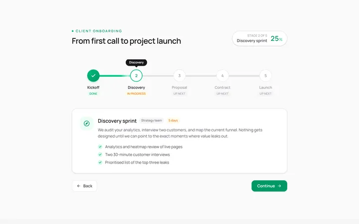
Horizontal Stepper
Originalhorizontal step indicator
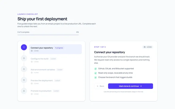
Vertical Stepper
Originalvertical stepper
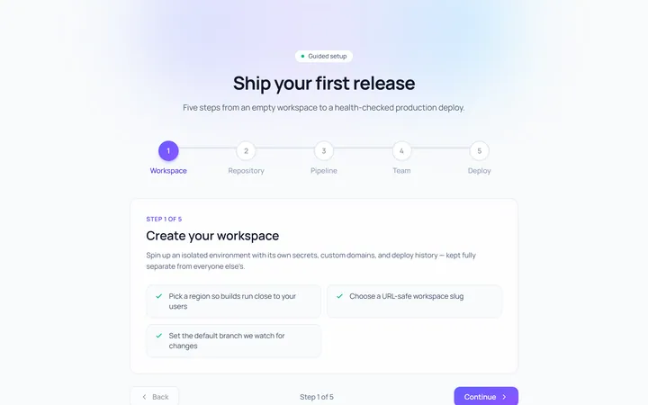
Numbered Stepper
Originalnumbered stepper with connectors
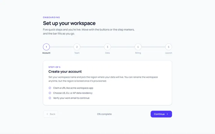
Progress Stepper
Originalstepper with progress fill
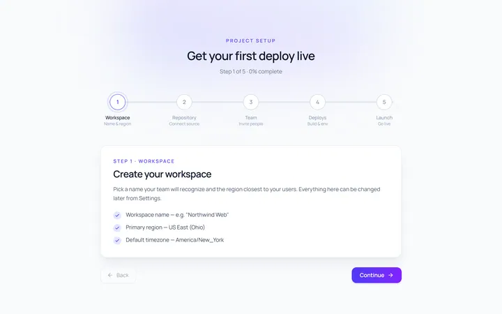
Dots Stepper
Originaldot stepper
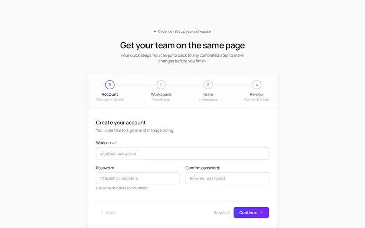
Wizard Stepper
Originalwizard stepper with next/back
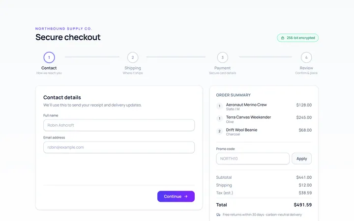
Checkout Stepper
Originalcheckout progress steps

Spotlight Hero
OriginalA centred hero with a soft radial spotlight, badge and dual call-to-action.

Split Hero
OriginalA two-column hero pairing a headline and CTAs with a product mock and social proof.

Gradient Spotlight Hero
OriginalA minimal centred hero with a soft gradient-mesh backdrop, announcement pill and dual call-to-action buttons.

App Preview Hero
OriginalA centred hero that pairs headline copy with a realistic product dashboard mock built entirely from markup, complete with browser chrome and a floating notification card.

Waitlist Capture Hero
OriginalA dark, focused hero with an inline email capture form and avatar social proof, ready for pre-launch waitlists.