

Horizontal Stepper
Original · freehorizontal step indicator
Copy prompt gives Claude Code, Cursor or v0 a ready-to-paste prompt that recreates this exact component.
npx shadcn@latest add https://webinnoventix.com/r/step-horizontal.json"use client";
import { useId, useRef, useState } from "react";
import type { KeyboardEvent, ReactNode } from "react";
import { AnimatePresence, motion, useReducedMotion } from "motion/react";
type IconProps = { className?: string };
function IconPhone({ className }: IconProps) {
return (
<svg viewBox="0 0 24 24" fill="none" stroke="currentColor" strokeWidth={1.8} strokeLinecap="round" strokeLinejoin="round" className={className} aria-hidden="true">
<path d="M5 4h3.2l1.4 3.6-2 1.4a12 12 0 0 0 5 5l1.4-2 3.6 1.4V20a1 1 0 0 1-1 1A16 16 0 0 1 4 5a1 1 0 0 1 1-1Z" />
</svg>
);
}
function IconCompass({ className }: IconProps) {
return (
<svg viewBox="0 0 24 24" fill="none" stroke="currentColor" strokeWidth={1.8} strokeLinecap="round" strokeLinejoin="round" className={className} aria-hidden="true">
<circle cx="12" cy="12" r="9" />
<path d="M15.6 8.4 13.3 13.3 8.4 15.6 10.7 10.7Z" />
<circle cx="12" cy="12" r="0.6" fill="currentColor" />
</svg>
);
}
function IconDocument({ className }: IconProps) {
return (
<svg viewBox="0 0 24 24" fill="none" stroke="currentColor" strokeWidth={1.8} strokeLinecap="round" strokeLinejoin="round" className={className} aria-hidden="true">
<path d="M6 3h7l5 5v13a0 0 0 0 1 0 0H6a0 0 0 0 1 0 0V3Z" />
<path d="M13 3v5h5" />
<path d="M9 13h6M9 16.5h4" />
</svg>
);
}
function IconSignature({ className }: IconProps) {
return (
<svg viewBox="0 0 24 24" fill="none" stroke="currentColor" strokeWidth={1.8} strokeLinecap="round" strokeLinejoin="round" className={className} aria-hidden="true">
<path d="M4 17c2.5 0 3-8 4.6-8 1.2 0 .8 5 2 5 1 0 1.4-3 2.6-3 1 0 1 2 2 2 1.2 0 1.6-2.5 2.8-2.5" />
<path d="M4 20.5h16" />
</svg>
);
}
function IconFlag({ className }: IconProps) {
return (
<svg viewBox="0 0 24 24" fill="none" stroke="currentColor" strokeWidth={1.8} strokeLinecap="round" strokeLinejoin="round" className={className} aria-hidden="true">
<path d="M6 21V4" />
<path d="M6 4.5h9.5l-1.6 3.2 1.6 3.3H6" />
</svg>
);
}
function IconCheck({ className }: IconProps) {
return (
<svg viewBox="0 0 24 24" fill="none" stroke="currentColor" strokeWidth={2.6} strokeLinecap="round" strokeLinejoin="round" className={className} aria-hidden="true">
<path d="M5 12.5 9.4 17 19 7" />
</svg>
);
}
function IconArrow({ className }: IconProps) {
return (
<svg viewBox="0 0 24 24" fill="none" stroke="currentColor" strokeWidth={2} strokeLinecap="round" strokeLinejoin="round" className={className} aria-hidden="true">
<path d="M5 12h14M13 6l6 6-6 6" />
</svg>
);
}
type Step = {
id: string;
title: string;
short: string;
owner: string;
duration: string;
description: string;
checklist: [string, string, string];
icon: (p: IconProps) => ReactNode;
};
const STEPS: Step[] = [
{
id: "kickoff",
title: "Kickoff call",
short: "Kickoff",
owner: "Account lead",
duration: "45 min",
description:
"A single video call to align on outcomes, budget, and the decision-maker. We record it, share the notes within the hour, and agree on how often we'll check in.",
checklist: [
"Confirm the primary goal and success metric",
"Identify who signs off at each stage",
"Book the discovery window on both calendars",
],
icon: IconPhone,
},
{
id: "discovery",
title: "Discovery sprint",
short: "Discovery",
owner: "Strategy team",
duration: "5 days",
description:
"We audit your analytics, interview two customers, and map the current funnel. Nothing gets designed until we can point to the exact moments where value leaks out.",
checklist: [
"Analytics and heatmap review of live pages",
"Two 30-minute customer interviews",
"Prioritised list of the top three leaks",
],
icon: IconCompass,
},
{
id: "proposal",
title: "Proposal review",
short: "Proposal",
owner: "Studio director",
duration: "2 days",
description:
"You get a fixed-scope proposal with milestones, deliverables, and a flat price — no hourly surprises. We walk through it live so every line makes sense before you commit.",
checklist: [
"Fixed scope with dated milestones",
"One flat price, revisions included",
"Live walkthrough and Q&A",
],
icon: IconDocument,
},
{
id: "contract",
title: "Contract & deposit",
short: "Contract",
owner: "Operations",
duration: "1 day",
description:
"Sign digitally and pay the deposit to lock your start date. The agreement spells out ownership, timelines, and the exit terms in plain language you can read in five minutes.",
checklist: [
"Plain-language master agreement",
"Digital signature, no printing",
"50% deposit reserves your slot",
],
icon: IconSignature,
},
{
id: "launch",
title: "Project launch",
short: "Launch",
owner: "Whole team",
duration: "Day one",
description:
"Your shared workspace opens, roles get assigned, and the first working session is scheduled. From here you can watch every task move across the board in real time.",
checklist: [
"Shared workspace and channel created",
"Roles and access handed over",
"First working session on the calendar",
],
icon: IconFlag,
},
];
export default function StepHorizontal() {
const reduce = useReducedMotion();
const [current, setCurrent] = useState<number>(1);
const [maxReached, setMaxReached] = useState<number>(1);
const [done, setDone] = useState<boolean>(false);
const [focusIndex, setFocusIndex] = useState<number>(1);
const stepRefs = useRef<Array<HTMLButtonElement | null>>([]);
const liveId = useId();
const panelId = useId();
const last = STEPS.length - 1;
const fillFraction = done ? 1 : current / last;
const percent = Math.round(fillFraction * 100);
const edgeInset = `${50 / STEPS.length}%`;
const markerIndex = done ? last : current;
const markerLeft = `${((markerIndex + 0.5) / STEPS.length) * 100}%`;
const getStatus = (i: number): "complete" | "current" | "upcoming" => {
if (done || i < current) return "complete";
if (i === current) return "current";
return "upcoming";
};
const focusStep = (i: number) => {
const clamped = Math.max(0, Math.min(last, i));
setFocusIndex(clamped);
stepRefs.current[clamped]?.focus();
};
const goTo = (i: number) => {
if (i > maxReached) return;
setDone(false);
setCurrent(i);
setFocusIndex(i);
};
const handleNext = () => {
if (current < last) {
const next = current + 1;
setCurrent(next);
setMaxReached((m) => Math.max(m, next));
setFocusIndex(next);
return;
}
setDone(true);
};
const handleBack = () => {
if (done) {
setDone(false);
return;
}
if (current > 0) {
const prev = current - 1;
setCurrent(prev);
setFocusIndex(prev);
}
};
const handleReset = () => {
setDone(false);
setCurrent(0);
setMaxReached(0);
setFocusIndex(0);
};
const handleKey = (e: KeyboardEvent<HTMLOListElement>) => {
switch (e.key) {
case "ArrowRight":
case "ArrowDown":
e.preventDefault();
focusStep(focusIndex + 1);
break;
case "ArrowLeft":
case "ArrowUp":
e.preventDefault();
focusStep(focusIndex - 1);
break;
case "Home":
e.preventDefault();
focusStep(0);
break;
case "End":
e.preventDefault();
focusStep(last);
break;
default:
break;
}
};
const active = STEPS[current];
const ActiveIcon = active.icon;
const panelKey = done ? "done" : active.id;
const rise = reduce ? 0 : 12;
const markerLabel = done ? "Onboarded" : active.short;
return (
<section className="relative w-full bg-zinc-50 px-4 py-16 text-zinc-900 sm:px-6 sm:py-24 dark:bg-zinc-950 dark:text-zinc-100">
<style>{`
@keyframes sthz_ping {
0% { transform: scale(1); opacity: 0.55; }
70% { transform: scale(2.1); opacity: 0; }
100% { transform: scale(2.1); opacity: 0; }
}
@keyframes sthz_draw {
from { stroke-dashoffset: 26; }
to { stroke-dashoffset: 0; }
}
@keyframes sthz_bob {
0%, 100% { transform: translateY(0); }
50% { transform: translateY(-2px); }
}
@keyframes sthz_sheen {
0% { transform: translateX(-130%); }
100% { transform: translateX(340%); }
}
.sthz-ping { animation: sthz_ping 2s cubic-bezier(0.4, 0, 0.2, 1) infinite; }
.sthz-draw { stroke-dasharray: 26; animation: sthz_draw 0.45s ease-out both; }
.sthz-bob { animation: sthz_bob 2.4s ease-in-out infinite; }
.sthz-sheen { animation: sthz_sheen 2.6s ease-in-out infinite; }
@media (prefers-reduced-motion: reduce) {
.sthz-ping, .sthz-draw, .sthz-bob, .sthz-sheen { animation: none !important; }
}
`}</style>
<div className="mx-auto max-w-3xl">
<header className="mb-12 flex flex-col gap-4 sm:flex-row sm:items-end sm:justify-between">
<div>
<p className="mb-2 inline-flex items-center gap-2 text-xs font-semibold uppercase tracking-[0.22em] text-emerald-600 dark:text-emerald-400">
<span className="h-1.5 w-1.5 rounded-full bg-emerald-500" />
Client onboarding
</p>
<h2 className="text-2xl font-semibold tracking-tight sm:text-[1.75rem]">
From first call to project launch
</h2>
</div>
<div className="flex items-center gap-3 rounded-full border border-zinc-200 bg-white px-4 py-2 shadow-sm dark:border-zinc-800 dark:bg-zinc-900">
<div className="text-right">
<div className="text-[11px] font-medium uppercase tracking-wide text-zinc-400 dark:text-zinc-500">
{done ? "All stages" : `Stage ${current + 1} of ${STEPS.length}`}
</div>
<div className="text-sm font-semibold text-zinc-700 dark:text-zinc-200">
{done ? "Complete" : active.title}
</div>
</div>
<div className="tabular-nums text-2xl font-semibold text-emerald-600 dark:text-emerald-400">
{percent}
<span className="text-sm text-emerald-500/70">%</span>
</div>
</div>
</header>
<div className="overflow-x-auto pb-1">
<div className="min-w-[34rem]">
{/* Traveling marker lane */}
<div className="relative h-9" aria-hidden="true">
<motion.div
className="absolute top-0 -translate-x-1/2"
initial={false}
animate={{ left: markerLeft }}
transition={{ duration: reduce ? 0 : 0.55, ease: [0.22, 1, 0.36, 1] }}
>
<div className={`flex flex-col items-center ${reduce ? "" : "sthz-bob"}`}>
<span
className={`whitespace-nowrap rounded-full px-3 py-1 text-[11px] font-semibold shadow-sm ${
done
? "bg-emerald-600 text-white"
: "bg-zinc-900 text-white dark:bg-white dark:text-zinc-900"
}`}
>
{markerLabel}
</span>
<span
className={`h-2 w-2 -translate-y-1 rotate-45 rounded-[2px] ${
done ? "bg-emerald-600" : "bg-zinc-900 dark:bg-white"
}`}
/>
</div>
</motion.div>
</div>
<nav aria-label="Onboarding progress">
<ol className="relative flex items-start" onKeyDown={handleKey}>
{/* Rail track */}
<div
className="pointer-events-none absolute top-[20px] h-1.5 rounded-full bg-zinc-200 dark:bg-zinc-800"
style={{ left: edgeInset, right: edgeInset }}
>
<motion.div
className="relative h-full overflow-hidden rounded-full bg-gradient-to-r from-emerald-500 to-emerald-400"
initial={false}
animate={{ width: `${fillFraction * 100}%` }}
transition={{ duration: reduce ? 0 : 0.55, ease: [0.22, 1, 0.36, 1] }}
>
{!reduce && fillFraction > 0 && (
<span className="sthz-sheen absolute inset-y-0 left-0 w-1/3 bg-gradient-to-r from-transparent via-white/70 to-transparent" />
)}
</motion.div>
</div>
{STEPS.map((step, i) => {
const status = getStatus(i);
const reachable = i <= maxReached;
const statusText =
status === "complete" ? "Done" : status === "current" ? "In progress" : reachable ? "Ready" : "Up next";
return (
<li key={step.id} className="relative flex min-w-0 flex-1 flex-col items-center">
<button
type="button"
ref={(el) => {
stepRefs.current[i] = el;
}}
tabIndex={i === focusIndex ? 0 : -1}
aria-current={status === "current" ? "step" : undefined}
aria-disabled={reachable ? undefined : true}
aria-controls={panelId}
aria-label={`Stage ${i + 1}, ${step.title}. ${
status === "complete"
? "Completed"
: status === "current"
? "Current stage"
: reachable
? "Available"
: "Not yet available"
}.`}
onClick={() => goTo(i)}
onFocus={() => setFocusIndex(i)}
className={`group flex w-full flex-col items-center rounded-2xl px-1 pt-0 outline-none focus-visible:ring-2 focus-visible:ring-emerald-500 focus-visible:ring-offset-2 dark:focus-visible:ring-offset-zinc-950 ${
reachable ? "cursor-pointer" : "cursor-not-allowed"
}`}
>
<span className="relative flex h-11 w-11 items-center justify-center">
{status === "current" && !reduce && (
<span className="sthz-ping absolute inset-0 rounded-full bg-emerald-500/40" />
)}
<span
className={`relative z-10 flex h-11 w-11 items-center justify-center rounded-full text-sm font-semibold transition-colors duration-300 ${
status === "complete"
? "bg-gradient-to-br from-emerald-500 to-emerald-600 text-white shadow-md shadow-emerald-500/25"
: status === "current"
? "border-2 border-emerald-500 bg-white text-emerald-600 dark:bg-zinc-900 dark:text-emerald-300"
: "border border-dashed border-zinc-300 bg-white text-zinc-400 dark:border-zinc-700 dark:bg-zinc-900 dark:text-zinc-500"
}`}
>
{status === "complete" ? (
<IconCheck className={`h-5 w-5 ${reduce ? "" : "sthz-draw"}`} />
) : (
<span className="tabular-nums">{i + 1}</span>
)}
</span>
</span>
<span
className={`mt-3 text-center text-[13px] font-semibold leading-tight transition-colors ${
status === "upcoming"
? "text-zinc-400 dark:text-zinc-500"
: "text-zinc-900 dark:text-zinc-100"
}`}
>
{step.short}
</span>
<span
className={`mt-1 rounded-full px-2 py-0.5 text-[10px] font-medium uppercase tracking-wide transition-colors ${
status === "complete"
? "bg-emerald-50 text-emerald-600 dark:bg-emerald-500/10 dark:text-emerald-400"
: status === "current"
? "bg-amber-50 text-amber-600 dark:bg-amber-500/10 dark:text-amber-400"
: "bg-zinc-100 text-zinc-400 dark:bg-zinc-800 dark:text-zinc-500"
}`}
>
{statusText}
</span>
</button>
</li>
);
})}
</ol>
</nav>
</div>
</div>
<div
id={panelId}
className="mt-10 min-h-[214px] overflow-hidden rounded-2xl border border-zinc-200 bg-white p-6 shadow-sm sm:p-7 dark:border-zinc-800 dark:bg-zinc-900"
>
<AnimatePresence mode="wait" initial={false}>
{done ? (
<motion.div
key={panelKey}
initial={{ opacity: 0, y: rise }}
animate={{ opacity: 1, y: 0 }}
exit={{ opacity: 0, y: -rise }}
transition={{ duration: reduce ? 0 : 0.3, ease: "easeOut" }}
className="flex flex-col items-start gap-4 sm:flex-row sm:items-center"
>
<span className="flex h-12 w-12 shrink-0 items-center justify-center rounded-2xl bg-gradient-to-br from-emerald-500 to-emerald-600 text-white shadow-md shadow-emerald-500/25">
<IconCheck className="h-6 w-6" />
</span>
<div>
<h3 className="text-lg font-semibold text-zinc-900 dark:text-zinc-100">
Onboarding complete — welcome aboard
</h3>
<p className="mt-1 text-sm leading-relaxed text-zinc-600 dark:text-zinc-300">
Every stage is signed off and your workspace is live. Your first working session is on the calendar, and you can track each task from the shared board starting today.
</p>
</div>
</motion.div>
) : (
<motion.div
key={panelKey}
initial={{ opacity: 0, y: rise }}
animate={{ opacity: 1, y: 0 }}
exit={{ opacity: 0, y: -rise }}
transition={{ duration: reduce ? 0 : 0.3, ease: "easeOut" }}
>
<div className="flex flex-col gap-4 sm:flex-row sm:items-start">
<span className="flex h-12 w-12 shrink-0 items-center justify-center rounded-2xl bg-emerald-50 text-emerald-600 dark:bg-emerald-500/10 dark:text-emerald-300">
<ActiveIcon className="h-6 w-6" />
</span>
<div className="min-w-0 flex-1">
<div className="flex flex-wrap items-center gap-2">
<h3 className="text-lg font-semibold text-zinc-900 dark:text-zinc-100">
{active.title}
</h3>
<span className="rounded-full bg-zinc-100 px-2 py-0.5 text-[11px] font-medium text-zinc-500 dark:bg-zinc-800 dark:text-zinc-400">
{active.owner}
</span>
<span className="rounded-full bg-amber-50 px-2 py-0.5 text-[11px] font-medium text-amber-600 dark:bg-amber-500/10 dark:text-amber-400">
{active.duration}
</span>
</div>
<p className="mt-2 text-sm leading-relaxed text-zinc-600 dark:text-zinc-300">
{active.description}
</p>
<ul className="mt-4 grid gap-2 sm:grid-cols-1">
{active.checklist.map((item) => (
<li key={item} className="flex items-start gap-2.5 text-sm text-zinc-700 dark:text-zinc-300">
<span className="mt-0.5 flex h-4 w-4 shrink-0 items-center justify-center rounded-full bg-emerald-100 text-emerald-600 dark:bg-emerald-500/15 dark:text-emerald-400">
<IconCheck className="h-3 w-3" />
</span>
{item}
</li>
))}
</ul>
</div>
</div>
</motion.div>
)}
</AnimatePresence>
</div>
<div className="mt-6 flex items-center justify-between gap-4">
<button
type="button"
onClick={handleBack}
disabled={current === 0 && !done}
className="inline-flex items-center gap-2 rounded-xl border border-zinc-200 bg-white px-4 py-2.5 text-sm font-semibold text-zinc-700 transition-colors hover:bg-zinc-50 focus-visible:outline-none focus-visible:ring-2 focus-visible:ring-emerald-500 focus-visible:ring-offset-2 disabled:cursor-not-allowed disabled:opacity-40 dark:border-zinc-700 dark:bg-zinc-900 dark:text-zinc-200 dark:hover:bg-zinc-800 dark:focus-visible:ring-offset-zinc-950"
>
<IconArrow className="h-4 w-4 rotate-180" />
Back
</button>
{done ? (
<button
type="button"
onClick={handleReset}
className="inline-flex items-center gap-2 rounded-xl bg-zinc-900 px-5 py-2.5 text-sm font-semibold text-white transition-colors hover:bg-zinc-700 focus-visible:outline-none focus-visible:ring-2 focus-visible:ring-zinc-500 focus-visible:ring-offset-2 dark:bg-white dark:text-zinc-900 dark:hover:bg-zinc-200 dark:focus-visible:ring-offset-zinc-950"
>
Restart tour
</button>
) : (
<button
type="button"
onClick={handleNext}
className="inline-flex items-center gap-2 rounded-xl bg-emerald-600 px-5 py-2.5 text-sm font-semibold text-white shadow-sm transition-colors hover:bg-emerald-500 focus-visible:outline-none focus-visible:ring-2 focus-visible:ring-emerald-500 focus-visible:ring-offset-2 dark:focus-visible:ring-offset-zinc-950"
>
{current === last ? "Mark onboarded" : "Continue"}
{current === last ? <IconCheck className="h-4 w-4" /> : <IconArrow className="h-4 w-4" />}
</button>
)}
</div>
<p id={liveId} aria-live="polite" className="sr-only">
{done
? "Onboarding complete. The client workspace is live."
: `Stage ${current + 1} of ${STEPS.length}: ${active.title}, owned by ${active.owner}. ${percent} percent complete.`}
</p>
</div>
</section>
);
}Dependencies
Licence
Built by Web Innoventix. Free for personal and commercial use, no attribution required.
Built by Web Innoventix
Need a custom interface, a full website, or SEO that gets you cited by AI? We design, build and rank it end to end.
Get a free quoteSimilar components
Browse all →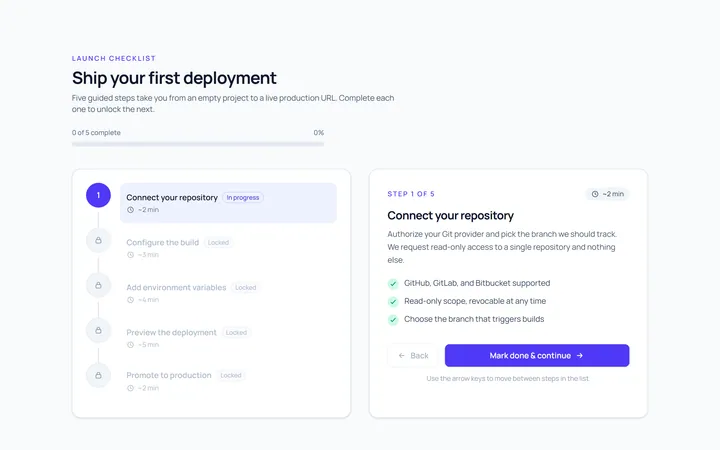
Vertical Stepper
Originalvertical stepper
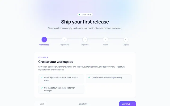
Numbered Stepper
Originalnumbered stepper with connectors
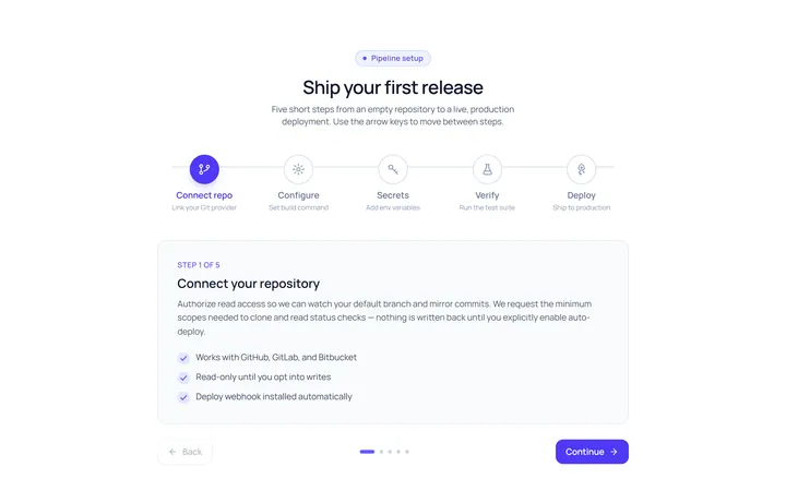
Icons Stepper
Originalicon stepper
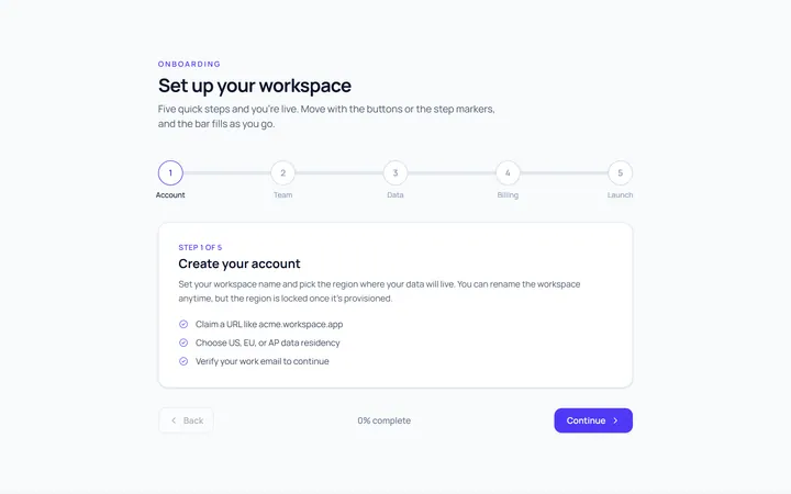
Progress Stepper
Originalstepper with progress fill
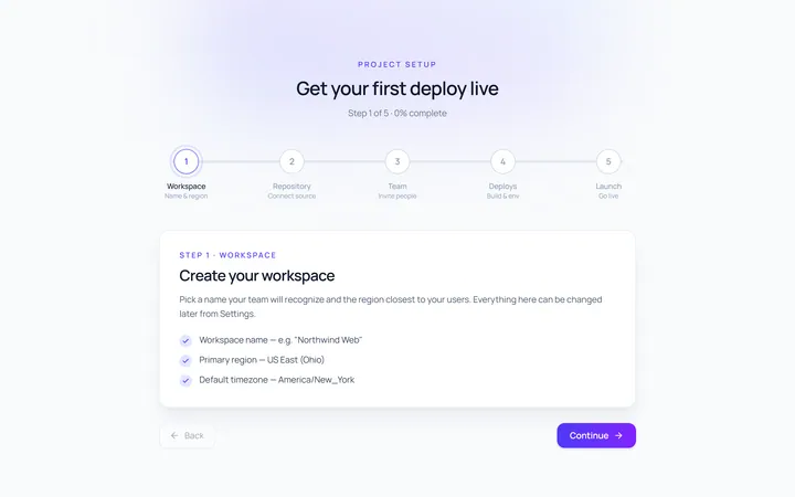
Dots Stepper
Originaldot stepper
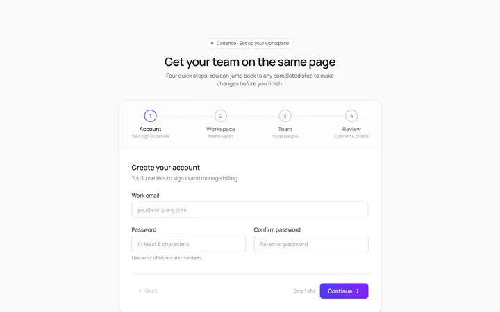
Wizard Stepper
Originalwizard stepper with next/back
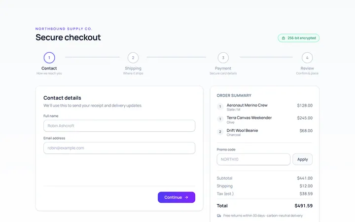
Checkout Stepper
Originalcheckout progress steps

Spotlight Hero
OriginalA centred hero with a soft radial spotlight, badge and dual call-to-action.

Split Hero
OriginalA two-column hero pairing a headline and CTAs with a product mock and social proof.

Gradient Spotlight Hero
OriginalA minimal centred hero with a soft gradient-mesh backdrop, announcement pill and dual call-to-action buttons.

App Preview Hero
OriginalA centred hero that pairs headline copy with a realistic product dashboard mock built entirely from markup, complete with browser chrome and a floating notification card.

Waitlist Capture Hero
OriginalA dark, focused hero with an inline email capture form and avatar social proof, ready for pre-launch waitlists.