

Progress Stepper
Original · freestepper with progress fill
Copy prompt gives Claude Code, Cursor or v0 a ready-to-paste prompt that recreates this exact component.
npx shadcn@latest add https://webinnoventix.com/r/step-progress.json"use client";
import { useRef, useState, type KeyboardEvent } from "react";
import { AnimatePresence, motion, useReducedMotion } from "motion/react";
type Step = {
id: string;
label: string;
title: string;
detail: string;
points: string[];
};
const steps: Step[] = [
{
id: "account",
label: "Account",
title: "Create your account",
detail:
"Set your workspace name and pick the region where your data will live. You can rename the workspace anytime, but the region is locked once it's provisioned.",
points: [
"Claim a URL like acme.workspace.app",
"Choose US, EU, or AP data residency",
"Verify your work email to continue",
],
},
{
id: "team",
label: "Team",
title: "Invite your team",
detail:
"Add the people you'll work alongside and give each a starting role. Invites stay valid for seven days and a seat is only billed once someone accepts.",
points: [
"Bulk-invite by pasting comma-separated emails",
"Assign Admin, Editor, or Viewer per person",
"Skip for now and invite from Settings later",
],
},
{
id: "data",
label: "Data",
title: "Connect a data source",
detail:
"Link a tool you already use so your dashboards fill in on day one. Every connection is read-only by default and can be revoked whenever you want.",
points: [
"One-click OAuth for Postgres, Stripe, and HubSpot",
"Or upload a CSV to get moving in seconds",
"The first sync usually finishes in under two minutes",
],
},
{
id: "billing",
label: "Billing",
title: "Choose a plan",
detail:
"Start the 14-day trial with no card required. Lock in annual pricing now, or decide later without losing a single thing you've set up.",
points: [
"Starter, Growth, and Scale tiers available",
"Switch or cancel anytime, prorated to the day",
"Nonprofit and education discounts on request",
],
},
{
id: "review",
label: "Launch",
title: "Review & launch",
detail:
"Everything checks out. Launching provisions your workspace, sends the pending invites, and kicks off the first data sync in the background.",
points: [
"Workspace name and region confirmed",
"Team invitations queued to send",
"Data source connected and ready to sync",
],
},
];
export default function StepProgress() {
const reduce = useReducedMotion();
const [current, setCurrent] = useState(0);
const [maxReached, setMaxReached] = useState(0);
const [launched, setLaunched] = useState(false);
const stepRefs = useRef<Array<HTMLButtonElement | null>>([]);
const last = steps.length - 1;
const fillPercent = launched ? 100 : (current / last) * 100;
const rounded = Math.round(fillPercent);
const goTo = (i: number) => {
if (launched || i < 0 || i > maxReached) return;
setCurrent(i);
};
const next = () => {
if (current < last) {
const n = current + 1;
setCurrent(n);
setMaxReached((m) => Math.max(m, n));
} else {
setLaunched(true);
}
};
const back = () => setCurrent((c) => Math.max(0, c - 1));
const reset = () => {
setLaunched(false);
setCurrent(0);
setMaxReached(0);
};
const onListKeyDown = (e: KeyboardEvent<HTMLOListElement>) => {
if (launched) return;
let target = current;
switch (e.key) {
case "ArrowRight":
case "ArrowDown":
target = Math.min(maxReached, current + 1);
break;
case "ArrowLeft":
case "ArrowUp":
target = Math.max(0, current - 1);
break;
case "Home":
target = 0;
break;
case "End":
target = maxReached;
break;
default:
return;
}
e.preventDefault();
setCurrent(target);
stepRefs.current[target]?.focus();
};
const contentTransition = reduce
? { duration: 0 }
: { duration: 0.3, ease: [0.22, 1, 0.36, 1] as const };
return (
<section className="relative w-full overflow-hidden bg-slate-50 px-4 py-16 sm:py-24 dark:bg-slate-950">
<style>{`
@keyframes sp_pop {
0% { transform: scale(0.4); opacity: 0; }
60% { transform: scale(1.15); }
100% { transform: scale(1); opacity: 1; }
}
@keyframes sp_ring {
0% { transform: scale(1); opacity: 0.5; }
70% { transform: scale(2); opacity: 0; }
100% { transform: scale(2); opacity: 0; }
}
@keyframes sp_sheen {
0% { transform: translateX(-120%); }
60%, 100% { transform: translateX(320%); }
}
.sp-check { animation: sp_pop 340ms cubic-bezier(0.34, 1.56, 0.64, 1) both; }
.sp-ring { animation: sp_ring 1900ms ease-out infinite; }
.sp-sheen { animation: sp_sheen 2600ms ease-in-out infinite; }
@media (prefers-reduced-motion: reduce) {
.sp-check, .sp-ring, .sp-sheen { animation: none !important; }
}
`}</style>
<div className="mx-auto max-w-3xl">
<header className="mb-12 text-center sm:text-left">
<p className="text-xs font-semibold uppercase tracking-[0.2em] text-indigo-600 dark:text-indigo-400">
Onboarding
</p>
<h2 className="mt-2 text-2xl font-bold tracking-tight text-slate-900 sm:text-3xl dark:text-white">
Set up your workspace
</h2>
<p className="mt-2 max-w-xl text-sm text-slate-600 sm:text-base dark:text-slate-400">
Five quick steps and you're live. Move with the buttons or the step
markers, and the bar fills as you go.
</p>
</header>
{/* Stepper */}
<div className="relative pb-9">
{/* Rail track */}
<div
aria-hidden="true"
className="pointer-events-none absolute inset-x-5 top-5 h-1.5 -translate-y-1/2 rounded-full bg-slate-200 dark:bg-slate-800"
/>
{/* Rail fill (progressbar) */}
<div
role="progressbar"
aria-label="Setup progress"
aria-valuemin={0}
aria-valuemax={100}
aria-valuenow={rounded}
className="pointer-events-none absolute inset-x-5 top-5 h-1.5 -translate-y-1/2 overflow-hidden rounded-full"
>
<motion.div
initial={false}
animate={{ width: `${fillPercent}%` }}
transition={
reduce ? { duration: 0 } : { type: "spring", stiffness: 140, damping: 24 }
}
className="relative h-full overflow-hidden rounded-full bg-gradient-to-r from-indigo-500 via-violet-500 to-sky-400"
>
<span
aria-hidden="true"
className="sp-sheen absolute inset-y-0 left-0 w-1/3 bg-gradient-to-r from-transparent via-white/60 to-transparent"
/>
</motion.div>
</div>
{/* Step markers */}
<ol
onKeyDown={onListKeyDown}
aria-label="Setup steps"
className="relative flex justify-between"
>
{steps.map((step, i) => {
const isComplete = launched || i < current;
const isCurrent = !launched && i === current;
const isReachable = !launched && i <= maxReached;
return (
<li key={step.id} className="relative flex w-10 flex-col items-center">
<span className="relative flex h-10 w-10 items-center justify-center">
{isCurrent && !reduce && (
<span
aria-hidden="true"
className="sp-ring pointer-events-none absolute inset-0 rounded-full bg-indigo-400/50 dark:bg-indigo-500/40"
/>
)}
<button
type="button"
ref={(el) => {
stepRefs.current[i] = el;
}}
onClick={() => goTo(i)}
disabled={!isReachable}
tabIndex={isCurrent || (launched && i === last) ? 0 : -1}
aria-current={isCurrent ? "step" : undefined}
aria-label={`Step ${i + 1} of ${steps.length}: ${step.title}${
isComplete ? ", completed" : isCurrent ? ", current" : ", not yet available"
}`}
className={[
"relative z-10 flex h-10 w-10 items-center justify-center rounded-full border text-sm font-semibold transition-colors duration-200",
"focus-visible:outline-none focus-visible:ring-2 focus-visible:ring-indigo-500 focus-visible:ring-offset-2 focus-visible:ring-offset-slate-50 dark:focus-visible:ring-offset-slate-950",
isReachable ? "cursor-pointer" : "cursor-not-allowed",
isComplete
? "border-emerald-500 bg-emerald-500 text-white"
: isCurrent
? "border-indigo-600 bg-white text-indigo-700 shadow-sm dark:bg-slate-900 dark:text-indigo-300"
: "border-slate-300 bg-white text-slate-400 dark:border-slate-700 dark:bg-slate-900 dark:text-slate-500",
].join(" ")}
>
{isComplete ? (
<svg
viewBox="0 0 24 24"
fill="none"
className="sp-check h-5 w-5"
aria-hidden="true"
>
<path
d="M20 6 9 17l-5-5"
stroke="currentColor"
strokeWidth={2.6}
strokeLinecap="round"
strokeLinejoin="round"
/>
</svg>
) : (
<span>{i + 1}</span>
)}
</button>
</span>
<span
className={[
"pointer-events-none absolute left-1/2 top-12 w-16 -translate-x-1/2 text-center text-[10px] font-medium sm:w-24 sm:text-xs",
isComplete
? "text-emerald-600 dark:text-emerald-400"
: isCurrent
? "text-slate-900 dark:text-white"
: "text-slate-400 dark:text-slate-500",
].join(" ")}
>
{step.label}
</span>
</li>
);
})}
</ol>
</div>
<p className="sr-only" aria-live="polite">
{launched
? "Workspace launched. Setup complete."
: `Step ${current + 1} of ${steps.length}: ${steps[current].title}`}
</p>
{/* Panel */}
<div className="mt-6 rounded-2xl border border-slate-200 bg-white p-6 shadow-sm sm:p-8 dark:border-slate-800 dark:bg-slate-900">
<AnimatePresence mode="wait" initial={false}>
{launched ? (
<motion.div
key="done"
initial={{ opacity: 0, y: reduce ? 0 : 8 }}
animate={{ opacity: 1, y: 0 }}
exit={{ opacity: 0, y: reduce ? 0 : -8 }}
transition={contentTransition}
className="flex flex-col items-center gap-4 py-6 text-center"
>
<span className="flex h-14 w-14 items-center justify-center rounded-full bg-emerald-500 text-white">
<svg viewBox="0 0 24 24" fill="none" className="sp-check h-7 w-7" aria-hidden="true">
<path
d="M20 6 9 17l-5-5"
stroke="currentColor"
strokeWidth={2.6}
strokeLinecap="round"
strokeLinejoin="round"
/>
</svg>
</span>
<div>
<h3 className="text-xl font-bold text-slate-900 dark:text-white">
Your workspace is live
</h3>
<p className="mx-auto mt-2 max-w-md text-sm text-slate-600 dark:text-slate-400">
Invitations are on their way and your first sync is running.
You'll get an email the moment your dashboards are ready.
</p>
</div>
<button
type="button"
onClick={reset}
className="mt-2 inline-flex items-center gap-2 rounded-xl border border-slate-300 bg-white px-5 py-2.5 text-sm font-semibold text-slate-700 transition-colors hover:bg-slate-50 focus-visible:outline-none focus-visible:ring-2 focus-visible:ring-indigo-500 focus-visible:ring-offset-2 focus-visible:ring-offset-white dark:border-slate-700 dark:bg-slate-900 dark:text-slate-200 dark:hover:bg-slate-800 dark:focus-visible:ring-offset-slate-900"
>
<svg viewBox="0 0 24 24" fill="none" className="h-4 w-4" aria-hidden="true">
<path
d="M3 12a9 9 0 1 0 3-6.7L3 8m0-5v5h5"
stroke="currentColor"
strokeWidth={1.8}
strokeLinecap="round"
strokeLinejoin="round"
/>
</svg>
Start over
</button>
</motion.div>
) : (
<motion.div
key={current}
initial={{ opacity: 0, y: reduce ? 0 : 8 }}
animate={{ opacity: 1, y: 0 }}
exit={{ opacity: 0, y: reduce ? 0 : -8 }}
transition={contentTransition}
>
<p className="text-xs font-semibold uppercase tracking-wider text-indigo-600 dark:text-indigo-400">
Step {current + 1} of {steps.length}
</p>
<h3 className="mt-1 text-xl font-bold text-slate-900 dark:text-white">
{steps[current].title}
</h3>
<p className="mt-2 text-sm leading-relaxed text-slate-600 dark:text-slate-400">
{steps[current].detail}
</p>
<ul className="mt-5 space-y-2.5">
{steps[current].points.map((point) => (
<li key={point} className="flex items-start gap-3 text-sm text-slate-700 dark:text-slate-300">
<svg
viewBox="0 0 24 24"
fill="none"
className="mt-0.5 h-4 w-4 flex-none text-indigo-500 dark:text-indigo-400"
aria-hidden="true"
>
<circle cx="12" cy="12" r="9" stroke="currentColor" strokeWidth={1.6} />
<path
d="m8.5 12 2.3 2.3 4.7-4.6"
stroke="currentColor"
strokeWidth={1.8}
strokeLinecap="round"
strokeLinejoin="round"
/>
</svg>
<span>{point}</span>
</li>
))}
</ul>
</motion.div>
)}
</AnimatePresence>
</div>
{/* Controls */}
{!launched && (
<div className="mt-8 flex items-center justify-between gap-4">
<button
type="button"
onClick={back}
disabled={current === 0}
className="inline-flex items-center gap-2 rounded-xl border border-slate-300 bg-white px-4 py-2.5 text-sm font-semibold text-slate-700 transition-colors hover:bg-slate-50 disabled:cursor-not-allowed disabled:opacity-40 focus-visible:outline-none focus-visible:ring-2 focus-visible:ring-indigo-500 focus-visible:ring-offset-2 focus-visible:ring-offset-slate-50 dark:border-slate-700 dark:bg-slate-900 dark:text-slate-200 dark:hover:bg-slate-800 dark:focus-visible:ring-offset-slate-950"
>
<svg viewBox="0 0 24 24" fill="none" className="h-4 w-4" aria-hidden="true">
<path
d="M15 18 9 12l6-6"
stroke="currentColor"
strokeWidth={1.9}
strokeLinecap="round"
strokeLinejoin="round"
/>
</svg>
Back
</button>
<span
aria-hidden="true"
className="text-sm font-medium tabular-nums text-slate-500 dark:text-slate-400"
>
{rounded}% complete
</span>
<button
type="button"
onClick={next}
className="inline-flex items-center gap-2 rounded-xl bg-indigo-600 px-5 py-2.5 text-sm font-semibold text-white shadow-sm transition-all hover:bg-indigo-500 active:scale-[0.98] focus-visible:outline-none focus-visible:ring-2 focus-visible:ring-indigo-500 focus-visible:ring-offset-2 focus-visible:ring-offset-slate-50 dark:focus-visible:ring-offset-slate-950"
>
{current === last ? "Launch workspace" : "Continue"}
<svg viewBox="0 0 24 24" fill="none" className="h-4 w-4" aria-hidden="true">
<path
d="M9 6l6 6-6 6"
stroke="currentColor"
strokeWidth={1.9}
strokeLinecap="round"
strokeLinejoin="round"
/>
</svg>
</button>
</div>
)}
</div>
</section>
);
}Dependencies
Licence
Built by Web Innoventix. Free for personal and commercial use, no attribution required.
Built by Web Innoventix
Need a custom interface, a full website, or SEO that gets you cited by AI? We design, build and rank it end to end.
Get a free quoteSimilar components
Browse all →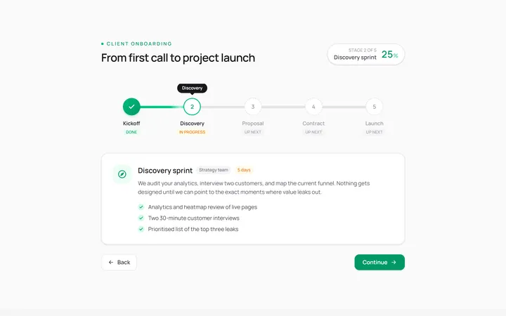
Horizontal Stepper
Originalhorizontal step indicator
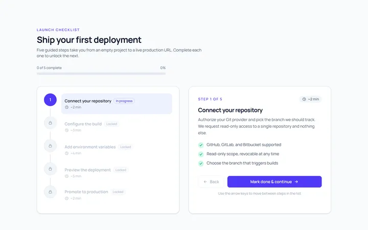
Vertical Stepper
Originalvertical stepper
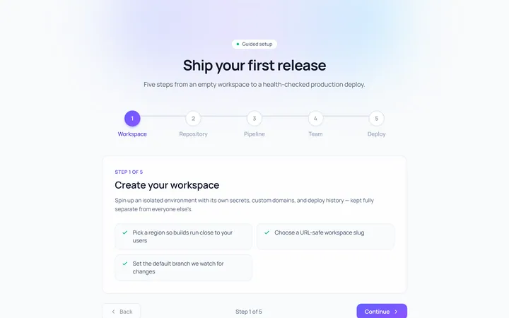
Numbered Stepper
Originalnumbered stepper with connectors
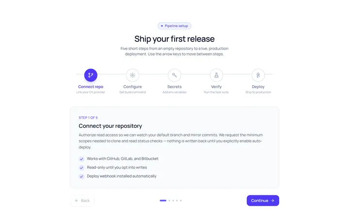
Icons Stepper
Originalicon stepper
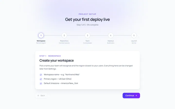
Dots Stepper
Originaldot stepper
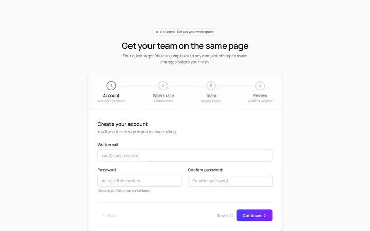
Wizard Stepper
Originalwizard stepper with next/back
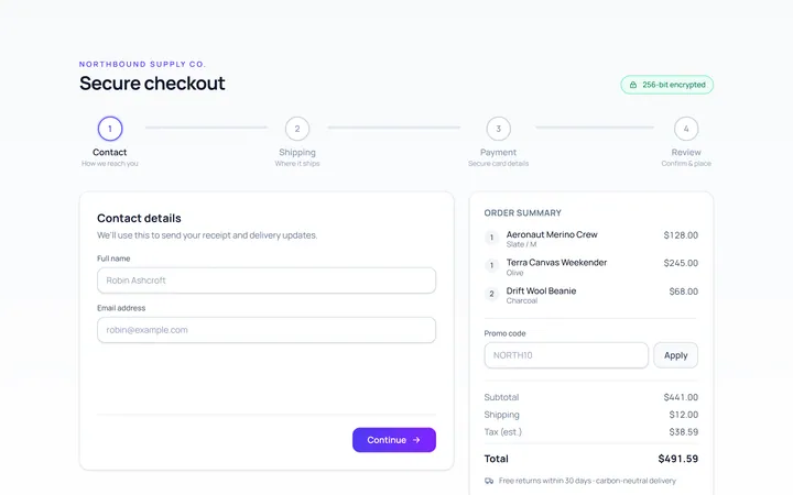
Checkout Stepper
Originalcheckout progress steps

Spotlight Hero
OriginalA centred hero with a soft radial spotlight, badge and dual call-to-action.

Split Hero
OriginalA two-column hero pairing a headline and CTAs with a product mock and social proof.

Gradient Spotlight Hero
OriginalA minimal centred hero with a soft gradient-mesh backdrop, announcement pill and dual call-to-action buttons.

App Preview Hero
OriginalA centred hero that pairs headline copy with a realistic product dashboard mock built entirely from markup, complete with browser chrome and a floating notification card.

Waitlist Capture Hero
OriginalA dark, focused hero with an inline email capture form and avatar social proof, ready for pre-launch waitlists.