

FAQ Two Col Accordion
Original · freeA two-column FAQ accordion layout.
Copy prompt gives Claude Code, Cursor or v0 a ready-to-paste prompt that recreates this exact component.
npx shadcn@latest add https://webinnoventix.com/r/accordion-faq-two-col.json"use client";
import { useId, useState } from "react";
type FaqItem = {
q: string;
a: string;
};
const LEFT_COLUMN: FaqItem[] = [
{
q: "How long does a typical website build take?",
a: "Most marketing sites ship in 3 to 5 weeks. A one-page launch site can go live in about 8 days, while a multi-template site with a CMS and custom animations usually runs 6 to 8 weeks. You get a dated milestone plan on day one so nothing slips quietly.",
},
{
q: "Do I own the code and design files after launch?",
a: "Yes, fully. On final payment we transfer the Git repository, the Figma source, and every asset license to your accounts. There is no vendor lock-in and no monthly ransom to keep your own site online.",
},
{
q: "Can you work with our existing brand guidelines?",
a: "Absolutely. Send over your logo, type scale, and color tokens and we build inside those constraints. If your guidelines are thin, we extend them into a small design system so every future page stays on-brand without guesswork.",
},
{
q: "What do you need from me to get started?",
a: "A short kickoff call, access to your domain and hosting, any existing copy or brand assets, and one decision-maker who can approve milestones. We handle the rest, from wireframes to deployment.",
},
];
const RIGHT_COLUMN: FaqItem[] = [
{
q: "Is the site optimized for search and speed?",
a: "Every build ships with semantic HTML, image compression, lazy loading, and a Lighthouse pass targeting 90+ on performance and SEO. We wire up meta tags, structured data, and a sitemap before we call it done.",
},
{
q: "Will the site be responsive on phones and tablets?",
a: "Mobile-first is the default, not an add-on. We design at 375px first and scale up, then test on real devices across iOS and Android so buttons stay tappable and text stays readable everywhere.",
},
{
q: "Do you offer support after the site goes live?",
a: "Yes. Every project includes 30 days of free bug fixes, and we offer optional monthly care plans covering updates, backups, uptime monitoring, and small content edits so you are never stuck.",
},
{
q: "How does pricing and payment work?",
a: "You get a fixed quote after the scoping call, split into a 40% deposit and a 60% balance on launch. No hourly surprises. If scope changes mid-project, we flag the cost before doing the work.",
},
];
function AccordionRow({
item,
isOpen,
onToggle,
}: {
item: FaqItem;
isOpen: boolean;
onToggle: () => void;
}) {
const baseId = useId();
const buttonId = `${baseId}-btn`;
const panelId = `${baseId}-panel`;
return (
<div className="overflow-hidden rounded-2xl border border-slate-200 bg-white/70 transition-colors duration-300 hover:border-indigo-300 dark:border-slate-800 dark:bg-slate-900/50 dark:hover:border-indigo-500/60">
<h3 className="m-0">
<button
type="button"
id={buttonId}
aria-expanded={isOpen}
aria-controls={panelId}
onClick={onToggle}
className="flex w-full items-center justify-between gap-4 px-5 py-4 text-left text-[0.975rem] font-semibold text-slate-900 outline-none transition-colors duration-200 focus-visible:ring-2 focus-visible:ring-indigo-500 focus-visible:ring-offset-2 focus-visible:ring-offset-white dark:text-slate-100 dark:focus-visible:ring-offset-slate-950"
>
<span>{item.q}</span>
<span
aria-hidden="true"
className={`grid h-7 w-7 shrink-0 place-items-center rounded-full border transition-all duration-300 ${
isOpen
? "rotate-180 border-indigo-500 bg-indigo-500 text-white dark:border-indigo-400 dark:bg-indigo-500"
: "border-slate-300 bg-transparent text-slate-500 dark:border-slate-700 dark:text-slate-400"
}`}
>
<svg
width="14"
height="14"
viewBox="0 0 24 24"
fill="none"
stroke="currentColor"
strokeWidth="2.5"
strokeLinecap="round"
strokeLinejoin="round"
>
<path d="m6 9 6 6 6-6" />
</svg>
</span>
</button>
</h3>
<div
id={panelId}
role="region"
aria-labelledby={buttonId}
className="grid transition-[grid-template-rows] duration-300 ease-out"
style={{ gridTemplateRows: isOpen ? "1fr" : "0fr" }}
>
<div className="overflow-hidden">
<p className="m-0 px-5 pb-5 pt-0 text-[0.9rem] leading-relaxed text-slate-600 dark:text-slate-400">
{item.a}
</p>
</div>
</div>
</div>
);
}
export default function AccordionFaqTwoCol() {
const styleId = "afqtc-anim";
const [openKey, setOpenKey] = useState<string | null>("L-0");
const toggle = (key: string) => {
setOpenKey((prev) => (prev === key ? null : key));
};
return (
<section className="relative w-full overflow-hidden bg-slate-50 px-6 py-20 sm:py-28 dark:bg-slate-950">
<style>{`
@keyframes afqtc-rise {
0% { opacity: 0; transform: translateY(16px); }
100% { opacity: 1; transform: translateY(0); }
}
.afqtc-rise { animation: afqtc-rise 0.6s cubic-bezier(0.22, 1, 0.36, 1) both; }
@media (prefers-reduced-motion: reduce) {
.afqtc-rise { animation: none; }
}
`}</style>
<span id={styleId} className="hidden" aria-hidden="true" />
<div
aria-hidden="true"
className="pointer-events-none absolute left-1/2 top-0 h-72 w-72 -translate-x-1/2 rounded-full bg-indigo-300/25 blur-3xl dark:bg-indigo-600/15"
/>
<div className="relative mx-auto max-w-5xl">
<div className="afqtc-rise mx-auto mb-14 max-w-2xl text-center">
<span className="inline-flex items-center gap-2 rounded-full border border-indigo-200 bg-indigo-50 px-3 py-1 text-xs font-semibold uppercase tracking-wide text-indigo-700 dark:border-indigo-500/30 dark:bg-indigo-500/10 dark:text-indigo-300">
<span className="h-1.5 w-1.5 rounded-full bg-indigo-500" />
Support
</span>
<h2 className="mt-4 text-3xl font-bold tracking-tight text-slate-900 sm:text-4xl dark:text-white">
Frequently asked questions
</h2>
<p className="mt-3 text-base text-slate-600 dark:text-slate-400">
Everything you need to know before we start building. Still curious?
Reach out and a human will answer within a day.
</p>
</div>
<div className="grid gap-4 md:grid-cols-2 md:gap-5">
<div className="flex flex-col gap-4">
{LEFT_COLUMN.map((item, i) => {
const key = `L-${i}`;
return (
<AccordionRow
key={key}
item={item}
isOpen={openKey === key}
onToggle={() => toggle(key)}
/>
);
})}
</div>
<div className="flex flex-col gap-4">
{RIGHT_COLUMN.map((item, i) => {
const key = `R-${i}`;
return (
<AccordionRow
key={key}
item={item}
isOpen={openKey === key}
onToggle={() => toggle(key)}
/>
);
})}
</div>
</div>
</div>
</section>
);
}Dependencies
Licence
Built by Web Innoventix. Free for personal and commercial use, no attribution required.
Built by Web Innoventix
Need a custom interface, a full website, or SEO that gets you cited by AI? We design, build and rank it end to end.
Get a free quoteSimilar components
Browse all →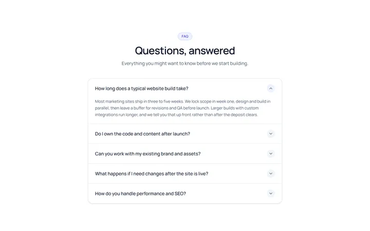
Simple Accordion
OriginalA clean single-column accordion, one panel open at a time, chevron rotates.
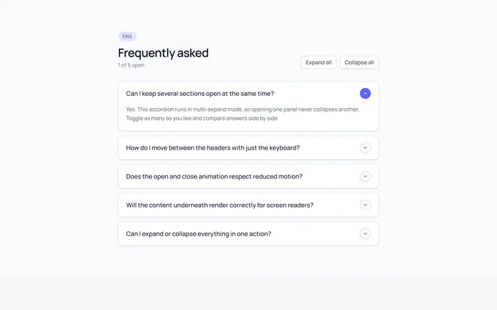
Multi Accordion
OriginalAn accordion where multiple panels can be open at once.
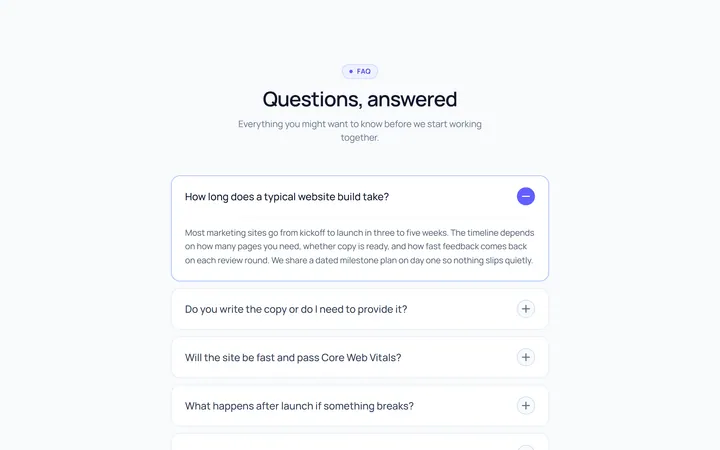
Plus Minus Accordion
OriginalAccordion with a plus/minus icon that toggles per item.
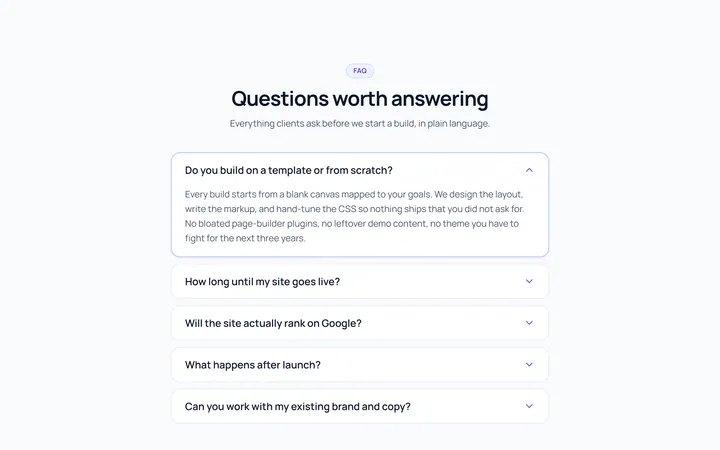
Bordered Accordion
OriginalBordered card-style accordion panels with rounded corners.
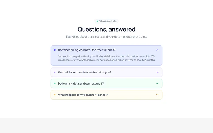
Filled Accordion
OriginalFilled, tinted accordion panels; the active one is highlighted.
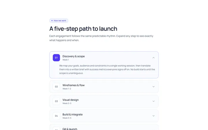
Numbered Accordion
OriginalA numbered-step accordion (01, 02, 03...).
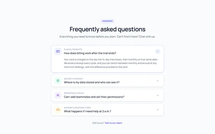
Icon Left Accordion
OriginalAccordion with a leading icon per item and a right chevron.
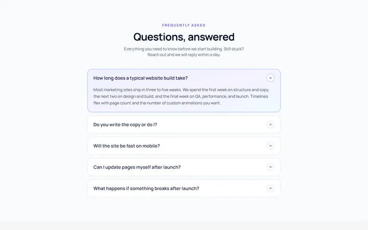
Gradient Active Accordion
OriginalAccordion where the open panel gets a soft gradient background.
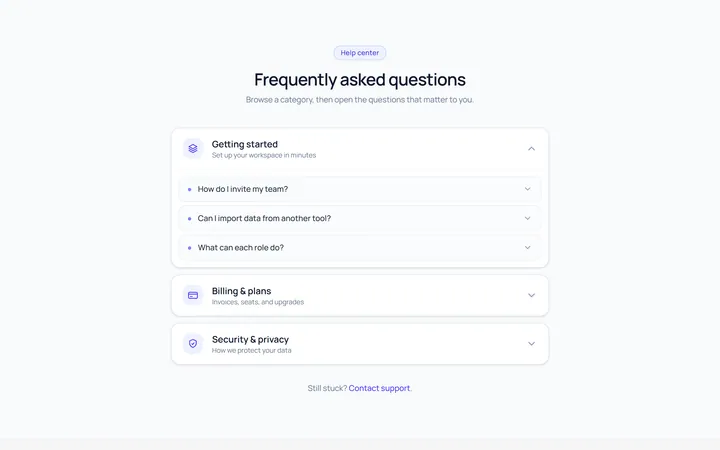
Nested Accordion
OriginalAn accordion with nested sub-accordions.
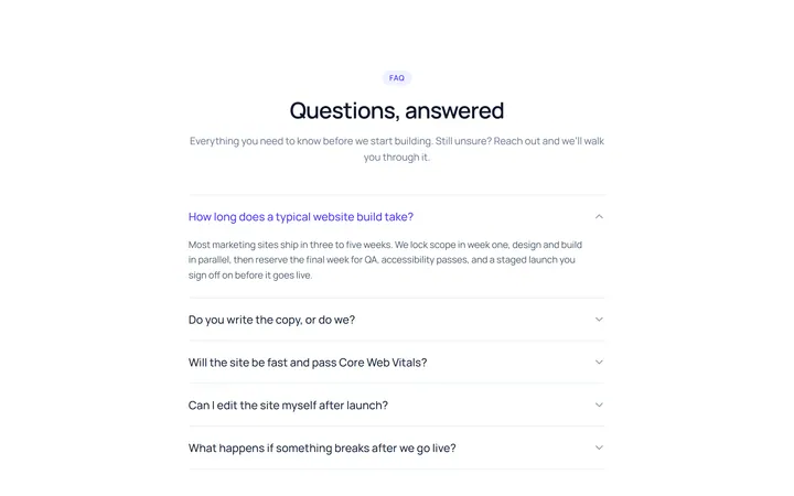
Flush Accordion
OriginalA borderless, flush accordion separated by hairlines.
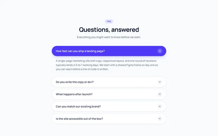
Pill Accordion
OriginalAccordion with rounded pill-shaped headers.
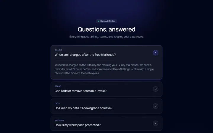
Dark Card Accordion
OriginalA dark, glassy card accordion.