

Plus Minus Accordion
Original · freeAccordion with a plus/minus icon that toggles per item.
Copy prompt gives Claude Code, Cursor or v0 a ready-to-paste prompt that recreates this exact component.
npx shadcn@latest add https://webinnoventix.com/r/accordion-plus-minus.json"use client";
import { useId, useRef, useState, type KeyboardEvent } from "react";
type FaqItem = {
q: string;
a: string;
};
const ITEMS: FaqItem[] = [
{
q: "How long does a typical website build take?",
a: "Most marketing sites go from kickoff to launch in three to five weeks. The timeline depends on how many pages you need, whether copy is ready, and how fast feedback comes back on each review round. We share a dated milestone plan on day one so nothing slips quietly.",
},
{
q: "Do you write the copy or do I need to provide it?",
a: "Either works. We can start from your existing content and sharpen it, or write everything from scratch after a short strategy call. Pages that lead with a clear outcome and one strong call to action convert far better than feature lists, so we steer toward that.",
},
{
q: "Will the site be fast and pass Core Web Vitals?",
a: "Yes. We ship hand-tuned HTML, CSS, and minimal JavaScript, compress every image to modern formats, and lazy-load anything below the fold. Every build is measured against Google's LCP, INP, and CLS thresholds on a throttled mobile connection before it goes live.",
},
{
q: "What happens after launch if something breaks?",
a: "You get thirty days of included support to catch anything that surfaces once real traffic arrives. After that you can keep us on a light monthly retainer for updates and monitoring, or take the keys entirely — the code is yours, documented, and dependency-light.",
},
{
q: "Can you improve a site I already have instead of rebuilding?",
a: "Often, yes. We start with an audit of speed, structure, and conversion friction, then tell you honestly whether targeted fixes will get you there or a rebuild is the better spend. We would rather save you money than sell a project you don't need.",
},
];
export default function AccordionPlusMinus() {
const [open, setOpen] = useState<Set<number>>(() => new Set([0]));
const uid = useId();
const btnRefs = useRef<(HTMLButtonElement | null)[]>([]);
const toggle = (i: number) => {
setOpen((prev) => {
const next = new Set(prev);
if (next.has(i)) next.delete(i);
else next.add(i);
return next;
});
};
const onKeyDown = (e: KeyboardEvent<HTMLButtonElement>, i: number) => {
const last = ITEMS.length - 1;
let target: number | null = null;
if (e.key === "ArrowDown") target = i === last ? 0 : i + 1;
else if (e.key === "ArrowUp") target = i === 0 ? last : i - 1;
else if (e.key === "Home") target = 0;
else if (e.key === "End") target = last;
if (target !== null) {
e.preventDefault();
btnRefs.current[target]?.focus();
}
};
return (
<section className="relative w-full bg-slate-50 px-5 py-20 dark:bg-slate-950 sm:px-8 sm:py-28">
<style>{`
@keyframes accpm-reveal {
from { opacity: 0; transform: translateY(-4px); }
to { opacity: 1; transform: translateY(0); }
}
.accpm-panel[data-open="true"] .accpm-inner {
animation: accpm-reveal 260ms cubic-bezier(0.22, 1, 0.36, 1);
}
@media (prefers-reduced-motion: reduce) {
.accpm-panel[data-open="true"] .accpm-inner { animation: none; }
.accpm-grid, .accpm-bar, .accpm-chev { transition: none !important; }
}
`}</style>
<div className="mx-auto max-w-2xl">
<div className="mb-10 text-center sm:mb-14">
<span className="inline-flex items-center gap-2 rounded-full border border-indigo-200 bg-indigo-50 px-3 py-1 text-xs font-semibold uppercase tracking-wider text-indigo-700 dark:border-indigo-500/25 dark:bg-indigo-500/10 dark:text-indigo-300">
<span className="h-1.5 w-1.5 rounded-full bg-indigo-500" />
FAQ
</span>
<h2 className="mt-4 text-3xl font-semibold tracking-tight text-slate-900 dark:text-white sm:text-4xl">
Questions, answered
</h2>
<p className="mx-auto mt-3 max-w-md text-base text-slate-500 dark:text-slate-400">
Everything you might want to know before we start working together.
</p>
</div>
<ul className="flex flex-col gap-3">
{ITEMS.map((item, i) => {
const isOpen = open.has(i);
const btnId = `${uid}-btn-${i}`;
const panelId = `${uid}-panel-${i}`;
return (
<li
key={item.q}
className={`group overflow-hidden rounded-2xl border bg-white transition-colors duration-200 dark:bg-slate-900/60 ${
isOpen
? "border-indigo-300 shadow-sm shadow-indigo-100/60 dark:border-indigo-500/40 dark:shadow-none"
: "border-slate-200 hover:border-slate-300 dark:border-slate-800 dark:hover:border-slate-700"
}`}
>
<h3 className="m-0">
<button
ref={(el) => {
btnRefs.current[i] = el;
}}
id={btnId}
type="button"
aria-expanded={isOpen}
aria-controls={panelId}
onClick={() => toggle(i)}
onKeyDown={(e) => onKeyDown(e, i)}
className="flex w-full items-center gap-4 px-5 py-4 text-left outline-none transition-colors focus-visible:ring-2 focus-visible:ring-indigo-500 focus-visible:ring-offset-2 focus-visible:ring-offset-white dark:focus-visible:ring-offset-slate-900 sm:px-6 sm:py-5"
>
<span
className={`flex-1 text-base font-medium transition-colors sm:text-lg ${
isOpen
? "text-slate-900 dark:text-white"
: "text-slate-700 dark:text-slate-200"
}`}
>
{item.q}
</span>
<span
aria-hidden="true"
className={`relative flex h-8 w-8 shrink-0 items-center justify-center rounded-full border transition-colors duration-200 ${
isOpen
? "border-indigo-500 bg-indigo-500 text-white"
: "border-slate-300 bg-slate-50 text-slate-500 group-hover:border-slate-400 dark:border-slate-700 dark:bg-slate-800 dark:text-slate-400"
}`}
>
<span className="absolute h-0.5 w-3.5 rounded-full bg-current" />
<span
className={`accpm-bar absolute h-3.5 w-0.5 rounded-full bg-current transition-transform duration-300 ${
isOpen ? "scale-y-0" : "scale-y-100"
}`}
/>
</span>
</button>
</h3>
<div
id={panelId}
role="region"
aria-labelledby={btnId}
hidden={!isOpen}
data-open={isOpen}
className="accpm-panel accpm-grid grid transition-[grid-template-rows] duration-300 ease-out"
style={{ gridTemplateRows: isOpen ? "1fr" : "0fr" }}
>
<div className="min-h-0 overflow-hidden">
<div className="accpm-inner px-5 pb-5 sm:px-6 sm:pb-6">
<p className="border-t border-slate-100 pt-4 text-[15px] leading-relaxed text-slate-600 dark:border-slate-800 dark:text-slate-400">
{item.a}
</p>
</div>
</div>
</div>
</li>
);
})}
</ul>
<p className="mt-8 text-center text-sm text-slate-500 dark:text-slate-400">
Still unsure?{" "}
<a
href="#contact"
className="font-semibold text-indigo-600 underline-offset-4 hover:underline dark:text-indigo-400"
>
Send us the question directly
</a>
.
</p>
</div>
</section>
);
}Dependencies
Licence
Built by Web Innoventix. Free for personal and commercial use, no attribution required.
Built by Web Innoventix
Need a custom interface, a full website, or SEO that gets you cited by AI? We design, build and rank it end to end.
Get a free quoteSimilar components
Browse all →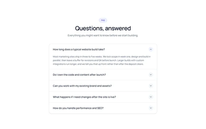
Simple Accordion
OriginalA clean single-column accordion, one panel open at a time, chevron rotates.
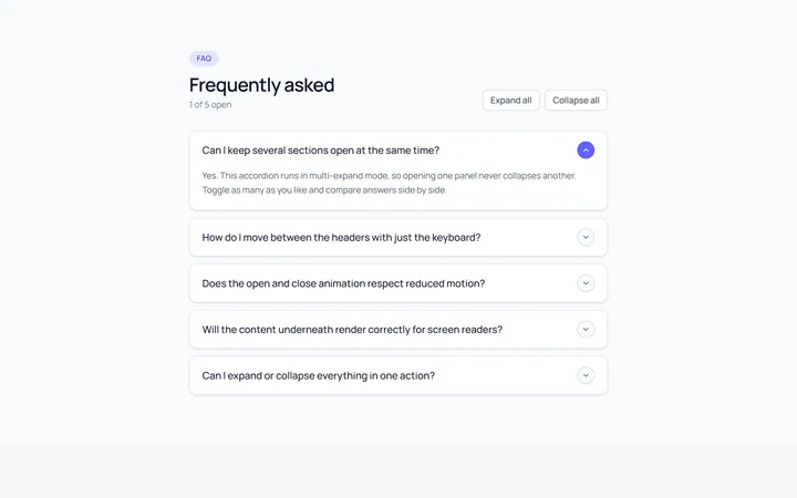
Multi Accordion
OriginalAn accordion where multiple panels can be open at once.
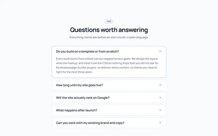
Bordered Accordion
OriginalBordered card-style accordion panels with rounded corners.
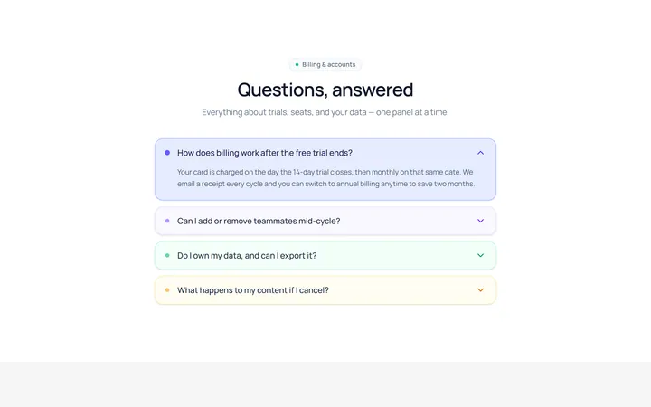
Filled Accordion
OriginalFilled, tinted accordion panels; the active one is highlighted.
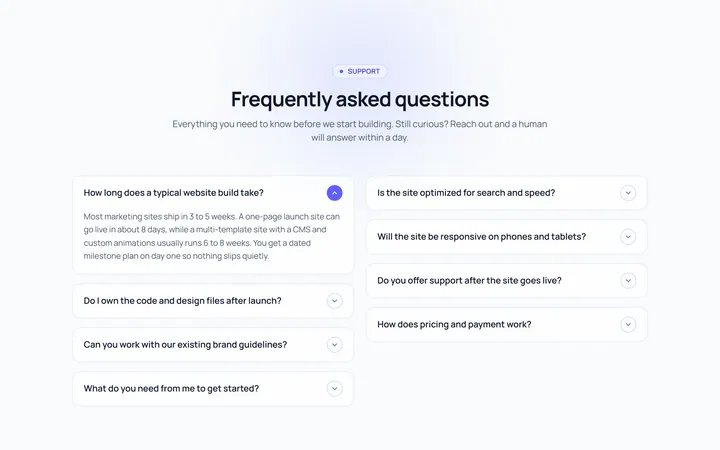
FAQ Two Col Accordion
OriginalA two-column FAQ accordion layout.
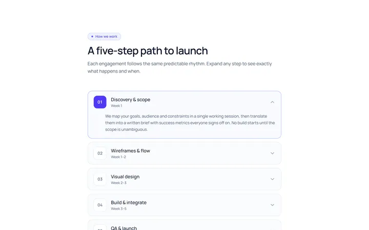
Numbered Accordion
OriginalA numbered-step accordion (01, 02, 03...).
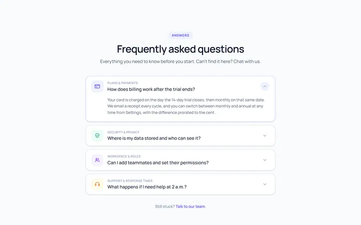
Icon Left Accordion
OriginalAccordion with a leading icon per item and a right chevron.
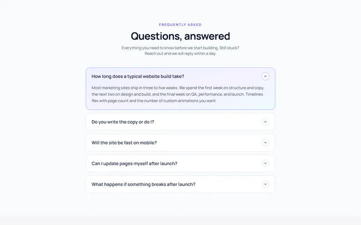
Gradient Active Accordion
OriginalAccordion where the open panel gets a soft gradient background.
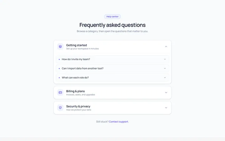
Nested Accordion
OriginalAn accordion with nested sub-accordions.
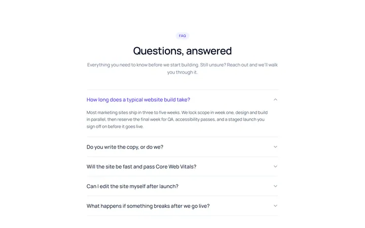
Flush Accordion
OriginalA borderless, flush accordion separated by hairlines.
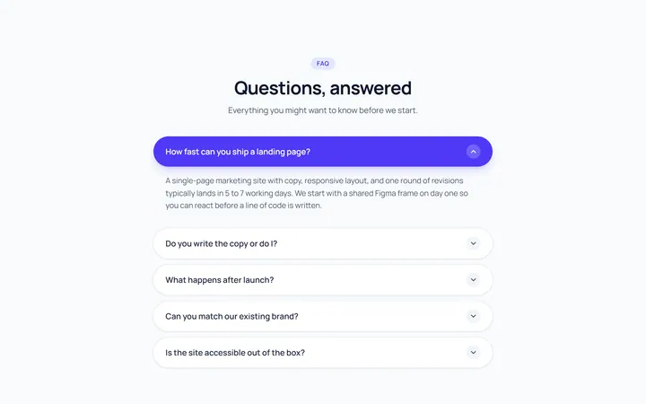
Pill Accordion
OriginalAccordion with rounded pill-shaped headers.
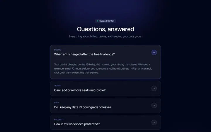
Dark Card Accordion
OriginalA dark, glassy card accordion.