

Pill Accordion
Original · freeAccordion with rounded pill-shaped headers.
Copy prompt gives Claude Code, Cursor or v0 a ready-to-paste prompt that recreates this exact component.
npx shadcn@latest add https://webinnoventix.com/r/accordion-pill.json"use client";
import { useId, useRef, useState, type KeyboardEvent } from "react";
type PillItem = {
q: string;
a: string;
};
const ITEMS: PillItem[] = [
{
q: "How fast can you ship a landing page?",
a: "A single-page marketing site with copy, responsive layout, and one round of revisions typically lands in 5 to 7 working days. We start with a shared Figma frame on day one so you can react before a line of code is written.",
},
{
q: "Do you write the copy or do I?",
a: "Either works. Most clients hand us rough bullet points and we shape the headlines, section flow, and CTA language. If you already have a copywriter, we build cleanly around their draft and flag anything that fights the layout.",
},
{
q: "What happens after launch?",
a: "You get the full source, a deploy walkthrough, and 14 days of free bug fixes. After that we offer a monthly care plan for updates, performance monitoring, and small content changes, cancellable any time.",
},
{
q: "Can you match our existing brand?",
a: "Yes. Send your logo, fonts, and color tokens and we mirror them exactly. If your brand guide is thin, we can extend it, propose a type scale, spacing system, and dark mode, without straying from your identity.",
},
{
q: "Is the site accessible out of the box?",
a: "We build to WCAG 2.1 AA: keyboard-navigable, screen-reader labelled, sufficient contrast in both themes, and reduced-motion support. Accessibility is part of the base price, never an upsell.",
},
];
export default function AccordionPill() {
const [open, setOpen] = useState<number | null>(0);
const uid = useId();
const btnRefs = useRef<Array<HTMLButtonElement | null>>([]);
const toggle = (i: number) => setOpen((cur) => (cur === i ? null : i));
const onKeyDown = (e: KeyboardEvent<HTMLButtonElement>, i: number) => {
const last = ITEMS.length - 1;
let next: number | null = null;
if (e.key === "ArrowDown") next = i === last ? 0 : i + 1;
else if (e.key === "ArrowUp") next = i === 0 ? last : i - 1;
else if (e.key === "Home") next = 0;
else if (e.key === "End") next = last;
if (next !== null) {
e.preventDefault();
btnRefs.current[next]?.focus();
}
};
return (
<section className="relative w-full bg-slate-50 px-5 py-20 dark:bg-slate-950 sm:px-8 sm:py-28">
<style>{`
@keyframes accpill-reveal {
from { opacity: 0; transform: translateY(-4px); }
to { opacity: 1; transform: translateY(0); }
}
@media (prefers-reduced-motion: reduce) {
.accpill-panel { animation: none !important; }
.accpill-chev { transition: none !important; }
}
`}</style>
<div className="mx-auto w-full max-w-2xl">
<div className="mb-10 text-center">
<span className="inline-block rounded-full bg-indigo-100 px-3 py-1 text-xs font-semibold uppercase tracking-wider text-indigo-700 dark:bg-indigo-500/15 dark:text-indigo-300">
FAQ
</span>
<h2 className="mt-4 text-3xl font-bold tracking-tight text-slate-900 dark:text-white sm:text-4xl">
Questions, answered
</h2>
<p className="mt-3 text-base text-slate-600 dark:text-slate-400">
Everything you might want to know before we start.
</p>
</div>
<ul className="space-y-3">
{ITEMS.map((item, i) => {
const isOpen = open === i;
const headerId = `${uid}-h-${i}`;
const panelId = `${uid}-p-${i}`;
return (
<li key={item.q}>
<button
ref={(el) => {
btnRefs.current[i] = el;
}}
id={headerId}
type="button"
aria-expanded={isOpen}
aria-controls={panelId}
onClick={() => toggle(i)}
onKeyDown={(e) => onKeyDown(e, i)}
className={`group flex w-full items-center justify-between gap-4 rounded-full px-6 py-4 text-left transition-colors duration-200 focus:outline-none focus-visible:ring-2 focus-visible:ring-indigo-500 focus-visible:ring-offset-2 focus-visible:ring-offset-slate-50 dark:focus-visible:ring-offset-slate-950 ${
isOpen
? "bg-indigo-600 text-white shadow-lg shadow-indigo-600/20 dark:bg-indigo-500"
: "bg-white text-slate-800 shadow-sm ring-1 ring-slate-200 hover:bg-slate-100 hover:ring-slate-300 dark:bg-slate-900 dark:text-slate-100 dark:ring-slate-800 dark:hover:bg-slate-800"
}`}
>
<span className="text-base font-semibold">{item.q}</span>
<span
className={`accpill-chev grid h-7 w-7 shrink-0 place-items-center rounded-full transition-all duration-300 ${
isOpen
? "rotate-180 bg-white/20"
: "bg-slate-100 group-hover:bg-slate-200 dark:bg-slate-800 dark:group-hover:bg-slate-700"
}`}
aria-hidden="true"
>
<svg
viewBox="0 0 24 24"
className={`h-4 w-4 ${isOpen ? "text-white" : "text-slate-600 dark:text-slate-300"}`}
fill="none"
stroke="currentColor"
strokeWidth="2.5"
strokeLinecap="round"
strokeLinejoin="round"
>
<path d="m6 9 6 6 6-6" />
</svg>
</span>
</button>
{isOpen && (
<div
id={panelId}
role="region"
aria-labelledby={headerId}
className="accpill-panel px-6 pb-5 pt-4"
style={{ animation: "accpill-reveal 0.24s ease-out" }}
>
<p className="text-[0.95rem] leading-relaxed text-slate-600 dark:text-slate-400">
{item.a}
</p>
</div>
)}
</li>
);
})}
</ul>
</div>
</section>
);
}Dependencies
Licence
Built by Web Innoventix. Free for personal and commercial use, no attribution required.
Built by Web Innoventix
Need a custom interface, a full website, or SEO that gets you cited by AI? We design, build and rank it end to end.
Get a free quoteSimilar components
Browse all →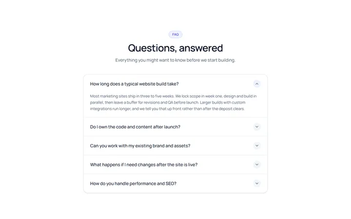
Simple Accordion
OriginalA clean single-column accordion, one panel open at a time, chevron rotates.
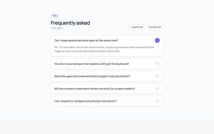
Multi Accordion
OriginalAn accordion where multiple panels can be open at once.
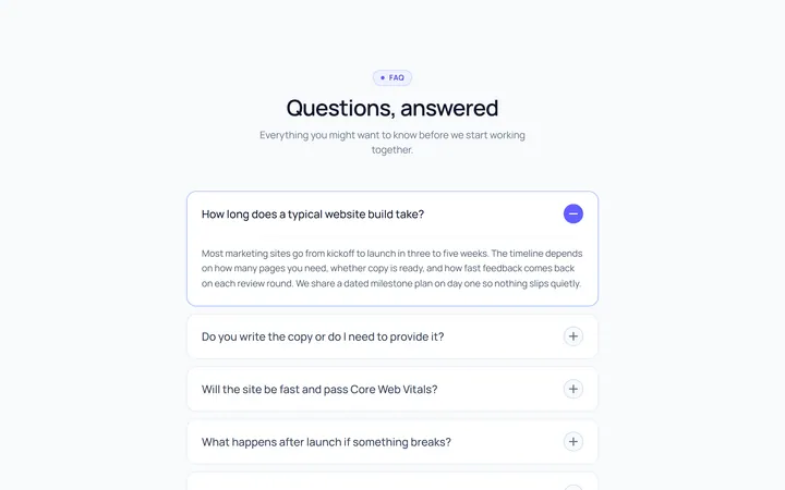
Plus Minus Accordion
OriginalAccordion with a plus/minus icon that toggles per item.
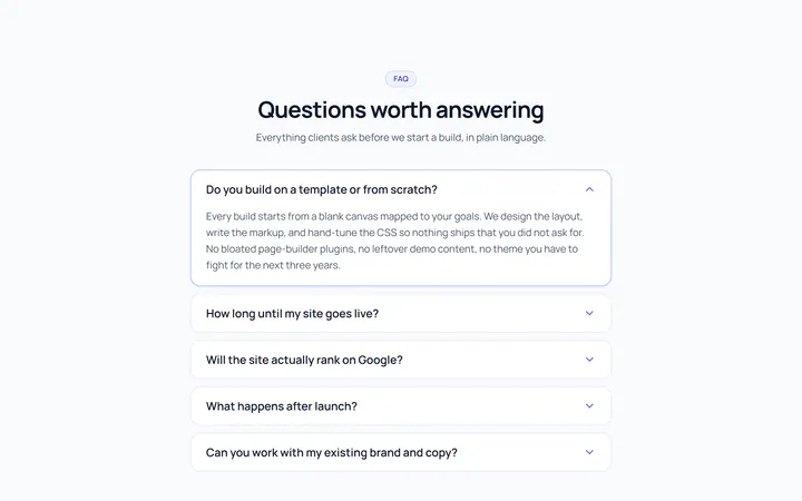
Bordered Accordion
OriginalBordered card-style accordion panels with rounded corners.
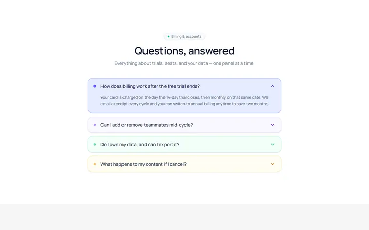
Filled Accordion
OriginalFilled, tinted accordion panels; the active one is highlighted.
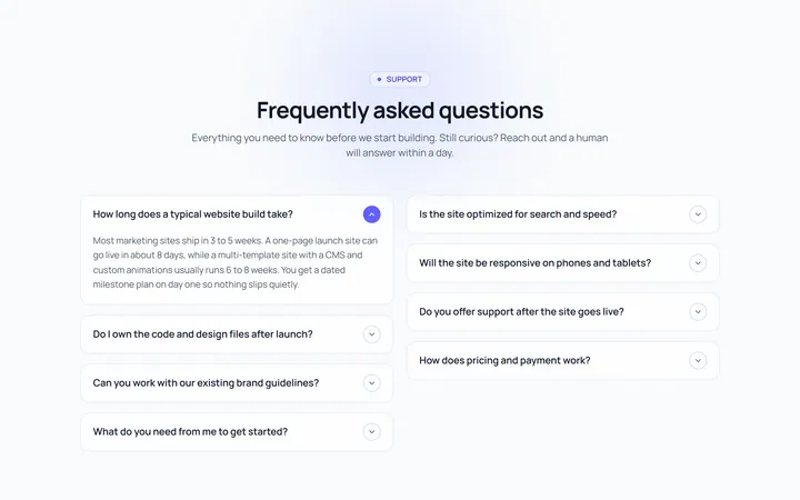
FAQ Two Col Accordion
OriginalA two-column FAQ accordion layout.
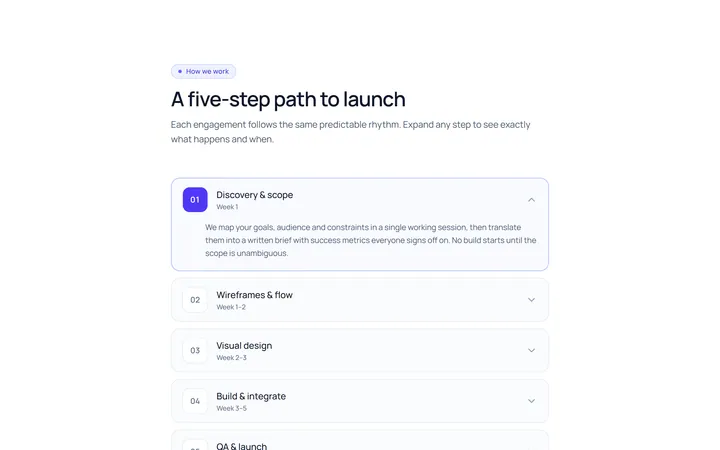
Numbered Accordion
OriginalA numbered-step accordion (01, 02, 03...).
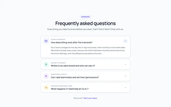
Icon Left Accordion
OriginalAccordion with a leading icon per item and a right chevron.
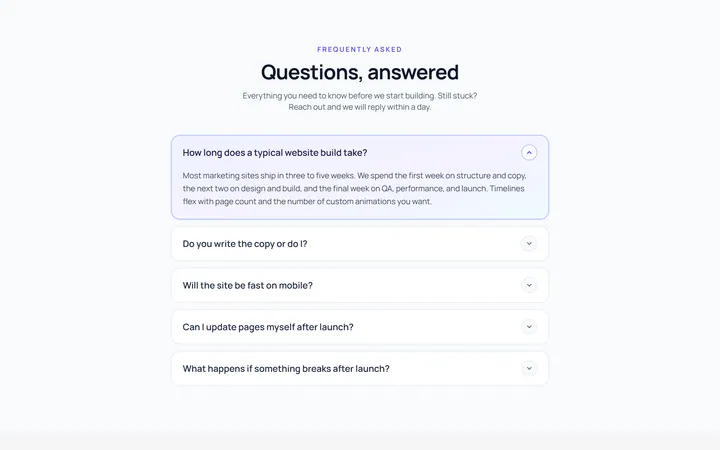
Gradient Active Accordion
OriginalAccordion where the open panel gets a soft gradient background.
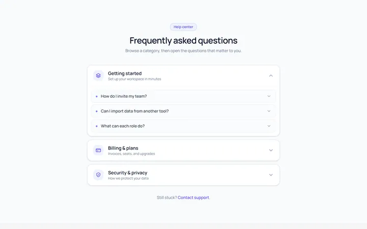
Nested Accordion
OriginalAn accordion with nested sub-accordions.
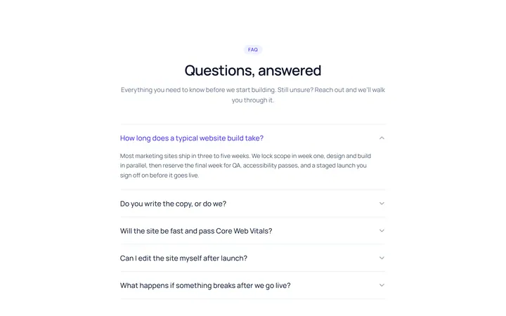
Flush Accordion
OriginalA borderless, flush accordion separated by hairlines.
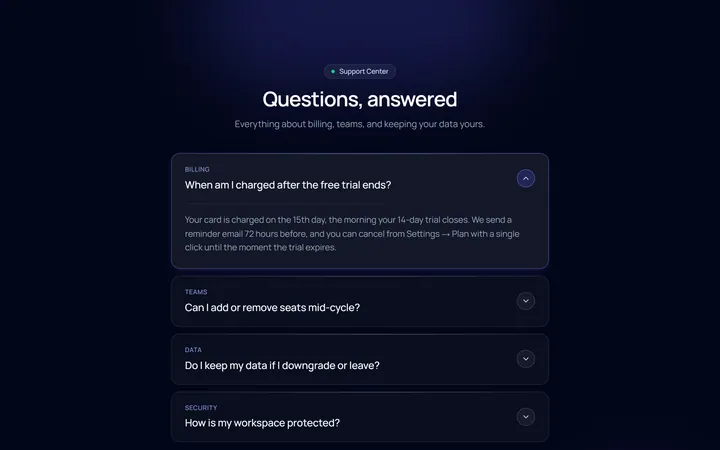
Dark Card Accordion
OriginalA dark, glassy card accordion.