

Gradient Active Accordion
Original · freeAccordion where the open panel gets a soft gradient background.
Copy prompt gives Claude Code, Cursor or v0 a ready-to-paste prompt that recreates this exact component.
npx shadcn@latest add https://webinnoventix.com/r/accordion-gradient-active.json"use client";
import { useId, useState } from "react";
type Item = {
question: string;
answer: string;
};
const ITEMS: Item[] = [
{
question: "How long does a typical website build take?",
answer:
"Most marketing sites ship in three to five weeks. We spend the first week on structure and copy, the next two on design and build, and the final week on QA, performance, and launch. Timelines flex with page count and the number of custom animations you want.",
},
{
question: "Do you write the copy or do I?",
answer:
"Either works. We can draft SEO-first copy from a short questionnaire and your existing material, or polish text you already have. Every page ships with metadata, headings, and internal links tuned for search from day one.",
},
{
question: "Will the site be fast on mobile?",
answer:
"Yes. We build vanilla HTML, CSS, and JavaScript with lazy-loaded images, system-aware fonts, and no bloated frameworks. Core Web Vitals are part of the launch checklist, not an afterthought, so real-device scores stay in the green.",
},
{
question: "Can I update pages myself after launch?",
answer:
"Absolutely. We hand over a clean, documented codebase and a short walkthrough video. If you prefer a CMS, we wire one in so non-technical editors can change text and images without touching markup.",
},
{
question: "What happens if something breaks after launch?",
answer:
"Every project includes 30 days of post-launch support for fixes and small tweaks. After that you can move to a monthly care plan covering updates, monitoring, and priority response, or simply reach out per issue.",
},
];
export default function AccordionGradientActive() {
const [open, setOpen] = useState<number | null>(0);
const baseId = useId();
const toggle = (index: number) => {
setOpen((current) => (current === index ? null : index));
};
return (
<section className="relative w-full bg-slate-50 px-4 py-20 sm:px-6 dark:bg-slate-950">
<style>{`
@keyframes agaFade {
from { opacity: 0; transform: translateY(-4px); }
to { opacity: 1; transform: translateY(0); }
}
@media (prefers-reduced-motion: reduce) {
.aga-panel-inner { animation: none !important; }
.aga-chevron { transition: none !important; }
}
`}</style>
<div className="mx-auto max-w-2xl">
<div className="mb-10 text-center">
<p className="mb-3 text-xs font-semibold uppercase tracking-[0.2em] text-indigo-600 dark:text-indigo-400">
Frequently asked
</p>
<h2 className="text-3xl font-bold tracking-tight text-slate-900 sm:text-4xl dark:text-slate-50">
Questions, answered
</h2>
<p className="mx-auto mt-3 max-w-md text-sm text-slate-600 dark:text-slate-400">
Everything you need to know before we start building. Still stuck? Reach out and we will reply within a day.
</p>
</div>
<ul className="space-y-3">
{ITEMS.map((item, index) => {
const isOpen = open === index;
const panelId = `${baseId}-panel-${index}`;
const headerId = `${baseId}-header-${index}`;
return (
<li
key={item.question}
className={[
"overflow-hidden rounded-2xl border transition-colors duration-300",
isOpen
? "border-indigo-300 bg-gradient-to-br from-indigo-50 via-violet-50 to-sky-50 shadow-sm shadow-indigo-200/50 dark:border-indigo-500/40 dark:from-indigo-950/60 dark:via-violet-950/40 dark:to-sky-950/40 dark:shadow-indigo-950/40"
: "border-slate-200 bg-white hover:border-slate-300 dark:border-slate-800 dark:bg-slate-900 dark:hover:border-slate-700",
].join(" ")}
>
<h3 className="m-0">
<button
type="button"
id={headerId}
aria-expanded={isOpen}
aria-controls={panelId}
onClick={() => toggle(index)}
className="flex w-full items-center justify-between gap-4 rounded-2xl px-5 py-4 text-left outline-none focus-visible:ring-2 focus-visible:ring-indigo-500 focus-visible:ring-offset-2 focus-visible:ring-offset-white dark:focus-visible:ring-offset-slate-950"
>
<span
className={[
"text-base font-semibold transition-colors duration-200",
isOpen
? "text-indigo-950 dark:text-indigo-100"
: "text-slate-800 dark:text-slate-100",
].join(" ")}
>
{item.question}
</span>
<span
className={[
"grid h-7 w-7 shrink-0 place-items-center rounded-full border transition-colors duration-200",
isOpen
? "border-indigo-300 bg-white/70 text-indigo-600 dark:border-indigo-500/50 dark:bg-indigo-500/10 dark:text-indigo-300"
: "border-slate-200 bg-slate-50 text-slate-500 dark:border-slate-700 dark:bg-slate-800 dark:text-slate-400",
].join(" ")}
>
<svg
className="aga-chevron h-4 w-4 transition-transform duration-300"
style={{ transform: isOpen ? "rotate(180deg)" : "rotate(0deg)" }}
viewBox="0 0 20 20"
fill="none"
stroke="currentColor"
strokeWidth="2"
strokeLinecap="round"
strokeLinejoin="round"
aria-hidden="true"
>
<path d="m6 8 4 4 4-4" />
</svg>
</span>
</button>
</h3>
<div
id={panelId}
role="region"
aria-labelledby={headerId}
hidden={!isOpen}
>
{isOpen && (
<div
className="aga-panel-inner px-5 pb-5 pt-0"
style={{ animation: "agaFade 0.28s ease-out" }}
>
<p className="text-sm leading-relaxed text-slate-700 dark:text-slate-300">
{item.answer}
</p>
</div>
)}
</div>
</li>
);
})}
</ul>
</div>
</section>
);
}Dependencies
Licence
Built by Web Innoventix. Free for personal and commercial use, no attribution required.
Built by Web Innoventix
Need a custom interface, a full website, or SEO that gets you cited by AI? We design, build and rank it end to end.
Get a free quoteSimilar components
Browse all →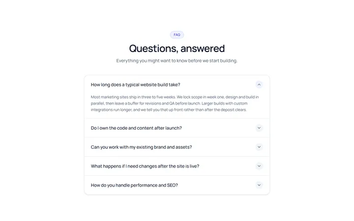
Simple Accordion
OriginalA clean single-column accordion, one panel open at a time, chevron rotates.
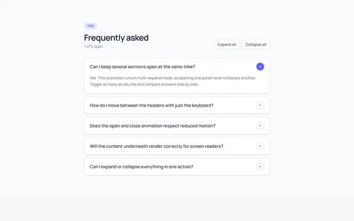
Multi Accordion
OriginalAn accordion where multiple panels can be open at once.
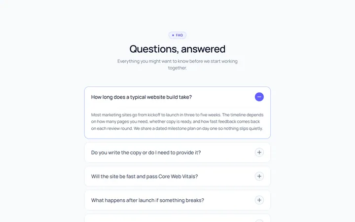
Plus Minus Accordion
OriginalAccordion with a plus/minus icon that toggles per item.
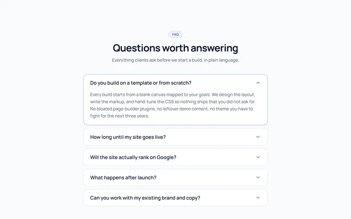
Bordered Accordion
OriginalBordered card-style accordion panels with rounded corners.
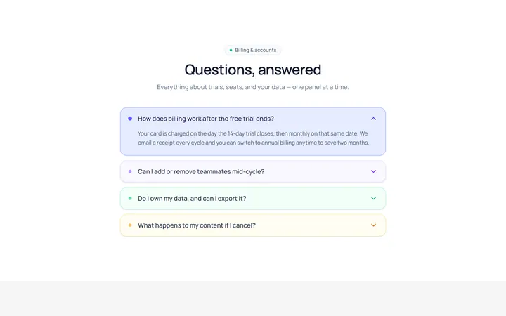
Filled Accordion
OriginalFilled, tinted accordion panels; the active one is highlighted.
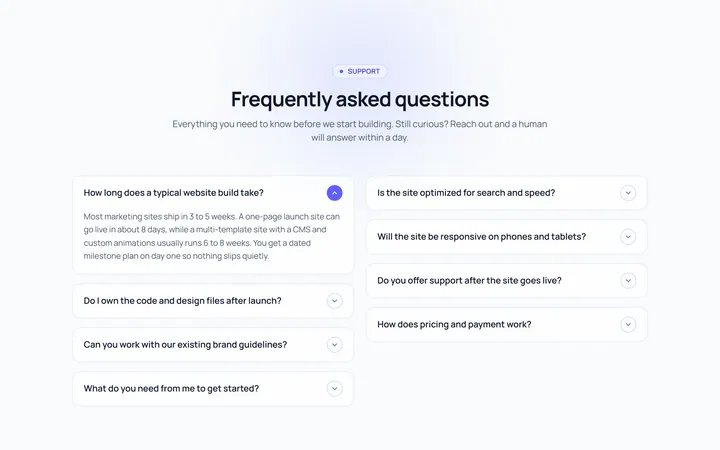
FAQ Two Col Accordion
OriginalA two-column FAQ accordion layout.
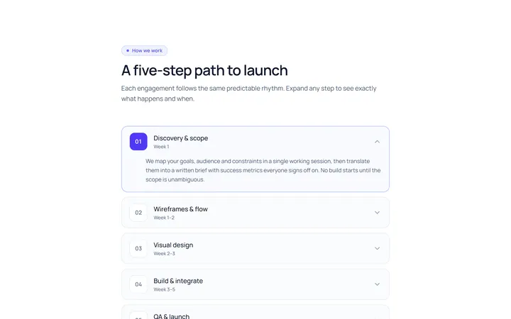
Numbered Accordion
OriginalA numbered-step accordion (01, 02, 03...).
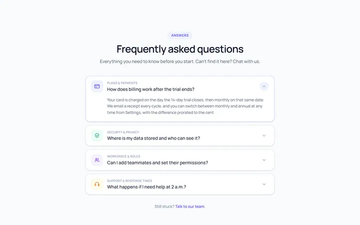
Icon Left Accordion
OriginalAccordion with a leading icon per item and a right chevron.
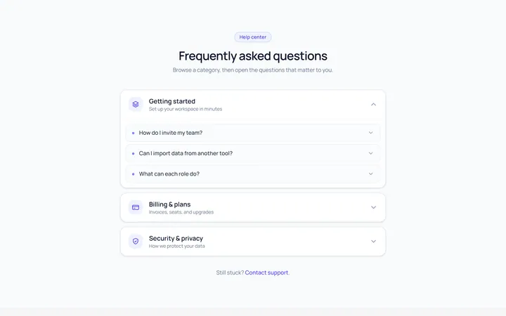
Nested Accordion
OriginalAn accordion with nested sub-accordions.
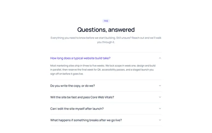
Flush Accordion
OriginalA borderless, flush accordion separated by hairlines.
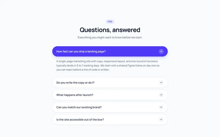
Pill Accordion
OriginalAccordion with rounded pill-shaped headers.
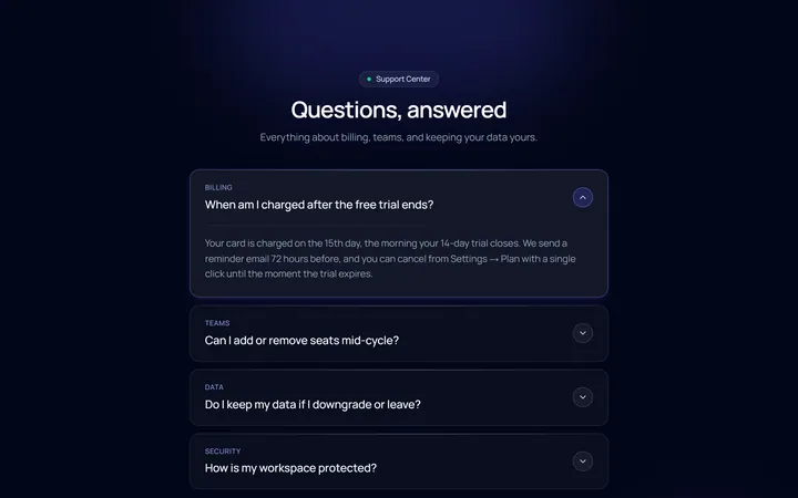
Dark Card Accordion
OriginalA dark, glassy card accordion.