

Multi Accordion
Original · freeAn accordion where multiple panels can be open at once.
Copy prompt gives Claude Code, Cursor or v0 a ready-to-paste prompt that recreates this exact component.
npx shadcn@latest add https://webinnoventix.com/r/accordion-multi.json"use client";
import { useId, useRef, useState, type KeyboardEvent } from "react";
type Item = {
q: string;
a: string;
};
const ITEMS: Item[] = [
{
q: "Can I keep several sections open at the same time?",
a: "Yes. This accordion runs in multi-expand mode, so opening one panel never collapses another. Toggle as many as you like and compare answers side by side.",
},
{
q: "How do I move between the headers with just the keyboard?",
a: "Use Arrow Up and Arrow Down to walk through the triggers, Home and End to jump to the first or last, and Enter or Space to expand the focused panel. Every trigger is a real button with an aria-expanded state.",
},
{
q: "Does the open and close animation respect reduced motion?",
a: "It does. The height and fade transitions are gated behind prefers-reduced-motion. If you have that system setting enabled, panels appear instantly with no sliding or easing.",
},
{
q: "Will the content underneath render correctly for screen readers?",
a: "Each panel is a region labelled by its trigger, and the trigger points back at the panel via aria-controls. Collapsed panels are hidden from the accessibility tree so nothing leaks into the reading order.",
},
{
q: "Can I expand or collapse everything in one action?",
a: "The controls in the header let you open all panels or close them at once. The counter next to them always reflects how many are currently expanded.",
},
];
export default function AccordionMulti() {
const [open, setOpen] = useState<Set<number>>(() => new Set([0]));
const baseId = useId();
const triggerRefs = useRef<(HTMLButtonElement | null)[]>([]);
const toggle = (i: number) => {
setOpen((prev) => {
const next = new Set(prev);
if (next.has(i)) next.delete(i);
else next.add(i);
return next;
});
};
const openAll = () => setOpen(new Set(ITEMS.map((_, i) => i)));
const closeAll = () => setOpen(new Set());
const onKeyDown = (e: KeyboardEvent<HTMLButtonElement>, i: number) => {
const last = ITEMS.length - 1;
let target = -1;
if (e.key === "ArrowDown") target = i === last ? 0 : i + 1;
else if (e.key === "ArrowUp") target = i === 0 ? last : i - 1;
else if (e.key === "Home") target = 0;
else if (e.key === "End") target = last;
if (target >= 0) {
e.preventDefault();
triggerRefs.current[target]?.focus();
}
};
return (
<section className="relative w-full bg-slate-50 px-4 py-20 sm:px-6 dark:bg-slate-950">
<style>{`
@keyframes accmul-fade-in {
from { opacity: 0; transform: translateY(-4px); }
to { opacity: 1; transform: translateY(0); }
}
.accmul-panel-inner { animation: accmul-fade-in 260ms ease; }
@media (prefers-reduced-motion: reduce) {
.accmul-grid { transition: none !important; }
.accmul-panel-inner { animation: none !important; }
.accmul-chevron { transition: none !important; }
}
`}</style>
<div className="mx-auto max-w-2xl">
<div className="mb-8 flex flex-col gap-4 sm:flex-row sm:items-end sm:justify-between">
<div>
<span className="inline-flex items-center rounded-full bg-indigo-100 px-3 py-1 text-xs font-medium tracking-wide text-indigo-700 uppercase dark:bg-indigo-500/15 dark:text-indigo-300">
FAQ
</span>
<h2 className="mt-3 text-2xl font-semibold tracking-tight text-slate-900 sm:text-3xl dark:text-white">
Frequently asked
</h2>
<p className="mt-1 text-sm text-slate-500 dark:text-slate-400">
{open.size} of {ITEMS.length} open
</p>
</div>
<div className="flex gap-2">
<button
type="button"
onClick={openAll}
className="rounded-lg border border-slate-300 bg-white px-3 py-1.5 text-sm font-medium text-slate-700 transition-colors hover:bg-slate-100 focus-visible:outline-2 focus-visible:outline-offset-2 focus-visible:outline-indigo-500 dark:border-slate-700 dark:bg-slate-900 dark:text-slate-200 dark:hover:bg-slate-800"
>
Expand all
</button>
<button
type="button"
onClick={closeAll}
className="rounded-lg border border-slate-300 bg-white px-3 py-1.5 text-sm font-medium text-slate-700 transition-colors hover:bg-slate-100 focus-visible:outline-2 focus-visible:outline-offset-2 focus-visible:outline-indigo-500 dark:border-slate-700 dark:bg-slate-900 dark:text-slate-200 dark:hover:bg-slate-800"
>
Collapse all
</button>
</div>
</div>
<div className="flex flex-col gap-3">
{ITEMS.map((item, i) => {
const isOpen = open.has(i);
const triggerId = `${baseId}-trigger-${i}`;
const panelId = `${baseId}-panel-${i}`;
return (
<div
key={i}
className="overflow-hidden rounded-xl border border-slate-200 bg-white shadow-sm transition-colors dark:border-slate-800 dark:bg-slate-900"
>
<h3 className="m-0">
<button
type="button"
id={triggerId}
ref={(el) => {
triggerRefs.current[i] = el;
}}
aria-expanded={isOpen}
aria-controls={panelId}
onClick={() => toggle(i)}
onKeyDown={(e) => onKeyDown(e, i)}
className="flex w-full items-center justify-between gap-4 px-5 py-4 text-left focus-visible:outline-2 focus-visible:-outline-offset-2 focus-visible:outline-indigo-500"
>
<span className="text-sm font-medium text-slate-900 sm:text-base dark:text-white">
{item.q}
</span>
<span
className={`accmul-chevron flex h-7 w-7 shrink-0 items-center justify-center rounded-full border transition-all duration-300 ${
isOpen
? "rotate-180 border-indigo-500 bg-indigo-500 text-white"
: "border-slate-300 bg-slate-50 text-slate-500 dark:border-slate-700 dark:bg-slate-800 dark:text-slate-400"
}`}
>
<svg
width="14"
height="14"
viewBox="0 0 24 24"
fill="none"
stroke="currentColor"
strokeWidth="2.5"
strokeLinecap="round"
strokeLinejoin="round"
aria-hidden="true"
>
<path d="m6 9 6 6 6-6" />
</svg>
</span>
</button>
</h3>
<div
className="accmul-grid grid transition-all duration-300 ease-out"
style={{
gridTemplateRows: isOpen ? "1fr" : "0fr",
}}
>
<div
className="min-h-0 overflow-hidden"
aria-hidden={!isOpen}
inert={!isOpen}
>
<div
id={panelId}
role="region"
aria-labelledby={triggerId}
className="accmul-panel-inner px-5 pb-5 text-sm leading-relaxed text-slate-600 dark:text-slate-300"
>
{item.a}
</div>
</div>
</div>
</div>
);
})}
</div>
</div>
</section>
);
}Dependencies
Licence
Built by Web Innoventix. Free for personal and commercial use, no attribution required.
Built by Web Innoventix
Need a custom interface, a full website, or SEO that gets you cited by AI? We design, build and rank it end to end.
Get a free quoteSimilar components
Browse all →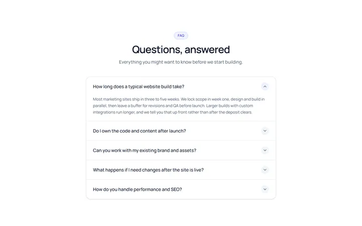
Simple Accordion
OriginalA clean single-column accordion, one panel open at a time, chevron rotates.
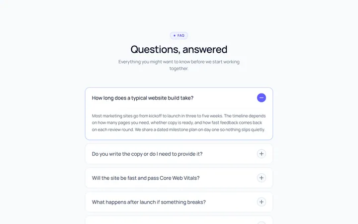
Plus Minus Accordion
OriginalAccordion with a plus/minus icon that toggles per item.
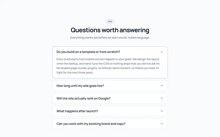
Bordered Accordion
OriginalBordered card-style accordion panels with rounded corners.
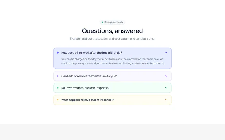
Filled Accordion
OriginalFilled, tinted accordion panels; the active one is highlighted.
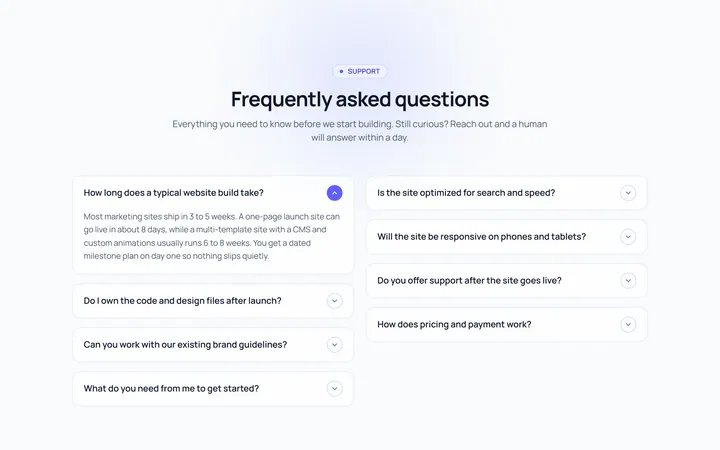
FAQ Two Col Accordion
OriginalA two-column FAQ accordion layout.
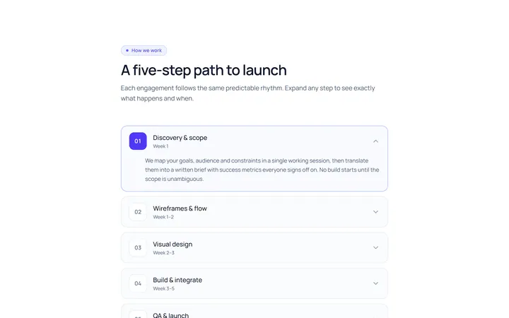
Numbered Accordion
OriginalA numbered-step accordion (01, 02, 03...).
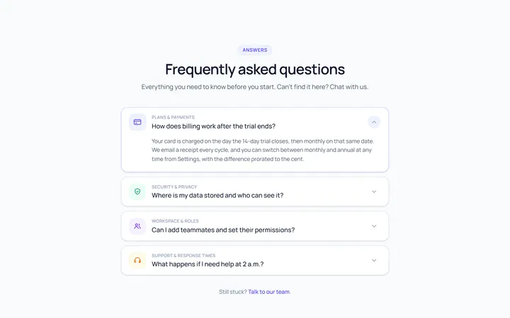
Icon Left Accordion
OriginalAccordion with a leading icon per item and a right chevron.
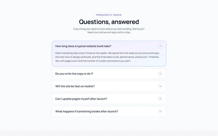
Gradient Active Accordion
OriginalAccordion where the open panel gets a soft gradient background.
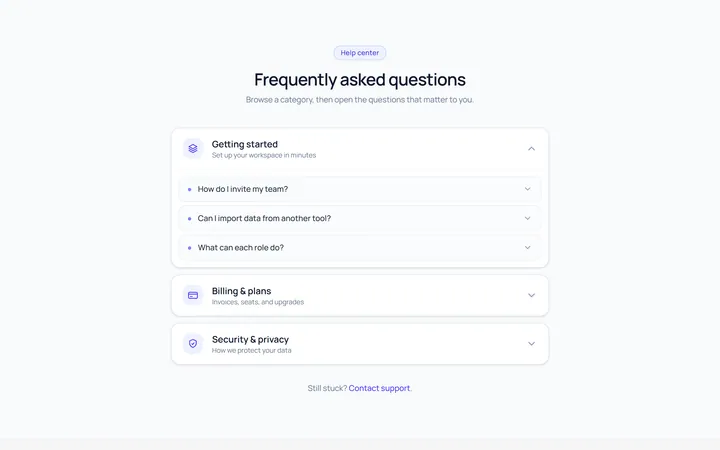
Nested Accordion
OriginalAn accordion with nested sub-accordions.
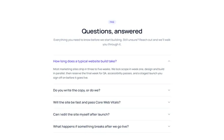
Flush Accordion
OriginalA borderless, flush accordion separated by hairlines.
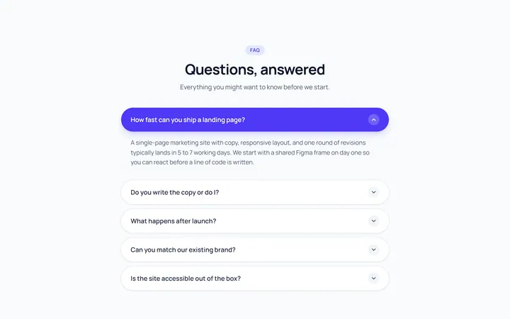
Pill Accordion
OriginalAccordion with rounded pill-shaped headers.
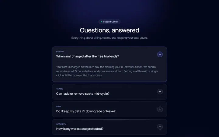
Dark Card Accordion
OriginalA dark, glassy card accordion.