

Simple Accordion
Original · freeA clean single-column accordion, one panel open at a time, chevron rotates.
Copy prompt gives Claude Code, Cursor or v0 a ready-to-paste prompt that recreates this exact component.
npx shadcn@latest add https://webinnoventix.com/r/accordion-simple.json"use client";
import { useId, useRef, useState, type KeyboardEvent } from "react";
type QA = {
q: string;
a: string;
};
const ITEMS: QA[] = [
{
q: "How long does a typical website build take?",
a: "Most marketing sites ship in three to five weeks. We lock scope in week one, design and build in parallel, then leave a buffer for revisions and QA before launch. Larger builds with custom integrations run longer, and we tell you that up front rather than after the deposit clears.",
},
{
q: "Do I own the code and content after launch?",
a: "Yes, completely. On the day we hand off you get the full repository, every source file, and admin access to your hosting and CMS. There are no license fees, no vendor lock-in, and nothing that stops you moving to another team later.",
},
{
q: "Can you work with my existing brand and assets?",
a: "Absolutely. Send us your logo, fonts, colour palette and any brand guidelines and we will build around them. If your brand is thin or dated we can tighten it as part of the project, but we never force a rebrand you did not ask for.",
},
{
q: "What happens if I need changes after the site is live?",
a: "Every launch includes thirty days of free fixes for anything that breaks. Beyond that you can book ad-hoc hours or a monthly retainer, and because you own the code any developer can pick it up. We document the stack so nobody is stranded.",
},
{
q: "How do you handle performance and SEO?",
a: "Fast loading and clean markup are built in, not bolted on. We ship semantic HTML, optimised images, and Core Web Vitals in the green, then set up the technical SEO foundations so search engines and AI answer engines can read your pages from day one.",
},
];
export default function AccordionSimple() {
const [open, setOpen] = useState<number | null>(0);
const baseId = useId();
const btnRefs = useRef<(HTMLButtonElement | null)[]>([]);
const toggle = (i: number) => {
setOpen((prev) => (prev === i ? null : i));
};
const onKeyDown = (e: KeyboardEvent<HTMLButtonElement>, i: number) => {
const last = ITEMS.length - 1;
let next: number | null = null;
if (e.key === "ArrowDown") next = i === last ? 0 : i + 1;
else if (e.key === "ArrowUp") next = i === 0 ? last : i - 1;
else if (e.key === "Home") next = 0;
else if (e.key === "End") next = last;
if (next !== null) {
e.preventDefault();
btnRefs.current[next]?.focus();
}
};
return (
<section className="relative w-full bg-white px-4 py-20 sm:px-6 sm:py-28 dark:bg-slate-950">
<style>{`
@keyframes accsimple_reveal {
from { opacity: 0; transform: translateY(-4px); }
to { opacity: 1; transform: translateY(0); }
}
.accsimple_panel[data-open="true"] .accsimple_inner {
animation: accsimple_reveal 0.28s ease both;
}
@media (prefers-reduced-motion: reduce) {
.accsimple_chevron { transition: none !important; }
.accsimple_panel[data-open="true"] .accsimple_inner { animation: none !important; }
}
`}</style>
<div className="mx-auto max-w-2xl">
<div className="mb-10 text-center">
<span className="inline-flex items-center rounded-full border border-indigo-200 bg-indigo-50 px-3 py-1 text-xs font-medium tracking-wide text-indigo-700 uppercase dark:border-indigo-500/30 dark:bg-indigo-500/10 dark:text-indigo-300">
FAQ
</span>
<h2 className="mt-4 text-3xl font-semibold tracking-tight text-slate-900 sm:text-4xl dark:text-white">
Questions, answered
</h2>
<p className="mt-3 text-base text-slate-600 dark:text-slate-400">
Everything you might want to know before we start building.
</p>
</div>
<div className="divide-y divide-slate-200 overflow-hidden rounded-2xl border border-slate-200 bg-white shadow-sm dark:divide-slate-800 dark:border-slate-800 dark:bg-slate-900">
{ITEMS.map((item, i) => {
const isOpen = open === i;
const btnId = `${baseId}-btn-${i}`;
const panelId = `${baseId}-panel-${i}`;
return (
<div key={item.q} className="accsimple_panel" data-open={isOpen}>
<h3>
<button
ref={(el) => {
btnRefs.current[i] = el;
}}
id={btnId}
type="button"
aria-expanded={isOpen}
aria-controls={panelId}
onClick={() => toggle(i)}
onKeyDown={(e) => onKeyDown(e, i)}
className="flex w-full items-center justify-between gap-4 px-5 py-5 text-left transition-colors outline-none hover:bg-slate-50 focus-visible:ring-2 focus-visible:ring-indigo-500 focus-visible:ring-inset sm:px-6 dark:hover:bg-slate-800/60"
>
<span className="text-base font-medium text-slate-900 dark:text-white">
{item.q}
</span>
<span
className={`accsimple_chevron flex h-7 w-7 shrink-0 items-center justify-center rounded-full text-slate-500 transition-transform duration-300 ease-out dark:text-slate-400 ${
isOpen
? "rotate-180 bg-indigo-50 text-indigo-600 dark:bg-indigo-500/15 dark:text-indigo-300"
: "bg-slate-100 dark:bg-slate-800"
}`}
aria-hidden="true"
>
<svg
width="16"
height="16"
viewBox="0 0 24 24"
fill="none"
stroke="currentColor"
strokeWidth="2.5"
strokeLinecap="round"
strokeLinejoin="round"
>
<path d="m6 9 6 6 6-6" />
</svg>
</span>
</button>
</h3>
<div
id={panelId}
role="region"
aria-labelledby={btnId}
hidden={!isOpen}
className="accsimple_inner px-5 pb-5 sm:px-6"
>
<p className="text-sm leading-relaxed text-slate-600 dark:text-slate-400">
{item.a}
</p>
</div>
</div>
);
})}
</div>
</div>
</section>
);
}Dependencies
Licence
Built by Web Innoventix. Free for personal and commercial use, no attribution required.
Built by Web Innoventix
Need a custom interface, a full website, or SEO that gets you cited by AI? We design, build and rank it end to end.
Get a free quoteSimilar components
Browse all →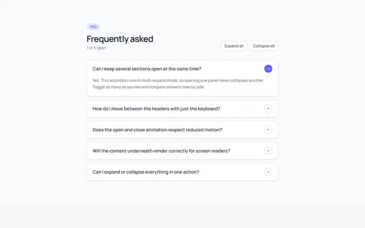
Multi Accordion
OriginalAn accordion where multiple panels can be open at once.
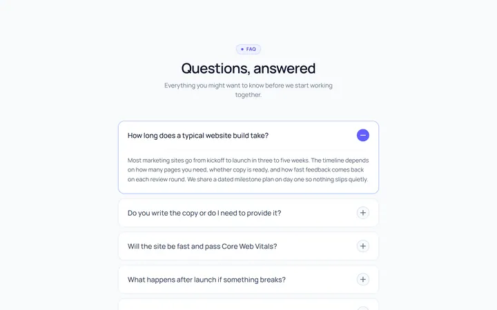
Plus Minus Accordion
OriginalAccordion with a plus/minus icon that toggles per item.
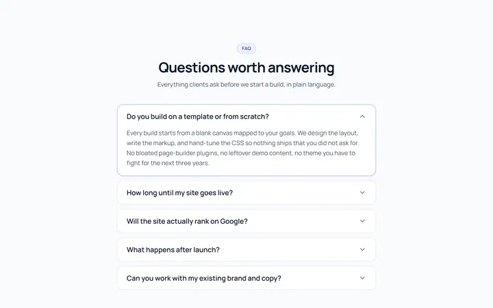
Bordered Accordion
OriginalBordered card-style accordion panels with rounded corners.
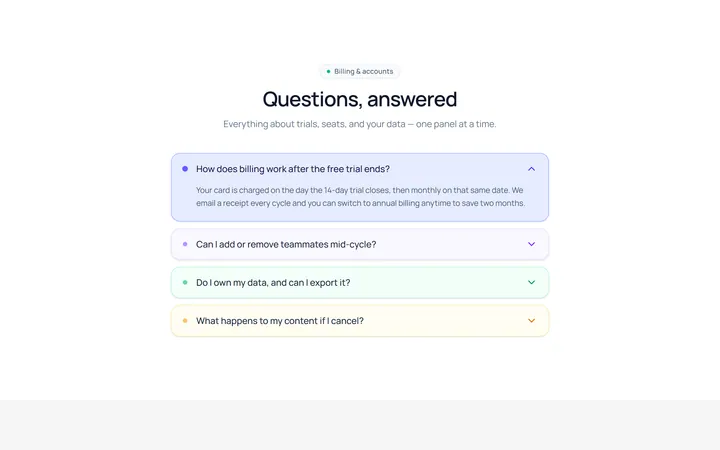
Filled Accordion
OriginalFilled, tinted accordion panels; the active one is highlighted.
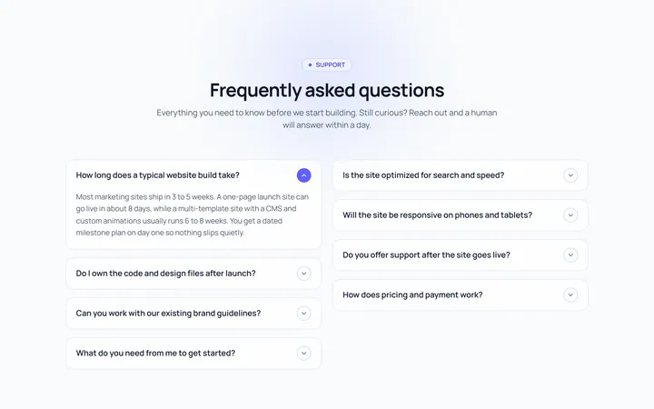
FAQ Two Col Accordion
OriginalA two-column FAQ accordion layout.
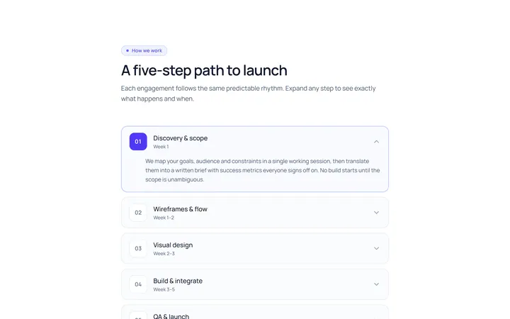
Numbered Accordion
OriginalA numbered-step accordion (01, 02, 03...).
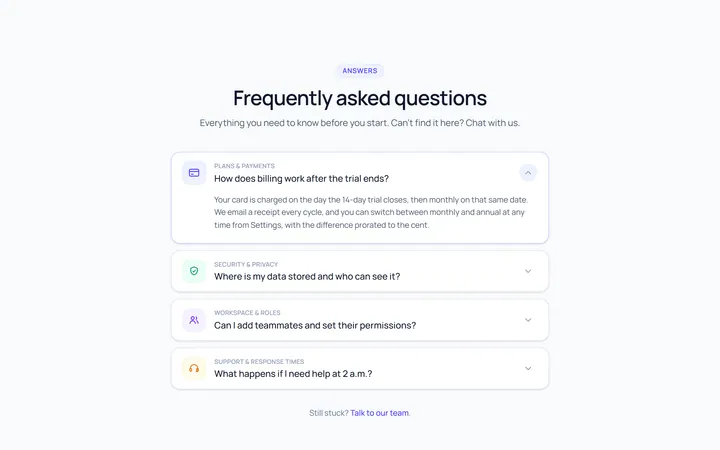
Icon Left Accordion
OriginalAccordion with a leading icon per item and a right chevron.
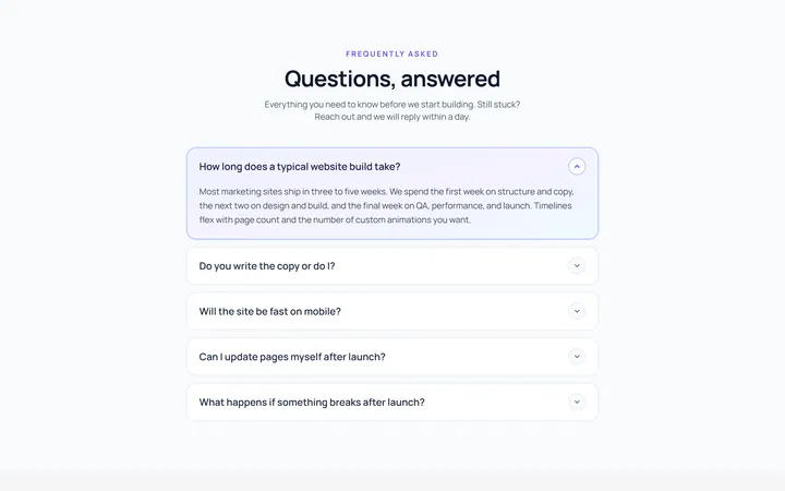
Gradient Active Accordion
OriginalAccordion where the open panel gets a soft gradient background.
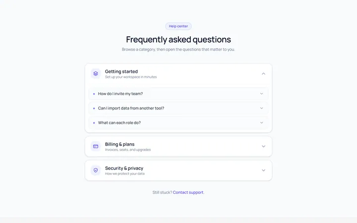
Nested Accordion
OriginalAn accordion with nested sub-accordions.
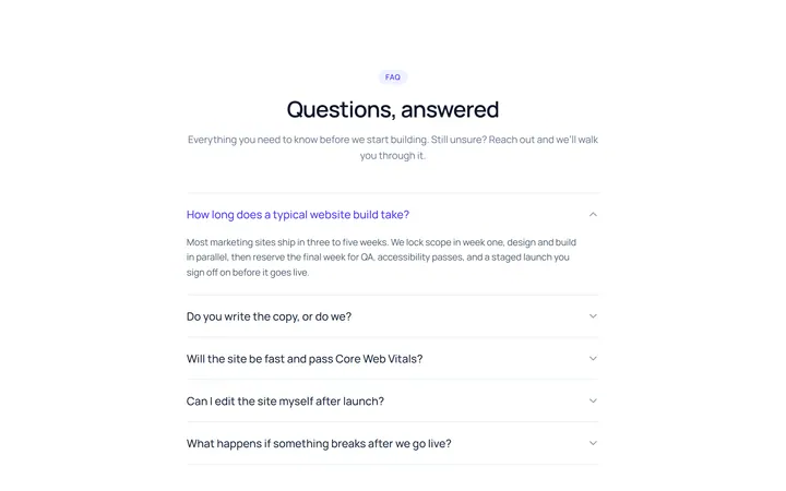
Flush Accordion
OriginalA borderless, flush accordion separated by hairlines.
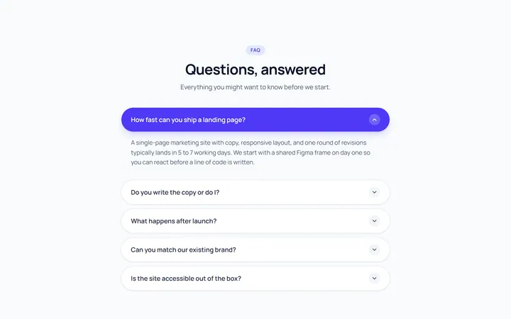
Pill Accordion
OriginalAccordion with rounded pill-shaped headers.
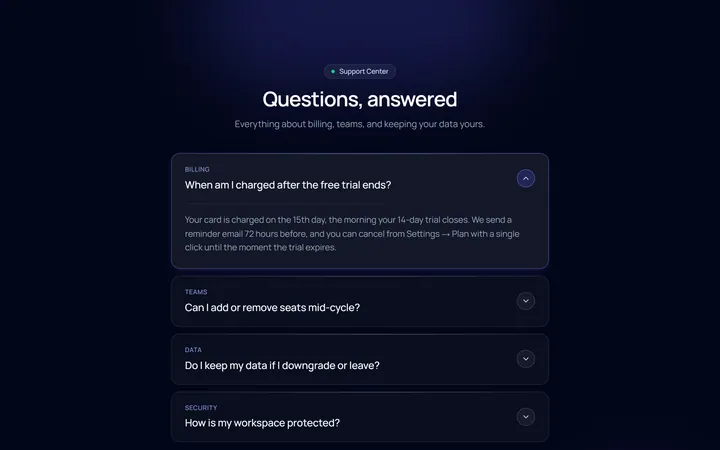
Dark Card Accordion
OriginalA dark, glassy card accordion.