

Count Badge
Original · freenotification count badges
byWeb InnoventixReact + Tailwind
badgecountbadges
Copy prompt gives Claude Code, Cursor or v0 a ready-to-paste prompt that recreates this exact component.
npx shadcn@latest add https://webinnoventix.com/r/badge-count.jsonbadge-count.tsx
"use client";
import { useCallback, useId, useState, type SVGProps } from "react";
import { AnimatePresence, motion, useReducedMotion } from "motion/react";
type ChannelId = "messages" | "mentions" | "cart" | "downloads";
interface Channel {
id: ChannelId;
label: string;
item: string;
hint: string;
count: number;
}
const INITIAL_CHANNELS: Channel[] = [
{ id: "messages", label: "Messages", item: "message", hint: "Direct replies", count: 3 },
{ id: "mentions", label: "Mentions", item: "mention", hint: "You were tagged", count: 12 },
{ id: "cart", label: "Cart", item: "item", hint: "Awaiting checkout", count: 0 },
{ id: "downloads", label: "Downloads", item: "download", hint: "Ready to install", count: 128 },
];
function unreadText(n: number): string {
if (n === 0) return "no unread notifications";
return `${n} unread notification${n === 1 ? "" : "s"}`;
}
function ChannelGlyph({ id, className }: { id: ChannelId; className?: string }) {
const shared: SVGProps<SVGSVGElement> = {
viewBox: "0 0 24 24",
fill: "none",
stroke: "currentColor",
strokeWidth: 1.75,
strokeLinecap: "round",
strokeLinejoin: "round",
"aria-hidden": true,
className,
};
switch (id) {
case "messages":
return (
<svg {...shared}>
<path d="M21 11.5a8.4 8.4 0 0 1-8.5 8.5 8.5 8.5 0 0 1-3.8-.9L3 21l1.9-5.7A8.4 8.4 0 0 1 4 11.5 8.5 8.5 0 0 1 12.5 3 8.4 8.4 0 0 1 21 11.5Z" />
</svg>
);
case "mentions":
return (
<svg {...shared}>
<circle cx="12" cy="12" r="4" />
<path d="M16 8v5a3 3 0 0 0 6 0v-1a10 10 0 1 0-3.9 7.9" />
</svg>
);
case "cart":
return (
<svg {...shared}>
<circle cx="9" cy="20" r="1.4" />
<circle cx="18" cy="20" r="1.4" />
<path d="M2 3h3l2.5 12.4a1.8 1.8 0 0 0 1.8 1.4h8.4a1.8 1.8 0 0 0 1.8-1.4L22 7H6.2" />
</svg>
);
case "downloads":
return (
<svg {...shared}>
<path d="M21 15v4a2 2 0 0 1-2 2H5a2 2 0 0 1-2-2v-4" />
<path d="M7 10l5 5 5-5" />
<path d="M12 15V3" />
</svg>
);
}
}
function IconBell({ className }: { className?: string }) {
return (
<svg
viewBox="0 0 24 24"
fill="none"
stroke="currentColor"
strokeWidth={1.75}
strokeLinecap="round"
strokeLinejoin="round"
aria-hidden="true"
className={className}
>
<path d="M6 8a6 6 0 1 1 12 0c0 7 3 8 3 8H3s3-1 3-8" />
<path d="M10.3 21a1.94 1.94 0 0 0 3.4 0" />
</svg>
);
}
function IconPlus({ className }: { className?: string }) {
return (
<svg
viewBox="0 0 24 24"
fill="none"
stroke="currentColor"
strokeWidth={2}
strokeLinecap="round"
strokeLinejoin="round"
aria-hidden="true"
className={className}
>
<path d="M12 5v14M5 12h14" />
</svg>
);
}
function IconCheck({ className }: { className?: string }) {
return (
<svg
viewBox="0 0 24 24"
fill="none"
stroke="currentColor"
strokeWidth={2}
strokeLinecap="round"
strokeLinejoin="round"
aria-hidden="true"
className={className}
>
<path d="M20 6 9 17l-5-5" />
</svg>
);
}
function CountBadge({
count,
cap,
dot,
reduced,
}: {
count: number;
cap: number;
dot: boolean;
reduced: boolean;
}) {
const label = count > cap ? `${cap}+` : String(count);
return (
<AnimatePresence initial={false}>
{count > 0 && (
<motion.span
key={dot ? "dot" : "count"}
initial={reduced ? { opacity: 1, scale: 1 } : { opacity: 0, scale: 0.4 }}
animate={{ opacity: 1, scale: 1 }}
exit={reduced ? { opacity: 0 } : { opacity: 0, scale: 0.4 }}
transition={reduced ? { duration: 0 } : { type: "spring", stiffness: 520, damping: 22 }}
aria-hidden="true"
className={
dot
? "absolute right-0 top-0 h-3 w-3 rounded-full bg-rose-500 shadow-sm ring-2 ring-white dark:ring-slate-900"
: "absolute -right-1.5 -top-1.5 flex h-5 min-w-[1.25rem] items-center justify-center overflow-hidden rounded-full bg-rose-500 px-1.5 text-[0.6875rem] font-bold leading-none tabular-nums text-white shadow-sm ring-2 ring-white dark:ring-slate-900"
}
>
{!dot &&
(reduced ? (
<span>{label}</span>
) : (
<AnimatePresence mode="popLayout" initial={false}>
<motion.span
key={label}
initial={{ y: -9, opacity: 0 }}
animate={{ y: 0, opacity: 1 }}
exit={{ y: 9, opacity: 0 }}
transition={{ duration: 0.18, ease: "easeOut" }}
className="block"
>
{label}
</motion.span>
</AnimatePresence>
))}
</motion.span>
)}
</AnimatePresence>
);
}
export default function BadgeCount() {
const uid = useId();
const prefersReduced = useReducedMotion();
const reduced = prefersReduced ?? false;
const [channels, setChannels] = useState<Channel[]>(INITIAL_CHANNELS);
const [cap, setCap] = useState<number>(99);
const [dotMode, setDotMode] = useState<boolean>(false);
const [message, setMessage] = useState<string>("");
const [feed, setFeed] = useState<string[]>([]);
const total = channels.reduce((sum, c) => sum + c.count, 0);
const announce = useCallback((text: string) => {
setMessage(text);
setFeed((prev) => [text, ...prev].slice(0, 5));
}, []);
const addTo = useCallback(
(id: ChannelId) => {
const ch = channels.find((c) => c.id === id);
if (!ch) return;
const nextCount = ch.count + 1;
setChannels((prev) => prev.map((c) => (c.id === id ? { ...c, count: nextCount } : c)));
announce(`New ${ch.item} in ${ch.label} — ${nextCount} unread.`);
},
[channels, announce],
);
const readChannel = useCallback(
(id: ChannelId) => {
const ch = channels.find((c) => c.id === id);
if (!ch || ch.count === 0) return;
setChannels((prev) => prev.map((c) => (c.id === id ? { ...c, count: 0 } : c)));
announce(`Opened ${ch.label}. Marked as read.`);
},
[channels, announce],
);
const markAll = useCallback(() => {
if (total === 0) return;
setChannels((prev) => prev.map((c) => ({ ...c, count: 0 })));
announce("All channels marked as read.");
}, [total, announce]);
const capChoices = [9, 99, 999];
return (
<section className="relative w-full overflow-hidden bg-slate-50 px-6 py-16 text-slate-900 sm:py-20 dark:bg-slate-950 dark:text-slate-100">
<style>{`
@keyframes bc-ring {
0% { transform: scale(0.85); opacity: 0.55; }
70% { transform: scale(2); opacity: 0; }
100% { transform: scale(2); opacity: 0; }
}
@keyframes bc-live {
0%, 100% { opacity: 1; }
50% { opacity: 0.35; }
}
@media (prefers-reduced-motion: reduce) {
[data-bc-anim] { animation: none !important; }
}
`}</style>
<div
aria-hidden="true"
className="pointer-events-none absolute -right-24 -top-24 h-72 w-72 rounded-full bg-indigo-300/25 blur-3xl dark:bg-indigo-500/15"
/>
<div
aria-hidden="true"
className="pointer-events-none absolute -bottom-28 -left-20 h-72 w-72 rounded-full bg-violet-300/20 blur-3xl dark:bg-violet-500/10"
/>
<div className="relative mx-auto max-w-5xl">
<header className="mb-10 max-w-2xl">
<span className="inline-flex items-center gap-2 rounded-full border border-slate-200 bg-white px-3 py-1 text-xs font-medium tracking-wide text-slate-600 dark:border-slate-800 dark:bg-slate-900 dark:text-slate-300">
<span className="relative flex h-2 w-2">
<span
data-bc-anim
className="absolute inline-flex h-full w-full rounded-full bg-emerald-400"
style={reduced ? undefined : { animation: "bc-live 1.8s ease-in-out infinite" }}
/>
<span className="relative inline-flex h-2 w-2 rounded-full bg-emerald-500" />
</span>
Live notification counters
</span>
<h2 className="mt-4 text-3xl font-semibold tracking-tight sm:text-4xl">
Count badges that stay in sync
</h2>
<p className="mt-3 text-base leading-relaxed text-slate-600 dark:text-slate-400">
Animated, overflow-aware unread counters with dot and numeric variants. Simulate incoming
events, open a channel to clear it, and every change is announced to assistive tech.
</p>
</header>
<div className="grid gap-6 lg:grid-cols-5">
{/* Notification tray */}
<div className="lg:col-span-3">
<div className="rounded-3xl border border-slate-200 bg-white p-6 shadow-sm sm:p-8 dark:border-slate-800 dark:bg-slate-900">
<div className="flex items-center justify-between gap-4">
<div className="flex items-center gap-3">
<button
type="button"
onClick={markAll}
aria-label={`Notifications: ${unreadText(total)}. Activate to mark all as read.`}
className="relative inline-flex h-12 w-12 items-center justify-center rounded-2xl border border-slate-200 bg-slate-50 text-slate-700 transition hover:border-slate-300 hover:text-slate-900 focus-visible:outline-none focus-visible:ring-2 focus-visible:ring-indigo-500 focus-visible:ring-offset-2 focus-visible:ring-offset-white dark:border-slate-700 dark:bg-slate-800 dark:text-slate-200 dark:hover:text-white dark:focus-visible:ring-offset-slate-900"
>
{!reduced && total > 0 && (
<span
data-bc-anim
aria-hidden="true"
className="pointer-events-none absolute -right-1.5 -top-1.5 h-5 w-5 rounded-full bg-rose-400/70"
style={{ animation: "bc-ring 2s ease-out infinite" }}
/>
)}
<IconBell className="relative h-5 w-5" />
<CountBadge count={total} cap={cap} dot={dotMode} reduced={reduced} />
</button>
<div>
<p className="text-sm font-semibold">Notification tray</p>
<p className="text-xs text-slate-500 dark:text-slate-400" aria-hidden="true">
{total === 0 ? "You're all caught up" : `${total} unread across channels`}
</p>
</div>
</div>
<button
type="button"
onClick={markAll}
disabled={total === 0}
className="inline-flex items-center gap-1.5 rounded-full border border-slate-200 px-3 py-1.5 text-xs font-medium text-slate-600 transition hover:border-slate-300 hover:text-slate-900 focus-visible:outline-none focus-visible:ring-2 focus-visible:ring-indigo-500 focus-visible:ring-offset-2 focus-visible:ring-offset-white disabled:cursor-not-allowed disabled:opacity-40 dark:border-slate-700 dark:text-slate-300 dark:hover:text-white dark:focus-visible:ring-offset-slate-900"
>
<IconCheck className="h-3.5 w-3.5" />
Mark all read
</button>
</div>
<ul className="mt-7 grid grid-cols-2 gap-3 sm:grid-cols-4">
{channels.map((ch) => (
<li key={ch.id}>
<button
type="button"
onClick={() => readChannel(ch.id)}
aria-label={`${ch.label}: ${unreadText(ch.count)}. Activate to mark as read.`}
className="group flex w-full flex-col items-center gap-2 rounded-2xl border border-slate-200 bg-slate-50/60 px-3 py-4 transition hover:border-indigo-300 hover:bg-white focus-visible:outline-none focus-visible:ring-2 focus-visible:ring-indigo-500 focus-visible:ring-offset-2 focus-visible:ring-offset-white dark:border-slate-800 dark:bg-slate-800/40 dark:hover:border-indigo-500/60 dark:hover:bg-slate-800 dark:focus-visible:ring-offset-slate-900"
>
<span className="relative inline-flex h-11 w-11 items-center justify-center rounded-xl bg-white text-slate-600 ring-1 ring-slate-200 transition group-hover:text-indigo-600 dark:bg-slate-900 dark:text-slate-300 dark:ring-slate-700 dark:group-hover:text-indigo-400">
<ChannelGlyph id={ch.id} className="h-5 w-5" />
<CountBadge count={ch.count} cap={cap} dot={dotMode} reduced={reduced} />
</span>
<span className="text-center">
<span className="block text-sm font-medium text-slate-800 dark:text-slate-100">
{ch.label}
</span>
<span className="mt-0.5 block text-[0.6875rem] text-slate-500 dark:text-slate-400">
{ch.hint}
</span>
</span>
</button>
</li>
))}
</ul>
<div className="mt-7 border-t border-slate-200 pt-5 dark:border-slate-800">
<p className="text-xs font-medium uppercase tracking-wide text-slate-500 dark:text-slate-400">
Simulate incoming events
</p>
<div className="mt-3 flex flex-wrap gap-2">
{channels.map((ch) => (
<button
key={ch.id}
type="button"
onClick={() => addTo(ch.id)}
className="inline-flex items-center gap-1.5 rounded-full bg-slate-900 px-3 py-1.5 text-xs font-medium text-white transition hover:bg-slate-700 focus-visible:outline-none focus-visible:ring-2 focus-visible:ring-indigo-500 focus-visible:ring-offset-2 focus-visible:ring-offset-white dark:bg-white dark:text-slate-900 dark:hover:bg-slate-200 dark:focus-visible:ring-offset-slate-900"
>
<IconPlus className="h-3.5 w-3.5" />
Add {ch.item}
</button>
))}
</div>
</div>
</div>
</div>
{/* Settings + activity */}
<div className="space-y-6 lg:col-span-2">
<div className="rounded-3xl border border-slate-200 bg-white p-6 shadow-sm dark:border-slate-800 dark:bg-slate-900">
<h3 className="text-sm font-semibold">Badge settings</h3>
<div className="mt-4 flex items-center justify-between gap-4">
<span id={`${uid}-dot-label`} className="text-sm text-slate-700 dark:text-slate-300">
Compact dot badges
<span className="mt-0.5 block text-xs text-slate-500 dark:text-slate-400">
Hide the number, show presence only
</span>
</span>
<button
type="button"
role="switch"
aria-checked={dotMode}
aria-labelledby={`${uid}-dot-label`}
onClick={() => setDotMode((v) => !v)}
className={`relative inline-flex h-6 w-11 shrink-0 items-center rounded-full transition focus-visible:outline-none focus-visible:ring-2 focus-visible:ring-indigo-500 focus-visible:ring-offset-2 focus-visible:ring-offset-white dark:focus-visible:ring-offset-slate-900 ${
dotMode ? "bg-indigo-500" : "bg-slate-300 dark:bg-slate-700"
}`}
>
<span
className={`inline-block h-5 w-5 transform rounded-full bg-white shadow transition ${
dotMode ? "translate-x-5" : "translate-x-0.5"
}`}
/>
</button>
</div>
<fieldset className="mt-6">
<legend className="text-sm text-slate-700 dark:text-slate-300">Overflow cap</legend>
<p className="mt-0.5 text-xs text-slate-500 dark:text-slate-400">
Counts above the cap collapse to “{cap}+”.
</p>
<div className="mt-3 inline-flex rounded-xl border border-slate-200 bg-slate-50 p-1 dark:border-slate-700 dark:bg-slate-800">
{capChoices.map((n) => (
<label
key={n}
className="relative cursor-pointer select-none"
>
<input
type="radio"
name={`${uid}-cap`}
value={n}
checked={cap === n}
onChange={() => setCap(n)}
className="peer sr-only"
/>
<span className="block rounded-lg px-3.5 py-1.5 text-sm font-medium text-slate-600 transition peer-checked:bg-white peer-checked:text-slate-900 peer-checked:shadow-sm peer-focus-visible:ring-2 peer-focus-visible:ring-indigo-500 dark:text-slate-300 dark:peer-checked:bg-slate-950 dark:peer-checked:text-white">
{n}+
</span>
</label>
))}
</div>
</fieldset>
</div>
<div className="rounded-3xl border border-slate-200 bg-white p-6 shadow-sm dark:border-slate-800 dark:bg-slate-900">
<h3 className="text-sm font-semibold">Recent activity</h3>
{feed.length === 0 ? (
<p className="mt-3 text-sm text-slate-500 dark:text-slate-400">
Add or clear a notification to see events logged here.
</p>
) : (
<ul className="mt-3 space-y-2">
{feed.map((entry, i) => (
<li
key={`${entry}-${i}`}
className="flex items-start gap-2 text-sm text-slate-600 dark:text-slate-300"
>
<span className="mt-1.5 h-1.5 w-1.5 shrink-0 rounded-full bg-indigo-500" aria-hidden="true" />
<span>{entry}</span>
</li>
))}
</ul>
)}
</div>
</div>
</div>
{/* Static variant showcase */}
<div className="mt-6 rounded-3xl border border-slate-200 bg-white p-6 shadow-sm sm:p-8 dark:border-slate-800 dark:bg-slate-900">
<h3 className="text-sm font-semibold">Badge patterns</h3>
<div className="mt-5 flex flex-wrap items-center gap-x-8 gap-y-6">
<span className="inline-flex items-center gap-2 text-sm text-slate-700 dark:text-slate-300">
Inbox
<span className="inline-flex h-5 min-w-[1.25rem] items-center justify-center rounded-full bg-rose-500 px-1.5 text-[0.6875rem] font-bold tabular-nums text-white">
4
</span>
</span>
<button
type="button"
className="inline-flex items-center gap-2 rounded-full border border-slate-200 px-4 py-2 text-sm font-medium text-slate-700 transition hover:border-slate-300 focus-visible:outline-none focus-visible:ring-2 focus-visible:ring-indigo-500 focus-visible:ring-offset-2 focus-visible:ring-offset-white dark:border-slate-700 dark:text-slate-200 dark:focus-visible:ring-offset-slate-900"
>
Updates
<span className="inline-flex h-5 min-w-[1.25rem] items-center justify-center rounded-full bg-slate-900 px-1.5 text-[0.6875rem] font-bold tabular-nums text-white dark:bg-white dark:text-slate-900">
8
</span>
</button>
<span className="inline-flex items-center gap-2 rounded-full bg-indigo-50 px-3 py-1 text-sm font-medium text-indigo-700 dark:bg-indigo-500/15 dark:text-indigo-300">
<span className="inline-flex h-5 min-w-[1.25rem] items-center justify-center rounded-full bg-indigo-600 px-1.5 text-[0.6875rem] font-bold tabular-nums text-white">
99+
</span>
new updates
</span>
<span className="inline-flex items-center gap-2 rounded-full bg-emerald-50 px-3 py-1 text-sm font-medium text-emerald-700 dark:bg-emerald-500/15 dark:text-emerald-300">
<span className="relative flex h-2.5 w-2.5">
<span
data-bc-anim
className="absolute inline-flex h-full w-full rounded-full bg-emerald-400"
style={reduced ? undefined : { animation: "bc-live 1.6s ease-in-out infinite" }}
/>
<span className="relative inline-flex h-2.5 w-2.5 rounded-full bg-emerald-500" />
</span>
Live
</span>
<span className="inline-flex items-center gap-2 text-sm text-slate-700 dark:text-slate-300">
<span className="relative inline-flex h-9 w-9 items-center justify-center rounded-xl bg-slate-100 text-slate-600 dark:bg-slate-800 dark:text-slate-300">
<ChannelGlyph id="messages" className="h-4 w-4" />
<span className="absolute right-0.5 top-0.5 h-2.5 w-2.5 rounded-full bg-rose-500 ring-2 ring-white dark:ring-slate-900" />
</span>
Presence dot
</span>
<span className="inline-flex items-center gap-2 rounded-full bg-amber-50 px-3 py-1 text-sm font-medium text-amber-700 dark:bg-amber-500/15 dark:text-amber-300">
<span className="inline-flex h-5 min-w-[1.25rem] items-center justify-center rounded-full bg-amber-500 px-1.5 text-[0.6875rem] font-bold tabular-nums text-white">
3
</span>
needs review
</span>
</div>
</div>
</div>
<p className="sr-only" role="status" aria-live="polite">
{message}
</p>
</section>
);
}Dependencies
motion
Licence
Built by Web Innoventix. Free for personal and commercial use, no attribution required.
Built by Web Innoventix
Need a custom interface, a full website, or SEO that gets you cited by AI? We design, build and rank it end to end.
Get a free quoteSimilar components
Browse all →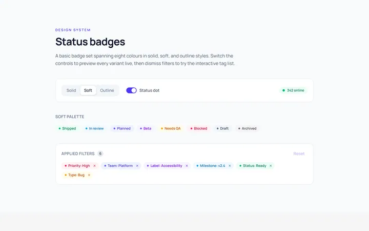
Basic Badge
Originalbasic badges across colours
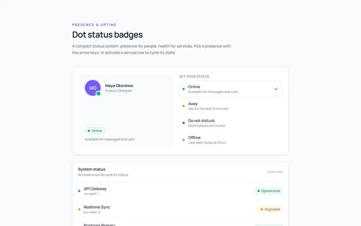
Dot Badge
Originaldot status badges
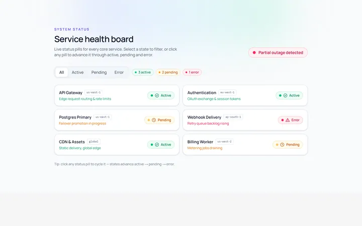
Status Badge
Originalstatus pills (active/pending/error)
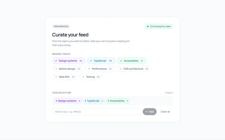
Pill Badge
Originalsoft pill badges
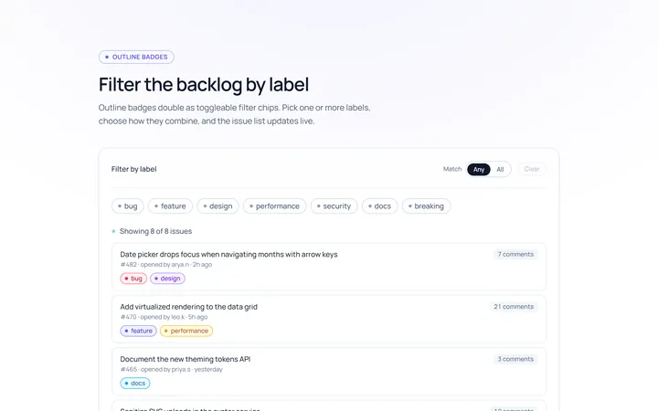
Outline Badge
Originaloutline badges
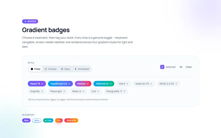
Gradient Badge
Originalgradient badges
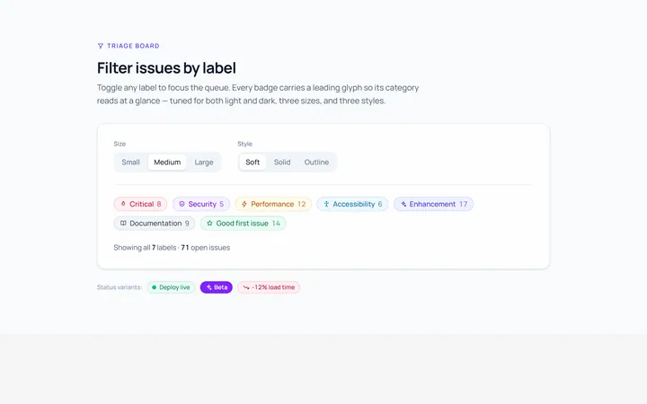
Icon Badge
Originalbadges with leading icons
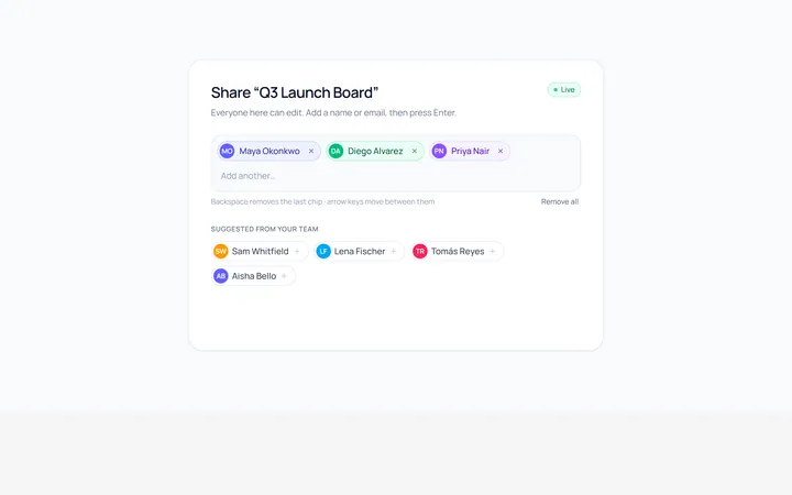
Removable Badge
Originalremovable chip badges
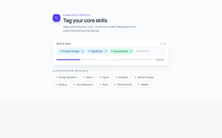
Input Chip
Originalchip input tokens
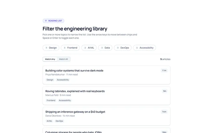
Filter Chip
Originalselectable filter chips
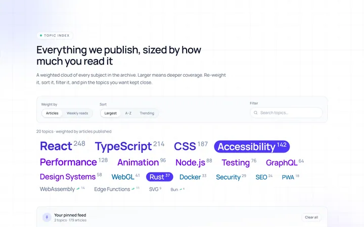
Cloud Tag
Originalweighted tag cloud
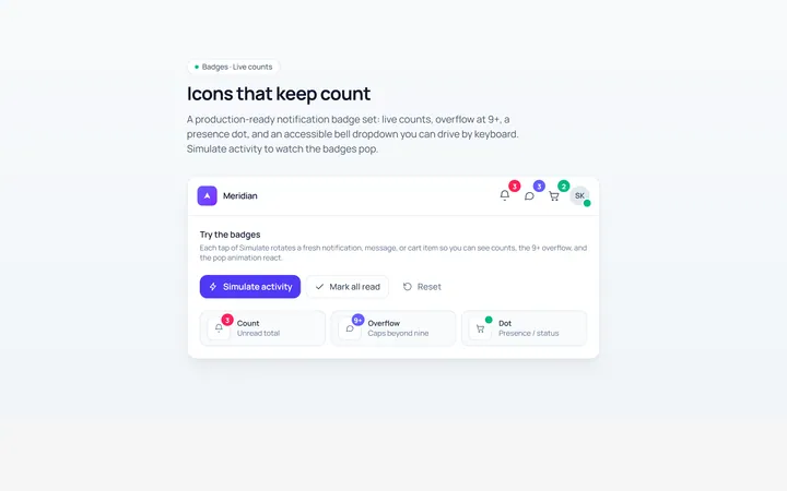
Notification Badge
Originalicon with notification badge