

Dot Badge
Original · freedot status badges
byWeb InnoventixReact + Tailwind
badgedotbadges
Copy prompt gives Claude Code, Cursor or v0 a ready-to-paste prompt that recreates this exact component.
npx shadcn@latest add https://webinnoventix.com/r/badge-dot.jsonbadge-dot.tsx
"use client";
import {
type KeyboardEvent as ReactKeyboardEvent,
useId,
useRef,
useState,
} from "react";
import { motion, useReducedMotion } from "motion/react";
type Presence = "online" | "away" | "busy" | "offline";
type ServiceStatus = "operational" | "degraded" | "maintenance" | "down";
type PresenceMeta = {
key: Presence;
label: string;
desc: string;
dot: string;
pill: string;
};
type StatusMeta = {
label: string;
dot: string;
pill: string;
pulse: boolean;
};
type ServiceItem = {
id: string;
name: string;
region: string;
status: ServiceStatus;
};
const PRESENCE: ReadonlyArray<PresenceMeta> = [
{
key: "online",
label: "Online",
desc: "Available for messages and calls",
dot: "bg-emerald-500",
pill: "bg-emerald-50 text-emerald-700 ring-emerald-600/20 dark:bg-emerald-500/10 dark:text-emerald-300 dark:ring-emerald-400/25",
},
{
key: "away",
label: "Away",
desc: "Idle for the last 12 minutes",
dot: "bg-amber-500",
pill: "bg-amber-50 text-amber-700 ring-amber-600/20 dark:bg-amber-500/10 dark:text-amber-300 dark:ring-amber-400/25",
},
{
key: "busy",
label: "Do not disturb",
desc: "Notifications are muted",
dot: "bg-rose-500",
pill: "bg-rose-50 text-rose-700 ring-rose-600/20 dark:bg-rose-500/10 dark:text-rose-300 dark:ring-rose-400/25",
},
{
key: "offline",
label: "Offline",
desc: "Last seen today at 09:41",
dot: "bg-slate-400 dark:bg-slate-500",
pill: "bg-slate-100 text-slate-600 ring-slate-500/20 dark:bg-slate-500/10 dark:text-slate-300 dark:ring-slate-400/20",
},
];
const SERVICE_STATUS: Record<ServiceStatus, StatusMeta> = {
operational: {
label: "Operational",
dot: "bg-emerald-500",
pill: "bg-emerald-50 text-emerald-700 ring-emerald-600/20 dark:bg-emerald-500/10 dark:text-emerald-300 dark:ring-emerald-400/25",
pulse: false,
},
degraded: {
label: "Degraded",
dot: "bg-amber-500",
pill: "bg-amber-50 text-amber-700 ring-amber-600/20 dark:bg-amber-500/10 dark:text-amber-300 dark:ring-amber-400/25",
pulse: true,
},
maintenance: {
label: "Maintenance",
dot: "bg-sky-500",
pill: "bg-sky-50 text-sky-700 ring-sky-600/20 dark:bg-sky-500/10 dark:text-sky-300 dark:ring-sky-400/25",
pulse: false,
},
down: {
label: "Major outage",
dot: "bg-rose-500",
pill: "bg-rose-50 text-rose-700 ring-rose-600/20 dark:bg-rose-500/10 dark:text-rose-300 dark:ring-rose-400/25",
pulse: true,
},
};
const SERVICE_CYCLE: ReadonlyArray<ServiceStatus> = [
"operational",
"degraded",
"maintenance",
"down",
];
const INITIAL_SERVICES: ReadonlyArray<ServiceItem> = [
{ id: "gateway", name: "API Gateway", region: "us-east-1", status: "operational" },
{ id: "realtime", name: "Realtime Sync", region: "eu-west-2", status: "degraded" },
{ id: "postgres", name: "Postgres Primary", region: "us-east-1", status: "operational" },
{ id: "storage", name: "Object Storage", region: "ap-south-1", status: "maintenance" },
{ id: "webhooks", name: "Webhook Delivery", region: "us-west-2", status: "down" },
];
function StatusDot({
color,
pulse,
reduced,
size = "sm",
}: {
color: string;
pulse: boolean;
reduced: boolean;
size?: "sm" | "lg";
}) {
const box = size === "lg" ? "h-3.5 w-3.5" : "h-2 w-2";
return (
<span className={`relative flex ${box}`}>
{pulse && !reduced ? (
<span
aria-hidden="true"
className={`dotbadge-anim absolute inline-flex h-full w-full rounded-full opacity-70 ${color} [animation:dotbadge-ping_1.8s_cubic-bezier(0,0,0.2,1)_infinite]`}
/>
) : null}
<span className={`relative inline-flex ${box} rounded-full ${color}`} />
</span>
);
}
function DotBadge({
label,
dot,
pill,
pulse,
reduced,
}: {
label: string;
dot: string;
pill: string;
pulse: boolean;
reduced: boolean;
}) {
return (
<span
className={`inline-flex items-center gap-x-1.5 rounded-full px-2.5 py-1 text-xs font-medium ring-1 ring-inset ${pill}`}
>
<StatusDot color={dot} pulse={pulse} reduced={reduced} />
{label}
</span>
);
}
function CheckIcon() {
return (
<svg
viewBox="0 0 20 20"
fill="currentColor"
aria-hidden="true"
className="h-4 w-4"
>
<path
fillRule="evenodd"
d="M16.7 5.3a1 1 0 0 1 0 1.4l-7.5 7.5a1 1 0 0 1-1.4 0L3.3 9.7a1 1 0 1 1 1.4-1.4l3.8 3.79 6.8-6.8a1 1 0 0 1 1.4 0Z"
clipRule="evenodd"
/>
</svg>
);
}
export default function DotStatusBadges() {
const reduced = useReducedMotion() ?? false;
const labelId = useId();
const [presence, setPresence] = useState<Presence>("online");
const [services, setServices] = useState<ReadonlyArray<ServiceItem>>(INITIAL_SERVICES);
const [announce, setAnnounce] = useState("");
const optionRefs = useRef<Array<HTMLButtonElement | null>>([]);
const current = PRESENCE.find((p) => p.key === presence) ?? PRESENCE[0];
const previewPulse = presence === "online" || presence === "busy";
function selectPresence(key: Presence) {
setPresence(key);
const meta = PRESENCE.find((p) => p.key === key);
if (meta) setAnnounce(`Presence set to ${meta.label}`);
}
function onOptionKeyDown(e: ReactKeyboardEvent<HTMLButtonElement>, index: number) {
const last = PRESENCE.length - 1;
let next = index;
switch (e.key) {
case "ArrowDown":
case "ArrowRight":
next = index === last ? 0 : index + 1;
break;
case "ArrowUp":
case "ArrowLeft":
next = index === 0 ? last : index - 1;
break;
case "Home":
next = 0;
break;
case "End":
next = last;
break;
default:
return;
}
e.preventDefault();
selectPresence(PRESENCE[next].key);
optionRefs.current[next]?.focus();
}
function cycleService(id: string) {
const svc = services.find((s) => s.id === id);
if (!svc) return;
const idx = SERVICE_CYCLE.indexOf(svc.status);
const nextStatus = SERVICE_CYCLE[(idx + 1) % SERVICE_CYCLE.length];
setServices((prev) =>
prev.map((s) => (s.id === id ? { ...s, status: nextStatus } : s)),
);
setAnnounce(`${svc.name} is now ${SERVICE_STATUS[nextStatus].label}`);
}
const focusRing =
"focus-visible:outline-none focus-visible:ring-2 focus-visible:ring-indigo-500 focus-visible:ring-offset-2 focus-visible:ring-offset-white dark:focus-visible:ring-offset-slate-900";
return (
<section className="relative w-full bg-slate-50 px-6 py-16 sm:py-20 dark:bg-slate-950">
<div className="mx-auto max-w-3xl">
<div className="mb-10 max-w-xl">
<p className="text-xs font-semibold uppercase tracking-[0.2em] text-indigo-600 dark:text-indigo-400">
Presence & uptime
</p>
<h2 className="mt-2 text-2xl font-semibold tracking-tight text-slate-900 sm:text-3xl dark:text-slate-50">
Dot status badges
</h2>
<p className="mt-3 text-sm leading-relaxed text-slate-600 dark:text-slate-400">
A compact status system: presence for people, health for services. Pick a
presence with the arrow keys, or activate a service row to cycle its state.
</p>
</div>
{/* Presence card */}
<div className="rounded-2xl border border-slate-200 bg-white p-5 shadow-sm sm:p-6 dark:border-slate-800 dark:bg-slate-900">
<div className="grid gap-6 md:grid-cols-[1fr_1.1fr]">
{/* Live preview */}
<div className="flex flex-col justify-between rounded-xl bg-slate-50 p-5 dark:bg-slate-800/40">
<div className="flex items-center gap-4">
<div className="relative shrink-0">
<div className="flex h-14 w-14 items-center justify-center rounded-full bg-gradient-to-br from-indigo-500 to-violet-500 text-base font-semibold text-white">
MO
</div>
<span className="absolute -bottom-0.5 -right-0.5 rounded-full p-[3px] bg-slate-50 dark:bg-slate-800">
<StatusDot
color={current.dot}
pulse={previewPulse}
reduced={reduced}
size="lg"
/>
</span>
</div>
<div className="min-w-0">
<p className="truncate text-sm font-semibold text-slate-900 dark:text-slate-100">
Maya Okonkwo
</p>
<p className="truncate text-xs text-slate-500 dark:text-slate-400">
Product designer
</p>
</div>
</div>
<motion.div
key={presence}
initial={reduced ? false : { opacity: 0, y: 6 }}
animate={{ opacity: 1, y: 0 }}
transition={reduced ? { duration: 0 } : { duration: 0.25, ease: "easeOut" }}
className="mt-5"
>
<DotBadge
label={current.label}
dot={current.dot}
pill={current.pill}
pulse={previewPulse}
reduced={reduced}
/>
<p className="mt-2 text-xs leading-relaxed text-slate-500 dark:text-slate-400">
{current.desc}
</p>
</motion.div>
</div>
{/* Radio group */}
<div>
<p
id={labelId}
className="mb-2 text-xs font-medium uppercase tracking-wide text-slate-500 dark:text-slate-400"
>
Set your status
</p>
<div
role="radiogroup"
aria-labelledby={labelId}
className="relative flex flex-col gap-1"
>
{PRESENCE.map((p, i) => {
const active = p.key === presence;
return (
<button
key={p.key}
ref={(el) => {
optionRefs.current[i] = el;
}}
type="button"
role="radio"
aria-checked={active}
tabIndex={active ? 0 : -1}
onClick={() => selectPresence(p.key)}
onKeyDown={(e) => onOptionKeyDown(e, i)}
className={`relative flex rounded-xl ${focusRing}`}
>
{active ? (
<motion.span
layoutId="dotbadge-active-presence"
aria-hidden="true"
className="absolute inset-0 rounded-xl bg-white shadow-sm ring-1 ring-slate-200 dark:bg-slate-800 dark:ring-slate-700"
transition={
reduced
? { duration: 0 }
: { type: "spring", stiffness: 520, damping: 42 }
}
/>
) : null}
<span className="relative z-10 flex w-full items-center gap-3 px-3 py-2.5 text-left">
<StatusDot
color={p.dot}
pulse={p.key === "online"}
reduced={reduced}
/>
<span className="flex min-w-0 flex-col">
<span className="text-sm font-medium text-slate-900 dark:text-slate-100">
{p.label}
</span>
<span className="truncate text-xs text-slate-500 dark:text-slate-400">
{p.desc}
</span>
</span>
<span
className={`ml-auto text-indigo-600 transition-opacity dark:text-indigo-400 ${
active ? "opacity-100" : "opacity-0"
}`}
>
<CheckIcon />
</span>
</span>
</button>
);
})}
</div>
</div>
</div>
</div>
{/* Services card */}
<div className="mt-6 rounded-2xl border border-slate-200 bg-white shadow-sm dark:border-slate-800 dark:bg-slate-900">
<div className="flex items-center justify-between border-b border-slate-200 px-5 py-4 dark:border-slate-800">
<div>
<h3 className="text-sm font-semibold text-slate-900 dark:text-slate-100">
System status
</h3>
<p className="mt-0.5 text-xs text-slate-500 dark:text-slate-400">
Activate a row to cycle its status
</p>
</div>
<span className="hidden text-xs text-slate-400 sm:inline dark:text-slate-500">
5 services
</span>
</div>
<ul className="divide-y divide-slate-100 dark:divide-slate-800">
{services.map((s) => {
const meta = SERVICE_STATUS[s.status];
return (
<li key={s.id}>
<button
type="button"
onClick={() => cycleService(s.id)}
aria-label={`${s.name}, ${s.region}. Status: ${meta.label}. Activate to change status.`}
className={`flex w-full items-center justify-between gap-3 px-5 py-3.5 text-left transition-colors hover:bg-slate-50 dark:hover:bg-slate-800/50 ${focusRing} focus-visible:ring-offset-0`}
>
<span className="flex min-w-0 items-center gap-3">
<StatusDot
color={meta.dot}
pulse={meta.pulse}
reduced={reduced}
/>
<span className="flex min-w-0 flex-col">
<span className="truncate text-sm font-medium text-slate-900 dark:text-slate-100">
{s.name}
</span>
<span className="truncate text-xs text-slate-500 dark:text-slate-400">
{s.region}
</span>
</span>
</span>
<DotBadge
label={meta.label}
dot={meta.dot}
pill={meta.pill}
pulse={meta.pulse}
reduced={reduced}
/>
</button>
</li>
);
})}
</ul>
</div>
<span aria-live="polite" className="sr-only">
{announce}
</span>
</div>
<style>{`
@keyframes dotbadge-ping {
75%, 100% { transform: scale(2.2); opacity: 0; }
}
@keyframes dotbadge-pulse {
0%, 100% { opacity: 1; }
50% { opacity: 0.5; }
}
@media (prefers-reduced-motion: reduce) {
.dotbadge-anim { animation: none !important; }
}
`}</style>
</section>
);
}Dependencies
motion
Licence
Built by Web Innoventix. Free for personal and commercial use, no attribution required.
Built by Web Innoventix
Need a custom interface, a full website, or SEO that gets you cited by AI? We design, build and rank it end to end.
Get a free quoteSimilar components
Browse all →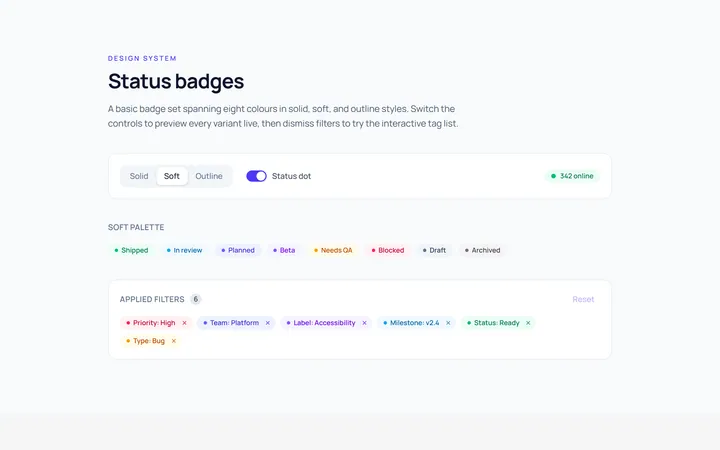
Basic Badge
Originalbasic badges across colours
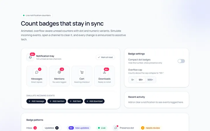
Count Badge
Originalnotification count badges
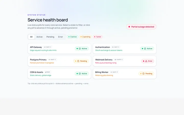
Status Badge
Originalstatus pills (active/pending/error)
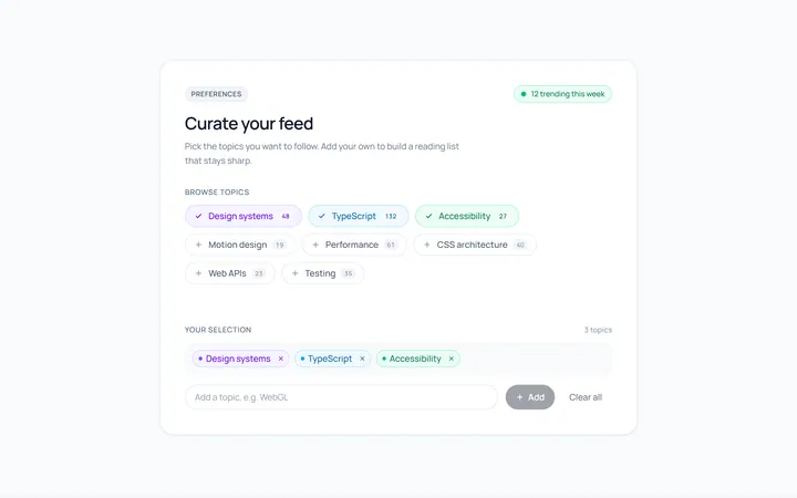
Pill Badge
Originalsoft pill badges
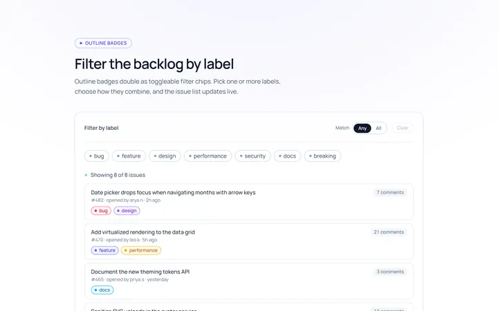
Outline Badge
Originaloutline badges
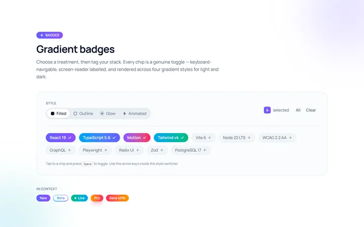
Gradient Badge
Originalgradient badges
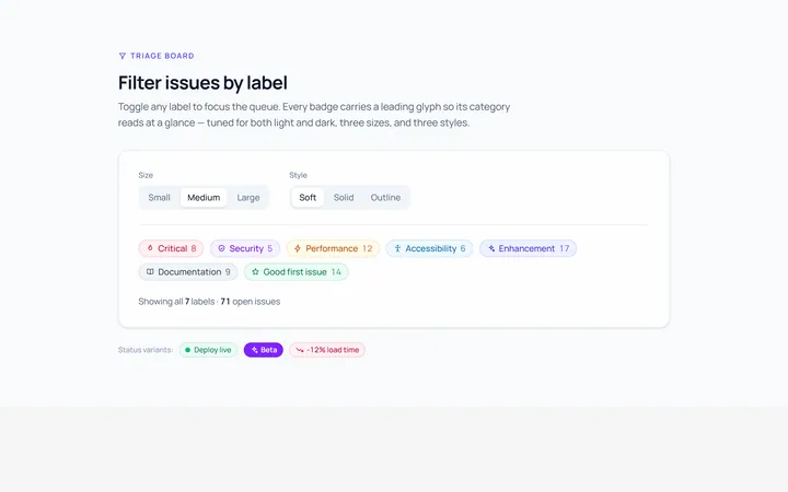
Icon Badge
Originalbadges with leading icons
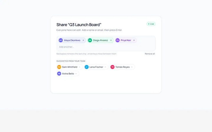
Removable Badge
Originalremovable chip badges
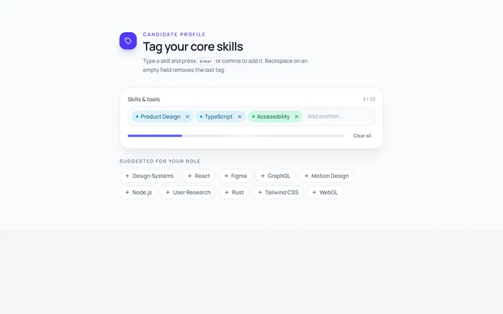
Input Chip
Originalchip input tokens
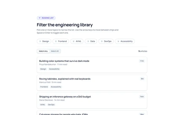
Filter Chip
Originalselectable filter chips
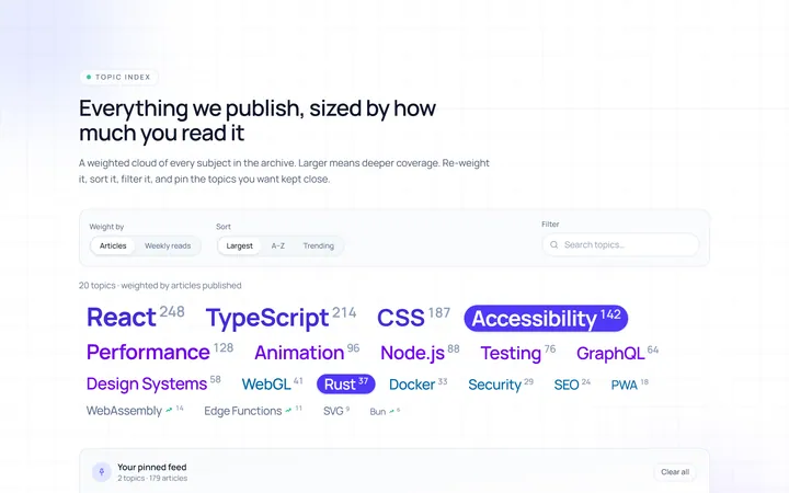
Cloud Tag
Originalweighted tag cloud
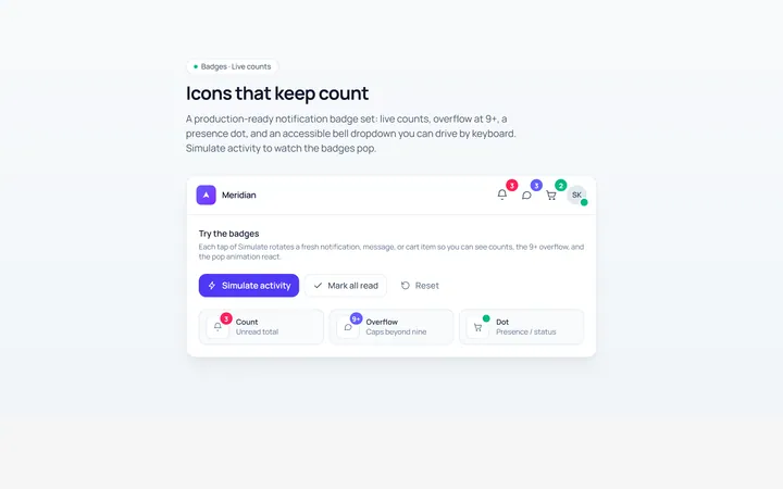
Notification Badge
Originalicon with notification badge