

Input Chip
Original · freechip input tokens
byWeb InnoventixReact + Tailwind
chipinputbadges
Copy prompt gives Claude Code, Cursor or v0 a ready-to-paste prompt that recreates this exact component.
npx shadcn@latest add https://webinnoventix.com/r/chip-input.jsonchip-input.tsx
"use client";
import {
useCallback,
useId,
useRef,
useState,
type KeyboardEvent as ReactKeyboardEvent,
} from "react";
import { AnimatePresence, motion, useReducedMotion } from "motion/react";
const MAX_TAGS = 12;
const SUGGESTIONS = [
"TypeScript",
"Design Systems",
"React",
"Accessibility",
"Figma",
"GraphQL",
"Motion Design",
"Node.js",
"User Research",
"Rust",
"Tailwind CSS",
"WebGL",
] as const;
type Tone = {
chip: string;
dot: string;
close: string;
};
const TONES: readonly Tone[] = [
{
chip: "bg-indigo-100 text-indigo-800 ring-indigo-200 dark:bg-indigo-500/15 dark:text-indigo-200 dark:ring-indigo-400/25",
dot: "bg-indigo-500",
close:
"hover:bg-indigo-200/70 focus-visible:ring-indigo-500 dark:hover:bg-indigo-400/20",
},
{
chip: "bg-violet-100 text-violet-800 ring-violet-200 dark:bg-violet-500/15 dark:text-violet-200 dark:ring-violet-400/25",
dot: "bg-violet-500",
close:
"hover:bg-violet-200/70 focus-visible:ring-violet-500 dark:hover:bg-violet-400/20",
},
{
chip: "bg-emerald-100 text-emerald-800 ring-emerald-200 dark:bg-emerald-500/15 dark:text-emerald-200 dark:ring-emerald-400/25",
dot: "bg-emerald-500",
close:
"hover:bg-emerald-200/70 focus-visible:ring-emerald-500 dark:hover:bg-emerald-400/20",
},
{
chip: "bg-sky-100 text-sky-800 ring-sky-200 dark:bg-sky-500/15 dark:text-sky-200 dark:ring-sky-400/25",
dot: "bg-sky-500",
close:
"hover:bg-sky-200/70 focus-visible:ring-sky-500 dark:hover:bg-sky-400/20",
},
{
chip: "bg-amber-100 text-amber-800 ring-amber-200 dark:bg-amber-500/15 dark:text-amber-200 dark:ring-amber-400/25",
dot: "bg-amber-500",
close:
"hover:bg-amber-200/70 focus-visible:ring-amber-500 dark:hover:bg-amber-400/20",
},
{
chip: "bg-rose-100 text-rose-800 ring-rose-200 dark:bg-rose-500/15 dark:text-rose-200 dark:ring-rose-400/25",
dot: "bg-rose-500",
close:
"hover:bg-rose-200/70 focus-visible:ring-rose-500 dark:hover:bg-rose-400/20",
},
];
function toneFor(label: string): Tone {
let sum = 0;
for (let i = 0; i < label.length; i += 1) {
sum = (sum + label.charCodeAt(i)) % 2147483647;
}
return TONES[sum % TONES.length];
}
function CloseIcon() {
return (
<svg
viewBox="0 0 24 24"
aria-hidden="true"
className="h-3.5 w-3.5"
fill="none"
stroke="currentColor"
strokeWidth={2.4}
strokeLinecap="round"
>
<path d="M6 6l12 12M18 6L6 18" />
</svg>
);
}
function PlusIcon() {
return (
<svg
viewBox="0 0 24 24"
aria-hidden="true"
className="h-3.5 w-3.5"
fill="none"
stroke="currentColor"
strokeWidth={2.2}
strokeLinecap="round"
>
<path d="M12 5v14M5 12h14" />
</svg>
);
}
function TagIcon() {
return (
<svg
viewBox="0 0 24 24"
aria-hidden="true"
className="h-5 w-5"
fill="none"
stroke="currentColor"
strokeWidth={1.8}
strokeLinecap="round"
strokeLinejoin="round"
>
<path d="M3 11.5V5a2 2 0 0 1 2-2h6.5a2 2 0 0 1 1.4.6l7.5 7.5a2 2 0 0 1 0 2.8l-6.5 6.5a2 2 0 0 1-2.8 0L3.6 12.9a2 2 0 0 1-.6-1.4Z" />
<circle cx="8" cy="8" r="1.4" fill="currentColor" stroke="none" />
</svg>
);
}
export default function ChipInput() {
const prefersReduced = useReducedMotion();
const reduce = prefersReduced ?? false;
const uid = useId();
const inputId = `${uid}-field`;
const helpId = `${uid}-help`;
const statusId = `${uid}-status`;
const [tags, setTags] = useState<string[]>([
"Product Design",
"TypeScript",
"Accessibility",
]);
const [value, setValue] = useState("");
const [status, setStatus] = useState("");
const [shaking, setShaking] = useState(false);
const inputRef = useRef<HTMLInputElement>(null);
const chipRefs = useRef<Array<HTMLButtonElement | null>>([]);
const shakeTimer = useRef<number | null>(null);
const atMax = tags.length >= MAX_TAGS;
const triggerShake = useCallback(() => {
setShaking(true);
if (shakeTimer.current !== null) {
window.clearTimeout(shakeTimer.current);
}
shakeTimer.current = window.setTimeout(() => setShaking(false), 380);
}, []);
const focusChip = useCallback((index: number) => {
if (index < 0) return;
chipRefs.current[index]?.focus();
}, []);
const commit = useCallback(
(raw: string) => {
const parts = raw
.split(",")
.map((part) => part.trim())
.filter((part) => part.length > 0);
if (parts.length === 0) return;
const next = [...tags];
let added = 0;
let hitMax = false;
for (const part of parts) {
if (next.length >= MAX_TAGS) {
hitMax = true;
break;
}
const duplicate = next.some(
(tag) => tag.toLowerCase() === part.toLowerCase(),
);
if (duplicate) continue;
next.push(part);
added += 1;
}
setValue("");
if (added > 0) {
setTags(next);
setStatus(
added === 1
? `Added ${parts[0]}. ${next.length} of ${MAX_TAGS} tags.`
: `Added ${added} tags. ${next.length} of ${MAX_TAGS}.`,
);
} else {
triggerShake();
setStatus(hitMax ? `Limit of ${MAX_TAGS} tags reached.` : "Already added.");
}
},
[tags, triggerShake],
);
const removeAt = useCallback(
(index: number, restoreFocus: "chip" | "input") => {
const label = tags[index];
const next = tags.filter((_, i) => i !== index);
setTags(next);
setStatus(`Removed ${label}. ${next.length} of ${MAX_TAGS} tags.`);
window.requestAnimationFrame(() => {
if (next.length === 0 || restoreFocus === "input") {
inputRef.current?.focus();
return;
}
const target = Math.min(index, next.length - 1);
chipRefs.current[target]?.focus();
});
},
[tags],
);
const onInputKeyDown = useCallback(
(event: ReactKeyboardEvent<HTMLInputElement>) => {
if (event.key === "Enter" || event.key === ",") {
event.preventDefault();
commit(value);
return;
}
if (event.key === "Backspace" && value === "" && tags.length > 0) {
event.preventDefault();
removeAt(tags.length - 1, "input");
return;
}
if (event.key === "ArrowLeft" && value === "" && tags.length > 0) {
event.preventDefault();
focusChip(tags.length - 1);
}
},
[commit, focusChip, removeAt, tags.length, value],
);
const onChipKeyDown = useCallback(
(event: ReactKeyboardEvent<HTMLButtonElement>, index: number) => {
switch (event.key) {
case "Backspace":
case "Delete":
case "Enter":
case " ":
event.preventDefault();
removeAt(index, "chip");
break;
case "ArrowLeft":
event.preventDefault();
focusChip(index - 1);
break;
case "ArrowRight":
event.preventDefault();
if (index >= tags.length - 1) {
inputRef.current?.focus();
} else {
focusChip(index + 1);
}
break;
default:
break;
}
},
[focusChip, removeAt, tags.length],
);
const clearAll = useCallback(() => {
if (tags.length === 0) return;
setTags([]);
setStatus("Cleared all tags.");
inputRef.current?.focus();
}, [tags.length]);
const remainingSuggestions = SUGGESTIONS.filter(
(item) => !tags.some((tag) => tag.toLowerCase() === item.toLowerCase()),
);
const fillPct = Math.min(100, (tags.length / MAX_TAGS) * 100);
return (
<section className="relative w-full overflow-hidden bg-slate-50 px-6 py-20 text-slate-900 dark:bg-slate-950 dark:text-slate-100 sm:px-8">
<style>{`
@keyframes chpni-shake {
0%, 100% { transform: translateX(0); }
18% { transform: translateX(-5px); }
38% { transform: translateX(5px); }
58% { transform: translateX(-4px); }
78% { transform: translateX(3px); }
}
@keyframes chpni-sheen {
0% { transform: translateX(-120%); }
100% { transform: translateX(220%); }
}
.chpni-field--shake { animation: chpni-shake 0.38s ease; }
.chpni-sheen { animation: chpni-sheen 2.6s ease-in-out infinite; }
@media (prefers-reduced-motion: reduce) {
.chpni-field--shake { animation: none; }
.chpni-sheen { animation: none; }
}
`}</style>
<div
aria-hidden="true"
className="pointer-events-none absolute inset-0 [background-image:radial-gradient(circle_at_1px_1px,theme(colors.slate.300)_1px,transparent_0)] [background-size:26px_26px] opacity-40 dark:[background-image:radial-gradient(circle_at_1px_1px,theme(colors.slate.700)_1px,transparent_0)] dark:opacity-30"
/>
<div className="relative mx-auto w-full max-w-2xl">
<div className="mb-8 flex items-start gap-4">
<span className="mt-0.5 inline-flex h-11 w-11 shrink-0 items-center justify-center rounded-2xl bg-indigo-600 text-white shadow-lg shadow-indigo-600/25 dark:bg-indigo-500">
<TagIcon />
</span>
<div>
<p className="text-xs font-semibold uppercase tracking-[0.22em] text-indigo-600 dark:text-indigo-400">
Candidate profile
</p>
<h2 className="mt-1 text-2xl font-semibold tracking-tight text-slate-900 dark:text-white sm:text-3xl">
Tag your core skills
</h2>
<p
id={helpId}
className="mt-2 max-w-md text-sm leading-relaxed text-slate-600 dark:text-slate-400"
>
Type a skill and press{" "}
<kbd className="rounded border border-slate-300 bg-white px-1.5 py-0.5 font-mono text-[0.7rem] font-medium text-slate-700 dark:border-slate-700 dark:bg-slate-800 dark:text-slate-200">
Enter
</kbd>{" "}
or comma to add it. Backspace on an empty field removes the last tag.
</p>
</div>
</div>
<div className="rounded-3xl border border-slate-200 bg-white p-5 shadow-xl shadow-slate-900/5 dark:border-slate-800 dark:bg-slate-900 dark:shadow-black/20">
<div className="mb-2 flex items-center justify-between gap-3">
<label
htmlFor={inputId}
className="text-sm font-medium text-slate-700 dark:text-slate-300"
>
Skills & tools
</label>
<span
className={`text-xs font-semibold tabular-nums ${
atMax
? "text-rose-600 dark:text-rose-400"
: "text-slate-400 dark:text-slate-500"
}`}
>
{tags.length} / {MAX_TAGS}
</span>
</div>
<div
onClick={() => inputRef.current?.focus()}
className={`group relative flex flex-wrap items-center gap-2 rounded-2xl border bg-slate-50 p-2.5 transition-colors focus-within:border-indigo-500 focus-within:bg-white focus-within:ring-4 focus-within:ring-indigo-500/15 dark:bg-slate-950/40 dark:focus-within:bg-slate-950 dark:focus-within:ring-indigo-400/15 ${
atMax
? "border-amber-300 dark:border-amber-500/40"
: "border-slate-200 focus-within:border-indigo-500 dark:border-slate-700"
} ${shaking && !reduce ? "chpni-field--shake" : ""}`}
>
<ul className="contents" role="list">
<AnimatePresence initial={false} mode="popLayout">
{tags.map((tag, index) => {
const tone = toneFor(tag);
return (
<motion.li
key={tag}
layout={reduce ? false : "position"}
initial={reduce ? false : { opacity: 0, scale: 0.7, y: 4 }}
animate={{ opacity: 1, scale: 1, y: 0 }}
exit={
reduce
? { opacity: 0 }
: { opacity: 0, scale: 0.7, y: -6 }
}
transition={{ duration: 0.18, ease: [0.2, 0.8, 0.2, 1] }}
>
<span
className={`inline-flex items-center gap-1.5 rounded-full py-1 pl-2.5 pr-1 text-sm font-medium ring-1 ring-inset ${tone.chip}`}
>
<span
aria-hidden="true"
className={`h-1.5 w-1.5 rounded-full ${tone.dot}`}
/>
{tag}
<button
type="button"
ref={(el) => {
chipRefs.current[index] = el;
}}
onClick={(event) => {
event.stopPropagation();
removeAt(index, "input");
}}
onKeyDown={(event) => onChipKeyDown(event, index)}
aria-label={`Remove ${tag}`}
className={`ml-0.5 inline-flex h-5 w-5 items-center justify-center rounded-full text-current/80 transition-colors focus-visible:outline-none focus-visible:ring-2 focus-visible:ring-offset-1 focus-visible:ring-offset-white dark:focus-visible:ring-offset-slate-900 ${tone.close}`}
>
<CloseIcon />
</button>
</span>
</motion.li>
);
})}
</AnimatePresence>
</ul>
<input
id={inputId}
ref={inputRef}
type="text"
value={value}
disabled={atMax}
onChange={(event) => setValue(event.target.value)}
onKeyDown={onInputKeyDown}
aria-describedby={`${helpId} ${statusId}`}
placeholder={
atMax ? "Tag limit reached" : tags.length ? "Add another…" : "e.g. GraphQL"
}
className="min-w-[7rem] flex-1 bg-transparent px-1.5 py-1 text-sm text-slate-900 outline-none placeholder:text-slate-400 disabled:cursor-not-allowed dark:text-white dark:placeholder:text-slate-500"
/>
</div>
<div className="mt-3 flex items-center gap-3">
<div className="relative h-1.5 flex-1 overflow-hidden rounded-full bg-slate-200 dark:bg-slate-800">
<div
className={`h-full rounded-full transition-[width] duration-300 ease-out ${
atMax ? "bg-amber-500" : "bg-indigo-500"
}`}
style={{ width: `${fillPct}%` }}
/>
{!reduce && !atMax && tags.length > 0 ? (
<div className="chpni-sheen absolute inset-y-0 left-0 w-1/3 bg-gradient-to-r from-transparent via-white/60 to-transparent dark:via-white/20" />
) : null}
</div>
<button
type="button"
onClick={clearAll}
disabled={tags.length === 0}
className="shrink-0 rounded-lg px-2.5 py-1 text-xs font-semibold text-slate-500 transition-colors hover:text-rose-600 focus-visible:outline-none focus-visible:ring-2 focus-visible:ring-rose-500 disabled:cursor-not-allowed disabled:opacity-40 dark:text-slate-400 dark:hover:text-rose-400"
>
Clear all
</button>
</div>
</div>
<div className="mt-6">
<p className="mb-3 text-xs font-semibold uppercase tracking-[0.16em] text-slate-500 dark:text-slate-400">
Suggested for your role
</p>
{remainingSuggestions.length > 0 ? (
<div className="flex flex-wrap gap-2">
{remainingSuggestions.map((item) => (
<button
key={item}
type="button"
disabled={atMax}
onClick={() => commit(item)}
className="inline-flex items-center gap-1.5 rounded-full border border-dashed border-slate-300 bg-white px-3 py-1.5 text-sm font-medium text-slate-600 transition-colors hover:border-indigo-400 hover:bg-indigo-50 hover:text-indigo-700 focus-visible:outline-none focus-visible:ring-2 focus-visible:ring-indigo-500 focus-visible:ring-offset-2 focus-visible:ring-offset-slate-50 disabled:cursor-not-allowed disabled:opacity-40 dark:border-slate-700 dark:bg-slate-900 dark:text-slate-300 dark:hover:border-indigo-500/60 dark:hover:bg-indigo-500/10 dark:hover:text-indigo-300 dark:focus-visible:ring-offset-slate-950"
>
<PlusIcon />
{item}
</button>
))}
</div>
) : (
<p className="text-sm text-slate-500 dark:text-slate-400">
Nice — every suggested skill is already on your profile.
</p>
)}
</div>
<p id={statusId} aria-live="polite" className="sr-only">
{status}
</p>
</div>
</section>
);
}Dependencies
motion
Licence
Built by Web Innoventix. Free for personal and commercial use, no attribution required.
Built by Web Innoventix
Need a custom interface, a full website, or SEO that gets you cited by AI? We design, build and rank it end to end.
Get a free quoteSimilar components
Browse all →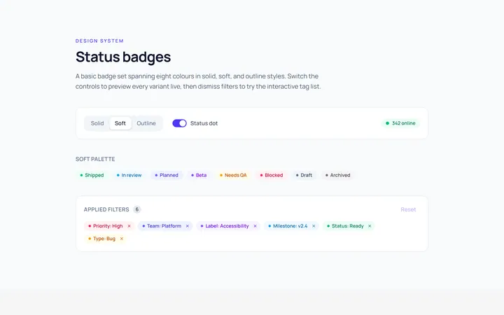
Basic Badge
Originalbasic badges across colours
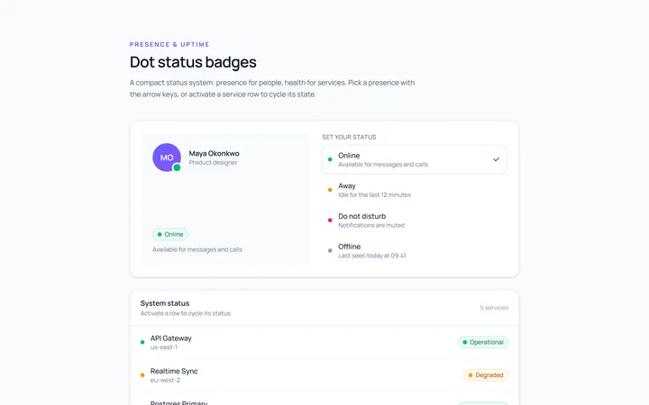
Dot Badge
Originaldot status badges
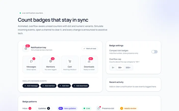
Count Badge
Originalnotification count badges
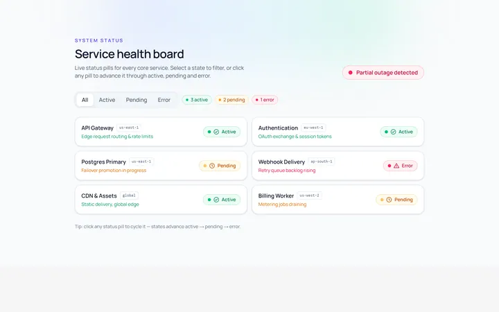
Status Badge
Originalstatus pills (active/pending/error)
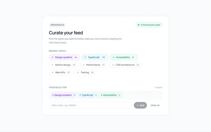
Pill Badge
Originalsoft pill badges
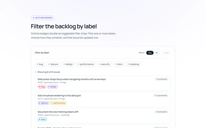
Outline Badge
Originaloutline badges
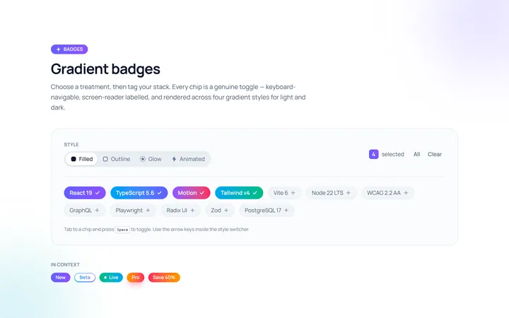
Gradient Badge
Originalgradient badges
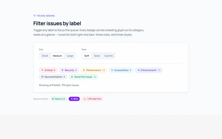
Icon Badge
Originalbadges with leading icons
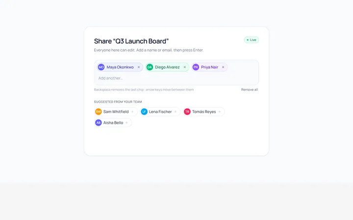
Removable Badge
Originalremovable chip badges
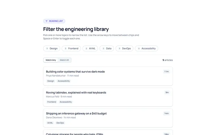
Filter Chip
Originalselectable filter chips
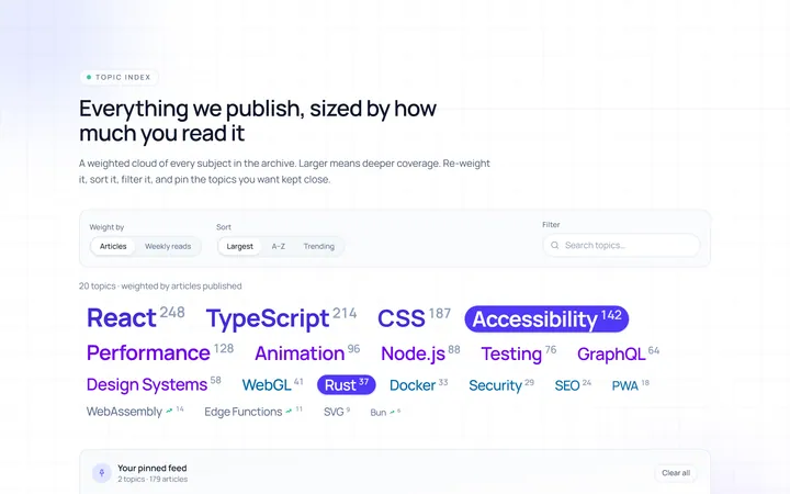
Cloud Tag
Originalweighted tag cloud
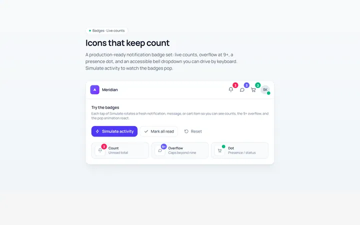
Notification Badge
Originalicon with notification badge