

Pill Badge
Original · freesoft pill badges
byWeb InnoventixReact + Tailwind
badgepillbadges
Copy prompt gives Claude Code, Cursor or v0 a ready-to-paste prompt that recreates this exact component.
npx shadcn@latest add https://webinnoventix.com/r/badge-pill.jsonbadge-pill.tsx
"use client";

import { useRef, useState } from "react";
import type { FormEvent } from "react";
import { AnimatePresence, motion, useReducedMotion } from "motion/react";
import type { Transition } from "motion/react";

type Accent = "indigo" | "violet" | "emerald" | "rose" | "amber" | "sky";

type Tag = {
  id: string;
  label: string;
  accent: Accent;
};

type PresetTopic = Tag & { count: string };

const SOFT: Record<Accent, string> = {
  indigo:
    "bg-indigo-50 text-indigo-700 ring-indigo-200 dark:bg-indigo-500/10 dark:text-indigo-300 dark:ring-indigo-400/25",
  violet:
    "bg-violet-50 text-violet-700 ring-violet-200 dark:bg-violet-500/10 dark:text-violet-300 dark:ring-violet-400/25",
  emerald:
    "bg-emerald-50 text-emerald-700 ring-emerald-200 dark:bg-emerald-500/10 dark:text-emerald-300 dark:ring-emerald-400/25",
  rose: "bg-rose-50 text-rose-700 ring-rose-200 dark:bg-rose-500/10 dark:text-rose-300 dark:ring-rose-400/25",
  amber:
    "bg-amber-50 text-amber-800 ring-amber-200 dark:bg-amber-500/10 dark:text-amber-300 dark:ring-amber-400/25",
  sky: "bg-sky-50 text-sky-700 ring-sky-200 dark:bg-sky-500/10 dark:text-sky-300 dark:ring-sky-400/25",
};

const DOT: Record<Accent, string> = {
  indigo: "bg-indigo-500",
  violet: "bg-violet-500",
  emerald: "bg-emerald-500",
  rose: "bg-rose-500",
  amber: "bg-amber-500",
  sky: "bg-sky-500",
};

const REMOVE_HOVER: Record<Accent, string> = {
  indigo:
    "hover:bg-indigo-100 focus-visible:ring-indigo-500 dark:hover:bg-indigo-400/20 dark:focus-visible:ring-indigo-400",
  violet:
    "hover:bg-violet-100 focus-visible:ring-violet-500 dark:hover:bg-violet-400/20 dark:focus-visible:ring-violet-400",
  emerald:
    "hover:bg-emerald-100 focus-visible:ring-emerald-500 dark:hover:bg-emerald-400/20 dark:focus-visible:ring-emerald-400",
  rose: "hover:bg-rose-100 focus-visible:ring-rose-500 dark:hover:bg-rose-400/20 dark:focus-visible:ring-rose-400",
  amber:
    "hover:bg-amber-100 focus-visible:ring-amber-500 dark:hover:bg-amber-400/20 dark:focus-visible:ring-amber-400",
  sky: "hover:bg-sky-100 focus-visible:ring-sky-500 dark:hover:bg-sky-400/20 dark:focus-visible:ring-sky-400",
};

const ACCENTS: Accent[] = ["indigo", "violet", "emerald", "rose", "amber", "sky"];

const PRESETS: PresetTopic[] = [
  { id: "design-systems", label: "Design systems", accent: "violet", count: "48" },
  { id: "typescript", label: "TypeScript", accent: "sky", count: "132" },
  { id: "accessibility", label: "Accessibility", accent: "emerald", count: "27" },
  { id: "motion", label: "Motion design", accent: "rose", count: "19" },
  { id: "performance", label: "Performance", accent: "amber", count: "61" },
  { id: "css-architecture", label: "CSS architecture", accent: "indigo", count: "40" },
  { id: "web-apis", label: "Web APIs", accent: "sky", count: "23" },
  { id: "testing", label: "Testing", accent: "emerald", count: "35" },
];

function CheckIcon() {
  return (
    <svg viewBox="0 0 20 20" className="h-3.5 w-3.5" fill="none" aria-hidden="true">
      <path
        d="M4.5 10.5l3.2 3.2 7.8-7.8"
        stroke="currentColor"
        strokeWidth="2"
        strokeLinecap="round"
        strokeLinejoin="round"
      />
    </svg>
  );
}

function PlusIcon() {
  return (
    <svg viewBox="0 0 20 20" className="h-3.5 w-3.5" fill="none" aria-hidden="true">
      <path
        d="M10 4.5v11M4.5 10h11"
        stroke="currentColor"
        strokeWidth="2"
        strokeLinecap="round"
      />
    </svg>
  );
}

function CloseIcon() {
  return (
    <svg viewBox="0 0 20 20" className="h-3 w-3" fill="none" aria-hidden="true">
      <path
        d="M5.5 5.5l9 9M14.5 5.5l-9 9"
        stroke="currentColor"
        strokeWidth="2"
        strokeLinecap="round"
      />
    </svg>
  );
}

export default function BadgePill() {
  const prefersReduced = useReducedMotion();
  const counter = useRef(0);
  const [draft, setDraft] = useState("");
  const [selected, setSelected] = useState<Tag[]>([
    { id: "design-systems", label: "Design systems", accent: "violet" },
    { id: "typescript", label: "TypeScript", accent: "sky" },
    { id: "accessibility", label: "Accessibility", accent: "emerald" },
  ]);

  const spring: Transition = prefersReduced
    ? { duration: 0 }
    : { type: "spring", stiffness: 480, damping: 32, mass: 0.7 };

  const isActive = (id: string) => selected.some((t) => t.id === id);

  function toggle(topic: PresetTopic) {
    setSelected((prev) =>
      prev.some((t) => t.id === topic.id)
        ? prev.filter((t) => t.id !== topic.id)
        : [...prev, { id: topic.id, label: topic.label, accent: topic.accent }],
    );
  }

  function remove(id: string) {
    setSelected((prev) => prev.filter((t) => t.id !== id));
  }

  function addCustom(event: FormEvent<HTMLFormElement>) {
    event.preventDefault();
    const label = draft.trim();
    if (!label) return;
    const exists = selected.some(
      (t) => t.label.toLowerCase() === label.toLowerCase(),
    );
    if (exists) {
      setDraft("");
      return;
    }
    const accent = ACCENTS[counter.current % ACCENTS.length];
    counter.current += 1;
    setSelected((prev) => [
      ...prev,
      { id: `custom-${counter.current}-${label}`, label, accent },
    ]);
    setDraft("");
  }

  return (
    <section className="relative w-full bg-slate-50 px-4 py-16 sm:py-24 dark:bg-slate-950">
      <style>{`
        @keyframes bdgpill-ping {
          0% { transform: scale(1); opacity: 0.55; }
          75%, 100% { transform: scale(2.3); opacity: 0; }
        }
        .bdgpill-ping { animation: bdgpill-ping 1.9s cubic-bezier(0,0,0.2,1) infinite; }
        @media (prefers-reduced-motion: reduce) {
          .bdgpill-ping { animation: none !important; }
        }
      `}</style>

      <div className="mx-auto max-w-3xl">
        <div className="overflow-hidden rounded-3xl border border-slate-200 bg-white shadow-sm shadow-slate-200/60 dark:border-slate-800 dark:bg-slate-900 dark:shadow-none">
          <div className="p-6 sm:p-10">
            {/* Header */}
            <div className="flex flex-wrap items-start justify-between gap-4">
              <div className="max-w-md">
                <span className="inline-flex items-center gap-1.5 rounded-full bg-slate-100 px-2.5 py-1 text-[11px] font-semibold uppercase tracking-wider text-slate-600 ring-1 ring-slate-200 ring-inset dark:bg-slate-800 dark:text-slate-300 dark:ring-slate-700">
                  Preferences
                </span>
                <h2 className="mt-4 text-2xl font-semibold tracking-tight text-slate-900 sm:text-[1.7rem] dark:text-white">
                  Curate your feed
                </h2>
                <p className="mt-2 text-sm leading-relaxed text-slate-500 dark:text-slate-400">
                  Pick the topics you want to follow. Add your own to build a
                  reading list that stays sharp.
                </p>
              </div>

              <span className="inline-flex items-center gap-2 rounded-full bg-emerald-50 px-3 py-1.5 text-xs font-medium text-emerald-700 ring-1 ring-emerald-200 ring-inset dark:bg-emerald-500/10 dark:text-emerald-300 dark:ring-emerald-400/25">
                <span className="relative flex h-2 w-2">
                  <span className="bdgpill-ping absolute inline-flex h-full w-full rounded-full bg-emerald-400" />
                  <span className="relative inline-flex h-2 w-2 rounded-full bg-emerald-500" />
                </span>
                12 trending this week
              </span>
            </div>

            {/* Toggle group */}
            <div className="mt-8">
              <p className="text-xs font-semibold uppercase tracking-wider text-slate-500 dark:text-slate-400">
                Browse topics
              </p>
              <div
                role="group"
                aria-label="Available topics"
                className="mt-3 flex flex-wrap gap-2.5"
              >
                {PRESETS.map((topic) => {
                  const active = isActive(topic.id);
                  return (
                    <button
                      key={topic.id}
                      type="button"
                      aria-pressed={active}
                      onClick={() => toggle(topic)}
                      className={[
                        "group inline-flex items-center gap-2 rounded-full px-3.5 py-2 text-sm font-medium ring-1 ring-inset transition-colors duration-200",
                        "focus-visible:outline-none focus-visible:ring-2 focus-visible:ring-offset-2 focus-visible:ring-slate-900 dark:focus-visible:ring-white dark:focus-visible:ring-offset-slate-900",
                        active
                          ? SOFT[topic.accent]
                          : "bg-white text-slate-600 ring-slate-200 hover:bg-slate-50 hover:text-slate-900 dark:bg-slate-800/60 dark:text-slate-300 dark:ring-slate-700 dark:hover:bg-slate-800",
                      ].join(" ")}
                    >
                      <span
                        className={[
                          "grid h-4 w-4 place-items-center rounded-full transition-colors",
                          active
                            ? "text-current"
                            : "text-slate-400 dark:text-slate-500",
                        ].join(" ")}
                        aria-hidden="true"
                      >
                        {active ? <CheckIcon /> : <PlusIcon />}
                      </span>
                      {topic.label}
                      <span
                        className={[
                          "rounded-full px-1.5 py-0.5 text-[10px] font-semibold tabular-nums transition-colors",
                          active
                            ? "bg-white/60 dark:bg-white/10"
                            : "bg-slate-100 text-slate-400 dark:bg-slate-700/60 dark:text-slate-400",
                        ].join(" ")}
                      >
                        {topic.count}
                      </span>
                    </button>
                  );
                })}
              </div>
            </div>

            {/* Divider */}
            <div className="my-8 h-px w-full bg-slate-100 dark:bg-slate-800" />

            {/* Selected pills */}
            <div className="flex items-center justify-between gap-4">
              <p className="text-xs font-semibold uppercase tracking-wider text-slate-500 dark:text-slate-400">
                Your selection
              </p>
              <span className="text-xs font-medium tabular-nums text-slate-400 dark:text-slate-500">
                {selected.length} {selected.length === 1 ? "topic" : "topics"}
              </span>
            </div>

            <ul
              role="list"
              aria-live="polite"
              className="mt-3 flex min-h-[3rem] flex-wrap content-start gap-2 rounded-2xl bg-slate-50 p-3 ring-1 ring-slate-100 ring-inset dark:bg-slate-800/40 dark:ring-slate-800"
            >
              <AnimatePresence initial={false} mode="popLayout">
                {selected.length === 0 ? (
                  <motion.li
                    key="empty"
                    layout={!prefersReduced}
                    initial={prefersReduced ? undefined : { opacity: 0 }}
                    animate={{ opacity: 1 }}
                    exit={prefersReduced ? undefined : { opacity: 0 }}
                    transition={spring}
                    className="px-2 py-1.5 text-sm text-slate-400 dark:text-slate-500"
                  >
                    No topics yet — choose a few above or add your own.
                  </motion.li>
                ) : (
                  selected.map((tag) => (
                    <motion.li
                      key={tag.id}
                      layout={!prefersReduced}
                      initial={
                        prefersReduced ? undefined : { opacity: 0, scale: 0.7 }
                      }
                      animate={{ opacity: 1, scale: 1 }}
                      exit={
                        prefersReduced
                          ? undefined
                          : { opacity: 0, scale: 0.7 }
                      }
                      transition={spring}
                      className={[
                        "inline-flex items-center gap-1.5 rounded-full py-1 pl-2.5 pr-1 text-sm font-medium ring-1 ring-inset",
                        SOFT[tag.accent],
                      ].join(" ")}
                    >
                      <span
                        className={[
                          "h-1.5 w-1.5 rounded-full",
                          DOT[tag.accent],
                        ].join(" ")}
                        aria-hidden="true"
                      />
                      {tag.label}
                      <button
                        type="button"
                        onClick={() => remove(tag.id)}
                        aria-label={`Remove ${tag.label}`}
                        className={[
                          "grid h-5 w-5 place-items-center rounded-full text-current opacity-80 transition hover:opacity-100 focus-visible:outline-none focus-visible:ring-2",
                          REMOVE_HOVER[tag.accent],
                        ].join(" ")}
                      >
                        <CloseIcon />
                      </button>
                    </motion.li>
                  ))
                )}
              </AnimatePresence>
            </ul>

            {/* Add custom + reset */}
            <form
              onSubmit={addCustom}
              className="mt-4 flex flex-col gap-3 sm:flex-row sm:items-center"
            >
              <div className="relative flex-1">
                <label htmlFor="bdgpill-add" className="sr-only">
                  Add a custom topic
                </label>
                <input
                  id="bdgpill-add"
                  type="text"
                  value={draft}
                  onChange={(e) => setDraft(e.target.value)}
                  placeholder="Add a topic, e.g. WebGL"
                  maxLength={32}
                  className="w-full rounded-full border-0 bg-white py-2.5 pl-4 pr-4 text-sm text-slate-900 ring-1 ring-slate-200 ring-inset transition placeholder:text-slate-400 focus:outline-none focus:ring-2 focus:ring-slate-900 dark:bg-slate-800/60 dark:text-white dark:ring-slate-700 dark:placeholder:text-slate-500 dark:focus:ring-white"
                />
              </div>
              <div className="flex items-center gap-2">
                <button
                  type="submit"
                  disabled={draft.trim().length === 0}
                  className="inline-flex items-center gap-1.5 rounded-full bg-slate-900 px-4 py-2.5 text-sm font-semibold text-white transition hover:bg-slate-700 focus-visible:outline-none focus-visible:ring-2 focus-visible:ring-slate-900 focus-visible:ring-offset-2 disabled:cursor-not-allowed disabled:opacity-40 dark:bg-white dark:text-slate-900 dark:hover:bg-slate-200 dark:focus-visible:ring-white dark:focus-visible:ring-offset-slate-900"
                >
                  <PlusIcon />
                  Add
                </button>
                <button
                  type="button"
                  onClick={() => setSelected([])}
                  disabled={selected.length === 0}
                  className="rounded-full px-4 py-2.5 text-sm font-medium text-slate-500 transition hover:text-slate-900 focus-visible:outline-none focus-visible:ring-2 focus-visible:ring-slate-900 focus-visible:ring-offset-2 disabled:cursor-not-allowed disabled:opacity-40 dark:text-slate-400 dark:hover:text-white dark:focus-visible:ring-white dark:focus-visible:ring-offset-slate-900"
                >
                  Clear all
                </button>
              </div>
            </form>
          </div>
        </div>
      </div>
    </section>
  );
}
Dependencies
motion
Licence
Built by Web Innoventix. Free for personal and commercial use, no attribution required.
Built by Web Innoventix
Need a custom interface, a full website, or SEO that gets you cited by AI? We design, build and rank it end to end.
Get a free quoteSimilar components
Browse all →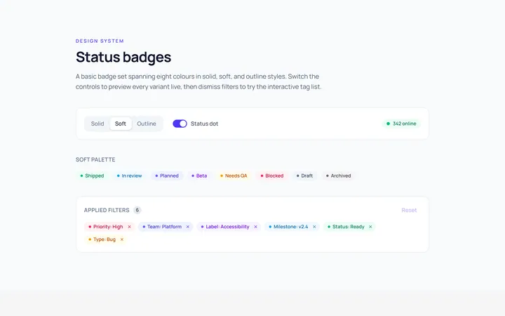
Basic Badge
Originalbasic badges across colours
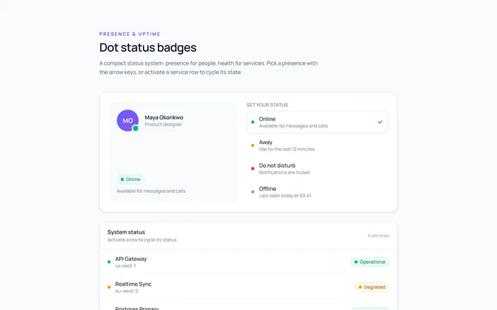
Dot Badge
Originaldot status badges
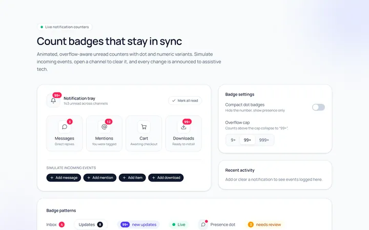
Count Badge
Originalnotification count badges
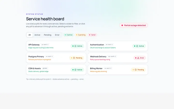
Status Badge
Originalstatus pills (active/pending/error)
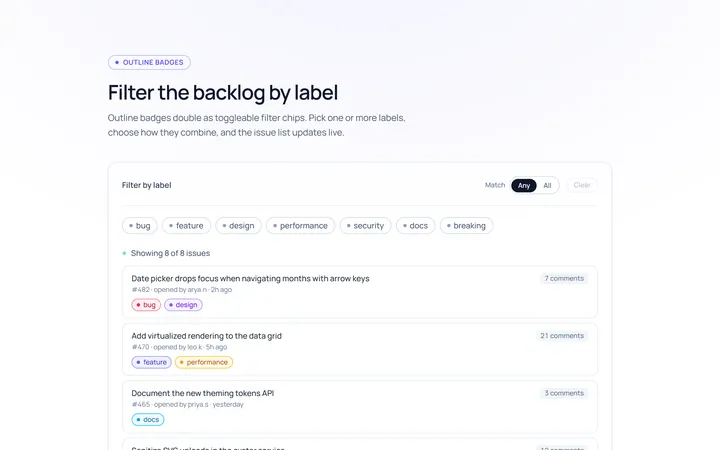
Outline Badge
Originaloutline badges
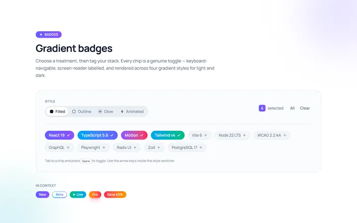
Gradient Badge
Originalgradient badges
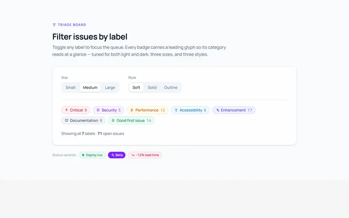
Icon Badge
Originalbadges with leading icons
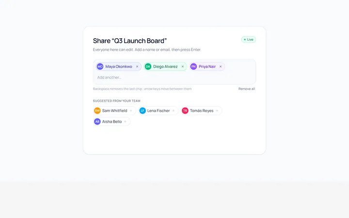
Removable Badge
Originalremovable chip badges
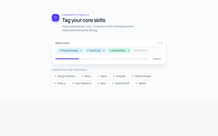
Input Chip
Originalchip input tokens
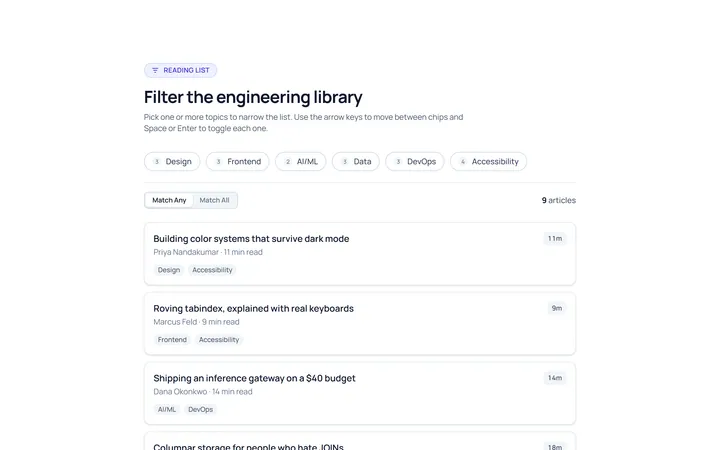
Filter Chip
Originalselectable filter chips
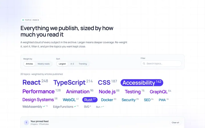
Cloud Tag
Originalweighted tag cloud
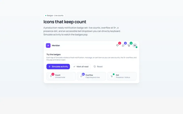
Notification Badge
Originalicon with notification badge