

Notification Badge
Original · freeicon with notification badge
byWeb InnoventixReact + Tailwind
badgenotificationbadges
Copy prompt gives Claude Code, Cursor or v0 a ready-to-paste prompt that recreates this exact component.
npx shadcn@latest add https://webinnoventix.com/r/badge-notification.jsonbadge-notification.tsx
"use client";

import { useEffect, useId, useRef, useState } from "react";
import { AnimatePresence, motion, useReducedMotion } from "motion/react";

type NotifKind = "task" | "deploy" | "comment" | "file" | "alert";

type Notif = {
  id: string;
  kind: NotifKind;
  title: string;
  meta: string;
  time: string;
  read: boolean;
};

type Incoming = Omit<Notif, "id" | "read">;

type Tone = keyof typeof TONES;

const TONES = {
  rose: "bg-rose-500",
  indigo: "bg-indigo-500",
  emerald: "bg-emerald-500",
} as const;

const KIND: Record<NotifKind, { bg: string; text: string }> = {
  task: { bg: "bg-indigo-100 dark:bg-indigo-500/15", text: "text-indigo-600 dark:text-indigo-300" },
  deploy: { bg: "bg-violet-100 dark:bg-violet-500/15", text: "text-violet-600 dark:text-violet-300" },
  comment: { bg: "bg-sky-100 dark:bg-sky-500/15", text: "text-sky-600 dark:text-sky-300" },
  file: { bg: "bg-emerald-100 dark:bg-emerald-500/15", text: "text-emerald-600 dark:text-emerald-300" },
  alert: { bg: "bg-amber-100 dark:bg-amber-500/15", text: "text-amber-600 dark:text-amber-300" },
};

const INITIAL_NOTIFS: Notif[] = [
  { id: "n1", kind: "task", title: "Priya assigned you to “Q3 pricing rebuild”", meta: "Design · due Friday", time: "just now", read: false },
  { id: "n2", kind: "deploy", title: "Deploy #482 finished in 2m 14s", meta: "production · web-app", time: "6m", read: false },
  { id: "n3", kind: "comment", title: "Marcus replied on Invoice #1084", meta: "“Can we split this into two POs?”", time: "38m", read: false },
  { id: "n4", kind: "file", title: "Export “leads-june.csv” is ready", meta: "1,204 rows · 380 KB", time: "2h", read: true },
  { id: "n5", kind: "alert", title: "Storage is at 92% of your plan", meta: "Upgrade to avoid write failures", time: "yesterday", read: true },
];

const INCOMING: Incoming[] = [
  { kind: "comment", title: "Aisha mentioned you in #launch-room", meta: "“need your sign-off on the hero copy”", time: "just now" },
  { kind: "deploy", title: "Deploy #483 started on staging", meta: "staging · web-app", time: "just now" },
  { kind: "task", title: "Review requested on PR #219", meta: "auth: rotate session tokens", time: "just now" },
  { kind: "file", title: "Invoice #1090 was paid in full", meta: "$4,800 · Northwind Ltd", time: "just now" },
  { kind: "alert", title: "Unusual login was blocked", meta: "Lagos, NG · Chrome on Windows", time: "just now" },
];

let uidSeed = 0;
function nextId(): string {
  uidSeed += 1;
  return `nb-${Date.now().toString(36)}-${uidSeed.toString(36)}`;
}

function formatCount(n: number): string {
  if (n > 99) return "99+";
  if (n > 9) return "9+";
  return String(n);
}

function IconBell({ className = "h-5 w-5" }: { className?: string }) {
  return (
    <svg viewBox="0 0 24 24" fill="none" stroke="currentColor" strokeWidth={1.7} strokeLinecap="round" strokeLinejoin="round" className={className} aria-hidden="true">
      <path d="M6 8a6 6 0 0 1 12 0c0 5 2 6 2 6H4s2-1 2-6Z" />
      <path d="M10.5 20a2 2 0 0 0 3 0" />
    </svg>
  );
}

function IconChat({ className = "h-5 w-5" }: { className?: string }) {
  return (
    <svg viewBox="0 0 24 24" fill="none" stroke="currentColor" strokeWidth={1.7} strokeLinecap="round" strokeLinejoin="round" className={className} aria-hidden="true">
      <path d="M20 11.5a7.5 7.5 0 0 1-10.9 6.7L4 19.5l1.3-4.6A7.5 7.5 0 1 1 20 11.5Z" />
    </svg>
  );
}

function IconCart({ className = "h-5 w-5" }: { className?: string }) {
  return (
    <svg viewBox="0 0 24 24" fill="none" stroke="currentColor" strokeWidth={1.7} strokeLinecap="round" strokeLinejoin="round" className={className} aria-hidden="true">
      <circle cx="9.5" cy="20" r="1.2" />
      <circle cx="17.5" cy="20" r="1.2" />
      <path d="M3 4h2l2.2 10.4a1.4 1.4 0 0 0 1.4 1.1h8.2a1.4 1.4 0 0 0 1.4-1.1L21 7.5H6.2" />
    </svg>
  );
}

function KindIcon({ kind, className = "h-4 w-4" }: { kind: NotifKind; className?: string }) {
  const props = { viewBox: "0 0 24 24", fill: "none", stroke: "currentColor", strokeWidth: 1.7, strokeLinecap: "round" as const, strokeLinejoin: "round" as const, className, "aria-hidden": true as const };
  switch (kind) {
    case "task":
      return (
        <svg {...props}>
          <rect x="4" y="4" width="16" height="16" rx="4.5" />
          <path d="m8.5 12.3 2.4 2.4 4.6-4.9" />
        </svg>
      );
    case "deploy":
      return (
        <svg {...props}>
          <path d="M5 15c-1 2-1 4-1 4s2 0 4-1" />
          <path d="M14.4 4.6c3.1 0 5 1.9 5 5-2 4-6 7.9-9 9l-5-5c1.1-3 5-7 9-9Z" />
          <circle cx="14.5" cy="9.5" r="1.3" />
        </svg>
      );
    case "comment":
      return (
        <svg {...props}>
          <path d="M20 11.5a7.5 7.5 0 0 1-10.9 6.7L4 19.5l1.3-4.6A7.5 7.5 0 1 1 20 11.5Z" />
        </svg>
      );
    case "file":
      return (
        <svg {...props}>
          <path d="M13 3H7.5A2.5 2.5 0 0 0 5 5.5v13A2.5 2.5 0 0 0 7.5 21h9a2.5 2.5 0 0 0 2.5-2.5V9Z" />
          <path d="M13 3v6h6" />
        </svg>
      );
    case "alert":
      return (
        <svg {...props}>
          <path d="M12 4 2.6 20h18.8L12 4Z" />
          <path d="M12 10v4.5" />
          <path d="M12 17.4h.01" />
        </svg>
      );
    default:
      return null;
  }
}

function CountBadge({ count, tone, reduced, ping = false }: { count: number; tone: Tone; reduced: boolean; ping?: boolean }) {
  const label = formatCount(count);
  return (
    <AnimatePresence initial={false}>
      {count > 0 && (
        <motion.span
          key={label}
          initial={reduced ? { opacity: 0 } : { scale: 0.3, opacity: 0 }}
          animate={reduced ? { opacity: 1 } : { scale: 1, opacity: 1 }}
          exit={reduced ? { opacity: 0 } : { scale: 0.3, opacity: 0 }}
          transition={{ type: "spring", stiffness: 520, damping: 20, mass: 0.6 }}
          className={`pointer-events-none absolute -right-1.5 -top-1.5 z-10 flex h-5 min-w-[1.25rem] items-center justify-center rounded-full px-1 text-[11px] font-bold tabular-nums leading-none text-white ring-2 ring-white dark:ring-slate-900 ${TONES[tone]}`}
          aria-hidden="true"
        >
          {ping && !reduced && <span className={`nb-ping absolute inset-0 rounded-full ${TONES[tone]}`} />}
          <span className="relative">{label}</span>
        </motion.span>
      )}
    </AnimatePresence>
  );
}

const iconBtn =
  "relative rounded-xl p-2.5 text-slate-600 transition-colors hover:bg-slate-100 hover:text-slate-900 focus-visible:outline-none focus-visible:ring-2 focus-visible:ring-indigo-500 focus-visible:ring-offset-2 focus-visible:ring-offset-white dark:text-slate-300 dark:hover:bg-slate-800 dark:hover:text-white dark:focus-visible:ring-offset-slate-900";

export default function BadgeNotification() {
  const reduced = !!useReducedMotion();
  const panelId = useId();

  const [notifs, setNotifs] = useState<Notif[]>(INITIAL_NOTIFS);
  const [messages, setMessages] = useState(3);
  const [cart, setCart] = useState(2);
  const [open, setOpen] = useState(false);
  const [tick, setTick] = useState(0);
  const [announce, setAnnounce] = useState("");

  const bellRef = useRef<HTMLButtonElement>(null);
  const panelRef = useRef<HTMLDivElement>(null);

  const unread = notifs.reduce((sum, n) => sum + (n.read ? 0 : 1), 0);

  useEffect(() => {
    if (!open) return;
    const onKey = (e: KeyboardEvent) => {
      if (e.key === "Escape") {
        setOpen(false);
        bellRef.current?.focus();
      }
    };
    const onDown = (e: MouseEvent) => {
      const target = e.target as Node;
      if (panelRef.current?.contains(target) || bellRef.current?.contains(target)) return;
      setOpen(false);
    };
    document.addEventListener("keydown", onKey);
    document.addEventListener("mousedown", onDown);
    return () => {
      document.removeEventListener("keydown", onKey);
      document.removeEventListener("mousedown", onDown);
    };
  }, [open]);

  useEffect(() => {
    if (open) panelRef.current?.focus();
  }, [open]);

  function simulate() {
    const type = tick % 3;
    if (type === 0) {
      const pick = INCOMING[Math.floor(Math.random() * INCOMING.length)];
      setNotifs((prev) => [{ ...pick, id: nextId(), read: false }, ...prev].slice(0, 9));
      setAnnounce(`New notification: ${pick.title}`);
    } else if (type === 1) {
      setMessages((m) => m + 1);
      setAnnounce("New message received");
    } else {
      setCart((c) => c + 1);
      setAnnounce("Item added to your cart");
    }
    setTick((t) => t + 1);
  }

  function markNotifsRead() {
    setNotifs((prev) => prev.map((n) => (n.read ? n : { ...n, read: true })));
  }

  function markRead(id: string) {
    setNotifs((prev) => prev.map((n) => (n.id === id ? { ...n, read: true } : n)));
  }

  function markAllRead() {
    markNotifsRead();
    setMessages(0);
    setAnnounce("Everything marked as read");
  }

  function handleMessages() {
    setAnnounce(messages > 0 ? "Messages opened and marked as read" : "Messages opened");
    setMessages(0);
  }

  function handleCart() {
    setAnnounce(`Opening cart with ${cart} item${cart === 1 ? "" : "s"}`);
  }

  function reset() {
    setNotifs(INITIAL_NOTIFS);
    setMessages(3);
    setCart(2);
    setTick(0);
    setOpen(false);
    setAnnounce("Demo reset to its starting state");
  }

  return (
    <section className="relative w-full overflow-hidden bg-gradient-to-b from-slate-50 to-slate-100 px-4 py-16 text-slate-900 dark:from-slate-950 dark:to-slate-900 dark:text-slate-100 sm:py-24">
      <div className="mx-auto max-w-2xl">
        <div className="mb-8 flex flex-col items-start gap-3">
          <span className="inline-flex items-center gap-1.5 rounded-full border border-slate-200 bg-white px-3 py-1 text-xs font-medium text-slate-600 dark:border-slate-800 dark:bg-slate-900 dark:text-slate-300">
            <span className="h-1.5 w-1.5 rounded-full bg-emerald-500" aria-hidden="true" />
            Badges · Live counts
          </span>
          <h2 className="text-2xl font-bold tracking-tight text-slate-900 dark:text-white sm:text-3xl">Icons that keep count</h2>
          <p className="max-w-xl text-sm text-slate-600 dark:text-slate-400 sm:text-base">
            A production-ready notification badge set: live counts, overflow at 9+, a presence dot, and an accessible bell dropdown you can drive by keyboard. Simulate activity to watch the badges pop.
          </p>
        </div>

        <div className="rounded-2xl border border-slate-200 bg-white shadow-xl shadow-slate-900/5 dark:border-slate-800 dark:bg-slate-900 dark:shadow-black/30">
          <div className="flex items-center justify-between gap-3 border-b border-slate-200 px-4 py-3 dark:border-slate-800">
            <div className="flex items-center gap-2.5">
              <span className="grid h-8 w-8 place-items-center rounded-lg bg-gradient-to-br from-indigo-500 to-violet-600 text-white shadow-sm" aria-hidden="true">
                <svg viewBox="0 0 24 24" fill="currentColor" className="h-4 w-4">
                  <path d="M4 19 12 4l8 15-8-3.6L4 19Z" />
                </svg>
              </span>
              <span className="text-sm font-semibold tracking-tight text-slate-900 dark:text-white">Meridian</span>
            </div>

            <div className="flex items-center">
              <div className="relative">
                <button
                  ref={bellRef}
                  type="button"
                  onClick={() => setOpen((o) => !o)}
                  aria-haspopup="dialog"
                  aria-expanded={open}
                  aria-controls={panelId}
                  aria-label={`Notifications, ${unread} unread`}
                  className={iconBtn}
                >
                  <IconBell />
                  <CountBadge count={unread} tone="rose" reduced={reduced} ping />
                </button>

                <AnimatePresence>
                  {open && (
                    <motion.div
                      id={panelId}
                      ref={panelRef}
                      role="dialog"
                      aria-label="Notifications"
                      tabIndex={-1}
                      initial={reduced ? { opacity: 0 } : { opacity: 0, y: -6, scale: 0.98 }}
                      animate={{ opacity: 1, y: 0, scale: 1 }}
                      exit={reduced ? { opacity: 0 } : { opacity: 0, y: -6, scale: 0.98 }}
                      transition={{ duration: 0.16, ease: "easeOut" }}
                      className="absolute right-0 top-full z-30 mt-2 w-[min(20rem,calc(100vw-2rem))] origin-top-right overflow-hidden rounded-2xl border border-slate-200 bg-white shadow-2xl shadow-slate-900/10 focus:outline-none dark:border-slate-800 dark:bg-slate-900 dark:shadow-black/50"
                    >
                      <div className="flex items-center justify-between gap-2 border-b border-slate-200 px-4 py-3 dark:border-slate-800">
                        <div className="flex items-center gap-2">
                          <h3 className="text-sm font-semibold text-slate-900 dark:text-white">Notifications</h3>
                          {unread > 0 && (
                            <span className="rounded-full bg-rose-100 px-2 py-0.5 text-[11px] font-semibold text-rose-600 dark:bg-rose-500/15 dark:text-rose-300">
                              {unread} new
                            </span>
                          )}
                        </div>
                        <button
                          type="button"
                          onClick={() => {
                            markNotifsRead();
                            setAnnounce("Notifications marked as read");
                          }}
                          disabled={unread === 0}
                          className="rounded-lg px-2 py-1 text-xs font-medium text-indigo-600 transition-colors hover:bg-indigo-50 focus-visible:outline-none focus-visible:ring-2 focus-visible:ring-indigo-500 disabled:cursor-not-allowed disabled:opacity-40 disabled:hover:bg-transparent dark:text-indigo-300 dark:hover:bg-indigo-500/10"
                        >
                          Mark all read
                        </button>
                      </div>

                      <ul className="max-h-80 overflow-y-auto p-1.5" role="list">
                        {notifs.map((n) => (
                          <li key={n.id}>
                            <button
                              type="button"
                              onClick={() => markRead(n.id)}
                              aria-label={`${n.read ? "" : "Unread. "}${n.title}. ${n.meta}. ${n.time}.${n.read ? "" : " Activate to mark as read."}`}
                              className={`group flex w-full items-start gap-3 rounded-xl px-2.5 py-2.5 text-left transition-colors focus-visible:outline-none focus-visible:ring-2 focus-visible:ring-indigo-500 ${n.read ? "hover:bg-slate-50 dark:hover:bg-slate-800/60" : "bg-indigo-50/70 hover:bg-indigo-50 dark:bg-indigo-500/10 dark:hover:bg-indigo-500/15"}`}
                            >
                              <span className={`mt-0.5 grid h-8 w-8 shrink-0 place-items-center rounded-lg ${KIND[n.kind].bg} ${KIND[n.kind].text}`}>
                                <KindIcon kind={n.kind} />
                              </span>
                              <span className="min-w-0 flex-1">
                                <span className={`block text-[13px] leading-snug ${n.read ? "font-medium text-slate-600 dark:text-slate-300" : "font-semibold text-slate-900 dark:text-white"}`}>
                                  {n.title}
                                </span>
                                <span className="mt-0.5 block truncate text-xs text-slate-500 dark:text-slate-400">{n.meta}</span>
                              </span>
                              <span className="flex shrink-0 flex-col items-end gap-1.5">
                                <span className="text-[11px] tabular-nums text-slate-400 dark:text-slate-500">{n.time}</span>
                                {!n.read && <span className="h-2 w-2 rounded-full bg-rose-500" aria-hidden="true" />}
                              </span>
                            </button>
                          </li>
                        ))}
                      </ul>

                      <div className="border-t border-slate-200 p-2 dark:border-slate-800">
                        <button
                          type="button"
                          onClick={() => setAnnounce("Opening the full activity log")}
                          className="w-full rounded-xl px-3 py-2 text-center text-xs font-medium text-slate-600 transition-colors hover:bg-slate-100 focus-visible:outline-none focus-visible:ring-2 focus-visible:ring-indigo-500 dark:text-slate-300 dark:hover:bg-slate-800"
                        >
                          View all activity
                        </button>
                      </div>
                    </motion.div>
                  )}
                </AnimatePresence>
              </div>

              <button type="button" onClick={handleMessages} aria-label={`Messages, ${messages} unread`} className={iconBtn}>
                <IconChat />
                <CountBadge count={messages} tone="indigo" reduced={reduced} />
              </button>

              <button type="button" onClick={handleCart} aria-label={`Cart, ${cart} item${cart === 1 ? "" : "s"}`} className={iconBtn}>
                <IconCart />
                <CountBadge count={cart} tone="emerald" reduced={reduced} />
              </button>

              <div className="relative ml-1.5">
                <div className="grid h-8 w-8 place-items-center rounded-full bg-slate-200 text-xs font-semibold text-slate-700 dark:bg-slate-700 dark:text-slate-100" aria-hidden="true">
                  SK
                </div>
                <span className="absolute -bottom-0.5 -right-0.5 h-3 w-3 rounded-full bg-emerald-500 ring-2 ring-white dark:ring-slate-900" aria-hidden="true" />
                <span className="sr-only">Salman Khan, online</span>
              </div>
            </div>
          </div>

          <div className="space-y-5 px-4 py-5 sm:px-5">
            <div>
              <h3 className="text-sm font-semibold text-slate-900 dark:text-white">Try the badges</h3>
              <p className="mt-1 text-xs text-slate-500 dark:text-slate-400">
                Each tap of Simulate rotates a fresh notification, message, or cart item so you can see counts, the 9+ overflow, and the pop animation react.
              </p>
            </div>

            <div className="flex flex-wrap gap-2">
              <button
                type="button"
                onClick={simulate}
                className="inline-flex items-center gap-2 rounded-xl bg-indigo-600 px-3.5 py-2 text-sm font-semibold text-white shadow-sm transition-colors hover:bg-indigo-500 active:bg-indigo-700 focus-visible:outline-none focus-visible:ring-2 focus-visible:ring-indigo-500 focus-visible:ring-offset-2 focus-visible:ring-offset-white dark:focus-visible:ring-offset-slate-900"
              >
                <svg viewBox="0 0 24 24" fill="none" stroke="currentColor" strokeWidth={1.8} strokeLinecap="round" strokeLinejoin="round" className="h-4 w-4" aria-hidden="true">
                  <path d="M13 3 4 14h6l-1 7 9-11h-6l1-7Z" />
                </svg>
                Simulate activity
              </button>

              <button
                type="button"
                onClick={markAllRead}
                className="inline-flex items-center gap-2 rounded-xl border border-slate-200 bg-white px-3.5 py-2 text-sm font-medium text-slate-700 transition-colors hover:bg-slate-50 focus-visible:outline-none focus-visible:ring-2 focus-visible:ring-indigo-500 focus-visible:ring-offset-2 focus-visible:ring-offset-white dark:border-slate-700 dark:bg-slate-800 dark:text-slate-200 dark:hover:bg-slate-700 dark:focus-visible:ring-offset-slate-900"
              >
                <svg viewBox="0 0 24 24" fill="none" stroke="currentColor" strokeWidth={1.8} strokeLinecap="round" strokeLinejoin="round" className="h-4 w-4" aria-hidden="true">
                  <path d="M4 12.5 9 17.5 20 6.5" />
                </svg>
                Mark all read
              </button>

              <button
                type="button"
                onClick={reset}
                className="inline-flex items-center gap-2 rounded-xl px-3.5 py-2 text-sm font-medium text-slate-500 transition-colors hover:bg-slate-100 hover:text-slate-800 focus-visible:outline-none focus-visible:ring-2 focus-visible:ring-indigo-500 focus-visible:ring-offset-2 focus-visible:ring-offset-white dark:text-slate-400 dark:hover:bg-slate-800 dark:hover:text-white dark:focus-visible:ring-offset-slate-900"
              >
                <svg viewBox="0 0 24 24" fill="none" stroke="currentColor" strokeWidth={1.8} strokeLinecap="round" strokeLinejoin="round" className="h-4 w-4" aria-hidden="true">
                  <path d="M3.5 12a8.5 8.5 0 1 0 2.8-6.3L3 8.5" />
                  <path d="M3 3.5V9h5.5" />
                </svg>
                Reset
              </button>
            </div>

            <ul className="grid grid-cols-1 gap-2 sm:grid-cols-3">
              <li className="flex items-center gap-3 rounded-xl border border-slate-200 bg-slate-50 px-3 py-2.5 dark:border-slate-800 dark:bg-slate-800/40">
                <span className="relative inline-flex">
                  <span className="grid h-9 w-9 place-items-center rounded-lg bg-white text-slate-500 ring-1 ring-slate-200 dark:bg-slate-900 dark:text-slate-400 dark:ring-slate-700">
                    <IconBell className="h-4 w-4" />
                  </span>
                  <span className="absolute -right-1.5 -top-1.5 flex h-5 min-w-[1.25rem] items-center justify-center rounded-full bg-rose-500 px-1 text-[11px] font-bold leading-none text-white ring-2 ring-slate-50 dark:ring-slate-800" aria-hidden="true">3</span>
                </span>
                <span className="text-xs">
                  <span className="block font-semibold text-slate-800 dark:text-slate-100">Count</span>
                  <span className="text-slate-500 dark:text-slate-400">Unread total</span>
                </span>
              </li>
              <li className="flex items-center gap-3 rounded-xl border border-slate-200 bg-slate-50 px-3 py-2.5 dark:border-slate-800 dark:bg-slate-800/40">
                <span className="relative inline-flex">
                  <span className="grid h-9 w-9 place-items-center rounded-lg bg-white text-slate-500 ring-1 ring-slate-200 dark:bg-slate-900 dark:text-slate-400 dark:ring-slate-700">
                    <IconChat className="h-4 w-4" />
                  </span>
                  <span className="absolute -right-1.5 -top-1.5 flex h-5 min-w-[1.25rem] items-center justify-center rounded-full bg-indigo-500 px-1 text-[11px] font-bold leading-none text-white ring-2 ring-slate-50 dark:ring-slate-800" aria-hidden="true">9+</span>
                </span>
                <span className="text-xs">
                  <span className="block font-semibold text-slate-800 dark:text-slate-100">Overflow</span>
                  <span className="text-slate-500 dark:text-slate-400">Caps beyond nine</span>
                </span>
              </li>
              <li className="flex items-center gap-3 rounded-xl border border-slate-200 bg-slate-50 px-3 py-2.5 dark:border-slate-800 dark:bg-slate-800/40">
                <span className="relative inline-flex">
                  <span className="grid h-9 w-9 place-items-center rounded-lg bg-white text-slate-500 ring-1 ring-slate-200 dark:bg-slate-900 dark:text-slate-400 dark:ring-slate-700">
                    <IconCart className="h-4 w-4" />
                  </span>
                  <span className="absolute -right-0.5 -top-0.5 h-3 w-3 rounded-full bg-emerald-500 ring-2 ring-slate-50 dark:ring-slate-800" aria-hidden="true" />
                </span>
                <span className="text-xs">
                  <span className="block font-semibold text-slate-800 dark:text-slate-100">Dot</span>
                  <span className="text-slate-500 dark:text-slate-400">Presence / status</span>
                </span>
              </li>
            </ul>
          </div>
        </div>
      </div>

      <div className="sr-only" role="status" aria-live="polite">
        {announce}
      </div>

      <style>{`
        @keyframes nb_ping {
          0% { transform: scale(1); opacity: 0.5; }
          75%, 100% { transform: scale(2.2); opacity: 0; }
        }
        .nb-ping { animation: nb_ping 1.9s cubic-bezier(0, 0, 0.2, 1) infinite; }
        @media (prefers-reduced-motion: reduce) {
          .nb-ping { animation: none; }
        }
      `}</style>
    </section>
  );
}
Dependencies
motion
Licence
Built by Web Innoventix. Free for personal and commercial use, no attribution required.
Built by Web Innoventix
Need a custom interface, a full website, or SEO that gets you cited by AI? We design, build and rank it end to end.
Get a free quoteSimilar components
Browse all →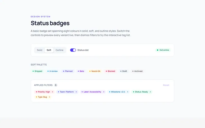
Basic Badge
Originalbasic badges across colours
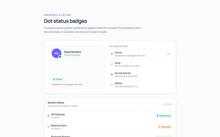
Dot Badge
Originaldot status badges
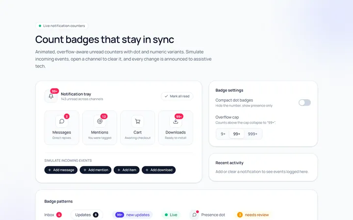
Count Badge
Originalnotification count badges
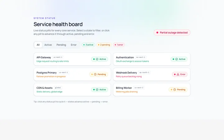
Status Badge
Originalstatus pills (active/pending/error)
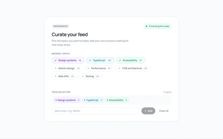
Pill Badge
Originalsoft pill badges
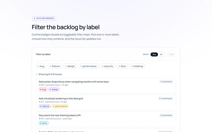
Outline Badge
Originaloutline badges
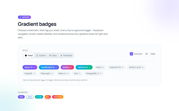
Gradient Badge
Originalgradient badges
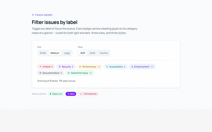
Icon Badge
Originalbadges with leading icons
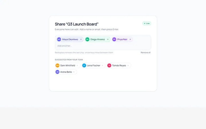
Removable Badge
Originalremovable chip badges
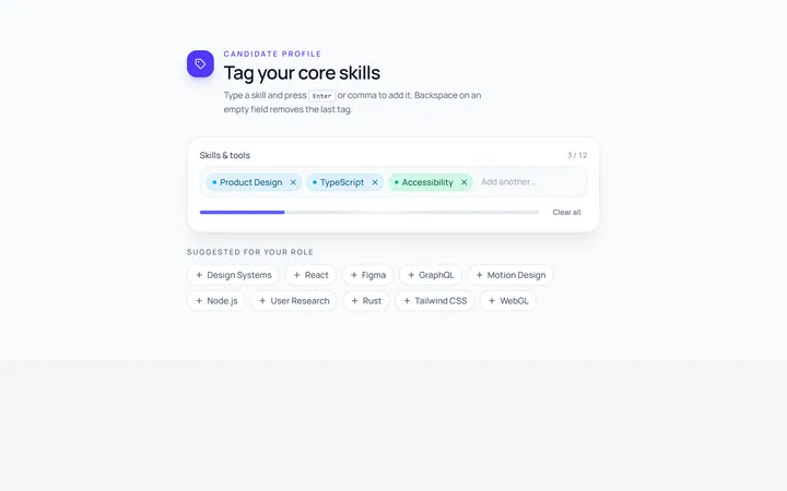
Input Chip
Originalchip input tokens
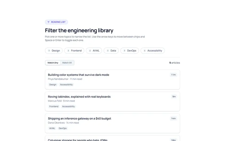
Filter Chip
Originalselectable filter chips
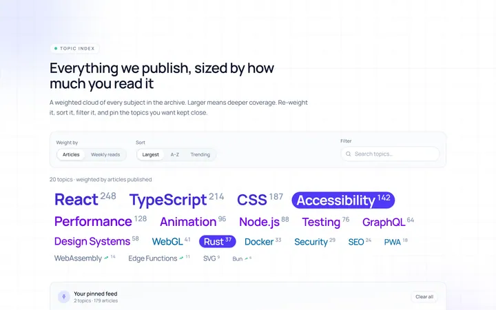
Cloud Tag
Originalweighted tag cloud