

Cloud Tag
Original · freeweighted tag cloud
byWeb InnoventixReact + Tailwind
tagcloudbadges
Copy prompt gives Claude Code, Cursor or v0 a ready-to-paste prompt that recreates this exact component.
npx shadcn@latest add https://webinnoventix.com/r/tag-cloud.jsontag-cloud.tsx
"use client";

import { useId, useMemo, useRef, useState } from "react";
import type { KeyboardEvent } from "react";
import { AnimatePresence, LayoutGroup, motion, useReducedMotion } from "motion/react";

type Metric = "articles" | "reads";
type SortKey = "weight" | "name" | "momentum";

interface Topic {
  label: string;
  articles: number;
  reads: number; // weekly reads, in thousands
  momentum: number; // week-over-week change, %
}

const TOPICS: Topic[] = [
  { label: "React", articles: 248, reads: 62.4, momentum: 12 },
  { label: "TypeScript", articles: 214, reads: 58.1, momentum: 18 },
  { label: "CSS", articles: 187, reads: 44.7, momentum: 9 },
  { label: "Accessibility", articles: 142, reads: 31.2, momentum: 34 },
  { label: "Performance", articles: 128, reads: 29.8, momentum: 21 },
  { label: "Animation", articles: 96, reads: 22.5, momentum: 15 },
  { label: "Node.js", articles: 88, reads: 19.3, momentum: 6 },
  { label: "Testing", articles: 76, reads: 15.7, momentum: 11 },
  { label: "GraphQL", articles: 64, reads: 12.1, momentum: -4 },
  { label: "Design Systems", articles: 58, reads: 14.9, momentum: 27 },
  { label: "WebGL", articles: 41, reads: 8.6, momentum: 19 },
  { label: "Rust", articles: 37, reads: 9.2, momentum: 41 },
  { label: "Docker", articles: 33, reads: 6.4, momentum: 3 },
  { label: "Security", articles: 29, reads: 7.1, momentum: 23 },
  { label: "SEO", articles: 24, reads: 5.8, momentum: 16 },
  { label: "PWA", articles: 18, reads: 3.2, momentum: -8 },
  { label: "WebAssembly", articles: 14, reads: 4.1, momentum: 38 },
  { label: "Edge Functions", articles: 11, reads: 3.9, momentum: 52 },
  { label: "SVG", articles: 9, reads: 2.3, momentum: 7 },
  { label: "Bun", articles: 6, reads: 2.8, momentum: 63 },
];

const SORTS: { value: SortKey; label: string }[] = [
  { value: "weight", label: "Largest" },
  { value: "name", label: "A–Z" },
  { value: "momentum", label: "Trending" },
];

const METRICS: { value: Metric; label: string }[] = [
  { value: "articles", label: "Articles" },
  { value: "reads", label: "Weekly reads" },
];

/* ---------- inline icons ---------- */

function SearchIcon() {
  return (
    <svg viewBox="0 0 24 24" fill="none" aria-hidden="true" className="h-4 w-4">
      <circle cx="11" cy="11" r="7" stroke="currentColor" strokeWidth="1.8" />
      <path d="M20 20l-3.4-3.4" stroke="currentColor" strokeWidth="1.8" strokeLinecap="round" />
    </svg>
  );
}

function CloseIcon() {
  return (
    <svg viewBox="0 0 24 24" fill="none" aria-hidden="true" className="h-3.5 w-3.5">
      <path d="M6 6l12 12M18 6L6 18" stroke="currentColor" strokeWidth="2" strokeLinecap="round" />
    </svg>
  );
}

function PinIcon() {
  return (
    <svg viewBox="0 0 24 24" fill="none" aria-hidden="true" className="h-3.5 w-3.5">
      <path
        d="M9 3h6l-1 5 3 3v2H7v-2l3-3-1-5Z"
        stroke="currentColor"
        strokeWidth="1.7"
        strokeLinejoin="round"
      />
      <path d="M12 13v8" stroke="currentColor" strokeWidth="1.7" strokeLinecap="round" />
    </svg>
  );
}

function RiseIcon() {
  return (
    <svg viewBox="0 0 24 24" fill="none" aria-hidden="true" style={{ width: "0.72em", height: "0.72em" }}>
      <path d="M5 15l5-5 3 3 6-7" stroke="currentColor" strokeWidth="2.4" strokeLinecap="round" strokeLinejoin="round" />
      <path d="M15 6h4v4" stroke="currentColor" strokeWidth="2.4" strokeLinecap="round" strokeLinejoin="round" />
    </svg>
  );
}

/* ---------- accessible segmented control ---------- */

interface SegmentedProps<T extends string> {
  label: string;
  options: { value: T; label: string }[];
  value: T;
  onChange: (v: T) => void;
}

function Segmented<T extends string>({ label, options, value, onChange }: SegmentedProps<T>) {
  const refs = useRef<(HTMLButtonElement | null)[]>([]);

  const focusAt = (i: number) => {
    const n = (i + options.length) % options.length;
    onChange(options[n].value);
    refs.current[n]?.focus();
  };

  const onKey = (e: KeyboardEvent<HTMLButtonElement>, i: number) => {
    switch (e.key) {
      case "ArrowRight":
      case "ArrowDown":
        e.preventDefault();
        focusAt(i + 1);
        break;
      case "ArrowLeft":
      case "ArrowUp":
        e.preventDefault();
        focusAt(i - 1);
        break;
      case "Home":
        e.preventDefault();
        focusAt(0);
        break;
      case "End":
        e.preventDefault();
        focusAt(options.length - 1);
        break;
      default:
        break;
    }
  };

  return (
    <div
      role="radiogroup"
      aria-label={label}
      className="inline-flex items-center gap-0.5 rounded-full border border-slate-200 bg-slate-100/70 p-0.5 dark:border-slate-800 dark:bg-slate-900/70"
    >
      {options.map((o, i) => {
        const active = o.value === value;
        return (
          <button
            key={o.value}
            ref={(el) => {
              refs.current[i] = el;
            }}
            type="button"
            role="radio"
            aria-checked={active}
            tabIndex={active ? 0 : -1}
            onClick={() => onChange(o.value)}
            onKeyDown={(e) => onKey(e, i)}
            className={[
              "rounded-full px-3.5 py-1.5 text-xs font-medium transition-colors",
              "focus-visible:outline-none focus-visible:ring-2 focus-visible:ring-indigo-500 focus-visible:ring-offset-2",
              "focus-visible:ring-offset-slate-100 dark:focus-visible:ring-offset-slate-900",
              active
                ? "bg-white text-slate-900 shadow-sm dark:bg-slate-700 dark:text-white"
                : "text-slate-500 hover:text-slate-800 dark:text-slate-400 dark:hover:text-slate-200",
            ].join(" ")}
          >
            {o.label}
          </button>
        );
      })}
    </div>
  );
}

/* ---------- main component ---------- */

export default function TagCloud() {
  const reduce = useReducedMotion();
  const uid = useId();
  const searchId = `${uid}-search`;

  const [metric, setMetric] = useState<Metric>("articles");
  const [sort, setSort] = useState<SortKey>("weight");
  const [query, setQuery] = useState("");
  const [pinned, setPinned] = useState<Set<string>>(() => new Set(["Accessibility", "Rust"]));

  const metricVal = (t: Topic) => (metric === "articles" ? t.articles : t.reads);

  const [minV, maxV] = useMemo(() => {
    const vals = TOPICS.map((t) => (metric === "articles" ? t.articles : t.reads));
    return [Math.min(...vals), Math.max(...vals)] as const;
  }, [metric]);

  const ordered = useMemo(() => {
    const arr = [...TOPICS];
    if (sort === "name") {
      arr.sort((a, b) => a.label.localeCompare(b.label));
    } else if (sort === "momentum") {
      arr.sort((a, b) => b.momentum - a.momentum);
    } else {
      const v = (t: Topic) => (metric === "articles" ? t.articles : t.reads);
      arr.sort((a, b) => v(b) - v(a));
    }
    return arr;
  }, [sort, metric]);

  const q = query.trim().toLowerCase();
  const matches = (t: Topic) => q === "" || t.label.toLowerCase().includes(q);
  const matchCount = q === "" ? TOPICS.length : TOPICS.filter(matches).length;

  const pinnedTopics = ordered.filter((t) => pinned.has(t.label));
  const pinnedArticles = pinnedTopics.reduce((s, t) => s + t.articles, 0);

  const togglePin = (label: string) => {
    setPinned((prev) => {
      const next = new Set(prev);
      if (next.has(label)) next.delete(label);
      else next.add(label);
      return next;
    });
  };

  const eased = (t: Topic) => {
    const v = metricVal(t);
    const norm = maxV === minV ? 1 : (v - minV) / (maxV - minV);
    return Math.sqrt(norm); // compress so the smallest tags stay legible
  };

  const tierClass = (e: number) => {
    if (e >= 0.72) return "text-indigo-700 hover:bg-indigo-50 dark:text-indigo-300 dark:hover:bg-indigo-500/10";
    if (e >= 0.45) return "text-violet-700 hover:bg-violet-50 dark:text-violet-300 dark:hover:bg-violet-500/10";
    if (e >= 0.22) return "text-sky-700 hover:bg-sky-50 dark:text-sky-300 dark:hover:bg-sky-500/10";
    return "text-slate-500 hover:bg-slate-100 dark:text-slate-400 dark:hover:bg-slate-800/70";
  };

  const badgeText = (t: Topic) => (metric === "articles" ? String(t.articles) : `${t.reads}k`);

  const container = {
    hidden: {},
    show: { transition: { staggerChildren: 0.022 } },
  };
  const item = {
    hidden: { opacity: 0, scale: 0.82, y: 10 },
    show: { opacity: 1, scale: 1, y: 0, transition: { type: "spring" as const, stiffness: 420, damping: 30 } },
  };

  const chipAnim = reduce
    ? {}
    : { initial: { opacity: 0, scale: 0.7 }, animate: { opacity: 1, scale: 1 }, exit: { opacity: 0, scale: 0.7 } };

  return (
    <section className="relative w-full overflow-hidden bg-white px-6 py-20 text-slate-900 sm:py-28 dark:bg-slate-950 dark:text-slate-100">
      <style>{`
        @keyframes tagcloud-drift {
          0%, 100% { transform: translate3d(0,0,0) scale(1); }
          50% { transform: translate3d(0,-22px,0) scale(1.06); }
        }
        @keyframes tagcloud-pulse {
          0%, 100% { opacity: 0.4; transform: scale(1); }
          50% { opacity: 1; transform: scale(1.35); }
        }
        .tagcloud-blob { animation: tagcloud-drift 15s ease-in-out infinite; }
        .tagcloud-blob--b { animation-duration: 21s; animation-direction: reverse; }
        .tagcloud-dot { animation: tagcloud-pulse 2.4s ease-in-out infinite; }
        @media (prefers-reduced-motion: reduce) {
          .tagcloud-blob, .tagcloud-dot { animation: none !important; }
        }
      `}</style>

      {/* ambient background */}
      <div aria-hidden="true" className="pointer-events-none absolute inset-0 overflow-hidden">
        <div className="tagcloud-blob absolute -left-24 -top-24 h-72 w-72 rounded-full bg-indigo-300/30 blur-3xl dark:bg-indigo-600/20" />
        <div className="tagcloud-blob tagcloud-blob--b absolute -bottom-28 right-0 h-80 w-80 rounded-full bg-violet-300/30 blur-3xl dark:bg-violet-700/20" />
        <div
          className="absolute inset-0 opacity-[0.04] dark:opacity-[0.06]"
          style={{
            backgroundImage:
              "linear-gradient(currentColor 1px, transparent 1px), linear-gradient(90deg, currentColor 1px, transparent 1px)",
            backgroundSize: "44px 44px",
          }}
        />
      </div>

      <div className="relative mx-auto max-w-5xl">
        {/* header */}
        <div className="flex flex-col gap-4">
          <span className="inline-flex items-center gap-2 self-start rounded-full border border-slate-200 bg-white/60 px-3 py-1 text-[0.7rem] font-semibold uppercase tracking-[0.18em] text-slate-500 backdrop-blur dark:border-slate-800 dark:bg-slate-900/60 dark:text-slate-400">
            <span className="tagcloud-dot inline-block h-1.5 w-1.5 rounded-full bg-emerald-500" />
            Topic index
          </span>
          <h2 className="max-w-2xl text-3xl font-semibold tracking-tight sm:text-4xl">
            Everything we publish, sized by how much you read it
          </h2>
          <p className="max-w-2xl text-base leading-relaxed text-slate-600 dark:text-slate-400">
            A weighted cloud of every subject in the archive. Larger means deeper coverage. Re-weight it, sort it,
            filter it, and pin the topics you want kept close.
          </p>
        </div>

        {/* controls */}
        <div className="mt-9 flex flex-col gap-4 rounded-2xl border border-slate-200 bg-slate-50/60 p-4 sm:flex-row sm:items-end sm:justify-between dark:border-slate-800 dark:bg-slate-900/40">
          <div className="flex flex-wrap items-end gap-6">
            <div className="flex flex-col gap-1.5">
              <span className="text-xs font-medium text-slate-500 dark:text-slate-400">Weight by</span>
              <Segmented label="Weight topics by" options={METRICS} value={metric} onChange={setMetric} />
            </div>
            <div className="flex flex-col gap-1.5">
              <span className="text-xs font-medium text-slate-500 dark:text-slate-400">Sort</span>
              <Segmented label="Sort topics by" options={SORTS} value={sort} onChange={setSort} />
            </div>
          </div>

          <div className="flex flex-col gap-1.5">
            <label htmlFor={searchId} className="text-xs font-medium text-slate-500 dark:text-slate-400">
              Filter
            </label>
            <div className="relative">
              <span className="pointer-events-none absolute left-3 top-1/2 -translate-y-1/2 text-slate-400 dark:text-slate-500">
                <SearchIcon />
              </span>
              <input
                id={searchId}
                type="search"
                value={query}
                onChange={(e) => setQuery(e.target.value)}
                onKeyDown={(e) => {
                  if (e.key === "Escape") setQuery("");
                }}
                placeholder="Search topics…"
                className="w-full rounded-full border border-slate-200 bg-white py-2 pl-9 pr-9 text-sm text-slate-900 placeholder:text-slate-400 focus-visible:outline-none focus-visible:ring-2 focus-visible:ring-indigo-500 focus-visible:ring-offset-2 focus-visible:ring-offset-slate-50 sm:w-64 dark:border-slate-700 dark:bg-slate-950 dark:text-slate-100 dark:placeholder:text-slate-500 dark:focus-visible:ring-offset-slate-900"
              />
              {query !== "" && (
                <button
                  type="button"
                  onClick={() => setQuery("")}
                  aria-label="Clear filter"
                  className="absolute right-2.5 top-1/2 -translate-y-1/2 rounded-full p-1 text-slate-400 transition-colors hover:bg-slate-100 hover:text-slate-700 focus-visible:outline-none focus-visible:ring-2 focus-visible:ring-indigo-500 dark:hover:bg-slate-800 dark:hover:text-slate-200"
                >
                  <CloseIcon />
                </button>
              )}
            </div>
          </div>
        </div>

        {/* live status */}
        <p role="status" aria-live="polite" className="mt-5 text-sm text-slate-500 dark:text-slate-400">
          {q === ""
            ? `${TOPICS.length} topics · weighted by ${metric === "articles" ? "articles published" : "weekly reads"}`
            : `${matchCount} of ${TOPICS.length} topics match “${query.trim()}”`}
        </p>

        {/* the cloud */}
        <LayoutGroup>
          <motion.div
            role="group"
            aria-label="Topic tags. Activate a tag to pin it to your feed."
            className="mt-4 flex flex-wrap items-baseline gap-x-2.5 gap-y-3"
            {...(reduce ? {} : { variants: container, initial: "hidden", animate: "show" })}
          >
            {ordered.map((t) => {
              const e = eased(t);
              const size = 0.9 + e * 1.7; // rem
              const weight = 440 + Math.round(e * 320);
              const isPinned = pinned.has(t.label);
              const dim = q !== "" && !matches(t);
              const rising = t.momentum >= 30;

              return (
                <motion.button
                  key={t.label}
                  type="button"
                  aria-pressed={isPinned}
                  aria-label={`${t.label}, ${t.articles} articles, ${t.momentum >= 0 ? "up" : "down"} ${Math.abs(
                    t.momentum,
                  )} percent this week${isPinned ? ", pinned" : ""}`}
                  onClick={() => togglePin(t.label)}
                  style={{ fontSize: `${size}rem`, fontWeight: weight }}
                  {...(reduce ? {} : { variants: item, layout: true, whileHover: { scale: 1.06 }, whileTap: { scale: 0.95 } })}
                  className={[
                    "group inline-flex items-baseline gap-1 rounded-full px-3 py-1 leading-none tracking-tight transition-colors",
                    "focus-visible:outline-none focus-visible:ring-2 focus-visible:ring-indigo-500 focus-visible:ring-offset-2",
                    "focus-visible:ring-offset-white dark:focus-visible:ring-offset-slate-950",
                    dim ? "opacity-25" : "opacity-100",
                    isPinned
                      ? "bg-indigo-600 text-white shadow-sm shadow-indigo-600/30 dark:bg-indigo-500"
                      : tierClass(e),
                  ].join(" ")}
                >
                  <span>{t.label}</span>
                  {rising && !isPinned && (
                    <span className="self-center text-emerald-500 dark:text-emerald-400">
                      <RiseIcon />
                    </span>
                  )}
                  <span
                    className={[
                      "self-start tabular-nums",
                      isPinned ? "text-indigo-100" : "text-slate-400 dark:text-slate-500",
                    ].join(" ")}
                    style={{ fontSize: "0.58em", fontWeight: 600 }}
                  >
                    {badgeText(t)}
                  </span>
                </motion.button>
              );
            })}
          </motion.div>
        </LayoutGroup>

        {/* pinned feed */}
        <div className="mt-12 rounded-2xl border border-slate-200 bg-gradient-to-br from-slate-50 to-white p-5 dark:border-slate-800 dark:from-slate-900/60 dark:to-slate-950">
          <div className="flex flex-wrap items-center justify-between gap-3">
            <div className="flex items-center gap-2.5">
              <span className="grid h-8 w-8 place-items-center rounded-full bg-indigo-100 text-indigo-600 dark:bg-indigo-500/15 dark:text-indigo-300">
                <PinIcon />
              </span>
              <div>
                <p className="text-sm font-semibold">Your pinned feed</p>
                <p className="text-xs text-slate-500 dark:text-slate-400">
                  {pinnedTopics.length === 0
                    ? "Pin a topic above to start building your feed"
                    : `${pinnedTopics.length} ${pinnedTopics.length === 1 ? "topic" : "topics"} · ${pinnedArticles} articles`}
                </p>
              </div>
            </div>
            {pinnedTopics.length > 0 && (
              <button
                type="button"
                onClick={() => setPinned(new Set())}
                className="rounded-full border border-slate-200 px-3 py-1.5 text-xs font-medium text-slate-600 transition-colors hover:bg-slate-100 hover:text-slate-900 focus-visible:outline-none focus-visible:ring-2 focus-visible:ring-indigo-500 focus-visible:ring-offset-2 focus-visible:ring-offset-white dark:border-slate-700 dark:text-slate-300 dark:hover:bg-slate-800 dark:hover:text-white dark:focus-visible:ring-offset-slate-950"
              >
                Clear all
              </button>
            )}
          </div>

          <div className="mt-4 flex min-h-[2.25rem] flex-wrap gap-2">
            <AnimatePresence initial={false}>
              {pinnedTopics.length === 0 ? (
                <motion.p
                  key="empty"
                  {...chipAnim}
                  className="text-sm text-slate-400 dark:text-slate-500"
                >
                  Nothing pinned yet.
                </motion.p>
              ) : (
                pinnedTopics.map((t) => (
                  <motion.span
                    key={t.label}
                    layout={reduce ? false : true}
                    {...chipAnim}
                    className="inline-flex items-center gap-1.5 rounded-full bg-indigo-600 py-1 pl-3 pr-1.5 text-sm font-medium text-white dark:bg-indigo-500"
                  >
                    {t.label}
                    <button
                      type="button"
                      onClick={() => togglePin(t.label)}
                      aria-label={`Unpin ${t.label}`}
                      className="grid h-5 w-5 place-items-center rounded-full text-indigo-100 transition-colors hover:bg-indigo-500 hover:text-white focus-visible:outline-none focus-visible:ring-2 focus-visible:ring-white/80 dark:hover:bg-indigo-400"
                    >
                      <CloseIcon />
                    </button>
                  </motion.span>
                ))
              )}
            </AnimatePresence>
          </div>
        </div>
      </div>
    </section>
  );
}
Dependencies
motion
Licence
Built by Web Innoventix. Free for personal and commercial use, no attribution required.
Built by Web Innoventix
Need a custom interface, a full website, or SEO that gets you cited by AI? We design, build and rank it end to end.
Get a free quoteSimilar components
Browse all →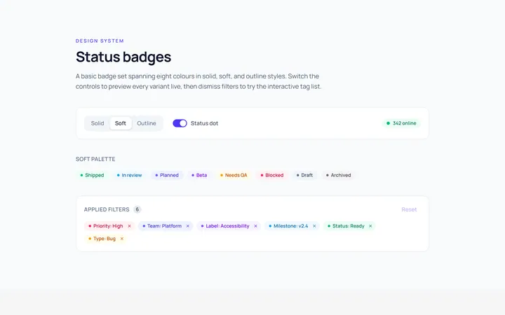
Basic Badge
Originalbasic badges across colours
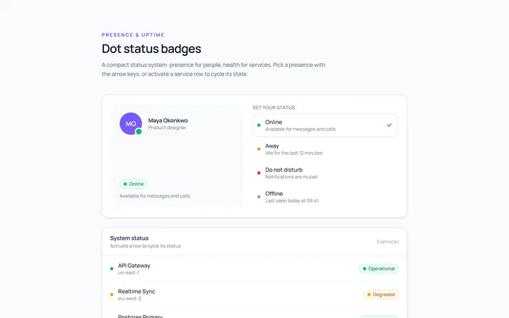
Dot Badge
Originaldot status badges
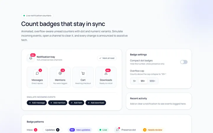
Count Badge
Originalnotification count badges
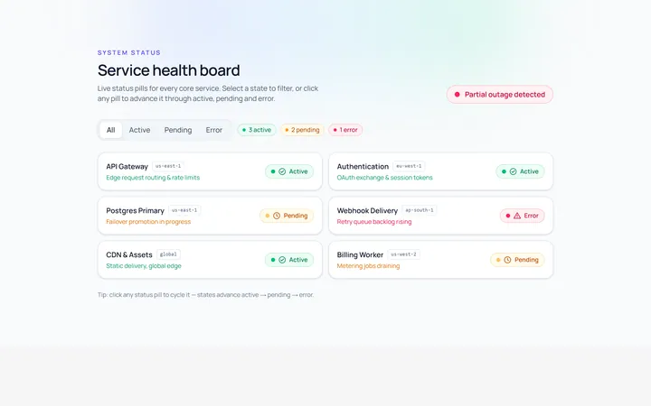
Status Badge
Originalstatus pills (active/pending/error)
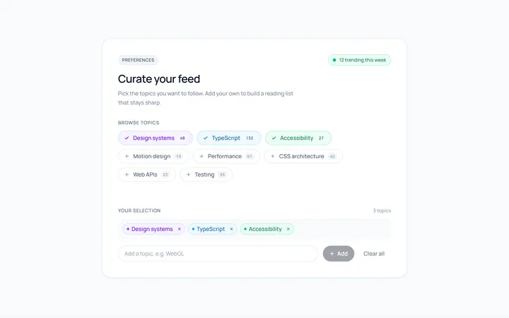
Pill Badge
Originalsoft pill badges
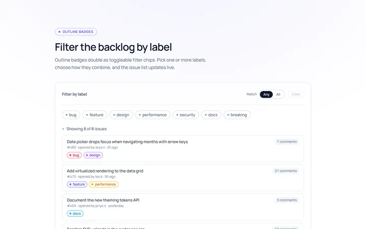
Outline Badge
Originaloutline badges
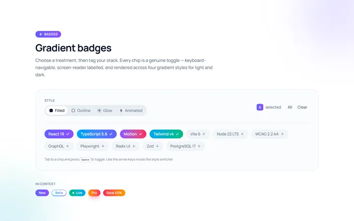
Gradient Badge
Originalgradient badges
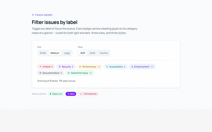
Icon Badge
Originalbadges with leading icons
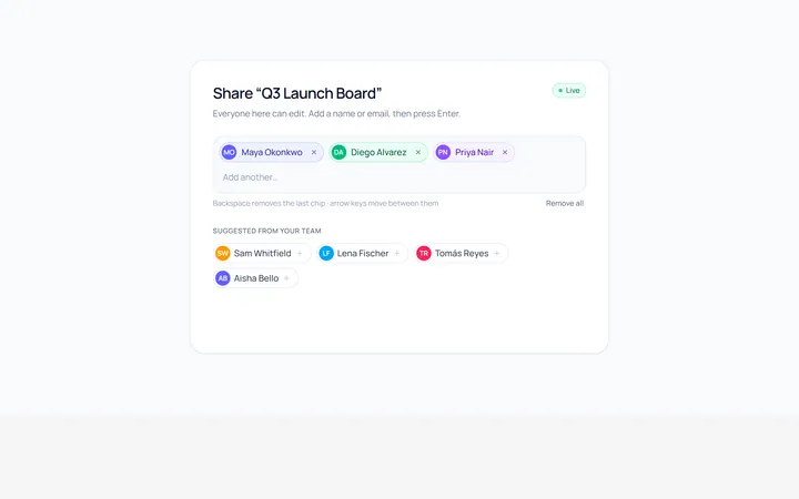
Removable Badge
Originalremovable chip badges
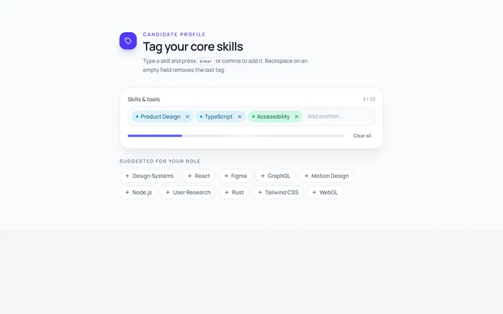
Input Chip
Originalchip input tokens
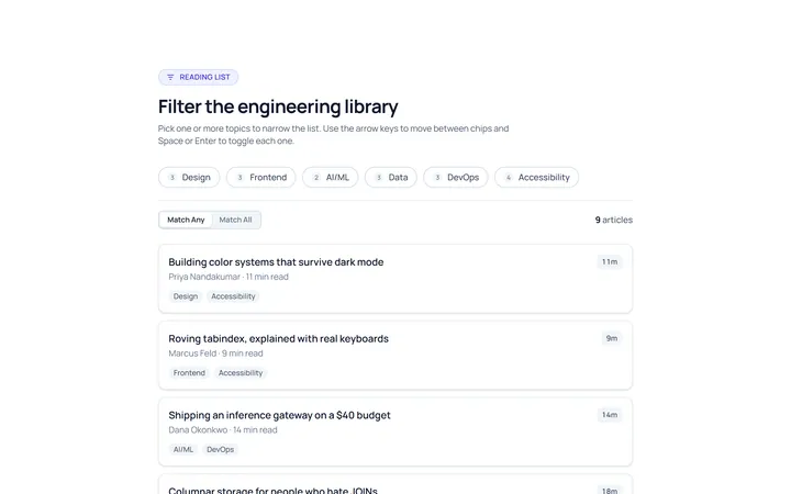
Filter Chip
Originalselectable filter chips
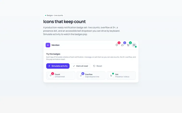
Notification Badge
Originalicon with notification badge