

Glow Badge
Original · freeglowing new/live badges
byWeb InnoventixReact + Tailwind
badgeglowbadges
Copy prompt gives Claude Code, Cursor or v0 a ready-to-paste prompt that recreates this exact component.
npx shadcn@latest add https://webinnoventix.com/r/badge-glow.jsonbadge-glow.tsx
"use client";
import {
useId,
useRef,
useState,
type CSSProperties,
type KeyboardEvent,
type ReactNode,
} from "react";
import { motion, useReducedMotion } from "motion/react";
type Accent = "indigo" | "violet" | "emerald" | "rose" | "amber" | "sky";
type BadgeKind = "new" | "live" | "beta" | "pro" | "hot" | "sale";
type BadgeSize = "md" | "lg";
type CSSVars = CSSProperties & Record<`--${string}`, string>;
interface AccentMeta {
label: string;
rgb: string;
dot: string;
chip: string;
swatch: string;
}
const ACCENTS: Record<Accent, AccentMeta> = {
indigo: {
label: "Indigo",
rgb: "99 102 241",
dot: "bg-indigo-500",
chip: "bg-indigo-50 text-indigo-700 ring-indigo-200 dark:bg-indigo-400/10 dark:text-indigo-200 dark:ring-indigo-400/25",
swatch: "bg-indigo-500",
},
violet: {
label: "Violet",
rgb: "139 92 246",
dot: "bg-violet-500",
chip: "bg-violet-50 text-violet-700 ring-violet-200 dark:bg-violet-400/10 dark:text-violet-200 dark:ring-violet-400/25",
swatch: "bg-violet-500",
},
emerald: {
label: "Emerald",
rgb: "16 185 129",
dot: "bg-emerald-500",
chip: "bg-emerald-50 text-emerald-700 ring-emerald-200 dark:bg-emerald-400/10 dark:text-emerald-200 dark:ring-emerald-400/25",
swatch: "bg-emerald-500",
},
rose: {
label: "Rose",
rgb: "244 63 94",
dot: "bg-rose-500",
chip: "bg-rose-50 text-rose-700 ring-rose-200 dark:bg-rose-400/10 dark:text-rose-200 dark:ring-rose-400/25",
swatch: "bg-rose-500",
},
amber: {
label: "Amber",
rgb: "245 158 11",
dot: "bg-amber-500",
chip: "bg-amber-50 text-amber-700 ring-amber-200 dark:bg-amber-400/10 dark:text-amber-200 dark:ring-amber-400/25",
swatch: "bg-amber-500",
},
sky: {
label: "Sky",
rgb: "14 165 233",
dot: "bg-sky-500",
chip: "bg-sky-50 text-sky-700 ring-sky-200 dark:bg-sky-400/10 dark:text-sky-200 dark:ring-sky-400/25",
swatch: "bg-sky-500",
},
};
const ACCENT_ORDER: readonly Accent[] = [
"indigo",
"violet",
"emerald",
"rose",
"amber",
"sky",
];
interface KindMeta {
label: string;
text: string;
tag: string;
live: boolean;
}
const KINDS: Record<BadgeKind, KindMeta> = {
new: { label: "New", text: "New", tag: "Just shipped", live: false },
live: { label: "Live", text: "Live", tag: "Streaming now", live: true },
beta: { label: "Beta", text: "Beta", tag: "Early access", live: false },
pro: { label: "Pro", text: "Pro", tag: "Paid plan", live: false },
hot: { label: "Hot", text: "Hot", tag: "Trending today", live: false },
sale: { label: "Sale", text: "Sale", tag: "40% off", live: false },
};
const KIND_ORDER: readonly BadgeKind[] = [
"new",
"live",
"beta",
"pro",
"hot",
"sale",
];
const GALLERY_ACCENT: Record<BadgeKind, Accent> = {
new: "indigo",
live: "emerald",
beta: "violet",
pro: "amber",
hot: "rose",
sale: "sky",
};
function KindGlyph({
kind,
className,
}: {
kind: BadgeKind;
className?: string;
}) {
const base = { className, viewBox: "0 0 24 24", "aria-hidden": true } as const;
switch (kind) {
case "new":
return (
<svg {...base} fill="currentColor">
<path d="M9.94 14.06A2 2 0 0 0 8.5 12.63l-6.14-1.58a.5.5 0 0 1 0-.97L8.5 8.5a2 2 0 0 0 1.44-1.44l1.58-6.14a.5.5 0 0 1 .96 0l1.58 6.14A2 2 0 0 0 15.5 8.5l6.14 1.58a.5.5 0 0 1 0 .97L15.5 12.63a2 2 0 0 0-1.44 1.44l-1.58 6.14a.5.5 0 0 1-.96 0z" />
</svg>
);
case "pro":
return (
<svg {...base} fill="currentColor">
<path d="M11.48 3.5a.6.6 0 0 1 1.07 0l2.35 4.76 5.26.77a.6.6 0 0 1 .33 1.02l-3.8 3.71.9 5.24a.6.6 0 0 1-.87.63L12 17.7l-4.7 2.47a.6.6 0 0 1-.87-.63l.9-5.24-3.8-3.71a.6.6 0 0 1 .33-1.02l5.26-.77z" />
</svg>
);
case "hot":
return (
<svg
{...base}
fill="none"
stroke="currentColor"
strokeWidth={2}
strokeLinecap="round"
strokeLinejoin="round"
>
<path d="M8.5 14.5A2.5 2.5 0 0 0 11 12c0-1.38-.5-2-1-3-1.07-2.14-.22-4.05 2-6 .5 2.5 2 4.9 4 6.5 2 1.6 3 3.5 3 5.5a7 7 0 1 1-14 0c0-1.15.43-2.29 1-3a2.5 2.5 0 0 0 2.5 2.5z" />
</svg>
);
case "sale":
return (
<svg
{...base}
fill="none"
stroke="currentColor"
strokeWidth={2}
strokeLinecap="round"
strokeLinejoin="round"
>
<path d="M12.59 2.59A2 2 0 0 0 11.17 2H4a2 2 0 0 0-2 2v7.17a2 2 0 0 0 .59 1.41l8.7 8.7a2.43 2.43 0 0 0 3.42 0l6.58-6.58a2.43 2.43 0 0 0 0-3.42z" />
<circle cx="7.5" cy="7.5" r="1.25" />
</svg>
);
case "beta":
return (
<svg
{...base}
fill="none"
stroke="currentColor"
strokeWidth={2}
strokeLinecap="round"
strokeLinejoin="round"
>
<path d="M10 2v6.2a2 2 0 0 1-.28 1.02l-5.44 9.26A2 2 0 0 0 6 21.5h12a2 2 0 0 0 1.72-3.02l-5.44-9.26A2 2 0 0 1 14 8.2V2" />
<path d="M8.5 2h7" />
<path d="M7 15h10" />
</svg>
);
default:
return null;
}
}
function LiveDot({
accentDot,
size,
animate,
}: {
accentDot: string;
size: BadgeSize;
animate: boolean;
}) {
const s = size === "lg" ? "h-2 w-2" : "h-1.5 w-1.5";
return (
<span className={`relative flex ${s}`}>
{animate ? (
<span
aria-hidden
className={`bgx-live-ping absolute inline-flex h-full w-full rounded-full ${accentDot} opacity-60`}
/>
) : null}
<span
className={`relative inline-flex h-full w-full rounded-full ${accentDot}`}
/>
</span>
);
}
function GlowBadge({
kind,
accent,
glow,
pulse,
intensity,
size,
reduced,
}: {
kind: BadgeKind;
accent: Accent;
glow: boolean;
pulse: boolean;
intensity: number;
size: BadgeSize;
reduced: boolean;
}) {
const a = ACCENTS[accent];
const k = KINDS[kind];
const animateGlow = glow && pulse && !reduced;
const style: CSSVars = {};
if (glow) {
const alpha = (0.22 + intensity * 0.005).toFixed(3);
const maxBlur = (8 + intensity * 0.42).toFixed(1);
const minBlur = (5 + intensity * 0.12).toFixed(1);
const color = `rgb(${a.rgb} / ${alpha})`;
if (animateGlow) {
style["--bg-gmin"] = `${minBlur}px`;
style["--bg-gmax"] = `${maxBlur}px`;
style["--bg-gcol"] = color;
} else {
style.boxShadow = `0 0 ${maxBlur}px ${color}`;
}
}
const sizeCls =
size === "lg"
? "px-4 py-1.5 text-sm gap-2"
: "px-2.5 py-1 text-[11px] gap-1.5";
const iconCls = size === "lg" ? "h-4 w-4" : "h-3.5 w-3.5";
return (
<span
className={`relative inline-flex items-center rounded-full font-semibold uppercase tracking-[0.09em] ring-1 ring-inset ${sizeCls} ${a.chip} ${animateGlow ? "bgx-glow-pulse" : ""}`}
style={style}
>
{k.live ? (
<LiveDot accentDot={a.dot} size={size} animate={!reduced} />
) : (
<KindGlyph kind={kind} className={iconCls} />
)}
{k.text}
</span>
);
}
function OptionGroup({
legend,
options,
value,
onChange,
columns,
renderOption,
}: {
legend: string;
options: readonly string[];
value: string;
onChange: (v: string) => void;
columns: string;
renderOption: (id: string, active: boolean) => ReactNode;
}) {
const refs = useRef<Record<string, HTMLButtonElement | null>>({});
const onKeyDown = (e: KeyboardEvent<HTMLDivElement>) => {
const i = options.indexOf(value);
if (i < 0) return;
let n = i;
switch (e.key) {
case "ArrowRight":
case "ArrowDown":
n = (i + 1) % options.length;
break;
case "ArrowLeft":
case "ArrowUp":
n = (i - 1 + options.length) % options.length;
break;
case "Home":
n = 0;
break;
case "End":
n = options.length - 1;
break;
default:
return;
}
e.preventDefault();
const id = options[n];
onChange(id);
refs.current[id]?.focus();
};
return (
<div
role="radiogroup"
aria-label={legend}
onKeyDown={onKeyDown}
className={`grid gap-2 ${columns}`}
>
{options.map((id) => {
const active = id === value;
return (
<button
key={id}
ref={(el) => {
refs.current[id] = el;
}}
type="button"
role="radio"
aria-checked={active}
tabIndex={active ? 0 : -1}
onClick={() => onChange(id)}
className="w-full rounded-xl transition focus-visible:outline-none focus-visible:ring-2 focus-visible:ring-indigo-500 focus-visible:ring-offset-2 focus-visible:ring-offset-white dark:focus-visible:ring-offset-slate-950"
>
{renderOption(id, active)}
</button>
);
})}
</div>
);
}
function Toggle({
label,
checked,
onChange,
disabled,
}: {
label: string;
checked: boolean;
onChange: (v: boolean) => void;
disabled?: boolean;
}) {
return (
<button
type="button"
role="switch"
aria-checked={checked}
aria-label={label}
disabled={disabled}
onClick={() => onChange(!checked)}
className={`relative inline-flex h-6 w-11 shrink-0 items-center rounded-full transition-colors focus-visible:outline-none focus-visible:ring-2 focus-visible:ring-indigo-500 focus-visible:ring-offset-2 focus-visible:ring-offset-white dark:focus-visible:ring-offset-slate-950 ${
checked
? "bg-indigo-500"
: "bg-slate-200 dark:bg-slate-700"
} ${disabled ? "cursor-not-allowed opacity-40" : "cursor-pointer"}`}
>
<span
className={`inline-block h-4 w-4 transform rounded-full bg-white shadow transition-transform ${
checked ? "translate-x-6" : "translate-x-1"
}`}
/>
</button>
);
}
export default function BadgeGlow() {
const reduced = useReducedMotion() ?? false;
const [kind, setKind] = useState<BadgeKind>("live");
const [accent, setAccent] = useState<Accent>("indigo");
const [glow, setGlow] = useState(true);
const [pulse, setPulse] = useState(true);
const [intensity, setIntensity] = useState(62);
const rangeId = useId();
return (
<section className="relative w-full bg-white text-slate-900 dark:bg-slate-950 dark:text-slate-100">
<style>{`
@keyframes bgGlowPulse {
0%, 100% { box-shadow: 0 0 var(--bg-gmin, 6px) var(--bg-gcol, transparent); }
50% { box-shadow: 0 0 var(--bg-gmax, 14px) var(--bg-gcol, transparent); }
}
@keyframes bgLivePing {
0% { transform: scale(1); opacity: .65; }
75%, 100% { transform: scale(2.3); opacity: 0; }
}
.bgx-glow-pulse { animation: bgGlowPulse 2s ease-in-out infinite; }
.bgx-live-ping { animation: bgLivePing 1.5s cubic-bezier(0,0,.2,1) infinite; }
@media (prefers-reduced-motion: reduce) {
.bgx-glow-pulse, .bgx-live-ping { animation: none !important; }
}
`}</style>
<div className="mx-auto max-w-6xl px-6 py-20 sm:py-24">
<header className="max-w-2xl">
<p className="text-xs font-semibold uppercase tracking-[0.22em] text-indigo-600 dark:text-indigo-400">
Design system · Status
</p>
<h2 className="mt-3 text-3xl font-bold tracking-tight sm:text-4xl">
Badges that glow when it matters.
</h2>
<p className="mt-4 text-base leading-relaxed text-slate-600 dark:text-slate-400">
Signal what's new, what's live, and what's on sale
with status badges you can actually tune. Change the color, glow, and
pulse below — every control works with a keyboard and screen reader.
</p>
</header>
<div className="mt-12 grid items-stretch gap-6 lg:grid-cols-[1.05fr_1fr]">
{/* Preview */}
<div className="flex flex-col">
<div className="relative flex min-h-[240px] flex-1 items-center justify-center overflow-hidden rounded-3xl border border-slate-200 bg-slate-50 dark:border-slate-800 dark:bg-slate-900/50">
<div
aria-hidden
className="pointer-events-none absolute inset-0"
style={{
backgroundImage:
"radial-gradient(circle at 50% 42%, rgb(148 163 184 / 0.14), transparent 62%)",
}}
/>
<motion.div
key={`${kind}-${accent}`}
initial={reduced ? false : { scale: 0.85, opacity: 0 }}
animate={reduced ? undefined : { scale: 1, opacity: 1 }}
transition={{ type: "spring", stiffness: 420, damping: 26 }}
className="relative"
>
<GlowBadge
kind={kind}
accent={accent}
glow={glow}
pulse={pulse}
intensity={intensity}
size="lg"
reduced={reduced}
/>
</motion.div>
</div>
<p className="mt-4 text-center text-sm text-slate-500 dark:text-slate-400">
<span className="font-semibold text-slate-700 dark:text-slate-200">
{KINDS[kind].text}
</span>{" "}
· {ACCENTS[accent].label} ·{" "}
{glow
? `glow ${intensity}%${pulse ? " · pulsing" : ""}`
: "no glow"}
</p>
</div>
{/* Controls */}
<div className="rounded-3xl border border-slate-200 bg-white p-6 dark:border-slate-800 dark:bg-slate-900/50">
<div className="space-y-6">
<div>
<div className="mb-2 text-xs font-semibold uppercase tracking-[0.14em] text-slate-500 dark:text-slate-400">
Badge
</div>
<OptionGroup
legend="Badge type"
options={KIND_ORDER}
value={kind}
onChange={(v) => setKind(v as BadgeKind)}
columns="grid-cols-3"
renderOption={(id, active) => (
<span
className={`block rounded-xl border px-3 py-2 text-sm font-medium transition ${
active
? "border-slate-900 bg-slate-900 text-white dark:border-white dark:bg-white dark:text-slate-900"
: "border-slate-200 bg-white text-slate-600 hover:border-slate-300 hover:text-slate-900 dark:border-slate-700 dark:bg-slate-900 dark:text-slate-300 dark:hover:border-slate-600"
}`}
>
{KINDS[id as BadgeKind].label}
</span>
)}
/>
</div>
<div>
<div className="mb-2 text-xs font-semibold uppercase tracking-[0.14em] text-slate-500 dark:text-slate-400">
Accent
</div>
<OptionGroup
legend="Accent color"
options={ACCENT_ORDER}
value={accent}
onChange={(v) => setAccent(v as Accent)}
columns="grid-cols-6"
renderOption={(id, active) => {
const m = ACCENTS[id as Accent];
return (
<span
className={`flex h-10 items-center justify-center rounded-xl border transition ${
active
? "border-slate-900 dark:border-white"
: "border-slate-200 dark:border-slate-700"
}`}
>
<span
className={`h-4 w-4 rounded-full ${m.swatch} ${
active
? "ring-2 ring-slate-400/60 ring-offset-2 ring-offset-white dark:ring-offset-slate-900"
: ""
}`}
/>
<span className="sr-only">{m.label}</span>
</span>
);
}}
/>
</div>
<div className="h-px bg-slate-200 dark:bg-slate-800" />
<div className="flex items-center justify-between">
<label
htmlFor="badge-glow-toggle"
className="text-sm font-medium text-slate-700 dark:text-slate-200"
>
Glow
<span className="ml-2 text-xs font-normal text-slate-400 dark:text-slate-500">
Ambient halo
</span>
</label>
<span id="badge-glow-toggle">
<Toggle label="Glow" checked={glow} onChange={setGlow} />
</span>
</div>
<div className="flex items-center justify-between">
<span
className={`text-sm font-medium ${
glow
? "text-slate-700 dark:text-slate-200"
: "text-slate-400 dark:text-slate-600"
}`}
>
Pulse
<span className="ml-2 text-xs font-normal text-slate-400 dark:text-slate-500">
Breathing loop
</span>
</span>
<Toggle
label="Pulse"
checked={pulse}
onChange={setPulse}
disabled={!glow}
/>
</div>
<div>
<div className="mb-2 flex items-center justify-between">
<label
htmlFor={rangeId}
className={`text-sm font-medium ${
glow
? "text-slate-700 dark:text-slate-200"
: "text-slate-400 dark:text-slate-600"
}`}
>
Intensity
</label>
<span
className={`text-sm tabular-nums ${
glow
? "text-slate-500 dark:text-slate-400"
: "text-slate-300 dark:text-slate-600"
}`}
>
{intensity}%
</span>
</div>
<input
id={rangeId}
type="range"
min={0}
max={100}
step={1}
value={intensity}
disabled={!glow}
onChange={(e) => setIntensity(Number(e.target.value))}
aria-label="Glow intensity"
className="h-2 w-full cursor-pointer appearance-none rounded-full bg-slate-200 accent-indigo-500 focus-visible:outline-none focus-visible:ring-2 focus-visible:ring-indigo-500 focus-visible:ring-offset-2 focus-visible:ring-offset-white disabled:cursor-not-allowed disabled:opacity-40 dark:bg-slate-700 dark:focus-visible:ring-offset-slate-900"
/>
</div>
</div>
</div>
</div>
{/* Gallery */}
<div className="mt-16">
<div className="flex items-baseline justify-between gap-4">
<h3 className="text-lg font-semibold tracking-tight">
Ready-made presets
</h3>
<p className="text-sm text-slate-500 dark:text-slate-400">
Six status states, drop-in.
</p>
</div>
<div className="mt-6 grid grid-cols-2 gap-3 sm:grid-cols-3">
{KIND_ORDER.map((k) => (
<div
key={k}
className="flex flex-col items-center gap-3 rounded-2xl border border-slate-200 bg-white px-4 py-7 dark:border-slate-800 dark:bg-slate-900/40"
>
<GlowBadge
kind={k}
accent={GALLERY_ACCENT[k]}
glow
pulse
intensity={55}
size="md"
reduced={reduced}
/>
<span className="text-xs text-slate-500 dark:text-slate-400">
{KINDS[k].tag}
</span>
</div>
))}
</div>
</div>
</div>
</section>
);
}Dependencies
motion
Licence
Built by Web Innoventix. Free for personal and commercial use, no attribution required.
Built by Web Innoventix
Need a custom interface, a full website, or SEO that gets you cited by AI? We design, build and rank it end to end.
Get a free quoteSimilar components
Browse all →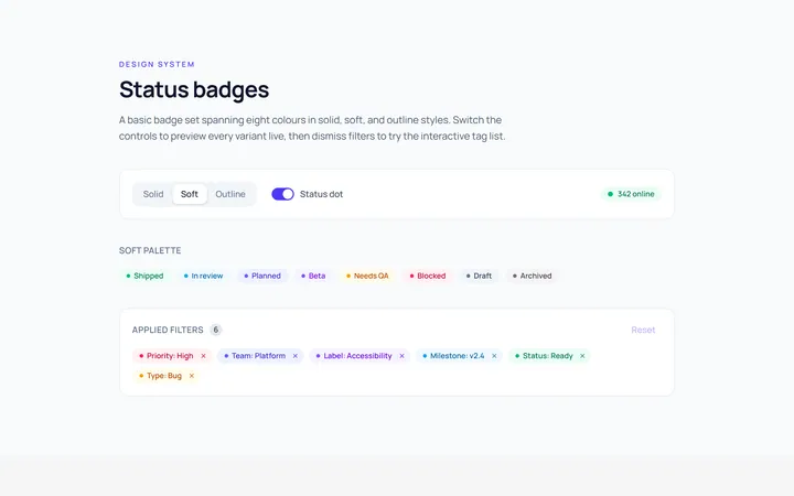
Basic Badge
Originalbasic badges across colours
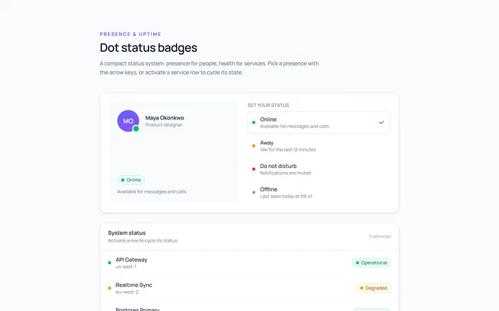
Dot Badge
Originaldot status badges
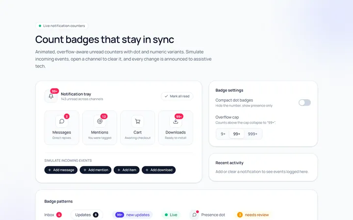
Count Badge
Originalnotification count badges
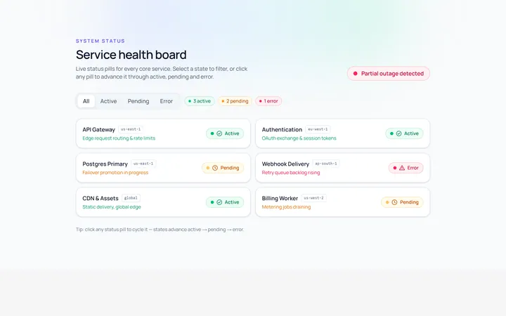
Status Badge
Originalstatus pills (active/pending/error)
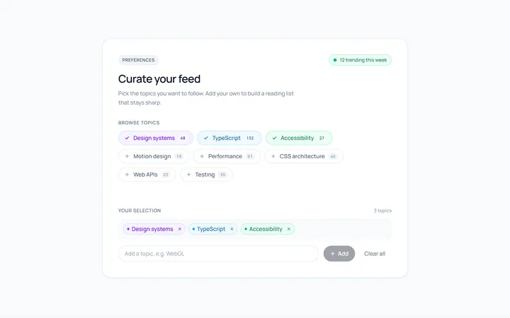
Pill Badge
Originalsoft pill badges
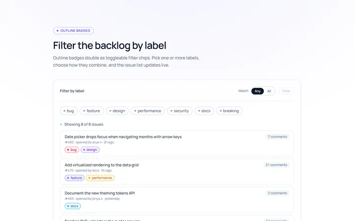
Outline Badge
Originaloutline badges
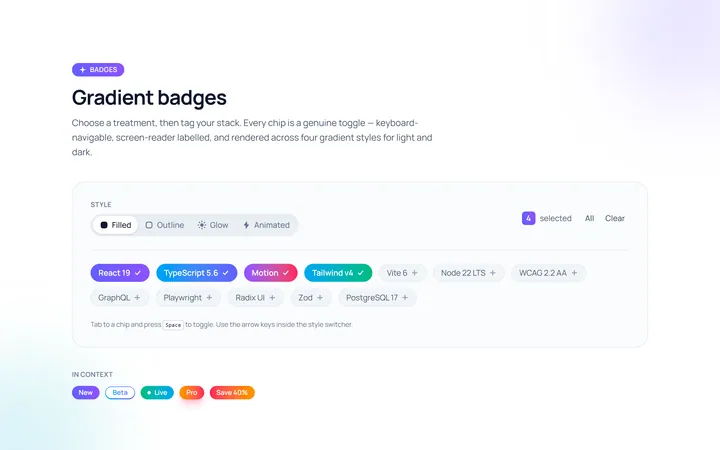
Gradient Badge
Originalgradient badges
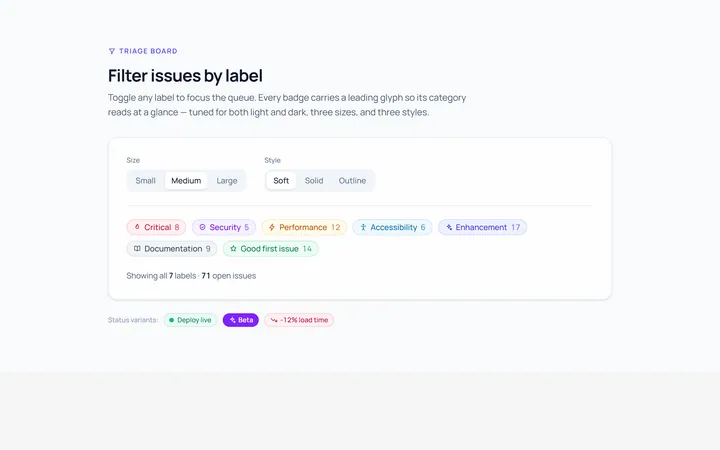
Icon Badge
Originalbadges with leading icons
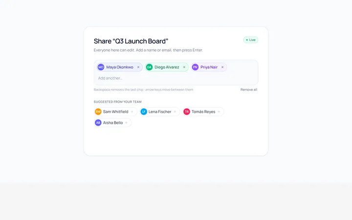
Removable Badge
Originalremovable chip badges
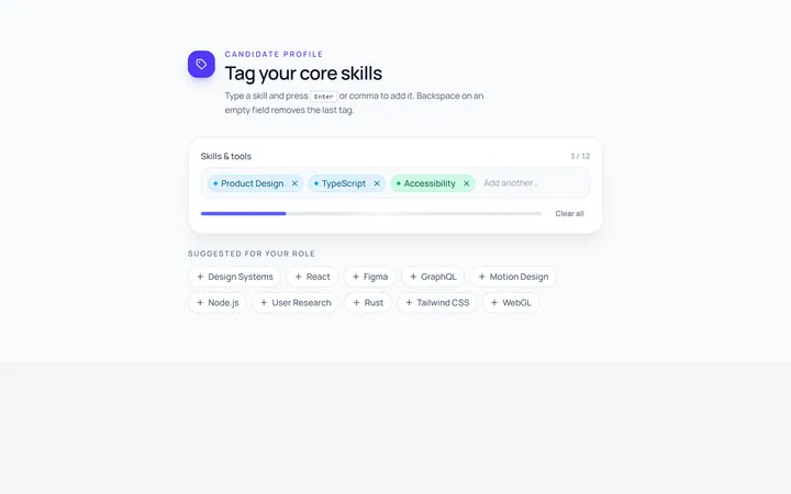
Input Chip
Originalchip input tokens
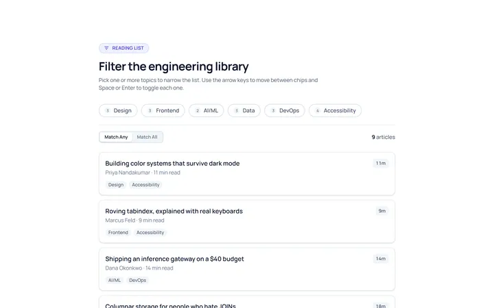
Filter Chip
Originalselectable filter chips
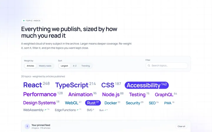
Cloud Tag
Originalweighted tag cloud