

Onboarding Checklist
Original · freesetup checklist with progress
Copy prompt gives Claude Code, Cursor or v0 a ready-to-paste prompt that recreates this exact component.
npx shadcn@latest add https://webinnoventix.com/r/onboard-checklist.json"use client";
import { useId, useMemo, useRef, useState, type KeyboardEvent } from "react";
import { AnimatePresence, motion, useReducedMotion } from "motion/react";
type Step = {
id: string;
title: string;
detail: string;
action: string;
minutes: number;
required: boolean;
done: boolean;
};
const STEPS: Step[] = [
{
id: "verify",
title: "Verify your email address",
detail:
"We sent a six-digit code to the address you signed up with. Confirming it unlocks invites and turns on delivery for alert emails.",
action: "Resend the code",
minutes: 1,
required: true,
done: true,
},
{
id: "workspace",
title: "Name your workspace",
detail:
"Pick something your teammates will recognise — usually the company or the product. The name shows up in shared links and in the sidebar switcher, and you can change it later in Settings.",
action: "Open workspace settings",
minutes: 2,
required: true,
done: true,
},
{
id: "snippet",
title: "Install the tracking snippet",
detail:
"Drop a single script tag before the closing </body> of your app shell, or install the package and call init() once at boot. Events start arriving within about thirty seconds of your first page view.",
action: "Copy the snippet",
minutes: 6,
required: true,
done: false,
},
{
id: "source",
title: "Connect a data source",
detail:
"Link Postgres, BigQuery, or a CSV upload so product events can be joined against revenue and account data. Read-only credentials are enough — we never issue writes.",
action: "Choose a source",
minutes: 8,
required: true,
done: false,
},
{
id: "invite",
title: "Invite a teammate",
detail:
"Workspaces get useful the moment a second person can see the numbers. Invite by email or share the join link with anyone on your verified domain.",
action: "Send an invite",
minutes: 2,
required: false,
done: false,
},
{
id: "alert",
title: "Set up an alert channel",
detail:
"Route threshold breaches to Slack, email, or a webhook so a drop in signups reaches you before the next standup rather than at the end of the month.",
action: "Add a channel",
minutes: 4,
required: false,
done: false,
},
];
const RADIUS = 52;
const CIRCUMFERENCE = 2 * Math.PI * RADIUS;
export default function OnboardChecklist() {
const [steps, setSteps] = useState<Step[]>(STEPS);
const [openId, setOpenId] = useState<string | null>(
() => STEPS.find((s) => !s.done)?.id ?? null,
);
const baseId = useId();
const gradientId = `${baseId}-ring-gradient`;
const boxRefs = useRef<Record<string, HTMLButtonElement | null>>({});
const reduce = useReducedMotion();
const stats = useMemo(() => {
const done = steps.filter((s) => s.done).length;
const requiredLeft = steps.filter((s) => s.required && !s.done).length;
const minutesLeft = steps
.filter((s) => !s.done)
.reduce((sum, s) => sum + s.minutes, 0);
const pct = Math.round((done / steps.length) * 100);
return { done, requiredLeft, minutesLeft, pct };
}, [steps]);
const allDone = stats.done === steps.length;
const toggle = (id: string) => {
setSteps((prev) =>
prev.map((s) => (s.id === id ? { ...s, done: !s.done } : s)),
);
};
const reset = () => {
setSteps(STEPS);
setOpenId(STEPS.find((s) => !s.done)?.id ?? null);
};
const onBoxKeyDown = (e: KeyboardEvent<HTMLButtonElement>, i: number) => {
const last = steps.length - 1;
let target = -1;
if (e.key === "ArrowDown") target = i === last ? 0 : i + 1;
else if (e.key === "ArrowUp") target = i === 0 ? last : i - 1;
else if (e.key === "Home") target = 0;
else if (e.key === "End") target = last;
if (target >= 0) {
e.preventDefault();
boxRefs.current[steps[target].id]?.focus();
}
};
return (
<section className="relative w-full bg-slate-50 px-4 py-20 sm:px-6 sm:py-24 dark:bg-slate-950">
<style>{`
@keyframes obck-check-pop {
0% { transform: scale(0.4); opacity: 0; }
60% { transform: scale(1.12); opacity: 1; }
100% { transform: scale(1); opacity: 1; }
}
@keyframes obck-ring-glow {
0%, 100% { opacity: 0.35; }
50% { opacity: 0.7; }
}
.obck-check-mark { animation: obck-check-pop 260ms cubic-bezier(0.34, 1.56, 0.64, 1); }
.obck-ring-track { transition: stroke-dashoffset 700ms cubic-bezier(0.22, 1, 0.36, 1); }
.obck-ring-halo { animation: obck-ring-glow 4s ease-in-out infinite; }
@media (prefers-reduced-motion: reduce) {
.obck-check-mark,
.obck-ring-halo { animation: none !important; }
.obck-ring-track { transition: none !important; }
}
`}</style>
<div className="mx-auto max-w-5xl">
<div className="grid gap-8 lg:grid-cols-[19rem_1fr] lg:gap-12">
{/* Progress panel */}
<div className="lg:sticky lg:top-8 lg:self-start">
<div className="rounded-2xl border border-slate-200 bg-white p-6 shadow-sm dark:border-slate-800 dark:bg-slate-900">
<span className="inline-flex items-center rounded-full bg-indigo-100 px-3 py-1 text-xs font-medium tracking-wide text-indigo-700 uppercase dark:bg-indigo-500/15 dark:text-indigo-300">
Getting started
</span>
<h2 className="mt-3 text-xl font-semibold tracking-tight text-slate-900 dark:text-white">
Set up your workspace
</h2>
<p className="mt-1.5 text-sm leading-relaxed text-slate-500 dark:text-slate-400">
Six short steps. Your progress saves as you go, so you can stop
and come back.
</p>
<div className="mt-6 flex items-center gap-5">
<div className="relative h-32 w-32 shrink-0">
<svg
viewBox="0 0 120 120"
className="h-full w-full -rotate-90"
role="img"
aria-label={`Setup ${stats.pct} percent complete`}
>
<defs>
<linearGradient id={gradientId} x1="0" y1="0" x2="1" y2="1">
<stop offset="0%" stopColor="#6366f1" />
<stop offset="100%" stopColor="#8b5cf6" />
</linearGradient>
</defs>
<circle
cx="60"
cy="60"
r={RADIUS}
fill="none"
strokeWidth="10"
className="stroke-slate-200 dark:stroke-slate-800"
/>
{stats.pct > 0 && (
<circle
cx="60"
cy="60"
r={RADIUS}
fill="none"
strokeWidth="10"
strokeLinecap="round"
stroke={`url(#${gradientId})`}
strokeDasharray={CIRCUMFERENCE}
strokeDashoffset={
CIRCUMFERENCE * (1 - stats.pct / 100)
}
className="obck-ring-track"
/>
)}
{allDone && (
<circle
cx="60"
cy="60"
r={RADIUS}
fill="none"
strokeWidth="16"
stroke={`url(#${gradientId})`}
className="obck-ring-halo blur-[6px]"
/>
)}
</svg>
<div className="absolute inset-0 flex flex-col items-center justify-center">
<span className="text-2xl font-semibold tabular-nums text-slate-900 dark:text-white">
{stats.pct}%
</span>
<span className="text-[11px] font-medium tracking-wide text-slate-400 uppercase dark:text-slate-500">
done
</span>
</div>
</div>
<dl className="min-w-0 space-y-3">
<div>
<dt className="text-[11px] font-medium tracking-wide text-slate-400 uppercase dark:text-slate-500">
Completed
</dt>
<dd className="text-sm font-medium tabular-nums text-slate-900 dark:text-white">
{stats.done} of {steps.length}
</dd>
</div>
<div>
<dt className="text-[11px] font-medium tracking-wide text-slate-400 uppercase dark:text-slate-500">
Time left
</dt>
<dd className="text-sm font-medium tabular-nums text-slate-900 dark:text-white">
{stats.minutesLeft > 0 ? `~${stats.minutesLeft} min` : "None"}
</dd>
</div>
<div>
<dt className="text-[11px] font-medium tracking-wide text-slate-400 uppercase dark:text-slate-500">
Required
</dt>
<dd className="text-sm font-medium text-slate-900 dark:text-white">
{stats.requiredLeft > 0
? `${stats.requiredLeft} left`
: "All handled"}
</dd>
</div>
</dl>
</div>
<p aria-live="polite" className="sr-only">
{stats.done} of {steps.length} setup steps complete.
</p>
<AnimatePresence initial={false}>
{allDone && (
<motion.div
key="done-banner"
initial={reduce ? false : { opacity: 0, y: 6 }}
animate={{ opacity: 1, y: 0 }}
exit={{ opacity: 0, y: reduce ? 0 : 6 }}
transition={{ duration: reduce ? 0 : 0.3, ease: "easeOut" }}
className="mt-6 rounded-xl border border-emerald-200 bg-emerald-50 p-4 dark:border-emerald-500/25 dark:bg-emerald-500/10"
>
<p className="text-sm font-medium text-emerald-800 dark:text-emerald-300">
Workspace is live
</p>
<p className="mt-1 text-xs leading-relaxed text-emerald-700 dark:text-emerald-400/90">
Events are flowing and alerts are routed. Head to your
dashboard whenever you are ready.
</p>
</motion.div>
)}
</AnimatePresence>
<button
type="button"
onClick={reset}
className="mt-6 w-full rounded-lg border border-slate-300 bg-white px-3 py-2 text-sm font-medium text-slate-600 transition-colors hover:bg-slate-100 focus-visible:outline-2 focus-visible:outline-offset-2 focus-visible:outline-indigo-500 dark:border-slate-700 dark:bg-slate-900 dark:text-slate-300 dark:hover:bg-slate-800"
>
Reset checklist
</button>
</div>
</div>
{/* Steps */}
<ul className="flex list-none flex-col gap-3 p-0">
{steps.map((step, i) => {
const isOpen = openId === step.id;
const boxId = `${baseId}-box-${step.id}`;
const labelId = `${baseId}-label-${step.id}`;
const panelId = `${baseId}-panel-${step.id}`;
const discloseId = `${baseId}-disclose-${step.id}`;
return (
<li
key={step.id}
className={`overflow-hidden rounded-xl border shadow-sm transition-colors ${
step.done
? "border-slate-200 bg-slate-50/80 dark:border-slate-800 dark:bg-slate-900/50"
: "border-slate-200 bg-white dark:border-slate-800 dark:bg-slate-900"
}`}
>
<div className="flex items-start gap-3 p-4 sm:gap-4 sm:p-5">
<button
type="button"
id={boxId}
role="checkbox"
aria-checked={step.done}
aria-labelledby={labelId}
ref={(el) => {
boxRefs.current[step.id] = el;
}}
onClick={() => toggle(step.id)}
onKeyDown={(e) => onBoxKeyDown(e, i)}
className={`mt-0.5 flex h-6 w-6 shrink-0 items-center justify-center rounded-md border-2 transition-colors focus-visible:outline-2 focus-visible:outline-offset-2 focus-visible:outline-indigo-500 ${
step.done
? "border-indigo-500 bg-indigo-500 text-white"
: "border-slate-300 bg-white hover:border-indigo-400 dark:border-slate-600 dark:bg-slate-800 dark:hover:border-indigo-400"
}`}
>
{step.done && (
<svg
className="obck-check-mark"
width="14"
height="14"
viewBox="0 0 24 24"
fill="none"
stroke="currentColor"
strokeWidth="3.5"
strokeLinecap="round"
strokeLinejoin="round"
aria-hidden="true"
>
<path d="m5 13 4 4L19 7" />
</svg>
)}
</button>
<div className="min-w-0 flex-1">
<div className="flex flex-wrap items-center gap-x-2 gap-y-1">
<span
id={labelId}
className={`text-sm font-medium sm:text-base ${
step.done
? "text-slate-400 line-through decoration-slate-300 dark:text-slate-500 dark:decoration-slate-600"
: "text-slate-900 dark:text-white"
}`}
>
{step.title}
</span>
{step.required ? (
<span className="rounded-full bg-rose-100 px-2 py-0.5 text-[10px] font-semibold tracking-wide text-rose-700 uppercase dark:bg-rose-500/15 dark:text-rose-300">
Required
</span>
) : (
<span className="rounded-full bg-slate-100 px-2 py-0.5 text-[10px] font-semibold tracking-wide text-slate-500 uppercase dark:bg-slate-800 dark:text-slate-400">
Optional
</span>
)}
</div>
<p className="mt-1 flex items-center gap-1.5 text-xs text-slate-500 dark:text-slate-400">
<svg
width="12"
height="12"
viewBox="0 0 24 24"
fill="none"
stroke="currentColor"
strokeWidth="2"
strokeLinecap="round"
strokeLinejoin="round"
aria-hidden="true"
>
<circle cx="12" cy="12" r="9" />
<path d="M12 7v5l3 2" />
</svg>
<span className="tabular-nums">
About {step.minutes} min
</span>
</p>
</div>
<button
type="button"
id={discloseId}
aria-expanded={isOpen}
aria-controls={panelId}
onClick={() => setOpenId(isOpen ? null : step.id)}
className="flex h-8 w-8 shrink-0 items-center justify-center rounded-lg text-slate-400 transition-colors hover:bg-slate-100 hover:text-slate-600 focus-visible:outline-2 focus-visible:outline-offset-2 focus-visible:outline-indigo-500 dark:hover:bg-slate-800 dark:hover:text-slate-200"
>
<span className="sr-only">
{isOpen ? "Hide details for" : "Show details for"}{" "}
{step.title}
</span>
<motion.svg
width="16"
height="16"
viewBox="0 0 24 24"
fill="none"
stroke="currentColor"
strokeWidth="2.5"
strokeLinecap="round"
strokeLinejoin="round"
aria-hidden="true"
animate={{ rotate: isOpen ? 180 : 0 }}
transition={{ duration: reduce ? 0 : 0.25, ease: "easeOut" }}
>
<path d="m6 9 6 6 6-6" />
</motion.svg>
</button>
</div>
<AnimatePresence initial={false}>
{isOpen && (
<motion.div
key="panel"
initial={reduce ? false : { height: 0, opacity: 0 }}
animate={{ height: "auto", opacity: 1 }}
exit={{ height: 0, opacity: 0 }}
transition={{
duration: reduce ? 0 : 0.28,
ease: [0.22, 1, 0.36, 1],
}}
className="overflow-hidden"
>
<div
id={panelId}
role="region"
aria-labelledby={discloseId}
className="border-t border-slate-200 px-4 py-4 pl-13 sm:px-5 sm:pl-14 dark:border-slate-800"
>
<p className="text-sm leading-relaxed text-slate-600 dark:text-slate-300">
{step.detail}
</p>
<button
type="button"
className="mt-3 inline-flex items-center gap-1.5 rounded-lg bg-indigo-600 px-3 py-1.5 text-sm font-medium text-white transition-colors hover:bg-indigo-500 focus-visible:outline-2 focus-visible:outline-offset-2 focus-visible:outline-indigo-500"
>
{step.action}
<svg
width="14"
height="14"
viewBox="0 0 24 24"
fill="none"
stroke="currentColor"
strokeWidth="2.5"
strokeLinecap="round"
strokeLinejoin="round"
aria-hidden="true"
>
<path d="M5 12h14" />
<path d="m12 5 7 7-7 7" />
</svg>
</button>
</div>
</motion.div>
)}
</AnimatePresence>
</li>
);
})}
</ul>
</div>
</div>
</section>
);
}Dependencies
Licence
Built by Web Innoventix. Free for personal and commercial use, no attribution required.
Built by Web Innoventix
Need a custom interface, a full website, or SEO that gets you cited by AI? We design, build and rank it end to end.
Get a free quoteSimilar components
Browse all →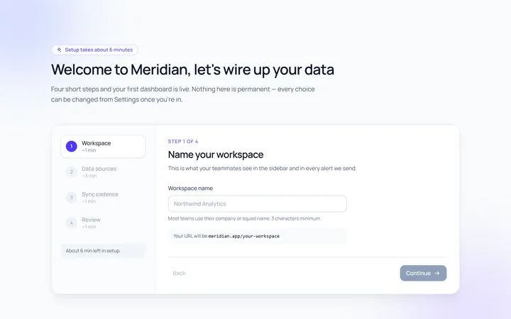
Onboarding Welcome
Originalwelcome screen with steps
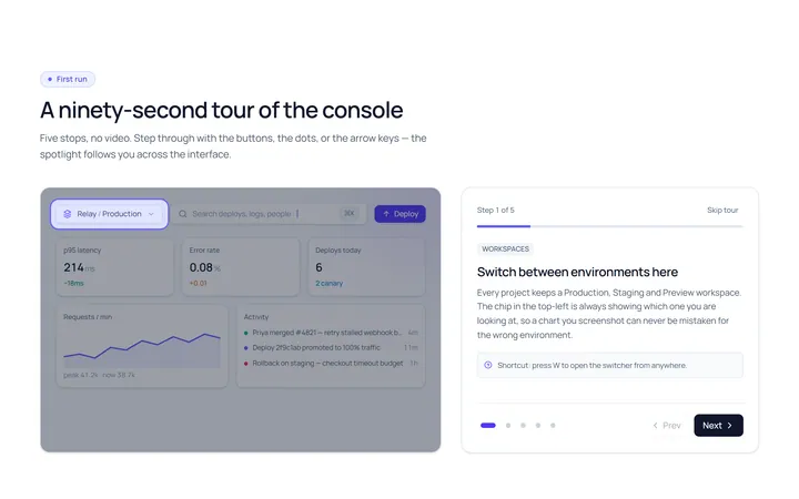
Onboarding Tour
Originalproduct tour with prev/next dots
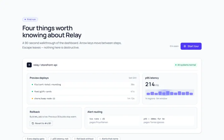
Onboarding Spotlight
Originalfeature spotlight highlight
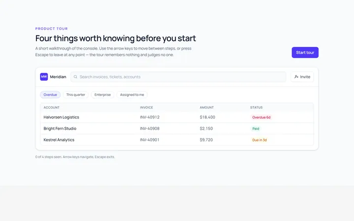
Onboarding Tooltip Tour
Originalguided tooltip walkthrough
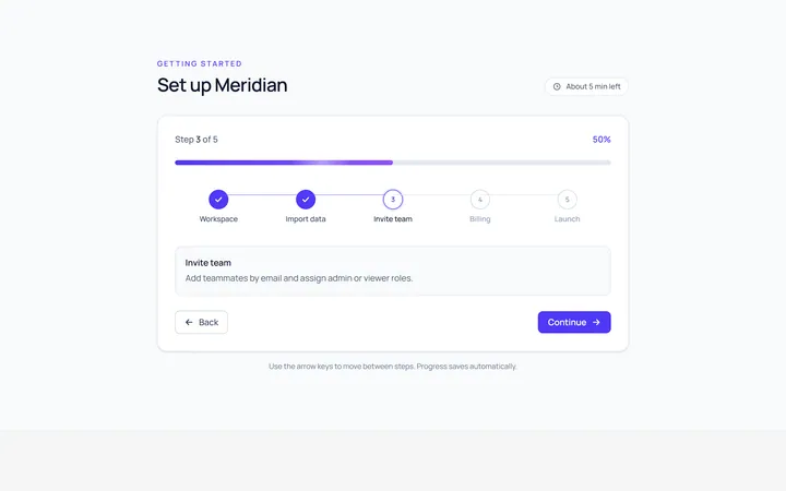
Onboarding Progress
Originalonboarding progress header
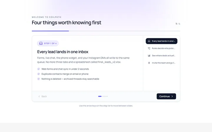
Onboarding Slides
Originalintro slides carousel
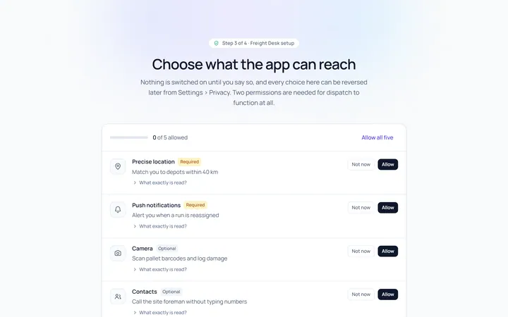
Onboarding Permissions
Originalpermissions request screen
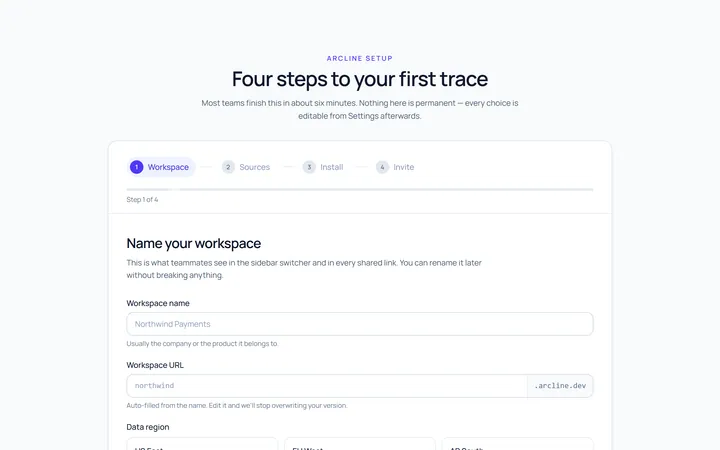
Onboarding Setup Wizard
Originalmulti-step setup wizard
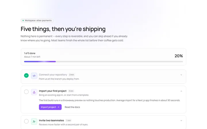
Onboarding Get Started
Originalget started action cards

Spotlight Hero
OriginalA centred hero with a soft radial spotlight, badge and dual call-to-action.

Split Hero
OriginalA two-column hero pairing a headline and CTAs with a product mock and social proof.

Gradient Spotlight Hero
OriginalA minimal centred hero with a soft gradient-mesh backdrop, announcement pill and dual call-to-action buttons.