

Onboarding Get Started
Original · freeget started action cards
Copy prompt gives Claude Code, Cursor or v0 a ready-to-paste prompt that recreates this exact component.
npx shadcn@latest add https://webinnoventix.com/r/onboard-get-started.json"use client";
import { useCallback, useMemo, useRef, useState } from "react";
import type { KeyboardEvent, ReactElement } from "react";
import { motion, useReducedMotion } from "motion/react";
type TaskId = "connect" | "invite" | "import" | "alerts" | "ship";
type Task = {
id: TaskId;
title: string;
blurb: string;
detail: string;
minutes: number;
action: string;
accent: "indigo" | "violet" | "emerald" | "amber" | "sky";
icon: (props: { className?: string }) => ReactElement;
};
const ACCENT: Record<
Task["accent"],
{ chip: string; glow: string; bar: string; ring: string }
> = {
indigo: {
chip: "bg-indigo-50 text-indigo-700 ring-indigo-200 dark:bg-indigo-500/10 dark:text-indigo-300 dark:ring-indigo-400/25",
glow: "from-indigo-500/25",
bar: "bg-indigo-500 dark:bg-indigo-400",
ring: "focus-visible:ring-indigo-500 dark:focus-visible:ring-indigo-400",
},
violet: {
chip: "bg-violet-50 text-violet-700 ring-violet-200 dark:bg-violet-500/10 dark:text-violet-300 dark:ring-violet-400/25",
glow: "from-violet-500/25",
bar: "bg-violet-500 dark:bg-violet-400",
ring: "focus-visible:ring-violet-500 dark:focus-visible:ring-violet-400",
},
emerald: {
chip: "bg-emerald-50 text-emerald-700 ring-emerald-200 dark:bg-emerald-500/10 dark:text-emerald-300 dark:ring-emerald-400/25",
glow: "from-emerald-500/25",
bar: "bg-emerald-500 dark:bg-emerald-400",
ring: "focus-visible:ring-emerald-500 dark:focus-visible:ring-emerald-400",
},
amber: {
chip: "bg-amber-50 text-amber-700 ring-amber-200 dark:bg-amber-500/10 dark:text-amber-300 dark:ring-amber-400/25",
glow: "from-amber-500/25",
bar: "bg-amber-500 dark:bg-amber-400",
ring: "focus-visible:ring-amber-500 dark:focus-visible:ring-amber-400",
},
sky: {
chip: "bg-sky-50 text-sky-700 ring-sky-200 dark:bg-sky-500/10 dark:text-sky-300 dark:ring-sky-400/25",
glow: "from-sky-500/25",
bar: "bg-sky-500 dark:bg-sky-400",
ring: "focus-visible:ring-sky-500 dark:focus-visible:ring-sky-400",
},
};
const TASKS: Task[] = [
{
id: "connect",
title: "Connect your repository",
blurb: "Point us at the branch you deploy from.",
detail:
"We read your lockfile and framework config to pick sane build defaults. Read-only access, revocable from Settings → Integrations at any time.",
minutes: 2,
action: "Connect GitHub",
accent: "indigo",
icon: ({ className }) => (
<svg viewBox="0 0 24 24" fill="none" aria-hidden="true" className={className}>
<path
d="M7 8.5 3.5 12 7 15.5M17 8.5 20.5 12 17 15.5M14 5l-4 14"
stroke="currentColor"
strokeWidth="1.6"
strokeLinecap="round"
strokeLinejoin="round"
/>
</svg>
),
},
{
id: "import",
title: "Import your first project",
blurb: "Bring an existing app in, or start from a template.",
detail:
"The first build runs in a throwaway preview so nothing touches production. Average import for a Next.js app finishes in about 90 seconds.",
minutes: 3,
action: "Import project",
accent: "violet",
icon: ({ className }) => (
<svg viewBox="0 0 24 24" fill="none" aria-hidden="true" className={className}>
<path
d="M12 3.5v10m0 0 3.5-3.5M12 13.5 8.5 10M4.5 15v3a2 2 0 0 0 2 2h11a2 2 0 0 0 2-2v-3"
stroke="currentColor"
strokeWidth="1.6"
strokeLinecap="round"
strokeLinejoin="round"
/>
</svg>
),
},
{
id: "invite",
title: "Invite two teammates",
blurb: "Reviews move faster with a second pair of eyes.",
detail:
"Invitees land on the same workspace with the Developer role. Teams that add a reviewer in week one merge roughly a third faster.",
minutes: 1,
action: "Send invites",
accent: "emerald",
icon: ({ className }) => (
<svg viewBox="0 0 24 24" fill="none" aria-hidden="true" className={className}>
<path
d="M9 11a3.25 3.25 0 1 0 0-6.5A3.25 3.25 0 0 0 9 11Zm-6 8.5c0-2.9 2.7-5 6-5s6 2.1 6 5M17 8.5v5m2.5-2.5h-5"
stroke="currentColor"
strokeWidth="1.6"
strokeLinecap="round"
strokeLinejoin="round"
/>
</svg>
),
},
{
id: "alerts",
title: "Route your alerts",
blurb: "Decide who gets woken up when a deploy fails.",
detail:
"Pipe failures into Slack, email, or a webhook. You can mute non-blocking warnings so the channel stays worth reading.",
minutes: 2,
action: "Set up routing",
accent: "amber",
icon: ({ className }) => (
<svg viewBox="0 0 24 24" fill="none" aria-hidden="true" className={className}>
<path
d="M12 4a5 5 0 0 0-5 5c0 3.5-1.2 4.8-2 5.6-.4.4-.1 1.1.5 1.1h13c.6 0 .9-.7.5-1.1-.8-.8-2-2.1-2-5.6a5 5 0 0 0-5-5Zm-2 12.5a2 2 0 0 0 4 0"
stroke="currentColor"
strokeWidth="1.6"
strokeLinecap="round"
strokeLinejoin="round"
/>
</svg>
),
},
{
id: "ship",
title: "Ship to production",
blurb: "Promote the preview you already trust.",
detail:
"Promotion reuses the exact artifact from your preview build — no rebuild, no drift. Rollback stays one click away for 30 days.",
minutes: 1,
action: "Deploy now",
accent: "sky",
icon: ({ className }) => (
<svg viewBox="0 0 24 24" fill="none" aria-hidden="true" className={className}>
<path
d="M13.5 4.5c3.5 0 6 2.5 6 6L14 16l-3.5-.5L8 13l-.5-3.5 6-5ZM8 13l-3 1 .5 4.5L10 18M15 9.5h.01"
stroke="currentColor"
strokeWidth="1.6"
strokeLinecap="round"
strokeLinejoin="round"
/>
</svg>
),
},
];
function CheckIcon({ className }: { className?: string }) {
return (
<svg viewBox="0 0 24 24" fill="none" aria-hidden="true" className={className}>
<path
d="m5 12.5 4.5 4.5L19 7.5"
stroke="currentColor"
strokeWidth="2.2"
strokeLinecap="round"
strokeLinejoin="round"
/>
</svg>
);
}
function ChevronIcon({ className }: { className?: string }) {
return (
<svg viewBox="0 0 24 24" fill="none" aria-hidden="true" className={className}>
<path
d="m8 10 4 4 4-4"
stroke="currentColor"
strokeWidth="1.8"
strokeLinecap="round"
strokeLinejoin="round"
/>
</svg>
);
}
export default function OnboardGetStarted() {
const reduceMotion = useReducedMotion();
const [done, setDone] = useState<TaskId[]>(["connect"]);
const [open, setOpen] = useState<TaskId | null>("import");
const [status, setStatus] = useState("Step 1 of 5 complete. Import your first project is next.");
const cardRefs = useRef<Record<string, HTMLButtonElement | null>>({});
const completed = done.length;
const total = TASKS.length;
const pct = Math.round((completed / total) * 100);
const remaining = useMemo(
() =>
TASKS.filter((t) => !done.includes(t.id)).reduce((sum, t) => sum + t.minutes, 0),
[done],
);
const toggleDone = useCallback((task: Task) => {
setDone((prev) => {
const next = prev.includes(task.id)
? prev.filter((id) => id !== task.id)
: [...prev, task.id];
setStatus(
prev.includes(task.id)
? `${task.title} marked as not done. ${next.length} of ${TASKS.length} complete.`
: `${task.title} complete. ${next.length} of ${TASKS.length} complete.`,
);
return next;
});
}, []);
const onCardKeyDown = useCallback(
(event: KeyboardEvent<HTMLButtonElement>, index: number) => {
const keys = ["ArrowDown", "ArrowUp", "Home", "End"];
if (!keys.includes(event.key)) return;
event.preventDefault();
let next = index;
if (event.key === "ArrowDown") next = (index + 1) % TASKS.length;
if (event.key === "ArrowUp") next = (index - 1 + TASKS.length) % TASKS.length;
if (event.key === "Home") next = 0;
if (event.key === "End") next = TASKS.length - 1;
cardRefs.current[TASKS[next].id]?.focus();
},
[],
);
return (
<section className="relative w-full overflow-hidden bg-white px-5 py-20 sm:py-28 dark:bg-zinc-950">
<style>{`
@keyframes ogs-sheen {
0% { transform: translateX(-120%); }
100% { transform: translateX(220%); }
}
@keyframes ogs-pulse-dot {
0%, 100% { opacity: 1; transform: scale(1); }
50% { opacity: .45; transform: scale(1.35); }
}
@keyframes ogs-drift {
0%, 100% { transform: translate3d(0, 0, 0); }
50% { transform: translate3d(0, -14px, 0); }
}
.ogs-sheen::after {
content: "";
position: absolute;
inset: 0 auto 0 0;
width: 40%;
background: linear-gradient(90deg, transparent, rgba(255,255,255,.5), transparent);
animation: ogs-sheen 2.4s linear infinite;
}
.ogs-dot { animation: ogs-pulse-dot 2s ease-in-out infinite; }
.ogs-drift { animation: ogs-drift 9s ease-in-out infinite; }
@media (prefers-reduced-motion: reduce) {
.ogs-sheen::after, .ogs-dot, .ogs-drift { animation: none !important; }
}
`}</style>
<div
aria-hidden="true"
className="ogs-drift pointer-events-none absolute -top-32 left-1/2 h-[26rem] w-[46rem] -translate-x-1/2 rounded-full bg-gradient-to-br from-indigo-200/50 via-violet-200/30 to-transparent blur-3xl dark:from-indigo-500/12 dark:via-violet-500/10"
/>
<div className="relative mx-auto w-full max-w-5xl">
<header className="max-w-2xl">
<span className="inline-flex items-center gap-2 rounded-full bg-zinc-100 px-3 py-1 text-xs font-medium tracking-wide text-zinc-600 ring-1 ring-zinc-200 dark:bg-zinc-900 dark:text-zinc-400 dark:ring-zinc-800">
<span className="ogs-dot h-1.5 w-1.5 rounded-full bg-emerald-500" />
Workspace: atlas-payments
</span>
<h2 className="mt-5 text-3xl font-semibold tracking-tight text-zinc-900 sm:text-4xl dark:text-zinc-50">
Five things, then you’re shipping
</h2>
<p className="mt-3 text-base leading-relaxed text-zinc-600 dark:text-zinc-400">
Nothing here is permanent — every step is reversible, and you can skip
ahead if you already know where you’re going. Most teams finish the
whole list before their coffee gets cold.
</p>
</header>
<div className="mt-9 rounded-2xl border border-zinc-200 bg-zinc-50/70 p-5 dark:border-zinc-800 dark:bg-zinc-900/50">
<div className="flex flex-wrap items-end justify-between gap-3">
<div>
<p className="text-sm font-medium text-zinc-900 dark:text-zinc-100">
{completed} of {total} done
</p>
<p className="mt-0.5 text-sm text-zinc-500 dark:text-zinc-500">
{remaining === 0
? "Setup complete — nice work."
: `About ${remaining} min left`}
</p>
</div>
<p className="text-2xl font-semibold tabular-nums text-zinc-900 dark:text-zinc-100">
{pct}%
</p>
</div>
<div
role="progressbar"
aria-valuenow={completed}
aria-valuemin={0}
aria-valuemax={total}
aria-label="Onboarding progress"
className="relative mt-4 h-2 w-full overflow-hidden rounded-full bg-zinc-200 dark:bg-zinc-800"
>
<motion.div
className={`relative h-full overflow-hidden rounded-full bg-gradient-to-r from-indigo-500 to-violet-500 dark:from-indigo-400 dark:to-violet-400 ${
!reduceMotion && pct > 0 && pct < 100 ? "ogs-sheen" : ""
}`}
initial={false}
animate={{ width: `${pct}%` }}
transition={
reduceMotion
? { duration: 0 }
: { type: "spring", stiffness: 160, damping: 22 }
}
/>
</div>
</div>
<ul className="mt-6 space-y-3">
{TASKS.map((task, index) => {
const isDone = done.includes(task.id);
const isOpen = open === task.id;
const accent = ACCENT[task.accent];
const Icon = task.icon;
const panelId = `ogs-panel-${task.id}`;
const headerId = `ogs-header-${task.id}`;
return (
<li key={task.id}>
<div
className={`group relative overflow-hidden rounded-2xl border transition-colors ${
isDone
? "border-zinc-200 bg-zinc-50/60 dark:border-zinc-800/80 dark:bg-zinc-900/30"
: "border-zinc-200 bg-white hover:border-zinc-300 dark:border-zinc-800 dark:bg-zinc-900/60 dark:hover:border-zinc-700"
}`}
>
<div
aria-hidden="true"
className={`pointer-events-none absolute -right-16 -top-16 h-40 w-40 rounded-full bg-gradient-to-br to-transparent opacity-0 blur-2xl transition-opacity duration-500 group-hover:opacity-100 ${accent.glow}`}
/>
<div className="relative flex items-start gap-4 p-4 sm:p-5">
<button
type="button"
onClick={() => toggleDone(task)}
aria-pressed={isDone}
className={`mt-0.5 flex h-7 w-7 shrink-0 items-center justify-center rounded-full border-2 transition-colors focus-visible:outline-none focus-visible:ring-2 focus-visible:ring-offset-2 focus-visible:ring-emerald-500 focus-visible:ring-offset-white dark:focus-visible:ring-offset-zinc-950 ${
isDone
? "border-emerald-500 bg-emerald-500 text-white dark:border-emerald-400 dark:bg-emerald-400 dark:text-emerald-950"
: "border-zinc-300 text-transparent hover:border-emerald-500 dark:border-zinc-700 dark:hover:border-emerald-400"
}`}
>
<span className="sr-only">
{isDone ? `Mark ${task.title} as not done` : `Mark ${task.title} as done`}
</span>
<motion.span
initial={false}
animate={{ scale: isDone ? 1 : 0.4, opacity: isDone ? 1 : 0 }}
transition={reduceMotion ? { duration: 0 } : { duration: 0.18 }}
className="block"
>
<CheckIcon className="h-4 w-4" />
</motion.span>
</button>
<div className="min-w-0 flex-1">
<button
type="button"
id={headerId}
ref={(el) => {
cardRefs.current[task.id] = el;
}}
onClick={() => setOpen(isOpen ? null : task.id)}
onKeyDown={(e) => onCardKeyDown(e, index)}
aria-expanded={isOpen}
aria-controls={panelId}
className={`flex w-full items-start gap-3 rounded-lg text-left focus-visible:outline-none focus-visible:ring-2 focus-visible:ring-offset-4 focus-visible:ring-offset-white dark:focus-visible:ring-offset-zinc-950 ${accent.ring}`}
>
<span
className={`hidden h-9 w-9 shrink-0 items-center justify-center rounded-lg ring-1 sm:flex ${accent.chip}`}
>
<Icon className="h-5 w-5" />
</span>
<span className="min-w-0 flex-1">
<span className="flex flex-wrap items-center gap-x-2 gap-y-1">
<span
className={`text-[15px] font-semibold ${
isDone
? "text-zinc-400 line-through decoration-zinc-300 dark:text-zinc-600 dark:decoration-zinc-700"
: "text-zinc-900 dark:text-zinc-100"
}`}
>
{task.title}
</span>
<span className="rounded-md bg-zinc-100 px-1.5 py-0.5 text-[11px] font-medium tabular-nums text-zinc-500 dark:bg-zinc-800 dark:text-zinc-400">
{task.minutes} min
</span>
</span>
<span className="mt-1 block text-sm text-zinc-500 dark:text-zinc-400">
{task.blurb}
</span>
</span>
<motion.span
aria-hidden="true"
initial={false}
animate={{ rotate: isOpen ? 180 : 0 }}
transition={reduceMotion ? { duration: 0 } : { duration: 0.2 }}
className="mt-0.5 shrink-0 text-zinc-400 dark:text-zinc-500"
>
<ChevronIcon className="h-5 w-5" />
</motion.span>
</button>
<motion.div
id={panelId}
role="region"
aria-labelledby={headerId}
hidden={!isOpen}
initial={false}
animate={{ height: isOpen ? "auto" : 0, opacity: isOpen ? 1 : 0 }}
transition={
reduceMotion ? { duration: 0 } : { duration: 0.24, ease: "easeOut" }
}
className="overflow-hidden"
>
<div className="pt-3 sm:pl-12">
<p className="text-sm leading-relaxed text-zinc-600 dark:text-zinc-400">
{task.detail}
</p>
<div className="mt-3 flex flex-wrap items-center gap-2">
<button
type="button"
onClick={() => toggleDone(task)}
className={`inline-flex items-center gap-1.5 rounded-lg px-3 py-2 text-sm font-medium text-white transition-transform hover:-translate-y-px focus-visible:outline-none focus-visible:ring-2 focus-visible:ring-offset-2 focus-visible:ring-offset-white active:translate-y-0 dark:text-zinc-950 dark:focus-visible:ring-offset-zinc-950 ${accent.bar} ${accent.ring}`}
>
{isDone ? "Revisit step" : task.action}
<svg
viewBox="0 0 24 24"
fill="none"
aria-hidden="true"
className="h-4 w-4"
>
<path
d="M5 12h13m0 0-5-5m5 5-5 5"
stroke="currentColor"
strokeWidth="1.8"
strokeLinecap="round"
strokeLinejoin="round"
/>
</svg>
</button>
<a
href="https://developer.mozilla.org/en-US/docs/Web/Accessibility"
target="_blank"
rel="noopener"
className="rounded-lg px-3 py-2 text-sm font-medium text-zinc-600 underline-offset-4 hover:underline focus-visible:outline-none focus-visible:ring-2 focus-visible:ring-zinc-400 dark:text-zinc-400 dark:focus-visible:ring-zinc-600"
>
Read the docs
</a>
</div>
</div>
</motion.div>
</div>
</div>
</div>
</li>
);
})}
</ul>
<p aria-live="polite" className="sr-only">
{status}
</p>
<p className="mt-6 text-sm text-zinc-500 dark:text-zinc-500">
Stuck on a step? Reply to your welcome email — it reaches a human on the
platform team, not a ticket queue.
</p>
</div>
</section>
);
}Dependencies
Licence
Built by Web Innoventix. Free for personal and commercial use, no attribution required.
Built by Web Innoventix
Need a custom interface, a full website, or SEO that gets you cited by AI? We design, build and rank it end to end.
Get a free quoteSimilar components
Browse all →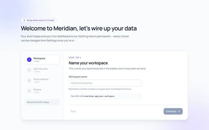
Onboarding Welcome
Originalwelcome screen with steps
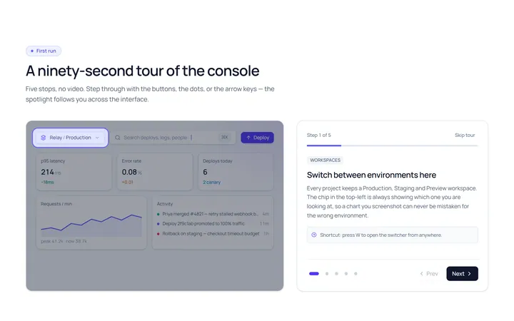
Onboarding Tour
Originalproduct tour with prev/next dots
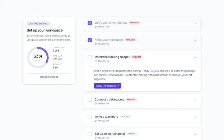
Onboarding Checklist
Originalsetup checklist with progress
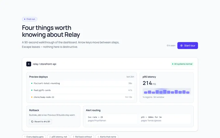
Onboarding Spotlight
Originalfeature spotlight highlight
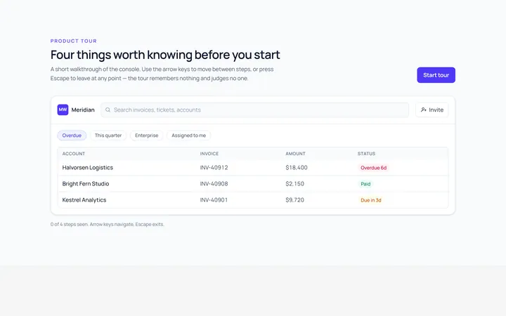
Onboarding Tooltip Tour
Originalguided tooltip walkthrough
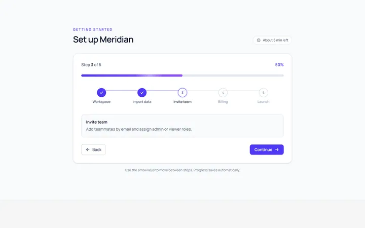
Onboarding Progress
Originalonboarding progress header
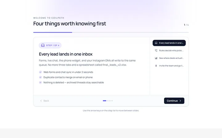
Onboarding Slides
Originalintro slides carousel
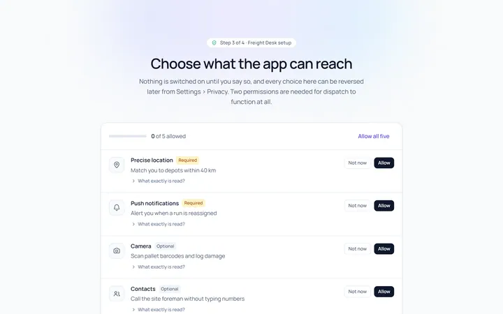
Onboarding Permissions
Originalpermissions request screen
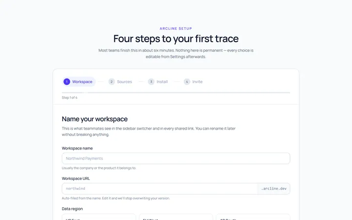
Onboarding Setup Wizard
Originalmulti-step setup wizard

Spotlight Hero
OriginalA centred hero with a soft radial spotlight, badge and dual call-to-action.

Split Hero
OriginalA two-column hero pairing a headline and CTAs with a product mock and social proof.

Gradient Spotlight Hero
OriginalA minimal centred hero with a soft gradient-mesh backdrop, announcement pill and dual call-to-action buttons.