

Onboarding Tooltip Tour
Original · freeguided tooltip walkthrough
Copy prompt gives Claude Code, Cursor or v0 a ready-to-paste prompt that recreates this exact component.
npx shadcn@latest add https://webinnoventix.com/r/onboard-tooltip-tour.json"use client";
import { useCallback, useEffect, useId, useMemo, useRef, useState } from "react";
import { AnimatePresence, motion, useReducedMotion } from "motion/react";
type Placement = "top" | "bottom" | "left" | "right";
type TourStep = {
id: string;
target: string;
title: string;
body: string;
placement: Placement;
hint: string;
};
const STEPS: TourStep[] = [
{
id: "search",
target: "search",
title: "Search across every workspace",
body:
"Type a customer name, invoice number, or ticket ID. Results stream in from Billing, Support, and Analytics at once — no tab switching.",
placement: "bottom",
hint: "Shortcut: press / anywhere",
},
{
id: "filters",
target: "filters",
title: "Filters stack, they don't replace",
body:
"Each chip narrows the set instead of resetting it. Click a chip twice to invert it — handy for finding everything that isn't overdue.",
placement: "bottom",
hint: "Alt-click a chip to solo it",
},
{
id: "table",
target: "table",
title: "Rows are editable in place",
body:
"Double-click any cell to edit without opening a drawer. Changes save on blur and appear in your teammates' views in under two seconds.",
placement: "top",
hint: "Undo with Cmd+Z for 30 seconds",
},
{
id: "invite",
target: "invite",
title: "Bring in the rest of your team",
body:
"Invited teammates land on this exact view with the same filters applied. Viewers are free — you only pay for people who edit.",
placement: "left",
hint: "Seats billed monthly, prorated",
},
];
type Rect = { top: number; left: number; width: number; height: number };
const clamp = (v: number, min: number, max: number) => Math.min(Math.max(v, min), max);
export default function OnboardTooltipTour() {
const reduceMotion = useReducedMotion();
const uid = useId().replace(/[^a-zA-Z0-9]/g, "");
const [running, setRunning] = useState(false);
const [index, setIndex] = useState(0);
const [rect, setRect] = useState<Rect | null>(null);
const [stageWidth, setStageWidth] = useState(0);
const [done, setDone] = useState<string[]>([]);
const stageRef = useRef<HTMLDivElement | null>(null);
const cardRef = useRef<HTMLDivElement | null>(null);
const startRef = useRef<HTMLButtonElement | null>(null);
const nextRef = useRef<HTMLButtonElement | null>(null);
const step = STEPS[index];
const isLast = index === STEPS.length - 1;
const measure = useCallback(() => {
const stage = stageRef.current;
if (!stage) return;
const el = stage.querySelector<HTMLElement>(`[data-tour-target="${STEPS[index].target}"]`);
if (!el) return;
const s = stage.getBoundingClientRect();
const t = el.getBoundingClientRect();
setStageWidth(s.width);
setRect({
top: t.top - s.top,
left: t.left - s.left,
width: t.width,
height: t.height,
});
}, [index]);
useEffect(() => {
if (!running) return;
measure();
}, [running, measure]);
useEffect(() => {
if (!running) return;
const onResize = () => measure();
window.addEventListener("resize", onResize);
return () => window.removeEventListener("resize", onResize);
}, [running, measure]);
useEffect(() => {
if (!running) return;
const id = window.setTimeout(() => nextRef.current?.focus(), reduceMotion ? 0 : 180);
return () => window.clearTimeout(id);
}, [running, index, reduceMotion]);
const stop = useCallback(() => {
setRunning(false);
setRect(null);
window.setTimeout(() => startRef.current?.focus(), 0);
}, []);
const goNext = useCallback(() => {
setDone((prev) => (prev.includes(STEPS[index].id) ? prev : [...prev, STEPS[index].id]));
if (index === STEPS.length - 1) {
stop();
setIndex(0);
return;
}
setIndex((i) => i + 1);
}, [index, stop]);
const goPrev = useCallback(() => {
setIndex((i) => Math.max(0, i - 1));
}, []);
useEffect(() => {
if (!running) return;
const onKey = (e: KeyboardEvent) => {
const target = e.target;
const typing =
target instanceof HTMLElement &&
(target.tagName === "INPUT" || target.tagName === "TEXTAREA" || target.isContentEditable);
if (e.key === "Escape") {
e.preventDefault();
stop();
} else if (e.key === "ArrowRight" && !typing) {
e.preventDefault();
goNext();
} else if (e.key === "ArrowLeft" && !typing) {
e.preventDefault();
goPrev();
} else if (e.key === "Tab") {
const card = cardRef.current;
if (!card) return;
const focusables = card.querySelectorAll<HTMLElement>(
'button:not([disabled]), [href], [tabindex]:not([tabindex="-1"])',
);
if (focusables.length === 0) return;
const first = focusables[0];
const last = focusables[focusables.length - 1];
const active = document.activeElement;
if (e.shiftKey && (active === first || !card.contains(active))) {
e.preventDefault();
last.focus();
} else if (!e.shiftKey && active === last) {
e.preventDefault();
first.focus();
}
}
};
document.addEventListener("keydown", onKey);
return () => document.removeEventListener("keydown", onKey);
}, [running, stop, goNext, goPrev]);
const start = () => {
setIndex(0);
setDone([]);
setRunning(true);
};
const cardPos = useMemo(() => {
if (!rect || stageWidth === 0) return null;
const gap = 14;
const pad = 8;
const cardW = Math.min(336, stageWidth - pad * 2);
const maxLeft = Math.max(pad, stageWidth - cardW - pad);
// Side placements need horizontal room for the card; fall back to stacking when narrow.
const sideFits = stageWidth >= 640;
const placement: Placement =
!sideFits && (step.placement === "left" || step.placement === "right") ? "bottom" : step.placement;
switch (placement) {
case "top":
return {
top: rect.top - gap,
left: clamp(rect.left, pad, maxLeft),
width: cardW,
flip: true,
origin: "bottom left",
};
case "left":
return {
top: rect.top,
left: clamp(rect.left - gap - cardW, pad, maxLeft),
width: cardW,
flip: false,
origin: "top right",
};
case "right":
return {
top: rect.top,
left: clamp(rect.left + rect.width + gap, pad, maxLeft),
width: cardW,
flip: false,
origin: "top left",
};
default:
return {
top: rect.top + rect.height + gap,
left: clamp(rect.left, pad, maxLeft),
width: cardW,
flip: false,
origin: "top left",
};
}
}, [rect, stageWidth, step.placement]);
const transition = reduceMotion
? { duration: 0 }
: { type: "spring" as const, stiffness: 420, damping: 34, mass: 0.7 };
return (
<section className="relative w-full bg-slate-50 px-4 py-16 sm:px-6 sm:py-24 dark:bg-slate-950">
<style>{`
@keyframes ott-${uid}-pulse {
0%, 100% { box-shadow: 0 0 0 0 rgba(99,102,241,0.45); }
50% { box-shadow: 0 0 0 8px rgba(99,102,241,0); }
}
@keyframes ott-${uid}-sheen {
from { transform: translateX(-120%); }
to { transform: translateX(220%); }
}
.ott-${uid}-pulse { animation: ott-${uid}-pulse 2.2s ease-out infinite; }
.ott-${uid}-sheen::after {
content: "";
position: absolute;
inset: 0;
background: linear-gradient(100deg, transparent 35%, rgba(255,255,255,0.35) 50%, transparent 65%);
animation: ott-${uid}-sheen 2.6s ease-in-out infinite;
}
@media (prefers-reduced-motion: reduce) {
.ott-${uid}-pulse, .ott-${uid}-sheen::after { animation: none !important; }
}
`}</style>
<div className="mx-auto w-full max-w-5xl">
<header className="mb-8 flex flex-col gap-4 sm:flex-row sm:items-end sm:justify-between">
<div>
<p className="text-xs font-semibold uppercase tracking-[0.18em] text-indigo-600 dark:text-indigo-400">
Product tour
</p>
<h2 className="mt-2 text-2xl font-semibold tracking-tight text-slate-900 sm:text-3xl dark:text-slate-50">
Four things worth knowing before you start
</h2>
<p className="mt-2 max-w-xl text-sm leading-relaxed text-slate-600 dark:text-slate-400">
A short walkthrough of the console. Use the arrow keys to move between steps, or press Escape to leave at
any point — the tour remembers nothing and judges no one.
</p>
</div>
<button
ref={startRef}
type="button"
onClick={running ? stop : start}
className="relative shrink-0 overflow-hidden rounded-lg bg-indigo-600 px-4 py-2.5 text-sm font-semibold text-white transition-colors hover:bg-indigo-500 focus-visible:outline-none focus-visible:ring-2 focus-visible:ring-indigo-500 focus-visible:ring-offset-2 focus-visible:ring-offset-slate-50 dark:focus-visible:ring-offset-slate-950"
>
{running ? "End tour" : done.length === STEPS.length ? "Replay tour" : "Start tour"}
</button>
</header>
<div
ref={stageRef}
className="relative rounded-2xl border border-slate-200 bg-white shadow-sm dark:border-slate-800 dark:bg-slate-900"
>
{/* Mock app chrome */}
<div className="flex flex-col gap-3 border-b border-slate-200 p-4 sm:flex-row sm:items-center sm:gap-4 dark:border-slate-800">
<div className="flex items-center gap-2">
<span className="grid h-7 w-7 place-items-center rounded-md bg-indigo-600 text-[11px] font-bold text-white">
MW
</span>
<span className="text-sm font-semibold text-slate-900 dark:text-slate-100">Meridian</span>
</div>
<div
data-tour-target="search"
className={`relative flex-1 rounded-lg ${
running && step.target === "search" ? `ott-${uid}-pulse` : ""
}`}
>
<label htmlFor={`${uid}-search`} className="sr-only">
Search records
</label>
<svg
aria-hidden="true"
viewBox="0 0 20 20"
className="pointer-events-none absolute left-2.5 top-1/2 h-4 w-4 -translate-y-1/2 text-slate-400"
fill="none"
stroke="currentColor"
strokeWidth="1.6"
>
<circle cx="9" cy="9" r="5.5" />
<path d="m13.2 13.2 3.3 3.3" strokeLinecap="round" />
</svg>
<input
id={`${uid}-search`}
type="search"
placeholder="Search invoices, tickets, accounts"
className="w-full rounded-lg border border-slate-200 bg-slate-50 py-2 pl-8 pr-3 text-sm text-slate-900 placeholder:text-slate-400 focus-visible:outline-none focus-visible:ring-2 focus-visible:ring-indigo-500 dark:border-slate-700 dark:bg-slate-950 dark:text-slate-100 dark:placeholder:text-slate-500"
/>
</div>
<div
data-tour-target="invite"
className={running && step.target === "invite" ? `ott-${uid}-pulse rounded-lg` : "rounded-lg"}
>
<button
type="button"
className="flex w-full items-center justify-center gap-1.5 rounded-lg border border-slate-200 bg-white px-3 py-2 text-sm font-medium text-slate-700 transition-colors hover:bg-slate-50 focus-visible:outline-none focus-visible:ring-2 focus-visible:ring-indigo-500 sm:w-auto dark:border-slate-700 dark:bg-slate-900 dark:text-slate-200 dark:hover:bg-slate-800"
>
<svg aria-hidden="true" viewBox="0 0 20 20" className="h-4 w-4" fill="none" stroke="currentColor" strokeWidth="1.6">
<circle cx="8" cy="6.5" r="3" />
<path d="M2.5 16c0-2.8 2.5-4.5 5.5-4.5M15 8.5v5M17.5 11h-5" strokeLinecap="round" />
</svg>
Invite
</button>
</div>
</div>
<div className="p-4">
<div
data-tour-target="filters"
className={`flex flex-wrap gap-2 rounded-lg ${running && step.target === "filters" ? `ott-${uid}-pulse` : ""}`}
>
{["Overdue", "This quarter", "Enterprise", "Assigned to me"].map((chip, i) => (
<span
key={chip}
className={`rounded-full border px-3 py-1 text-xs font-medium ${
i === 0
? "border-indigo-200 bg-indigo-50 text-indigo-700 dark:border-indigo-900 dark:bg-indigo-950 dark:text-indigo-300"
: "border-slate-200 bg-white text-slate-600 dark:border-slate-700 dark:bg-slate-900 dark:text-slate-400"
}`}
>
{chip}
</span>
))}
</div>
<div
data-tour-target="table"
className={`mt-4 overflow-x-auto rounded-lg border border-slate-200 dark:border-slate-800 ${
running && step.target === "table" ? `ott-${uid}-pulse` : ""
}`}
>
<table className="w-full min-w-[34rem] border-collapse text-left text-sm">
<caption className="sr-only">Recent invoices</caption>
<thead>
<tr className="bg-slate-50 text-[11px] uppercase tracking-wider text-slate-500 dark:bg-slate-950 dark:text-slate-500">
<th scope="col" className="px-3 py-2 font-semibold">Account</th>
<th scope="col" className="px-3 py-2 font-semibold">Invoice</th>
<th scope="col" className="px-3 py-2 font-semibold">Amount</th>
<th scope="col" className="px-3 py-2 font-semibold">Status</th>
</tr>
</thead>
<tbody className="divide-y divide-slate-200 dark:divide-slate-800">
{[
["Halvorsen Logistics", "INV-40912", "$18,400", "Overdue 6d", "rose"],
["Bright Fern Studio", "INV-40908", "$2,150", "Paid", "emerald"],
["Kestrel Analytics", "INV-40901", "$9,720", "Due in 3d", "amber"],
].map(([account, inv, amount, status, tone]) => (
<tr key={inv} className="text-slate-700 dark:text-slate-300">
<td className="px-3 py-2.5 font-medium text-slate-900 dark:text-slate-100">{account}</td>
<td className="px-3 py-2.5 tabular-nums">{inv}</td>
<td className="px-3 py-2.5 tabular-nums">{amount}</td>
<td className="px-3 py-2.5">
<span
className={
tone === "rose"
? "rounded-full bg-rose-50 px-2 py-0.5 text-xs font-medium text-rose-700 dark:bg-rose-950 dark:text-rose-300"
: tone === "emerald"
? "rounded-full bg-emerald-50 px-2 py-0.5 text-xs font-medium text-emerald-700 dark:bg-emerald-950 dark:text-emerald-300"
: "rounded-full bg-amber-50 px-2 py-0.5 text-xs font-medium text-amber-700 dark:bg-amber-950 dark:text-amber-300"
}
>
{status}
</span>
</td>
</tr>
))}
</tbody>
</table>
</div>
</div>
{/* Spotlight */}
<AnimatePresence>
{running && rect ? (
<motion.div
key="scrim"
aria-hidden="true"
initial={{ opacity: 0 }}
animate={{ opacity: 1 }}
exit={{ opacity: 0 }}
transition={{ duration: reduceMotion ? 0 : 0.2 }}
className="pointer-events-none absolute inset-0 z-10 rounded-2xl"
style={{
background: "rgba(15,23,42,0.55)",
clipPath: `polygon(0% 0%, 0% 100%, ${rect.left - 6}px 100%, ${rect.left - 6}px ${rect.top - 6}px, ${
rect.left + rect.width + 6
}px ${rect.top - 6}px, ${rect.left + rect.width + 6}px ${rect.top + rect.height + 6}px, ${
rect.left - 6
}px ${rect.top + rect.height + 6}px, ${rect.left - 6}px 100%, 100% 100%, 100% 0%)`,
}}
/>
) : null}
</AnimatePresence>
{running && rect ? (
<motion.div
aria-hidden="true"
initial={false}
animate={{ top: rect.top - 6, left: rect.left - 6, width: rect.width + 12, height: rect.height + 12 }}
transition={transition}
className={`pointer-events-none absolute z-20 overflow-hidden rounded-xl border-2 border-indigo-400 ott-${uid}-sheen`}
/>
) : null}
{/* Tooltip card */}
{running && cardPos ? (
<div
className="absolute z-30"
style={{
top: cardPos.top,
left: cardPos.left,
width: cardPos.width,
transform: cardPos.flip ? "translateY(-100%)" : undefined,
}}
>
<motion.div
key={step.id}
ref={cardRef}
role="dialog"
aria-labelledby={`${uid}-title`}
aria-describedby={`${uid}-body`}
initial={reduceMotion ? { opacity: 0 } : { opacity: 0, scale: 0.96 }}
animate={reduceMotion ? { opacity: 1 } : { opacity: 1, scale: 1 }}
transition={reduceMotion ? { duration: 0 } : { duration: 0.22, ease: [0.22, 1, 0.36, 1] }}
style={{ transformOrigin: cardPos.origin }}
className="w-full rounded-xl border border-slate-200 bg-white p-4 shadow-xl dark:border-slate-700 dark:bg-slate-900"
>
<p className="text-[11px] font-semibold uppercase tracking-[0.14em] text-indigo-600 dark:text-indigo-400">
Step {index + 1} of {STEPS.length}
</p>
<h3 id={`${uid}-title`} className="mt-1 text-base font-semibold text-slate-900 dark:text-slate-50">
{step.title}
</h3>
<p id={`${uid}-body`} className="mt-1.5 text-sm leading-relaxed text-slate-600 dark:text-slate-400">
{step.body}
</p>
<p className="mt-2.5 rounded-md bg-slate-50 px-2.5 py-1.5 text-xs text-slate-500 dark:bg-slate-950 dark:text-slate-400">
{step.hint}
</p>
<div className="mt-4 flex items-center justify-between gap-3">
<div className="flex gap-1.5" aria-hidden="true">
{STEPS.map((s, i) => (
<span
key={s.id}
className={`h-1.5 rounded-full transition-all ${
i === index
? "w-5 bg-indigo-600 dark:bg-indigo-400"
: "w-1.5 bg-slate-300 dark:bg-slate-700"
}`}
/>
))}
</div>
<div className="flex items-center gap-2">
<button
type="button"
onClick={stop}
className="rounded-md px-2 py-1.5 text-xs font-medium text-slate-500 transition-colors hover:text-slate-900 focus-visible:outline-none focus-visible:ring-2 focus-visible:ring-indigo-500 dark:text-slate-400 dark:hover:text-slate-100"
>
Skip
</button>
<button
type="button"
onClick={goPrev}
disabled={index === 0}
className="rounded-md border border-slate-200 px-2.5 py-1.5 text-xs font-medium text-slate-700 transition-colors hover:bg-slate-50 focus-visible:outline-none focus-visible:ring-2 focus-visible:ring-indigo-500 disabled:cursor-not-allowed disabled:opacity-40 dark:border-slate-700 dark:text-slate-200 dark:hover:bg-slate-800"
>
Back
</button>
<button
ref={nextRef}
type="button"
onClick={goNext}
className="rounded-md bg-indigo-600 px-3 py-1.5 text-xs font-semibold text-white transition-colors hover:bg-indigo-500 focus-visible:outline-none focus-visible:ring-2 focus-visible:ring-indigo-500 focus-visible:ring-offset-2 focus-visible:ring-offset-white dark:focus-visible:ring-offset-slate-900"
>
{isLast ? "Finish" : "Next"}
</button>
</div>
</div>
</motion.div>
</div>
) : null}
</div>
<p aria-live="polite" className="sr-only">
{running ? `Step ${index + 1} of ${STEPS.length}: ${step.title}. ${step.body}` : "Tour is not running."}
</p>
<p className="mt-4 text-xs text-slate-500 dark:text-slate-500">
{done.length === STEPS.length
? "Tour complete — every step covered."
: `${done.length} of ${STEPS.length} steps seen. Arrow keys navigate, Escape exits.`}
</p>
</div>
</section>
);
}Dependencies
Licence
Built by Web Innoventix. Free for personal and commercial use, no attribution required.
Built by Web Innoventix
Need a custom interface, a full website, or SEO that gets you cited by AI? We design, build and rank it end to end.
Get a free quoteSimilar components
Browse all →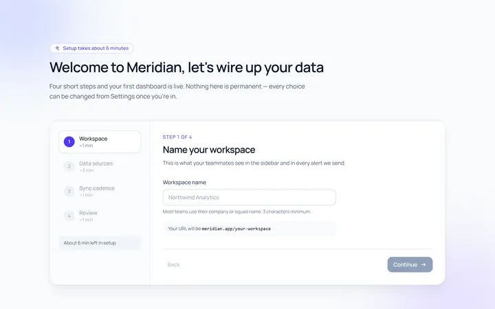
Onboarding Welcome
Originalwelcome screen with steps
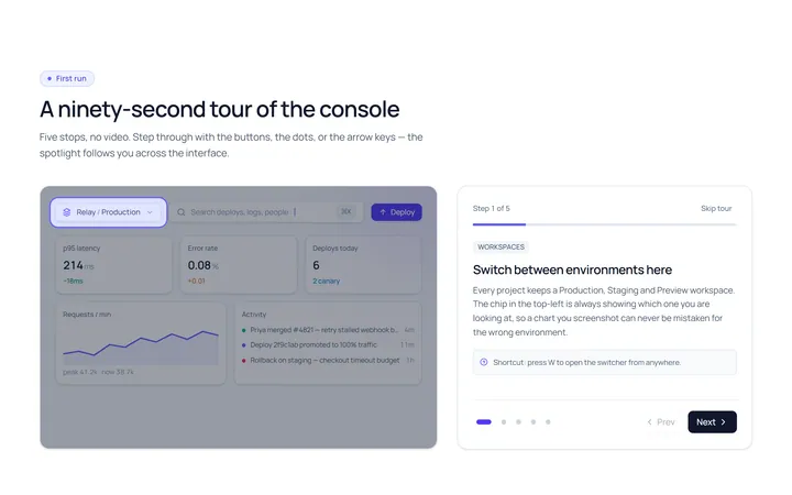
Onboarding Tour
Originalproduct tour with prev/next dots
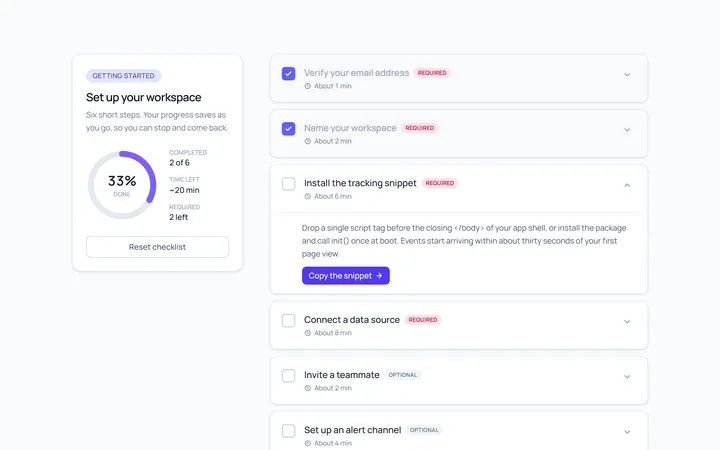
Onboarding Checklist
Originalsetup checklist with progress
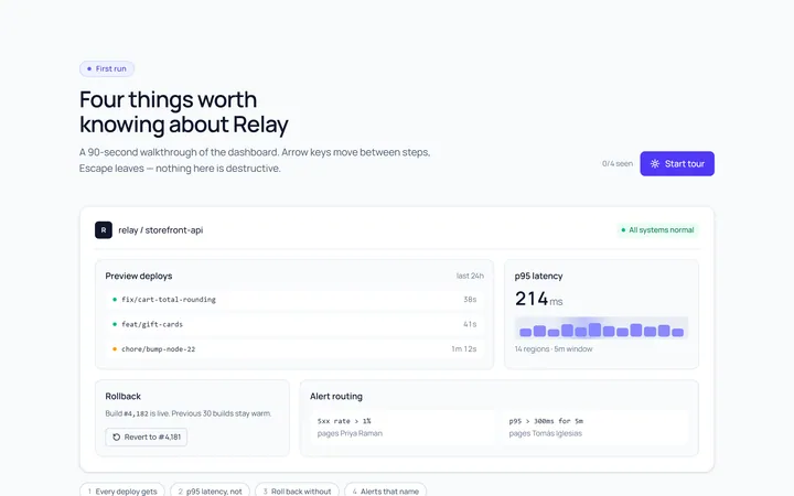
Onboarding Spotlight
Originalfeature spotlight highlight
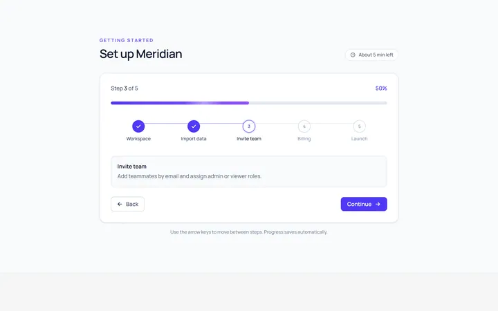
Onboarding Progress
Originalonboarding progress header
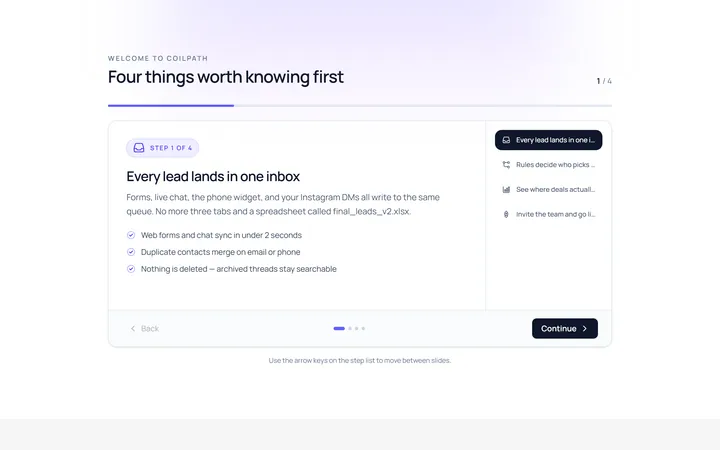
Onboarding Slides
Originalintro slides carousel
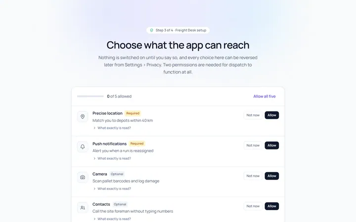
Onboarding Permissions
Originalpermissions request screen
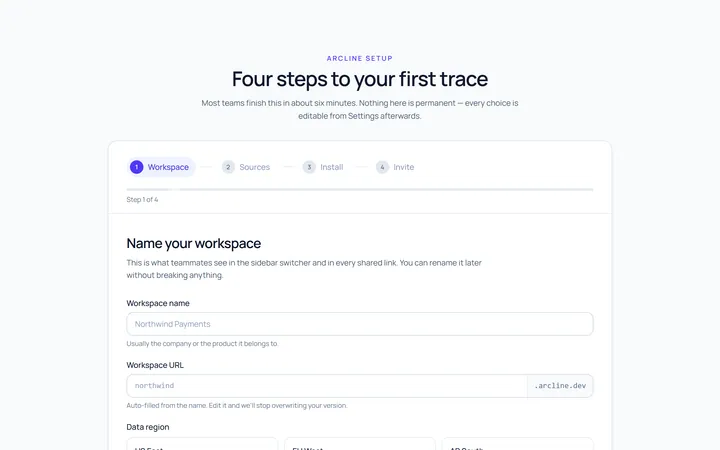
Onboarding Setup Wizard
Originalmulti-step setup wizard
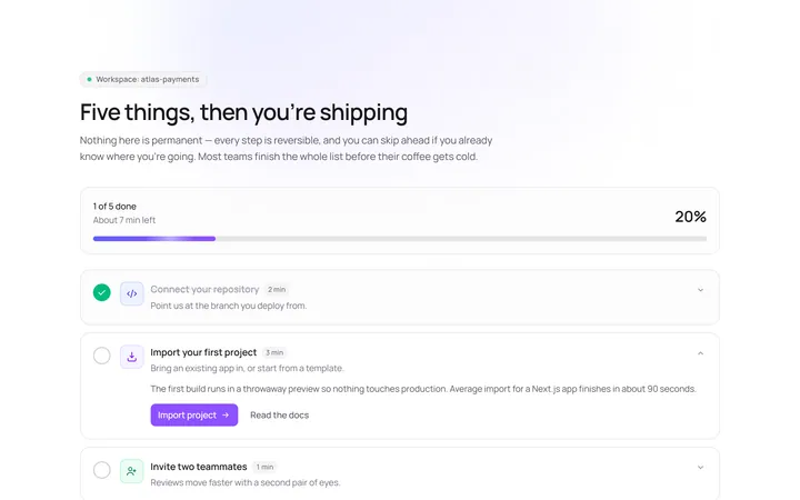
Onboarding Get Started
Originalget started action cards

Spotlight Hero
OriginalA centred hero with a soft radial spotlight, badge and dual call-to-action.

Split Hero
OriginalA two-column hero pairing a headline and CTAs with a product mock and social proof.

Gradient Spotlight Hero
OriginalA minimal centred hero with a soft gradient-mesh backdrop, announcement pill and dual call-to-action buttons.