

Onboarding Spotlight
Original · freefeature spotlight highlight
Copy prompt gives Claude Code, Cursor or v0 a ready-to-paste prompt that recreates this exact component.
npx shadcn@latest add https://webinnoventix.com/r/onboard-spotlight.json"use client";
import { useCallback, useEffect, useId, useRef, useState } from "react";
import { AnimatePresence, motion, useReducedMotion } from "motion/react";
type SpotStep = {
id: string;
targetId: string;
eyebrow: string;
title: string;
body: string;
hint: string;
placement: "bottom" | "top" | "right" | "left";
};
type Rect = { top: number; left: number; width: number; height: number };
const STEPS: SpotStep[] = [
{
id: "step-branches",
targetId: "spot-branches",
eyebrow: "Step 1 of 4",
title: "Every deploy gets its own URL",
body:
"Push a branch and Relay builds it in about 40 seconds. The preview link stays alive until the branch is merged or deleted, so reviewers never argue over stale screenshots.",
hint: "Try it: open a pull request and check the bot comment.",
placement: "bottom",
},
{
id: "step-latency",
targetId: "spot-latency",
eyebrow: "Step 2 of 4",
title: "p95 latency, not averages",
body:
"Averages hide the users who suffer. This tile tracks the 95th percentile across all 14 edge regions and turns amber past 300 ms — the point where checkout abandonment starts climbing.",
hint: "Click any region on the map to isolate its curve.",
placement: "left",
},
{
id: "step-rollback",
targetId: "spot-rollback",
eyebrow: "Step 3 of 4",
title: "Roll back without a redeploy",
body:
"Previous builds stay warm for 30 days. Rolling back swaps the routing table instead of rebuilding, so recovery is a single click and takes under two seconds.",
hint: "Keyboard: press R twice on any build row.",
placement: "top",
},
{
id: "step-alerts",
targetId: "spot-alerts",
eyebrow: "Step 4 of 4",
title: "Alerts that name a human",
body:
"Each alert rule routes to the person who last touched the failing path — pulled from git blame, not a rota spreadsheet. Escalation falls back to the on-call channel after eight minutes.",
hint: "Connect Slack or PagerDuty in Settings → Routing.",
placement: "right",
},
];
export default function OnboardSpotlight() {
const reduceMotion = useReducedMotion();
const uid = useId().replace(/[:]/g, "");
const [active, setActive] = useState(false);
const [index, setIndex] = useState(0);
const [rect, setRect] = useState<Rect | null>(null);
const [done, setDone] = useState<string[]>([]);
const stageRef = useRef<HTMLDivElement | null>(null);
const nextRef = useRef<HTMLButtonElement | null>(null);
const startRef = useRef<HTMLButtonElement | null>(null);
const step = STEPS[index];
const measure = useCallback(() => {
const stage = stageRef.current;
if (!stage) return;
const target = stage.querySelector<HTMLElement>(`[data-spot="${step.targetId}"]`);
if (!target) return;
const s = stage.getBoundingClientRect();
const t = target.getBoundingClientRect();
setRect({
top: t.top - s.top,
left: t.left - s.left,
width: t.width,
height: t.height,
});
}, [step.targetId]);
useEffect(() => {
if (!active) return;
measure();
}, [active, measure]);
useEffect(() => {
if (!active) return;
const onResize = () => measure();
window.addEventListener("resize", onResize);
return () => window.removeEventListener("resize", onResize);
}, [active, measure]);
useEffect(() => {
if (!active) return;
const id = window.setTimeout(() => nextRef.current?.focus(), 20);
return () => window.clearTimeout(id);
}, [active, index]);
const close = useCallback(() => {
setActive(false);
window.setTimeout(() => startRef.current?.focus(), 20);
}, []);
const advance = useCallback(() => {
setDone((prev) => (prev.includes(STEPS[index].id) ? prev : [...prev, STEPS[index].id]));
if (index < STEPS.length - 1) {
setIndex(index + 1);
} else {
close();
}
}, [index, close]);
const back = useCallback(() => {
setIndex((i) => Math.max(0, i - 1));
}, []);
useEffect(() => {
if (!active) return;
const onKey = (e: KeyboardEvent) => {
if (e.key === "Escape") {
e.preventDefault();
close();
} else if (e.key === "ArrowRight") {
e.preventDefault();
advance();
} else if (e.key === "ArrowLeft") {
e.preventDefault();
back();
}
};
window.addEventListener("keydown", onKey);
return () => window.removeEventListener("keydown", onKey);
}, [active, close, advance, back]);
const start = () => {
setIndex(0);
setActive(true);
};
const pad = 10;
const halo = rect
? {
top: rect.top - pad,
left: rect.left - pad,
width: rect.width + pad * 2,
height: rect.height + pad * 2,
}
: null;
const cardPosition = (): { top: number; left: number; translate: string } => {
if (!halo) return { top: 0, left: 0, translate: "translate(0,0)" };
const cx = halo.left + halo.width / 2;
const cy = halo.top + halo.height / 2;
switch (step.placement) {
case "top":
return { top: halo.top - 12, left: cx, translate: "translate(-50%,-100%)" };
case "left":
return { top: cy, left: halo.left - 12, translate: "translate(-100%,-50%)" };
case "right":
return { top: cy, left: halo.left + halo.width + 12, translate: "translate(0,-50%)" };
default:
return { top: halo.top + halo.height + 12, left: cx, translate: "translate(-50%,0)" };
}
};
const card = cardPosition();
const progress = ((index + 1) / STEPS.length) * 100;
return (
<section className="relative w-full bg-slate-50 px-4 py-20 text-slate-900 sm:px-6 sm:py-24 dark:bg-slate-950 dark:text-slate-100">
<style>{`
@keyframes ${uid}-pulse {
0%, 100% { box-shadow: 0 0 0 0 rgba(99,102,241,0.55), 0 0 0 1px rgba(99,102,241,0.9) inset; }
50% { box-shadow: 0 0 0 10px rgba(99,102,241,0), 0 0 0 1px rgba(99,102,241,0.9) inset; }
}
@keyframes ${uid}-sweep {
from { transform: translateX(-120%); }
to { transform: translateX(220%); }
}
.${uid}-halo { animation: ${uid}-pulse 2.4s ease-out infinite; }
.${uid}-sweep { animation: ${uid}-sweep 2.8s linear infinite; }
@media (prefers-reduced-motion: reduce) {
.${uid}-halo, .${uid}-sweep { animation: none !important; }
}
`}</style>
<div className="mx-auto w-full max-w-5xl">
<header className="mb-10 flex flex-col gap-5 sm:mb-12 sm:flex-row sm:items-end sm:justify-between">
<div className="max-w-xl">
<span className="inline-flex items-center gap-2 rounded-full border border-indigo-200 bg-indigo-50 px-3 py-1 text-xs font-medium tracking-wide text-indigo-700 dark:border-indigo-500/30 dark:bg-indigo-500/10 dark:text-indigo-300">
<span className="h-1.5 w-1.5 rounded-full bg-indigo-500" />
First run
</span>
<h2 className="mt-4 text-3xl font-semibold tracking-tight text-balance sm:text-4xl">
Four things worth knowing about Relay
</h2>
<p className="mt-3 text-sm leading-relaxed text-slate-600 sm:text-base dark:text-slate-400">
A 90-second walkthrough of the dashboard. Arrow keys move between steps, Escape
leaves — nothing here is destructive.
</p>
</div>
<div className="flex shrink-0 items-center gap-3">
<span className="text-xs tabular-nums text-slate-500 dark:text-slate-400">
{done.length}/{STEPS.length} seen
</span>
<button
ref={startRef}
type="button"
onClick={start}
aria-expanded={active}
className="inline-flex items-center gap-2 rounded-lg bg-indigo-600 px-4 py-2.5 text-sm font-medium text-white transition-colors hover:bg-indigo-500 focus-visible:outline-none focus-visible:ring-2 focus-visible:ring-indigo-500 focus-visible:ring-offset-2 focus-visible:ring-offset-slate-50 dark:focus-visible:ring-offset-slate-950"
>
<svg
aria-hidden="true"
viewBox="0 0 16 16"
className="h-4 w-4"
fill="none"
stroke="currentColor"
strokeWidth={1.6}
strokeLinecap="round"
strokeLinejoin="round"
>
<path d="M8 1.5v2M8 12.5v2M1.5 8h2M12.5 8h2M3.4 3.4l1.4 1.4M11.2 11.2l1.4 1.4M12.6 3.4l-1.4 1.4M4.8 11.2l-1.4 1.4" />
<circle cx="8" cy="8" r="2.4" />
</svg>
{done.length === STEPS.length ? "Replay tour" : "Start tour"}
</button>
</div>
</header>
<div
ref={stageRef}
className="relative overflow-hidden rounded-2xl border border-slate-200 bg-white p-4 shadow-sm sm:p-6 dark:border-slate-800 dark:bg-slate-900"
>
<div className="mb-4 flex items-center justify-between gap-4 border-b border-slate-200 pb-4 dark:border-slate-800">
<div className="flex items-center gap-2.5">
<span className="grid h-7 w-7 place-items-center rounded-md bg-slate-900 text-[11px] font-bold text-white dark:bg-slate-100 dark:text-slate-900">
R
</span>
<span className="text-sm font-medium">relay / storefront-api</span>
</div>
<span className="hidden items-center gap-1.5 rounded-md bg-emerald-50 px-2 py-1 text-xs font-medium text-emerald-700 sm:inline-flex dark:bg-emerald-500/10 dark:text-emerald-400">
<span className="h-1.5 w-1.5 rounded-full bg-emerald-500" />
All systems normal
</span>
</div>
<div className="grid gap-4 sm:grid-cols-3">
<div
data-spot="spot-branches"
className="rounded-xl border border-slate-200 bg-slate-50 p-4 sm:col-span-2 dark:border-slate-800 dark:bg-slate-950/50"
>
<div className="flex items-center justify-between">
<h3 className="text-sm font-semibold">Preview deploys</h3>
<span className="text-xs text-slate-500 dark:text-slate-400">last 24h</span>
</div>
<ul className="mt-3 space-y-2">
{[
{ b: "fix/cart-total-rounding", t: "38s", ok: true },
{ b: "feat/gift-cards", t: "41s", ok: true },
{ b: "chore/bump-node-22", t: "1m 12s", ok: false },
].map((r) => (
<li
key={r.b}
className="flex items-center justify-between gap-3 rounded-lg bg-white px-3 py-2 text-xs dark:bg-slate-900"
>
<span className="flex min-w-0 items-center gap-2">
<span
className={`h-1.5 w-1.5 shrink-0 rounded-full ${
r.ok ? "bg-emerald-500" : "bg-amber-500"
}`}
/>
<span className="truncate font-mono text-slate-700 dark:text-slate-300">
{r.b}
</span>
</span>
<span className="shrink-0 tabular-nums text-slate-500 dark:text-slate-400">
{r.t}
</span>
</li>
))}
</ul>
</div>
<div
data-spot="spot-latency"
className="rounded-xl border border-slate-200 bg-slate-50 p-4 dark:border-slate-800 dark:bg-slate-950/50"
>
<h3 className="text-sm font-semibold">p95 latency</h3>
<p className="mt-2 text-3xl font-semibold tabular-nums tracking-tight">
214<span className="text-base font-normal text-slate-500"> ms</span>
</p>
<div className="relative mt-3 h-9 overflow-hidden rounded-md bg-slate-200/70 dark:bg-slate-800">
<div
className={`absolute inset-y-0 left-0 w-1/3 bg-gradient-to-r from-transparent via-indigo-400/40 to-transparent ${uid}-sweep`}
/>
<div className="flex h-full items-end gap-[3px] px-2 pb-1">
{[42, 55, 38, 61, 48, 70, 52, 44, 66, 50, 58, 40].map((h, i) => (
<span
key={i}
style={{ height: `${h}%` }}
className="flex-1 rounded-sm bg-indigo-500/70"
/>
))}
</div>
</div>
<p className="mt-2 text-xs text-slate-500 dark:text-slate-400">14 regions · 5m window</p>
</div>
<div
data-spot="spot-rollback"
className="rounded-xl border border-slate-200 bg-slate-50 p-4 dark:border-slate-800 dark:bg-slate-950/50"
>
<h3 className="text-sm font-semibold">Rollback</h3>
<p className="mt-2 text-xs leading-relaxed text-slate-600 dark:text-slate-400">
Build <span className="font-mono">#4,182</span> is live. Previous 30 builds stay
warm.
</p>
<span className="mt-3 inline-flex items-center gap-1.5 rounded-md border border-slate-300 px-2.5 py-1.5 text-xs font-medium text-slate-700 dark:border-slate-700 dark:text-slate-300">
<svg
aria-hidden="true"
viewBox="0 0 16 16"
className="h-3.5 w-3.5"
fill="none"
stroke="currentColor"
strokeWidth={1.6}
strokeLinecap="round"
strokeLinejoin="round"
>
<path d="M2.5 8a5.5 5.5 0 1 0 1.7-4" />
<path d="M2.5 2.5v3.2h3.2" />
</svg>
Revert to #4,181
</span>
</div>
<div
data-spot="spot-alerts"
className="rounded-xl border border-slate-200 bg-slate-50 p-4 sm:col-span-2 dark:border-slate-800 dark:bg-slate-950/50"
>
<h3 className="text-sm font-semibold">Alert routing</h3>
<div className="mt-3 grid gap-2 sm:grid-cols-2">
{[
{ rule: "5xx rate > 1%", who: "Priya Raman" },
{ rule: "p95 > 300ms for 5m", who: "Tomás Iglesias" },
].map((a) => (
<div
key={a.rule}
className="rounded-lg bg-white px-3 py-2.5 text-xs dark:bg-slate-900"
>
<p className="font-mono text-slate-700 dark:text-slate-300">{a.rule}</p>
<p className="mt-1 text-slate-500 dark:text-slate-400">pages {a.who}</p>
</div>
))}
</div>
</div>
</div>
<AnimatePresence>
{active && halo ? (
<>
<motion.div
key="scrim"
initial={reduceMotion ? false : { opacity: 0 }}
animate={{ opacity: 1 }}
exit={reduceMotion ? undefined : { opacity: 0 }}
transition={{ duration: 0.18 }}
aria-hidden="true"
className="pointer-events-none absolute inset-0 z-10 bg-slate-950/55 dark:bg-slate-950/75"
style={{
clipPath: `polygon(0% 0%, 0% 100%, ${halo.left}px 100%, ${halo.left}px ${halo.top}px, ${
halo.left + halo.width
}px ${halo.top}px, ${halo.left + halo.width}px ${halo.top + halo.height}px, ${
halo.left
}px ${halo.top + halo.height}px, ${halo.left}px 100%, 100% 100%, 100% 0%)`,
}}
/>
<motion.div
key="halo"
aria-hidden="true"
initial={reduceMotion ? false : { opacity: 0 }}
animate={{
opacity: 1,
top: halo.top,
left: halo.left,
width: halo.width,
height: halo.height,
}}
exit={reduceMotion ? undefined : { opacity: 0 }}
transition={
reduceMotion
? { duration: 0 }
: { type: "spring", stiffness: 320, damping: 34 }
}
className={`pointer-events-none absolute z-20 rounded-xl ${uid}-halo`}
/>
<motion.div
key={`card-${step.id}`}
role="dialog"
aria-modal="false"
aria-labelledby={`${uid}-title`}
aria-describedby={`${uid}-body`}
initial={reduceMotion ? false : { opacity: 0, scale: 0.97 }}
animate={{ opacity: 1, scale: 1 }}
exit={reduceMotion ? undefined : { opacity: 0, scale: 0.97 }}
transition={{ duration: reduceMotion ? 0 : 0.2 }}
style={{ top: card.top, left: card.left, transform: card.translate }}
className="absolute z-30 w-[min(20rem,calc(100%-2rem))] rounded-xl border border-slate-200 bg-white p-4 shadow-xl shadow-slate-900/10 dark:border-slate-700 dark:bg-slate-900 dark:shadow-black/40"
>
<div className="flex items-start justify-between gap-3">
<p className="text-[11px] font-medium uppercase tracking-wider text-indigo-600 dark:text-indigo-400">
{step.eyebrow}
</p>
<button
type="button"
onClick={close}
aria-label="Close tour"
className="-m-1 rounded p-1 text-slate-400 transition-colors hover:text-slate-700 focus-visible:outline-none focus-visible:ring-2 focus-visible:ring-indigo-500 dark:hover:text-slate-200"
>
<svg
aria-hidden="true"
viewBox="0 0 16 16"
className="h-3.5 w-3.5"
fill="none"
stroke="currentColor"
strokeWidth={1.8}
strokeLinecap="round"
>
<path d="M3.5 3.5l9 9M12.5 3.5l-9 9" />
</svg>
</button>
</div>
<h3
id={`${uid}-title`}
className="mt-1.5 text-base font-semibold tracking-tight text-slate-900 dark:text-slate-100"
>
{step.title}
</h3>
<p
id={`${uid}-body`}
className="mt-2 text-[13px] leading-relaxed text-slate-600 dark:text-slate-400"
>
{step.body}
</p>
<p className="mt-2.5 rounded-md bg-slate-100 px-2.5 py-1.5 text-[11px] leading-relaxed text-slate-600 dark:bg-slate-800 dark:text-slate-400">
{step.hint}
</p>
<div
className="mt-3.5 h-1 overflow-hidden rounded-full bg-slate-200 dark:bg-slate-800"
role="progressbar"
aria-valuenow={index + 1}
aria-valuemin={1}
aria-valuemax={STEPS.length}
aria-label="Tour progress"
>
<motion.div
className="h-full rounded-full bg-indigo-500"
initial={false}
animate={{ width: `${progress}%` }}
transition={{ duration: reduceMotion ? 0 : 0.3 }}
/>
</div>
<div className="mt-3 flex items-center justify-between gap-2">
<button
type="button"
onClick={close}
className="rounded-md px-2 py-1.5 text-xs font-medium text-slate-500 transition-colors hover:text-slate-800 focus-visible:outline-none focus-visible:ring-2 focus-visible:ring-indigo-500 dark:hover:text-slate-200"
>
Skip
</button>
<div className="flex items-center gap-2">
<button
type="button"
onClick={back}
disabled={index === 0}
className="rounded-md border border-slate-300 px-2.5 py-1.5 text-xs font-medium text-slate-700 transition-colors hover:bg-slate-100 focus-visible:outline-none focus-visible:ring-2 focus-visible:ring-indigo-500 disabled:cursor-not-allowed disabled:opacity-40 dark:border-slate-700 dark:text-slate-300 dark:hover:bg-slate-800"
>
Back
</button>
<button
ref={nextRef}
type="button"
onClick={advance}
className="rounded-md bg-indigo-600 px-3 py-1.5 text-xs font-medium text-white transition-colors hover:bg-indigo-500 focus-visible:outline-none focus-visible:ring-2 focus-visible:ring-indigo-500 focus-visible:ring-offset-2 focus-visible:ring-offset-white dark:focus-visible:ring-offset-slate-900"
>
{index === STEPS.length - 1 ? "Finish" : "Next"}
</button>
</div>
</div>
</motion.div>
</>
) : null}
</AnimatePresence>
</div>
<div
className="mt-4 flex flex-wrap items-center gap-2"
role="group"
aria-label="Jump to tour step"
>
{STEPS.map((s, i) => {
const seen = done.includes(s.id);
const current = active && i === index;
return (
<button
key={s.id}
type="button"
onClick={() => {
setIndex(i);
setActive(true);
}}
aria-current={current ? "step" : undefined}
className={`inline-flex items-center gap-1.5 rounded-full border px-3 py-1.5 text-xs font-medium transition-colors focus-visible:outline-none focus-visible:ring-2 focus-visible:ring-indigo-500 focus-visible:ring-offset-2 focus-visible:ring-offset-slate-50 dark:focus-visible:ring-offset-slate-950 ${
current
? "border-indigo-500 bg-indigo-500 text-white"
: seen
? "border-emerald-300 bg-emerald-50 text-emerald-800 dark:border-emerald-500/30 dark:bg-emerald-500/10 dark:text-emerald-300"
: "border-slate-300 bg-white text-slate-600 hover:bg-slate-100 dark:border-slate-700 dark:bg-slate-900 dark:text-slate-400 dark:hover:bg-slate-800"
}`}
>
{seen && !current ? (
<svg
aria-hidden="true"
viewBox="0 0 16 16"
className="h-3 w-3"
fill="none"
stroke="currentColor"
strokeWidth={2}
strokeLinecap="round"
strokeLinejoin="round"
>
<path d="M3 8.5l3.2 3.2L13 5" />
</svg>
) : (
<span className="tabular-nums opacity-60">{i + 1}</span>
)}
{s.title.split(" ").slice(0, 3).join(" ")}
<span className="sr-only">{seen ? " (seen)" : ""}</span>
</button>
);
})}
</div>
</div>
</section>
);
}Dependencies
Licence
Built by Web Innoventix. Free for personal and commercial use, no attribution required.
Built by Web Innoventix
Need a custom interface, a full website, or SEO that gets you cited by AI? We design, build and rank it end to end.
Get a free quoteSimilar components
Browse all →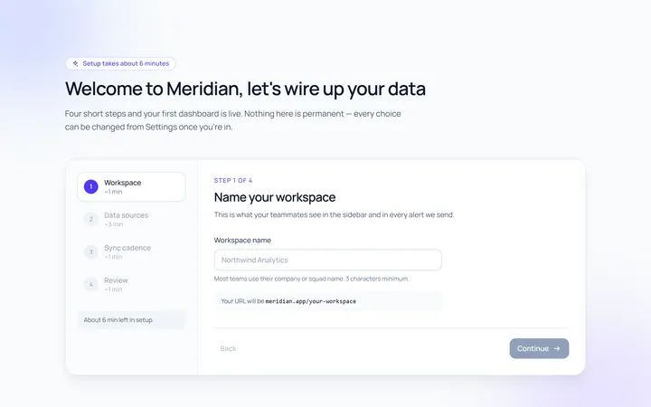
Onboarding Welcome
Originalwelcome screen with steps
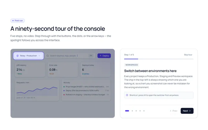
Onboarding Tour
Originalproduct tour with prev/next dots
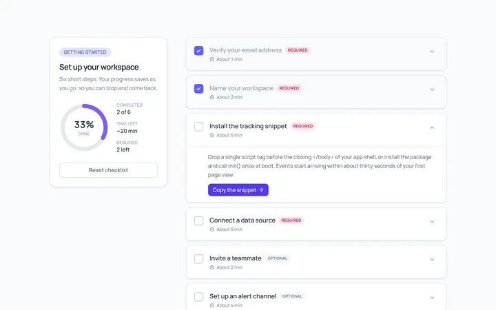
Onboarding Checklist
Originalsetup checklist with progress
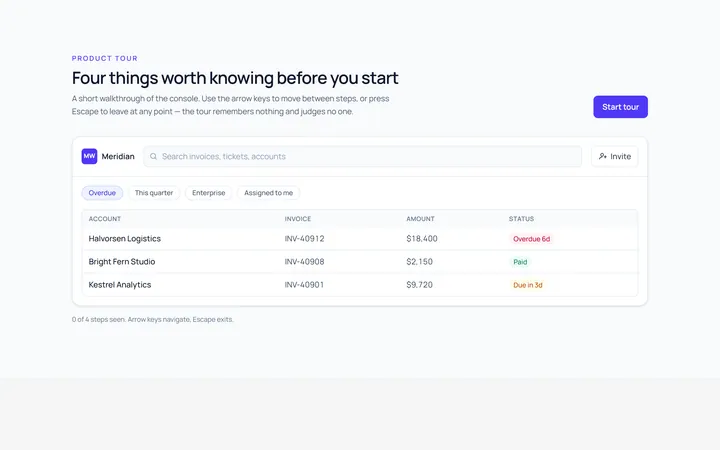
Onboarding Tooltip Tour
Originalguided tooltip walkthrough
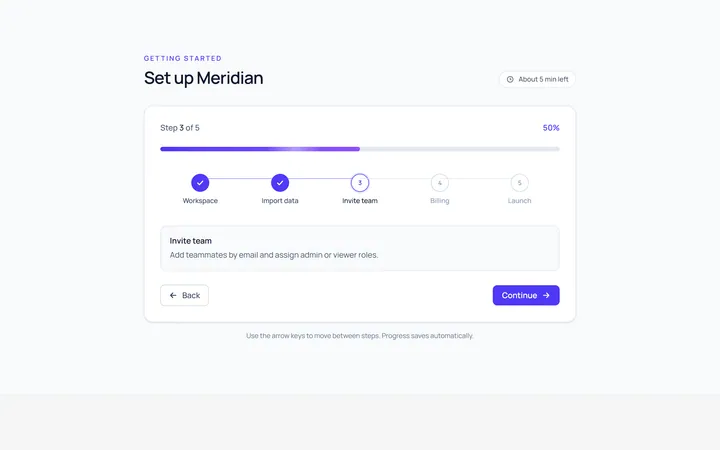
Onboarding Progress
Originalonboarding progress header
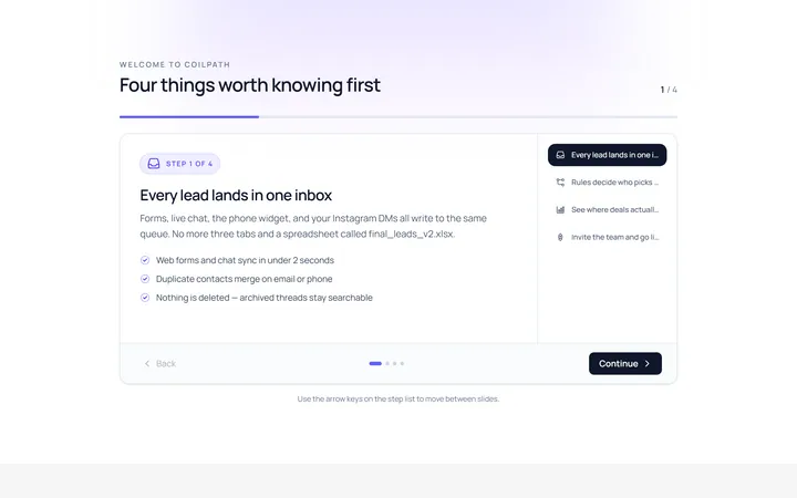
Onboarding Slides
Originalintro slides carousel
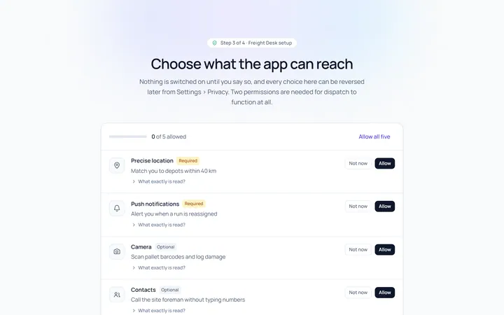
Onboarding Permissions
Originalpermissions request screen
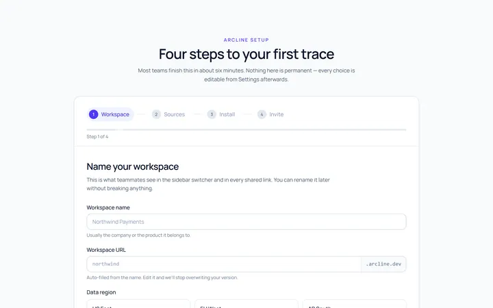
Onboarding Setup Wizard
Originalmulti-step setup wizard
Onboarding Get Started
Originalget started action cards

Spotlight Hero
OriginalA centred hero with a soft radial spotlight, badge and dual call-to-action.

Split Hero
OriginalA two-column hero pairing a headline and CTAs with a product mock and social proof.

Gradient Spotlight Hero
OriginalA minimal centred hero with a soft gradient-mesh backdrop, announcement pill and dual call-to-action buttons.