

Onboarding Tour
Original · freeproduct tour with prev/next dots
Copy prompt gives Claude Code, Cursor or v0 a ready-to-paste prompt that recreates this exact component.
npx shadcn@latest add https://webinnoventix.com/r/onboard-tour.json"use client";
import {
useCallback,
useEffect,
useId,
useRef,
useState,
type KeyboardEvent,
} from "react";
import { motion, useReducedMotion } from "motion/react";
type TargetKey = "switcher" | "search" | "metrics" | "deploy" | "activity";
type Step = {
target: TargetKey;
chip: string;
title: string;
body: string;
hint: string;
};
const STEPS: Step[] = [
{
target: "switcher",
chip: "Workspaces",
title: "Switch between environments here",
body: "Every project keeps a Production, Staging and Preview workspace. The chip in the top-left is always showing which one you are looking at, so a chart you screenshot can never be mistaken for the wrong environment.",
hint: "Shortcut: press W to open the switcher from anywhere.",
},
{
target: "search",
chip: "Command bar",
title: "Find anything without leaving the keyboard",
body: "The command bar searches deploys, log lines, environment variables and teammates in one index. Type a commit SHA to jump straight to the release that shipped it.",
hint: "Shortcut: Ctrl K on Windows, Cmd K on macOS.",
},
{
target: "metrics",
chip: "Health strip",
title: "The three numbers that page you at 2am",
body: "p95 latency, error rate and deploy count refresh every 15 seconds off the live edge. A number turns amber at your warning threshold and rose once it breaches, so you can read the strip from across the room.",
hint: "Click any tile to open its 30-day trend.",
},
{
target: "deploy",
chip: "Shipping",
title: "Ship the current branch in one click",
body: "Deploy builds from the commit shown in the activity feed, runs your checks, then swaps traffic over gradually. If error rate crosses the threshold during the rollout, Relay rolls back on its own and tells you why.",
hint: "Hold Shift while clicking to deploy without the canary stage.",
},
{
target: "activity",
chip: "Activity",
title: "See who changed what, in order",
body: "Merges, config edits, rollbacks and alerts all land in one feed instead of three different tabs. Each entry links to the diff and the person who made it, which makes an incident timeline a copy-paste job.",
hint: "Filter with author:priya or type:rollback.",
},
];
type Rect = { x: number; y: number; w: number; h: number };
const PAD = 8;
export default function OnboardTour() {
const [index, setIndex] = useState(0);
const [done, setDone] = useState(false);
const [rect, setRect] = useState<Rect | null>(null);
const reduce = useReducedMotion();
const baseId = useId();
const panelId = `${baseId}-panel`;
const tabId = (i: number) => `${baseId}-dot-${i}`;
const canvasRef = useRef<HTMLDivElement | null>(null);
const targetsRef = useRef<Partial<Record<TargetKey, HTMLElement | null>>>({});
const dotsRef = useRef<(HTMLButtonElement | null)[]>([]);
const setTarget = (key: TargetKey) => (el: HTMLDivElement | null) => {
targetsRef.current[key] = el;
};
const measure = useCallback(() => {
const canvas = canvasRef.current;
const el = targetsRef.current[STEPS[index].target];
if (!canvas || !el) {
setRect(null);
return;
}
const c = canvas.getBoundingClientRect();
const t = el.getBoundingClientRect();
setRect({
x: t.left - c.left - PAD,
y: t.top - c.top - PAD,
w: t.width + PAD * 2,
h: t.height + PAD * 2,
});
}, [index]);
useEffect(() => {
measure();
const canvas = canvasRef.current;
const ro = new ResizeObserver(() => measure());
if (canvas) ro.observe(canvas);
window.addEventListener("resize", measure);
return () => {
ro.disconnect();
window.removeEventListener("resize", measure);
};
}, [measure]);
const goTo = (i: number) => {
setIndex(Math.min(STEPS.length - 1, Math.max(0, i)));
setDone(false);
};
const next = () => {
if (index === STEPS.length - 1) setDone(true);
else setIndex(index + 1);
};
const prev = () => {
if (done) setDone(false);
else if (index > 0) setIndex(index - 1);
};
const onDotsKeyDown = (e: KeyboardEvent<HTMLDivElement>) => {
const last = STEPS.length - 1;
let target = -1;
if (e.key === "ArrowRight") target = index === last ? 0 : index + 1;
else if (e.key === "ArrowLeft") target = index === 0 ? last : index - 1;
else if (e.key === "Home") target = 0;
else if (e.key === "End") target = last;
if (target < 0) return;
e.preventDefault();
goTo(target);
dotsRef.current[target]?.focus();
};
const step = STEPS[index];
const progress = done ? 100 : ((index + 1) / STEPS.length) * 100;
const ring =
"focus-visible:outline-none focus-visible:ring-2 focus-visible:ring-indigo-500 focus-visible:ring-offset-2 focus-visible:ring-offset-white dark:focus-visible:ring-offset-slate-950";
return (
<section className="relative w-full bg-white px-5 py-20 text-slate-900 sm:px-8 sm:py-28 dark:bg-slate-950 dark:text-slate-100">
<style>{`
@keyframes otour-halo {
0%, 100% { opacity: 0.3; transform: scale(1); }
50% { opacity: 0.62; transform: scale(1.012); }
}
@keyframes otour-caret {
0%, 100% { opacity: 0; }
50% { opacity: 1; }
}
@keyframes otour-drift {
0%, 100% { transform: translate3d(0, 0, 0); }
50% { transform: translate3d(0, -6px, 0); }
}
.otour-halo { animation: otour-halo 2.4s ease-in-out infinite; }
.otour-caret { animation: otour-caret 1.1s steps(2, start) infinite; }
.otour-drift { animation: otour-drift 9s ease-in-out infinite; }
@media (prefers-reduced-motion: reduce) {
.otour-halo, .otour-caret, .otour-drift { animation: none !important; }
}
`}</style>
<div className="mx-auto max-w-6xl">
<header className="max-w-2xl">
<span className="inline-flex items-center gap-2 rounded-full border border-indigo-200 bg-indigo-50 px-3 py-1 text-xs font-medium tracking-wide text-indigo-700 dark:border-indigo-500/30 dark:bg-indigo-500/10 dark:text-indigo-300">
<span className="h-1.5 w-1.5 rounded-full bg-indigo-500" />
First run
</span>
<h2 className="mt-4 text-3xl font-semibold tracking-tight text-slate-900 sm:text-4xl dark:text-white">
A ninety-second tour of the console
</h2>
<p className="mt-3 text-base leading-relaxed text-slate-600 dark:text-slate-400">
Five stops, no video. Step through with the buttons, the dots, or the
arrow keys — the spotlight follows you across the interface.
</p>
</header>
<div className="mt-10 grid gap-6 lg:grid-cols-[minmax(0,1.35fr)_minmax(0,1fr)] lg:gap-8">
{/* ---------- mock product canvas ---------- */}
<div
ref={canvasRef}
aria-hidden="true"
className="relative isolate overflow-hidden rounded-2xl border border-slate-200 bg-slate-50 p-4 shadow-sm sm:p-6 dark:border-slate-800 dark:bg-slate-900/60"
>
<div
className="otour-drift pointer-events-none absolute -right-20 -top-24 h-56 w-56 rounded-full bg-violet-400/20 blur-3xl dark:bg-violet-500/20"
/>
{/* top bar */}
<div className="relative flex items-center gap-3">
<div
ref={setTarget("switcher")}
className="flex shrink-0 items-center gap-2 rounded-lg border border-slate-200 bg-white px-2.5 py-1.5 shadow-sm dark:border-slate-700 dark:bg-slate-900"
>
<svg viewBox="0 0 24 24" className="h-4 w-4 text-indigo-500" fill="none" stroke="currentColor" strokeWidth={2}>
<path d="M12 3l8 4.5-8 4.5-8-4.5L12 3z" strokeLinejoin="round" />
<path d="M4 12.5l8 4.5 8-4.5M4 17l8 4.5 8-4.5" strokeLinecap="round" strokeLinejoin="round" />
</svg>
<span className="text-xs font-medium text-slate-700 dark:text-slate-200">
Relay <span className="text-slate-400 dark:text-slate-500">/</span> Production
</span>
<svg viewBox="0 0 24 24" className="h-3.5 w-3.5 text-slate-400" fill="none" stroke="currentColor" strokeWidth={2}>
<path d="M6 9l6 6 6-6" strokeLinecap="round" strokeLinejoin="round" />
</svg>
</div>
<div
ref={setTarget("search")}
className="flex min-w-0 flex-1 items-center gap-2 rounded-lg border border-slate-200 bg-white px-3 py-1.5 shadow-sm dark:border-slate-700 dark:bg-slate-900"
>
<svg viewBox="0 0 24 24" className="h-4 w-4 shrink-0 text-slate-400" fill="none" stroke="currentColor" strokeWidth={2}>
<circle cx="11" cy="11" r="7" />
<path d="M20 20l-3.5-3.5" strokeLinecap="round" />
</svg>
<span className="truncate text-xs text-slate-400 dark:text-slate-500">
Search deploys, logs, people
</span>
<span className="otour-caret ml-0.5 h-3.5 w-px shrink-0 bg-indigo-500" />
<kbd className="ml-auto hidden shrink-0 rounded border border-slate-200 bg-slate-100 px-1.5 py-0.5 font-mono text-[10px] text-slate-500 sm:block dark:border-slate-700 dark:bg-slate-800 dark:text-slate-400">
⌘K
</kbd>
</div>
<div
ref={setTarget("deploy")}
className="flex shrink-0 items-center gap-1.5 rounded-lg bg-indigo-600 px-3 py-1.5 text-xs font-medium text-white shadow-sm"
>
<svg viewBox="0 0 24 24" className="h-3.5 w-3.5" fill="none" stroke="currentColor" strokeWidth={2}>
<path d="M12 19V5M12 5l-6 6M12 5l6 6" strokeLinecap="round" strokeLinejoin="round" />
</svg>
Deploy
</div>
</div>
{/* metrics */}
<div ref={setTarget("metrics")} className="mt-5 grid grid-cols-3 gap-3">
{[
{ k: "p95 latency", v: "214", u: "ms", d: "−18ms", tone: "emerald" as const },
{ k: "Error rate", v: "0.08", u: "%", d: "+0.01", tone: "amber" as const },
{ k: "Deploys today", v: "6", u: "", d: "2 canary", tone: "sky" as const },
].map((m) => (
<div
key={m.k}
className="rounded-xl border border-slate-200 bg-white p-3 shadow-sm dark:border-slate-700/70 dark:bg-slate-900"
>
<p className="truncate text-[11px] font-medium text-slate-500 dark:text-slate-400">{m.k}</p>
<p className="mt-1 flex items-baseline gap-0.5 text-lg font-semibold tabular-nums tracking-tight text-slate-900 dark:text-white">
{m.v}
<span className="text-xs font-normal text-slate-400">{m.u}</span>
</p>
<p
className={
"mt-1 truncate text-[11px] font-medium " +
(m.tone === "emerald"
? "text-emerald-600 dark:text-emerald-400"
: m.tone === "amber"
? "text-amber-600 dark:text-amber-400"
: "text-sky-600 dark:text-sky-400")
}
>
{m.d}
</p>
</div>
))}
</div>
{/* body */}
<div className="mt-3 grid gap-3 sm:grid-cols-[minmax(0,1fr)_minmax(0,1.1fr)]">
<div className="rounded-xl border border-slate-200 bg-white p-3 shadow-sm dark:border-slate-700/70 dark:bg-slate-900">
<p className="text-[11px] font-medium text-slate-500 dark:text-slate-400">
Requests / min
</p>
<svg viewBox="0 0 200 60" className="mt-2 h-16 w-full" preserveAspectRatio="none">
<polyline
points="0,44 20,40 40,46 60,30 80,34 100,20 120,26 140,14 160,22 180,10 200,16"
fill="none"
stroke="currentColor"
strokeWidth={2}
strokeLinecap="round"
strokeLinejoin="round"
className="text-indigo-500"
/>
<polyline
points="0,44 20,40 40,46 60,30 80,34 100,20 120,26 140,14 160,22 180,10 200,16 200,60 0,60"
className="fill-indigo-500/10"
stroke="none"
/>
</svg>
<p className="mt-1 text-[11px] tabular-nums text-slate-400 dark:text-slate-500">
peak 41.2k · now 38.7k
</p>
</div>
<div
ref={setTarget("activity")}
className="rounded-xl border border-slate-200 bg-white p-3 shadow-sm dark:border-slate-700/70 dark:bg-slate-900"
>
<p className="text-[11px] font-medium text-slate-500 dark:text-slate-400">Activity</p>
<ul className="mt-2 space-y-2">
{[
{ c: "bg-emerald-500", t: "Priya merged #4821 — retry stalled webhook batches", s: "4m" },
{ c: "bg-indigo-500", t: "Deploy 2f9c1ab promoted to 100% traffic", s: "11m" },
{ c: "bg-rose-500", t: "Rollback on staging — checkout timeout budget", s: "1h" },
].map((a) => (
<li key={a.t} className="flex items-start gap-2">
<span className={"mt-1.5 h-1.5 w-1.5 shrink-0 rounded-full " + a.c} />
<span className="min-w-0 flex-1 truncate text-[11px] text-slate-600 dark:text-slate-300">
{a.t}
</span>
<span className="shrink-0 text-[11px] tabular-nums text-slate-400 dark:text-slate-500">
{a.s}
</span>
</li>
))}
</ul>
</div>
</div>
{/* spotlight */}
{rect ? (
<motion.div
className="pointer-events-none absolute left-0 top-0 rounded-xl shadow-[0_0_0_9999px_rgba(15,23,42,0.42)] ring-2 ring-indigo-500 dark:shadow-[0_0_0_9999px_rgba(2,6,23,0.7)]"
initial={false}
animate={{
x: rect.x,
y: rect.y,
width: rect.w,
height: rect.h,
opacity: done ? 0 : 1,
}}
transition={
reduce
? { duration: 0 }
: { type: "spring", stiffness: 280, damping: 32, mass: 0.7 }
}
>
<span className="otour-halo absolute inset-0 rounded-xl bg-indigo-400/40" />
</motion.div>
) : null}
</div>
{/* ---------- tour card ---------- */}
<div
role="group"
aria-label="Product tour"
className="flex flex-col rounded-2xl border border-slate-200 bg-white p-5 shadow-sm sm:p-6 dark:border-slate-800 dark:bg-slate-900"
>
<div className="flex items-center justify-between gap-3">
<span className="text-xs font-medium tabular-nums text-slate-500 dark:text-slate-400">
{done ? "Complete" : `Step ${index + 1} of ${STEPS.length}`}
</span>
<button
type="button"
onClick={() => setDone(true)}
className={
"rounded-md px-2 py-1 text-xs font-medium text-slate-500 transition-colors hover:bg-slate-100 hover:text-slate-800 dark:text-slate-400 dark:hover:bg-slate-800 dark:hover:text-slate-100 " +
ring
}
>
Skip tour
</button>
</div>
<div className="mt-3 h-1 w-full overflow-hidden rounded-full bg-slate-200 dark:bg-slate-800">
<motion.div
className="h-full rounded-full bg-indigo-500"
initial={false}
animate={{ width: `${progress}%` }}
transition={reduce ? { duration: 0 } : { duration: 0.35, ease: "easeOut" }}
/>
</div>
<p aria-live="polite" className="sr-only">
{done
? "Tour complete."
: `Step ${index + 1} of ${STEPS.length}. ${step.title}.`}
</p>
{done ? (
<div className="mt-6 flex flex-1 flex-col">
<span className="inline-flex h-9 w-9 items-center justify-center rounded-full bg-emerald-100 text-emerald-700 dark:bg-emerald-500/15 dark:text-emerald-400">
<svg viewBox="0 0 24 24" className="h-5 w-5" fill="none" stroke="currentColor" strokeWidth={2.2}>
<path d="M5 12.5l4.5 4.5L19 7" strokeLinecap="round" strokeLinejoin="round" />
</svg>
</span>
<h3 className="mt-4 text-xl font-semibold tracking-tight text-slate-900 dark:text-white">
That is the whole console
</h3>
<p className="mt-2 text-sm leading-relaxed text-slate-600 dark:text-slate-400">
Your first deploy is the fastest way to make the rest of it make
sense. Connect a repository and Relay will build a preview
environment from your default branch in about two minutes.
</p>
<p className="mt-3 text-sm text-slate-500 dark:text-slate-400">
You can reopen this tour any time from the help menu.
</p>
<div className="mt-auto flex flex-wrap gap-2 pt-6">
<button
type="button"
onClick={() => goTo(0)}
className={
"rounded-lg bg-indigo-600 px-3.5 py-2 text-sm font-medium text-white transition-colors hover:bg-indigo-500 " +
ring
}
>
Replay the tour
</button>
<button
type="button"
onClick={() => goTo(STEPS.length - 1)}
className={
"rounded-lg border border-slate-200 px-3.5 py-2 text-sm font-medium text-slate-700 transition-colors hover:bg-slate-50 dark:border-slate-700 dark:text-slate-200 dark:hover:bg-slate-800 " +
ring
}
>
Back to last step
</button>
</div>
</div>
) : (
<div
id={panelId}
role="tabpanel"
aria-labelledby={tabId(index)}
tabIndex={-1}
className="mt-6 flex flex-1 flex-col"
>
<span className="w-fit rounded-md bg-slate-100 px-2 py-0.5 text-[11px] font-medium tracking-wide text-slate-600 uppercase dark:bg-slate-800 dark:text-slate-300">
{step.chip}
</span>
<h3 className="mt-3 text-xl font-semibold tracking-tight text-slate-900 dark:text-white">
{step.title}
</h3>
<p className="mt-2 text-sm leading-relaxed text-slate-600 dark:text-slate-400">
{step.body}
</p>
<p className="mt-4 flex items-start gap-2 rounded-lg border border-slate-200 bg-slate-50 p-2.5 text-xs leading-relaxed text-slate-600 dark:border-slate-800 dark:bg-slate-800/50 dark:text-slate-300">
<svg viewBox="0 0 24 24" className="mt-0.5 h-3.5 w-3.5 shrink-0 text-indigo-500" fill="none" stroke="currentColor" strokeWidth={2}>
<path d="M12 17v.01M12 14a2.5 2.5 0 10-2.5-3" strokeLinecap="round" />
<circle cx="12" cy="12" r="9" />
</svg>
{step.hint}
</p>
<div className="mt-auto pt-6" />
</div>
)}
{/* controls */}
<div className="mt-4 flex items-center justify-between gap-4 border-t border-slate-200 pt-4 dark:border-slate-800">
<div
role="tablist"
aria-label="Tour steps"
aria-orientation="horizontal"
onKeyDown={onDotsKeyDown}
className="flex items-center gap-1"
>
{STEPS.map((s, i) => {
const active = !done && i === index;
return (
<button
key={s.target}
id={tabId(i)}
ref={(el) => {
dotsRef.current[i] = el;
}}
type="button"
role="tab"
aria-selected={active}
aria-controls={panelId}
tabIndex={i === index ? 0 : -1}
onClick={() => goTo(i)}
className={"group rounded-full p-1.5 " + ring}
>
<span className="sr-only">{`Step ${i + 1}: ${s.title}`}</span>
<span
aria-hidden="true"
className={
"block h-2 rounded-full transition-all duration-300 " +
(active
? "w-6 bg-indigo-600 dark:bg-indigo-400"
: done || i < index
? "w-2 bg-indigo-300 group-hover:bg-indigo-400 dark:bg-indigo-500/60"
: "w-2 bg-slate-300 group-hover:bg-slate-400 dark:bg-slate-700 dark:group-hover:bg-slate-600")
}
/>
</button>
);
})}
</div>
<div className="flex items-center gap-2">
<button
type="button"
onClick={prev}
disabled={!done && index === 0}
className={
"inline-flex items-center gap-1 rounded-lg border border-slate-200 px-3 py-2 text-sm font-medium text-slate-700 transition-colors hover:bg-slate-50 disabled:cursor-not-allowed disabled:opacity-40 disabled:hover:bg-transparent dark:border-slate-700 dark:text-slate-200 dark:hover:bg-slate-800 dark:disabled:hover:bg-transparent " +
ring
}
>
<svg viewBox="0 0 24 24" className="h-4 w-4" fill="none" stroke="currentColor" strokeWidth={2}>
<path d="M15 6l-6 6 6 6" strokeLinecap="round" strokeLinejoin="round" />
</svg>
Prev
</button>
<button
type="button"
onClick={next}
disabled={done}
className={
"inline-flex items-center gap-1 rounded-lg bg-slate-900 px-3.5 py-2 text-sm font-medium text-white transition-colors hover:bg-slate-700 disabled:cursor-not-allowed disabled:opacity-40 disabled:hover:bg-slate-900 dark:bg-white dark:text-slate-900 dark:hover:bg-slate-200 dark:disabled:hover:bg-white " +
ring
}
>
{index === STEPS.length - 1 ? "Finish" : "Next"}
<svg viewBox="0 0 24 24" className="h-4 w-4" fill="none" stroke="currentColor" strokeWidth={2}>
<path d="M9 6l6 6-6 6" strokeLinecap="round" strokeLinejoin="round" />
</svg>
</button>
</div>
</div>
</div>
</div>
</div>
</section>
);
}Dependencies
Licence
Built by Web Innoventix. Free for personal and commercial use, no attribution required.
Built by Web Innoventix
Need a custom interface, a full website, or SEO that gets you cited by AI? We design, build and rank it end to end.
Get a free quoteSimilar components
Browse all →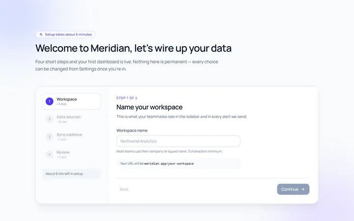
Onboarding Welcome
Originalwelcome screen with steps
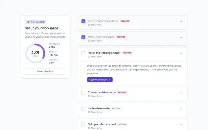
Onboarding Checklist
Originalsetup checklist with progress
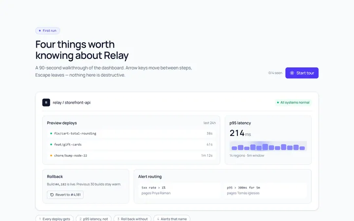
Onboarding Spotlight
Originalfeature spotlight highlight
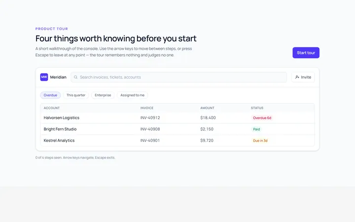
Onboarding Tooltip Tour
Originalguided tooltip walkthrough
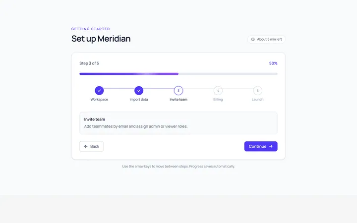
Onboarding Progress
Originalonboarding progress header
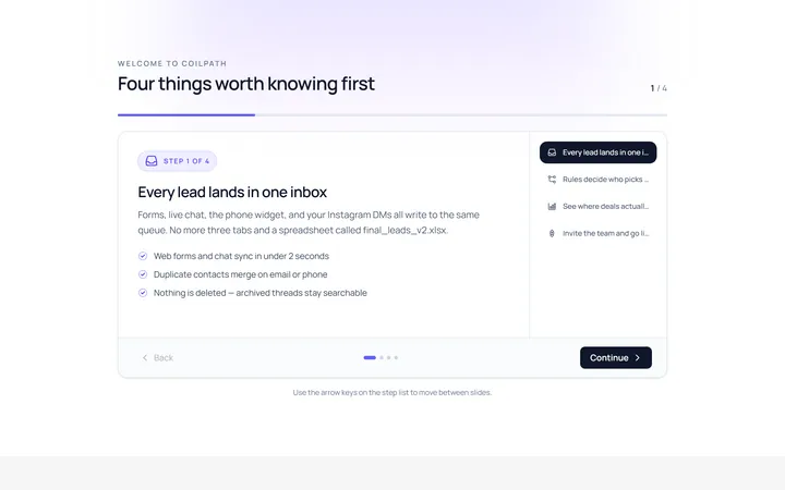
Onboarding Slides
Originalintro slides carousel
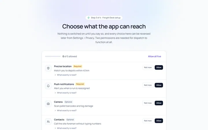
Onboarding Permissions
Originalpermissions request screen
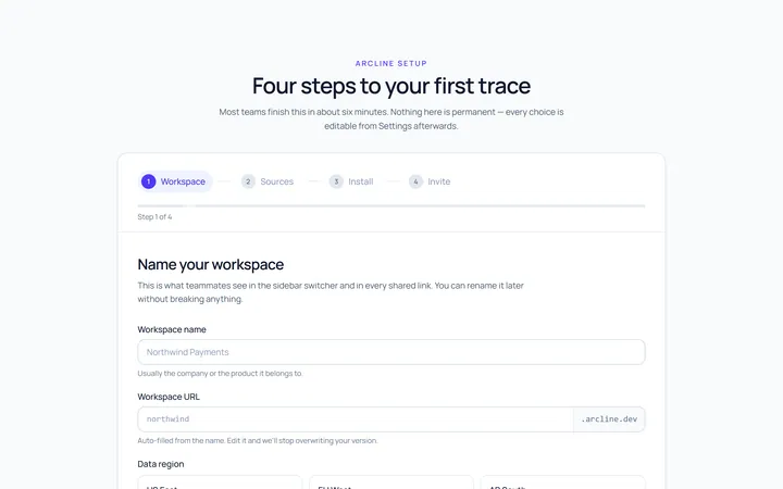
Onboarding Setup Wizard
Originalmulti-step setup wizard
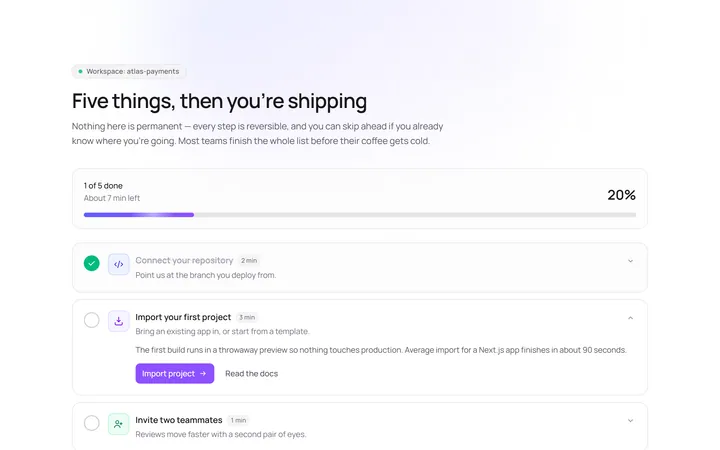
Onboarding Get Started
Originalget started action cards

Spotlight Hero
OriginalA centred hero with a soft radial spotlight, badge and dual call-to-action.

Split Hero
OriginalA two-column hero pairing a headline and CTAs with a product mock and social proof.

Gradient Spotlight Hero
OriginalA minimal centred hero with a soft gradient-mesh backdrop, announcement pill and dual call-to-action buttons.