

Onboarding Progress
Original · freeonboarding progress header
Copy prompt gives Claude Code, Cursor or v0 a ready-to-paste prompt that recreates this exact component.
npx shadcn@latest add https://webinnoventix.com/r/onboard-progress.json"use client";
import type { KeyboardEvent } from "react";
import { useCallback, useId, useMemo, useRef, useState } from "react";
import { AnimatePresence, motion, useReducedMotion } from "motion/react";
type StepState = "done" | "current" | "upcoming";
type Step = {
id: string;
label: string;
hint: string;
minutes: number;
};
const STEPS: Step[] = [
{
id: "workspace",
label: "Workspace",
hint: "Name your workspace and pick a region for data residency.",
minutes: 1,
},
{
id: "import",
label: "Import data",
hint: "Pull in contacts from a CSV, HubSpot, or the REST API.",
minutes: 4,
},
{
id: "team",
label: "Invite team",
hint: "Add teammates by email and assign admin or viewer roles.",
minutes: 2,
},
{
id: "billing",
label: "Billing",
hint: "Add a card. You are not charged until the trial ends on day 14.",
minutes: 2,
},
{
id: "launch",
label: "Launch",
hint: "Publish your first workflow and start tracking events.",
minutes: 1,
},
];
function stateOf(index: number, current: number): StepState {
if (index < current) return "done";
if (index === current) return "current";
return "upcoming";
}
const DOT_BASE =
"grid h-8 w-8 shrink-0 place-items-center rounded-full border text-[11px] font-semibold tabular-nums transition-colors duration-300";
const DOT_STYLES: Record<StepState, string> = {
done: "border-indigo-600 bg-indigo-600 text-white dark:border-indigo-500 dark:bg-indigo-500",
current:
"border-indigo-600 bg-white text-indigo-700 dark:border-indigo-400 dark:bg-slate-950 dark:text-indigo-300",
upcoming:
"border-slate-300 bg-white text-slate-400 dark:border-slate-700 dark:bg-slate-950 dark:text-slate-500",
};
const LABEL_STYLES: Record<StepState, string> = {
done: "text-slate-700 dark:text-slate-300",
current: "text-slate-900 dark:text-slate-50",
upcoming: "text-slate-400 dark:text-slate-500",
};
function CheckIcon() {
return (
<svg
viewBox="0 0 20 20"
aria-hidden="true"
className="h-4 w-4"
fill="none"
stroke="currentColor"
strokeWidth={2.4}
strokeLinecap="round"
strokeLinejoin="round"
>
<path d="M4.5 10.5 8.2 14.2 15.5 6.4" />
</svg>
);
}
function ArrowIcon({ back = false }: { back?: boolean }) {
return (
<svg
viewBox="0 0 20 20"
aria-hidden="true"
className={`h-4 w-4 ${back ? "rotate-180" : ""}`}
fill="none"
stroke="currentColor"
strokeWidth={2}
strokeLinecap="round"
strokeLinejoin="round"
>
<path d="M4 10h12M11 5l5 5-5 5" />
</svg>
);
}
function ClockIcon() {
return (
<svg
viewBox="0 0 20 20"
aria-hidden="true"
className="h-3.5 w-3.5"
fill="none"
stroke="currentColor"
strokeWidth={1.6}
strokeLinecap="round"
strokeLinejoin="round"
>
<circle cx="10" cy="10" r="7.2" />
<path d="M10 6.2V10l2.6 1.6" />
</svg>
);
}
export default function OnboardProgress() {
const [current, setCurrent] = useState<number>(2);
const reduced = useReducedMotion();
const headingId = useId();
const listId = useId();
const tabRefs = useRef<Array<HTMLButtonElement | null>>([]);
const total = STEPS.length;
const pct = Math.round((current / (total - 1)) * 100);
const remaining = useMemo(
() =>
STEPS.slice(current).reduce((sum, step) => sum + step.minutes, 0),
[current],
);
const focusStep = useCallback((index: number) => {
const next = Math.max(0, Math.min(STEPS.length - 1, index));
setCurrent(next);
tabRefs.current[next]?.focus();
}, []);
const onKeyDown = useCallback(
(event: KeyboardEvent<HTMLDivElement>) => {
const keys = ["ArrowRight", "ArrowLeft", "Home", "End"];
if (!keys.includes(event.key)) return;
event.preventDefault();
if (event.key === "ArrowRight") focusStep(current + 1);
if (event.key === "ArrowLeft") focusStep(current - 1);
if (event.key === "Home") focusStep(0);
if (event.key === "End") focusStep(STEPS.length - 1);
},
[current, focusStep],
);
const active = STEPS[current];
return (
<section
className="relative w-full bg-slate-50 px-5 py-20 sm:px-8 sm:py-24 dark:bg-slate-950"
aria-labelledby={headingId}
>
<style>{`
@keyframes obprog-sheen {
0% { transform: translateX(-120%); opacity: 0; }
40% { opacity: 0.85; }
100% { transform: translateX(320%); opacity: 0; }
}
@keyframes obprog-pulse {
0%, 100% { transform: scale(1); opacity: 0.55; }
50% { transform: scale(1.75); opacity: 0; }
}
.obprog-sheen::after {
content: "";
position: absolute;
inset: 0;
width: 28%;
border-radius: 9999px;
background: linear-gradient(90deg, transparent, rgba(255,255,255,0.75), transparent);
animation: obprog-sheen 2.6s ease-in-out infinite;
}
.obprog-ping {
animation: obprog-pulse 2s ease-out infinite;
}
@media (prefers-reduced-motion: reduce) {
.obprog-sheen::after,
.obprog-ping {
animation: none !important;
}
.obprog-sheen::after { opacity: 0; }
}
`}</style>
<div className="mx-auto w-full max-w-3xl">
<header className="mb-8 flex flex-wrap items-end justify-between gap-4">
<div>
<p className="text-xs font-semibold uppercase tracking-[0.18em] text-indigo-600 dark:text-indigo-400">
Getting started
</p>
<h2
id={headingId}
className="mt-2 text-2xl font-semibold tracking-tight text-slate-900 sm:text-3xl dark:text-slate-50"
>
Set up Meridian
</h2>
</div>
<div className="flex items-center gap-2 rounded-full border border-slate-200 bg-white px-3 py-1.5 text-xs font-medium text-slate-600 dark:border-slate-800 dark:bg-slate-900 dark:text-slate-400">
<ClockIcon />
<span className="tabular-nums">
{remaining === 0
? "All done"
: `About ${remaining} min left`}
</span>
</div>
</header>
<div className="rounded-2xl border border-slate-200 bg-white p-5 shadow-sm sm:p-7 dark:border-slate-800 dark:bg-slate-900">
<div className="mb-6 flex items-baseline justify-between gap-4">
<p className="text-sm font-medium text-slate-600 dark:text-slate-400">
Step{" "}
<span className="tabular-nums text-slate-900 dark:text-slate-100">
{current + 1}
</span>{" "}
of <span className="tabular-nums">{total}</span>
</p>
<p
className="text-sm font-semibold tabular-nums text-indigo-600 dark:text-indigo-400"
aria-hidden="true"
>
{pct}%
</p>
</div>
<div
className="relative mb-8 h-2 w-full overflow-hidden rounded-full bg-slate-200 dark:bg-slate-800"
role="progressbar"
aria-valuenow={pct}
aria-valuemin={0}
aria-valuemax={100}
aria-valuetext={`${pct} percent complete, step ${current + 1} of ${total}: ${active.label}`}
aria-labelledby={headingId}
>
<motion.div
className="obprog-sheen relative h-full overflow-hidden rounded-full bg-gradient-to-r from-indigo-600 to-violet-500 dark:from-indigo-500 dark:to-violet-400"
initial={false}
animate={{ width: `${pct}%` }}
transition={
reduced
? { duration: 0 }
: { type: "spring", stiffness: 190, damping: 26 }
}
/>
</div>
<div
role="tablist"
aria-label="Onboarding steps"
id={listId}
onKeyDown={onKeyDown}
className="grid grid-cols-1 gap-2 sm:grid-cols-5 sm:gap-0"
>
{STEPS.map((step, index) => {
const state = stateOf(index, current);
const selected = index === current;
return (
<div key={step.id} className="relative sm:text-center">
{index > 0 ? (
<span
aria-hidden="true"
className={`absolute left-[-50%] top-4 hidden h-px w-full sm:block ${
index <= current
? "bg-indigo-500/70 dark:bg-indigo-400/60"
: "bg-slate-200 dark:bg-slate-800"
}`}
/>
) : null}
<button
ref={(node) => {
tabRefs.current[index] = node;
}}
type="button"
role="tab"
id={`${listId}-tab-${step.id}`}
aria-selected={selected}
aria-controls={`${listId}-panel`}
tabIndex={selected ? 0 : -1}
onClick={() => setCurrent(index)}
className="group relative flex w-full items-center gap-3 rounded-xl px-2 py-2 text-left outline-none focus-visible:ring-2 focus-visible:ring-indigo-600 focus-visible:ring-offset-2 focus-visible:ring-offset-white sm:flex-col sm:gap-2 sm:text-center dark:focus-visible:ring-indigo-400 dark:focus-visible:ring-offset-slate-900"
>
<span className="relative">
{selected && !reduced ? (
<span
aria-hidden="true"
className="obprog-ping absolute inset-0 rounded-full bg-indigo-500/40"
/>
) : null}
<span
className={`${DOT_BASE} ${DOT_STYLES[state]} relative group-hover:border-indigo-500`}
>
{state === "done" ? <CheckIcon /> : index + 1}
</span>
</span>
<span
className={`text-xs font-medium transition-colors duration-200 ${LABEL_STYLES[state]}`}
>
{step.label}
</span>
<span className="sr-only">
{state === "done"
? "Completed"
: state === "current"
? "Current step"
: "Not started"}
</span>
</button>
</div>
);
})}
</div>
<div
id={`${listId}-panel`}
role="tabpanel"
aria-labelledby={`${listId}-tab-${active.id}`}
tabIndex={0}
className="mt-7 rounded-xl border border-slate-200 bg-slate-50 p-4 outline-none focus-visible:ring-2 focus-visible:ring-indigo-600 dark:border-slate-800 dark:bg-slate-950/60 dark:focus-visible:ring-indigo-400"
>
<AnimatePresence mode="wait" initial={false}>
<motion.div
key={active.id}
initial={reduced ? false : { opacity: 0, y: 6 }}
animate={{ opacity: 1, y: 0 }}
exit={reduced ? { opacity: 1 } : { opacity: 0, y: -6 }}
transition={{ duration: reduced ? 0 : 0.22, ease: "easeOut" }}
>
<p className="text-sm font-semibold text-slate-900 dark:text-slate-100">
{active.label}
</p>
<p className="mt-1 text-sm leading-relaxed text-slate-600 dark:text-slate-400">
{active.hint}
</p>
</motion.div>
</AnimatePresence>
</div>
<div className="mt-6 flex items-center justify-between gap-3">
<button
type="button"
onClick={() => setCurrent((v) => Math.max(0, v - 1))}
disabled={current === 0}
className="inline-flex items-center gap-2 rounded-lg border border-slate-300 bg-white px-3.5 py-2 text-sm font-medium text-slate-700 transition-colors hover:bg-slate-100 focus-visible:outline-none focus-visible:ring-2 focus-visible:ring-indigo-600 focus-visible:ring-offset-2 focus-visible:ring-offset-white disabled:cursor-not-allowed disabled:opacity-45 dark:border-slate-700 dark:bg-slate-900 dark:text-slate-300 dark:hover:bg-slate-800 dark:focus-visible:ring-indigo-400 dark:focus-visible:ring-offset-slate-900"
>
<ArrowIcon back />
Back
</button>
<button
type="button"
onClick={() => setCurrent((v) => Math.min(total - 1, v + 1))}
disabled={current === total - 1}
className="inline-flex items-center gap-2 rounded-lg bg-indigo-600 px-4 py-2 text-sm font-semibold text-white transition-colors hover:bg-indigo-500 focus-visible:outline-none focus-visible:ring-2 focus-visible:ring-indigo-600 focus-visible:ring-offset-2 focus-visible:ring-offset-white disabled:cursor-not-allowed disabled:opacity-45 dark:bg-indigo-500 dark:hover:bg-indigo-400 dark:focus-visible:ring-indigo-400 dark:focus-visible:ring-offset-slate-900"
>
{current === total - 2 ? "Finish setup" : "Continue"}
<ArrowIcon />
</button>
</div>
</div>
<p className="mt-4 text-center text-xs text-slate-500 dark:text-slate-500">
Use the arrow keys to move between steps. Progress saves automatically.
</p>
</div>
</section>
);
}Dependencies
Licence
Built by Web Innoventix. Free for personal and commercial use, no attribution required.
Built by Web Innoventix
Need a custom interface, a full website, or SEO that gets you cited by AI? We design, build and rank it end to end.
Get a free quoteSimilar components
Browse all →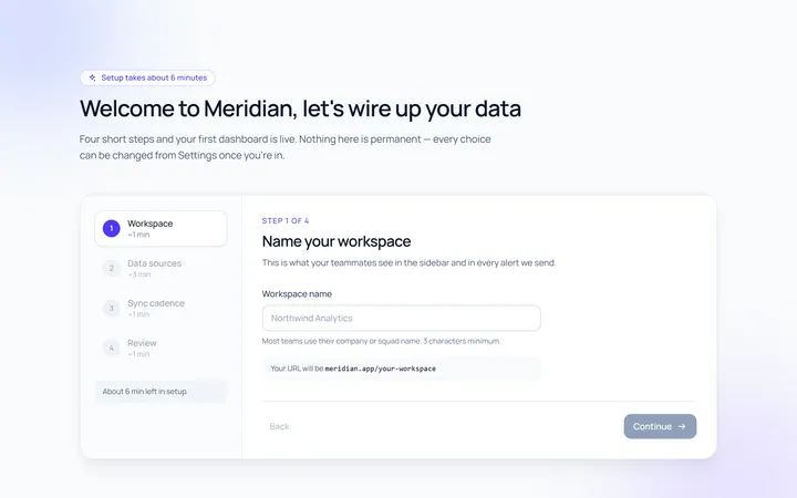
Onboarding Welcome
Originalwelcome screen with steps
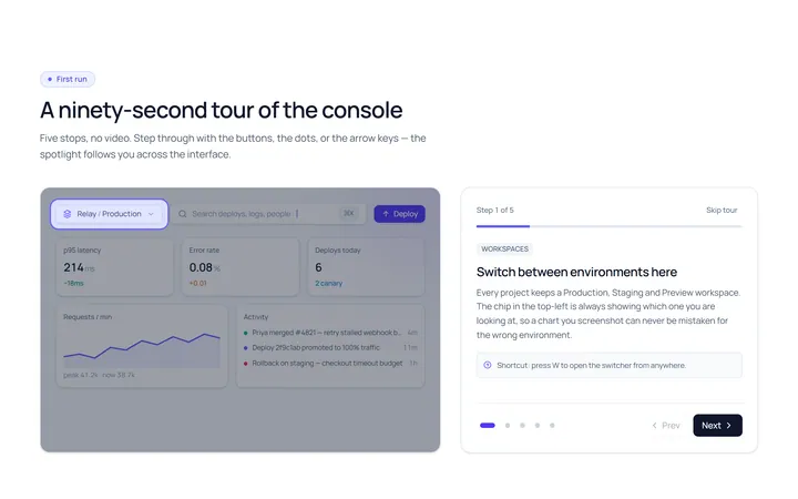
Onboarding Tour
Originalproduct tour with prev/next dots
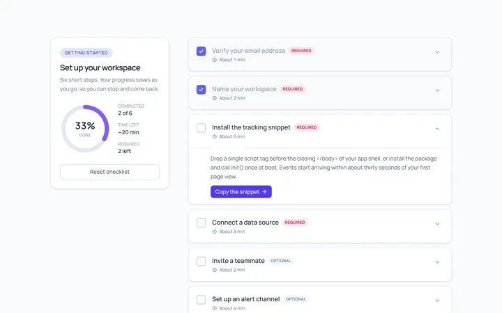
Onboarding Checklist
Originalsetup checklist with progress
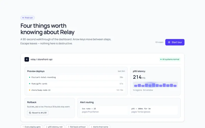
Onboarding Spotlight
Originalfeature spotlight highlight
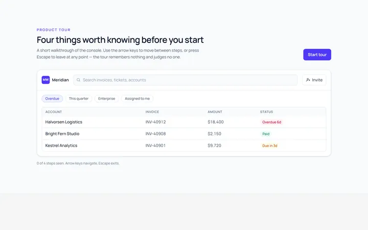
Onboarding Tooltip Tour
Originalguided tooltip walkthrough
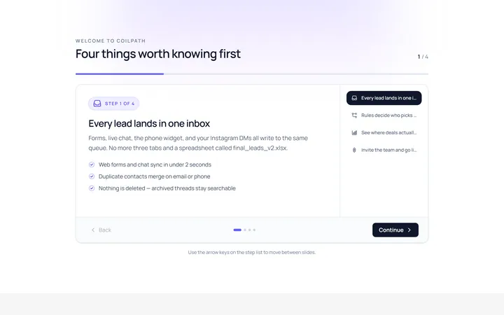
Onboarding Slides
Originalintro slides carousel
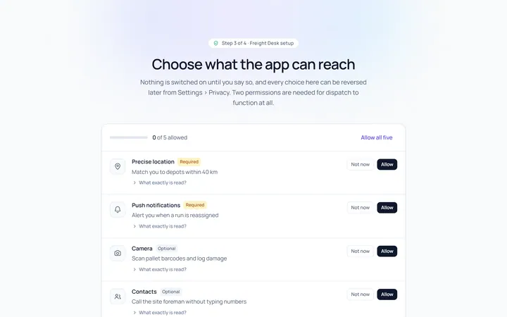
Onboarding Permissions
Originalpermissions request screen
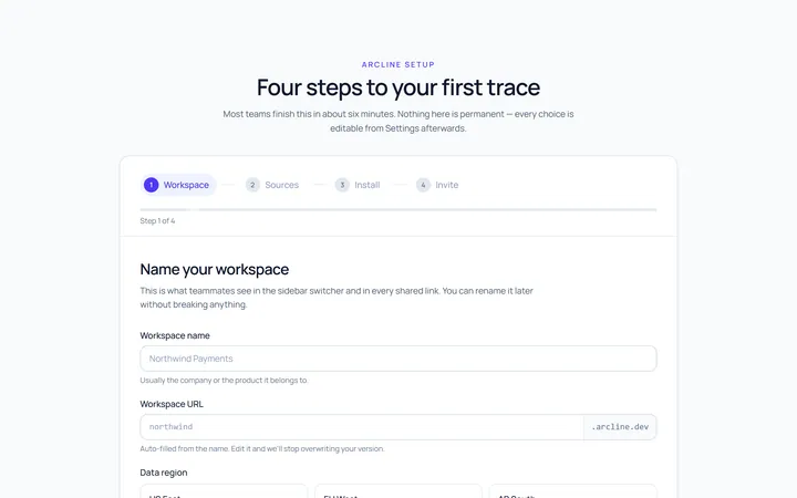
Onboarding Setup Wizard
Originalmulti-step setup wizard
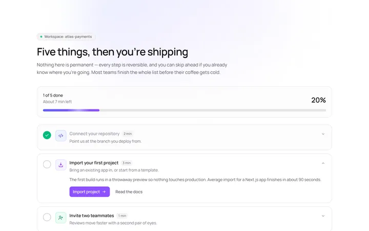
Onboarding Get Started
Originalget started action cards

Spotlight Hero
OriginalA centred hero with a soft radial spotlight, badge and dual call-to-action.

Split Hero
OriginalA two-column hero pairing a headline and CTAs with a product mock and social proof.

Gradient Spotlight Hero
OriginalA minimal centred hero with a soft gradient-mesh backdrop, announcement pill and dual call-to-action buttons.