

Custom Track Scrollbar
Original · freecustom track and thumb scrollbar
Copy prompt gives Claude Code, Cursor or v0 a ready-to-paste prompt that recreates this exact component.
npx shadcn@latest add https://webinnoventix.com/r/scb-custom-track.json"use client";
import {
useCallback,
useEffect,
useId,
useRef,
useState,
type KeyboardEvent as ReactKeyboardEvent,
type PointerEvent as ReactPointerEvent,
} from "react";
import { motion, useReducedMotion } from "motion/react";
type SectionMeta = { id: string; label: string };
const SECTIONS: SectionMeta[] = [
{ id: "restraint", label: "Restraint" },
{ id: "rhythm", label: "Rhythm" },
{ id: "contrast", label: "Contrast" },
{ id: "motion", label: "Motion" },
{ id: "density", label: "Density" },
];
const MIN_THUMB = 36;
const clamp = (value: number, min: number, max: number): number =>
Math.min(Math.max(value, min), max);
export default function ScbCustomTrack() {
const reduce = useReducedMotion();
const viewportId = useId();
const scrollRef = useRef<HTMLDivElement | null>(null);
const trackRef = useRef<HTMLDivElement | null>(null);
const dragState = useRef<{ startY: number; startScroll: number } | null>(null);
const [thumb, setThumb] = useState<{ height: number; top: number }>({
height: MIN_THUMB,
top: 0,
});
const [progress, setProgress] = useState(0);
const [dragging, setDragging] = useState(false);
const [hovering, setHovering] = useState(false);
const [atTop, setAtTop] = useState(true);
const [atBottom, setAtBottom] = useState(false);
const [active, setActive] = useState<string>(SECTIONS[0].id);
const sync = useCallback(() => {
const el = scrollRef.current;
const track = trackRef.current;
if (!el || !track) return;
const { scrollTop, scrollHeight, clientHeight } = el;
const trackH = track.clientHeight;
const scrollable = scrollHeight - clientHeight;
const ratio = clientHeight / scrollHeight;
const thumbH = clamp(Math.round(trackH * ratio), MIN_THUMB, trackH);
const maxThumbTop = trackH - thumbH;
const p = scrollable > 0 ? scrollTop / scrollable : 0;
setThumb({ height: thumbH, top: Math.round(maxThumbTop * p) });
setProgress(Math.round(p * 100));
setAtTop(scrollTop <= 1);
setAtBottom(scrollTop >= scrollable - 1);
const cTop = el.getBoundingClientRect().top;
let current = SECTIONS[0].id;
for (const s of SECTIONS) {
const node = el.querySelector<HTMLElement>(`[data-scb-section="${s.id}"]`);
if (node && node.getBoundingClientRect().top - cTop <= 28) current = s.id;
}
setActive(current);
}, []);
useEffect(() => {
const el = scrollRef.current;
if (!el) return;
sync();
el.addEventListener("scroll", sync, { passive: true });
const ro = new ResizeObserver(sync);
ro.observe(el);
if (el.firstElementChild) ro.observe(el.firstElementChild);
window.addEventListener("resize", sync);
return () => {
el.removeEventListener("scroll", sync);
window.removeEventListener("resize", sync);
ro.disconnect();
};
}, [sync]);
const onThumbPointerDown = (event: ReactPointerEvent<HTMLDivElement>) => {
const el = scrollRef.current;
if (!el) return;
event.preventDefault();
event.currentTarget.setPointerCapture(event.pointerId);
dragState.current = { startY: event.clientY, startScroll: el.scrollTop };
setDragging(true);
};
const onThumbPointerMove = (event: ReactPointerEvent<HTMLDivElement>) => {
const el = scrollRef.current;
const track = trackRef.current;
if (!el || !track || !dragState.current) return;
const trackH = track.clientHeight;
const scrollable = el.scrollHeight - el.clientHeight;
const maxThumbTop = trackH - thumb.height;
const delta = event.clientY - dragState.current.startY;
const scrollDelta = maxThumbTop > 0 ? (delta / maxThumbTop) * scrollable : 0;
el.scrollTop = dragState.current.startScroll + scrollDelta;
};
const endDrag = (event: ReactPointerEvent<HTMLDivElement>) => {
if (event.currentTarget.hasPointerCapture(event.pointerId)) {
event.currentTarget.releasePointerCapture(event.pointerId);
}
dragState.current = null;
setDragging(false);
};
const onTrackPointerDown = (event: ReactPointerEvent<HTMLDivElement>) => {
if (event.target !== event.currentTarget) return;
const el = scrollRef.current;
const track = trackRef.current;
if (!el || !track) return;
const rect = track.getBoundingClientRect();
const trackH = track.clientHeight;
const scrollable = el.scrollHeight - el.clientHeight;
const maxThumbTop = trackH - thumb.height;
const targetTop = clamp(
event.clientY - rect.top - thumb.height / 2,
0,
maxThumbTop,
);
const p = maxThumbTop > 0 ? targetTop / maxThumbTop : 0;
el.scrollTo({
top: p * scrollable,
behavior: reduce ? "auto" : "smooth",
});
};
const onScrollbarKeyDown = (event: ReactKeyboardEvent<HTMLDivElement>) => {
const el = scrollRef.current;
if (!el) return;
const line = 52;
const page = el.clientHeight * 0.9;
let handled = true;
switch (event.key) {
case "ArrowDown":
el.scrollTop += line;
break;
case "ArrowUp":
el.scrollTop -= line;
break;
case "PageDown":
el.scrollTop += page;
break;
case "PageUp":
el.scrollTop -= page;
break;
case "Home":
el.scrollTop = 0;
break;
case "End":
el.scrollTop = el.scrollHeight;
break;
default:
handled = false;
}
if (handled) event.preventDefault();
};
const scrollToEdge = (edge: "top" | "bottom") => {
const el = scrollRef.current;
if (!el) return;
el.scrollTo({
top: edge === "top" ? 0 : el.scrollHeight,
behavior: reduce ? "auto" : "smooth",
});
};
const jumpTo = (id: string) => {
const el = scrollRef.current;
if (!el) return;
const target = el.querySelector<HTMLElement>(`[data-scb-section="${id}"]`);
if (!target) return;
const cRect = el.getBoundingClientRect();
const tRect = target.getBoundingClientRect();
el.scrollTo({
top: el.scrollTop + (tRect.top - cRect.top) - 16,
behavior: reduce ? "auto" : "smooth",
});
};
const thumbActive = dragging || hovering;
return (
<section className="relative w-full overflow-hidden bg-slate-50 px-4 py-16 text-slate-900 sm:px-6 sm:py-20 dark:bg-slate-950 dark:text-slate-100">
<style>{`
.scb-ct-viewport { scrollbar-width: none; -ms-overflow-style: none; }
.scb-ct-viewport::-webkit-scrollbar { width: 0; height: 0; display: none; }
.scb-ct-sheen { animation: scb-ct-sheen 3.4s ease-in-out infinite; }
@keyframes scb-ct-sheen {
0%, 12% { transform: translateY(-160%); opacity: 0; }
50% { opacity: 0.85; }
88%, 100% { transform: translateY(280%); opacity: 0; }
}
@media (prefers-reduced-motion: reduce) {
.scb-ct-sheen { animation: none; }
.scb-ct-viewport { scroll-behavior: auto; }
}
`}</style>
<div
aria-hidden="true"
className="pointer-events-none absolute -top-24 right-[-6rem] h-72 w-72 rounded-full bg-indigo-300/25 blur-3xl dark:bg-indigo-500/15"
/>
<div
aria-hidden="true"
className="pointer-events-none absolute -bottom-24 left-[-6rem] h-72 w-72 rounded-full bg-violet-300/25 blur-3xl dark:bg-violet-500/10"
/>
<div className="relative mx-auto max-w-4xl">
<header className="mb-8 flex flex-col gap-4 sm:mb-10 sm:flex-row sm:items-end sm:justify-between">
<div>
<span className="inline-flex items-center gap-2 rounded-full border border-slate-200 bg-white/70 px-3 py-1 text-xs font-medium tracking-wide text-indigo-700 uppercase backdrop-blur dark:border-slate-800 dark:bg-slate-900/70 dark:text-indigo-300">
<span className="h-1.5 w-1.5 rounded-full bg-indigo-500" />
Reading pane
</span>
<h2 className="mt-4 text-2xl font-semibold tracking-tight sm:text-3xl">
Field notes on quiet interfaces
</h2>
<p className="mt-2 max-w-md text-sm text-slate-600 dark:text-slate-400">
A native scrollbar, replaced. Drag the thumb, click the track,
or use the arrow keys once it holds focus.
</p>
</div>
<div className="flex shrink-0 items-center gap-2">
<button
type="button"
onClick={() => scrollToEdge("top")}
disabled={atTop}
className="inline-flex items-center gap-1.5 rounded-lg border border-slate-200 bg-white px-3 py-2 text-sm font-medium text-slate-700 transition hover:border-indigo-300 hover:text-indigo-700 focus-visible:outline-none focus-visible:ring-2 focus-visible:ring-indigo-500 focus-visible:ring-offset-2 focus-visible:ring-offset-slate-50 disabled:cursor-not-allowed disabled:opacity-40 dark:border-slate-800 dark:bg-slate-900 dark:text-slate-200 dark:hover:border-indigo-500 dark:hover:text-indigo-300 dark:focus-visible:ring-offset-slate-950"
>
<svg
aria-hidden="true"
viewBox="0 0 16 16"
className="h-3.5 w-3.5"
fill="none"
stroke="currentColor"
strokeWidth="1.75"
strokeLinecap="round"
strokeLinejoin="round"
>
<path d="M8 12.5V4M4 7.5 8 3.5 12 7.5" />
</svg>
Top
</button>
<button
type="button"
onClick={() => scrollToEdge("bottom")}
disabled={atBottom}
className="inline-flex items-center gap-1.5 rounded-lg border border-slate-200 bg-white px-3 py-2 text-sm font-medium text-slate-700 transition hover:border-indigo-300 hover:text-indigo-700 focus-visible:outline-none focus-visible:ring-2 focus-visible:ring-indigo-500 focus-visible:ring-offset-2 focus-visible:ring-offset-slate-50 disabled:cursor-not-allowed disabled:opacity-40 dark:border-slate-800 dark:bg-slate-900 dark:text-slate-200 dark:hover:border-indigo-500 dark:hover:text-indigo-300 dark:focus-visible:ring-offset-slate-950"
>
<svg
aria-hidden="true"
viewBox="0 0 16 16"
className="h-3.5 w-3.5"
fill="none"
stroke="currentColor"
strokeWidth="1.75"
strokeLinecap="round"
strokeLinejoin="round"
>
<path d="M8 3.5V12M4 8.5 8 12.5 12 8.5" />
</svg>
Bottom
</button>
</div>
</header>
<nav
aria-label="Jump to section"
className="mb-4 flex flex-wrap gap-2"
>
{SECTIONS.map((s) => {
const isActive = active === s.id;
return (
<button
key={s.id}
type="button"
onClick={() => jumpTo(s.id)}
aria-current={isActive ? "true" : undefined}
className={`rounded-full border px-3 py-1.5 text-xs font-medium transition focus-visible:outline-none focus-visible:ring-2 focus-visible:ring-indigo-500 focus-visible:ring-offset-2 focus-visible:ring-offset-slate-50 dark:focus-visible:ring-offset-slate-950 ${
isActive
? "border-transparent bg-indigo-600 text-white shadow-sm shadow-indigo-600/25 dark:bg-indigo-500"
: "border-slate-200 bg-white text-slate-600 hover:border-indigo-300 hover:text-indigo-700 dark:border-slate-800 dark:bg-slate-900 dark:text-slate-400 dark:hover:border-indigo-500 dark:hover:text-indigo-300"
}`}
>
{s.label}
</button>
);
})}
</nav>
<div className="relative overflow-hidden rounded-2xl border border-slate-200 bg-white shadow-xl shadow-slate-900/5 dark:border-slate-800 dark:bg-slate-900 dark:shadow-black/40">
<div className="relative flex">
<div
ref={scrollRef}
id={viewportId}
tabIndex={0}
className="scb-ct-viewport h-[26rem] flex-1 overflow-y-auto overscroll-contain px-6 py-6 focus-visible:outline-none focus-visible:ring-2 focus-visible:ring-inset focus-visible:ring-indigo-500 sm:px-9 sm:py-8"
>
<article className="max-w-prose space-y-9 text-[15px] leading-relaxed text-slate-700 dark:text-slate-300">
<p className="text-xs font-medium tracking-wide text-slate-400 uppercase dark:text-slate-500">
Working log · entry 14 · revised in build
</p>
<section data-scb-section="restraint" className="space-y-3">
<h3
id="restraint"
className="text-lg font-semibold text-slate-900 dark:text-slate-100"
>
On restraint
</h3>
<p>
You only earn the right to hide the browser's scrollbar
once you have built something better to take its place. The
default is not ugly by accident; it is a hundred small
decisions about affordance and hit-area that you now inherit
the responsibility for. Replace it casually and users lose
the one control they never had to think about.
</p>
<p>
So the rule here is narrow: the custom track exists to match
the surface it sits on, nothing more. It keeps a generous
drag target, it respects keyboard focus, and it never fakes
a position it cannot back up with a real scroll offset. When
in doubt, the replacement should behave so faithfully that
nobody notices it was replaced at all.
</p>
</section>
<section data-scb-section="rhythm" className="space-y-3">
<h3
id="rhythm"
className="text-lg font-semibold text-slate-900 dark:text-slate-100"
>
On vertical rhythm
</h3>
<p>
Long-form reading lives or dies on rhythm. A measure of
around sixty-six characters, line-height near 1.6, and space
between paragraphs that is unmistakably larger than the space
between lines. Get those three ratios wrong and no amount of
typeface polish will rescue the page.
</p>
<p>
The thumb becomes part of that rhythm too. Its height maps to
how much of the document you can see at once, so a tall thumb
quietly tells you the piece is short, and a sliver warns you
to settle in. That is information the reader absorbs without
ever reading a word of it.
</p>
</section>
<section data-scb-section="contrast" className="space-y-3">
<h3
id="contrast"
className="text-lg font-semibold text-slate-900 dark:text-slate-100"
>
On contrast that survives dark mode
</h3>
<p>
A control that reads perfectly at noon can vanish at night.
The track and thumb are drawn from the same token set as the
surrounding card, so the pair keeps a legible gap in both
themes rather than collapsing into the background the moment
the lights go out.
</p>
<p>
Test the extremes deliberately: pure white behind black text,
then near-black behind off-white. If the thumb stays findable
at a glance in both, and the focus ring stays visible against
each, the contrast budget is honest. Anything that only works
in one theme is a bug wearing a costume.
</p>
</section>
<section data-scb-section="motion" className="space-y-3">
<h3
id="motion"
className="text-lg font-semibold text-slate-900 dark:text-slate-100"
>
On motion budgets
</h3>
<p>
Motion is a currency and you have less of it than you think.
Spend it on transitions that clarify cause and effect, and
refuse to spend it on decoration that competes with the text.
A smooth scroll to an anchor earns its keep; a thumb that
jitters as you read does not.
</p>
<p>
Every animation here checks the reduced-motion preference
first. When a reader asks the system to calm down, the sheen
stops, smooth scrolling turns instant, and the interface
honours the request without argument. Respecting that setting
is not a nice-to-have; it is the whole point of having it.
</p>
</section>
<section data-scb-section="density" className="space-y-3">
<h3
id="density"
className="text-lg font-semibold text-slate-900 dark:text-slate-100"
>
On density and breathing room
</h3>
<p>
Density is a choice, not a default. A dashboard packed with
live numbers wants tight rows; an essay wants air. The same
scrollbar has to feel at home in both, which is why it stays
thin and defers to its container instead of announcing
itself with chrome and shadow.
</p>
<p>
When you reach the end of a piece like this one, the thumb
settles flush against the bottom of the track and the reading
is done. That final resting position is the last small
promise the control makes: what you see is exactly where you
are, with nothing hidden below the fold.
</p>
</section>
</article>
</div>
<div className="flex w-6 shrink-0 items-stretch py-3 pr-2 select-none sm:w-7">
<div
ref={trackRef}
onPointerDown={onTrackPointerDown}
className="relative w-full cursor-pointer rounded-full bg-slate-100 ring-1 ring-inset ring-slate-200/70 transition-colors dark:bg-slate-800/60 dark:ring-slate-700/60"
>
<div
role="scrollbar"
aria-controls={viewportId}
aria-orientation="vertical"
aria-label="Article scroll position"
aria-valuemin={0}
aria-valuemax={100}
aria-valuenow={progress}
aria-valuetext={`${progress}% scrolled`}
tabIndex={0}
onPointerDown={onThumbPointerDown}
onPointerMove={onThumbPointerMove}
onPointerUp={endDrag}
onPointerCancel={endDrag}
onKeyDown={onScrollbarKeyDown}
onMouseEnter={() => setHovering(true)}
onMouseLeave={() => setHovering(false)}
onFocus={() => setHovering(true)}
onBlur={() => setHovering(false)}
style={{
height: `${thumb.height}px`,
transform: `translateY(${thumb.top}px)`,
willChange: "transform",
}}
className={`absolute inset-x-0 flex touch-none flex-col items-center justify-center overflow-hidden rounded-full bg-gradient-to-b from-indigo-500 to-violet-600 shadow-sm transition-[box-shadow,filter] focus-visible:outline-none focus-visible:ring-2 focus-visible:ring-indigo-400 focus-visible:ring-offset-2 focus-visible:ring-offset-white dark:from-indigo-400 dark:to-violet-500 dark:focus-visible:ring-offset-slate-900 ${
thumbActive
? "shadow-indigo-500/40 brightness-110"
: "brightness-100"
} ${dragging ? "cursor-grabbing" : "cursor-grab"}`}
>
{!reduce && (
<span
aria-hidden="true"
className="scb-ct-sheen pointer-events-none absolute inset-x-0 top-0 h-1/3 bg-gradient-to-b from-white/70 to-transparent"
/>
)}
<span
aria-hidden="true"
className="pointer-events-none flex flex-col gap-[3px]"
>
<span className="h-px w-2.5 rounded-full bg-white/70" />
<span className="h-px w-2.5 rounded-full bg-white/70" />
<span className="h-px w-2.5 rounded-full bg-white/70" />
</span>
</div>
</div>
</div>
<div className="pointer-events-none absolute inset-x-0 top-0 h-8 rounded-t-2xl bg-gradient-to-b from-white to-transparent dark:from-slate-900" />
<div className="pointer-events-none absolute inset-x-0 bottom-0 h-8 rounded-b-2xl bg-gradient-to-t from-white to-transparent dark:from-slate-900" />
<div className="pointer-events-none absolute bottom-4 left-1/2 -translate-x-1/2">
<motion.div
aria-hidden="true"
initial={false}
animate={
atBottom
? { opacity: 0, y: 6 }
: reduce
? { opacity: 1, y: 0 }
: { opacity: 1, y: [0, 5, 0] }
}
transition={
atBottom || reduce
? { duration: 0.25 }
: { duration: 1.6, repeat: Infinity, ease: "easeInOut" }
}
className="flex items-center gap-1.5 rounded-full border border-slate-200 bg-white/85 px-3 py-1 text-[11px] font-medium text-slate-500 shadow-sm backdrop-blur dark:border-slate-700 dark:bg-slate-800/85 dark:text-slate-400"
>
<svg
viewBox="0 0 16 16"
className="h-3 w-3"
fill="none"
stroke="currentColor"
strokeWidth="1.75"
strokeLinecap="round"
strokeLinejoin="round"
>
<path d="M4 6.5 8 10.5 12 6.5" />
</svg>
Scroll to read
</motion.div>
</div>
</div>
<div className="flex items-center justify-between gap-4 border-t border-slate-200 bg-slate-50/80 px-5 py-3 text-xs text-slate-500 dark:border-slate-800 dark:bg-slate-950/40 dark:text-slate-400">
<span className="font-medium">
{SECTIONS.find((s) => s.id === active)?.label ?? "Start"}
</span>
<span className="flex items-center gap-3">
<span
className="h-1.5 w-28 overflow-hidden rounded-full bg-slate-200 dark:bg-slate-800"
role="presentation"
>
<span
className="block h-full rounded-full bg-gradient-to-r from-indigo-500 to-violet-500"
style={{ width: `${progress}%` }}
/>
</span>
<span className="w-9 text-right font-semibold tabular-nums text-slate-700 dark:text-slate-200">
{progress}%
</span>
</span>
</div>
</div>
</div>
</section>
);
}Dependencies
Licence
Built by Web Innoventix. Free for personal and commercial use, no attribution required.
Built by Web Innoventix
Need a custom interface, a full website, or SEO that gets you cited by AI? We design, build and rank it end to end.
Get a free quoteSimilar components
Browse all →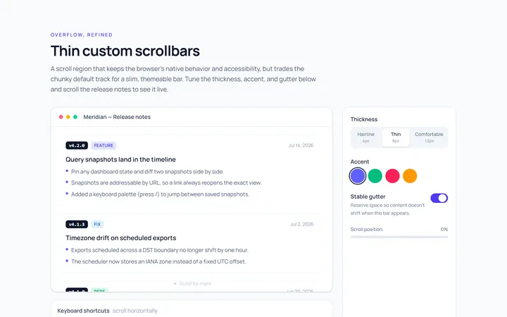
Thin Scrollbar
Originalthin custom scrollbar demo
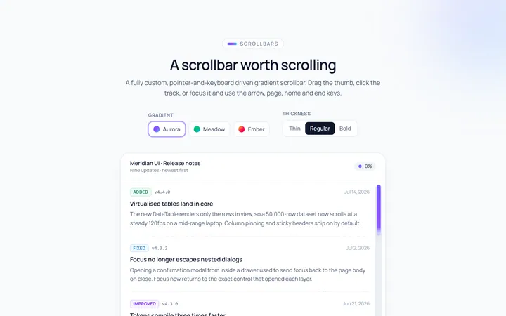
Gradient Scrollbar
Originalgradient scrollbar
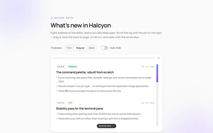
Rounded Scrollbar
Originalrounded pill scrollbar
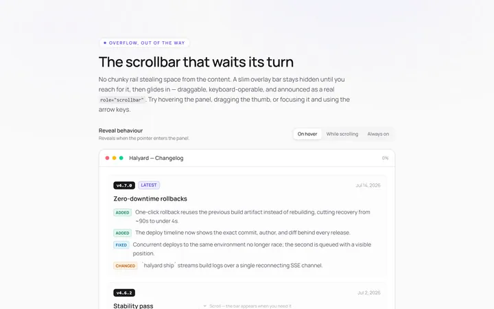
Hidden Hover Scrollbar
Originalscrollbar that appears on hover
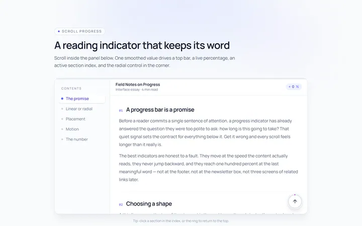
Progress Scrollbar
Originalscroll progress indicator

Spotlight Hero
OriginalA centred hero with a soft radial spotlight, badge and dual call-to-action.

Split Hero
OriginalA two-column hero pairing a headline and CTAs with a product mock and social proof.

Gradient Spotlight Hero
OriginalA minimal centred hero with a soft gradient-mesh backdrop, announcement pill and dual call-to-action buttons.

App Preview Hero
OriginalA centred hero that pairs headline copy with a realistic product dashboard mock built entirely from markup, complete with browser chrome and a floating notification card.

Waitlist Capture Hero
OriginalA dark, focused hero with an inline email capture form and avatar social proof, ready for pre-launch waitlists.

Image Backdrop Hero
OriginalA cinematic full-bleed hero with a layered image-style backdrop, overlaid left-aligned copy and a trusted-by logos strip.
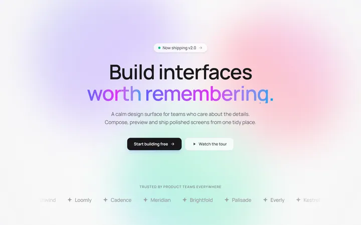
Gradient Mesh Hero with Staggered Text Reveal
OriginalA full-screen hero pairing a drifting animated gradient-mesh backdrop with a word-by-word staggered blur-in headline and a logo marquee under the fold.