

Progress Scrollbar
Original · freescroll progress indicator
Copy prompt gives Claude Code, Cursor or v0 a ready-to-paste prompt that recreates this exact component.
npx shadcn@latest add https://webinnoventix.com/r/scb-progress.json"use client";
import { useEffect, useId, useRef, useState } from "react";
import {
motion,
useMotionValueEvent,
useReducedMotion,
useScroll,
useSpring,
} from "motion/react";
type Section = {
id: string;
nav: string;
title: string;
body: string[];
};
const SECTIONS: Section[] = [
{
id: "promise",
nav: "The promise",
title: "A progress bar is a promise",
body: [
"Before a reader commits a single sentence of attention, a progress indicator has already answered the question they were too polite to ask: how long is this going to take? That quiet signal sets the contract for everything below it. Get it wrong and every scroll feels longer than it really is.",
"The best indicators are honest to a fault. They move at the speed the content actually reads, they never jump backward, and they reach one hundred percent at the last meaningful word — not at the footer, not at the newsletter box, not three screens of related links later.",
],
},
{
id: "shape",
nav: "Linear or radial",
title: "Choosing a shape",
body: [
"A thin line across the top of the viewport is the workhorse. It reads instantly, costs almost no space, and maps cleanly onto the mental model of a page as a single vertical column. Reach for it when reading is the entire job.",
"A radial ring earns its place when the indicator also has to be a control. Wrap progress around a back-to-top button and two elements collapse into one, while the arc gives the eye something to complete. The trade is precision: nobody reads sixty-one percent off a ring, so pair it with a number whenever the exact figure matters.",
],
},
{
id: "placement",
nav: "Placement",
title: "Where the eye forgives it",
body: [
"Anchor a linear bar to the very top edge and it dissolves into the browser chrome — present, but never demanding. Drop the radial control into the bottom-right corner, where thumbs already live on touch devices and where a returning glance costs nothing.",
"Avoid the middle of anything. A progress element that floats over body copy competes with the very words it is measuring, and the reader ends up losing both.",
],
},
{
id: "motion",
nav: "Motion",
title: "Motion with manners",
body: [
"Scroll position is jittery by nature, so smooth it. A light spring between the raw scroll value and the rendered bar removes the twitch without adding lag you can feel. Overshoot is the enemy here — a bar that bounces past its value reads as a bug, not a flourish.",
"And when a reader has asked their system for less motion, listen. Snap straight to the value, drop the shimmer, keep the meaning intact. Respecting that setting is not a downgrade; it is the same information delivered with less noise.",
],
},
{
id: "number",
nav: "The number",
title: "What the number should mean",
body: [
"Decide what one hundred percent represents and then hold the line. If it counts the article, stop counting at the article. Readers calibrate against the figure within the first few screens, and a percentage that lies once is never trusted again.",
"The most generous thing an indicator can do is finish early and honestly, letting the reader feel the ending a beat before they arrive. Certainty at the close is worth far more than precision in the middle.",
],
},
];
export default function ScbProgress() {
const reduce = useReducedMotion();
const rawId = useId();
const gradId = `scbprog-grad-${rawId.replace(/:/g, "")}`;
const scrollRef = useRef<HTMLDivElement>(null);
const [pct, setPct] = useState(0);
const [active, setActive] = useState<string>(SECTIONS[0].id);
const { scrollYProgress } = useScroll({ container: scrollRef });
const smooth = useSpring(scrollYProgress, {
stiffness: 120,
damping: 30,
mass: 0.4,
});
const progress = reduce ? scrollYProgress : smooth;
useMotionValueEvent(progress, "change", (v) => {
setPct(Math.min(100, Math.max(0, Math.round(v * 100))));
});
useEffect(() => {
const container = scrollRef.current;
if (!container) return;
const els = Array.from(
container.querySelectorAll<HTMLElement>("[data-scb-section]")
);
const io = new IntersectionObserver(
(entries) => {
const visible = entries.filter((e) => e.isIntersecting);
if (visible.length === 0) return;
visible.sort(
(a, b) => a.boundingClientRect.top - b.boundingClientRect.top
);
const id = visible[0].target.getAttribute("data-scb-id");
if (id) setActive(id);
},
{ root: container, rootMargin: "0px 0px -68% 0px", threshold: 0 }
);
els.forEach((el) => io.observe(el));
return () => io.disconnect();
}, []);
const goTo = (id: string) => {
const container = scrollRef.current;
if (!container) return;
const el = container.querySelector<HTMLElement>(`[data-scb-id="${id}"]`);
if (!el) return;
const header = container.querySelector<HTMLElement>("[data-scb-header]");
const offset = (header?.offsetHeight ?? 0) + 12;
container.scrollTo({
top: Math.max(0, el.offsetTop - offset),
behavior: reduce ? "instant" : "smooth",
});
};
const goTop = () => {
scrollRef.current?.scrollTo({
top: 0,
behavior: reduce ? "instant" : "smooth",
});
};
return (
<section className="relative w-full overflow-hidden bg-slate-50 px-4 py-16 text-slate-900 sm:py-24 dark:bg-slate-950 dark:text-slate-50">
<style>{`
@keyframes scbprog-sheen {
0% { transform: translateX(-120%); }
100% { transform: translateX(320%); }
}
@keyframes scbprog-pulse {
0%, 100% { opacity: 0.35; transform: scale(0.85); }
50% { opacity: 0.9; transform: scale(1.05); }
}
@media (prefers-reduced-motion: reduce) {
.scbprog-sheen, .scbprog-pulse { animation: none !important; }
}
`}</style>
{/* ambient backdrop */}
<div
aria-hidden="true"
className="pointer-events-none absolute inset-0 opacity-70 [mask-image:radial-gradient(70%_60%_at_50%_0%,black,transparent)]"
>
<div className="absolute -top-24 left-1/2 h-72 w-[42rem] -translate-x-1/2 rounded-full bg-indigo-300/30 blur-3xl dark:bg-indigo-600/20" />
<div className="absolute right-[12%] top-10 h-56 w-56 rounded-full bg-violet-300/30 blur-3xl dark:bg-violet-700/20" />
</div>
<div className="relative mx-auto w-full max-w-4xl">
<header className="mb-8">
<span className="inline-flex items-center gap-2 rounded-full border border-slate-300/70 bg-white/70 px-3 py-1 text-xs font-medium uppercase tracking-[0.18em] text-slate-500 backdrop-blur dark:border-slate-700/70 dark:bg-slate-900/60 dark:text-slate-400">
<span
aria-hidden="true"
className="h-1.5 w-1.5 rounded-full bg-indigo-500"
/>
Scroll progress
</span>
<h2 className="mt-4 text-balance text-3xl font-semibold tracking-tight sm:text-4xl">
A reading indicator that keeps its word
</h2>
<p className="mt-3 max-w-2xl text-pretty text-base leading-relaxed text-slate-600 dark:text-slate-400">
Scroll inside the panel below. One smoothed value drives a top bar, a
live percentage, an active section index, and the radial control in
the corner.
</p>
</header>
<div className="relative overflow-hidden rounded-2xl border border-slate-200 bg-white shadow-xl shadow-slate-900/5 dark:border-slate-800 dark:bg-slate-900 dark:shadow-black/30">
{/* linear progress bar */}
<div
role="progressbar"
aria-label="Reading progress"
aria-valuemin={0}
aria-valuemax={100}
aria-valuenow={pct}
className="absolute inset-x-0 top-0 z-20 h-[4px] bg-slate-200/80 dark:bg-slate-800"
>
<motion.div
style={{ scaleX: progress }}
className="relative h-full origin-left overflow-hidden bg-gradient-to-r from-indigo-500 via-violet-500 to-fuchsia-500"
>
<span
aria-hidden="true"
className="scbprog-sheen absolute inset-y-0 left-0 w-1/3 bg-gradient-to-r from-transparent via-white/70 to-transparent"
style={{ animation: "scbprog-sheen 2.6s ease-in-out infinite" }}
/>
</motion.div>
</div>
<div className="grid md:grid-cols-[196px_1fr]">
{/* section index */}
<nav
aria-label="Article sections"
className="hidden border-r border-slate-200 bg-slate-50/60 p-4 pt-7 md:block dark:border-slate-800 dark:bg-slate-950/30"
>
<p className="mb-3 px-2 text-[0.68rem] font-semibold uppercase tracking-[0.16em] text-slate-400 dark:text-slate-500">
Contents
</p>
<ul className="space-y-1">
{SECTIONS.map((s) => {
const isActive = s.id === active;
return (
<li key={s.id}>
<button
type="button"
onClick={() => goTo(s.id)}
aria-current={isActive ? "true" : undefined}
className={`group flex w-full items-center gap-2.5 rounded-lg px-2 py-1.5 text-left text-sm transition-colors focus-visible:outline-none focus-visible:ring-2 focus-visible:ring-indigo-500 focus-visible:ring-offset-2 focus-visible:ring-offset-slate-50 dark:focus-visible:ring-offset-slate-950 ${
isActive
? "bg-white font-medium text-indigo-700 shadow-sm dark:bg-slate-800/80 dark:text-indigo-300"
: "text-slate-500 hover:text-slate-900 dark:text-slate-400 dark:hover:text-slate-200"
}`}
>
<span
aria-hidden="true"
className={`h-1.5 w-1.5 shrink-0 rounded-full transition-all ${
isActive
? "scale-125 bg-indigo-500"
: "bg-slate-300 group-hover:bg-slate-400 dark:bg-slate-600"
}`}
/>
{s.nav}
</button>
</li>
);
})}
</ul>
</nav>
{/* scroll container */}
<div
ref={scrollRef}
tabIndex={0}
aria-label="Article, scroll to read"
className="scbprog-scroll relative h-[26rem] overflow-y-auto scroll-smooth focus-visible:outline-none focus-visible:ring-2 focus-visible:ring-inset focus-visible:ring-indigo-500 sm:h-[30rem]"
>
{/* sticky header inside scroller */}
<div className="sticky top-0 z-10 flex items-center justify-between gap-3 border-b border-slate-200/80 bg-white/85 px-5 py-3 backdrop-blur dark:border-slate-800/80 dark:bg-slate-900/85">
<div className="min-w-0">
<p className="truncate text-sm font-semibold text-slate-900 dark:text-slate-100">
Field Notes on Progress
</p>
<p className="text-xs text-slate-500 dark:text-slate-400">
Interface essay · 4 min read
</p>
</div>
<span className="inline-flex shrink-0 items-center gap-1.5 rounded-full bg-indigo-50 px-2.5 py-1 text-xs font-semibold tabular-nums text-indigo-700 dark:bg-indigo-500/15 dark:text-indigo-300">
<span
aria-hidden="true"
className="scbprog-pulse h-1.5 w-1.5 rounded-full bg-indigo-500"
style={{ animation: "scbprog-pulse 2s ease-in-out infinite" }}
/>
{pct}
<span className="text-indigo-400 dark:text-indigo-400/80">
%
</span>
</span>
</div>
<article className="px-5 pb-16 pt-2 sm:px-8">
{SECTIONS.map((s, i) => (
<section
key={s.id}
data-scb-section=""
data-scb-id={s.id}
className="scroll-mt-4 border-b border-slate-100 py-7 last:border-none dark:border-slate-800/60"
>
<div className="mb-3 flex items-baseline gap-3">
<span className="font-mono text-xs font-medium tabular-nums text-indigo-500 dark:text-indigo-400">
{String(i + 1).padStart(2, "0")}
</span>
<h3 className="text-xl font-semibold tracking-tight text-slate-900 dark:text-slate-50">
{s.title}
</h3>
</div>
{s.body.map((p, j) => (
<p
key={j}
className="mt-3 text-[0.95rem] leading-7 text-slate-600 dark:text-slate-300"
>
{p}
</p>
))}
</section>
))}
<p className="pt-4 text-sm font-medium text-slate-400 dark:text-slate-500">
You have reached the end — and the bar should agree.
</p>
</article>
{/* radial control */}
<motion.button
type="button"
onClick={goTop}
aria-label={`Scroll back to top — ${pct}% read`}
whileHover={reduce ? undefined : { y: -2 }}
whileTap={reduce ? undefined : { scale: 0.92 }}
className="sticky bottom-4 z-10 ml-auto mr-4 flex h-14 w-14 items-center justify-center rounded-full border border-slate-200 bg-white/90 text-slate-700 shadow-lg shadow-slate-900/10 backdrop-blur transition-colors hover:text-indigo-600 focus-visible:outline-none focus-visible:ring-2 focus-visible:ring-indigo-500 focus-visible:ring-offset-2 focus-visible:ring-offset-white dark:border-slate-700 dark:bg-slate-800/90 dark:text-slate-200 dark:shadow-black/40 dark:hover:text-indigo-300 dark:focus-visible:ring-offset-slate-900"
>
<svg
viewBox="0 0 48 48"
className="absolute inset-0 h-full w-full -rotate-90"
aria-hidden="true"
>
<defs>
<linearGradient id={gradId} x1="0" y1="0" x2="1" y2="1">
<stop offset="0%" stopColor="#6366f1" />
<stop offset="100%" stopColor="#d946ef" />
</linearGradient>
</defs>
<circle
cx="24"
cy="24"
r="21"
fill="none"
strokeWidth="3"
className="stroke-slate-200 dark:stroke-slate-700"
/>
<motion.circle
cx="24"
cy="24"
r="21"
fill="none"
stroke={`url(#${gradId})`}
strokeWidth="3"
strokeLinecap="round"
pathLength={1}
style={{ pathLength: progress }}
/>
</svg>
<svg
viewBox="0 0 24 24"
fill="none"
stroke="currentColor"
strokeWidth="2"
strokeLinecap="round"
strokeLinejoin="round"
className="relative h-5 w-5"
aria-hidden="true"
>
<path d="M12 19V5" />
<path d="m5 12 7-7 7 7" />
</svg>
</motion.button>
</div>
</div>
</div>
<p className="mt-4 text-center text-xs text-slate-400 dark:text-slate-500">
Tip: click a section in the index, or the ring to return to the top.
</p>
</div>
</section>
);
}Dependencies
Licence
Built by Web Innoventix. Free for personal and commercial use, no attribution required.
Built by Web Innoventix
Need a custom interface, a full website, or SEO that gets you cited by AI? We design, build and rank it end to end.
Get a free quoteSimilar components
Browse all →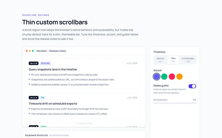
Thin Scrollbar
Originalthin custom scrollbar demo
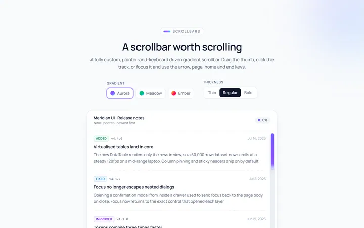
Gradient Scrollbar
Originalgradient scrollbar
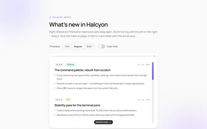
Rounded Scrollbar
Originalrounded pill scrollbar
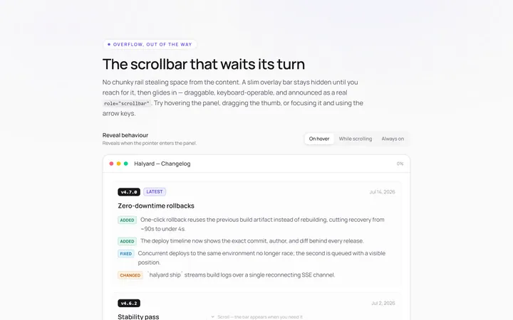
Hidden Hover Scrollbar
Originalscrollbar that appears on hover
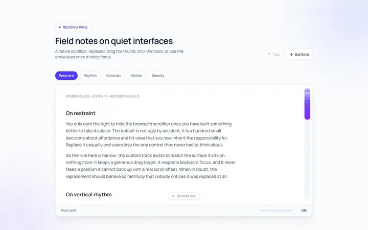
Custom Track Scrollbar
Originalcustom track and thumb scrollbar

Spotlight Hero
OriginalA centred hero with a soft radial spotlight, badge and dual call-to-action.

Split Hero
OriginalA two-column hero pairing a headline and CTAs with a product mock and social proof.

Gradient Spotlight Hero
OriginalA minimal centred hero with a soft gradient-mesh backdrop, announcement pill and dual call-to-action buttons.

App Preview Hero
OriginalA centred hero that pairs headline copy with a realistic product dashboard mock built entirely from markup, complete with browser chrome and a floating notification card.

Waitlist Capture Hero
OriginalA dark, focused hero with an inline email capture form and avatar social proof, ready for pre-launch waitlists.

Image Backdrop Hero
OriginalA cinematic full-bleed hero with a layered image-style backdrop, overlaid left-aligned copy and a trusted-by logos strip.
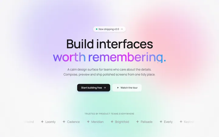
Gradient Mesh Hero with Staggered Text Reveal
OriginalA full-screen hero pairing a drifting animated gradient-mesh backdrop with a word-by-word staggered blur-in headline and a logo marquee under the fold.