

Rounded Scrollbar
Original · freerounded pill scrollbar
Copy prompt gives Claude Code, Cursor or v0 a ready-to-paste prompt that recreates this exact component.
npx shadcn@latest add https://webinnoventix.com/r/scb-rounded.json"use client";
import { useCallback, useEffect, useId, useRef, useState } from "react";
import type {
PointerEvent as ReactPointerEvent,
KeyboardEvent as ReactKeyboardEvent,
} from "react";
import { motion, useReducedMotion } from "motion/react";
type Thickness = "thin" | "regular" | "bold";
type Entry = {
version: string;
date: string;
kind: "Feature" | "Fix" | "Performance";
title: string;
points: string[];
};
const MIN_THUMB = 34;
const THUMB_WIDTH: Record<Thickness, number> = {
thin: 6,
regular: 10,
bold: 14,
};
const THICKNESS_OPTIONS: { value: Thickness; label: string }[] = [
{ value: "thin", label: "Thin" },
{ value: "regular", label: "Regular" },
{ value: "bold", label: "Bold" },
];
const KIND_CLASS: Record<Entry["kind"], string> = {
Feature:
"bg-emerald-500/10 text-emerald-700 ring-emerald-500/30 dark:text-emerald-300",
Fix: "bg-amber-500/10 text-amber-700 ring-amber-500/30 dark:text-amber-300",
Performance:
"bg-sky-500/10 text-sky-700 ring-sky-500/30 dark:text-sky-300",
};
const ENTRIES: Entry[] = [
{
version: "2.8.0",
date: "Jul 14, 2026",
kind: "Feature",
title: "The command palette, rebuilt from scratch",
points: [
"Fuzzy matching now spans files, symbols, settings, and recent commands from a single input.",
"Results stream in as you type — no waiting on the first keystroke in large repositories.",
"Press ⌘K twice to scope the search to the current file only.",
],
},
{
version: "2.7.3",
date: "Jun 30, 2026",
kind: "Fix",
title: "Stability pass for the terminal pane",
points: [
"Fixed a hang when pasting more than 10,000 lines into an active shell session.",
"Resolved cursor drift on reflow when resizing a split with a wrapped prompt.",
],
},
{
version: "2.7.0",
date: "Jun 12, 2026",
kind: "Feature",
title: "Infinite split panes",
points: [
"Drag any tab to an edge to spawn a new pane; layouts persist per workspace.",
"Panes share a synchronized scroll group when you hold ⌥ while scrolling.",
"Added keyboard-only pane navigation with ⌃⌘ and the arrow keys.",
],
},
{
version: "2.6.1",
date: "May 28, 2026",
kind: "Performance",
title: "Startup is 40% faster on a cold launch",
points: [
"Deferred extension activation until the editor's first paint.",
"Trimmed 18 MB from the bundled runtime by dropping an unused ICU dataset.",
],
},
{
version: "2.6.0",
date: "May 9, 2026",
kind: "Feature",
title: "Bring-your-own themes",
points: [
"Author themes in plain JSON and hot-reload them without restarting.",
"Ships with six hand-tuned presets, including a high-contrast option that passes WCAG AA.",
],
},
{
version: "2.5.2",
date: "Apr 22, 2026",
kind: "Fix",
title: "Git integration corrections",
points: [
"Blame annotations no longer duplicate after a rebase with a force-push.",
"Fixed an off-by-one in the diff gutter for files without a trailing newline.",
],
},
{
version: "2.5.0",
date: "Apr 3, 2026",
kind: "Feature",
title: "See your teammates in real time",
points: [
"Live cursors and selections appear inline during a shared session.",
"Follow mode locks your viewport to a collaborator until you scroll away.",
],
},
{
version: "2.4.0",
date: "Mar 15, 2026",
kind: "Feature",
title: "Inline history you can trust",
points: [
"Hover any line to reveal the commit, author, and message without leaving the editor.",
"Click through to a full-screen, side-by-side history for the current file.",
],
},
];
const STYLES = `
@keyframes scbrnd-hint { 0%, 100% { transform: translateY(0); } 50% { transform: translateY(3px); } }
@keyframes scbrnd-drift { 0%, 100% { transform: translate(0, 0) scale(1); } 50% { transform: translate(18px, -14px) scale(1.07); } }
.scbrnd-hint { animation: scbrnd-hint 1.4s ease-in-out infinite; }
.scbrnd-drift { animation: scbrnd-drift 15s ease-in-out infinite; }
.scbrnd-viewport { scrollbar-width: none; -ms-overflow-style: none; }
.scbrnd-viewport::-webkit-scrollbar { width: 0; height: 0; display: none; }
@media (prefers-reduced-motion: reduce) {
.scbrnd-hint, .scbrnd-drift { animation: none !important; }
.scbrnd-viewport { scroll-behavior: auto !important; }
}
`;
export default function ScbRounded() {
const reduce = useReducedMotion();
const uid = useId();
const viewportId = `${uid}-viewport`;
const [thickness, setThickness] = useState<Thickness>("regular");
const [autoHide, setAutoHide] = useState(false);
const [visible, setVisible] = useState(true);
const [hovering, setHovering] = useState(false);
const [dragging, setDragging] = useState(false);
const [thumb, setThumb] = useState<{ height: number; top: number }>({
height: 48,
top: 0,
});
const [progress, setProgress] = useState(0);
const [scrollable, setScrollable] = useState(true);
const viewportRef = useRef<HTMLDivElement | null>(null);
const trackRef = useRef<HTMLDivElement | null>(null);
const dragState = useRef<{ startY: number; startScrollTop: number } | null>(
null,
);
const thumbHeightRef = useRef(48);
const thumbTopRef = useRef(0);
const hideTimer = useRef<number | null>(null);
const segRefs = useRef<(HTMLButtonElement | null)[]>([]);
const thumbW = THUMB_WIDTH[thickness];
const trackW = Math.max(thumbW, 12);
const shown = !autoHide || visible || dragging || hovering;
const updateThumb = useCallback(() => {
const viewport = viewportRef.current;
const track = trackRef.current;
if (!viewport || !track) return;
const { scrollTop, scrollHeight, clientHeight } = viewport;
const trackH = track.clientHeight;
const maxScrollTop = scrollHeight - clientHeight;
const ratio = scrollHeight > 0 ? clientHeight / scrollHeight : 1;
const thumbH = Math.min(
trackH,
Math.max(MIN_THUMB, Math.round(trackH * ratio)),
);
const maxThumbTop = trackH - thumbH;
const top =
maxScrollTop > 0 ? (scrollTop / maxScrollTop) * maxThumbTop : 0;
thumbHeightRef.current = thumbH;
thumbTopRef.current = top;
setThumb({ height: thumbH, top });
setScrollable(maxScrollTop > 1);
setProgress(
maxScrollTop > 0 ? Math.round((scrollTop / maxScrollTop) * 100) : 0,
);
}, []);
const showScrollbar = useCallback(() => {
setVisible(true);
if (hideTimer.current) window.clearTimeout(hideTimer.current);
if (autoHide && !dragging) {
hideTimer.current = window.setTimeout(() => setVisible(false), 1400);
}
}, [autoHide, dragging]);
useEffect(() => {
updateThumb();
const viewport = viewportRef.current;
if (!viewport || typeof ResizeObserver === "undefined") return;
const ro = new ResizeObserver(() => updateThumb());
ro.observe(viewport);
if (viewport.firstElementChild) ro.observe(viewport.firstElementChild);
return () => ro.disconnect();
}, [updateThumb]);
useEffect(() => {
updateThumb();
}, [thickness, updateThumb]);
const toggleAutoHide = () => {
const next = !autoHide;
setAutoHide(next);
setVisible(true);
if (hideTimer.current) window.clearTimeout(hideTimer.current);
if (next) {
hideTimer.current = window.setTimeout(() => setVisible(false), 1400);
}
};
useEffect(
() => () => {
if (hideTimer.current) window.clearTimeout(hideTimer.current);
},
[],
);
const onScroll = () => {
updateThumb();
if (autoHide) showScrollbar();
};
const onThumbPointerDown = (e: ReactPointerEvent<HTMLDivElement>) => {
const viewport = viewportRef.current;
if (!viewport) return;
e.preventDefault();
e.stopPropagation();
(e.target as HTMLElement).setPointerCapture(e.pointerId);
dragState.current = {
startY: e.clientY,
startScrollTop: viewport.scrollTop,
};
setDragging(true);
};
const onThumbPointerMove = (e: ReactPointerEvent<HTMLDivElement>) => {
const state = dragState.current;
const viewport = viewportRef.current;
const track = trackRef.current;
if (!state || !viewport || !track) return;
const trackH = track.clientHeight;
const maxThumbTop = trackH - thumbHeightRef.current;
const maxScrollTop = viewport.scrollHeight - viewport.clientHeight;
if (maxThumbTop <= 0) return;
const deltaY = e.clientY - state.startY;
viewport.scrollTop =
state.startScrollTop + (deltaY / maxThumbTop) * maxScrollTop;
};
const onThumbPointerUp = (e: ReactPointerEvent<HTMLDivElement>) => {
dragState.current = null;
setDragging(false);
try {
(e.target as HTMLElement).releasePointerCapture(e.pointerId);
} catch {
/* pointer already released */
}
if (autoHide) showScrollbar();
};
const onTrackPointerDown = (e: ReactPointerEvent<HTMLDivElement>) => {
const viewport = viewportRef.current;
const track = trackRef.current;
if (!viewport || !track) return;
const rect = track.getBoundingClientRect();
const clickY = e.clientY - rect.top;
const thumbCenter = thumbTopRef.current + thumbHeightRef.current / 2;
const dir = clickY < thumbCenter ? -1 : 1;
viewport.scrollBy({
top: dir * viewport.clientHeight * 0.9,
behavior: reduce ? "auto" : "smooth",
});
};
const onThumbKeyDown = (e: ReactKeyboardEvent<HTMLDivElement>) => {
const viewport = viewportRef.current;
if (!viewport) return;
const page = viewport.clientHeight * 0.9;
const behavior: ScrollBehavior = reduce ? "auto" : "smooth";
let handled = true;
switch (e.key) {
case "ArrowDown":
viewport.scrollBy({ top: 56, behavior });
break;
case "ArrowUp":
viewport.scrollBy({ top: -56, behavior });
break;
case "PageDown":
viewport.scrollBy({ top: page, behavior });
break;
case "PageUp":
viewport.scrollBy({ top: -page, behavior });
break;
case "Home":
viewport.scrollTo({ top: 0, behavior });
break;
case "End":
viewport.scrollTo({ top: viewport.scrollHeight, behavior });
break;
default:
handled = false;
}
if (handled) e.preventDefault();
};
const onSegKeyDown = (
e: ReactKeyboardEvent<HTMLButtonElement>,
i: number,
) => {
const count = THICKNESS_OPTIONS.length;
let next = i;
if (e.key === "ArrowRight" || e.key === "ArrowDown") next = (i + 1) % count;
else if (e.key === "ArrowLeft" || e.key === "ArrowUp")
next = (i - 1 + count) % count;
else if (e.key === "Home") next = 0;
else if (e.key === "End") next = count - 1;
else return;
e.preventDefault();
setThickness(THICKNESS_OPTIONS[next].value);
segRefs.current[next]?.focus();
};
const focusRing =
"focus-visible:outline-none focus-visible:ring-2 focus-visible:ring-indigo-500";
return (
<section className="relative w-full overflow-hidden bg-zinc-50 px-4 py-16 sm:px-6 sm:py-24 dark:bg-zinc-950">
<div
aria-hidden="true"
className="pointer-events-none absolute inset-0 overflow-hidden"
>
<div className="scbrnd-drift absolute -left-16 -top-24 h-72 w-72 rounded-full bg-indigo-400/20 blur-3xl dark:bg-indigo-500/15" />
<div
className="scbrnd-drift absolute -bottom-24 -right-10 h-80 w-80 rounded-full bg-violet-400/20 blur-3xl dark:bg-violet-500/15"
style={{ animationDelay: "-5s" }}
/>
</div>
<div className="relative mx-auto max-w-2xl">
<header className="mb-8">
<span className="inline-flex items-center gap-2 font-mono text-xs uppercase tracking-[0.2em] text-indigo-600 dark:text-indigo-400">
<svg
viewBox="0 0 24 24"
className="h-3.5 w-3.5"
fill="none"
stroke="currentColor"
strokeWidth="1.8"
strokeLinecap="round"
strokeLinejoin="round"
aria-hidden="true"
>
<path d="M12 3v4M12 17v4M3 12h4M17 12h4M6 6l2 2M16 16l2 2M18 6l-2 2M8 16l-2 2" />
</svg>
Release notes
</span>
<h2 className="mt-3 text-3xl font-semibold tracking-tight text-zinc-900 sm:text-4xl dark:text-white">
What’s new in Halcyon
</h2>
<p className="mt-3 leading-relaxed text-zinc-500 dark:text-zinc-400">
Eight releases of the editor teams actually keep open. Scroll the
log with the pill on the right — drag it, click the track to page,
or tab to it and steer with the arrow keys.
</p>
</header>
<div className="mb-5 flex flex-wrap items-center gap-x-6 gap-y-3">
<div className="flex items-center gap-3">
<span className="text-sm font-medium text-zinc-600 dark:text-zinc-300">
Thickness
</span>
<div
role="radiogroup"
aria-label="Scrollbar thickness"
className="inline-flex rounded-full bg-zinc-100 p-1 dark:bg-zinc-800"
>
{THICKNESS_OPTIONS.map((opt, i) => {
const selected = thickness === opt.value;
return (
<button
key={opt.value}
ref={(el) => {
segRefs.current[i] = el;
}}
type="button"
role="radio"
aria-checked={selected}
tabIndex={selected ? 0 : -1}
onClick={() => setThickness(opt.value)}
onKeyDown={(e) => onSegKeyDown(e, i)}
className={`relative z-10 rounded-full px-3.5 py-1.5 text-sm font-medium transition-colors ${focusRing} focus-visible:ring-offset-2 focus-visible:ring-offset-zinc-100 dark:focus-visible:ring-offset-zinc-800 ${
selected
? "text-zinc-900 dark:text-white"
: "text-zinc-500 hover:text-zinc-700 dark:text-zinc-400 dark:hover:text-zinc-200"
}`}
>
{selected && (
<motion.span
layoutId={`${uid}-seg`}
transition={
reduce
? { duration: 0 }
: { type: "spring", stiffness: 500, damping: 40 }
}
className="absolute inset-0 -z-10 rounded-full bg-white shadow-sm dark:bg-zinc-700"
/>
)}
{opt.label}
</button>
);
})}
</div>
</div>
<div className="flex items-center gap-2.5">
<button
type="button"
role="switch"
aria-checked={autoHide}
aria-label="Auto-hide the scrollbar when idle"
onClick={() => setAutoHide((v) => !v)}
className={`relative inline-flex h-6 w-11 shrink-0 rounded-full transition-colors ${focusRing} focus-visible:ring-offset-2 focus-visible:ring-offset-zinc-50 dark:focus-visible:ring-offset-zinc-950 ${
autoHide ? "bg-indigo-500" : "bg-zinc-300 dark:bg-zinc-700"
}`}
>
<motion.span
className="absolute left-0.5 top-0.5 h-5 w-5 rounded-full bg-white shadow-sm"
animate={{ x: autoHide ? 20 : 0 }}
transition={
reduce
? { duration: 0 }
: { type: "spring", stiffness: 500, damping: 32 }
}
/>
</button>
<span className="text-sm font-medium text-zinc-600 dark:text-zinc-300">
Auto-hide
</span>
</div>
</div>
<motion.div
initial={reduce ? { opacity: 1 } : { opacity: 0, y: 24 }}
animate={{ opacity: 1, y: 0 }}
transition={reduce ? { duration: 0 } : { duration: 0.6, ease: "easeOut" }}
onPointerEnter={() => setHovering(true)}
onPointerLeave={() => setHovering(false)}
className={`relative rounded-3xl border border-zinc-200/80 bg-white p-3 shadow-xl shadow-zinc-900/5 dark:border-zinc-800 dark:bg-zinc-900 ${
dragging ? "cursor-grabbing select-none" : ""
}`}
>
<div
aria-hidden="true"
className="mb-2 flex items-center gap-3 px-1"
>
<div className="h-1 flex-1 overflow-hidden rounded-full bg-zinc-200 dark:bg-zinc-800">
<div
className="h-full rounded-full bg-gradient-to-r from-indigo-500 to-violet-500 transition-[width] duration-150 motion-reduce:transition-none"
style={{ width: `${progress}%` }}
/>
</div>
<span className="font-mono text-[11px] tabular-nums text-zinc-400 dark:text-zinc-500">
{progress}%
</span>
</div>
<div className="relative">
<div
id={viewportId}
ref={viewportRef}
role="region"
aria-label="Halcyon release notes, scrollable"
tabIndex={0}
onScroll={onScroll}
className={`scbrnd-viewport relative h-[24rem] overflow-y-auto rounded-2xl py-6 pl-5 pr-9 sm:h-[26rem] ${focusRing} focus-visible:ring-offset-2 focus-visible:ring-offset-white dark:focus-visible:ring-offset-zinc-900`}
>
<ol className="space-y-6">
{ENTRIES.map((entry, i) => (
<motion.li
key={entry.version}
initial={
reduce ? { opacity: 1, y: 0 } : { opacity: 0, y: 16 }
}
animate={{ opacity: 1, y: 0 }}
transition={
reduce
? { duration: 0 }
: {
duration: 0.5,
delay: Math.min(i, 7) * 0.05,
ease: "easeOut",
}
}
className="border-b border-zinc-100 pb-6 last:border-0 last:pb-0 dark:border-zinc-800/70"
>
<div className="flex flex-wrap items-center gap-3">
<span className="rounded-md bg-zinc-100 px-2 py-0.5 font-mono text-xs font-medium text-zinc-600 dark:bg-zinc-800 dark:text-zinc-300">
v{entry.version}
</span>
<span
className={`rounded-full px-2.5 py-0.5 text-xs font-medium ring-1 ring-inset ${KIND_CLASS[entry.kind]}`}
>
{entry.kind}
</span>
<span className="ml-auto font-mono text-xs text-zinc-400 dark:text-zinc-500">
{entry.date}
</span>
</div>
<h3 className="mt-2.5 text-lg font-semibold tracking-tight text-zinc-900 dark:text-white">
{entry.title}
</h3>
<ul className="mt-2 space-y-1.5">
{entry.points.map((point) => (
<li
key={point}
className="flex gap-2.5 text-sm leading-relaxed text-zinc-600 dark:text-zinc-300"
>
<span className="mt-2 h-1 w-1 shrink-0 rounded-full bg-indigo-400 dark:bg-indigo-500" />
<span>{point}</span>
</li>
))}
</ul>
</motion.li>
))}
</ol>
</div>
<div className="pointer-events-none absolute inset-x-0 top-0 z-10 h-8 rounded-t-2xl bg-gradient-to-b from-white to-transparent dark:from-zinc-900" />
<div className="pointer-events-none absolute inset-x-0 bottom-0 z-10 h-10 rounded-b-2xl bg-gradient-to-t from-white to-transparent dark:from-zinc-900" />
<div
ref={trackRef}
onPointerDown={onTrackPointerDown}
aria-hidden={!scrollable}
className="absolute bottom-5 right-3 top-5 z-20 select-none rounded-full transition-opacity duration-300 motion-reduce:transition-none"
style={{ width: trackW, opacity: shown ? 1 : 0 }}
>
<div className="absolute inset-0 rounded-full bg-zinc-200/70 dark:bg-zinc-700/40" />
<div
role="scrollbar"
aria-controls={viewportId}
aria-orientation="vertical"
aria-label="Scroll release notes"
aria-valuemin={0}
aria-valuemax={100}
aria-valuenow={progress}
tabIndex={scrollable ? 0 : -1}
onPointerDown={onThumbPointerDown}
onPointerMove={onThumbPointerMove}
onPointerUp={onThumbPointerUp}
onPointerCancel={onThumbPointerUp}
onKeyDown={onThumbKeyDown}
className={`absolute left-1/2 top-0 touch-none rounded-full bg-gradient-to-b from-indigo-400 to-violet-500 shadow-sm transition-colors hover:from-indigo-500 hover:to-violet-600 focus-visible:outline-none focus-visible:ring-2 focus-visible:ring-indigo-500 focus-visible:ring-offset-2 focus-visible:ring-offset-white dark:focus-visible:ring-offset-zinc-900 ${
dragging ? "cursor-grabbing" : "cursor-grab"
}`}
style={{
width: thumbW,
height: thumb.height,
transform: `translateX(-50%) translateY(${thumb.top}px)`,
}}
/>
</div>
<div
aria-hidden="true"
className={`pointer-events-none absolute bottom-3 left-1/2 z-20 -translate-x-1/2 transition-opacity duration-300 motion-reduce:transition-none ${
scrollable && progress < 94 ? "opacity-100" : "opacity-0"
}`}
>
<span className="inline-flex items-center gap-1.5 rounded-full bg-zinc-900/85 px-3 py-1 text-[11px] font-medium text-white shadow-lg backdrop-blur dark:bg-white/90 dark:text-zinc-900">
Scroll for more
<svg
viewBox="0 0 24 24"
className="scbrnd-hint h-3 w-3"
fill="none"
stroke="currentColor"
strokeWidth="2.4"
strokeLinecap="round"
strokeLinejoin="round"
>
<path d="M6 9l6 6 6-6" />
</svg>
</span>
</div>
</div>
</motion.div>
<p className="mt-4 text-center text-xs text-zinc-400 dark:text-zinc-500">
Drag the pill, click the track to page, or focus it and use ↑ ↓ ·
Page Up / Page Down · Home / End.
</p>
</div>
<style>{STYLES}</style>
</section>
);
}Dependencies
Licence
Built by Web Innoventix. Free for personal and commercial use, no attribution required.
Built by Web Innoventix
Need a custom interface, a full website, or SEO that gets you cited by AI? We design, build and rank it end to end.
Get a free quoteSimilar components
Browse all →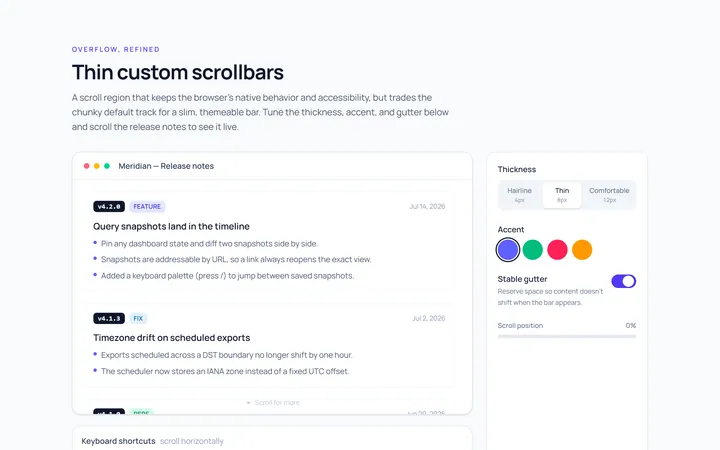
Thin Scrollbar
Originalthin custom scrollbar demo
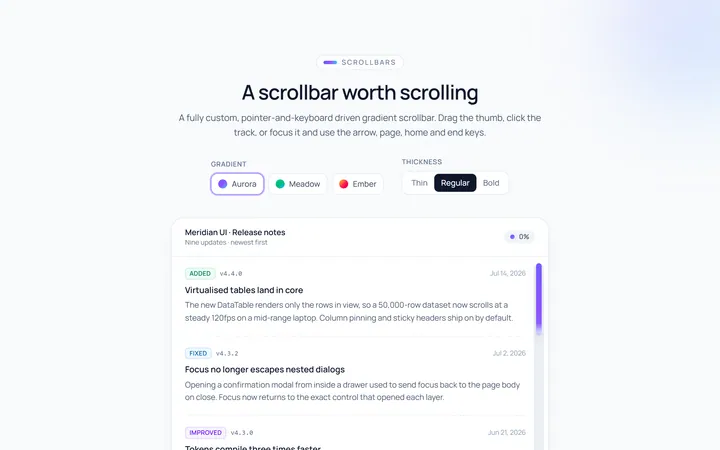
Gradient Scrollbar
Originalgradient scrollbar
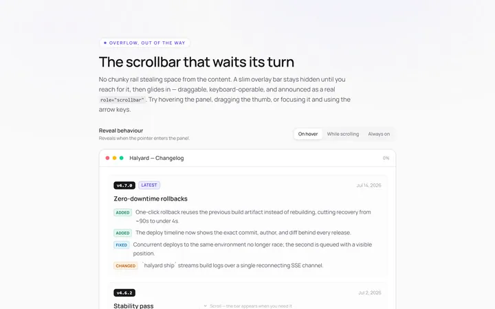
Hidden Hover Scrollbar
Originalscrollbar that appears on hover
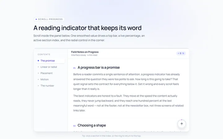
Progress Scrollbar
Originalscroll progress indicator
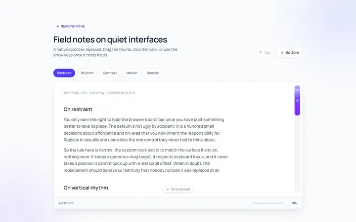
Custom Track Scrollbar
Originalcustom track and thumb scrollbar

Spotlight Hero
OriginalA centred hero with a soft radial spotlight, badge and dual call-to-action.

Split Hero
OriginalA two-column hero pairing a headline and CTAs with a product mock and social proof.

Gradient Spotlight Hero
OriginalA minimal centred hero with a soft gradient-mesh backdrop, announcement pill and dual call-to-action buttons.

App Preview Hero
OriginalA centred hero that pairs headline copy with a realistic product dashboard mock built entirely from markup, complete with browser chrome and a floating notification card.

Waitlist Capture Hero
OriginalA dark, focused hero with an inline email capture form and avatar social proof, ready for pre-launch waitlists.

Image Backdrop Hero
OriginalA cinematic full-bleed hero with a layered image-style backdrop, overlaid left-aligned copy and a trusted-by logos strip.
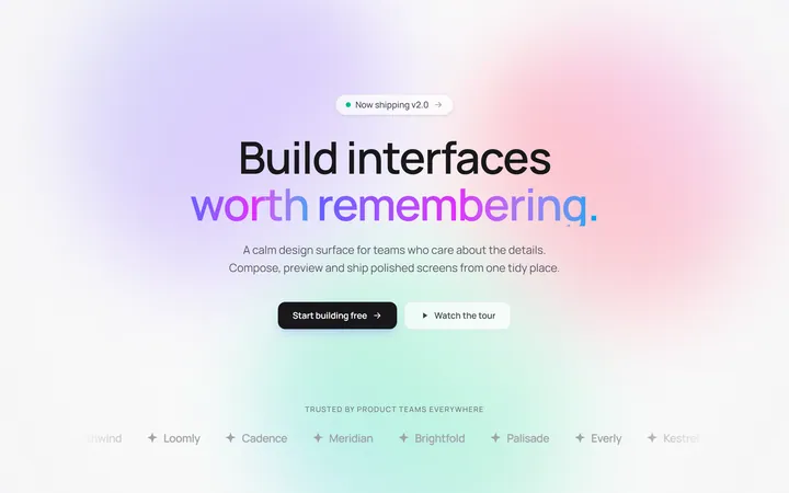
Gradient Mesh Hero with Staggered Text Reveal
OriginalA full-screen hero pairing a drifting animated gradient-mesh backdrop with a word-by-word staggered blur-in headline and a logo marquee under the fold.