

Hidden Hover Scrollbar
Original · freescrollbar that appears on hover
Copy prompt gives Claude Code, Cursor or v0 a ready-to-paste prompt that recreates this exact component.
npx shadcn@latest add https://webinnoventix.com/r/scb-hidden-hover.json"use client";
import type {
CSSProperties,
FocusEvent as ReactFocusEvent,
KeyboardEvent as ReactKeyboardEvent,
PointerEvent as ReactPointerEvent,
} from "react";
import { useCallback, useEffect, useId, useRef, useState } from "react";
import { motion, useReducedMotion } from "motion/react";
type RevealMode = "hover" | "scroll" | "always";
type ChangeKind = "Added" | "Fixed" | "Changed" | "Removed";
type Change = { kind: ChangeKind; text: string };
type Entry = {
version: string;
date: string;
title: string;
latest?: boolean;
changes: Change[];
};
const MIN_THUMB = 44;
const MODES: { id: RevealMode; label: string; hint: string }[] = [
{ id: "hover", label: "On hover", hint: "Reveals when the pointer enters the panel." },
{ id: "scroll", label: "While scrolling", hint: "Reveals only while the content is moving." },
{ id: "always", label: "Always on", hint: "Stays pinned like a classic scrollbar." },
];
const KIND_STYLE: Record<ChangeKind, string> = {
Added:
"bg-emerald-500/10 text-emerald-700 ring-1 ring-inset ring-emerald-600/20 dark:text-emerald-300 dark:ring-emerald-400/25",
Fixed:
"bg-sky-500/10 text-sky-700 ring-1 ring-inset ring-sky-600/20 dark:text-sky-300 dark:ring-sky-400/25",
Changed:
"bg-amber-500/10 text-amber-700 ring-1 ring-inset ring-amber-600/20 dark:text-amber-300 dark:ring-amber-400/25",
Removed:
"bg-rose-500/10 text-rose-700 ring-1 ring-inset ring-rose-600/20 dark:text-rose-300 dark:ring-rose-400/25",
};
const ENTRIES: Entry[] = [
{
version: "4.7.0",
date: "Jul 14, 2026",
title: "Zero-downtime rollbacks",
latest: true,
changes: [
{ kind: "Added", text: "One-click rollback reuses the previous build artifact instead of rebuilding, cutting recovery from ~90s to under 4s." },
{ kind: "Added", text: "The deploy timeline now shows the exact commit, author, and diff behind every release." },
{ kind: "Fixed", text: "Concurrent deploys to the same environment no longer race; the second is queued with a visible position." },
{ kind: "Changed", text: "`halyard ship` streams build logs over a single reconnecting SSE channel." },
],
},
{
version: "4.6.2",
date: "Jul 2, 2026",
title: "Stability pass",
changes: [
{ kind: "Fixed", text: "Webhook retries used a fixed 30s interval; they now back off exponentially up to 10 minutes." },
{ kind: "Fixed", text: "Monorepos over 12k files occasionally timed out during the dependency-graph scan." },
{ kind: "Removed", text: "Dropped the legacy /v1/hooks endpoint deprecated back in March." },
],
},
{
version: "4.6.0",
date: "Jun 20, 2026",
title: "Preview environments",
changes: [
{ kind: "Added", text: "Every pull request spins up an isolated preview URL with its own database branch." },
{ kind: "Added", text: "Previews auto-sleep after 20 minutes idle and wake on first request in about 1.2s." },
{ kind: "Changed", text: "Environment variables can be scoped to preview, staging, or production individually." },
],
},
{
version: "4.5.1",
date: "Jun 9, 2026",
title: "Accessibility & polish",
changes: [
{ kind: "Fixed", text: "Dark-mode contrast on the metrics dashboard failed WCAG AA on three chart legends." },
{ kind: "Fixed", text: "The region selector reset to us-east-1 after saving team settings." },
],
},
{
version: "4.5.0",
date: "May 28, 2026",
title: "Observability",
changes: [
{ kind: "Added", text: "Per-request tracing with p50/p95/p99 latency, searchable by route and status code." },
{ kind: "Added", text: "Alert rules can now target a Slack channel or a raw webhook." },
{ kind: "Changed", text: "Log retention increased from 7 to 30 days on all paid plans." },
],
},
{
version: "4.4.0",
date: "May 12, 2026",
title: "Teams & roles",
changes: [
{ kind: "Added", text: "Granular roles — Owner, Deployer, and Viewer — replace the old admin/member split." },
{ kind: "Added", text: "An audit log records every deploy, secret change, and role edit with actor and IP." },
{ kind: "Fixed", text: "Invitations to plus-tagged addresses (name+team@) were being silently dropped." },
],
},
{
version: "4.3.0",
date: "Apr 30, 2026",
title: "Faster builds",
changes: [
{ kind: "Added", text: "A remote build cache shared across branches cut cold builds by an average of 41%." },
{ kind: "Changed", text: "Node 22 is now the default runtime for new projects." },
{ kind: "Removed", text: "Retired the beta Bun runtime toggle after low adoption." },
],
},
{
version: "4.2.1",
date: "Apr 18, 2026",
title: "Billing fixes",
changes: [
{ kind: "Fixed", text: "Custom domains with wildcard certificates failed verification on renewal." },
{ kind: "Fixed", text: "The usage page double-counted bandwidth for cached static assets." },
],
},
];
export default function ScbHiddenHover() {
const reduceMotion = useReducedMotion();
const contentId = useId();
const wrapperRef = useRef<HTMLDivElement | null>(null);
const scrollRef = useRef<HTMLDivElement | null>(null);
const trackRef = useRef<HTMLDivElement | null>(null);
const thumbRef = useRef<HTMLDivElement | null>(null);
const modeRefs = useRef<Array<HTMLButtonElement | null>>([]);
const dragState = useRef<{ startY: number; startScroll: number } | null>(null);
const scrollTimer = useRef<number | null>(null);
const [mode, setMode] = useState<RevealMode>("hover");
const [thumb, setThumb] = useState<{ height: number; top: number }>({ height: 0, top: 0 });
const [progress, setProgress] = useState<number>(0);
const [atTop, setAtTop] = useState<boolean>(true);
const [hovering, setHovering] = useState<boolean>(false);
const [focused, setFocused] = useState<boolean>(false);
const [scrolling, setScrolling] = useState<boolean>(false);
const [dragging, setDragging] = useState<boolean>(false);
const revealed =
mode === "always"
? true
: mode === "hover"
? hovering || focused || dragging
: scrolling || focused || dragging;
const updateThumb = useCallback(() => {
const el = scrollRef.current;
const track = trackRef.current;
if (!el || !track) return;
const { scrollTop, scrollHeight, clientHeight } = el;
const trackH = track.clientHeight;
const scrollable = scrollHeight - clientHeight;
const ratio = scrollHeight > 0 ? clientHeight / scrollHeight : 1;
const thumbH = Math.max(Math.min(ratio, 1) * trackH, MIN_THUMB);
const maxTop = Math.max(trackH - thumbH, 0);
const p = scrollable > 0 ? scrollTop / scrollable : 0;
setThumb({ height: thumbH, top: p * maxTop });
setProgress(Math.round(p * 100));
setAtTop(scrollTop <= 2);
}, []);
useEffect(() => {
updateThumb();
const el = scrollRef.current;
if (!el) return;
const ro = new ResizeObserver(() => updateThumb());
ro.observe(el);
return () => ro.disconnect();
}, [updateThumb]);
const handleScroll = useCallback(() => {
updateThumb();
setScrolling(true);
if (scrollTimer.current !== null) window.clearTimeout(scrollTimer.current);
scrollTimer.current = window.setTimeout(() => setScrolling(false), 700);
}, [updateThumb]);
useEffect(() => {
return () => {
if (scrollTimer.current !== null) window.clearTimeout(scrollTimer.current);
};
}, []);
// Thumb dragging via window pointer listeners.
useEffect(() => {
if (!dragging) return;
const onMove = (event: PointerEvent) => {
const el = scrollRef.current;
const track = trackRef.current;
const st = dragState.current;
if (!el || !track || !st) return;
const { scrollHeight, clientHeight } = el;
const trackH = track.clientHeight;
const ratio = scrollHeight > 0 ? clientHeight / scrollHeight : 1;
const thumbH = Math.max(Math.min(ratio, 1) * trackH, MIN_THUMB);
const maxTop = Math.max(trackH - thumbH, 0);
const scrollable = scrollHeight - clientHeight;
const delta = event.clientY - st.startY;
const scrollDelta = maxTop > 0 ? (delta / maxTop) * scrollable : 0;
el.scrollTop = st.startScroll + scrollDelta;
};
const onUp = () => {
dragState.current = null;
setDragging(false);
};
window.addEventListener("pointermove", onMove);
window.addEventListener("pointerup", onUp);
window.addEventListener("pointercancel", onUp);
return () => {
window.removeEventListener("pointermove", onMove);
window.removeEventListener("pointerup", onUp);
window.removeEventListener("pointercancel", onUp);
};
}, [dragging]);
const onThumbPointerDown = (event: ReactPointerEvent<HTMLDivElement>) => {
const el = scrollRef.current;
if (!el) return;
event.preventDefault();
event.stopPropagation();
dragState.current = { startY: event.clientY, startScroll: el.scrollTop };
setDragging(true);
};
const onTrackPointerDown = (event: ReactPointerEvent<HTMLDivElement>) => {
if (event.target === thumbRef.current) return;
const el = scrollRef.current;
const track = trackRef.current;
if (!el || !track) return;
const rect = track.getBoundingClientRect();
const clickRatio = (event.clientY - rect.top) / track.clientHeight;
const target = clickRatio * (el.scrollHeight - el.clientHeight);
el.scrollTo({ top: target, behavior: reduceMotion ? "auto" : "smooth" });
};
const scrollByKey = (event: ReactKeyboardEvent<HTMLElement>) => {
const el = scrollRef.current;
if (!el) return;
const page = el.clientHeight * 0.9;
const line = 52;
let handled = true;
switch (event.key) {
case "ArrowDown":
el.scrollTop += line;
break;
case "ArrowUp":
el.scrollTop -= line;
break;
case "PageDown":
el.scrollTop += page;
break;
case "PageUp":
el.scrollTop -= page;
break;
case "Home":
el.scrollTop = 0;
break;
case "End":
el.scrollTop = el.scrollHeight;
break;
default:
handled = false;
}
if (handled) event.preventDefault();
};
const scrollToTop = () => {
scrollRef.current?.scrollTo({ top: 0, behavior: reduceMotion ? "auto" : "smooth" });
};
const onWrapperFocus = () => setFocused(true);
const onWrapperBlur = (event: ReactFocusEvent<HTMLDivElement>) => {
if (!wrapperRef.current?.contains(event.relatedTarget as Node | null)) {
setFocused(false);
}
};
const onModeKeyDown = (event: ReactKeyboardEvent<HTMLButtonElement>, index: number) => {
let next = index;
if (event.key === "ArrowRight" || event.key === "ArrowDown") next = (index + 1) % MODES.length;
else if (event.key === "ArrowLeft" || event.key === "ArrowUp") next = (index - 1 + MODES.length) % MODES.length;
else if (event.key === "Home") next = 0;
else if (event.key === "End") next = MODES.length - 1;
else return;
event.preventDefault();
setMode(MODES[next].id);
modeRefs.current[next]?.focus();
};
const activeMode = MODES.find((m) => m.id === mode) ?? MODES[0];
return (
<section className="relative w-full overflow-hidden bg-zinc-50 px-5 py-16 text-zinc-900 sm:px-8 sm:py-24 dark:bg-zinc-950 dark:text-zinc-100">
<style>{`
.scbhh-hide-native { scrollbar-width: none; -ms-overflow-style: none; }
.scbhh-hide-native::-webkit-scrollbar { width: 0; height: 0; display: none; }
@keyframes scbhh-nudge {
0%, 100% { transform: translateY(0); opacity: 0.5; }
50% { transform: translateY(4px); opacity: 1; }
}
@keyframes scbhh-rise {
from { opacity: 0; transform: translateY(12px); }
to { opacity: 1; transform: translateY(0); }
}
.scbhh-nudge { animation: scbhh-nudge 1.7s ease-in-out infinite; }
.scbhh-rise { animation: scbhh-rise 560ms cubic-bezier(0.22, 1, 0.36, 1) both; }
@media (prefers-reduced-motion: reduce) {
.scbhh-nudge, .scbhh-rise { animation: none !important; }
}
`}</style>
{/* Ambient backdrop */}
<div
aria-hidden="true"
className="pointer-events-none absolute inset-0 opacity-70 [mask-image:radial-gradient(70%_60%_at_50%_0%,#000,transparent)]"
style={{
backgroundImage:
"radial-gradient(38rem 22rem at 82% -6%, rgba(99,102,241,0.14), transparent), radial-gradient(30rem 20rem at 6% 8%, rgba(139,92,246,0.10), transparent)",
}}
/>
<div className={`relative mx-auto max-w-3xl ${reduceMotion ? "" : "scbhh-rise"}`}>
<header>
<div className="inline-flex items-center gap-2 rounded-full border border-zinc-200 bg-white/70 px-3 py-1 text-[11px] font-semibold uppercase tracking-[0.18em] text-indigo-600 backdrop-blur dark:border-zinc-800 dark:bg-zinc-900/70 dark:text-indigo-300">
<span className="h-1.5 w-1.5 rounded-full bg-indigo-500" aria-hidden="true" />
Overflow, out of the way
</div>
<h2 className="mt-4 text-3xl font-semibold tracking-tight sm:text-4xl">
The scrollbar that waits its turn
</h2>
<p className="mt-3 max-w-2xl text-base leading-relaxed text-zinc-600 dark:text-zinc-400">
No chunky rail stealing space from the content. A slim overlay bar
stays hidden until you reach for it, then glides in — draggable,
keyboard-operable, and announced as a real{" "}
<code className="rounded bg-zinc-200/70 px-1 py-0.5 font-mono text-[0.8em] text-zinc-700 dark:bg-zinc-800 dark:text-zinc-300">
role="scrollbar"
</code>
. Try hovering the panel, dragging the thumb, or focusing it and
using the arrow keys.
</p>
</header>
{/* Reveal-mode selector */}
<div className="mt-8 flex flex-col gap-3 sm:flex-row sm:items-center sm:justify-between">
<div>
<p
id="scbhh-mode-label"
className="text-sm font-semibold text-zinc-800 dark:text-zinc-200"
>
Reveal behaviour
</p>
<p className="mt-0.5 text-xs text-zinc-500 dark:text-zinc-400">{activeMode.hint}</p>
</div>
<div
role="radiogroup"
aria-labelledby="scbhh-mode-label"
className="flex shrink-0 rounded-xl bg-zinc-100 p-1 dark:bg-zinc-900"
>
{MODES.map((option, index) => {
const active = option.id === mode;
return (
<button
key={option.id}
ref={(node) => {
modeRefs.current[index] = node;
}}
type="button"
role="radio"
aria-checked={active}
tabIndex={active ? 0 : -1}
onClick={() => setMode(option.id)}
onKeyDown={(event) => onModeKeyDown(event, index)}
className={[
"rounded-lg px-3 py-1.5 text-xs font-medium outline-none transition-colors",
"focus-visible:ring-2 focus-visible:ring-indigo-500 focus-visible:ring-offset-2 focus-visible:ring-offset-zinc-100 dark:focus-visible:ring-offset-zinc-900",
active
? "bg-white text-zinc-900 shadow-sm dark:bg-zinc-800 dark:text-white"
: "text-zinc-500 hover:text-zinc-800 dark:text-zinc-400 dark:hover:text-zinc-200",
].join(" ")}
>
{option.label}
</button>
);
})}
</div>
</div>
{/* Scroll panel */}
<div className="mt-5 overflow-hidden rounded-2xl border border-zinc-200 bg-white shadow-sm dark:border-zinc-800 dark:bg-zinc-900">
{/* Window chrome */}
<div className="flex items-center gap-2 border-b border-zinc-200 px-4 py-3 dark:border-zinc-800">
<span className="h-2.5 w-2.5 rounded-full bg-rose-400" aria-hidden="true" />
<span className="h-2.5 w-2.5 rounded-full bg-amber-400" aria-hidden="true" />
<span className="h-2.5 w-2.5 rounded-full bg-emerald-400" aria-hidden="true" />
<h3 className="ml-2 text-sm font-semibold text-zinc-700 dark:text-zinc-300">
Halyard — Changelog
</h3>
<span
className="ml-auto text-[11px] font-medium tabular-nums text-zinc-400 dark:text-zinc-500"
aria-live="polite"
>
{progress}%
</span>
</div>
{/* Scroll region + overlay scrollbar */}
<div
ref={wrapperRef}
className="relative"
onMouseEnter={() => setHovering(true)}
onMouseLeave={() => setHovering(false)}
onFocusCapture={onWrapperFocus}
onBlurCapture={onWrapperBlur}
>
<div
ref={scrollRef}
id={contentId}
onScroll={handleScroll}
onKeyDown={scrollByKey}
tabIndex={0}
role="region"
aria-label="Halyard changelog, scrollable"
className="scbhh-hide-native h-[24rem] overflow-y-auto overscroll-contain px-5 py-5 outline-none focus-visible:ring-2 focus-visible:ring-inset focus-visible:ring-indigo-500"
>
<ol className="space-y-4">
{ENTRIES.map((entry) => (
<li
key={entry.version}
className="rounded-xl border border-zinc-100 bg-zinc-50/60 p-4 dark:border-zinc-800/70 dark:bg-zinc-950/40"
>
<div className="flex flex-wrap items-center gap-2">
<span className="rounded-md bg-zinc-900 px-2 py-0.5 font-mono text-xs font-semibold text-white dark:bg-zinc-100 dark:text-zinc-900">
v{entry.version}
</span>
{entry.latest ? (
<span className="rounded-md bg-indigo-500/10 px-2 py-0.5 text-[11px] font-semibold uppercase tracking-wide text-indigo-700 ring-1 ring-inset ring-indigo-600/25 dark:text-indigo-300 dark:ring-indigo-400/30">
Latest
</span>
) : null}
<time className="ml-auto text-xs text-zinc-400 dark:text-zinc-500">
{entry.date}
</time>
</div>
<h4 className="mt-3 text-base font-semibold text-zinc-900 dark:text-zinc-100">
{entry.title}
</h4>
<ul className="mt-3 space-y-2">
{entry.changes.map((change, changeIndex) => (
<li
key={`${entry.version}-${changeIndex}`}
className="flex items-start gap-2.5 text-sm leading-relaxed text-zinc-600 dark:text-zinc-400"
>
<span
className={[
"mt-0.5 inline-flex shrink-0 rounded px-1.5 py-0.5 text-[10px] font-bold uppercase tracking-wide",
KIND_STYLE[change.kind],
].join(" ")}
>
{change.kind}
</span>
<span>{change.text}</span>
</li>
))}
</ul>
</li>
))}
</ol>
<p className="mt-4 text-center text-xs text-zinc-400 dark:text-zinc-500">
That's the whole history — thanks for reading to the end.
</p>
</div>
{/* Custom overlay scrollbar */}
<motion.div
className="absolute right-1.5 top-2 bottom-2 z-10 w-2.5"
initial={false}
animate={{ opacity: revealed ? 1 : 0, x: revealed || reduceMotion ? 0 : 6 }}
transition={{ duration: reduceMotion ? 0 : 0.18, ease: "easeOut" }}
style={{ pointerEvents: revealed ? "auto" : "none" }}
aria-hidden={revealed ? undefined : true}
>
<div
ref={trackRef}
onPointerDown={onTrackPointerDown}
className="relative h-full w-full rounded-full bg-zinc-200/50 transition-colors hover:bg-zinc-200/80 dark:bg-zinc-800/50 dark:hover:bg-zinc-800/80"
>
<div
ref={thumbRef}
role="scrollbar"
aria-controls={contentId}
aria-orientation="vertical"
aria-label="Scroll changelog"
aria-valuemin={0}
aria-valuemax={100}
aria-valuenow={progress}
tabIndex={0}
onPointerDown={onThumbPointerDown}
onKeyDown={scrollByKey}
style={
{
height: `${thumb.height}px`,
transform: `translateY(${thumb.top}px)`,
willChange: "transform",
} as CSSProperties
}
className={[
"absolute inset-x-0 rounded-full outline-none transition-colors",
"cursor-grab active:cursor-grabbing",
"focus-visible:ring-2 focus-visible:ring-indigo-500 focus-visible:ring-offset-1 focus-visible:ring-offset-white dark:focus-visible:ring-offset-zinc-900",
dragging
? "bg-indigo-500 dark:bg-indigo-400"
: "bg-zinc-400/80 hover:bg-zinc-500/90 dark:bg-zinc-500/70 dark:hover:bg-zinc-400/80",
].join(" ")}
/>
</div>
</motion.div>
{/* Back to top */}
<motion.button
type="button"
onClick={scrollToTop}
initial={false}
animate={{ opacity: atTop ? 0 : 1, y: atTop ? 6 : 0 }}
transition={{ duration: reduceMotion ? 0 : 0.16, ease: "easeOut" }}
style={{ pointerEvents: atTop ? "none" : "auto" }}
aria-hidden={atTop ? true : undefined}
className="absolute bottom-3 left-1/2 z-10 -translate-x-1/2 inline-flex items-center gap-1.5 rounded-full border border-zinc-200 bg-white/90 px-3 py-1.5 text-xs font-medium text-zinc-700 shadow-sm backdrop-blur outline-none transition-colors hover:text-indigo-600 focus-visible:ring-2 focus-visible:ring-indigo-500 dark:border-zinc-700 dark:bg-zinc-900/90 dark:text-zinc-200 dark:hover:text-indigo-300"
>
<svg viewBox="0 0 16 16" className="h-3.5 w-3.5 fill-current" aria-hidden="true">
<path d="M8 3.5 13 8.5l-1.4 1.4L9 7.3V13H7V7.3L4.4 9.9 3 8.5 8 3.5Z" />
</svg>
Back to top
</motion.button>
{/* Scroll hint */}
{atTop ? (
<div
aria-hidden="true"
className="pointer-events-none absolute inset-x-0 bottom-3 flex justify-center"
>
<span
className={[
"inline-flex items-center gap-1.5 rounded-full bg-white/80 px-2.5 py-1 text-[11px] font-medium text-zinc-500 shadow-sm backdrop-blur dark:bg-zinc-900/80 dark:text-zinc-400",
reduceMotion ? "" : "scbhh-nudge",
].join(" ")}
>
<svg viewBox="0 0 16 16" className="h-3 w-3 fill-current" aria-hidden="true">
<path d="M8 11 3.5 6.5 4.9 5.1 8 8.2l3.1-3.1 1.4 1.4L8 11Z" />
</svg>
Scroll — the bar appears when you need it
</span>
</div>
) : null}
</div>
</div>
{/* Footnote / legend */}
<div className="mt-5 flex flex-wrap items-center gap-x-5 gap-y-2 text-xs text-zinc-500 dark:text-zinc-400">
<span className="inline-flex items-center gap-1.5">
<span className="h-4 w-1.5 rounded-full bg-zinc-400/80 dark:bg-zinc-500/70" aria-hidden="true" />
Drag the thumb
</span>
<span className="inline-flex items-center gap-1.5">
<kbd className="rounded border border-zinc-300 bg-white px-1.5 py-0.5 font-mono text-[10px] text-zinc-600 dark:border-zinc-700 dark:bg-zinc-800 dark:text-zinc-300">
Tab
</kbd>
to focus, arrows to scroll
</span>
<span className="inline-flex items-center gap-1.5">
<span className="h-1.5 w-1.5 rounded-full bg-indigo-500" aria-hidden="true" />
Click the track to jump
</span>
</div>
</div>
</section>
);
}Dependencies
Licence
Built by Web Innoventix. Free for personal and commercial use, no attribution required.
Built by Web Innoventix
Need a custom interface, a full website, or SEO that gets you cited by AI? We design, build and rank it end to end.
Get a free quoteSimilar components
Browse all →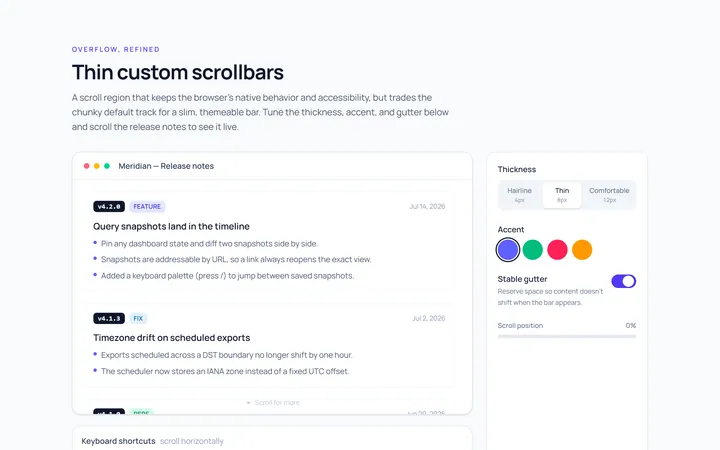
Thin Scrollbar
Originalthin custom scrollbar demo
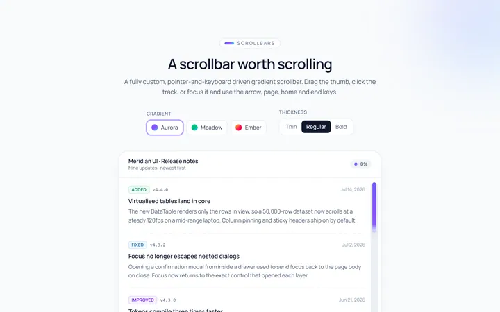
Gradient Scrollbar
Originalgradient scrollbar
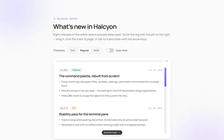
Rounded Scrollbar
Originalrounded pill scrollbar
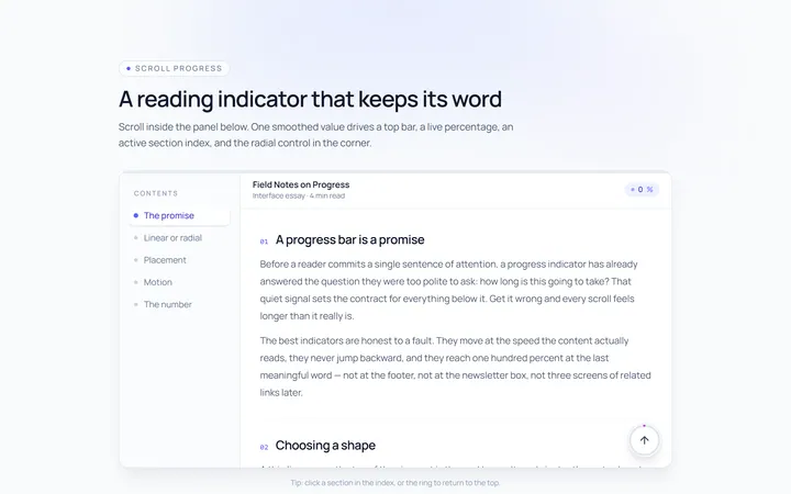
Progress Scrollbar
Originalscroll progress indicator
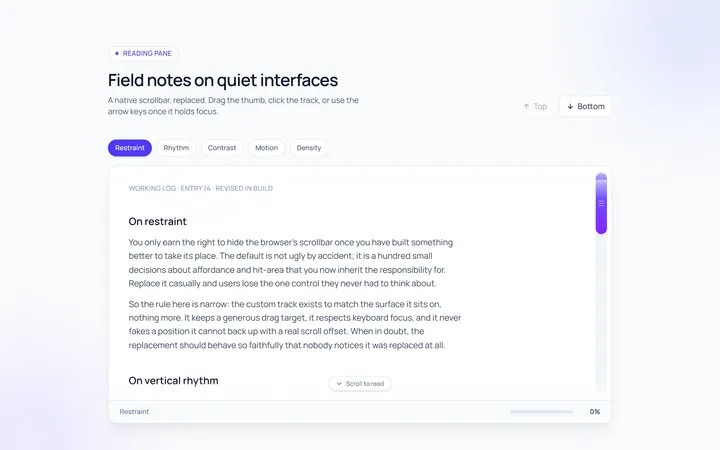
Custom Track Scrollbar
Originalcustom track and thumb scrollbar

Spotlight Hero
OriginalA centred hero with a soft radial spotlight, badge and dual call-to-action.

Split Hero
OriginalA two-column hero pairing a headline and CTAs with a product mock and social proof.

Gradient Spotlight Hero
OriginalA minimal centred hero with a soft gradient-mesh backdrop, announcement pill and dual call-to-action buttons.

App Preview Hero
OriginalA centred hero that pairs headline copy with a realistic product dashboard mock built entirely from markup, complete with browser chrome and a floating notification card.

Waitlist Capture Hero
OriginalA dark, focused hero with an inline email capture form and avatar social proof, ready for pre-launch waitlists.

Image Backdrop Hero
OriginalA cinematic full-bleed hero with a layered image-style backdrop, overlaid left-aligned copy and a trusted-by logos strip.
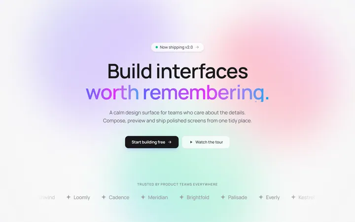
Gradient Mesh Hero with Staggered Text Reveal
OriginalA full-screen hero pairing a drifting animated gradient-mesh backdrop with a word-by-word staggered blur-in headline and a logo marquee under the fold.