

Thin Scrollbar
Original · freethin custom scrollbar demo
Copy prompt gives Claude Code, Cursor or v0 a ready-to-paste prompt that recreates this exact component.
npx shadcn@latest add https://webinnoventix.com/r/scb-thin.json"use client";
import type { CSSProperties, KeyboardEvent as ReactKeyboardEvent } from "react";
import { useCallback, useMemo, useRef, useState } from "react";
import { motion, useReducedMotion } from "motion/react";
type Thickness = "hairline" | "thin" | "comfortable";
type Accent = "indigo" | "emerald" | "rose" | "amber";
type ReleaseEntry = {
version: string;
date: string;
tag: "feature" | "fix" | "perf";
title: string;
points: string[];
};
const THICKNESS_OPTIONS: { id: Thickness; label: string; hint: string }[] = [
{ id: "hairline", label: "Hairline", hint: "4px" },
{ id: "thin", label: "Thin", hint: "8px" },
{ id: "comfortable", label: "Comfortable", hint: "12px" },
];
const ACCENT_OPTIONS: { id: Accent; label: string; swatch: string }[] = [
{ id: "indigo", label: "Indigo", swatch: "bg-indigo-500" },
{ id: "emerald", label: "Emerald", swatch: "bg-emerald-500" },
{ id: "rose", label: "Rose", swatch: "bg-rose-500" },
{ id: "amber", label: "Amber", swatch: "bg-amber-500" },
];
const RELEASES: ReleaseEntry[] = [
{
version: "4.2.0",
date: "Jul 14, 2026",
tag: "feature",
title: "Query snapshots land in the timeline",
points: [
"Pin any dashboard state and diff two snapshots side by side.",
"Snapshots are addressable by URL, so a link always reopens the exact view.",
"Added a keyboard palette (press /) to jump between saved snapshots.",
],
},
{
version: "4.1.3",
date: "Jul 2, 2026",
tag: "fix",
title: "Timezone drift on scheduled exports",
points: [
"Exports scheduled across a DST boundary no longer shift by one hour.",
"The scheduler now stores an IANA zone instead of a fixed UTC offset.",
],
},
{
version: "4.1.0",
date: "Jun 20, 2026",
tag: "perf",
title: "Streaming charts render 40% faster",
points: [
"Point decimation moved off the main thread into a worker.",
"First paint for a 1M-row series dropped from 1.8s to 1.1s on mid-tier laptops.",
"Memory ceiling for live series is now capped and configurable per board.",
],
},
{
version: "4.0.2",
date: "Jun 9, 2026",
tag: "fix",
title: "Sticky filters lost on refresh",
points: [
"Filter state now persists to the URL and survives a hard reload.",
"Cleared a race where two filters applied in the same tick would cancel out.",
],
},
{
version: "4.0.0",
date: "May 28, 2026",
tag: "feature",
title: "Boards become collaborative",
points: [
"Live cursors and presence for everyone viewing the same board.",
"Comment threads anchor to a specific chart region, not the whole panel.",
"Role-based edit locks prevent two people overwriting the same query.",
],
},
{
version: "3.9.1",
date: "May 15, 2026",
tag: "perf",
title: "Cold-start latency on serverless queries",
points: [
"Connection pools warm on the first keystroke instead of on submit.",
"Median cold query time fell from 640ms to 210ms.",
],
},
{
version: "3.9.0",
date: "May 3, 2026",
tag: "feature",
title: "Formula fields with autocomplete",
points: [
"Type-ahead now suggests columns, functions, and prior formulas.",
"Errors surface inline with the exact token that failed to parse.",
],
},
];
const SHORTCUTS: { keys: string; action: string }[] = [
{ keys: "/", action: "Open palette" },
{ keys: "G then B", action: "Go to boards" },
{ keys: "⌘ K", action: "Search everything" },
{ keys: "⇧ ?", action: "Show shortcuts" },
{ keys: "⌘ ⏎", action: "Run query" },
{ keys: "E", action: "Edit panel" },
{ keys: "⌥ D", action: "Duplicate view" },
{ keys: "Esc", action: "Dismiss overlay" },
];
const TAG_STYLES: Record<ReleaseEntry["tag"], string> = {
feature:
"bg-indigo-100 text-indigo-700 dark:bg-indigo-500/15 dark:text-indigo-300",
fix: "bg-sky-100 text-sky-700 dark:bg-sky-500/15 dark:text-sky-300",
perf: "bg-emerald-100 text-emerald-700 dark:bg-emerald-500/15 dark:text-emerald-300",
};
function moveWithinGroup(
event: ReactKeyboardEvent,
currentIndex: number,
length: number,
onSelect: (index: number) => void,
): void {
let next = currentIndex;
if (event.key === "ArrowRight" || event.key === "ArrowDown") {
next = (currentIndex + 1) % length;
} else if (event.key === "ArrowLeft" || event.key === "ArrowUp") {
next = (currentIndex - 1 + length) % length;
} else if (event.key === "Home") {
next = 0;
} else if (event.key === "End") {
next = length - 1;
} else {
return;
}
event.preventDefault();
onSelect(next);
const radios = event.currentTarget.parentElement?.querySelectorAll<HTMLButtonElement>(
'[role="radio"]',
);
radios?.[next]?.focus();
}
export default function ScbThin() {
const [thickness, setThickness] = useState<Thickness>("thin");
const [accent, setAccent] = useState<Accent>("indigo");
const [stableGutter, setStableGutter] = useState<boolean>(true);
const [progress, setProgress] = useState<number>(0);
const scrollRef = useRef<HTMLDivElement | null>(null);
const reduceMotion = useReducedMotion();
const handleScroll = useCallback(() => {
const el = scrollRef.current;
if (!el) return;
const max = el.scrollHeight - el.clientHeight;
setProgress(max <= 0 ? 0 : Math.min(1, Math.max(0, el.scrollTop / max)));
}, []);
const scrollToTop = useCallback(() => {
scrollRef.current?.scrollTo({
top: 0,
behavior: reduceMotion ? "auto" : "smooth",
});
}, [reduceMotion]);
const panelClassName = useMemo(
() =>
[
"scbthin-scroll",
`scbthin-accent-${accent}`,
stableGutter ? "scbthin-gutter-stable" : "",
]
.filter(Boolean)
.join(" "),
[accent, stableGutter],
);
const progressPct = Math.round(progress * 100);
return (
<section className="relative w-full overflow-hidden bg-slate-50 px-5 py-16 text-slate-900 sm:px-8 sm:py-20 dark:bg-slate-950 dark:text-slate-100">
<style>{`
.scbthin-scroll {
scrollbar-width: var(--scbthin-ff-width, thin);
scrollbar-color: var(--scbthin-thumb) transparent;
scrollbar-gutter: auto;
}
.scbthin-scroll.scbthin-gutter-stable {
scrollbar-gutter: stable;
}
.scbthin-scroll::-webkit-scrollbar {
width: var(--scbthin-size, 8px);
height: var(--scbthin-size, 8px);
}
.scbthin-scroll::-webkit-scrollbar-track {
background: transparent;
margin: 6px 0;
}
.scbthin-scroll::-webkit-scrollbar-thumb {
background: var(--scbthin-thumb);
border-radius: 999px;
border: 2px solid transparent;
background-clip: padding-box;
transition: background-color 160ms ease;
}
.scbthin-scroll::-webkit-scrollbar-thumb:hover {
background: var(--scbthin-thumb-hover);
}
.scbthin-scroll::-webkit-scrollbar-thumb:active {
background: var(--scbthin-thumb-hover);
}
.scbthin-scroll::-webkit-scrollbar-corner {
background: transparent;
}
.scbthin-x-scroll {
scrollbar-width: var(--scbthin-ff-width, thin);
scrollbar-color: var(--scbthin-thumb) transparent;
}
.scbthin-x-scroll::-webkit-scrollbar {
height: var(--scbthin-size, 8px);
}
.scbthin-x-scroll::-webkit-scrollbar-track {
background: transparent;
margin: 0 8px;
}
.scbthin-x-scroll::-webkit-scrollbar-thumb {
background: var(--scbthin-thumb);
border-radius: 999px;
border: 2px solid transparent;
background-clip: padding-box;
}
.scbthin-x-scroll::-webkit-scrollbar-thumb:hover {
background: var(--scbthin-thumb-hover);
}
.scbthin-accent-indigo { --scbthin-thumb: #6366f1; --scbthin-thumb-hover: #4f46e5; }
.scbthin-accent-emerald { --scbthin-thumb: #10b981; --scbthin-thumb-hover: #059669; }
.scbthin-accent-rose { --scbthin-thumb: #f43f5e; --scbthin-thumb-hover: #e11d48; }
.scbthin-accent-amber { --scbthin-thumb: #f59e0b; --scbthin-thumb-hover: #d97706; }
:is(.dark) .scbthin-accent-indigo { --scbthin-thumb: #818cf8; --scbthin-thumb-hover: #a5b4fc; }
:is(.dark) .scbthin-accent-emerald { --scbthin-thumb: #34d399; --scbthin-thumb-hover: #6ee7b7; }
:is(.dark) .scbthin-accent-rose { --scbthin-thumb: #fb7185; --scbthin-thumb-hover: #fda4af; }
:is(.dark) .scbthin-accent-amber { --scbthin-thumb: #fbbf24; --scbthin-thumb-hover: #fcd34d; }
@keyframes scbthin-rise {
from { opacity: 0; transform: translateY(10px); }
to { opacity: 1; transform: translateY(0); }
}
@keyframes scbthin-hint {
0%, 100% { transform: translateY(0); opacity: 0.55; }
50% { transform: translateY(3px); opacity: 1; }
}
.scbthin-rise {
animation: scbthin-rise 520ms cubic-bezier(0.22, 1, 0.36, 1) both;
}
.scbthin-hint {
animation: scbthin-hint 1600ms ease-in-out infinite;
}
@media (prefers-reduced-motion: reduce) {
.scbthin-rise, .scbthin-hint {
animation: none !important;
}
.scbthin-scroll::-webkit-scrollbar-thumb {
transition: none !important;
}
}
`}</style>
<div
className="mx-auto max-w-5xl"
style={
{
"--scbthin-size":
thickness === "hairline"
? "4px"
: thickness === "comfortable"
? "12px"
: "8px",
"--scbthin-ff-width":
thickness === "comfortable" ? "auto" : "thin",
} as CSSProperties
}
>
<header className={reduceMotion ? "" : "scbthin-rise"}>
<p className="text-xs font-semibold uppercase tracking-[0.2em] text-indigo-600 dark:text-indigo-400">
Overflow, refined
</p>
<h2 className="mt-3 text-3xl font-bold tracking-tight sm:text-4xl">
Thin custom scrollbars
</h2>
<p className="mt-3 max-w-2xl text-base leading-relaxed text-slate-600 dark:text-slate-400">
A scroll region that keeps the browser's native behavior and
accessibility, but trades the chunky default track for a slim,
themeable bar. Tune the thickness, accent, and gutter below and
scroll the release notes to see it live.
</p>
</header>
<div className="mt-8 grid gap-6 lg:grid-cols-[minmax(0,1fr)_18rem]">
{/* Controls */}
<div className="order-2 flex flex-col gap-6 rounded-2xl border border-slate-200 bg-white p-5 lg:order-2 dark:border-slate-800 dark:bg-slate-900">
{/* Thickness */}
<fieldset>
<legend
id="scbthin-thickness-label"
className="mb-2 text-sm font-semibold text-slate-800 dark:text-slate-200"
>
Thickness
</legend>
<div
role="radiogroup"
aria-labelledby="scbthin-thickness-label"
className="flex gap-1.5 rounded-xl bg-slate-100 p-1 dark:bg-slate-800"
>
{THICKNESS_OPTIONS.map((option, index) => {
const active = option.id === thickness;
return (
<button
key={option.id}
type="button"
role="radio"
aria-checked={active}
tabIndex={active ? 0 : -1}
onClick={() => setThickness(option.id)}
onKeyDown={(event) =>
moveWithinGroup(
event,
index,
THICKNESS_OPTIONS.length,
(i) => setThickness(THICKNESS_OPTIONS[i].id),
)
}
className={[
"flex-1 rounded-lg px-2 py-2 text-center text-xs font-medium transition-colors outline-none",
"focus-visible:ring-2 focus-visible:ring-indigo-500 focus-visible:ring-offset-2 focus-visible:ring-offset-white dark:focus-visible:ring-offset-slate-900",
active
? "bg-white text-slate-900 shadow-sm dark:bg-slate-950 dark:text-white"
: "text-slate-500 hover:text-slate-800 dark:text-slate-400 dark:hover:text-slate-200",
].join(" ")}
>
<span className="block">{option.label}</span>
<span className="mt-0.5 block text-[10px] tabular-nums text-slate-400 dark:text-slate-500">
{option.hint}
</span>
</button>
);
})}
</div>
</fieldset>
{/* Accent */}
<fieldset>
<legend
id="scbthin-accent-label"
className="mb-2 text-sm font-semibold text-slate-800 dark:text-slate-200"
>
Accent
</legend>
<div
role="radiogroup"
aria-labelledby="scbthin-accent-label"
className="flex gap-2"
>
{ACCENT_OPTIONS.map((option, index) => {
const active = option.id === accent;
return (
<button
key={option.id}
type="button"
role="radio"
aria-checked={active}
aria-label={option.label}
tabIndex={active ? 0 : -1}
onClick={() => setAccent(option.id)}
onKeyDown={(event) =>
moveWithinGroup(
event,
index,
ACCENT_OPTIONS.length,
(i) => setAccent(ACCENT_OPTIONS[i].id),
)
}
className={[
"relative h-9 w-9 rounded-full outline-none transition-transform",
"focus-visible:ring-2 focus-visible:ring-slate-400 focus-visible:ring-offset-2 focus-visible:ring-offset-white dark:focus-visible:ring-offset-slate-900",
active
? "ring-2 ring-slate-900 ring-offset-2 ring-offset-white dark:ring-white dark:ring-offset-slate-900"
: "hover:scale-105",
].join(" ")}
>
<span
className={[
"block h-full w-full rounded-full",
option.swatch,
].join(" ")}
aria-hidden="true"
/>
</button>
);
})}
</div>
</fieldset>
{/* Stable gutter switch */}
<div className="flex items-start justify-between gap-3">
<div>
<p
id="scbthin-gutter-label"
className="text-sm font-semibold text-slate-800 dark:text-slate-200"
>
Stable gutter
</p>
<p className="mt-0.5 text-xs leading-relaxed text-slate-500 dark:text-slate-400">
Reserve space so content doesn't shift when the bar
appears.
</p>
</div>
<button
type="button"
role="switch"
aria-checked={stableGutter}
aria-labelledby="scbthin-gutter-label"
onClick={() => setStableGutter((prev) => !prev)}
className={[
"relative mt-0.5 inline-flex h-6 w-11 shrink-0 items-center rounded-full transition-colors outline-none",
"focus-visible:ring-2 focus-visible:ring-indigo-500 focus-visible:ring-offset-2 focus-visible:ring-offset-white dark:focus-visible:ring-offset-slate-900",
stableGutter
? "bg-indigo-600 dark:bg-indigo-500"
: "bg-slate-300 dark:bg-slate-700",
].join(" ")}
>
<span
aria-hidden="true"
className={[
"inline-block h-5 w-5 transform rounded-full bg-white shadow transition-transform",
stableGutter ? "translate-x-5" : "translate-x-0.5",
].join(" ")}
/>
</button>
</div>
{/* Live progress */}
<div aria-live="polite">
<div className="flex items-center justify-between text-xs font-medium text-slate-500 dark:text-slate-400">
<span>Scroll position</span>
<span className="tabular-nums">{progressPct}%</span>
</div>
<div
className="mt-2 h-1.5 w-full overflow-hidden rounded-full bg-slate-200 dark:bg-slate-800"
role="progressbar"
aria-valuemin={0}
aria-valuemax={100}
aria-valuenow={progressPct}
aria-label="Release notes scroll progress"
>
<motion.div
className="h-full rounded-full bg-indigo-600 dark:bg-indigo-400"
initial={false}
animate={{ width: `${progressPct}%` }}
transition={
reduceMotion
? { duration: 0 }
: { type: "spring", stiffness: 260, damping: 30 }
}
/>
</div>
</div>
</div>
{/* Scroll panel */}
<div className="order-1 lg:order-1 lg:col-start-1 lg:row-start-1">
<div className="relative rounded-2xl border border-slate-200 bg-white shadow-sm dark:border-slate-800 dark:bg-slate-900">
<div className="flex items-center justify-between gap-3 border-b border-slate-200 px-5 py-3 dark:border-slate-800">
<div className="flex items-center gap-2">
<span className="h-2.5 w-2.5 rounded-full bg-rose-400" />
<span className="h-2.5 w-2.5 rounded-full bg-amber-400" />
<span className="h-2.5 w-2.5 rounded-full bg-emerald-400" />
<h3 className="ml-2 text-sm font-semibold text-slate-700 dark:text-slate-300">
Meridian — Release notes
</h3>
</div>
<button
type="button"
onClick={scrollToTop}
disabled={progress <= 0.001}
className={[
"rounded-lg px-2.5 py-1 text-xs font-medium transition-colors outline-none",
"focus-visible:ring-2 focus-visible:ring-indigo-500 focus-visible:ring-offset-2 focus-visible:ring-offset-white dark:focus-visible:ring-offset-slate-900",
"text-indigo-600 hover:bg-indigo-50 disabled:pointer-events-none disabled:opacity-0 dark:text-indigo-400 dark:hover:bg-indigo-500/10",
].join(" ")}
>
Back to top
</button>
</div>
<div
ref={scrollRef}
onScroll={handleScroll}
tabIndex={0}
role="region"
aria-label="Meridian release notes, scrollable"
className={[
panelClassName,
"max-h-[26rem] overflow-y-auto px-5 py-5 outline-none",
"focus-visible:ring-2 focus-visible:ring-inset focus-visible:ring-indigo-500",
].join(" ")}
>
<ol className="space-y-5">
{RELEASES.map((entry) => (
<li
key={entry.version}
className="rounded-xl border border-slate-100 p-4 dark:border-slate-800/70"
>
<div className="flex flex-wrap items-center gap-2">
<span className="rounded-md bg-slate-900 px-2 py-0.5 font-mono text-xs font-semibold text-white dark:bg-slate-100 dark:text-slate-900">
v{entry.version}
</span>
<span
className={[
"rounded-md px-2 py-0.5 text-[11px] font-semibold uppercase tracking-wide",
TAG_STYLES[entry.tag],
].join(" ")}
>
{entry.tag}
</span>
<time className="ml-auto text-xs text-slate-400 dark:text-slate-500">
{entry.date}
</time>
</div>
<h4 className="mt-3 text-base font-semibold text-slate-900 dark:text-slate-100">
{entry.title}
</h4>
<ul className="mt-2 space-y-1.5">
{entry.points.map((point) => (
<li
key={point}
className="flex gap-2 text-sm leading-relaxed text-slate-600 dark:text-slate-400"
>
<svg
viewBox="0 0 16 16"
className="mt-1.5 h-1.5 w-1.5 shrink-0 fill-indigo-500 dark:fill-indigo-400"
aria-hidden="true"
>
<circle cx="8" cy="8" r="8" />
</svg>
<span>{point}</span>
</li>
))}
</ul>
</li>
))}
</ol>
<p className="mt-5 text-center text-xs text-slate-400 dark:text-slate-500">
You've reached the end of the changelog.
</p>
</div>
{progress <= 0.001 ? (
<div
aria-hidden="true"
className="pointer-events-none absolute inset-x-0 bottom-3 flex justify-center"
>
<span
className={[
"inline-flex items-center gap-1 text-xs text-slate-400 dark:text-slate-500",
reduceMotion ? "" : "scbthin-hint",
].join(" ")}
>
<svg
viewBox="0 0 20 20"
className="h-3.5 w-3.5 fill-current"
aria-hidden="true"
>
<path d="M10 13.5 4.5 8h11L10 13.5Z" />
</svg>
Scroll for more
</span>
</div>
) : null}
</div>
{/* Horizontal thin scrollbar demo */}
<div className="mt-5 rounded-2xl border border-slate-200 bg-white p-4 dark:border-slate-800 dark:bg-slate-900">
<h3 className="text-sm font-semibold text-slate-700 dark:text-slate-300">
Keyboard shortcuts
<span className="ml-2 font-normal text-slate-400 dark:text-slate-500">
scroll horizontally
</span>
</h3>
<div
tabIndex={0}
role="region"
aria-label="Keyboard shortcuts, scrollable horizontally"
className={[
"scbthin-x-scroll",
`scbthin-accent-${accent}`,
"mt-3 flex gap-3 overflow-x-auto pb-3 outline-none",
"focus-visible:ring-2 focus-visible:ring-inset focus-visible:ring-indigo-500 rounded-lg",
].join(" ")}
>
{SHORTCUTS.map((shortcut) => (
<div
key={shortcut.action}
className="flex min-w-[10rem] shrink-0 flex-col gap-2 rounded-xl border border-slate-200 bg-slate-50 p-3 dark:border-slate-800 dark:bg-slate-950"
>
<kbd className="w-fit rounded-md border border-slate-300 bg-white px-2 py-1 font-mono text-xs font-semibold text-slate-700 shadow-sm dark:border-slate-700 dark:bg-slate-800 dark:text-slate-200">
{shortcut.keys}
</kbd>
<span className="text-sm text-slate-600 dark:text-slate-400">
{shortcut.action}
</span>
</div>
))}
</div>
</div>
</div>
</div>
</div>
</section>
);
}Dependencies
Licence
Built by Web Innoventix. Free for personal and commercial use, no attribution required.
Built by Web Innoventix
Need a custom interface, a full website, or SEO that gets you cited by AI? We design, build and rank it end to end.
Get a free quoteSimilar components
Browse all →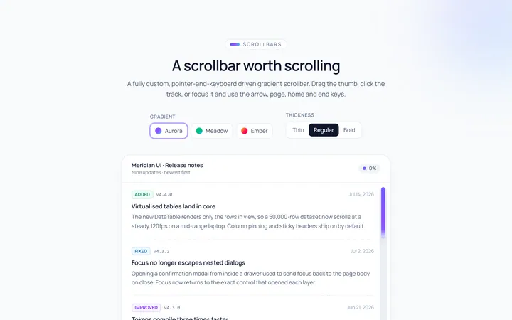
Gradient Scrollbar
Originalgradient scrollbar
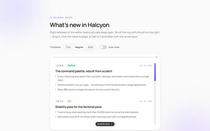
Rounded Scrollbar
Originalrounded pill scrollbar
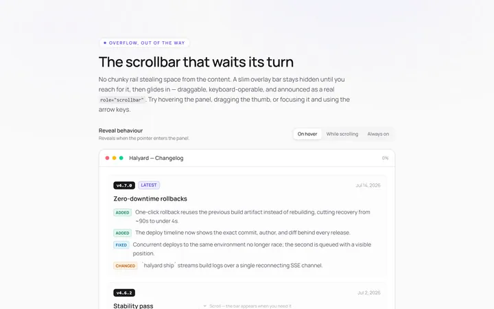
Hidden Hover Scrollbar
Originalscrollbar that appears on hover
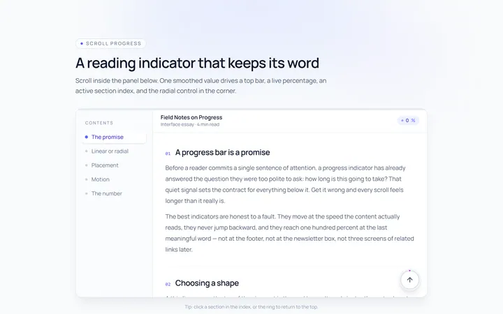
Progress Scrollbar
Originalscroll progress indicator
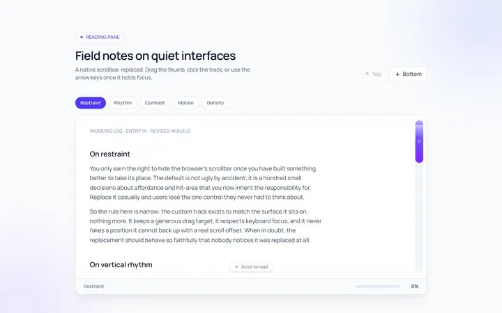
Custom Track Scrollbar
Originalcustom track and thumb scrollbar

Spotlight Hero
OriginalA centred hero with a soft radial spotlight, badge and dual call-to-action.

Split Hero
OriginalA two-column hero pairing a headline and CTAs with a product mock and social proof.

Gradient Spotlight Hero
OriginalA minimal centred hero with a soft gradient-mesh backdrop, announcement pill and dual call-to-action buttons.

App Preview Hero
OriginalA centred hero that pairs headline copy with a realistic product dashboard mock built entirely from markup, complete with browser chrome and a floating notification card.

Waitlist Capture Hero
OriginalA dark, focused hero with an inline email capture form and avatar social proof, ready for pre-launch waitlists.

Image Backdrop Hero
OriginalA cinematic full-bleed hero with a layered image-style backdrop, overlaid left-aligned copy and a trusted-by logos strip.
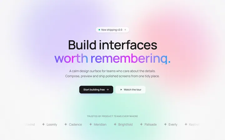
Gradient Mesh Hero with Staggered Text Reveal
OriginalA full-screen hero pairing a drifting animated gradient-mesh backdrop with a word-by-word staggered blur-in headline and a logo marquee under the fold.