

Gradient Scrollbar
Original · freegradient scrollbar
Copy prompt gives Claude Code, Cursor or v0 a ready-to-paste prompt that recreates this exact component.
npx shadcn@latest add https://webinnoventix.com/r/scb-gradient.json"use client";
import {
useCallback,
useEffect,
useId,
useRef,
useState,
type CSSProperties,
type KeyboardEvent as ReactKeyboardEvent,
type PointerEvent as ReactPointerEvent,
} from "react";
import { motion, useReducedMotion } from "motion/react";
type ThemeKey = "aurora" | "meadow" | "ember";
type ThicknessKey = "thin" | "regular" | "bold";
type ThemeDef = {
label: string;
grad: string;
swatch: string;
checked: string;
};
type Entry = {
version: string;
date: string;
tag: "Added" | "Fixed" | "Changed" | "Security" | "Improved";
title: string;
body: string;
};
const THEMES: Record<ThemeKey, ThemeDef> = {
aurora: {
label: "Aurora",
grad: "from-indigo-500 via-violet-500 to-sky-400",
swatch: "from-indigo-500 via-violet-500 to-sky-400",
checked: "peer-checked:border-violet-400 peer-checked:ring-2 peer-checked:ring-violet-400/60",
},
meadow: {
label: "Meadow",
grad: "from-emerald-400 via-emerald-500 to-sky-400",
swatch: "from-emerald-400 via-emerald-500 to-sky-400",
checked: "peer-checked:border-emerald-400 peer-checked:ring-2 peer-checked:ring-emerald-400/60",
},
ember: {
label: "Ember",
grad: "from-amber-400 via-rose-500 to-rose-600",
swatch: "from-amber-400 via-rose-500 to-rose-600",
checked: "peer-checked:border-rose-400 peer-checked:ring-2 peer-checked:ring-rose-400/60",
},
};
const THICKNESS: Record<ThicknessKey, { label: string; w: number }> = {
thin: { label: "Thin", w: 6 },
regular: { label: "Regular", w: 10 },
bold: { label: "Bold", w: 14 },
};
const TAG_STYLE: Record<Entry["tag"], string> = {
Added:
"bg-emerald-50 text-emerald-700 ring-emerald-600/20 dark:bg-emerald-500/10 dark:text-emerald-300 dark:ring-emerald-400/25",
Fixed:
"bg-sky-50 text-sky-700 ring-sky-600/20 dark:bg-sky-500/10 dark:text-sky-300 dark:ring-sky-400/25",
Changed:
"bg-amber-50 text-amber-700 ring-amber-600/20 dark:bg-amber-500/10 dark:text-amber-300 dark:ring-amber-400/25",
Security:
"bg-rose-50 text-rose-700 ring-rose-600/20 dark:bg-rose-500/10 dark:text-rose-300 dark:ring-rose-400/25",
Improved:
"bg-violet-50 text-violet-700 ring-violet-600/20 dark:bg-violet-500/10 dark:text-violet-300 dark:ring-violet-400/25",
};
const ENTRIES: Entry[] = [
{
version: "v4.4.0",
date: "Jul 14, 2026",
tag: "Added",
title: "Virtualised tables land in core",
body: "The new DataTable renders only the rows in view, so a 50,000-row dataset now scrolls at a steady 120fps on a mid-range laptop. Column pinning and sticky headers ship on by default.",
},
{
version: "v4.3.2",
date: "Jul 2, 2026",
tag: "Fixed",
title: "Focus no longer escapes nested dialogs",
body: "Opening a confirmation modal from inside a drawer used to send focus back to the page body on close. Focus now returns to the exact control that opened each layer.",
},
{
version: "v4.3.0",
date: "Jun 21, 2026",
tag: "Improved",
title: "Tokens compile three times faster",
body: "We moved theme generation off the main thread. A full rebuild of the 1,200-token palette dropped from 4.1s to 1.3s in our local benchmarks.",
},
{
version: "v4.2.5",
date: "Jun 10, 2026",
tag: "Changed",
title: "Button padding follows the 4px grid",
body: "Small buttons gained two pixels of horizontal padding to align with the spacing scale. Existing overrides are respected; only the defaults moved.",
},
{
version: "v4.2.1",
date: "May 30, 2026",
tag: "Security",
title: "Patched a sanitiser bypass in rich text",
body: "A crafted paste payload could slip an unescaped attribute past the editor. Upgrade immediately if you accept pasted HTML from untrusted users.",
},
{
version: "v4.2.0",
date: "May 18, 2026",
tag: "Added",
title: "A command palette, keyboard-first",
body: "Press Cmd or Ctrl+K anywhere to search actions, pages and settings. Every result is reachable without a mouse and announces itself to screen readers.",
},
{
version: "v4.1.4",
date: "May 6, 2026",
tag: "Fixed",
title: "Date picker respects the user's locale",
body: "Weeks now start on the correct day for 38 additional locales, and the year selector no longer clips beyond 2099.",
},
{
version: "v4.1.0",
date: "Apr 24, 2026",
tag: "Improved",
title: "Contrast bumped across every surface",
body: "Muted text now clears WCAG AA on both themes. We re-checked sixty component states and fixed the seven that fell short.",
},
{
version: "v4.0.0",
date: "Apr 3, 2026",
tag: "Changed",
title: "The 4.0 baseline",
body: "Dropped the legacy CSS reset, moved to logical properties throughout, and renamed six props for consistency. Read the migration guide before upgrading.",
},
];
const MIN_THUMB = 40;
function clamp(value: number, lo: number, hi: number): number {
return Math.min(hi, Math.max(lo, value));
}
export default function ScbGradient() {
const reduce = useReducedMotion();
const uid = useId();
const contentId = `${uid}-feed`;
const themeName = `${uid}-theme`;
const thickName = `${uid}-thick`;
const contentRef = useRef<HTMLDivElement | null>(null);
const trackRef = useRef<HTMLDivElement | null>(null);
const drag = useRef<{ startY: number; startTop: number } | null>(null);
const [theme, setTheme] = useState<ThemeKey>("aurora");
const [thickness, setThickness] = useState<ThicknessKey>("regular");
const [ratio, setRatio] = useState(0);
const [thumbFraction, setThumbFraction] = useState(1);
const [trackH, setTrackH] = useState(0);
const [dragging, setDragging] = useState(false);
const [scrollable, setScrollable] = useState(false);
const measure = useCallback(() => {
const el = contentRef.current;
if (!el) return;
const max = el.scrollHeight - el.clientHeight;
setScrollable(max > 1);
setRatio(max > 0 ? clamp(el.scrollTop / max, 0, 1) : 0);
setThumbFraction(el.scrollHeight > 0 ? el.clientHeight / el.scrollHeight : 1);
}, []);
useEffect(() => {
measure();
const content = contentRef.current;
const track = trackRef.current;
if (track) setTrackH(track.clientHeight);
const ro = new ResizeObserver(() => {
if (trackRef.current) setTrackH(trackRef.current.clientHeight);
measure();
});
if (content) ro.observe(content);
if (track) ro.observe(track);
return () => ro.disconnect();
}, [measure]);
const thumbW = THICKNESS[thickness].w;
const trackPad = 4;
const trackWidth = thumbW + trackPad * 2;
const thumbPx = trackH > 0 ? Math.max(MIN_THUMB, Math.round(thumbFraction * trackH)) : 0;
const travel = Math.max(0, trackH - thumbPx);
const thumbTop = Math.round(ratio * travel);
const percent = Math.round(ratio * 100);
const activeTheme = THEMES[theme];
const onThumbDown = (e: ReactPointerEvent<HTMLDivElement>) => {
e.stopPropagation();
const el = contentRef.current;
if (!el) return;
drag.current = { startY: e.clientY, startTop: el.scrollTop };
trackRef.current?.setPointerCapture(e.pointerId);
setDragging(true);
};
const onTrackDown = (e: ReactPointerEvent<HTMLDivElement>) => {
if (e.target !== e.currentTarget) return;
const el = contentRef.current;
if (!el || travel <= 0) return;
const rect = e.currentTarget.getBoundingClientRect();
const max = el.scrollHeight - el.clientHeight;
const y = e.clientY - rect.top - thumbPx / 2;
el.scrollTop = clamp(y / travel, 0, 1) * max;
drag.current = { startY: e.clientY, startTop: el.scrollTop };
e.currentTarget.setPointerCapture(e.pointerId);
setDragging(true);
};
const onPointerMove = (e: ReactPointerEvent<HTMLDivElement>) => {
if (!drag.current) return;
const el = contentRef.current;
if (!el || travel <= 0) return;
const max = el.scrollHeight - el.clientHeight;
const dy = e.clientY - drag.current.startY;
el.scrollTop = clamp(drag.current.startTop + (dy / travel) * max, 0, max);
};
const onPointerUp = (e: ReactPointerEvent<HTMLDivElement>) => {
if (!drag.current) return;
drag.current = null;
setDragging(false);
if (trackRef.current?.hasPointerCapture(e.pointerId)) {
trackRef.current.releasePointerCapture(e.pointerId);
}
};
const onThumbKey = (e: ReactKeyboardEvent<HTMLDivElement>) => {
const el = contentRef.current;
if (!el) return;
const max = el.scrollHeight - el.clientHeight;
const line = 56;
const page = el.clientHeight * 0.85;
const keys = ["ArrowUp", "ArrowDown", "PageUp", "PageDown", "Home", "End"];
if (!keys.includes(e.key)) return;
e.preventDefault();
let next = el.scrollTop;
if (e.key === "ArrowDown") next += line;
else if (e.key === "ArrowUp") next -= line;
else if (e.key === "PageDown") next += page;
else if (e.key === "PageUp") next -= page;
else if (e.key === "Home") next = 0;
else if (e.key === "End") next = max;
el.scrollTop = clamp(next, 0, max);
};
const thumbStyle: CSSProperties = {
top: thumbTop,
height: thumbPx,
left: trackPad,
right: trackPad,
backgroundSize: "100% 220%",
};
return (
<section className="relative w-full overflow-hidden bg-slate-50 px-4 py-16 text-slate-900 sm:px-6 sm:py-24 dark:bg-slate-950 dark:text-slate-100">
<style>{`
@keyframes scbgr-drift {
0% { background-position: 50% 0%; }
100% { background-position: 50% 120%; }
}
@keyframes scbgr-shine {
0% { transform: translateY(-160%); }
60%, 100% { transform: translateY(420%); }
}
.scbgr-scroll { scrollbar-width: none; -ms-overflow-style: none; }
.scbgr-scroll::-webkit-scrollbar { width: 0; height: 0; display: none; }
.scbgr-drift { animation: scbgr-drift 5.5s linear infinite; }
.scbgr-shine { animation: scbgr-shine 3.6s ease-in-out infinite; }
@media (prefers-reduced-motion: reduce) {
.scbgr-drift, .scbgr-shine { animation: none !important; }
}
`}</style>
<div className="pointer-events-none absolute -top-24 right-[-6rem] h-72 w-72 rounded-full bg-gradient-to-br from-violet-300/40 to-sky-300/30 blur-3xl dark:from-violet-600/20 dark:to-sky-600/15" />
<div className="relative mx-auto w-full max-w-5xl">
<div className="mx-auto max-w-2xl text-center">
<span className="inline-flex items-center gap-2 rounded-full border border-slate-200 bg-white/70 px-3 py-1 text-xs font-medium uppercase tracking-[0.18em] text-slate-500 backdrop-blur dark:border-slate-800 dark:bg-slate-900/70 dark:text-slate-400">
<span className={`h-1.5 w-6 rounded-full bg-gradient-to-r ${activeTheme.swatch}`} />
Scrollbars
</span>
<h2 className="mt-5 text-3xl font-semibold tracking-tight text-slate-900 sm:text-4xl dark:text-white">
A scrollbar worth scrolling
</h2>
<p className="mt-3 text-base leading-relaxed text-slate-600 dark:text-slate-400">
A fully custom, pointer-and-keyboard driven gradient scrollbar. Drag the thumb,
click the track, or focus it and use the arrow, page, home and end keys.
</p>
</div>
{/* Controls */}
<div className="mx-auto mt-8 flex max-w-2xl flex-col items-stretch justify-center gap-4 sm:flex-row sm:items-end sm:gap-8">
<fieldset>
<legend className="mb-2 block text-xs font-semibold uppercase tracking-wider text-slate-500 dark:text-slate-400">
Gradient
</legend>
<div className="flex gap-2">
{(Object.keys(THEMES) as ThemeKey[]).map((key) => (
<label key={key} className="cursor-pointer">
<input
type="radio"
name={themeName}
value={key}
checked={theme === key}
onChange={() => setTheme(key)}
className="peer sr-only"
/>
<span
className={`flex items-center gap-2 rounded-xl border border-slate-200 bg-white px-3 py-2 text-sm font-medium text-slate-600 transition ${THEMES[key].checked} peer-focus-visible:ring-2 peer-focus-visible:ring-slate-900 peer-focus-visible:ring-offset-2 peer-focus-visible:ring-offset-slate-50 dark:border-slate-800 dark:bg-slate-900 dark:text-slate-300 dark:peer-focus-visible:ring-white dark:peer-focus-visible:ring-offset-slate-950`}
>
<span className={`h-4 w-4 rounded-full bg-gradient-to-br ${THEMES[key].swatch}`} />
{THEMES[key].label}
</span>
</label>
))}
</div>
</fieldset>
<fieldset>
<legend className="mb-2 block text-xs font-semibold uppercase tracking-wider text-slate-500 dark:text-slate-400">
Thickness
</legend>
<div className="inline-flex rounded-xl border border-slate-200 bg-white p-1 dark:border-slate-800 dark:bg-slate-900">
{(Object.keys(THICKNESS) as ThicknessKey[]).map((key) => (
<label key={key} className="cursor-pointer">
<input
type="radio"
name={thickName}
value={key}
checked={thickness === key}
onChange={() => setThickness(key)}
className="peer sr-only"
/>
<span className="block rounded-lg px-3 py-1.5 text-sm font-medium text-slate-500 transition peer-checked:bg-slate-900 peer-checked:text-white peer-focus-visible:ring-2 peer-focus-visible:ring-slate-900 peer-focus-visible:ring-offset-2 peer-focus-visible:ring-offset-white dark:text-slate-400 dark:peer-checked:bg-white dark:peer-checked:text-slate-900 dark:peer-focus-visible:ring-white dark:peer-focus-visible:ring-offset-slate-900">
{THICKNESS[key].label}
</span>
</label>
))}
</div>
</fieldset>
</div>
{/* Card */}
<motion.div
initial={reduce ? false : { opacity: 0, y: 18 }}
whileInView={reduce ? undefined : { opacity: 1, y: 0 }}
viewport={{ once: true, margin: "-80px" }}
transition={{ duration: 0.55, ease: [0.22, 1, 0.36, 1] }}
className="mx-auto mt-10 max-w-2xl overflow-hidden rounded-3xl border border-slate-200 bg-white shadow-xl shadow-slate-900/5 dark:border-slate-800 dark:bg-slate-900 dark:shadow-black/30"
>
<header className="flex items-center justify-between gap-4 border-b border-slate-200 px-5 py-4 sm:px-6 dark:border-slate-800">
<div>
<h3 className="text-sm font-semibold text-slate-900 dark:text-white">
Meridian UI · Release notes
</h3>
<p className="text-xs text-slate-500 dark:text-slate-400">
Nine updates · newest first
</p>
</div>
<span
aria-hidden="true"
className="inline-flex items-center gap-2 rounded-full bg-slate-100 px-2.5 py-1 text-xs font-semibold tabular-nums text-slate-600 dark:bg-slate-800 dark:text-slate-300"
>
<span className={`h-2 w-2 rounded-full bg-gradient-to-br ${activeTheme.swatch}`} />
{percent}%
</span>
</header>
<div className="relative">
<div
id={contentId}
ref={contentRef}
onScroll={measure}
tabIndex={0}
role="region"
aria-label="Meridian UI release notes, scrollable region"
className="scbgr-scroll h-[26rem] overflow-y-auto py-5 pl-5 focus:outline-none focus-visible:ring-2 focus-visible:ring-inset focus-visible:ring-slate-400 sm:pl-6 dark:focus-visible:ring-slate-500"
style={{ paddingRight: trackWidth + 22 }}
>
<ol className="space-y-5">
{ENTRIES.map((entry) => (
<li
key={entry.version}
className="border-b border-dashed border-slate-200 pb-5 last:border-none last:pb-0 dark:border-slate-800"
>
<div className="flex items-center gap-2">
<span
className={`inline-flex rounded-md px-2 py-0.5 text-[11px] font-semibold uppercase tracking-wide ring-1 ring-inset ${TAG_STYLE[entry.tag]}`}
>
{entry.tag}
</span>
<span className="font-mono text-xs font-medium text-slate-500 dark:text-slate-400">
{entry.version}
</span>
<span className="ml-auto text-xs text-slate-400 dark:text-slate-500">
{entry.date}
</span>
</div>
<h4 className="mt-2 text-[15px] font-semibold text-slate-900 dark:text-white">
{entry.title}
</h4>
<p className="mt-1 text-sm leading-relaxed text-slate-600 dark:text-slate-400">
{entry.body}
</p>
</li>
))}
</ol>
</div>
{/* Edge fades */}
<div
aria-hidden="true"
className="pointer-events-none absolute inset-x-0 top-0 h-8 bg-gradient-to-b from-white to-transparent transition-opacity duration-200 dark:from-slate-900"
style={{ opacity: ratio > 0.02 ? 1 : 0 }}
/>
<div
aria-hidden="true"
className="pointer-events-none absolute inset-x-0 bottom-0 h-8 bg-gradient-to-t from-white to-transparent transition-opacity duration-200 dark:from-slate-900"
style={{ opacity: scrollable && ratio < 0.98 ? 1 : 0 }}
/>
{/* Custom gradient scrollbar */}
<div
ref={trackRef}
onPointerDown={onTrackDown}
onPointerMove={onPointerMove}
onPointerUp={onPointerUp}
onPointerCancel={onPointerUp}
className="absolute inset-y-3 right-2 rounded-full bg-slate-200/70 backdrop-blur-sm dark:bg-slate-800/70"
style={{ width: trackWidth }}
>
<div
role="scrollbar"
aria-controls={contentId}
aria-orientation="vertical"
aria-valuemin={0}
aria-valuemax={100}
aria-valuenow={percent}
aria-valuetext={`${percent} percent scrolled`}
aria-label="Scroll release notes"
aria-disabled={!scrollable}
tabIndex={scrollable ? 0 : -1}
onPointerDown={onThumbDown}
onKeyDown={onThumbKey}
className={`scbgr-drift absolute cursor-grab touch-none rounded-full bg-gradient-to-b ${activeTheme.grad} shadow-lg shadow-slate-900/20 outline-none transition-[filter,box-shadow] duration-150 focus-visible:ring-2 focus-visible:ring-slate-900 focus-visible:ring-offset-2 focus-visible:ring-offset-slate-100 active:cursor-grabbing dark:focus-visible:ring-white dark:focus-visible:ring-offset-slate-800 ${dragging ? "brightness-110" : ""}`}
style={thumbStyle}
>
<span className="pointer-events-none absolute inset-0 overflow-hidden rounded-full">
<span className="scbgr-shine absolute inset-x-0 top-0 h-1/4 bg-gradient-to-b from-transparent via-white/70 to-transparent" />
</span>
</div>
</div>
</div>
</motion.div>
<p className="mx-auto mt-4 max-w-2xl text-center text-xs text-slate-400 dark:text-slate-500">
The gradient thumb is a real <code className="rounded bg-slate-100 px-1 py-0.5 font-mono text-slate-500 dark:bg-slate-800 dark:text-slate-400">role="scrollbar"</code> control with live value and full keyboard support.
</p>
</div>
</section>
);
}Dependencies
Licence
Built by Web Innoventix. Free for personal and commercial use, no attribution required.
Built by Web Innoventix
Need a custom interface, a full website, or SEO that gets you cited by AI? We design, build and rank it end to end.
Get a free quoteSimilar components
Browse all →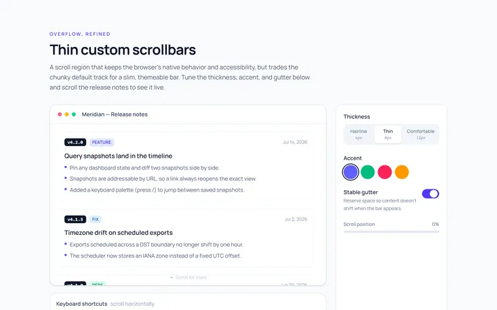
Thin Scrollbar
Originalthin custom scrollbar demo
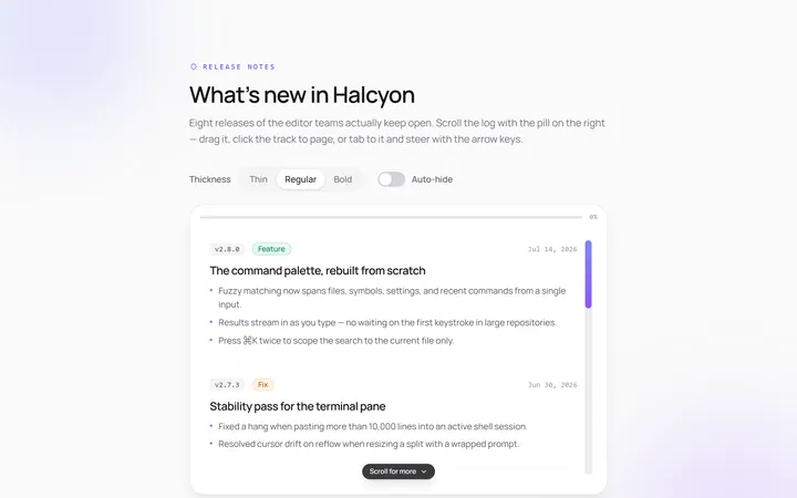
Rounded Scrollbar
Originalrounded pill scrollbar
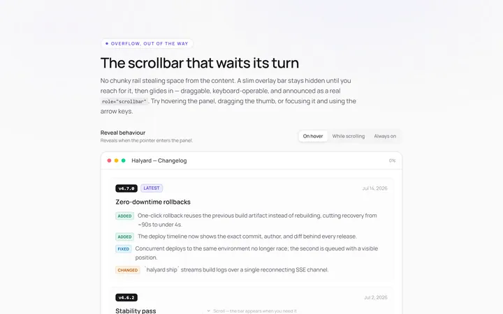
Hidden Hover Scrollbar
Originalscrollbar that appears on hover
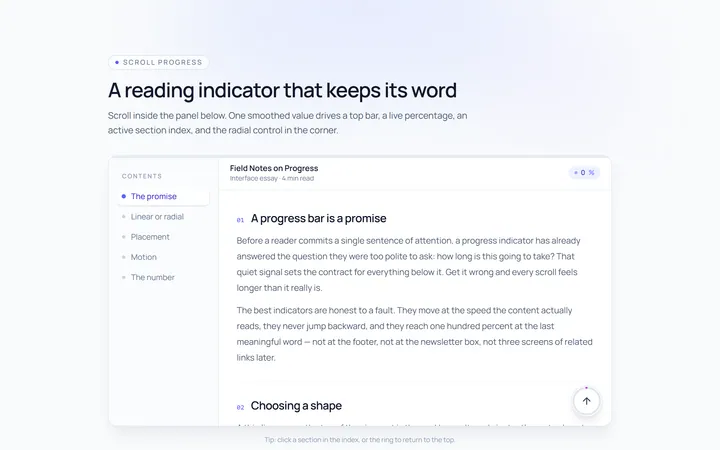
Progress Scrollbar
Originalscroll progress indicator
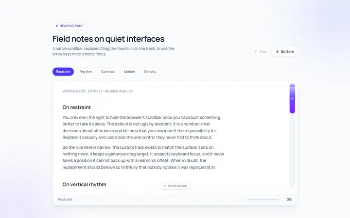
Custom Track Scrollbar
Originalcustom track and thumb scrollbar

Spotlight Hero
OriginalA centred hero with a soft radial spotlight, badge and dual call-to-action.

Split Hero
OriginalA two-column hero pairing a headline and CTAs with a product mock and social proof.

Gradient Spotlight Hero
OriginalA minimal centred hero with a soft gradient-mesh backdrop, announcement pill and dual call-to-action buttons.

App Preview Hero
OriginalA centred hero that pairs headline copy with a realistic product dashboard mock built entirely from markup, complete with browser chrome and a floating notification card.

Waitlist Capture Hero
OriginalA dark, focused hero with an inline email capture form and avatar social proof, ready for pre-launch waitlists.

Image Backdrop Hero
OriginalA cinematic full-bleed hero with a layered image-style backdrop, overlaid left-aligned copy and a trusted-by logos strip.
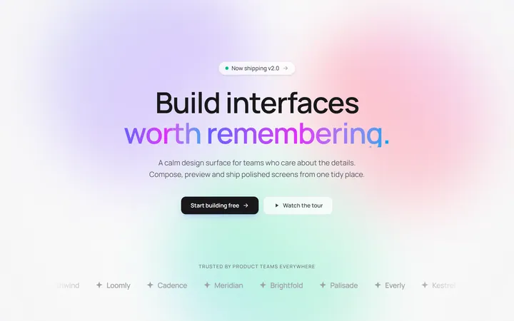
Gradient Mesh Hero with Staggered Text Reveal
OriginalA full-screen hero pairing a drifting animated gradient-mesh backdrop with a word-by-word staggered blur-in headline and a logo marquee under the fold.