

Checkbox Card Toggle
Original · freeselectable card checkboxes
byWeb InnoventixReact + Tailwind
tglcheckboxcardtoggles
Copy prompt gives Claude Code, Cursor or v0 a ready-to-paste prompt that recreates this exact component.
npx shadcn@latest add https://webinnoventix.com/r/tgl-checkbox-card.jsontgl-checkbox-card.tsx
"use client";
import { useId, useState, type ReactNode } from "react";
import { motion, useReducedMotion, type Variants } from "motion/react";
type Accent = "indigo" | "emerald";
function cx(...parts: Array<string | false | null | undefined>): string {
return parts.filter(Boolean).join(" ");
}
const cardChecked: Record<Accent, string> = {
indigo:
"border-indigo-500 bg-indigo-50 dark:border-indigo-500/70 dark:bg-indigo-500/10",
emerald:
"border-emerald-500 bg-emerald-50 dark:border-emerald-500/70 dark:bg-emerald-500/10",
};
const focusRing: Record<Accent, string> = {
indigo: "peer-focus-visible:ring-indigo-500",
emerald: "peer-focus-visible:ring-emerald-500",
};
const boxChecked: Record<Accent, string> = {
indigo:
"border-indigo-600 bg-indigo-600 text-white dark:border-indigo-500 dark:bg-indigo-500",
emerald:
"border-emerald-600 bg-emerald-600 text-white dark:border-emerald-500 dark:bg-emerald-500",
};
const iconTint: Record<Accent, string> = {
indigo:
"bg-indigo-100 text-indigo-700 dark:bg-indigo-500/15 dark:text-indigo-300",
emerald:
"bg-emerald-100 text-emerald-700 dark:bg-emerald-500/15 dark:text-emerald-300",
};
function IconChart({ className }: { className?: string }) {
return (
<svg viewBox="0 0 24 24" fill="none" aria-hidden="true" className={className}>
<path d="M4 20V10M10 20V4M16 20v-7M22 20H2" stroke="currentColor" strokeWidth="2" strokeLinecap="round" strokeLinejoin="round" />
</svg>
);
}
function IconLifebuoy({ className }: { className?: string }) {
return (
<svg viewBox="0 0 24 24" fill="none" aria-hidden="true" className={className}>
<circle cx="12" cy="12" r="9" stroke="currentColor" strokeWidth="2" />
<circle cx="12" cy="12" r="3.5" stroke="currentColor" strokeWidth="2" />
<path d="M9.5 9.5 5.6 5.6M14.5 9.5l3.9-3.9M9.5 14.5l-3.9 3.9M14.5 14.5l3.9 3.9" stroke="currentColor" strokeWidth="2" strokeLinecap="round" />
</svg>
);
}
function IconShield({ className }: { className?: string }) {
return (
<svg viewBox="0 0 24 24" fill="none" aria-hidden="true" className={className}>
<path d="M12 3 5 6v5c0 4.4 2.9 7.9 7 9 4.1-1.1 7-4.6 7-9V6l-7-3Z" stroke="currentColor" strokeWidth="2" strokeLinejoin="round" />
<path d="m9 12 2 2 4-4" stroke="currentColor" strokeWidth="2" strokeLinecap="round" strokeLinejoin="round" />
</svg>
);
}
function IconDatabase({ className }: { className?: string }) {
return (
<svg viewBox="0 0 24 24" fill="none" aria-hidden="true" className={className}>
<ellipse cx="12" cy="5.5" rx="7" ry="2.8" stroke="currentColor" strokeWidth="2" />
<path d="M5 5.5v13c0 1.5 3.1 2.8 7 2.8s7-1.3 7-2.8v-13" stroke="currentColor" strokeWidth="2" />
<path d="M5 12c0 1.5 3.1 2.8 7 2.8s7-1.3 7-2.8" stroke="currentColor" strokeWidth="2" />
</svg>
);
}
function CheckBox({ checked, accent }: { checked: boolean; accent: Accent }) {
return (
<span
data-on={checked}
className={cx(
"tglcc-box mt-0.5 flex h-5 w-5 shrink-0 items-center justify-center rounded-md border transition-colors duration-200",
checked
? boxChecked[accent]
: "border-slate-300 bg-white text-transparent dark:border-slate-600 dark:bg-slate-800"
)}
>
<svg viewBox="0 0 24 24" fill="none" aria-hidden="true" className="h-3.5 w-3.5">
<path
d="M5 12.5 9.2 16.7 19 7"
className="tglcc-tick"
stroke="currentColor"
strokeWidth="2.6"
strokeLinecap="round"
strokeLinejoin="round"
/>
</svg>
</span>
);
}
interface OptionCardProps {
leading: ReactNode;
title: string;
description: string;
meta?: string;
badge?: string;
accent: Accent;
checked: boolean;
onToggle: () => void;
describedById: string;
}
function OptionCard({
leading,
title,
description,
meta,
badge,
accent,
checked,
onToggle,
describedById,
}: OptionCardProps) {
return (
<label className="block cursor-pointer">
<input
type="checkbox"
checked={checked}
onChange={onToggle}
aria-describedby={describedById}
className="sr-only peer"
/>
<div
className={cx(
"relative flex items-start gap-4 rounded-2xl border p-4 transition-[border-color,background-color,box-shadow] duration-200",
"peer-focus-visible:outline-none peer-focus-visible:ring-2 peer-focus-visible:ring-offset-2 dark:peer-focus-visible:ring-offset-slate-950",
focusRing[accent],
checked
? cx(cardChecked[accent], "shadow-sm")
: "border-slate-200 bg-white hover:border-slate-300 hover:shadow-sm dark:border-slate-700 dark:bg-slate-800/50 dark:hover:border-slate-600"
)}
>
<span
className={cx(
"flex h-11 w-11 shrink-0 items-center justify-center rounded-xl [&>svg]:h-5 [&>svg]:w-5",
iconTint[accent]
)}
>
{leading}
</span>
<div className="min-w-0 flex-1">
<div className="flex flex-wrap items-center gap-2">
<h4 className="text-sm font-semibold text-slate-900 dark:text-slate-100">
{title}
</h4>
{badge ? (
<span className="rounded-full bg-amber-100 px-2 py-0.5 text-[11px] font-semibold uppercase tracking-wide text-amber-700 dark:bg-amber-400/15 dark:text-amber-300">
{badge}
</span>
) : null}
</div>
<p
id={describedById}
className="mt-1 text-sm leading-snug text-slate-500 dark:text-slate-400"
>
{description}
</p>
{meta ? (
<p className="mt-2 text-sm font-semibold text-slate-700 dark:text-slate-300">
{meta}
</p>
) : null}
</div>
<CheckBox checked={checked} accent={accent} />
</div>
</label>
);
}
function InterestChip({
label,
checked,
onToggle,
}: {
label: string;
checked: boolean;
onToggle: () => void;
}) {
return (
<label className="cursor-pointer">
<input
type="checkbox"
checked={checked}
onChange={onToggle}
className="sr-only peer"
/>
<span
className={cx(
"inline-flex select-none items-center gap-1.5 rounded-full border px-3.5 py-2 text-sm font-medium transition duration-200",
"peer-focus-visible:outline-none peer-focus-visible:ring-2 peer-focus-visible:ring-violet-500 peer-focus-visible:ring-offset-2 dark:peer-focus-visible:ring-offset-slate-950",
checked
? "border-violet-500 bg-violet-600 text-white dark:border-violet-500 dark:bg-violet-500"
: "border-slate-300 bg-white text-slate-700 hover:border-slate-400 dark:border-slate-700 dark:bg-slate-900 dark:text-slate-300 dark:hover:border-slate-600"
)}
>
<span data-on={checked} className="tglcc-box inline-flex h-4 w-4 items-center justify-center">
<svg viewBox="0 0 24 24" fill="none" aria-hidden="true" className="h-4 w-4">
{checked ? (
<path
d="M5 12.5 9.2 16.7 19 7"
className="tglcc-tick"
stroke="currentColor"
strokeWidth="2.6"
strokeLinecap="round"
strokeLinejoin="round"
/>
) : (
<path
d="M12 5v14M5 12h14"
stroke="currentColor"
strokeWidth="2.2"
strokeLinecap="round"
opacity="0.55"
/>
)}
</svg>
</span>
{label}
</span>
</label>
);
}
interface Addon {
id: string;
title: string;
description: string;
price: number;
badge?: string;
icon: ReactNode;
}
const addonOptions: Addon[] = [
{
id: "analytics",
title: "Advanced analytics",
description: "Cohorts, funnels, and retention dashboards updated hourly.",
price: 29,
badge: "Popular",
icon: <IconChart />,
},
{
id: "support",
title: "Priority support",
description: "24/7 live chat with a 15-minute first-response SLA.",
price: 49,
icon: <IconLifebuoy />,
},
{
id: "sso",
title: "SSO & SAML",
description: "Okta, Microsoft Entra ID, and Google Workspace login.",
price: 39,
icon: <IconShield />,
},
{
id: "storage",
title: "Expanded storage",
description: "1 TB of encrypted object storage with versioning.",
price: 12,
icon: <IconDatabase />,
},
];
interface Member {
id: string;
name: string;
role: string;
initials: string;
}
const memberOptions: Member[] = [
{ id: "maya", name: "Maya Okonkwo", role: "Design Lead", initials: "MO" },
{ id: "devon", name: "Devon Ramirez", role: "Backend Engineer", initials: "DR" },
{ id: "priya", name: "Priya Nair", role: "Data Scientist", initials: "PN" },
{ id: "leo", name: "Leo Fischer", role: "Product Manager", initials: "LF" },
];
const interestOptions: string[] = [
"Product design",
"Frontend",
"Machine learning",
"DevOps",
"Accessibility",
"Data viz",
"Security",
"Motion design",
];
function toggleInSet(prev: Set<string>, id: string): Set<string> {
const next = new Set(prev);
if (next.has(id)) {
next.delete(id);
} else {
next.add(id);
}
return next;
}
export default function TglCheckboxCard() {
const uid = useId();
const prefersReduced = useReducedMotion();
const [addons, setAddons] = useState<Set<string>>(
() => new Set(["analytics", "sso"])
);
const [members, setMembers] = useState<Set<string>>(() => new Set(["maya"]));
const [interests, setInterests] = useState<Set<string>>(
() => new Set(["Frontend", "Motion design"])
);
const allAddonsSelected = addons.size === addonOptions.length;
const noAddonsSelected = addons.size === 0;
const monthlyTotal = addonOptions
.filter((o) => addons.has(o.id))
.reduce((sum, o) => sum + o.price, 0);
const listV: Variants = {
hidden: {},
show: { transition: { staggerChildren: 0.05, delayChildren: 0.03 } },
};
const itemV: Variants = prefersReduced
? { hidden: { opacity: 1, y: 0 }, show: { opacity: 1, y: 0 } }
: {
hidden: { opacity: 0, y: 10 },
show: { opacity: 1, y: 0, transition: { duration: 0.35, ease: "easeOut" } },
};
return (
<section className="relative w-full overflow-hidden bg-gradient-to-b from-white to-slate-50 px-4 py-16 text-slate-900 sm:px-6 sm:py-20 lg:py-24 dark:from-slate-950 dark:to-slate-900 dark:text-slate-100">
<style>{`
@keyframes tglcc-draw { to { stroke-dashoffset: 0; } }
@keyframes tglcc-pop {
0% { transform: scale(0.5); opacity: 0; }
60% { transform: scale(1.12); }
100% { transform: scale(1); opacity: 1; }
}
.tglcc-tick { stroke-dasharray: 26; stroke-dashoffset: 26; }
.tglcc-box[data-on="true"] .tglcc-tick {
animation: tglcc-draw 360ms cubic-bezier(0.65, 0, 0.35, 1) forwards;
}
.tglcc-box[data-on="true"] { animation: tglcc-pop 220ms ease-out; }
@media (prefers-reduced-motion: reduce) {
.tglcc-tick { animation: none !important; stroke-dashoffset: 0 !important; }
.tglcc-box[data-on="true"] { animation: none !important; }
}
`}</style>
<div
aria-hidden="true"
className="pointer-events-none absolute -top-24 left-1/2 h-72 w-72 -translate-x-1/2 rounded-full bg-indigo-300/25 blur-3xl dark:bg-indigo-600/15"
/>
<div className="relative mx-auto max-w-5xl">
<header className="mb-12 max-w-2xl">
<span className="inline-flex items-center gap-2 rounded-full border border-slate-200 bg-white px-3 py-1 text-xs font-semibold uppercase tracking-wider text-slate-500 dark:border-slate-700 dark:bg-slate-900 dark:text-slate-400">
<span className="h-1.5 w-1.5 rounded-full bg-indigo-500" />
Toggles
</span>
<h2 className="mt-4 text-3xl font-bold tracking-tight text-slate-900 sm:text-4xl dark:text-white">
Selectable card checkboxes
</h2>
<p className="mt-3 text-base leading-relaxed text-slate-600 dark:text-slate-400">
Multi-select cards backed by real checkbox inputs. Fully keyboard
operable—tab to a card and press space—with visible focus
rings, live selection summaries, and animated check marks.
</p>
</header>
<div className="grid gap-8 lg:grid-cols-5">
{/* Variant 1 - Plan add-ons */}
<fieldset className="rounded-3xl border border-slate-200 bg-slate-100/40 p-4 sm:p-6 lg:col-span-3 dark:border-slate-800 dark:bg-slate-900/40">
<div className="mb-4 flex flex-wrap items-center justify-between gap-3">
<legend className="text-base font-semibold text-slate-900 dark:text-slate-100">
Configure your workspace
</legend>
<div className="flex items-center gap-1">
<button
type="button"
onClick={() => setAddons(new Set(addonOptions.map((o) => o.id)))}
disabled={allAddonsSelected}
className="rounded-lg px-3 py-1.5 text-sm font-medium text-slate-600 transition hover:bg-slate-200/70 focus-visible:outline-none focus-visible:ring-2 focus-visible:ring-indigo-500 focus-visible:ring-offset-2 focus-visible:ring-offset-slate-100 disabled:pointer-events-none disabled:opacity-40 dark:text-slate-300 dark:hover:bg-slate-800 dark:focus-visible:ring-offset-slate-900"
>
Select all
</button>
<button
type="button"
onClick={() => setAddons(new Set())}
disabled={noAddonsSelected}
className="rounded-lg px-3 py-1.5 text-sm font-medium text-slate-600 transition hover:bg-slate-200/70 focus-visible:outline-none focus-visible:ring-2 focus-visible:ring-indigo-500 focus-visible:ring-offset-2 focus-visible:ring-offset-slate-100 disabled:pointer-events-none disabled:opacity-40 dark:text-slate-300 dark:hover:bg-slate-800 dark:focus-visible:ring-offset-slate-900"
>
Clear
</button>
</div>
</div>
<motion.div
variants={listV}
initial="hidden"
whileInView="show"
viewport={{ once: true, amount: 0.15 }}
className="grid gap-3 sm:grid-cols-2"
>
{addonOptions.map((o) => (
<motion.div key={o.id} variants={itemV}>
<OptionCard
leading={o.icon}
title={o.title}
description={o.description}
meta={`$${o.price} / mo`}
badge={o.badge}
accent="indigo"
checked={addons.has(o.id)}
onToggle={() => setAddons((prev) => toggleInSet(prev, o.id))}
describedById={`${uid}-addon-${o.id}`}
/>
</motion.div>
))}
</motion.div>
<div className="mt-4 flex items-center justify-between rounded-2xl border border-slate-200 bg-white px-4 py-3 dark:border-slate-700 dark:bg-slate-800/60">
<p
aria-live="polite"
className="text-sm text-slate-600 dark:text-slate-400"
>
<span className="font-semibold text-slate-900 dark:text-slate-100">
{addons.size}
</span>{" "}
{addons.size === 1 ? "add-on" : "add-ons"} selected
</p>
<p className="text-right">
<span className="text-lg font-bold text-slate-900 dark:text-white">
${monthlyTotal}
</span>
<span className="text-sm text-slate-500 dark:text-slate-400"> / mo</span>
</p>
</div>
</fieldset>
{/* Variant 2 - Invite teammates */}
<fieldset className="rounded-3xl border border-slate-200 bg-slate-100/40 p-4 sm:p-6 lg:col-span-2 dark:border-slate-800 dark:bg-slate-900/40">
<legend className="mb-4 text-base font-semibold text-slate-900 dark:text-slate-100">
Invite teammates
</legend>
<motion.div
variants={listV}
initial="hidden"
whileInView="show"
viewport={{ once: true, amount: 0.15 }}
className="grid gap-3"
>
{memberOptions.map((m) => (
<motion.div key={m.id} variants={itemV}>
<OptionCard
leading={
<span className="text-sm font-semibold">{m.initials}</span>
}
title={m.name}
description={m.role}
accent="emerald"
checked={members.has(m.id)}
onToggle={() => setMembers((prev) => toggleInSet(prev, m.id))}
describedById={`${uid}-member-${m.id}`}
/>
</motion.div>
))}
</motion.div>
<p
aria-live="polite"
className="mt-4 text-sm text-slate-600 dark:text-slate-400"
>
<span className="font-semibold text-slate-900 dark:text-slate-100">
{members.size}
</span>{" "}
{members.size === 1 ? "person" : "people"} will be invited
</p>
</fieldset>
</div>
{/* Variant 3 - Interest chips */}
<fieldset className="mt-8 rounded-3xl border border-slate-200 bg-slate-100/40 p-4 sm:p-6 dark:border-slate-800 dark:bg-slate-900/40">
<div className="mb-4 flex flex-wrap items-center justify-between gap-2">
<legend className="text-base font-semibold text-slate-900 dark:text-slate-100">
Tune your feed
</legend>
<p
aria-live="polite"
className="text-sm text-slate-500 dark:text-slate-400"
>
{interests.size} selected
</p>
</div>
<div className="flex flex-wrap gap-2">
{interestOptions.map((label) => (
<InterestChip
key={label}
label={label}
checked={interests.has(label)}
onToggle={() => setInterests((prev) => toggleInSet(prev, label))}
/>
))}
</div>
</fieldset>
</div>
</section>
);
}Dependencies
motion
Licence
Built by Web Innoventix. Free for personal and commercial use, no attribution required.
Built by Web Innoventix
Need a custom interface, a full website, or SEO that gets you cited by AI? We design, build and rank it end to end.
Get a free quoteSimilar components
Browse all →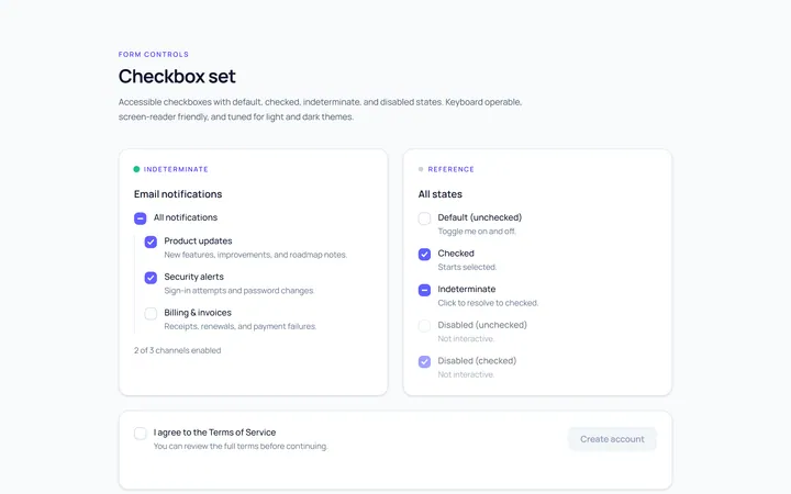
Checkbox Set Toggle
Originaldefault/checked/indeterminate/disabled checkboxes
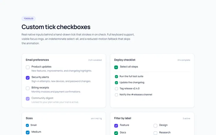
Checkbox Custom Toggle
Originalcustom animated tick checkboxes
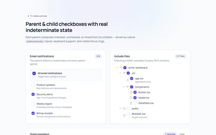
Checkbox Indeterminate Toggle
Originalparent/child indeterminate checkboxes
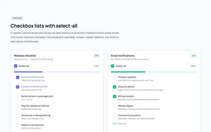
Checkbox List Toggle
Originalcheckbox list with select-all
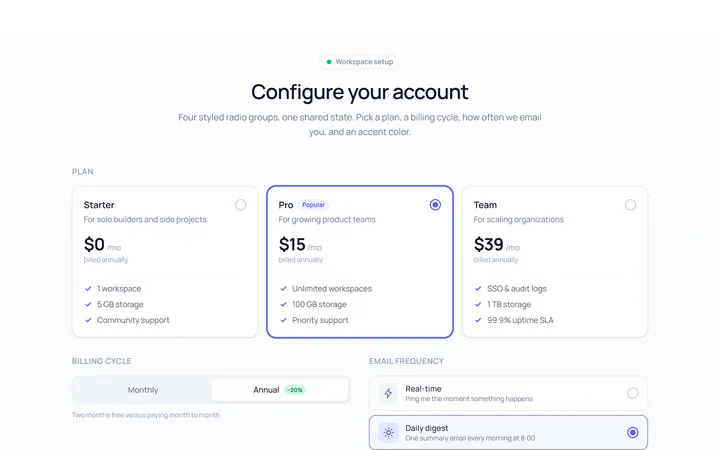
Radio Set Toggle
Originalstyled radio button group
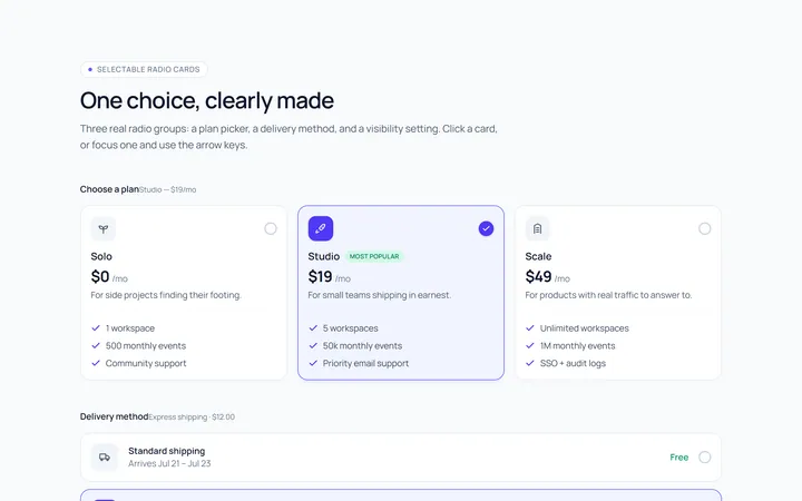
Radio Cards Toggle
Originalselectable radio cards
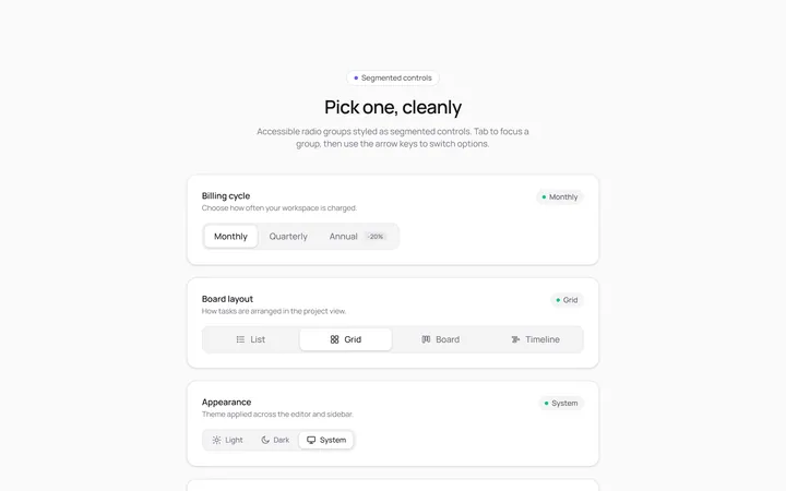
Radio Segmented Toggle
Originalsegmented control radios
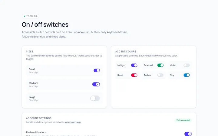
Switch Basic Toggle
Originalbasic on/off switches in sizes
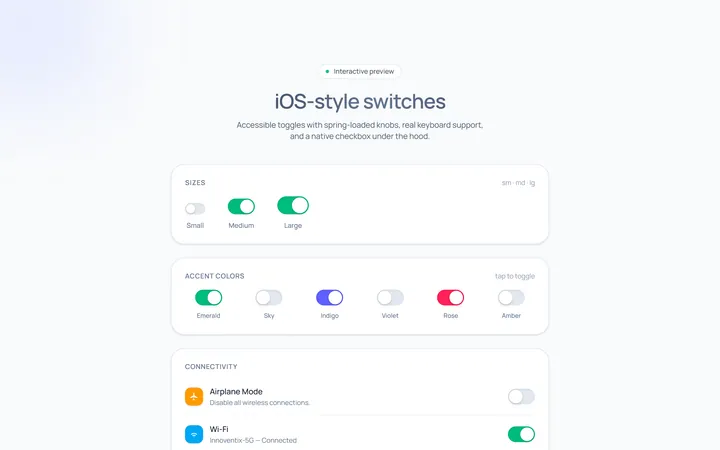
Switch iOS Toggle
OriginaliOS-style switches
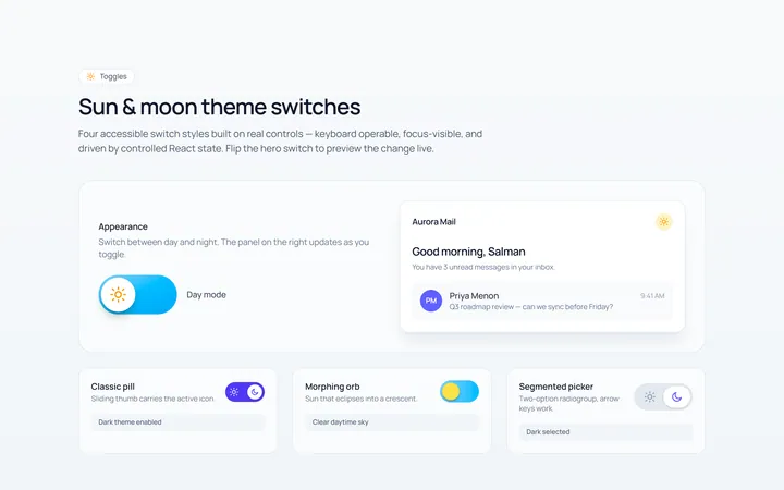
Switch Icons Toggle
Originalswitches with sun/moon style icons
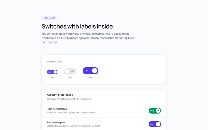
Switch Labels Toggle
Originalswitches with on/off labels inside
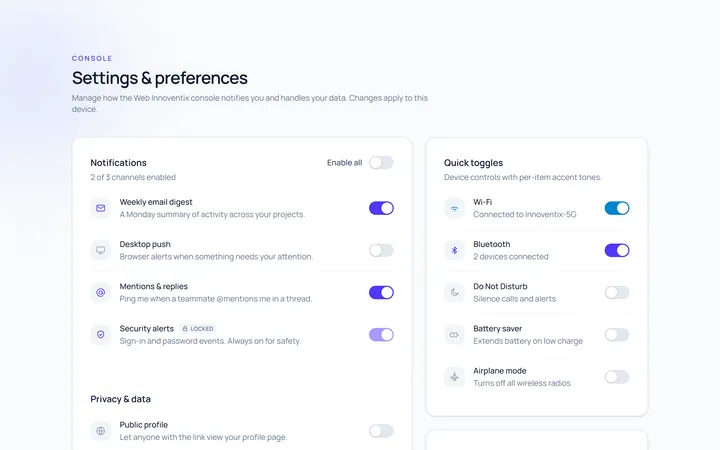
Switch Group Toggle
Originala settings list of switches