

Switch iOS Toggle
Original · freeiOS-style switches
byWeb InnoventixReact + Tailwind
tglswitchiostoggles
Copy prompt gives Claude Code, Cursor or v0 a ready-to-paste prompt that recreates this exact component.
npx shadcn@latest add https://webinnoventix.com/r/tgl-switch-ios.jsontgl-switch-ios.tsx
"use client";

import { useId, useState, type ReactNode } from "react";
import { motion, useReducedMotion } from "motion/react";

type SwitchSize = "sm" | "md" | "lg";
type SwitchColor = "emerald" | "sky" | "indigo" | "violet" | "rose" | "amber";
type KnobIcon = "none" | "theme" | "check";
type StateKey = keyof typeof DEFAULTS;

const SIZE_CONFIG: Record<
  SwitchSize,
  { track: string; knob: string; travel: number; icon: string }
> = {
  sm: { track: "h-5 w-9", knob: "h-4 w-4", travel: 16, icon: "h-2.5 w-2.5" },
  md: { track: "h-7 w-12", knob: "h-6 w-6", travel: 20, icon: "h-3.5 w-3.5" },
  lg: { track: "h-8 w-14", knob: "h-7 w-7", travel: 24, icon: "h-4 w-4" },
};

const COLOR_ON: Record<SwitchColor, string> = {
  emerald: "bg-emerald-500",
  sky: "bg-sky-500",
  indigo: "bg-indigo-500",
  violet: "bg-violet-500",
  rose: "bg-rose-500",
  amber: "bg-amber-500",
};

const COLOR_RING: Record<SwitchColor, string> = {
  emerald: "peer-focus-visible:ring-emerald-500",
  sky: "peer-focus-visible:ring-sky-500",
  indigo: "peer-focus-visible:ring-indigo-500",
  violet: "peer-focus-visible:ring-violet-500",
  rose: "peer-focus-visible:ring-rose-500",
  amber: "peer-focus-visible:ring-amber-500",
};

const DEFAULTS = {
  sizeSm: false,
  sizeMd: true,
  sizeLg: true,
  colorEmerald: true,
  colorSky: false,
  colorIndigo: true,
  colorViolet: false,
  colorRose: true,
  colorAmber: false,
  airplane: false,
  wifi: true,
  bluetooth: true,
  lowPower: false,
  darkAppearance: false,
  autoSave: true,
  location: true,
  analytics: false,
};

const SIZE_DEMO: { size: SwitchSize; key: StateKey; label: string }[] = [
  { size: "sm", key: "sizeSm", label: "Small" },
  { size: "md", key: "sizeMd", label: "Medium" },
  { size: "lg", key: "sizeLg", label: "Large" },
];

const COLOR_DEMO: { color: SwitchColor; key: StateKey; label: string }[] = [
  { color: "emerald", key: "colorEmerald", label: "Emerald" },
  { color: "sky", key: "colorSky", label: "Sky" },
  { color: "indigo", key: "colorIndigo", label: "Indigo" },
  { color: "violet", key: "colorViolet", label: "Violet" },
  { color: "rose", key: "colorRose", label: "Rose" },
  { color: "amber", key: "colorAmber", label: "Amber" },
];

function SunIcon({ className }: { className?: string }) {
  return (
    <svg
      viewBox="0 0 24 24"
      fill="none"
      stroke="currentColor"
      strokeWidth={2.2}
      strokeLinecap="round"
      className={className}
      aria-hidden="true"
      focusable="false"
    >
      <circle cx="12" cy="12" r="4" />
      <path d="M12 2v2M12 20v2M4.9 4.9l1.4 1.4M17.7 17.7l1.4 1.4M2 12h2M20 12h2M4.9 19.1l1.4-1.4M17.7 6.3l1.4-1.4" />
    </svg>
  );
}

function MoonIcon({ className }: { className?: string }) {
  return (
    <svg
      viewBox="0 0 24 24"
      fill="currentColor"
      className={className}
      aria-hidden="true"
      focusable="false"
    >
      <path d="M21 12.8A9 9 0 1 1 11.2 3a7 7 0 0 0 9.8 9.8z" />
    </svg>
  );
}

function CheckIcon({ className }: { className?: string }) {
  return (
    <svg
      viewBox="0 0 24 24"
      fill="none"
      stroke="currentColor"
      strokeWidth={3}
      strokeLinecap="round"
      strokeLinejoin="round"
      className={className}
      aria-hidden="true"
      focusable="false"
    >
      <path d="M20 6 9 17l-5-5" />
    </svg>
  );
}

function AirplaneIcon({ className }: { className?: string }) {
  return (
    <svg
      viewBox="0 0 24 24"
      fill="currentColor"
      className={className}
      aria-hidden="true"
      focusable="false"
    >
      <path d="M21 16v-2l-8-5V3.5a1.5 1.5 0 0 0-3 0V9l-8 5v2l8-2.5V19l-2 1.5V22l3.5-1 3.5 1v-1.5L11 19v-5.5z" />
    </svg>
  );
}

function WifiIcon({ className }: { className?: string }) {
  return (
    <svg
      viewBox="0 0 24 24"
      fill="none"
      stroke="currentColor"
      strokeWidth={2}
      strokeLinecap="round"
      className={className}
      aria-hidden="true"
      focusable="false"
    >
      <path d="M5 12.5a10 10 0 0 1 14 0" />
      <path d="M8.5 16a5 5 0 0 1 7 0" />
      <path d="M12 19h.01" />
    </svg>
  );
}

function BluetoothIcon({ className }: { className?: string }) {
  return (
    <svg
      viewBox="0 0 24 24"
      fill="none"
      stroke="currentColor"
      strokeWidth={2}
      strokeLinecap="round"
      strokeLinejoin="round"
      className={className}
      aria-hidden="true"
      focusable="false"
    >
      <path d="M7 8l10 8-5 4V4l5 4L7 16" />
    </svg>
  );
}

function BoltIcon({ className }: { className?: string }) {
  return (
    <svg
      viewBox="0 0 24 24"
      fill="currentColor"
      className={className}
      aria-hidden="true"
      focusable="false"
    >
      <path d="M13 2 4.5 13.5H11l-1 8.5L20 9.5h-6.5z" />
    </svg>
  );
}

function ResetIcon({ className }: { className?: string }) {
  return (
    <svg
      viewBox="0 0 24 24"
      fill="none"
      stroke="currentColor"
      strokeWidth={2}
      strokeLinecap="round"
      strokeLinejoin="round"
      className={className}
      aria-hidden="true"
      focusable="false"
    >
      <path d="M3 12a9 9 0 0 1 15-6.7L21 8" />
      <path d="M21 3v5h-5" />
      <path d="M21 12a9 9 0 0 1-15 6.7L3 16" />
      <path d="M3 21v-5h5" />
    </svg>
  );
}

function AppIcon({ bg, children }: { bg: string; children: ReactNode }) {
  return (
    <span
      className={`flex h-8 w-8 shrink-0 items-center justify-center rounded-[10px] text-white shadow-sm ${bg}`}
    >
      {children}
    </span>
  );
}

interface ToggleProps {
  checked: boolean;
  onCheckedChange: (value: boolean) => void;
  size?: SwitchSize;
  color?: SwitchColor;
  disabled?: boolean;
  icon?: KnobIcon;
  ariaLabel?: string;
  describedById?: string;
}

function Toggle({
  checked,
  onCheckedChange,
  size = "md",
  color = "emerald",
  disabled = false,
  icon = "none",
  ariaLabel,
  describedById,
}: ToggleProps) {
  const reduce = useReducedMotion();
  const cfg = SIZE_CONFIG[size];

  return (
    <span className="relative inline-flex shrink-0">
      <input
        type="checkbox"
        role="switch"
        checked={checked}
        disabled={disabled}
        aria-checked={checked}
        aria-label={ariaLabel}
        aria-describedby={describedById}
        onChange={(e) => onCheckedChange(e.target.checked)}
        className="peer sr-only"
      />
      <span
        aria-hidden="true"
        className={[
          "relative flex items-center rounded-full p-0.5 shadow-inner transition-colors duration-300 ease-out",
          cfg.track,
          checked ? COLOR_ON[color] : "bg-slate-200 dark:bg-slate-700",
          disabled ? "opacity-50" : "",
          "peer-focus-visible:outline-none peer-focus-visible:ring-2 peer-focus-visible:ring-offset-2 peer-focus-visible:ring-offset-white dark:peer-focus-visible:ring-offset-slate-900",
          checked
            ? COLOR_RING[color]
            : "peer-focus-visible:ring-slate-400 dark:peer-focus-visible:ring-slate-500",
        ].join(" ")}
      >
        <motion.span
          initial={false}
          animate={{ x: checked ? cfg.travel : 0 }}
          transition={
            reduce
              ? { duration: 0 }
              : { type: "spring", stiffness: 500, damping: 34, mass: 0.6 }
          }
          className={[
            "relative flex items-center justify-center rounded-full bg-white shadow-md ring-1 ring-black/5",
            cfg.knob,
          ].join(" ")}
        >
          {icon === "theme" && (
            <>
              <SunIcon
                className={`absolute ${cfg.icon} text-amber-500 transition-opacity duration-200 ${
                  checked ? "opacity-0" : "opacity-100"
                }`}
              />
              <MoonIcon
                className={`absolute ${cfg.icon} text-indigo-500 transition-opacity duration-200 ${
                  checked ? "opacity-100" : "opacity-0"
                }`}
              />
            </>
          )}
          {icon === "check" && (
            <CheckIcon
              className={`${cfg.icon} text-emerald-500 transition-opacity duration-200 ${
                checked ? "opacity-100" : "opacity-0"
              }`}
            />
          )}
        </motion.span>
      </span>
    </span>
  );
}

interface SettingRowProps {
  label: string;
  description?: string;
  leading?: ReactNode;
  checked: boolean;
  onCheckedChange: (value: boolean) => void;
  color?: SwitchColor;
  icon?: KnobIcon;
  disabled?: boolean;
}

function SettingRow({
  label,
  description,
  leading,
  checked,
  onCheckedChange,
  color = "emerald",
  icon = "none",
  disabled = false,
}: SettingRowProps) {
  const uid = useId();
  const descId = description ? `${uid}-desc` : undefined;

  return (
    <label
      className={`flex items-center justify-between gap-4 py-3.5 ${
        disabled ? "cursor-not-allowed" : "cursor-pointer"
      }`}
    >
      <span className="flex min-w-0 items-center gap-3">
        {leading}
        <span className="min-w-0">
          <span className="block truncate text-sm font-medium text-slate-900 dark:text-slate-100">
            {label}
          </span>
          {description && (
            <span
              id={descId}
              className="mt-0.5 block text-xs leading-snug text-slate-500 dark:text-slate-400"
            >
              {description}
            </span>
          )}
        </span>
      </span>
      <Toggle
        checked={checked}
        onCheckedChange={onCheckedChange}
        color={color}
        icon={icon}
        disabled={disabled}
        ariaLabel={label}
        describedById={descId}
      />
    </label>
  );
}

function Panel({
  title,
  hint,
  children,
}: {
  title: string;
  hint?: string;
  children: ReactNode;
}) {
  return (
    <div className="rounded-3xl border border-slate-200 bg-white p-6 shadow-sm dark:border-slate-800 dark:bg-slate-900">
      <div className="flex items-baseline justify-between gap-3">
        <h3 className="text-xs font-semibold uppercase tracking-wider text-slate-500 dark:text-slate-400">
          {title}
        </h3>
        {hint && (
          <span className="text-xs text-slate-400 dark:text-slate-500">
            {hint}
          </span>
        )}
      </div>
      <div className="mt-4">{children}</div>
    </div>
  );
}

export default function TglSwitchIos() {
  const [state, setState] = useState(DEFAULTS);

  const toggle = (key: StateKey) =>
    setState((prev) => ({ ...prev, [key]: !prev[key] }));

  const css = `
    @keyframes tglios-pulse {
      0%, 100% { opacity: 1; transform: scale(1); }
      50% { opacity: 0.35; transform: scale(0.8); }
    }
    @keyframes tglios-sheen {
      0% { background-position: 0% 50%; }
      100% { background-position: 200% 50%; }
    }
    .tglios-dot { animation: tglios-pulse 1.8s ease-in-out infinite; }
    .tglios-title { background-size: 200% auto; animation: tglios-sheen 7s linear infinite; }
    @media (prefers-reduced-motion: reduce) {
      .tglios-dot, .tglios-title { animation: none !important; }
    }
  `;

  return (
    <section className="relative w-full overflow-hidden bg-slate-50 px-4 py-20 dark:bg-slate-950 sm:py-28">
      <style>{css}</style>

      <div
        aria-hidden="true"
        className="pointer-events-none absolute -left-24 -top-24 h-72 w-72 rounded-full bg-indigo-300/20 blur-3xl dark:bg-indigo-500/10"
      />
      <div
        aria-hidden="true"
        className="pointer-events-none absolute -bottom-24 -right-24 h-72 w-72 rounded-full bg-emerald-300/20 blur-3xl dark:bg-emerald-500/10"
      />

      <div className="relative mx-auto max-w-2xl">
        <div className="text-center">
          <span className="inline-flex items-center gap-2 rounded-full border border-slate-200 bg-white px-3 py-1 text-xs font-medium text-slate-600 dark:border-slate-800 dark:bg-slate-900 dark:text-slate-300">
            <span className="tglios-dot h-1.5 w-1.5 rounded-full bg-emerald-500" />
            Interactive preview
          </span>
          <h2 className="tglios-title mt-5 bg-gradient-to-r from-slate-900 via-slate-500 to-slate-900 bg-clip-text text-3xl font-semibold tracking-tight text-transparent dark:from-white dark:via-slate-400 dark:to-white sm:text-4xl">
            iOS-style switches
          </h2>
          <p className="mx-auto mt-3 max-w-md text-sm text-slate-600 dark:text-slate-400">
            Accessible toggles with spring-loaded knobs, real keyboard support,
            and a native checkbox under the hood.
          </p>
        </div>

        <div className="mt-10 space-y-6">
          <Panel title="Sizes" hint="sm · md · lg">
            <div className="flex flex-wrap items-end gap-x-10 gap-y-6">
              {SIZE_DEMO.map(({ size, key, label }) => (
                <div key={key} className="flex flex-col items-center gap-3">
                  <Toggle
                    size={size}
                    color="emerald"
                    checked={state[key]}
                    onCheckedChange={() => toggle(key)}
                    ariaLabel={`${label} switch`}
                  />
                  <span className="select-none text-xs font-medium text-slate-500 dark:text-slate-400">
                    {label}
                  </span>
                </div>
              ))}
            </div>
          </Panel>

          <Panel title="Accent colors" hint="tap to toggle">
            <div className="grid grid-cols-3 gap-x-6 gap-y-6 sm:grid-cols-6">
              {COLOR_DEMO.map(({ color, key, label }) => (
                <div
                  key={key}
                  className="flex flex-col items-center gap-2.5"
                >
                  <Toggle
                    color={color}
                    checked={state[key]}
                    onCheckedChange={() => toggle(key)}
                    ariaLabel={`${label} accent`}
                  />
                  <span className="select-none text-[11px] font-medium text-slate-500 dark:text-slate-400">
                    {label}
                  </span>
                </div>
              ))}
            </div>
          </Panel>

          <Panel title="Connectivity">
            <div className="-my-1 divide-y divide-slate-100 dark:divide-slate-800">
              <SettingRow
                leading={
                  <AppIcon bg="bg-amber-500">
                    <AirplaneIcon className="h-4 w-4" />
                  </AppIcon>
                }
                label="Airplane Mode"
                description="Disable all wireless connections."
                checked={state.airplane}
                onCheckedChange={() => toggle("airplane")}
              />
              <SettingRow
                leading={
                  <AppIcon bg="bg-sky-500">
                    <WifiIcon className="h-4 w-4" />
                  </AppIcon>
                }
                label="Wi-Fi"
                description="Innoventix-5G — Connected"
                checked={state.wifi}
                onCheckedChange={() => toggle("wifi")}
              />
              <SettingRow
                leading={
                  <AppIcon bg="bg-indigo-500">
                    <BluetoothIcon className="h-4 w-4" />
                  </AppIcon>
                }
                label="Bluetooth"
                description="Discoverable as Studio Mac."
                checked={state.bluetooth}
                onCheckedChange={() => toggle("bluetooth")}
              />
              <SettingRow
                leading={
                  <AppIcon bg="bg-emerald-500">
                    <BoltIcon className="h-4 w-4" />
                  </AppIcon>
                }
                label="Low Power Mode"
                description="Reduce background activity to save battery."
                color="amber"
                checked={state.lowPower}
                onCheckedChange={() => toggle("lowPower")}
              />
            </div>
          </Panel>

          <Panel title="Preferences">
            <div className="-my-1 divide-y divide-slate-100 dark:divide-slate-800">
              <SettingRow
                label="Dark Appearance"
                description="Switch the interface between light and dark."
                color="indigo"
                icon="theme"
                checked={state.darkAppearance}
                onCheckedChange={() => toggle("darkAppearance")}
              />
              <SettingRow
                label="Autosave"
                description="Save changes to the cloud every few seconds."
                color="emerald"
                icon="check"
                checked={state.autoSave}
                onCheckedChange={() => toggle("autoSave")}
              />
            </div>
          </Panel>

          <Panel title="Managed by administrator" hint="locked">
            <div className="-my-1 divide-y divide-slate-100 dark:divide-slate-800">
              <SettingRow
                label="Location Services"
                description="Enforced on by your organization."
                disabled
                checked={state.location}
                onCheckedChange={() => undefined}
              />
              <SettingRow
                label="Usage Analytics"
                description="Sharing is turned off and cannot be changed."
                disabled
                checked={state.analytics}
                onCheckedChange={() => undefined}
              />
            </div>
          </Panel>
        </div>

        <div className="mt-8 flex items-center justify-center">
          <button
            type="button"
            onClick={() => setState({ ...DEFAULTS })}
            className="inline-flex items-center gap-2 rounded-full border border-slate-200 bg-white px-4 py-2 text-sm font-medium text-slate-700 transition-colors hover:bg-slate-100 focus-visible:outline-none focus-visible:ring-2 focus-visible:ring-slate-400 focus-visible:ring-offset-2 focus-visible:ring-offset-slate-50 dark:border-slate-700 dark:bg-slate-900 dark:text-slate-200 dark:hover:bg-slate-800 dark:focus-visible:ring-offset-slate-950"
          >
            <ResetIcon className="h-4 w-4" />
            Reset to defaults
          </button>
        </div>
      </div>
    </section>
  );
}
Dependencies
motion
Licence
Built by Web Innoventix. Free for personal and commercial use, no attribution required.
Built by Web Innoventix
Need a custom interface, a full website, or SEO that gets you cited by AI? We design, build and rank it end to end.
Get a free quoteSimilar components
Browse all →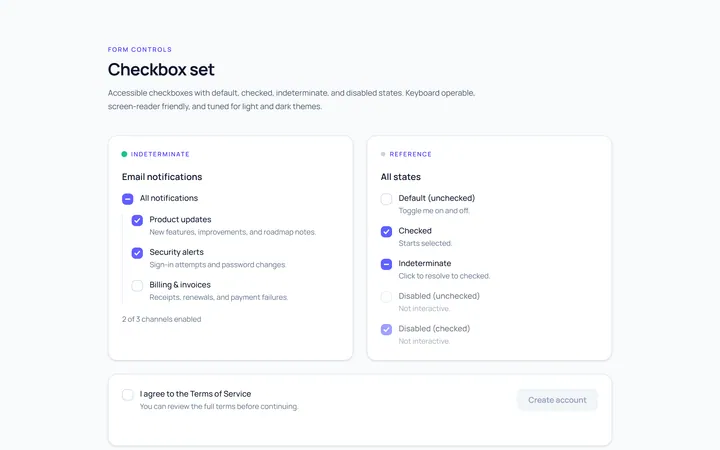
Checkbox Set Toggle
Originaldefault/checked/indeterminate/disabled checkboxes
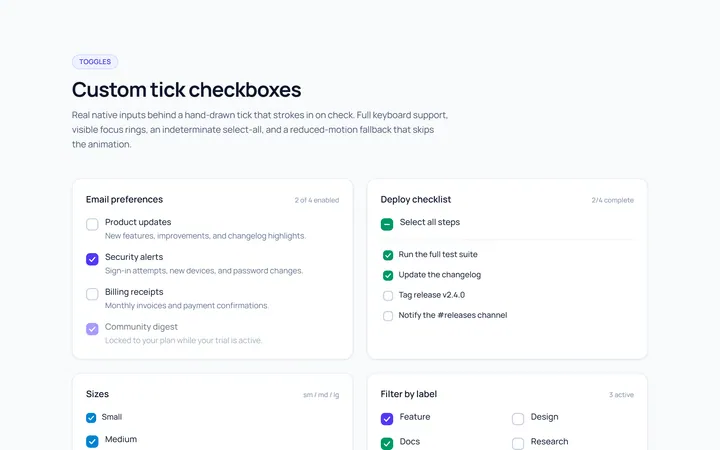
Checkbox Custom Toggle
Originalcustom animated tick checkboxes
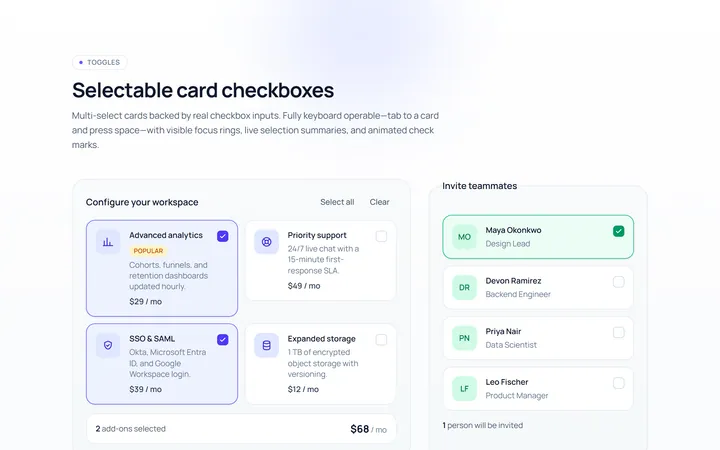
Checkbox Card Toggle
Originalselectable card checkboxes
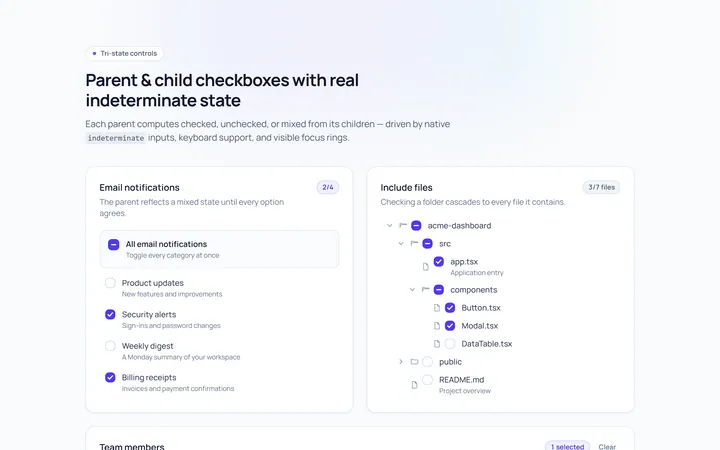
Checkbox Indeterminate Toggle
Originalparent/child indeterminate checkboxes
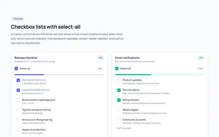
Checkbox List Toggle
Originalcheckbox list with select-all
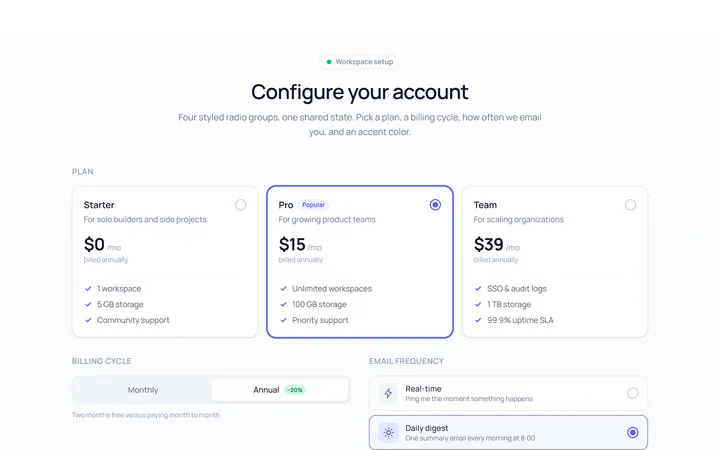
Radio Set Toggle
Originalstyled radio button group
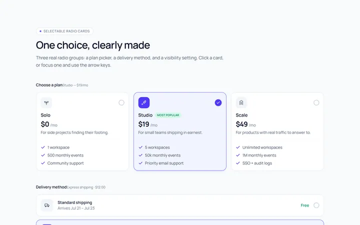
Radio Cards Toggle
Originalselectable radio cards
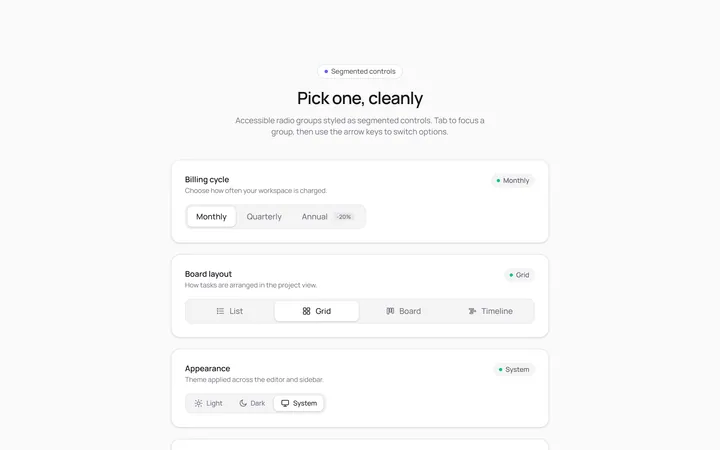
Radio Segmented Toggle
Originalsegmented control radios
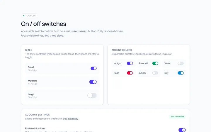
Switch Basic Toggle
Originalbasic on/off switches in sizes
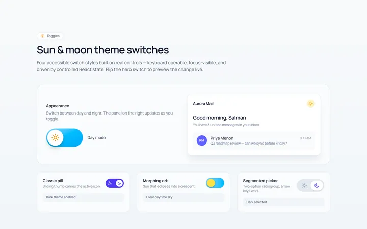
Switch Icons Toggle
Originalswitches with sun/moon style icons
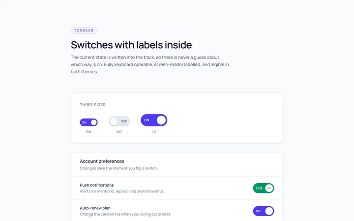
Switch Labels Toggle
Originalswitches with on/off labels inside
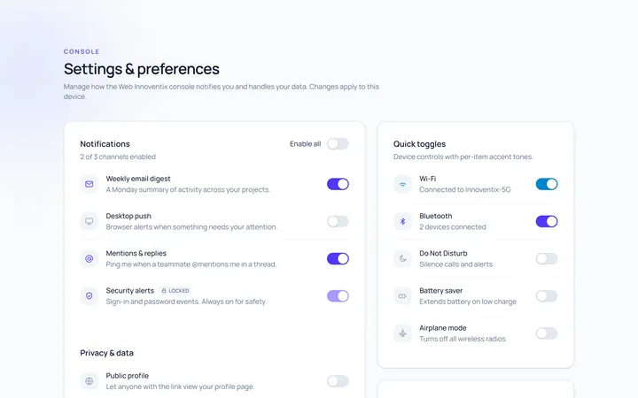
Switch Group Toggle
Originala settings list of switches