

Switch Icons Toggle
Original · freeswitches with sun/moon style icons
byWeb InnoventixReact + Tailwind
tglswitchiconstoggles
Copy prompt gives Claude Code, Cursor or v0 a ready-to-paste prompt that recreates this exact component.
npx shadcn@latest add https://webinnoventix.com/r/tgl-switch-icons.jsontgl-switch-icons.tsx
"use client";
import { useId, useRef, useState, type KeyboardEvent, type ReactNode } from "react";
import { motion, useReducedMotion, type Transition } from "motion/react";
/* ---------------------------------- icons --------------------------------- */
function SunIcon({ className }: { className?: string }) {
return (
<svg
viewBox="0 0 24 24"
fill="none"
stroke="currentColor"
strokeWidth={2}
strokeLinecap="round"
strokeLinejoin="round"
className={className}
aria-hidden="true"
>
<circle cx="12" cy="12" r="4.1" />
<path d="M12 2v2.2M12 19.8V22M4.2 4.2l1.6 1.6M18.2 18.2l1.6 1.6M2 12h2.2M19.8 12H22M4.2 19.8l1.6-1.6M18.2 5.8l1.6-1.6" />
</svg>
);
}
function MoonIcon({ className }: { className?: string }) {
return (
<svg
viewBox="0 0 24 24"
fill="none"
stroke="currentColor"
strokeWidth={2}
strokeLinecap="round"
strokeLinejoin="round"
className={className}
aria-hidden="true"
>
<path d="M20.5 13.2A8.4 8.4 0 1 1 10.8 3.5a6.5 6.5 0 0 0 9.7 9.7Z" />
</svg>
);
}
/* --------------------------------- helpers -------------------------------- */
function springFor(reduce: boolean): Transition {
return reduce ? { duration: 0 } : { type: "spring", stiffness: 460, damping: 32 };
}
interface SwitchProps {
on: boolean;
onToggle: () => void;
labelId: string;
reduce: boolean;
}
const HERO_STARS: { top: string; left: string; size: number; delay: string }[] = [
{ top: "24%", left: "16%", size: 3, delay: "0s" },
{ top: "44%", left: "28%", size: 2, delay: "0.7s" },
{ top: "20%", left: "38%", size: 2, delay: "1.2s" },
{ top: "60%", left: "22%", size: 2, delay: "0.35s" },
{ top: "34%", left: "48%", size: 3, delay: "0.9s" },
{ top: "56%", left: "40%", size: 2, delay: "1.5s" },
];
/* ------------------------------ scene switch ------------------------------ */
/* Large day/night hero toggle that drives the live preview. */
function SceneSwitch({ on, onToggle, labelId, reduce }: SwitchProps) {
const spring = springFor(reduce);
return (
<button
type="button"
role="switch"
aria-checked={on}
aria-labelledby={labelId}
onClick={onToggle}
className="relative h-16 w-32 shrink-0 rounded-full p-1 outline-none ring-1 ring-inset ring-black/10 transition-shadow dark:ring-white/15 focus-visible:ring-2 focus-visible:ring-indigo-500 focus-visible:ring-offset-2 focus-visible:ring-offset-slate-100 dark:focus-visible:ring-offset-slate-950"
>
<span className="pointer-events-none absolute inset-0 rounded-full bg-gradient-to-br from-sky-300 via-sky-400 to-sky-500" />
<motion.span
aria-hidden="true"
className="pointer-events-none absolute inset-0 rounded-full bg-gradient-to-br from-indigo-900 via-slate-900 to-slate-950"
initial={false}
animate={{ opacity: on ? 1 : 0 }}
transition={{ duration: reduce ? 0 : 0.5 }}
/>
<motion.span
aria-hidden="true"
className="pointer-events-none absolute inset-0 overflow-hidden rounded-full"
initial={false}
animate={{ opacity: on ? 1 : 0 }}
transition={{ duration: reduce ? 0 : 0.5 }}
>
{HERO_STARS.map((star, i) => (
<span
key={i}
className="tglswi-anim absolute rounded-full bg-white"
style={{
top: star.top,
left: star.left,
width: star.size,
height: star.size,
animation: `tglswi-twinkle 2.6s ease-in-out ${star.delay} infinite`,
}}
/>
))}
</motion.span>
<motion.span
aria-hidden="true"
className="relative z-10 flex h-14 w-14 items-center justify-center rounded-full bg-white shadow-lg shadow-black/25"
initial={false}
animate={{ x: on ? 64 : 0 }}
transition={spring}
>
<motion.span
className="absolute text-amber-500"
initial={false}
animate={{ opacity: on ? 0 : 1, rotate: on ? -80 : 0, scale: on ? 0.4 : 1 }}
transition={{ duration: reduce ? 0 : 0.35 }}
>
<SunIcon className="h-7 w-7" />
</motion.span>
<motion.span
className="absolute text-slate-700"
initial={false}
animate={{ opacity: on ? 1 : 0, rotate: on ? 0 : 80, scale: on ? 1 : 0.4 }}
transition={{ duration: reduce ? 0 : 0.35 }}
>
<MoonIcon className="h-6 w-6" />
</motion.span>
</motion.span>
</button>
);
}
/* ------------------------------- pill switch ------------------------------ */
/* Classic track with faint sun/moon markers, thumb carries the active icon. */
function PillSwitch({ on, onToggle, labelId, reduce }: SwitchProps) {
const spring = springFor(reduce);
return (
<button
type="button"
role="switch"
aria-checked={on}
aria-labelledby={labelId}
onClick={onToggle}
className={`relative flex h-8 w-16 shrink-0 items-center rounded-full p-1 outline-none transition-colors duration-300 focus-visible:ring-2 focus-visible:ring-indigo-500 focus-visible:ring-offset-2 focus-visible:ring-offset-white dark:focus-visible:ring-offset-slate-900 ${
on ? "bg-indigo-600" : "bg-amber-400"
}`}
>
<SunIcon className="pointer-events-none absolute left-1.5 h-4 w-4 text-white/85" />
<MoonIcon className="pointer-events-none absolute right-1.5 h-4 w-4 text-white/85" />
<motion.span
aria-hidden="true"
className="relative z-10 flex h-6 w-6 items-center justify-center rounded-full bg-white shadow-md"
initial={false}
animate={{ x: on ? 32 : 0 }}
transition={spring}
>
{on ? (
<MoonIcon className="h-3.5 w-3.5 text-indigo-600" />
) : (
<SunIcon className="h-3.5 w-3.5 text-amber-500" />
)}
</motion.span>
</button>
);
}
/* ------------------------------ morph switch ------------------------------ */
/* The thumb itself morphs from a solid sun into a carved crescent moon. */
function MorphSwitch({ on, onToggle, labelId, reduce }: SwitchProps) {
const spring = springFor(reduce);
return (
<button
type="button"
role="switch"
aria-checked={on}
aria-labelledby={labelId}
onClick={onToggle}
className="relative h-9 w-16 shrink-0 overflow-hidden rounded-full p-1 outline-none ring-1 ring-inset ring-black/10 dark:ring-white/10 focus-visible:ring-2 focus-visible:ring-indigo-500 focus-visible:ring-offset-2 focus-visible:ring-offset-white dark:focus-visible:ring-offset-slate-900"
>
<span className="pointer-events-none absolute inset-0 bg-gradient-to-r from-sky-300 to-sky-400" />
<motion.span
aria-hidden="true"
className="pointer-events-none absolute inset-0 bg-gradient-to-r from-indigo-800 to-slate-900"
initial={false}
animate={{ opacity: on ? 1 : 0 }}
transition={{ duration: reduce ? 0 : 0.4 }}
/>
<motion.span
aria-hidden="true"
className="pointer-events-none absolute inset-0"
initial={false}
animate={{ opacity: on ? 1 : 0 }}
transition={{ duration: reduce ? 0 : 0.4 }}
>
<span
className="tglswi-anim absolute left-3 top-2 h-0.5 w-0.5 rounded-full bg-white"
style={{ animation: "tglswi-twinkle 2.1s ease-in-out 0s infinite" }}
/>
<span
className="tglswi-anim absolute left-5 top-5 h-0.5 w-0.5 rounded-full bg-white"
style={{ animation: "tglswi-twinkle 2.1s ease-in-out 0.8s infinite" }}
/>
<span
className="tglswi-anim absolute left-7 top-3 h-0.5 w-0.5 rounded-full bg-white"
style={{ animation: "tglswi-twinkle 2.1s ease-in-out 1.3s infinite" }}
/>
</motion.span>
<motion.span
aria-hidden="true"
className="relative z-10 block h-7 w-7 overflow-hidden rounded-full shadow-md shadow-black/25"
initial={false}
animate={{ x: on ? 28 : 0, backgroundColor: on ? "#e2e8f0" : "#fde047" }}
transition={spring}
>
<motion.span
className="absolute h-6 w-6 rounded-full"
initial={false}
animate={{ opacity: on ? 1 : 0, top: -3, right: -4 }}
transition={{ duration: reduce ? 0 : 0.4 }}
style={{ backgroundColor: "#0f172a" }}
/>
</motion.span>
</button>
);
}
/* ---------------------------- segmented control --------------------------- */
/* Two-option day/night picker with real radiogroup + arrow-key semantics. */
function SegmentedTheme({
dark,
onChange,
labelId,
reduce,
}: {
dark: boolean;
onChange: (next: boolean) => void;
labelId: string;
reduce: boolean;
}) {
const spring = springFor(reduce);
const lightRef = useRef<HTMLButtonElement>(null);
const darkRef = useRef<HTMLButtonElement>(null);
const onKey = (e: KeyboardEvent<HTMLDivElement>) => {
if (e.key === "ArrowRight" || e.key === "ArrowDown") {
e.preventDefault();
onChange(true);
darkRef.current?.focus();
} else if (e.key === "ArrowLeft" || e.key === "ArrowUp") {
e.preventDefault();
onChange(false);
lightRef.current?.focus();
}
};
return (
<div
role="radiogroup"
aria-labelledby={labelId}
onKeyDown={onKey}
className="relative inline-flex shrink-0 items-center rounded-full bg-slate-200 p-1 dark:bg-slate-800"
>
<motion.span
aria-hidden="true"
className="absolute bottom-1 left-1 top-1 w-11 rounded-full bg-white shadow-sm dark:bg-slate-950"
initial={false}
animate={{ x: dark ? 44 : 0 }}
transition={spring}
/>
<button
ref={lightRef}
type="button"
role="radio"
aria-checked={!dark}
aria-label="Light theme"
tabIndex={dark ? -1 : 0}
onClick={() => onChange(false)}
className="relative z-10 flex h-9 w-11 items-center justify-center rounded-full outline-none focus-visible:ring-2 focus-visible:ring-indigo-500 focus-visible:ring-offset-2 focus-visible:ring-offset-slate-200 dark:focus-visible:ring-offset-slate-800"
>
<SunIcon
className={`h-5 w-5 transition-colors ${dark ? "text-slate-400 dark:text-slate-500" : "text-amber-500"}`}
/>
</button>
<button
ref={darkRef}
type="button"
role="radio"
aria-checked={dark}
aria-label="Dark theme"
tabIndex={dark ? 0 : -1}
onClick={() => onChange(true)}
className="relative z-10 flex h-9 w-11 items-center justify-center rounded-full outline-none focus-visible:ring-2 focus-visible:ring-indigo-500 focus-visible:ring-offset-2 focus-visible:ring-offset-slate-200 dark:focus-visible:ring-offset-slate-800"
>
<MoonIcon
className={`h-5 w-5 transition-colors ${dark ? "text-indigo-500 dark:text-indigo-300" : "text-slate-400 dark:text-slate-500"}`}
/>
</button>
</div>
);
}
/* ------------------------------- preview card ----------------------------- */
function PreviewCard({ dark, reduce }: { dark: boolean; reduce: boolean }) {
return (
<div
className={`relative overflow-hidden rounded-2xl border p-5 shadow-xl transition-colors duration-500 ${
dark ? "border-slate-700 bg-slate-900 shadow-black/40" : "border-slate-200 bg-white shadow-slate-300/40"
}`}
>
<motion.div
aria-hidden="true"
className="pointer-events-none absolute inset-0"
initial={false}
animate={{ opacity: dark ? 1 : 0 }}
transition={{ duration: reduce ? 0 : 0.5 }}
>
<span
className="tglswi-anim absolute right-8 top-4 h-1 w-1 rounded-full bg-slate-300"
style={{ animation: "tglswi-twinkle 2.6s ease-in-out 0.2s infinite" }}
/>
<span
className="tglswi-anim absolute right-16 top-8 h-0.5 w-0.5 rounded-full bg-slate-400"
style={{ animation: "tglswi-twinkle 2.6s ease-in-out 1s infinite" }}
/>
<span
className="tglswi-anim absolute right-24 top-3 h-0.5 w-0.5 rounded-full bg-slate-300"
style={{ animation: "tglswi-twinkle 2.6s ease-in-out 1.6s infinite" }}
/>
</motion.div>
<div className="relative flex items-center justify-between">
<span className={`text-sm font-semibold tracking-tight ${dark ? "text-slate-100" : "text-slate-900"}`}>
Aurora Mail
</span>
<span
className={`flex h-7 w-7 items-center justify-center rounded-full ${
dark ? "bg-slate-800 text-indigo-300" : "bg-amber-100 text-amber-500"
}`}
>
{dark ? <MoonIcon className="h-4 w-4" /> : <SunIcon className="h-4 w-4" />}
</span>
</div>
<p className={`relative mt-5 text-lg font-semibold tracking-tight ${dark ? "text-slate-50" : "text-slate-900"}`}>
{dark ? "Good evening, Salman" : "Good morning, Salman"}
</p>
<p className={`relative mt-1 text-xs ${dark ? "text-slate-400" : "text-slate-500"}`}>
You have 3 unread messages in your inbox.
</p>
<div
className={`relative mt-4 flex items-center gap-3 rounded-xl border p-3 transition-colors duration-500 ${
dark ? "border-slate-700 bg-slate-800/60" : "border-slate-100 bg-slate-50"
}`}
>
<span className="flex h-9 w-9 shrink-0 items-center justify-center rounded-full bg-indigo-500 text-xs font-semibold text-white">
PM
</span>
<div className="min-w-0 flex-1">
<div className="flex items-center justify-between gap-2">
<span className={`truncate text-sm font-medium ${dark ? "text-slate-100" : "text-slate-800"}`}>
Priya Menon
</span>
<span className={`text-[11px] ${dark ? "text-slate-500" : "text-slate-400"}`}>9:41 AM</span>
</div>
<p className={`truncate text-xs ${dark ? "text-slate-400" : "text-slate-500"}`}>
Q3 roadmap review — can we sync before Friday?
</p>
</div>
</div>
</div>
);
}
/* -------------------------------- toggle row ------------------------------ */
function ToggleRow({
labelId,
title,
desc,
status,
control,
}: {
labelId: string;
title: string;
desc: string;
status: string;
control: ReactNode;
}) {
return (
<div className="flex flex-col gap-4 rounded-2xl border border-slate-200 bg-white/70 p-5 backdrop-blur-sm transition-colors dark:border-slate-800 dark:bg-slate-900/50">
<div className="flex items-center justify-between gap-4">
<div className="min-w-0">
<h3 id={labelId} className="text-sm font-semibold text-slate-900 dark:text-slate-100">
{title}
</h3>
<p className="mt-0.5 text-xs text-slate-500 dark:text-slate-400">{desc}</p>
</div>
<div className="shrink-0">{control}</div>
</div>
<p
aria-live="polite"
className="rounded-lg bg-slate-100 px-3 py-1.5 text-[11px] font-medium text-slate-600 dark:bg-slate-800/70 dark:text-slate-300"
>
{status}
</p>
</div>
);
}
/* --------------------------------- section -------------------------------- */
export default function ThemeSwitchIcons() {
const reduce = useReducedMotion() ?? false;
const uid = useId();
const heroId = `${uid}-hero`;
const pillId = `${uid}-pill`;
const morphId = `${uid}-morph`;
const segId = `${uid}-seg`;
const [isDark, setIsDark] = useState(false);
const [pill, setPill] = useState(true);
const [morph, setMorph] = useState(false);
const [seg, setSeg] = useState(true);
return (
<section className="relative w-full overflow-hidden bg-gradient-to-b from-slate-50 to-slate-100 px-4 py-20 sm:px-6 sm:py-28 dark:from-slate-950 dark:to-slate-900">
<style>{`
@keyframes tglswi-twinkle {
0%, 100% { opacity: 0.2; transform: scale(0.6); }
50% { opacity: 1; transform: scale(1); }
}
@media (prefers-reduced-motion: reduce) {
.tglswi-anim { animation: none !important; }
}
`}</style>
<div className="mx-auto max-w-5xl">
<div className="max-w-2xl">
<span className="inline-flex items-center gap-2 rounded-full border border-slate-200 bg-white px-3 py-1 text-xs font-medium text-slate-600 dark:border-slate-700 dark:bg-slate-900 dark:text-slate-300">
<SunIcon className="h-3.5 w-3.5 text-amber-500" />
Toggles
</span>
<h2 className="mt-4 text-3xl font-semibold tracking-tight text-slate-900 sm:text-4xl dark:text-slate-50">
Sun & moon theme switches
</h2>
<p className="mt-3 text-base text-slate-600 dark:text-slate-300">
Four accessible switch styles built on real controls — keyboard operable, focus-visible,
and driven by controlled React state. Flip the hero switch to preview the change live.
</p>
</div>
<div className="mt-10 grid gap-6 rounded-3xl border border-slate-200 bg-white/60 p-6 backdrop-blur-sm sm:p-8 md:grid-cols-2 md:items-center dark:border-slate-800 dark:bg-slate-900/40">
<div className="flex flex-col gap-6">
<div>
<span id={heroId} className="text-sm font-semibold text-slate-900 dark:text-slate-100">
Appearance
</span>
<p className="mt-1 text-sm text-slate-500 dark:text-slate-400">
Switch between day and night. The panel on the right updates as you toggle.
</p>
</div>
<div className="flex items-center gap-4">
<SceneSwitch on={isDark} onToggle={() => setIsDark((v) => !v)} labelId={heroId} reduce={reduce} />
<span aria-live="polite" className="text-sm font-medium text-slate-700 dark:text-slate-200">
{isDark ? "Night mode" : "Day mode"}
</span>
</div>
</div>
<PreviewCard dark={isDark} reduce={reduce} />
</div>
<div className="mt-6 grid gap-6 sm:grid-cols-3">
<ToggleRow
labelId={pillId}
title="Classic pill"
desc="Sliding thumb carries the active icon."
status={pill ? "Dark theme enabled" : "Light theme enabled"}
control={
<PillSwitch on={pill} onToggle={() => setPill((v) => !v)} labelId={pillId} reduce={reduce} />
}
/>
<ToggleRow
labelId={morphId}
title="Morphing orb"
desc="Sun that eclipses into a crescent."
status={morph ? "Night sky active" : "Clear daytime sky"}
control={
<MorphSwitch on={morph} onToggle={() => setMorph((v) => !v)} labelId={morphId} reduce={reduce} />
}
/>
<ToggleRow
labelId={segId}
title="Segmented picker"
desc="Two-option radiogroup, arrow keys work."
status={seg ? "Dark selected" : "Light selected"}
control={<SegmentedTheme dark={seg} onChange={setSeg} labelId={segId} reduce={reduce} />}
/>
</div>
</div>
</section>
);
}Dependencies
motion
Licence
Built by Web Innoventix. Free for personal and commercial use, no attribution required.
Built by Web Innoventix
Need a custom interface, a full website, or SEO that gets you cited by AI? We design, build and rank it end to end.
Get a free quoteSimilar components
Browse all →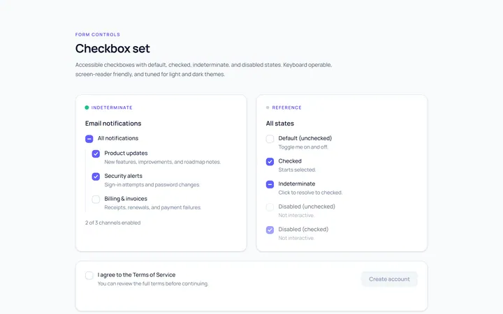
Checkbox Set Toggle
Originaldefault/checked/indeterminate/disabled checkboxes
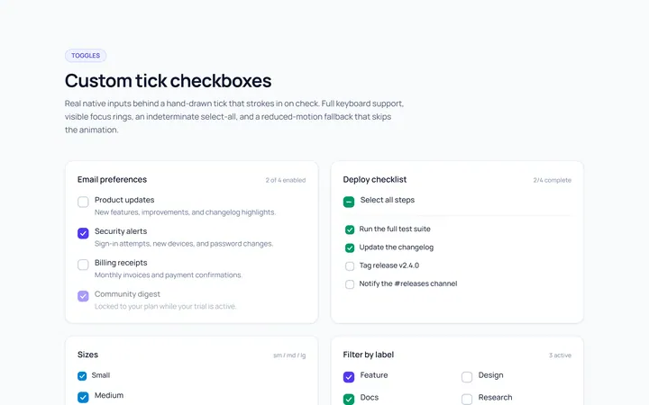
Checkbox Custom Toggle
Originalcustom animated tick checkboxes
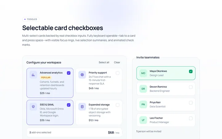
Checkbox Card Toggle
Originalselectable card checkboxes
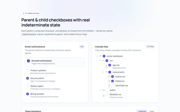
Checkbox Indeterminate Toggle
Originalparent/child indeterminate checkboxes
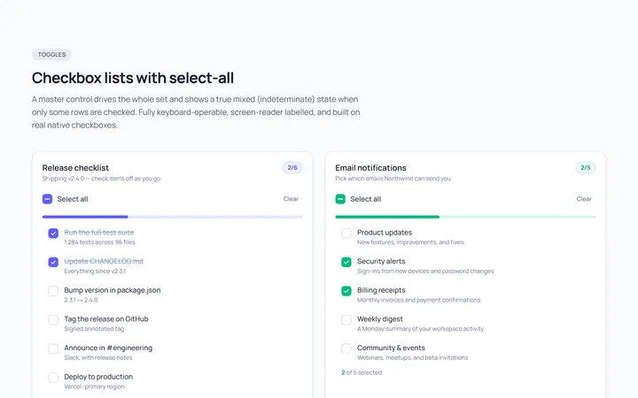
Checkbox List Toggle
Originalcheckbox list with select-all
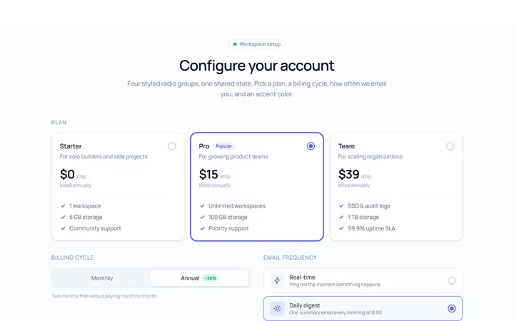
Radio Set Toggle
Originalstyled radio button group
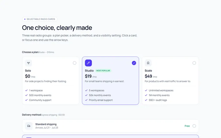
Radio Cards Toggle
Originalselectable radio cards
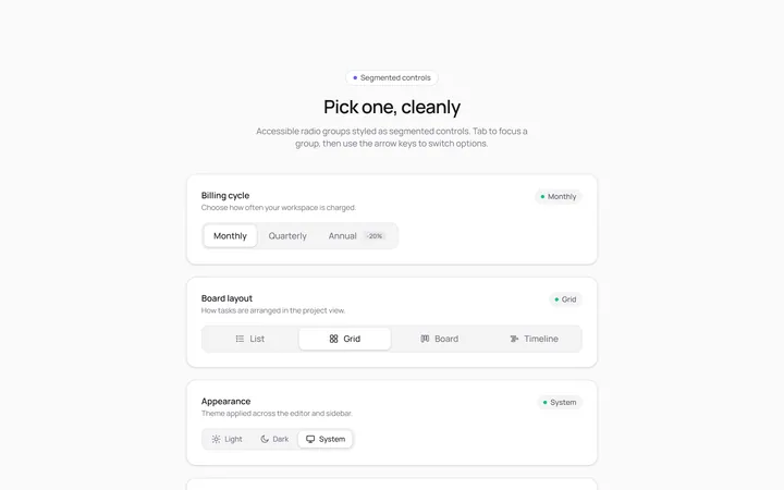
Radio Segmented Toggle
Originalsegmented control radios
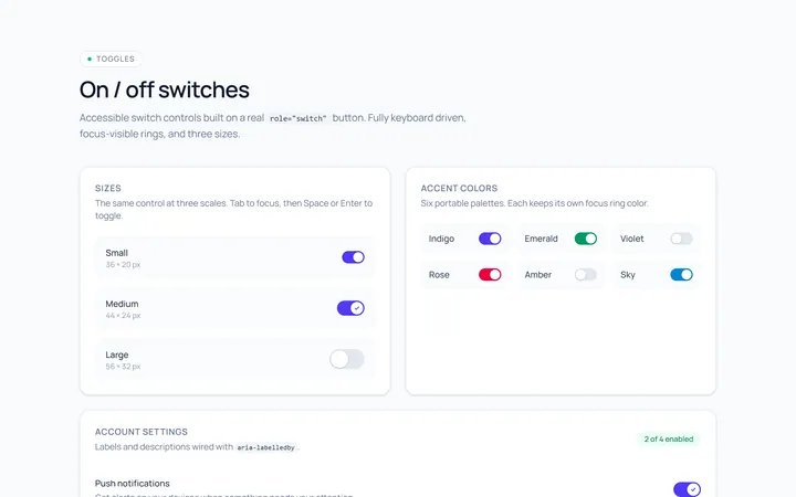
Switch Basic Toggle
Originalbasic on/off switches in sizes
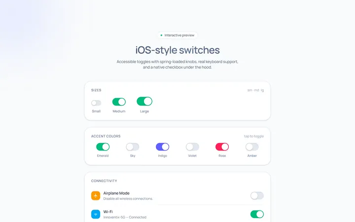
Switch iOS Toggle
OriginaliOS-style switches
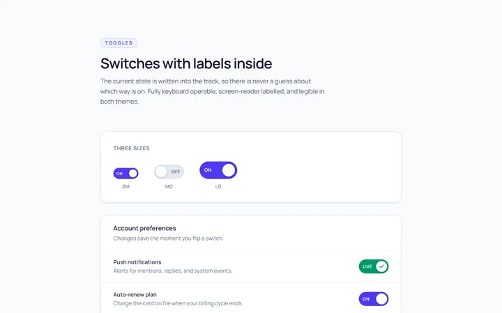
Switch Labels Toggle
Originalswitches with on/off labels inside
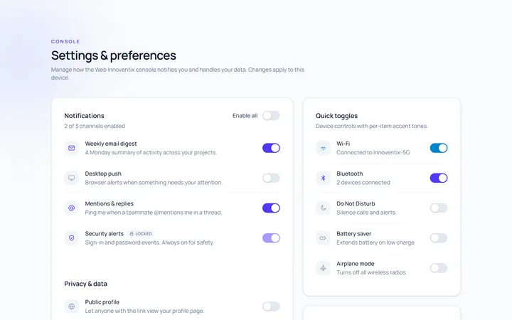
Switch Group Toggle
Originala settings list of switches