

Switch Group Toggle
Original · freea settings list of switches
byWeb InnoventixReact + Tailwind
tglswitchgrouptoggles
Copy prompt gives Claude Code, Cursor or v0 a ready-to-paste prompt that recreates this exact component.
npx shadcn@latest add https://webinnoventix.com/r/tgl-switch-group.jsontgl-switch-group.tsx
"use client";
import { useId, useState, type ReactNode } from "react";
import { motion, useReducedMotion } from "motion/react";
type Tone = "indigo" | "emerald" | "violet" | "rose" | "amber" | "sky";
type Size = "sm" | "md" | "lg";
type SettingItem = {
id: string;
label: string;
description: string;
icon?: ReactNode;
locked?: boolean;
};
const toneOn: Record<Tone, string> = {
indigo: "bg-indigo-600",
emerald: "bg-emerald-600",
violet: "bg-violet-600",
rose: "bg-rose-600",
amber: "bg-amber-500",
sky: "bg-sky-600",
};
const toneRing: Record<Tone, string> = {
indigo: "focus-visible:ring-indigo-500",
emerald: "focus-visible:ring-emerald-500",
violet: "focus-visible:ring-violet-500",
rose: "focus-visible:ring-rose-500",
amber: "focus-visible:ring-amber-500",
sky: "focus-visible:ring-sky-500",
};
const toneText: Record<Tone, string> = {
indigo: "text-indigo-600 dark:text-indigo-400",
emerald: "text-emerald-600 dark:text-emerald-400",
violet: "text-violet-600 dark:text-violet-400",
rose: "text-rose-600 dark:text-rose-400",
amber: "text-amber-600 dark:text-amber-400",
sky: "text-sky-600 dark:text-sky-400",
};
const sizeMap: Record<Size, { track: string; thumb: string; x: number }> = {
sm: { track: "h-5 w-9", thumb: "h-4 w-4", x: 16 },
md: { track: "h-6 w-11", thumb: "h-5 w-5", x: 20 },
lg: { track: "h-7 w-14", thumb: "h-6 w-6", x: 28 },
};
type SwitchProps = {
checked: boolean;
onChange: (next: boolean) => void;
labelId: string;
descId?: string;
tone?: Tone;
size?: Size;
disabled?: boolean;
};
function Switch({
checked,
onChange,
labelId,
descId,
tone = "indigo",
size = "md",
disabled = false,
}: SwitchProps) {
const reduce = useReducedMotion();
const s = sizeMap[size];
return (
<button
type="button"
role="switch"
aria-checked={checked}
aria-labelledby={labelId}
aria-describedby={descId}
disabled={disabled}
onClick={() => onChange(!checked)}
onKeyDown={(e) => {
if (disabled) return;
if (e.key === "ArrowRight" || e.key === "ArrowUp") {
e.preventDefault();
onChange(true);
} else if (e.key === "ArrowLeft" || e.key === "ArrowDown") {
e.preventDefault();
onChange(false);
}
}}
className={[
"relative inline-flex shrink-0 items-center rounded-full p-0.5 outline-none",
"transition-colors duration-200",
"focus-visible:ring-2 focus-visible:ring-offset-2",
"focus-visible:ring-offset-white dark:focus-visible:ring-offset-slate-900",
toneRing[tone],
s.track,
checked ? toneOn[tone] : "bg-slate-200 dark:bg-slate-700",
disabled ? "cursor-not-allowed opacity-50" : "cursor-pointer",
].join(" ")}
>
<motion.span
aria-hidden="true"
initial={false}
animate={{ x: checked ? s.x : 0 }}
transition={
reduce ? { duration: 0 } : { type: "spring", stiffness: 520, damping: 34 }
}
className={[
"pointer-events-none block rounded-full bg-white shadow-sm ring-1 ring-black/5",
s.thumb,
].join(" ")}
/>
</button>
);
}
type RowProps = {
item: SettingItem;
checked: boolean;
onChange: (next: boolean) => void;
tone: Tone;
size?: Size;
};
function Row({ item, checked, onChange, tone, size = "md" }: RowProps) {
const uid = useId();
const labelId = `${uid}-label`;
const descId = `${uid}-desc`;
return (
<li className="flex items-center gap-4 py-4">
{item.icon ? (
<span
aria-hidden="true"
className={[
"grid h-9 w-9 shrink-0 place-items-center rounded-xl",
"bg-slate-100 dark:bg-slate-800",
checked ? toneText[tone] : "text-slate-400 dark:text-slate-500",
"transition-colors duration-200",
].join(" ")}
>
{item.icon}
</span>
) : null}
<div className="min-w-0 flex-1">
<span
id={labelId}
className="flex items-center gap-2 text-sm font-medium text-slate-900 dark:text-slate-100"
>
<span className="truncate">{item.label}</span>
{item.locked ? (
<span className="inline-flex items-center gap-1 rounded-full bg-slate-100 px-1.5 py-0.5 text-[10px] font-semibold uppercase tracking-wide text-slate-500 dark:bg-slate-800 dark:text-slate-400">
<svg viewBox="0 0 24 24" className="h-3 w-3" fill="none" stroke="currentColor" strokeWidth={2} strokeLinecap="round" strokeLinejoin="round">
<rect x="5" y="11" width="14" height="9" rx="2" />
<path d="M8 11V8a4 4 0 0 1 8 0v3" />
</svg>
Locked
</span>
) : null}
</span>
<span id={descId} className="mt-0.5 block text-sm text-slate-500 dark:text-slate-400">
{item.description}
</span>
</div>
<Switch
checked={checked}
onChange={onChange}
labelId={labelId}
descId={descId}
tone={tone}
size={size}
disabled={item.locked}
/>
</li>
);
}
const iconProps = {
viewBox: "0 0 24 24",
className: "h-[18px] w-[18px]",
fill: "none",
stroke: "currentColor",
strokeWidth: 1.7,
strokeLinecap: "round" as const,
strokeLinejoin: "round" as const,
};
const notifications: SettingItem[] = [
{
id: "emailDigest",
label: "Weekly email digest",
description: "A Monday summary of activity across your projects.",
icon: (
<svg {...iconProps}>
<rect x="3" y="5" width="18" height="14" rx="2" />
<path d="m3 7 9 6 9-6" />
</svg>
),
},
{
id: "desktopPush",
label: "Desktop push",
description: "Browser alerts when something needs your attention.",
icon: (
<svg {...iconProps}>
<rect x="3" y="4" width="18" height="12" rx="2" />
<path d="M8 20h8M12 16v4" />
</svg>
),
},
{
id: "mentions",
label: "Mentions & replies",
description: "Ping me when a teammate @mentions me in a thread.",
icon: (
<svg {...iconProps}>
<circle cx="12" cy="12" r="4" />
<path d="M16 12v1.5a2.5 2.5 0 0 0 5 0V12a9 9 0 1 0-3.6 7.2" />
</svg>
),
},
{
id: "securityAlerts",
label: "Security alerts",
description: "Sign-in and password events. Always on for safety.",
locked: true,
icon: (
<svg {...iconProps}>
<path d="M12 3 5 6v5c0 4.5 3 7.6 7 9 4-1.4 7-4.5 7-9V6l-7-3Z" />
<path d="m9 12 2 2 4-4" />
</svg>
),
},
];
const privacy: SettingItem[] = [
{
id: "publicProfile",
label: "Public profile",
description: "Let anyone with the link view your profile page.",
icon: (
<svg {...iconProps}>
<circle cx="12" cy="12" r="9" />
<path d="M3 12h18M12 3a15 15 0 0 1 0 18 15 15 0 0 1 0-18Z" />
</svg>
),
},
{
id: "activityStatus",
label: "Show activity status",
description: "Display when you were last active to teammates.",
icon: (
<svg {...iconProps}>
<path d="M3 12h4l3 8 4-16 3 8h4" />
</svg>
),
},
{
id: "usageAnalytics",
label: "Anonymous usage data",
description: "Share product analytics to help us improve.",
icon: (
<svg {...iconProps}>
<path d="M4 20h16" />
<rect x="5" y="11" width="3" height="6" rx="1" />
<rect x="10.5" y="7" width="3" height="10" rx="1" />
<rect x="16" y="13" width="3" height="4" rx="1" />
</svg>
),
},
];
const workspace: SettingItem[] = [
{
id: "compactMode",
label: "Compact mode",
description: "Tighter spacing across tables and lists.",
icon: (
<svg {...iconProps}>
<rect x="3" y="4" width="18" height="16" rx="2" />
<path d="M3 9h18M9 9v11" />
</svg>
),
},
{
id: "autoSave",
label: "Auto-save drafts",
description: "Save changes automatically as you type.",
icon: (
<svg {...iconProps}>
<path d="M19 21H5a2 2 0 0 1-2-2V5a2 2 0 0 1 2-2h11l5 5v11a2 2 0 0 1-2 2Z" />
<path d="M17 21v-8H7v8M7 3v5h8" />
</svg>
),
},
{
id: "betaFeatures",
label: "Beta features",
description: "Try new tools before they ship to everyone.",
icon: (
<svg {...iconProps}>
<path d="M12 3l1.8 4.2L18 9l-4.2 1.8L12 15l-1.8-4.2L6 9l4.2-1.8L12 3Z" />
<path d="M19 14l.6 1.6 1.6.6-1.6.6L19 19l-.6-1.6-1.6-.6 1.6-.6L19 14Z" />
</svg>
),
},
];
const quickToggles: { item: SettingItem; tone: Tone }[] = [
{
tone: "sky",
item: {
id: "wifi",
label: "Wi-Fi",
description: "Connected to Innoventix-5G",
icon: (
<svg {...iconProps}>
<path d="M5 12.5a10 10 0 0 1 14 0M8.5 16a5 5 0 0 1 7 0" />
<circle cx="12" cy="19" r="1" fill="currentColor" stroke="none" />
</svg>
),
},
},
{
tone: "indigo",
item: {
id: "bluetooth",
label: "Bluetooth",
description: "2 devices connected",
icon: (
<svg {...iconProps}>
<path d="m7 8 10 8-5 4V4l5 4L7 16" />
</svg>
),
},
},
{
tone: "rose",
item: {
id: "dnd",
label: "Do Not Disturb",
description: "Silence calls and alerts",
icon: (
<svg {...iconProps}>
<path d="M21 12.8A8 8 0 1 1 11.2 3a6 6 0 0 0 9.8 9.8Z" />
</svg>
),
},
},
{
tone: "emerald",
item: {
id: "battery",
label: "Battery saver",
description: "Extends battery on low charge",
icon: (
<svg {...iconProps}>
<rect x="2" y="8" width="16" height="9" rx="2" />
<path d="M21 11v3M10 11v3" />
</svg>
),
},
},
{
tone: "amber",
item: {
id: "airplane",
label: "Airplane mode",
description: "Turns off all wireless radios",
icon: (
<svg {...iconProps}>
<path d="M12 3c.9 0 1.4.9 1.4 1.9v4.6l7.1 4v2l-7.1-2v4l2 1.5v1.6l-3.4-1-3.4 1v-1.6l2-1.5v-4l-7.1 2v-2l7.1-4V4.9C10.6 3.9 11.1 3 12 3Z" />
</svg>
),
},
},
];
const sizeDemo: { item: SettingItem; size: Size }[] = [
{ size: "sm", item: { id: "sizeSm", label: "Small", description: "36 × 20 track" } },
{ size: "md", item: { id: "sizeMd", label: "Medium", description: "44 × 24 track" } },
{ size: "lg", item: { id: "sizeLg", label: "Large", description: "56 × 28 track" } },
];
const initialState: Record<string, boolean> = {
emailDigest: true,
desktopPush: false,
mentions: true,
securityAlerts: true,
publicProfile: false,
activityStatus: true,
usageAnalytics: true,
compactMode: false,
autoSave: true,
betaFeatures: false,
};
const notifKeys = ["emailDigest", "desktopPush", "mentions"] as const;
export default function TglSwitchGroup() {
const [state, setState] = useState<Record<string, boolean>>(initialState);
const [saved, setSaved] = useState<Record<string, boolean>>(initialState);
const [quick, setQuick] = useState<Record<string, boolean>>({
wifi: true,
bluetooth: true,
dnd: false,
battery: false,
airplane: false,
});
const [sizes, setSizes] = useState<Record<string, boolean>>({
sizeSm: false,
sizeMd: true,
sizeLg: false,
});
const dirty = Object.keys(state).some((k) => state[k] !== saved[k]);
const enabledCount = notifKeys.filter((k) => state[k]).length;
const allNotifOn = enabledCount === notifKeys.length;
const set = (id: string) => (next: boolean) =>
setState((prev) => ({ ...prev, [id]: next }));
const setAllNotif = (next: boolean) =>
setState((prev) => ({
...prev,
emailDigest: next,
desktopPush: next,
mentions: next,
}));
const notifHeadingId = useId();
const privacyHeadingId = useId();
const workspaceHeadingId = useId();
const masterLabelId = useId();
const quickHeadingId = useId();
const sizeHeadingId = useId();
const cardClass =
"rounded-2xl border border-slate-200 bg-white shadow-sm dark:border-slate-800 dark:bg-slate-900";
const dividerList =
"divide-y divide-slate-100 dark:divide-slate-800";
return (
<section className="relative w-full overflow-hidden bg-slate-50 px-4 py-16 text-slate-900 sm:px-6 sm:py-24 dark:bg-slate-950 dark:text-slate-100">
<style>{`
@keyframes tglsg-slide-up {
from { opacity: 0; transform: translateY(10px); }
to { opacity: 1; transform: translateY(0); }
}
@keyframes tglsg-pulse {
0%, 100% { opacity: 1; transform: scale(1); }
50% { opacity: 0.45; transform: scale(0.8); }
}
.tglsg-bar { animation: tglsg-slide-up 0.3s cubic-bezier(0.22, 1, 0.36, 1) both; }
.tglsg-dot { animation: tglsg-pulse 1.8s ease-in-out infinite; }
@media (prefers-reduced-motion: reduce) {
.tglsg-bar, .tglsg-dot { animation: none !important; }
}
`}</style>
{/* soft backdrop accents */}
<div
aria-hidden="true"
className="pointer-events-none absolute -left-24 top-0 h-72 w-72 rounded-full bg-indigo-200/40 blur-3xl dark:bg-indigo-500/10"
/>
<div
aria-hidden="true"
className="pointer-events-none absolute -right-24 bottom-0 h-72 w-72 rounded-full bg-violet-200/40 blur-3xl dark:bg-violet-500/10"
/>
<div className="relative mx-auto max-w-5xl">
<header className="mb-10 max-w-2xl">
<p className="text-xs font-semibold uppercase tracking-[0.2em] text-indigo-600 dark:text-indigo-400">
Console
</p>
<h2 className="mt-2 text-2xl font-semibold tracking-tight sm:text-3xl">
Settings & preferences
</h2>
<p className="mt-2 text-sm text-slate-500 dark:text-slate-400">
Manage how the Web Innoventix console notifies you and handles your
data. Changes apply to this device.
</p>
</header>
<div className="grid gap-6 lg:grid-cols-5">
{/* Main settings card */}
<div className={`${cardClass} lg:col-span-3`}>
{/* Notifications */}
<div className="p-6 sm:p-8">
<div className="flex items-start justify-between gap-4">
<div>
<h3
id={notifHeadingId}
className="text-base font-semibold text-slate-900 dark:text-slate-100"
>
Notifications
</h3>
<p className="mt-1 text-sm text-slate-500 dark:text-slate-400">
{enabledCount} of {notifKeys.length} channels enabled
</p>
</div>
<div className="flex items-center gap-3">
<span
id={masterLabelId}
className="text-sm font-medium text-slate-700 dark:text-slate-300"
>
Enable all
</span>
<Switch
checked={allNotifOn}
onChange={setAllNotif}
labelId={masterLabelId}
tone="indigo"
/>
</div>
</div>
<ul
role="group"
aria-labelledby={notifHeadingId}
className={`mt-2 ${dividerList}`}
>
{notifications.map((item) => (
<Row
key={item.id}
item={item}
tone="indigo"
checked={state[item.id]}
onChange={set(item.id)}
/>
))}
</ul>
</div>
<div className="h-px bg-slate-100 dark:bg-slate-800" />
{/* Privacy */}
<div className="p-6 sm:p-8">
<h3
id={privacyHeadingId}
className="text-base font-semibold text-slate-900 dark:text-slate-100"
>
Privacy & data
</h3>
<ul
role="group"
aria-labelledby={privacyHeadingId}
className={`mt-2 ${dividerList}`}
>
{privacy.map((item) => (
<Row
key={item.id}
item={item}
tone="emerald"
checked={state[item.id]}
onChange={set(item.id)}
/>
))}
</ul>
</div>
<div className="h-px bg-slate-100 dark:bg-slate-800" />
{/* Workspace */}
<div className="p-6 sm:p-8">
<h3
id={workspaceHeadingId}
className="text-base font-semibold text-slate-900 dark:text-slate-100"
>
Workspace
</h3>
<ul
role="group"
aria-labelledby={workspaceHeadingId}
className={`mt-2 ${dividerList}`}
>
{workspace.map((item) => (
<Row
key={item.id}
item={item}
tone="violet"
checked={state[item.id]}
onChange={set(item.id)}
/>
))}
</ul>
</div>
{/* Footer / save bar */}
<div className="border-t border-slate-100 px-6 py-4 sm:px-8 dark:border-slate-800">
{dirty ? (
<div className="tglsg-bar flex flex-wrap items-center justify-between gap-3">
<span className="inline-flex items-center gap-2 text-sm text-amber-600 dark:text-amber-400">
<span className="tglsg-dot h-2 w-2 rounded-full bg-amber-500" />
You have unsaved changes
</span>
<div className="flex items-center gap-2">
<button
type="button"
onClick={() => setState(saved)}
className="rounded-lg px-3 py-2 text-sm font-medium text-slate-600 outline-none transition-colors hover:bg-slate-100 focus-visible:ring-2 focus-visible:ring-slate-400 focus-visible:ring-offset-2 focus-visible:ring-offset-white dark:text-slate-300 dark:hover:bg-slate-800 dark:focus-visible:ring-offset-slate-900"
>
Discard
</button>
<button
type="button"
onClick={() => setSaved(state)}
className="rounded-lg bg-indigo-600 px-4 py-2 text-sm font-semibold text-white outline-none transition-colors hover:bg-indigo-500 focus-visible:ring-2 focus-visible:ring-indigo-500 focus-visible:ring-offset-2 focus-visible:ring-offset-white dark:focus-visible:ring-offset-slate-900"
>
Save changes
</button>
</div>
</div>
) : (
<p className="inline-flex items-center gap-2 text-sm text-emerald-600 dark:text-emerald-400">
<svg viewBox="0 0 24 24" className="h-4 w-4" fill="none" stroke="currentColor" strokeWidth={2.2} strokeLinecap="round" strokeLinejoin="round">
<path d="m5 13 4 4L19 7" />
</svg>
All changes saved
</p>
)}
</div>
</div>
{/* Right column */}
<div className="flex flex-col gap-6 lg:col-span-2">
{/* Quick toggles */}
<div className={`${cardClass} p-6 sm:p-8`}>
<h3
id={quickHeadingId}
className="text-base font-semibold text-slate-900 dark:text-slate-100"
>
Quick toggles
</h3>
<p className="mt-1 text-sm text-slate-500 dark:text-slate-400">
Device controls with per-item accent tones.
</p>
<ul
role="group"
aria-labelledby={quickHeadingId}
className={`mt-2 ${dividerList}`}
>
{quickToggles.map(({ item, tone }) => (
<Row
key={item.id}
item={item}
tone={tone}
checked={quick[item.id]}
onChange={(next) =>
setQuick((prev) => ({ ...prev, [item.id]: next }))
}
/>
))}
</ul>
</div>
{/* Size variants */}
<div className={`${cardClass} p-6 sm:p-8`}>
<h3
id={sizeHeadingId}
className="text-base font-semibold text-slate-900 dark:text-slate-100"
>
Size variants
</h3>
<ul
role="group"
aria-labelledby={sizeHeadingId}
className={`mt-2 ${dividerList}`}
>
{sizeDemo.map(({ item, size }) => (
<Row
key={item.id}
item={item}
tone="sky"
size={size}
checked={sizes[item.id]}
onChange={(next) =>
setSizes((prev) => ({ ...prev, [item.id]: next }))
}
/>
))}
</ul>
<p className="mt-4 text-xs text-slate-400 dark:text-slate-500">
Tip: focus a switch and use the arrow keys to set it on or off.
</p>
</div>
</div>
</div>
</div>
</section>
);
}Dependencies
motion
Licence
Built by Web Innoventix. Free for personal and commercial use, no attribution required.
Built by Web Innoventix
Need a custom interface, a full website, or SEO that gets you cited by AI? We design, build and rank it end to end.
Get a free quoteSimilar components
Browse all →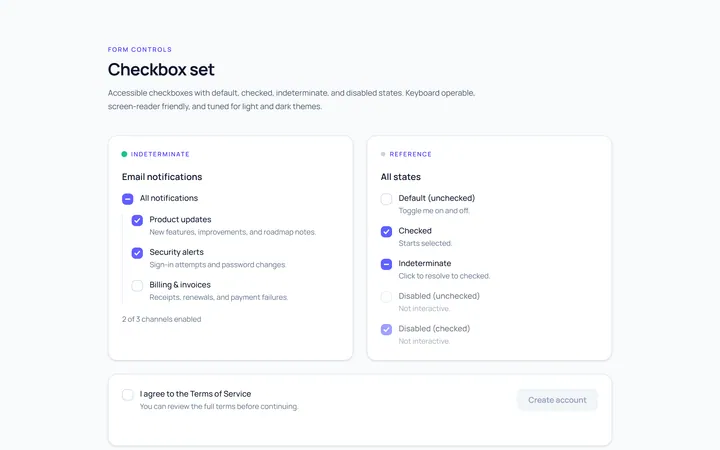
Checkbox Set Toggle
Originaldefault/checked/indeterminate/disabled checkboxes
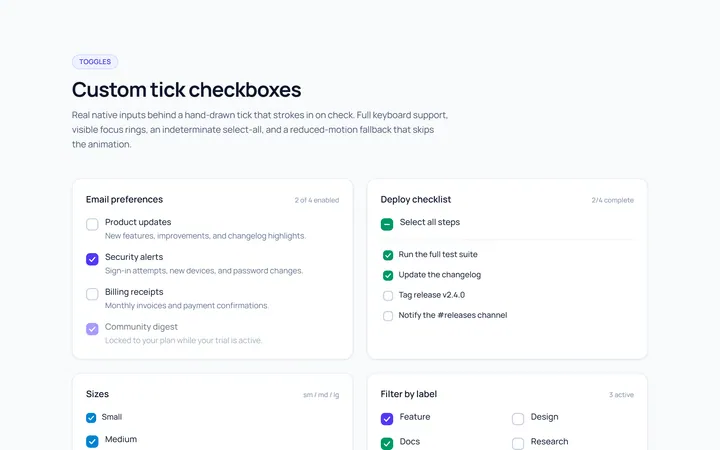
Checkbox Custom Toggle
Originalcustom animated tick checkboxes
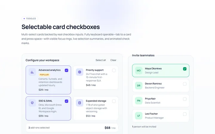
Checkbox Card Toggle
Originalselectable card checkboxes
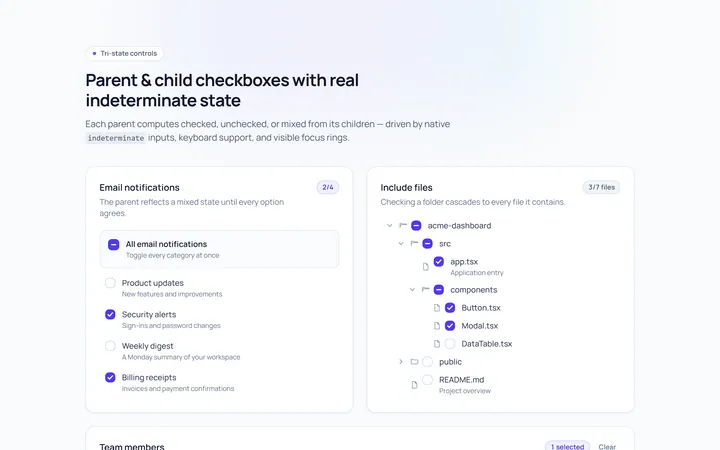
Checkbox Indeterminate Toggle
Originalparent/child indeterminate checkboxes
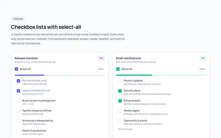
Checkbox List Toggle
Originalcheckbox list with select-all
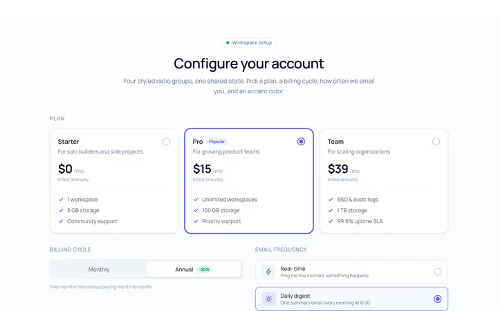
Radio Set Toggle
Originalstyled radio button group
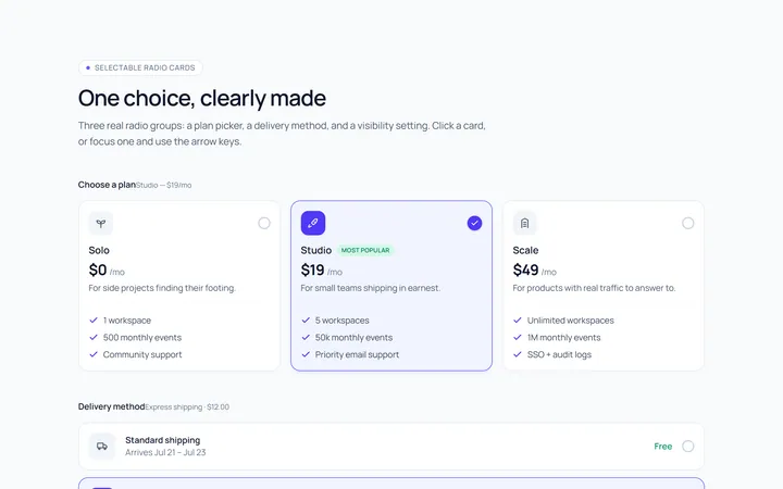
Radio Cards Toggle
Originalselectable radio cards
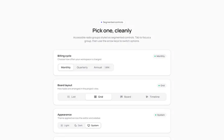
Radio Segmented Toggle
Originalsegmented control radios
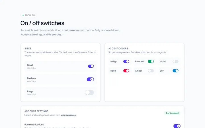
Switch Basic Toggle
Originalbasic on/off switches in sizes
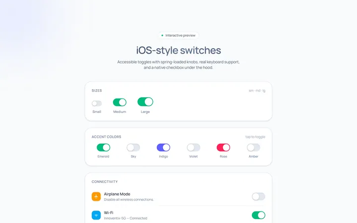
Switch iOS Toggle
OriginaliOS-style switches
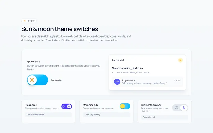
Switch Icons Toggle
Originalswitches with sun/moon style icons
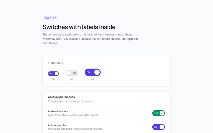
Switch Labels Toggle
Originalswitches with on/off labels inside