

Checkbox Custom Toggle
Original · freecustom animated tick checkboxes
byWeb InnoventixReact + Tailwind
tglcheckboxcustomtoggles
Copy prompt gives Claude Code, Cursor or v0 a ready-to-paste prompt that recreates this exact component.
npx shadcn@latest add https://webinnoventix.com/r/tgl-checkbox-custom.jsontgl-checkbox-custom.tsx
"use client";

import { useEffect, useId, useRef, useState, type ReactNode } from "react";
import { motion, useReducedMotion } from "motion/react";

type ColorKey = "indigo" | "violet" | "emerald" | "rose" | "amber" | "sky";
type SizeKey = "sm" | "md" | "lg";

const COLORS: Record<ColorKey, { on: string; ring: string; hover: string; tick: string }> = {
  indigo: {
    on: "border-indigo-600 bg-indigo-600 dark:border-indigo-500 dark:bg-indigo-500",
    ring: "peer-focus-visible:ring-indigo-500/60",
    hover: "peer-hover:border-indigo-400 dark:peer-hover:border-indigo-500",
    tick: "text-white",
  },
  violet: {
    on: "border-violet-600 bg-violet-600 dark:border-violet-500 dark:bg-violet-500",
    ring: "peer-focus-visible:ring-violet-500/60",
    hover: "peer-hover:border-violet-400 dark:peer-hover:border-violet-500",
    tick: "text-white",
  },
  emerald: {
    on: "border-emerald-600 bg-emerald-600 dark:border-emerald-500 dark:bg-emerald-500",
    ring: "peer-focus-visible:ring-emerald-500/60",
    hover: "peer-hover:border-emerald-400 dark:peer-hover:border-emerald-500",
    tick: "text-white",
  },
  rose: {
    on: "border-rose-600 bg-rose-600 dark:border-rose-500 dark:bg-rose-500",
    ring: "peer-focus-visible:ring-rose-500/60",
    hover: "peer-hover:border-rose-400 dark:peer-hover:border-rose-500",
    tick: "text-white",
  },
  amber: {
    on: "border-amber-500 bg-amber-500 dark:border-amber-400 dark:bg-amber-400",
    ring: "peer-focus-visible:ring-amber-500/60",
    hover: "peer-hover:border-amber-400 dark:peer-hover:border-amber-500",
    tick: "text-amber-950",
  },
  sky: {
    on: "border-sky-600 bg-sky-600 dark:border-sky-500 dark:bg-sky-500",
    ring: "peer-focus-visible:ring-sky-500/60",
    hover: "peer-hover:border-sky-400 dark:peer-hover:border-sky-500",
    tick: "text-white",
  },
};

const SIZES: Record<SizeKey, { box: string; svg: string; label: string; gap: string }> = {
  sm: { box: "h-[18px] w-[18px] rounded-[6px]", svg: "h-3.5 w-3.5", label: "text-sm", gap: "gap-2.5" },
  md: { box: "h-[22px] w-[22px] rounded-[7px]", svg: "h-4 w-4", label: "text-[15px]", gap: "gap-3" },
  lg: { box: "h-[26px] w-[26px] rounded-lg", svg: "h-[18px] w-[18px]", label: "text-base", gap: "gap-3" },
};

const KEYFRAMES = `
@keyframes tglcc-pop {
  0% { transform: scale(1); }
  38% { transform: scale(0.82); }
  70% { transform: scale(1.08); }
  100% { transform: scale(1); }
}
@keyframes tglcc-rise {
  from { opacity: 0; transform: translateY(14px); }
  to { opacity: 1; transform: translateY(0); }
}
.tglcc-pop { animation: tglcc-pop 0.3s cubic-bezier(0.34, 1.56, 0.64, 1); }
.tglcc-rise { animation: tglcc-rise 0.5s ease-out both; }
@media (prefers-reduced-motion: reduce) {
  .tglcc-pop, .tglcc-rise { animation: none !important; }
}
`;

function TickCheckbox({
  checked,
  indeterminate = false,
  onChange,
  label,
  description,
  color = "indigo",
  size = "md",
  disabled = false,
}: {
  checked: boolean;
  indeterminate?: boolean;
  onChange: (next: boolean) => void;
  label: string;
  description?: string;
  color?: ColorKey;
  size?: SizeKey;
  disabled?: boolean;
}) {
  const reduce = useReducedMotion();
  const id = useId();
  const ref = useRef<HTMLInputElement>(null);
  const c = COLORS[color];
  const s = SIZES[size];
  const active = checked || indeterminate;
  const showTick = checked && !indeterminate;

  useEffect(() => {
    if (ref.current) ref.current.indeterminate = indeterminate;
  }, [indeterminate]);

  return (
    <label
      className={[
        "group flex items-start",
        s.gap,
        disabled ? "cursor-not-allowed" : "cursor-pointer",
      ].join(" ")}
    >
      <span className="relative mt-0.5 inline-flex shrink-0 items-center justify-center">
        <input
          ref={ref}
          id={id}
          type="checkbox"
          className="peer sr-only"
          checked={checked}
          disabled={disabled}
          onChange={(e) => onChange(e.target.checked)}
          aria-describedby={description ? `${id}-desc` : undefined}
        />
        <span
          aria-hidden="true"
          className={[
            "flex items-center justify-center border-2 transition-colors duration-200",
            s.box,
            active ? c.on : "border-slate-300 bg-white dark:border-slate-600 dark:bg-slate-900",
            disabled ? "" : c.hover,
            "peer-focus-visible:outline-none peer-focus-visible:ring-2 peer-focus-visible:ring-offset-2 peer-focus-visible:ring-offset-white dark:peer-focus-visible:ring-offset-slate-950",
            c.ring,
            c.tick,
            active && !reduce ? "tglcc-pop" : "",
            disabled ? "opacity-50" : "",
          ].join(" ")}
        >
          <svg viewBox="0 0 24 24" fill="none" className={s.svg}>
            <motion.path
              d="M5 12.5 L10 17.5 L19 7"
              stroke="currentColor"
              strokeWidth={3}
              strokeLinecap="round"
              strokeLinejoin="round"
              initial={false}
              animate={{ pathLength: showTick ? 1 : 0, opacity: showTick ? 1 : 0 }}
              transition={reduce ? { duration: 0 } : { duration: 0.25, ease: "easeOut" }}
            />
            <motion.line
              x1="6"
              y1="12"
              x2="18"
              y2="12"
              stroke="currentColor"
              strokeWidth={3}
              strokeLinecap="round"
              initial={false}
              animate={{ pathLength: indeterminate ? 1 : 0, opacity: indeterminate ? 1 : 0 }}
              transition={reduce ? { duration: 0 } : { duration: 0.2, ease: "easeOut" }}
            />
          </svg>
        </span>
      </span>
      <span className="flex min-w-0 flex-col">
        <span
          className={[
            "font-medium leading-tight text-slate-800 dark:text-slate-100",
            s.label,
            disabled ? "opacity-60" : "",
          ].join(" ")}
        >
          {label}
        </span>
        {description ? (
          <span
            id={`${id}-desc`}
            className={[
              "mt-1 text-sm leading-snug text-slate-500 dark:text-slate-400",
              disabled ? "opacity-60" : "",
            ].join(" ")}
          >
            {description}
          </span>
        ) : null}
      </span>
    </label>
  );
}

function Card({ title, hint, children }: { title: string; hint: string; children: ReactNode }) {
  return (
    <div className="tglcc-rise rounded-2xl border border-slate-200 bg-white p-6 shadow-sm shadow-slate-900/5 dark:border-slate-800 dark:bg-slate-900 dark:shadow-black/20">
      <div className="mb-5 flex items-baseline justify-between gap-3">
        <h3 className="text-base font-semibold text-slate-900 dark:text-white">{title}</h3>
        <span className="shrink-0 text-xs font-medium tabular-nums text-slate-400 dark:text-slate-500">
          {hint}
        </span>
      </div>
      {children}
    </div>
  );
}

const TAGS: { key: ColorKey; label: string }[] = [
  { key: "indigo", label: "Feature" },
  { key: "violet", label: "Design" },
  { key: "emerald", label: "Docs" },
  { key: "sky", label: "Research" },
  { key: "amber", label: "Chore" },
  { key: "rose", label: "Bug" },
];

const TASKS = [
  "Run the full test suite",
  "Update the changelog",
  "Tag release v2.4.0",
  "Notify the #releases channel",
];

export default function TglCheckboxCustom() {
  const [prefs, setPrefs] = useState({
    updates: false,
    security: true,
    billing: false,
    community: true,
  });
  const prefsCount = Object.values(prefs).filter(Boolean).length;

  const [tasks, setTasks] = useState<boolean[]>([true, true, false, false]);
  const doneCount = tasks.filter(Boolean).length;
  const allDone = tasks.every(Boolean);
  const someDone = tasks.some(Boolean);
  const parentIndeterminate = someDone && !allDone;

  const [sizes, setSizes] = useState({ sm: true, md: true, lg: false });

  const [tagState, setTagState] = useState<Record<ColorKey, boolean>>({
    indigo: true,
    violet: false,
    emerald: true,
    rose: false,
    amber: true,
    sky: false,
  });
  const tagCount = Object.values(tagState).filter(Boolean).length;

  return (
    <section className="relative w-full bg-slate-50 px-6 py-20 dark:bg-slate-950 sm:px-8 lg:py-24">
      <style>{KEYFRAMES}</style>

      <div className="mx-auto max-w-5xl">
        <header className="tglcc-rise max-w-2xl">
          <span className="inline-flex items-center gap-2 rounded-full border border-indigo-200 bg-indigo-50 px-3 py-1 text-xs font-semibold uppercase tracking-wide text-indigo-700 dark:border-indigo-500/30 dark:bg-indigo-500/10 dark:text-indigo-300">
            Toggles
          </span>
          <h2 className="mt-4 text-3xl font-bold tracking-tight text-slate-900 dark:text-white sm:text-4xl">
            Custom tick checkboxes
          </h2>
          <p className="mt-3 text-base leading-relaxed text-slate-600 dark:text-slate-400">
            Real native inputs behind a hand-drawn tick that strokes in on check. Full keyboard
            support, visible focus rings, an indeterminate select-all, and a reduced-motion
            fallback that skips the animation.
          </p>
        </header>

        <div className="mt-12 grid gap-6 lg:grid-cols-2">
          <Card title="Email preferences" hint={`${prefsCount} of 4 enabled`}>
            <div className="flex flex-col gap-5">
              <TickCheckbox
                color="indigo"
                label="Product updates"
                description="New features, improvements, and changelog highlights."
                checked={prefs.updates}
                onChange={(next) => setPrefs((p) => ({ ...p, updates: next }))}
              />
              <TickCheckbox
                color="indigo"
                label="Security alerts"
                description="Sign-in attempts, new devices, and password changes."
                checked={prefs.security}
                onChange={(next) => setPrefs((p) => ({ ...p, security: next }))}
              />
              <TickCheckbox
                color="indigo"
                label="Billing receipts"
                description="Monthly invoices and payment confirmations."
                checked={prefs.billing}
                onChange={(next) => setPrefs((p) => ({ ...p, billing: next }))}
              />
              <TickCheckbox
                color="indigo"
                label="Community digest"
                description="Locked to your plan while your trial is active."
                checked={prefs.community}
                disabled
                onChange={(next) => setPrefs((p) => ({ ...p, community: next }))}
              />
            </div>
          </Card>

          <Card title="Deploy checklist" hint={`${doneCount}/${TASKS.length} complete`}>
            <TickCheckbox
              color="emerald"
              label="Select all steps"
              checked={allDone}
              indeterminate={parentIndeterminate}
              onChange={(next) => setTasks(TASKS.map(() => next))}
            />
            <div className="my-4 h-px bg-slate-200 dark:bg-slate-800" />
            <div className="flex flex-col gap-4 pl-1">
              {TASKS.map((task, i) => (
                <TickCheckbox
                  key={task}
                  color="emerald"
                  size="sm"
                  label={task}
                  checked={tasks[i]}
                  onChange={(next) =>
                    setTasks((prev) => prev.map((t, idx) => (idx === i ? next : t)))
                  }
                />
              ))}
            </div>
          </Card>
        </div>

        <div className="mt-6 grid gap-6 sm:grid-cols-2">
          <Card title="Sizes" hint="sm / md / lg">
            <div className="flex flex-col gap-5">
              <TickCheckbox
                color="sky"
                size="sm"
                label="Small"
                checked={sizes.sm}
                onChange={(next) => setSizes((v) => ({ ...v, sm: next }))}
              />
              <TickCheckbox
                color="sky"
                size="md"
                label="Medium"
                checked={sizes.md}
                onChange={(next) => setSizes((v) => ({ ...v, md: next }))}
              />
              <TickCheckbox
                color="sky"
                size="lg"
                label="Large"
                checked={sizes.lg}
                onChange={(next) => setSizes((v) => ({ ...v, lg: next }))}
              />
            </div>
          </Card>

          <Card title="Filter by label" hint={`${tagCount} active`}>
            <div className="grid grid-cols-2 gap-x-4 gap-y-5">
              {TAGS.map((tag) => (
                <TickCheckbox
                  key={tag.key}
                  color={tag.key}
                  label={tag.label}
                  checked={tagState[tag.key]}
                  onChange={(next) => setTagState((v) => ({ ...v, [tag.key]: next }))}
                />
              ))}
            </div>
          </Card>
        </div>
      </div>
    </section>
  );
}
Dependencies
motion
Licence
Built by Web Innoventix. Free for personal and commercial use, no attribution required.
Built by Web Innoventix
Need a custom interface, a full website, or SEO that gets you cited by AI? We design, build and rank it end to end.
Get a free quoteSimilar components
Browse all →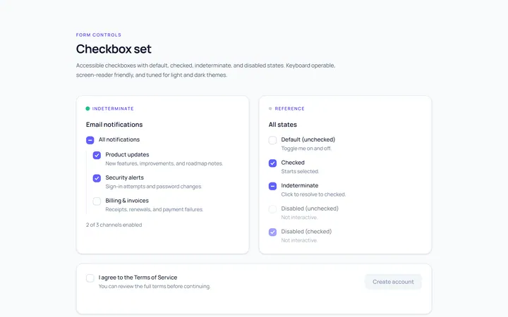
Checkbox Set Toggle
Originaldefault/checked/indeterminate/disabled checkboxes
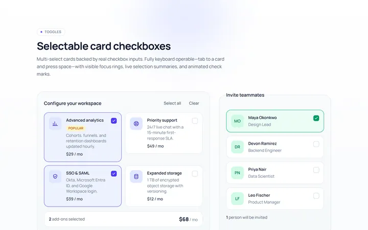
Checkbox Card Toggle
Originalselectable card checkboxes
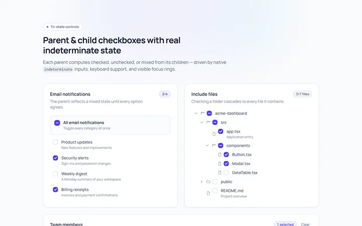
Checkbox Indeterminate Toggle
Originalparent/child indeterminate checkboxes
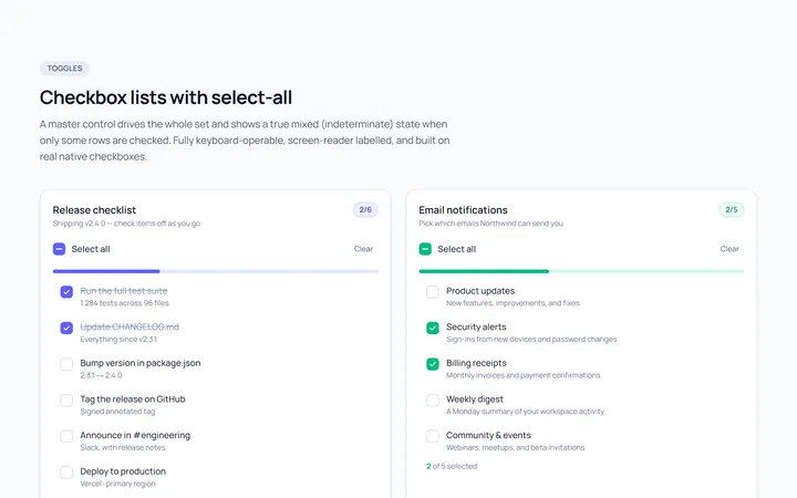
Checkbox List Toggle
Originalcheckbox list with select-all
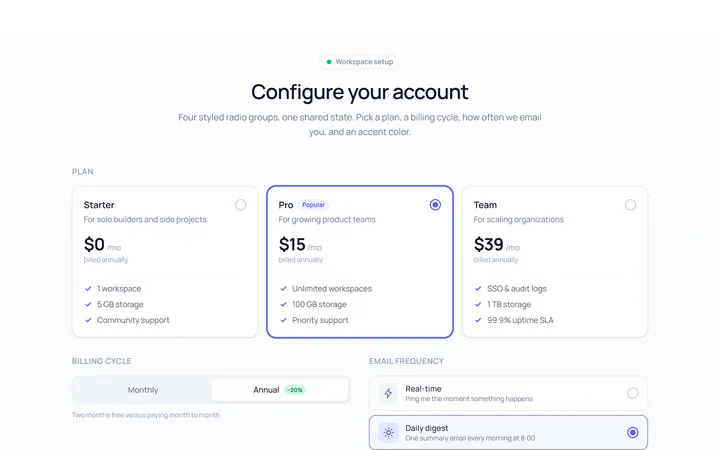
Radio Set Toggle
Originalstyled radio button group
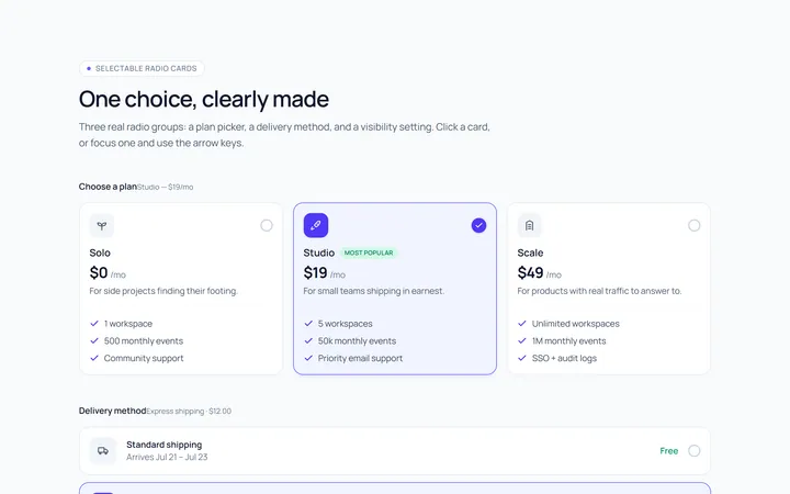
Radio Cards Toggle
Originalselectable radio cards
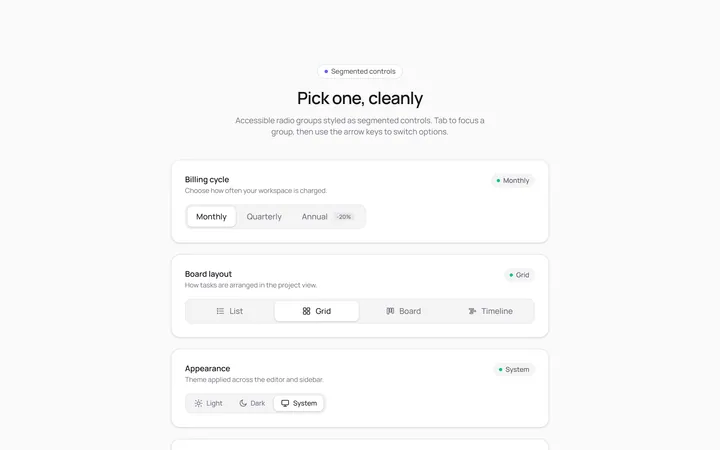
Radio Segmented Toggle
Originalsegmented control radios
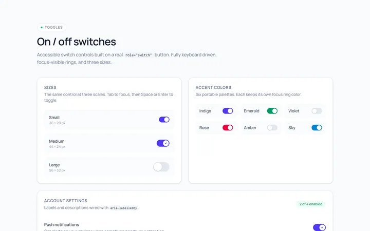
Switch Basic Toggle
Originalbasic on/off switches in sizes
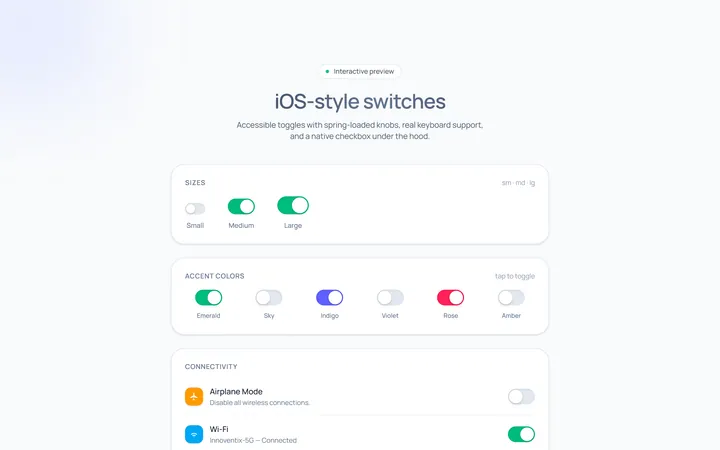
Switch iOS Toggle
OriginaliOS-style switches
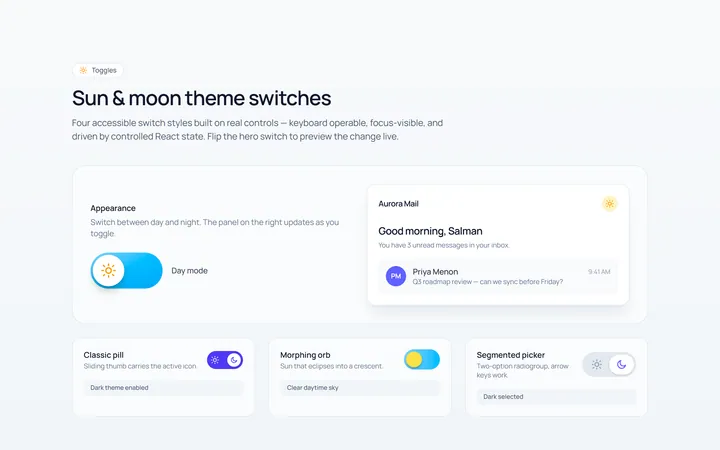
Switch Icons Toggle
Originalswitches with sun/moon style icons
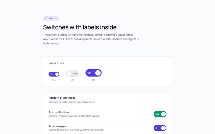
Switch Labels Toggle
Originalswitches with on/off labels inside
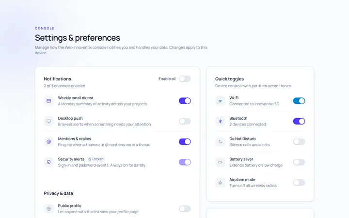
Switch Group Toggle
Originala settings list of switches