

Radio Cards Toggle
Original · freeselectable radio cards
byWeb InnoventixReact + Tailwind
tglradiocardstoggles
Copy prompt gives Claude Code, Cursor or v0 a ready-to-paste prompt that recreates this exact component.
npx shadcn@latest add https://webinnoventix.com/r/tgl-radio-cards.jsontgl-radio-cards.tsx
"use client"

import { useId, useState } from "react"
import type { ReactNode } from "react"
import { motion, useReducedMotion } from "motion/react"

/* ---------------------------------- icons --------------------------------- */

type IconProps = { className?: string }

function CheckIcon({ className }: IconProps) {
  return (
    <svg viewBox="0 0 24 24" fill="none" aria-hidden="true" className={className}>
      <path
        d="M20 6 9 17l-5-5"
        stroke="currentColor"
        strokeWidth="2.5"
        strokeLinecap="round"
        strokeLinejoin="round"
      />
    </svg>
  )
}

function SeedlingIcon({ className }: IconProps) {
  return (
    <svg viewBox="0 0 24 24" fill="none" aria-hidden="true" className={className}>
      <path
        d="M12 21v-8m0 0C12 9 9 7 4 7c0 4 3 6 8 6Zm0 0c0-4 3-6 8-6 0 4-3 6-8 6Z"
        stroke="currentColor"
        strokeWidth="1.8"
        strokeLinecap="round"
        strokeLinejoin="round"
      />
    </svg>
  )
}

function RocketIcon({ className }: IconProps) {
  return (
    <svg viewBox="0 0 24 24" fill="none" aria-hidden="true" className={className}>
      <path
        d="M5 15c-1.5 1.5-2 5-2 5s3.5-.5 5-2m8.5-14C14 5 10.5 8.5 9 12l3 3c3.5-1.5 7-5 8-11 0 0-.5 0-1.5.5Z"
        stroke="currentColor"
        strokeWidth="1.8"
        strokeLinecap="round"
        strokeLinejoin="round"
      />
      <circle cx="14.5" cy="9.5" r="1.4" fill="currentColor" />
    </svg>
  )
}

function TowerIcon({ className }: IconProps) {
  return (
    <svg viewBox="0 0 24 24" fill="none" aria-hidden="true" className={className}>
      <path
        d="M6 21V6l6-3 6 3v15M9.5 10.5h5M9.5 14.5h5M9.5 18.5h5"
        stroke="currentColor"
        strokeWidth="1.8"
        strokeLinecap="round"
        strokeLinejoin="round"
      />
    </svg>
  )
}

function TruckIcon({ className }: IconProps) {
  return (
    <svg viewBox="0 0 24 24" fill="none" aria-hidden="true" className={className}>
      <path
        d="M3 6h11v9H3zM14 9h4l3 3v3h-7M6.5 18.5a1.5 1.5 0 1 0 0-3 1.5 1.5 0 0 0 0 3ZM17.5 18.5a1.5 1.5 0 1 0 0-3 1.5 1.5 0 0 0 0 3Z"
        stroke="currentColor"
        strokeWidth="1.8"
        strokeLinecap="round"
        strokeLinejoin="round"
      />
    </svg>
  )
}

function BoltIcon({ className }: IconProps) {
  return (
    <svg viewBox="0 0 24 24" fill="none" aria-hidden="true" className={className}>
      <path
        d="M13 2 4 14h6l-1 8 9-12h-6l1-8Z"
        stroke="currentColor"
        strokeWidth="1.8"
        strokeLinecap="round"
        strokeLinejoin="round"
      />
    </svg>
  )
}

function StoreIcon({ className }: IconProps) {
  return (
    <svg viewBox="0 0 24 24" fill="none" aria-hidden="true" className={className}>
      <path
        d="M4 9h16v11H4zM4 9l1.2-4h13.6L20 9M9 20v-6h6v6"
        stroke="currentColor"
        strokeWidth="1.8"
        strokeLinecap="round"
        strokeLinejoin="round"
      />
    </svg>
  )
}

function LockIcon({ className }: IconProps) {
  return (
    <svg viewBox="0 0 24 24" fill="none" aria-hidden="true" className={className}>
      <rect x="5" y="11" width="14" height="9" rx="2" stroke="currentColor" strokeWidth="1.8" />
      <path d="M8 11V8a4 4 0 0 1 8 0v3" stroke="currentColor" strokeWidth="1.8" strokeLinecap="round" />
    </svg>
  )
}

function UsersIcon({ className }: IconProps) {
  return (
    <svg viewBox="0 0 24 24" fill="none" aria-hidden="true" className={className}>
      <circle cx="9" cy="8" r="3" stroke="currentColor" strokeWidth="1.8" />
      <path
        d="M3.5 20a5.5 5.5 0 0 1 11 0M16 5.5a3 3 0 0 1 0 5.7M17 20a5 5 0 0 0-3-4.6"
        stroke="currentColor"
        strokeWidth="1.8"
        strokeLinecap="round"
      />
    </svg>
  )
}

function GlobeIcon({ className }: IconProps) {
  return (
    <svg viewBox="0 0 24 24" fill="none" aria-hidden="true" className={className}>
      <circle cx="12" cy="12" r="9" stroke="currentColor" strokeWidth="1.8" />
      <path
        d="M3 12h18M12 3c2.5 2.5 3.8 5.7 3.8 9S14.5 18.5 12 21c-2.5-2.5-3.8-5.7-3.8-9S9.5 5.5 12 3Z"
        stroke="currentColor"
        strokeWidth="1.8"
        strokeLinecap="round"
      />
    </svg>
  )
}

/* --------------------------------- shared --------------------------------- */

type Reduce = boolean

function RadioDot({ selected, reduce }: { selected: boolean; reduce: Reduce }) {
  return (
    <span
      aria-hidden="true"
      className={[
        "relative grid h-5 w-5 shrink-0 place-items-center rounded-full border-2 transition-colors duration-200",
        selected
          ? "border-indigo-600 dark:border-indigo-400"
          : "border-slate-300 dark:border-slate-600",
      ].join(" ")}
    >
      {selected ? (
        <motion.span
          initial={reduce ? false : { scale: 0 }}
          animate={{ scale: 1 }}
          transition={{ type: "spring", stiffness: 520, damping: 24 }}
          className="h-2.5 w-2.5 rounded-full bg-indigo-600 dark:bg-indigo-400"
        />
      ) : null}
    </span>
  )
}

function CheckBadge({ reduce }: { reduce: Reduce }) {
  return (
    <motion.span
      aria-hidden="true"
      initial={reduce ? false : { scale: 0, opacity: 0 }}
      animate={{ scale: 1, opacity: 1 }}
      transition={{ type: "spring", stiffness: 480, damping: 22 }}
      className="grid h-6 w-6 place-items-center rounded-full bg-indigo-600 text-white shadow-sm shadow-indigo-600/30 dark:bg-indigo-500"
    >
      <CheckIcon className="h-3.5 w-3.5" />
    </motion.span>
  )
}

/* Base card chrome shared by every variant. `peer` styling reacts to the
   sibling native <input>, so keyboard focus + checked state drive the visuals
   even before React state updates. */
const cardBase =
  "relative flex cursor-pointer rounded-2xl border bg-white p-4 transition-all duration-200 " +
  "border-slate-200 hover:border-slate-300 hover:shadow-sm " +
  "dark:bg-slate-900/70 dark:border-slate-700/80 dark:hover:border-slate-600 " +
  "peer-checked:border-indigo-500 peer-checked:bg-indigo-50/70 peer-checked:shadow-md peer-checked:shadow-indigo-500/10 " +
  "dark:peer-checked:border-indigo-400/80 dark:peer-checked:bg-indigo-500/10 " +
  "peer-focus-visible:outline-none peer-focus-visible:ring-2 peer-focus-visible:ring-indigo-500 " +
  "peer-focus-visible:ring-offset-2 peer-focus-visible:ring-offset-white dark:peer-focus-visible:ring-offset-slate-950"

/* ------------------------------- data models ------------------------------ */

type Plan = {
  id: string
  name: string
  price: string
  cadence: string
  blurb: string
  features: string[]
  icon: (props: IconProps) => ReactNode
  tag?: string
}

const plans: Plan[] = [
  {
    id: "solo",
    name: "Solo",
    price: "$0",
    cadence: "/mo",
    blurb: "For side projects finding their footing.",
    features: ["1 workspace", "500 monthly events", "Community support"],
    icon: SeedlingIcon,
  },
  {
    id: "studio",
    name: "Studio",
    price: "$19",
    cadence: "/mo",
    blurb: "For small teams shipping in earnest.",
    features: ["5 workspaces", "50k monthly events", "Priority email support"],
    icon: RocketIcon,
    tag: "Most popular",
  },
  {
    id: "scale",
    name: "Scale",
    price: "$49",
    cadence: "/mo",
    blurb: "For products with real traffic to answer to.",
    features: ["Unlimited workspaces", "1M monthly events", "SSO + audit logs"],
    icon: TowerIcon,
  },
]

type Delivery = {
  id: string
  title: string
  eta: string
  price: string
  icon: (props: IconProps) => ReactNode
}

const deliveries: Delivery[] = [
  { id: "standard", title: "Standard shipping", eta: "Arrives Jul 21 – Jul 23", price: "Free", icon: TruckIcon },
  { id: "express", title: "Express shipping", eta: "Arrives Jul 17 – Jul 18", price: "$12.00", icon: BoltIcon },
  { id: "pickup", title: "Pick up in store", eta: "Ready today · Fillmore St.", price: "Free", icon: StoreIcon },
]

type Visibility = {
  id: string
  label: string
  desc: string
  icon: (props: IconProps) => ReactNode
}

const visibilities: Visibility[] = [
  { id: "private", label: "Private", desc: "Only you can open it.", icon: LockIcon },
  { id: "team", label: "Team", desc: "Everyone in Web Innoventix.", icon: UsersIcon },
  { id: "public", label: "Public", desc: "Anyone with the link.", icon: GlobeIcon },
]

/* -------------------------------- component ------------------------------- */

export default function TglRadioCards() {
  const reduce = useReducedMotion() ?? false
  const planName = useId()
  const deliveryName = useId()
  const visName = useId()

  const [plan, setPlan] = useState<string>("studio")
  const [delivery, setDelivery] = useState<string>("express")
  const [visibility, setVisibility] = useState<string>("team")

  const selectedPlan = plans.find((p) => p.id === plan)
  const selectedDelivery = deliveries.find((d) => d.id === delivery)

  return (
    <section className="relative w-full overflow-hidden bg-slate-50 px-4 py-16 text-slate-900 sm:py-24 dark:bg-slate-950 dark:text-slate-100">
      <style>{`
        @keyframes tglrc-glow {
          0%, 100% { opacity: 0.30; transform: scale(0.98); }
          50%      { opacity: 0.65; transform: scale(1.02); }
        }
        @keyframes tglrc-sweep {
          from { transform: translateX(-120%); }
          to   { transform: translateX(120%); }
        }
        .tglrc-glow { animation: tglrc-glow 3.4s ease-in-out infinite; }
        .tglrc-sweep { animation: tglrc-sweep 2.6s ease-in-out infinite; }
        @media (prefers-reduced-motion: reduce) {
          .tglrc-glow, .tglrc-sweep { animation: none !important; }
        }
      `}</style>

      {/* atmospheric backdrop */}
      <div
        aria-hidden="true"
        className="pointer-events-none absolute inset-0 -z-10 opacity-70 [mask-image:radial-gradient(60%_50%_at_50%_0%,black,transparent)]"
      >
        <div className="tglrc-glow absolute -top-24 left-1/2 h-72 w-[42rem] -translate-x-1/2 rounded-full bg-indigo-300/40 blur-3xl dark:bg-indigo-600/20" />
      </div>

      <div className="mx-auto max-w-5xl">
        <header className="mb-12 max-w-2xl">
          <span className="inline-flex items-center gap-2 rounded-full border border-slate-200 bg-white px-3 py-1 text-xs font-medium uppercase tracking-wider text-slate-500 dark:border-slate-800 dark:bg-slate-900 dark:text-slate-400">
            <span className="h-1.5 w-1.5 rounded-full bg-indigo-500" />
            Selectable radio cards
          </span>
          <h2 className="mt-4 text-3xl font-semibold tracking-tight text-slate-900 sm:text-4xl dark:text-white">
            One choice, clearly made
          </h2>
          <p className="mt-3 text-base leading-relaxed text-slate-600 dark:text-slate-400">
            Three real radio groups: a plan picker, a delivery method, and a visibility
            setting. Click a card, or focus one and use the arrow keys.
          </p>
        </header>

        <div className="grid gap-12">
          {/* -------------------------- Variant 1: plans ------------------------- */}
          <fieldset>
            <legend className="mb-4 flex items-baseline justify-between text-sm font-semibold text-slate-900 dark:text-white">
              <span>Choose a plan</span>
              <span aria-live="polite" className="text-xs font-normal text-slate-500 dark:text-slate-400">
                {selectedPlan ? `${selectedPlan.name} — ${selectedPlan.price}${selectedPlan.cadence}` : "None"}
              </span>
            </legend>

            <div className="grid gap-4 sm:grid-cols-3">
              {plans.map((p) => {
                const active = plan === p.id
                const Icon = p.icon
                return (
                  <label key={p.id} className="group block">
                    <input
                      type="radio"
                      name={planName}
                      value={p.id}
                      checked={active}
                      onChange={() => setPlan(p.id)}
                      aria-label={`${p.name} plan, ${p.price}${p.cadence}. ${p.blurb}`}
                      className="peer sr-only"
                    />
                    <span className={`${cardBase} flex-col`}>
                      <span className="mb-3 flex items-center justify-between">
                        <span
                          className={[
                            "grid h-10 w-10 place-items-center rounded-xl transition-colors",
                            active
                              ? "bg-indigo-600 text-white dark:bg-indigo-500"
                              : "bg-slate-100 text-slate-600 dark:bg-slate-800 dark:text-slate-300",
                          ].join(" ")}
                        >
                          <Icon className="h-5 w-5" />
                        </span>
                        {active ? <CheckBadge reduce={reduce} /> : <RadioDot selected={false} reduce={reduce} />}
                      </span>

                      <span className="flex items-center gap-2">
                        <span className="text-base font-semibold text-slate-900 dark:text-white">{p.name}</span>
                        {p.tag ? (
                          <span className="rounded-full bg-emerald-100 px-2 py-0.5 text-[10px] font-semibold uppercase tracking-wide text-emerald-700 dark:bg-emerald-500/15 dark:text-emerald-300">
                            {p.tag}
                          </span>
                        ) : null}
                      </span>

                      <span className="mt-1 flex items-baseline gap-1">
                        <span className="text-2xl font-bold tracking-tight text-slate-900 dark:text-white">{p.price}</span>
                        <span className="text-sm text-slate-500 dark:text-slate-400">{p.cadence}</span>
                      </span>

                      <span className="mt-1 text-sm text-slate-600 dark:text-slate-400">{p.blurb}</span>

                      <span className="mt-4 flex flex-col gap-2 border-t border-slate-100 pt-4 dark:border-slate-800">
                        {p.features.map((f) => (
                          <span key={f} className="flex items-center gap-2 text-sm text-slate-700 dark:text-slate-300">
                            <CheckIcon className="h-4 w-4 shrink-0 text-indigo-600 dark:text-indigo-400" />
                            {f}
                          </span>
                        ))}
                      </span>
                    </span>
                  </label>
                )
              })}
            </div>
          </fieldset>

          {/* ------------------------ Variant 2: delivery ----------------------- */}
          <fieldset>
            <legend className="mb-4 flex items-baseline justify-between text-sm font-semibold text-slate-900 dark:text-white">
              <span>Delivery method</span>
              <span aria-live="polite" className="text-xs font-normal text-slate-500 dark:text-slate-400">
                {selectedDelivery ? `${selectedDelivery.title} · ${selectedDelivery.price}` : "None"}
              </span>
            </legend>

            <div className="flex flex-col gap-3">
              {deliveries.map((d) => {
                const active = delivery === d.id
                const Icon = d.icon
                return (
                  <label key={d.id} className="block">
                    <input
                      type="radio"
                      name={deliveryName}
                      value={d.id}
                      checked={active}
                      onChange={() => setDelivery(d.id)}
                      aria-label={`${d.title}, ${d.eta}, ${d.price}`}
                      className="peer sr-only"
                    />
                    <span className={`${cardBase} items-center gap-4`}>
                      <span
                        className={[
                          "grid h-11 w-11 shrink-0 place-items-center rounded-xl transition-colors",
                          active
                            ? "bg-indigo-600 text-white dark:bg-indigo-500"
                            : "bg-slate-100 text-slate-600 dark:bg-slate-800 dark:text-slate-300",
                        ].join(" ")}
                      >
                        <Icon className="h-5 w-5" />
                      </span>

                      <span className="min-w-0 flex-1">
                        <span className="block truncate text-sm font-semibold text-slate-900 dark:text-white">{d.title}</span>
                        <span className="block truncate text-sm text-slate-500 dark:text-slate-400">{d.eta}</span>
                      </span>

                      <span
                        className={[
                          "text-sm font-semibold tabular-nums",
                          d.price === "Free"
                            ? "text-emerald-600 dark:text-emerald-400"
                            : "text-slate-900 dark:text-white",
                        ].join(" ")}
                      >
                        {d.price}
                      </span>

                      <RadioDot selected={active} reduce={reduce} />
                    </span>
                  </label>
                )
              })}
            </div>
          </fieldset>

          {/* ----------------------- Variant 3: visibility ---------------------- */}
          <fieldset>
            <legend className="mb-4 text-sm font-semibold text-slate-900 dark:text-white">
              Who can see this project?
            </legend>

            <div className="grid gap-3 sm:grid-cols-3">
              {visibilities.map((v) => {
                const active = visibility === v.id
                const Icon = v.icon
                return (
                  <label key={v.id} className="block">
                    <input
                      type="radio"
                      name={visName}
                      value={v.id}
                      checked={active}
                      onChange={() => setVisibility(v.id)}
                      aria-label={`${v.label}. ${v.desc}`}
                      className="peer sr-only"
                    />
                    <span className={`${cardBase} items-start gap-3`}>
                      <span
                        className={[
                          "grid h-9 w-9 shrink-0 place-items-center rounded-lg transition-colors",
                          active
                            ? "bg-indigo-600 text-white dark:bg-indigo-500"
                            : "bg-slate-100 text-slate-600 dark:bg-slate-800 dark:text-slate-300",
                        ].join(" ")}
                      >
                        <Icon className="h-[18px] w-[18px]" />
                      </span>
                      <span className="min-w-0">
                        <span className="block text-sm font-semibold text-slate-900 dark:text-white">{v.label}</span>
                        <span className="block text-xs leading-relaxed text-slate-500 dark:text-slate-400">{v.desc}</span>
                      </span>
                      {active ? (
                        <span className="absolute right-3 top-3">
                          <CheckBadge reduce={reduce} />
                        </span>
                      ) : null}
                    </span>
                  </label>
                )
              })}
            </div>

            {/* animated confirmation strip proves live state + gated motion */}
            <div className="relative mt-5 overflow-hidden rounded-xl border border-slate-200 bg-white px-4 py-3 dark:border-slate-800 dark:bg-slate-900">
              {!reduce ? (
                <span
                  aria-hidden="true"
                  className="tglrc-sweep pointer-events-none absolute inset-y-0 -left-1/3 w-1/3 bg-gradient-to-r from-transparent via-indigo-500/10 to-transparent"
                />
              ) : null}
              <p className="relative text-sm text-slate-600 dark:text-slate-400">
                Selected visibility:{" "}
                <span className="font-semibold text-slate-900 dark:text-white">
                  {visibilities.find((v) => v.id === visibility)?.label}
                </span>
              </p>
            </div>
          </fieldset>
        </div>
      </div>
    </section>
  )
}
Dependencies
motion
Licence
Built by Web Innoventix. Free for personal and commercial use, no attribution required.
Built by Web Innoventix
Need a custom interface, a full website, or SEO that gets you cited by AI? We design, build and rank it end to end.
Get a free quoteSimilar components
Browse all →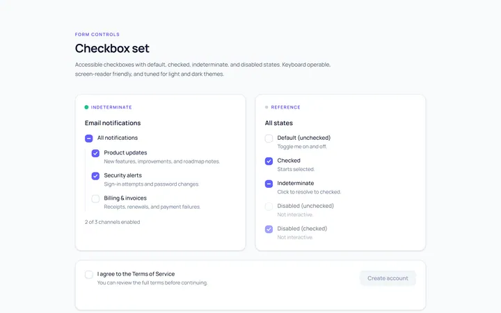
Checkbox Set Toggle
Originaldefault/checked/indeterminate/disabled checkboxes
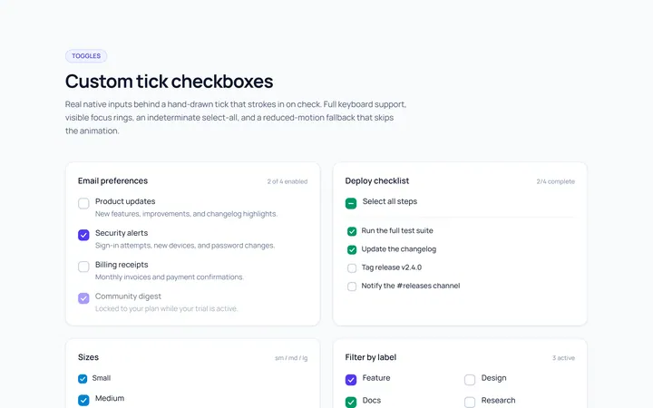
Checkbox Custom Toggle
Originalcustom animated tick checkboxes
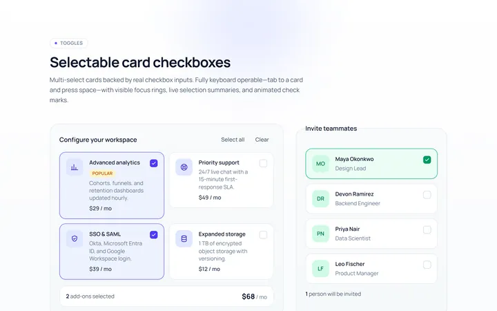
Checkbox Card Toggle
Originalselectable card checkboxes
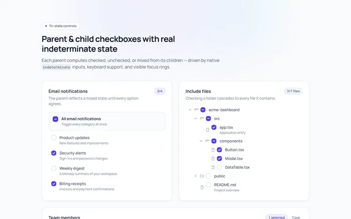
Checkbox Indeterminate Toggle
Originalparent/child indeterminate checkboxes
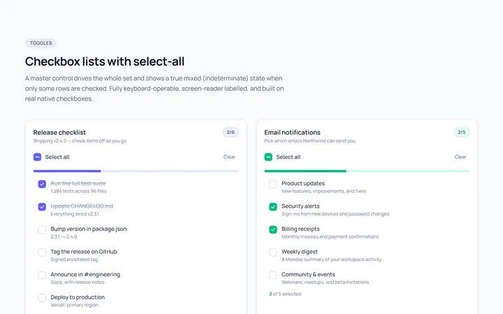
Checkbox List Toggle
Originalcheckbox list with select-all
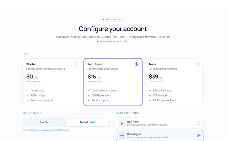
Radio Set Toggle
Originalstyled radio button group
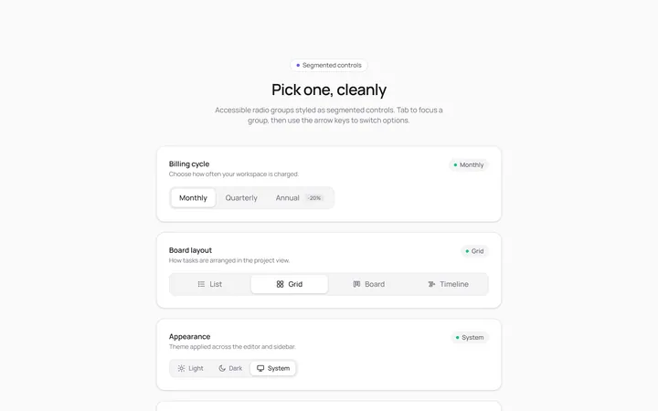
Radio Segmented Toggle
Originalsegmented control radios
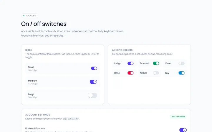
Switch Basic Toggle
Originalbasic on/off switches in sizes
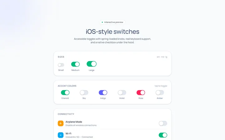
Switch iOS Toggle
OriginaliOS-style switches
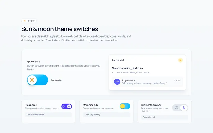
Switch Icons Toggle
Originalswitches with sun/moon style icons
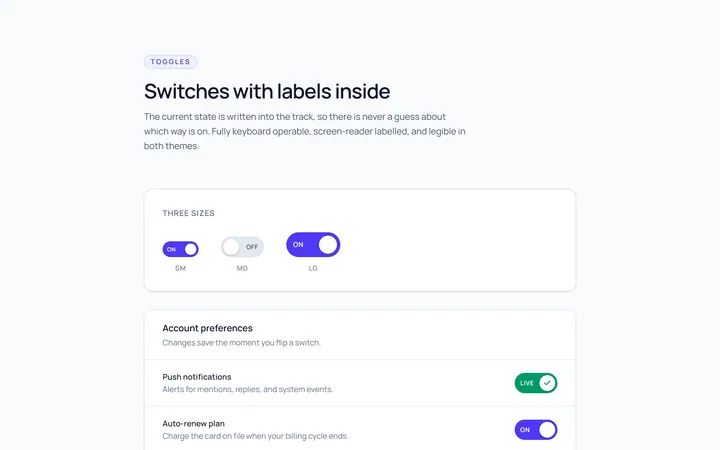
Switch Labels Toggle
Originalswitches with on/off labels inside
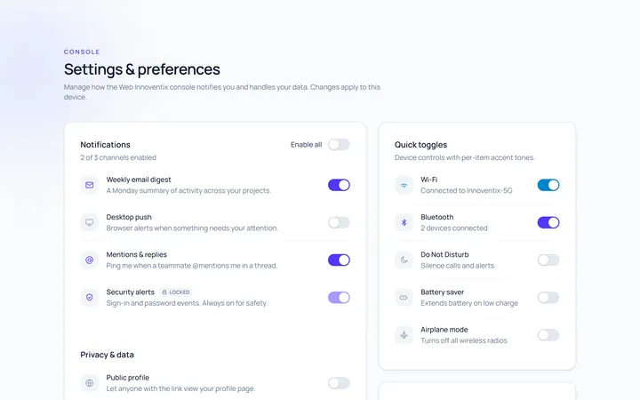
Switch Group Toggle
Originala settings list of switches