

Checkbox Tree Toggle
Original · freenested checkbox tree
byWeb InnoventixReact + Tailwind
tglcheckboxtreetoggles
Copy prompt gives Claude Code, Cursor or v0 a ready-to-paste prompt that recreates this exact component.
npx shadcn@latest add https://webinnoventix.com/r/tgl-checkbox-tree.jsontgl-checkbox-tree.tsx
"use client";

import { useMemo, useRef, useState, type KeyboardEvent } from "react";
import { AnimatePresence, motion, useReducedMotion } from "motion/react";

type TreeNode = {
  id: string;
  label: string;
  meta?: string;
  size?: number;
  children?: TreeNode[];
};

type NodeState = "on" | "off" | "mixed";

const TREE: TreeNode[] = [
  {
    id: "projects",
    label: "Projects",
    children: [
      { id: "projects-active", label: "Active projects", meta: "48 boards", size: 12.4 },
      { id: "projects-archived", label: "Archived projects", meta: "211 boards", size: 34.1 },
      { id: "projects-templates", label: "Project templates", meta: "9 templates", size: 1.2 },
    ],
  },
  {
    id: "people",
    label: "People & teams",
    children: [
      { id: "people-profiles", label: "Member profiles", meta: "126 people", size: 3.8 },
      { id: "people-structure", label: "Team structure", meta: "14 teams", size: 0.4 },
      { id: "people-roles", label: "Roles & permissions", meta: "access matrix", size: 0.2 },
    ],
  },
  {
    id: "content",
    label: "Content library",
    children: [
      {
        id: "content-docs",
        label: "Documents",
        children: [
          { id: "content-docs-specs", label: "Product specs", meta: "412 files", size: 40.2 },
          { id: "content-docs-notes", label: "Meeting notes", meta: "1,890 files", size: 61.0 },
          { id: "content-docs-wiki", label: "Team wiki", meta: "1,100 pages", size: 27.4 },
        ],
      },
      { id: "content-comments", label: "Comments & threads", meta: "9,120 threads", size: 22.3 },
      { id: "content-files", label: "File attachments", meta: "1,588 files", size: 512.9 },
    ],
  },
  {
    id: "analytics",
    label: "Analytics",
    children: [
      { id: "analytics-usage", label: "Usage reports", meta: "last 24 months", size: 8.7 },
      { id: "analytics-audit", label: "Audit logs", meta: "last 12 months", size: 44.0 },
    ],
  },
];

const collectLeaves = (node: TreeNode): TreeNode[] =>
  node.children && node.children.length > 0 ? node.children.flatMap(collectLeaves) : [node];

const getNodeState = (node: TreeNode, checked: Set<string>): NodeState => {
  const leaves = collectLeaves(node);
  const on = leaves.filter((l) => checked.has(l.id)).length;
  if (on === 0) return "off";
  if (on === leaves.length) return "on";
  return "mixed";
};

const formatSize = (mb: number): string => {
  if (mb >= 1024) return `${(mb / 1024).toFixed(2)} GB`;
  if (mb >= 100) return `${mb.toFixed(0)} MB`;
  return `${mb.toFixed(1)} MB`;
};

type FlatRow = { node: TreeNode; level: number };

const flattenVisible = (nodes: TreeNode[], expanded: Set<string>, level: number, acc: FlatRow[]): FlatRow[] => {
  for (const node of nodes) {
    acc.push({ node, level });
    if (node.children && node.children.length > 0 && expanded.has(node.id)) {
      flattenVisible(node.children, expanded, level + 1, acc);
    }
  }
  return acc;
};

function CheckGlyph({ state, animate }: { state: NodeState; animate: boolean }) {
  const filled = state !== "off";
  return (
    <span
      aria-hidden="true"
      className={[
        "relative grid h-[19px] w-[19px] shrink-0 place-items-center rounded-[6px] border-2 transition-colors duration-150",
        filled
          ? "border-indigo-600 bg-indigo-600 dark:border-indigo-500 dark:bg-indigo-500"
          : "border-slate-300 bg-white group-hover:border-slate-400 dark:border-slate-600 dark:bg-slate-900 dark:group-hover:border-slate-500",
      ].join(" ")}
    >
      {state === "on" && (
        <svg
          viewBox="0 0 20 20"
          fill="none"
          stroke="currentColor"
          strokeWidth={3}
          strokeLinecap="round"
          strokeLinejoin="round"
          className={["h-3 w-3 text-white", animate ? "tglct-pop" : ""].join(" ")}
        >
          <path d="M4.5 10.5l3.4 3.4L15.5 6.5" />
        </svg>
      )}
      {state === "mixed" && <span className="block h-[2.5px] w-2.5 rounded-full bg-white" />}
    </span>
  );
}

export default function CheckboxTree() {
  const prefersReduced = useReducedMotion();

  const [checked, setChecked] = useState<Set<string>>(
    () => new Set(["projects-active", "people-profiles", "content-docs-specs"]),
  );
  const [expanded, setExpanded] = useState<Set<string>>(() => new Set(["content", "content-docs"]));
  const [focusedId, setFocusedId] = useState<string>(TREE[0].id);
  const [lastToggled, setLastToggled] = useState<string | null>(null);

  const rowRefs = useRef<Map<string, HTMLLIElement>>(new Map());
  const setRef = (id: string, el: HTMLLIElement | null) => {
    if (el) rowRefs.current.set(id, el);
    else rowRefs.current.delete(id);
  };

  const allLeaves = useMemo(() => TREE.flatMap(collectLeaves), []);
  const allParentIds = useMemo(() => {
    const ids: string[] = [];
    const walk = (nodes: TreeNode[]) => {
      for (const n of nodes) {
        if (n.children && n.children.length > 0) {
          ids.push(n.id);
          walk(n.children);
        }
      }
    };
    walk(TREE);
    return ids;
  }, []);

  const parentMap = useMemo(() => {
    const map = new Map<string, string>();
    const walk = (nodes: TreeNode[], parent: string | null) => {
      for (const n of nodes) {
        if (parent) map.set(n.id, parent);
        if (n.children) walk(n.children, n.id);
      }
    };
    walk(TREE, null);
    return map;
  }, []);

  const visibleRows = useMemo(() => flattenVisible(TREE, expanded, 1, []), [expanded]);

  const overallState: NodeState = useMemo(() => {
    const on = allLeaves.filter((l) => checked.has(l.id)).length;
    if (on === 0) return "off";
    if (on === allLeaves.length) return "on";
    return "mixed";
  }, [allLeaves, checked]);

  const selectedSize = useMemo(
    () => allLeaves.filter((l) => checked.has(l.id)).reduce((sum, l) => sum + (l.size ?? 0), 0),
    [allLeaves, checked],
  );
  const totalSize = useMemo(() => allLeaves.reduce((sum, l) => sum + (l.size ?? 0), 0), [allLeaves]);
  const selectedCount = useMemo(() => allLeaves.filter((l) => checked.has(l.id)).length, [allLeaves, checked]);
  const pct = totalSize > 0 ? Math.round((selectedSize / totalSize) * 100) : 0;

  const toggleNode = (node: TreeNode) => {
    const leaves = collectLeaves(node);
    const state = getNodeState(node, checked);
    setChecked((prev) => {
      const next = new Set(prev);
      if (state === "on") leaves.forEach((l) => next.delete(l.id));
      else leaves.forEach((l) => next.add(l.id));
      return next;
    });
    setLastToggled(node.id);
  };

  const toggleExpanded = (id: string) => {
    setExpanded((prev) => {
      const next = new Set(prev);
      if (next.has(id)) next.delete(id);
      else next.add(id);
      return next;
    });
  };

  const toggleAll = () => {
    setChecked((prev) => (prev.size === allLeaves.length ? new Set() : new Set(allLeaves.map((l) => l.id))));
    setLastToggled("__all__");
  };

  const focusRow = (id: string) => {
    setFocusedId(id);
    const el = rowRefs.current.get(id);
    if (el) el.focus();
  };

  const onRowKeyDown = (e: KeyboardEvent<HTMLLIElement>, node: TreeNode, hasChildren: boolean) => {
    const rows = visibleRows;
    const idx = rows.findIndex((r) => r.node.id === node.id);
    if (idx < 0) return;

    switch (e.key) {
      case "ArrowDown":
        e.preventDefault();
        if (idx < rows.length - 1) focusRow(rows[idx + 1].node.id);
        break;
      case "ArrowUp":
        e.preventDefault();
        if (idx > 0) focusRow(rows[idx - 1].node.id);
        break;
      case "Home":
        e.preventDefault();
        focusRow(rows[0].node.id);
        break;
      case "End":
        e.preventDefault();
        focusRow(rows[rows.length - 1].node.id);
        break;
      case "ArrowRight":
        e.preventDefault();
        if (hasChildren) {
          if (!expanded.has(node.id)) toggleExpanded(node.id);
          else if (idx < rows.length - 1) focusRow(rows[idx + 1].node.id);
        }
        break;
      case "ArrowLeft":
        e.preventDefault();
        if (hasChildren && expanded.has(node.id)) {
          toggleExpanded(node.id);
        } else {
          const p = parentMap.get(node.id);
          if (p) focusRow(p);
        }
        break;
      case " ":
      case "Enter":
        e.preventDefault();
        toggleNode(node);
        break;
      default:
        break;
    }
  };

  const renderItem = (node: TreeNode, level: number, posinset: number, setsize: number) => {
    const hasChildren = !!(node.children && node.children.length > 0);
    const state = getNodeState(node, checked);
    const isExpanded = hasChildren && expanded.has(node.id);
    const isFocused = focusedId === node.id;
    const ariaChecked: boolean | "mixed" = state === "mixed" ? "mixed" : state === "on";
    const animateCheck = !prefersReduced && lastToggled === node.id && state === "on";
    const a11yLabel = `${node.label}${node.meta ? `, ${node.meta}` : ""}${
      node.size != null ? `, ${formatSize(node.size)}` : ""
    }`;

    return (
      <li
        key={node.id}
        role="treeitem"
        aria-checked={ariaChecked}
        aria-expanded={hasChildren ? isExpanded : undefined}
        aria-level={level}
        aria-posinset={posinset}
        aria-setsize={setsize}
        aria-label={a11yLabel}
        tabIndex={isFocused ? 0 : -1}
        ref={(el) => setRef(node.id, el)}
        onFocus={() => setFocusedId(node.id)}
        onKeyDown={(e) => onRowKeyDown(e, node, hasChildren)}
        className="rounded-lg outline-none focus-visible:ring-2 focus-visible:ring-indigo-500 focus-visible:ring-offset-2 focus-visible:ring-offset-white dark:focus-visible:ring-indigo-400 dark:focus-visible:ring-offset-slate-950"
      >
        <div
          onClick={() => toggleNode(node)}
          className={[
            "group flex cursor-pointer select-none items-center gap-2.5 rounded-lg px-2 py-2 transition-colors",
            "hover:bg-slate-100 dark:hover:bg-slate-800/70",
            state !== "off" ? "text-slate-900 dark:text-slate-50" : "text-slate-700 dark:text-slate-300",
          ].join(" ")}
        >
          {hasChildren ? (
            <button
              type="button"
              tabIndex={-1}
              aria-hidden="true"
              onClick={(e) => {
                e.stopPropagation();
                toggleExpanded(node.id);
              }}
              className="grid h-5 w-5 shrink-0 place-items-center rounded text-slate-400 hover:bg-slate-200 hover:text-slate-600 dark:text-slate-500 dark:hover:bg-slate-700 dark:hover:text-slate-200"
            >
              <svg
                viewBox="0 0 20 20"
                fill="none"
                stroke="currentColor"
                strokeWidth={2.4}
                strokeLinecap="round"
                strokeLinejoin="round"
                className="tglct-chevron h-3.5 w-3.5"
                data-open={isExpanded ? "true" : "false"}
              >
                <path d="M7.5 5l5 5-5 5" />
              </svg>
            </button>
          ) : (
            <span aria-hidden="true" className="flex h-5 w-5 shrink-0 items-center justify-center">
              <span className="h-1 w-1 rounded-full bg-slate-300 dark:bg-slate-700" />
            </span>
          )}

          <CheckGlyph state={state} animate={animateCheck} />

          <span className="flex min-w-0 flex-1 items-baseline gap-2">
            <span className="truncate text-sm font-medium">{node.label}</span>
            {node.meta && (
              <span aria-hidden="true" className="truncate text-xs text-slate-400 dark:text-slate-500">
                {node.meta}
              </span>
            )}
          </span>

          {!hasChildren && node.size != null && (
            <span
              aria-hidden="true"
              className="shrink-0 rounded-md bg-slate-100 px-1.5 py-0.5 font-mono text-[11px] tabular-nums text-slate-500 dark:bg-slate-800 dark:text-slate-400"
            >
              {formatSize(node.size)}
            </span>
          )}
        </div>

        {hasChildren && (
          <AnimatePresence initial={false}>
            {isExpanded && (
              <motion.ul
                role="group"
                initial={prefersReduced ? false : { height: 0, opacity: 0 }}
                animate={{ height: "auto", opacity: 1 }}
                exit={prefersReduced ? { opacity: 0 } : { height: 0, opacity: 0 }}
                transition={{ duration: prefersReduced ? 0 : 0.22, ease: [0.22, 1, 0.36, 1] }}
                className="ml-4 overflow-hidden border-l border-slate-200 pl-1 dark:border-slate-700/70"
              >
                {node.children!.map((child, i) =>
                  renderItem(child, level + 1, i + 1, node.children!.length),
                )}
              </motion.ul>
            )}
          </AnimatePresence>
        )}
      </li>
    );
  };

  return (
    <section className="relative w-full bg-white px-4 py-16 text-slate-900 sm:py-24 dark:bg-slate-950 dark:text-slate-100">
      <style>{`
        @keyframes tglct-pop {
          0% { transform: scale(0.5); opacity: 0; }
          55% { transform: scale(1.12); }
          100% { transform: scale(1); opacity: 1; }
        }
        .tglct-pop { animation: tglct-pop 0.28s cubic-bezier(0.34, 1.56, 0.64, 1) both; }
        .tglct-chevron { transition: transform 0.2s ease; }
        .tglct-chevron[data-open="true"] { transform: rotate(90deg); }
        @media (prefers-reduced-motion: reduce) {
          .tglct-pop { animation: none !important; }
          .tglct-chevron { transition: none !important; }
        }
      `}</style>

      <div className="mx-auto w-full max-w-xl">
        <header className="mb-6">
          <p className="mb-2 inline-flex items-center gap-2 rounded-full border border-slate-200 bg-slate-50 px-3 py-1 text-xs font-medium tracking-wide text-slate-500 dark:border-slate-800 dark:bg-slate-900 dark:text-slate-400">
            <span className="h-1.5 w-1.5 rounded-full bg-emerald-500" />
            Data export
          </p>
          <h2 className="text-2xl font-semibold tracking-tight text-slate-900 sm:text-3xl dark:text-slate-50">
            Choose what to include
          </h2>
          <p className="mt-2 text-sm leading-relaxed text-slate-500 dark:text-slate-400">
            Select the workspace data for your archive. Pick a whole category or expand it to fine-tune
            individual items. Use the arrow keys to navigate and space to toggle.
          </p>
        </header>

        <div className="overflow-hidden rounded-2xl border border-slate-200 bg-white shadow-sm dark:border-slate-800 dark:bg-slate-900">
          <div className="flex items-center justify-between gap-3 border-b border-slate-200 bg-slate-50/70 px-3 py-2.5 dark:border-slate-800 dark:bg-slate-900/60">
            <button
              type="button"
              role="checkbox"
              aria-checked={overallState === "mixed" ? "mixed" : overallState === "on"}
              onClick={toggleAll}
              className="group flex items-center gap-2.5 rounded-lg px-2 py-1.5 text-sm font-semibold text-slate-800 outline-none transition-colors hover:bg-slate-100 focus-visible:ring-2 focus-visible:ring-indigo-500 focus-visible:ring-offset-2 focus-visible:ring-offset-slate-50 dark:text-slate-100 dark:hover:bg-slate-800 dark:focus-visible:ring-indigo-400 dark:focus-visible:ring-offset-slate-900"
            >
              <CheckGlyph state={overallState} animate={!prefersReduced && lastToggled === "__all__" && overallState === "on"} />
              Select everything
            </button>
            <div className="flex items-center gap-1.5">
              <button
                type="button"
                onClick={() => setExpanded(new Set(allParentIds))}
                className="rounded-md px-2 py-1 text-xs font-medium text-slate-500 outline-none transition-colors hover:bg-slate-100 hover:text-slate-800 focus-visible:ring-2 focus-visible:ring-indigo-500 dark:text-slate-400 dark:hover:bg-slate-800 dark:hover:text-slate-100"
              >
                Expand all
              </button>
              <span aria-hidden="true" className="text-slate-300 dark:text-slate-700">
                |
              </span>
              <button
                type="button"
                onClick={() => setExpanded(new Set())}
                className="rounded-md px-2 py-1 text-xs font-medium text-slate-500 outline-none transition-colors hover:bg-slate-100 hover:text-slate-800 focus-visible:ring-2 focus-visible:ring-indigo-500 dark:text-slate-400 dark:hover:bg-slate-800 dark:hover:text-slate-100"
              >
                Collapse
              </button>
            </div>
          </div>

          <ul
            role="tree"
            aria-label="Workspace data to export"
            aria-multiselectable="true"
            className="p-2"
          >
            {TREE.map((node, i) => renderItem(node, 1, i + 1, TREE.length))}
          </ul>

          <div className="border-t border-slate-200 bg-slate-50/70 px-4 py-3.5 dark:border-slate-800 dark:bg-slate-900/60">
            <div className="mb-2 flex items-center justify-between text-xs">
              <span className="font-medium text-slate-600 dark:text-slate-300">
                <span className="tabular-nums text-slate-900 dark:text-slate-50">{selectedCount}</span>
                {" of "}
                <span className="tabular-nums">{allLeaves.length}</span> items selected
              </span>
              <span className="font-mono tabular-nums text-slate-500 dark:text-slate-400">
                {formatSize(selectedSize)} <span className="text-slate-400 dark:text-slate-600">/ {formatSize(totalSize)}</span>
              </span>
            </div>
            <div
              role="progressbar"
              aria-valuenow={pct}
              aria-valuemin={0}
              aria-valuemax={100}
              aria-label="Portion of workspace selected"
              className="h-1.5 w-full overflow-hidden rounded-full bg-slate-200 dark:bg-slate-800"
            >
              <motion.div
                className="h-full rounded-full bg-gradient-to-r from-indigo-500 to-violet-500"
                animate={{ width: `${pct}%` }}
                transition={{ duration: prefersReduced ? 0 : 0.3, ease: "easeOut" }}
              />
            </div>
          </div>
        </div>

        <div className="mt-4 flex items-center justify-end gap-3">
          <button
            type="button"
            onClick={() => setChecked(new Set())}
            disabled={selectedCount === 0}
            className="rounded-lg px-3.5 py-2 text-sm font-medium text-slate-600 outline-none transition-colors hover:bg-slate-100 focus-visible:ring-2 focus-visible:ring-indigo-500 disabled:cursor-not-allowed disabled:opacity-40 dark:text-slate-300 dark:hover:bg-slate-800 dark:focus-visible:ring-indigo-400"
          >
            Clear
          </button>
          <button
            type="button"
            disabled={selectedCount === 0}
            className="inline-flex items-center gap-2 rounded-lg bg-indigo-600 px-4 py-2 text-sm font-semibold text-white shadow-sm outline-none transition-colors hover:bg-indigo-500 focus-visible:ring-2 focus-visible:ring-indigo-500 focus-visible:ring-offset-2 focus-visible:ring-offset-white disabled:cursor-not-allowed disabled:opacity-40 dark:focus-visible:ring-indigo-400 dark:focus-visible:ring-offset-slate-950"
          >
            <svg
              viewBox="0 0 20 20"
              fill="none"
              stroke="currentColor"
              strokeWidth={2}
              strokeLinecap="round"
              strokeLinejoin="round"
              className="h-4 w-4"
              aria-hidden="true"
            >
              <path d="M10 3v10m0 0l-3.5-3.5M10 13l3.5-3.5M4 16h12" />
            </svg>
            Prepare export
          </button>
        </div>
      </div>
    </section>
  );
}
Dependencies
motion
Licence
Built by Web Innoventix. Free for personal and commercial use, no attribution required.
Built by Web Innoventix
Need a custom interface, a full website, or SEO that gets you cited by AI? We design, build and rank it end to end.
Get a free quoteSimilar components
Browse all →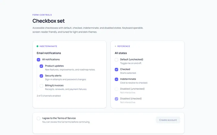
Checkbox Set Toggle
Originaldefault/checked/indeterminate/disabled checkboxes
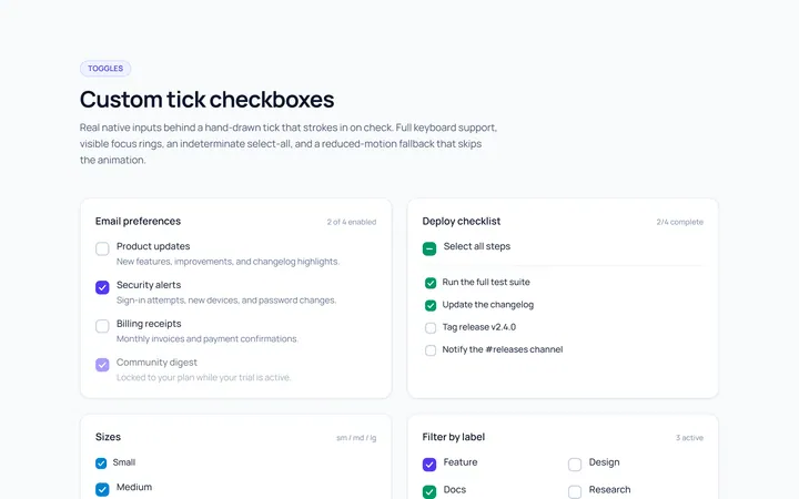
Checkbox Custom Toggle
Originalcustom animated tick checkboxes

Checkbox Card Toggle
Originalselectable card checkboxes
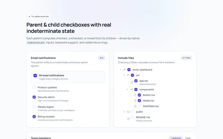
Checkbox Indeterminate Toggle
Originalparent/child indeterminate checkboxes
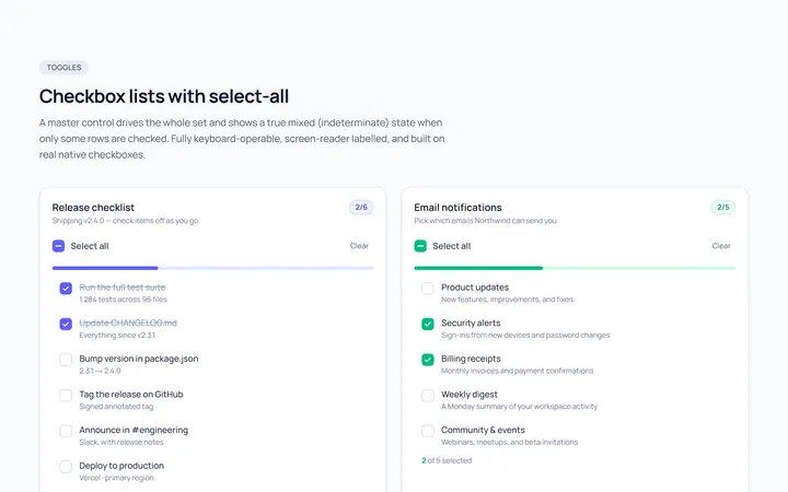
Checkbox List Toggle
Originalcheckbox list with select-all

Radio Set Toggle
Originalstyled radio button group
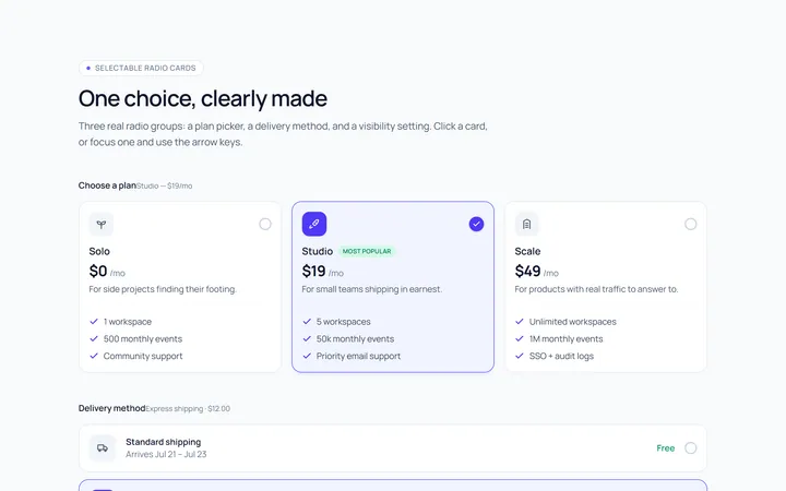
Radio Cards Toggle
Originalselectable radio cards
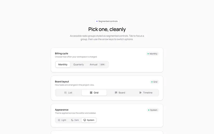
Radio Segmented Toggle
Originalsegmented control radios
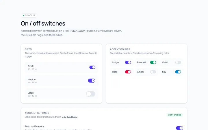
Switch Basic Toggle
Originalbasic on/off switches in sizes
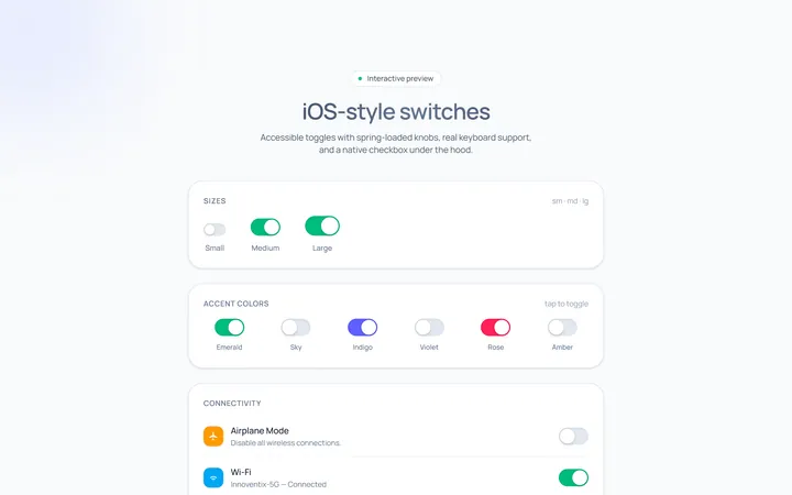
Switch iOS Toggle
OriginaliOS-style switches
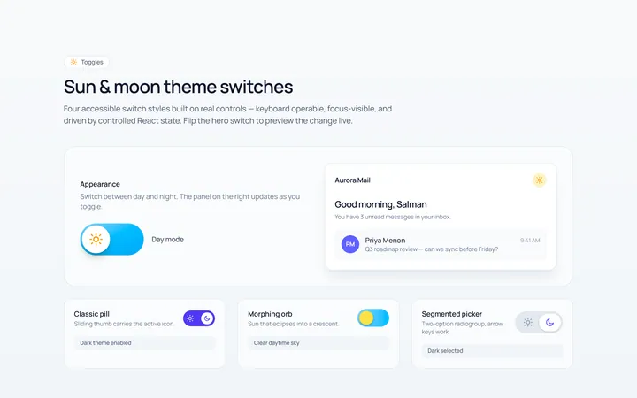
Switch Icons Toggle
Originalswitches with sun/moon style icons
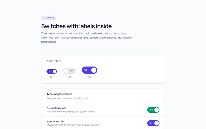
Switch Labels Toggle
Originalswitches with on/off labels inside