

Like Heart Toggle
Original · freeheart like toggle with burst
byWeb InnoventixReact + Tailwind
tgllikehearttoggles
Copy prompt gives Claude Code, Cursor or v0 a ready-to-paste prompt that recreates this exact component.
npx shadcn@latest add https://webinnoventix.com/r/tgl-like-heart.jsontgl-like-heart.tsx
"use client";
import { useMemo, useState, type CSSProperties } from "react";
import { motion, AnimatePresence, useReducedMotion } from "motion/react";
type HeartSize = "sm" | "md" | "lg";
interface Particle {
tx: number;
ty: number;
size: number;
color: string;
delay: number;
}
type ParticleStyle = CSSProperties & Record<"--tx" | "--ty", string>;
const SIZES: Record<HeartSize, { icon: number; dist: number; dot: number }> = {
sm: { icon: 20, dist: 22, dot: 4 },
md: { icon: 28, dist: 30, dot: 6 },
lg: { icon: 46, dist: 46, dot: 8 },
};
const BURST_COLORS = [
"bg-rose-400",
"bg-rose-500",
"bg-amber-400",
"bg-violet-400",
"bg-sky-400",
"bg-emerald-400",
];
function makeBurst(dist: number, dot: number): Particle[] {
const outer = Array.from({ length: 8 }, (_, i) => {
const a = (i / 8) * Math.PI * 2;
return {
tx: Math.cos(a) * dist,
ty: Math.sin(a) * dist,
size: dot,
color: BURST_COLORS[i % BURST_COLORS.length],
delay: 0,
};
});
const inner = Array.from({ length: 6 }, (_, i) => {
const a = ((i + 0.5) / 6) * Math.PI * 2;
const d = dist * 0.6;
return {
tx: Math.cos(a) * d,
ty: Math.sin(a) * d,
size: Math.max(3, dot - 2),
color: BURST_COLORS[(i + 3) % BURST_COLORS.length],
delay: 0.05,
};
});
return [...outer, ...inner];
}
const KEYFRAMES = `
@keyframes hb-particle {
0% { transform: translate(-50%, -50%) scale(0.2); opacity: 0; }
20% { opacity: 1; }
75% { transform: translate(calc(-50% + var(--tx)), calc(-50% + var(--ty))) scale(1); opacity: 1; }
100% { transform: translate(calc(-50% + var(--tx)), calc(-50% + var(--ty))) scale(0.3); opacity: 0; }
}
@keyframes hb-ring {
0% { transform: translate(-50%, -50%) scale(0.35); opacity: 0.65; }
100% { transform: translate(-50%, -50%) scale(1.7); opacity: 0; }
}
.hb-particle { animation: hb-particle 0.62s ease-out both; }
.hb-ring { animation: hb-ring 0.55s ease-out both; }
@media (prefers-reduced-motion: reduce) {
.hb-particle, .hb-ring { animation: none !important; }
}
`;
function CountText({
value,
reduced,
className,
}: {
value: number;
reduced: boolean;
className?: string;
}) {
const text = value.toLocaleString("en-US");
if (reduced) {
return <span className={`tabular-nums ${className ?? ""}`}>{text}</span>;
}
return (
<span className={`relative inline-flex overflow-hidden ${className ?? ""}`}>
<AnimatePresence initial={false} mode="popLayout">
<motion.span
key={value}
initial={{ y: "0.9em", opacity: 0 }}
animate={{ y: 0, opacity: 1 }}
exit={{ y: "-0.9em", opacity: 0 }}
transition={{ duration: 0.22, ease: "easeOut" }}
className="tabular-nums"
>
{text}
</motion.span>
</AnimatePresence>
</span>
);
}
function LikeHeart({
size = "md",
actionLabel,
initialLiked = false,
initialCount = null,
}: {
size?: HeartSize;
actionLabel: string;
initialLiked?: boolean;
initialCount?: number | null;
}) {
const prefersReduced = useReducedMotion();
const reduced = prefersReduced ?? false;
const [liked, setLiked] = useState<boolean>(initialLiked);
const cfg = SIZES[size];
const burst = useMemo(() => makeBurst(cfg.dist, cfg.dot), [cfg.dist, cfg.dot]);
const count =
initialCount === null ? null : liked ? initialCount + 1 : initialCount;
const status = `${liked ? "Liked" : "Not liked"}${
count === null ? "" : `, ${count.toLocaleString("en-US")} likes`
}`;
return (
<span className="inline-flex items-center">
<motion.button
type="button"
onClick={() => setLiked((v) => !v)}
aria-pressed={liked}
aria-label={`${liked ? "Remove like from" : "Like"} ${actionLabel}`}
whileTap={reduced ? undefined : { scale: 0.9 }}
className="group relative inline-flex select-none items-center gap-1.5 rounded-full px-2 py-1.5 transition-colors hover:bg-rose-50 focus-visible:outline-none focus-visible:ring-2 focus-visible:ring-rose-500 focus-visible:ring-offset-2 focus-visible:ring-offset-white dark:hover:bg-rose-500/10 dark:focus-visible:ring-offset-zinc-900"
>
<span
className="relative inline-flex items-center justify-center"
style={{ width: cfg.icon, height: cfg.icon }}
>
{!reduced && liked && (
<span
aria-hidden="true"
className="pointer-events-none absolute inset-0"
>
<span
className="hb-ring absolute left-1/2 top-1/2 rounded-full border-2 border-rose-400"
style={{ width: cfg.icon * 1.5, height: cfg.icon * 1.5 }}
/>
{burst.map((p, i) => {
const style: ParticleStyle = {
width: p.size,
height: p.size,
animationDelay: `${p.delay}s`,
"--tx": `${p.tx}px`,
"--ty": `${p.ty}px`,
};
return (
<span
key={i}
className={`hb-particle absolute left-1/2 top-1/2 rounded-full ${p.color}`}
style={style}
/>
);
})}
</span>
)}
<motion.span
className={`relative block ${
liked
? "text-rose-500"
: "text-zinc-400 group-hover:text-rose-400 dark:text-zinc-500 dark:group-hover:text-rose-400"
}`}
animate={reduced ? { scale: 1 } : { scale: liked ? [1, 1.35, 0.9, 1] : 1 }}
transition={
reduced
? { duration: 0 }
: { duration: 0.5, ease: "easeOut", times: [0, 0.28, 0.52, 1] }
}
style={{ width: cfg.icon, height: cfg.icon }}
>
<svg
viewBox="0 0 24 24"
width={cfg.icon}
height={cfg.icon}
fill={liked ? "currentColor" : "none"}
stroke="currentColor"
strokeWidth={1.8}
strokeLinejoin="round"
strokeLinecap="round"
className="transition-colors duration-200"
aria-hidden="true"
>
<path d="M12 21.35l-1.45-1.32C5.4 15.36 2 12.28 2 8.5 2 5.42 4.42 3 7.5 3c1.74 0 3.41.81 4.5 2.09C13.09 3.81 14.76 3 16.5 3 19.58 3 22 5.42 22 8.5c0 3.78-3.4 6.86-8.55 11.54L12 21.35z" />
</svg>
</motion.span>
</span>
{count !== null && (
<CountText
value={count}
reduced={reduced}
className={`text-sm font-semibold ${
liked ? "text-rose-500" : "text-zinc-600 dark:text-zinc-300"
}`}
/>
)}
</motion.button>
<span className="sr-only" role="status" aria-live="polite">
{status}
</span>
</span>
);
}
function Avatar({ initials, className }: { initials: string; className: string }) {
return (
<span
aria-hidden="true"
className={`grid h-10 w-10 shrink-0 place-items-center rounded-full text-sm font-semibold ${className}`}
>
{initials}
</span>
);
}
function Stars({ value }: { value: number }) {
return (
<span
className="inline-flex items-center gap-0.5"
aria-label={`Rated ${value} out of 5`}
>
{Array.from({ length: 5 }, (_, i) => (
<svg
key={i}
viewBox="0 0 20 20"
fill="currentColor"
aria-hidden="true"
className={`h-4 w-4 ${
i < value ? "text-amber-400" : "text-zinc-300 dark:text-zinc-600"
}`}
>
<path d="M10 1.5l2.6 5.27 5.82.85-4.21 4.1.99 5.79L10 14.77 4.8 17.5l.99-5.79L1.58 7.62l5.82-.85L10 1.5z" />
</svg>
))}
</span>
);
}
const COMMENTS = [
{
name: "Devin Osei",
initials: "DO",
avatar: "bg-indigo-100 text-indigo-700 dark:bg-indigo-500/20 dark:text-indigo-300",
time: "2h",
text: "This tutorial finally made flexbox click for me. The alignment section alone was worth it.",
likes: 214,
liked: true,
},
{
name: "Priya Nair",
initials: "PN",
avatar: "bg-emerald-100 text-emerald-700 dark:bg-emerald-500/20 dark:text-emerald-300",
time: "5h",
text: "Bookmarking this for the whole team — clearest explanation of stacking contexts I've read.",
likes: 47,
liked: false,
},
];
export default function LikeHeartToggle() {
return (
<section className="relative w-full overflow-hidden bg-gradient-to-b from-white to-zinc-50 px-6 py-20 text-zinc-900 dark:from-zinc-950 dark:to-zinc-900 dark:text-zinc-50 sm:px-8 lg:py-28">
<style>{KEYFRAMES}</style>
<div
aria-hidden="true"
className="pointer-events-none absolute inset-x-0 top-0 -z-10 h-72 bg-gradient-to-b from-rose-100/70 to-transparent dark:from-rose-500/10"
/>
<div className="mx-auto max-w-5xl">
<header className="mx-auto max-w-2xl text-center">
<span className="inline-flex items-center gap-2 rounded-full border border-rose-200 bg-rose-50 px-3 py-1 text-xs font-semibold uppercase tracking-widest text-rose-600 dark:border-rose-500/30 dark:bg-rose-500/10 dark:text-rose-300">
Micro-interaction
</span>
<h2 className="mt-5 text-balance text-3xl font-bold tracking-tight sm:text-4xl">
One tap to show some love
</h2>
<p className="mt-4 text-pretty text-base leading-relaxed text-zinc-600 dark:text-zinc-400">
A tactile like control with a radiating particle burst, an animated
count, and full keyboard support. Tap a heart, or focus it and press
Enter or Space.
</p>
</header>
<div className="mt-12 grid gap-5 sm:grid-cols-2 lg:grid-cols-3">
<div className="flex flex-col items-center justify-center gap-4 rounded-3xl border border-zinc-200 bg-white/70 p-8 text-center shadow-sm backdrop-blur dark:border-zinc-800 dark:bg-zinc-900/60 sm:col-span-2 lg:col-span-1">
<span className="text-xs font-semibold uppercase tracking-widest text-rose-500">
Wishlist
</span>
<LikeHeart
size="lg"
actionLabel="the Aria lounge chair"
initialCount={null}
/>
<div>
<p className="text-base font-semibold">Save to favorites</p>
<p className="mt-1 text-sm leading-relaxed text-zinc-500 dark:text-zinc-400">
Tap the heart and we’ll keep the Aria lounge chair in your
collection.
</p>
</div>
</div>
<div className="flex flex-col gap-4 rounded-3xl border border-zinc-200 bg-white p-6 shadow-sm dark:border-zinc-800 dark:bg-zinc-900 sm:col-span-2">
<div className="flex items-start gap-3">
<Avatar
initials="AW"
className="bg-rose-100 text-rose-700 dark:bg-rose-500/20 dark:text-rose-300"
/>
<div className="min-w-0 flex-1">
<div className="flex flex-wrap items-center gap-x-2 gap-y-0.5">
<p className="font-semibold">Amara Whitfield</p>
<span className="inline-flex items-center gap-1 rounded-full bg-emerald-50 px-2 py-0.5 text-xs font-medium text-emerald-700 dark:bg-emerald-500/15 dark:text-emerald-300">
<svg
viewBox="0 0 20 20"
fill="currentColor"
aria-hidden="true"
className="h-3 w-3"
>
<path
fillRule="evenodd"
d="M16.7 5.3a1 1 0 010 1.4l-7.5 7.5a1 1 0 01-1.4 0L3.3 9.7a1 1 0 011.4-1.4l3.3 3.29 6.8-6.8a1 1 0 011.4 0z"
clipRule="evenodd"
/>
</svg>
Verified buyer
</span>
</div>
<div className="mt-1">
<Stars value={5} />
</div>
</div>
</div>
<p className="text-pretty text-sm leading-relaxed text-zinc-600 dark:text-zinc-300">
“The ceramic glaze is even better in person — perfectly
even, no pooling at the base, and it survived three dinner parties
without a single chip. Worth every penny.”
</p>
<div className="flex items-center justify-between border-t border-zinc-100 pt-3 dark:border-zinc-800">
<LikeHeart
size="md"
actionLabel="Amara's review"
initialCount={1204}
/>
<div className="flex items-center gap-4 pr-1 text-sm text-zinc-500 dark:text-zinc-400">
<span className="inline-flex items-center gap-1.5">
<svg
viewBox="0 0 24 24"
fill="none"
stroke="currentColor"
strokeWidth={1.8}
strokeLinecap="round"
strokeLinejoin="round"
aria-hidden="true"
className="h-4 w-4"
>
<path d="M21 11.5a8.38 8.38 0 01-.9 3.8 8.5 8.5 0 01-7.6 4.7 8.38 8.38 0 01-3.8-.9L3 21l1.9-5.7a8.38 8.38 0 01-.9-3.8 8.5 8.5 0 014.7-7.6 8.38 8.38 0 013.8-.9h.5a8.48 8.48 0 018 8v.5z" />
</svg>
38
<span className="sr-only">replies</span>
</span>
<span className="inline-flex items-center gap-1.5">
<svg
viewBox="0 0 24 24"
fill="none"
stroke="currentColor"
strokeWidth={1.8}
strokeLinecap="round"
strokeLinejoin="round"
aria-hidden="true"
className="h-4 w-4"
>
<circle cx="18" cy="5" r="3" />
<circle cx="6" cy="12" r="3" />
<circle cx="18" cy="19" r="3" />
<path d="M8.6 13.5l6.8 4M15.4 6.5l-6.8 4" />
</svg>
<span className="sr-only">shares</span>
12
</span>
</div>
</div>
</div>
<div className="rounded-3xl border border-zinc-200 bg-white p-6 shadow-sm dark:border-zinc-800 dark:bg-zinc-900 sm:col-span-2 lg:col-span-3">
<p className="mb-2 text-sm font-semibold text-zinc-500 dark:text-zinc-400">
Recent comments
</p>
<ul className="divide-y divide-zinc-100 dark:divide-zinc-800">
{COMMENTS.map((c) => (
<li key={c.name} className="flex items-start gap-3 py-4">
<Avatar initials={c.initials} className={c.avatar} />
<div className="min-w-0 flex-1">
<p className="text-sm">
<span className="font-semibold">{c.name}</span>
<span className="text-zinc-400 dark:text-zinc-500">
{" "}
· {c.time}
</span>
</p>
<p className="mt-0.5 text-pretty text-sm leading-relaxed text-zinc-600 dark:text-zinc-300">
{c.text}
</p>
</div>
<div className="pt-0.5">
<LikeHeart
size="sm"
actionLabel={`${c.name}'s comment`}
initialLiked={c.liked}
initialCount={c.likes}
/>
</div>
</li>
))}
</ul>
</div>
</div>
<p className="mt-8 text-center text-sm text-zinc-500 dark:text-zinc-400">
Tip: focus any heart and press{" "}
<kbd className="rounded border border-zinc-300 bg-zinc-100 px-1.5 py-0.5 font-mono text-xs text-zinc-700 dark:border-zinc-700 dark:bg-zinc-800 dark:text-zinc-200">
Space
</kbd>{" "}
or{" "}
<kbd className="rounded border border-zinc-300 bg-zinc-100 px-1.5 py-0.5 font-mono text-xs text-zinc-700 dark:border-zinc-700 dark:bg-zinc-800 dark:text-zinc-200">
Enter
</kbd>{" "}
to toggle it.
</p>
</div>
</section>
);
}Dependencies
motion
Licence
Built by Web Innoventix. Free for personal and commercial use, no attribution required.
Built by Web Innoventix
Need a custom interface, a full website, or SEO that gets you cited by AI? We design, build and rank it end to end.
Get a free quoteSimilar components
Browse all →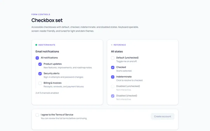
Checkbox Set Toggle
Originaldefault/checked/indeterminate/disabled checkboxes
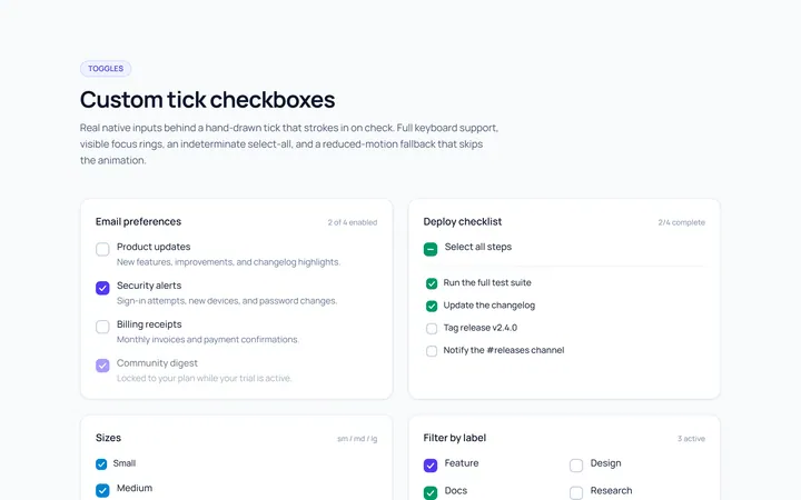
Checkbox Custom Toggle
Originalcustom animated tick checkboxes
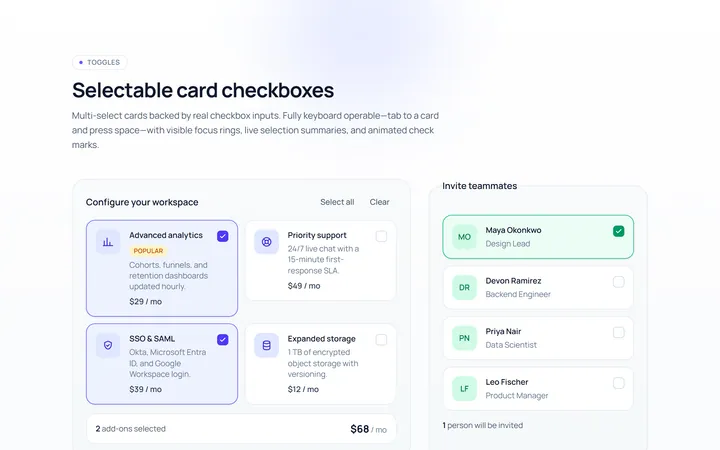
Checkbox Card Toggle
Originalselectable card checkboxes
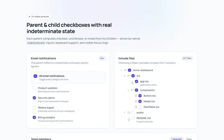
Checkbox Indeterminate Toggle
Originalparent/child indeterminate checkboxes
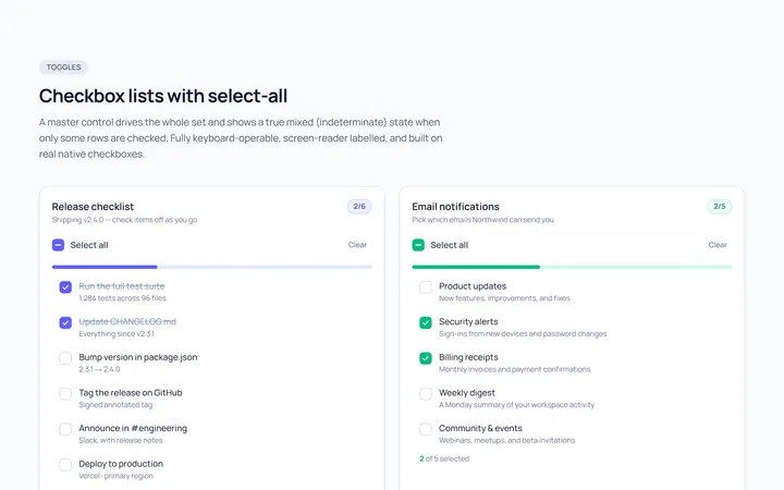
Checkbox List Toggle
Originalcheckbox list with select-all
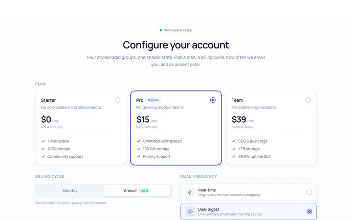
Radio Set Toggle
Originalstyled radio button group
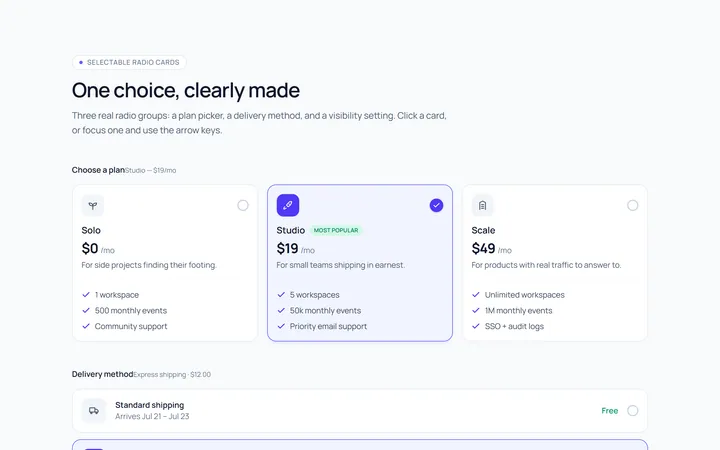
Radio Cards Toggle
Originalselectable radio cards
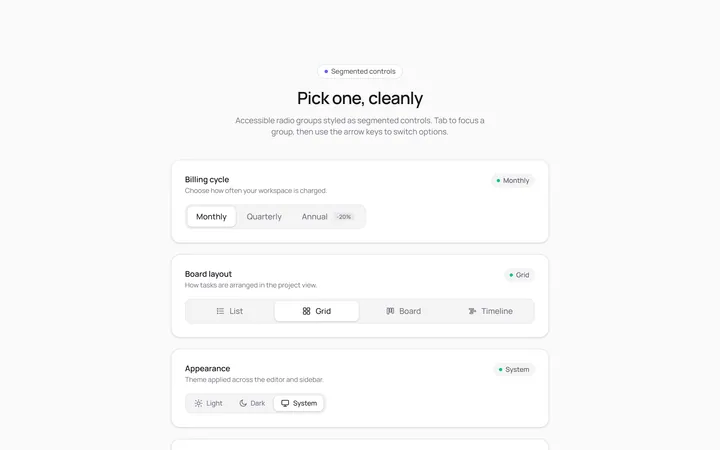
Radio Segmented Toggle
Originalsegmented control radios
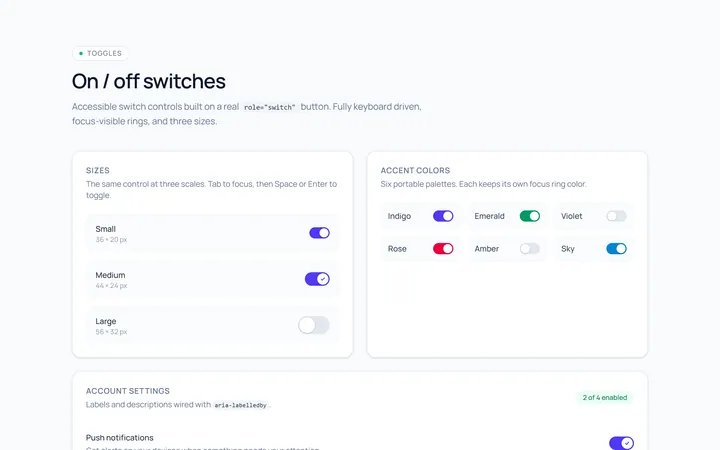
Switch Basic Toggle
Originalbasic on/off switches in sizes
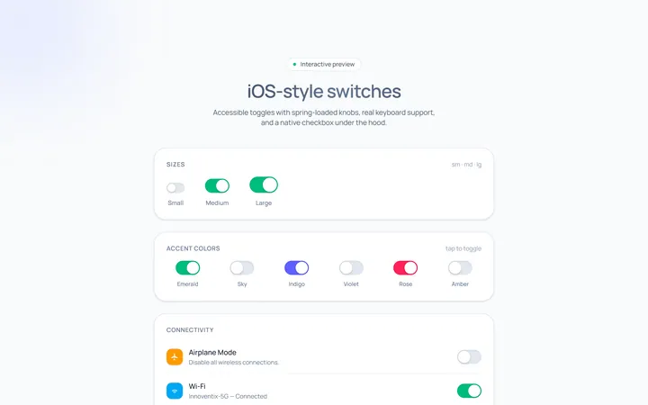
Switch iOS Toggle
OriginaliOS-style switches
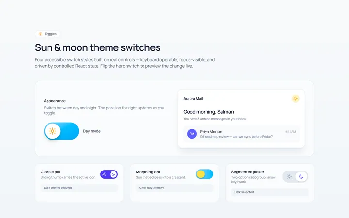
Switch Icons Toggle
Originalswitches with sun/moon style icons
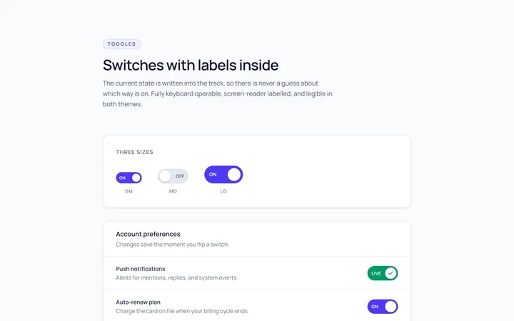
Switch Labels Toggle
Originalswitches with on/off labels inside