

Pill Multi Toggle
Original · freemulti-select pill toggles
byWeb InnoventixReact + Tailwind
tglpillmultitoggles
Copy prompt gives Claude Code, Cursor or v0 a ready-to-paste prompt that recreates this exact component.
npx shadcn@latest add https://webinnoventix.com/r/tgl-pill-multi.jsontgl-pill-multi.tsx
"use client";
import { useId, useState } from "react";
import { motion, useReducedMotion } from "motion/react";
type PillOption = {
value: string;
label: string;
};
type Tone = "indigo" | "emerald" | "violet";
const OFF_PILL =
"border-slate-300 bg-white text-slate-700 hover:border-slate-400 hover:bg-slate-50 " +
"dark:border-slate-700 dark:bg-slate-900 dark:text-slate-200 dark:hover:border-slate-600 dark:hover:bg-slate-800";
const TONES: Record<
Tone,
{ on: string; ring: string; accent: string; softDot: string }
> = {
indigo: {
on: "border-indigo-600 bg-indigo-600 text-white shadow-sm shadow-indigo-600/25 dark:border-indigo-500 dark:bg-indigo-500",
ring: "peer-focus-visible:ring-indigo-500 dark:peer-focus-visible:ring-indigo-400",
accent: "text-indigo-700 dark:text-indigo-300",
softDot: "bg-indigo-500",
},
emerald: {
on: "border-emerald-600 bg-emerald-600 text-white shadow-sm shadow-emerald-600/25 dark:border-emerald-500 dark:bg-emerald-500",
ring: "peer-focus-visible:ring-emerald-500 dark:peer-focus-visible:ring-emerald-400",
accent: "text-emerald-700 dark:text-emerald-300",
softDot: "bg-emerald-500",
},
violet: {
on: "border-violet-600 bg-violet-600 text-white shadow-sm shadow-violet-600/25 dark:border-violet-500 dark:bg-violet-500",
ring: "peer-focus-visible:ring-violet-500 dark:peer-focus-visible:ring-violet-400",
accent: "text-violet-700 dark:text-violet-300",
softDot: "bg-violet-500",
},
};
function CheckIcon() {
return (
<svg
viewBox="0 0 16 16"
fill="none"
aria-hidden="true"
className="h-3.5 w-3.5"
>
<path
d="M3.5 8.5l3 3 6-7"
stroke="currentColor"
strokeWidth={2}
strokeLinecap="round"
strokeLinejoin="round"
/>
</svg>
);
}
function PlusIcon() {
return (
<svg
viewBox="0 0 16 16"
fill="none"
aria-hidden="true"
className="h-3.5 w-3.5 opacity-55"
>
<path
d="M8 3.5v9M3.5 8h9"
stroke="currentColor"
strokeWidth={2}
strokeLinecap="round"
/>
</svg>
);
}
function PillChip({
option,
checked,
disabled,
tone,
onToggle,
}: {
option: PillOption;
checked: boolean;
disabled: boolean;
tone: Tone;
onToggle: () => void;
}) {
const reduce = useReducedMotion();
const t = TONES[tone];
return (
<label
className={`group inline-flex ${
disabled ? "cursor-not-allowed" : "cursor-pointer"
} select-none`}
>
<input
type="checkbox"
className="peer sr-only"
checked={checked}
disabled={disabled}
onChange={onToggle}
/>
<motion.span
whileTap={reduce || disabled ? undefined : { scale: 0.94 }}
className={`inline-flex items-center gap-1.5 rounded-full border px-3.5 py-2 text-sm font-medium outline-none transition-colors duration-200 peer-focus-visible:ring-2 peer-focus-visible:ring-offset-2 peer-focus-visible:ring-offset-white dark:peer-focus-visible:ring-offset-slate-900 ${
t.ring
} ${checked ? t.on : OFF_PILL} ${disabled ? "opacity-45" : ""}`}
>
<span className="grid h-3.5 w-3.5 place-items-center">
{checked ? (
reduce ? (
<CheckIcon />
) : (
<motion.span
initial={{ scale: 0, rotate: -25 }}
animate={{ scale: 1, rotate: 0 }}
transition={{ type: "spring", stiffness: 520, damping: 20 }}
className="grid place-items-center"
>
<CheckIcon />
</motion.span>
)
) : (
<PlusIcon />
)}
</span>
{option.label}
</motion.span>
</label>
);
}
function PillGroup({
legend,
hint,
options,
tone,
selected,
onChange,
max,
}: {
legend: string;
hint: string;
options: PillOption[];
tone: Tone;
selected: string[];
onChange: (next: string[]) => void;
max?: number;
}) {
const t = TONES[tone];
const titleId = useId();
const hintId = useId();
const atMax = max !== undefined && selected.length >= max;
const allValues = options.map((o) => o.value);
const allSelected = selected.length === options.length;
const toggle = (value: string) => {
if (selected.includes(value)) {
onChange(selected.filter((v) => v !== value));
return;
}
if (max !== undefined && selected.length >= max) return;
onChange([...selected, value]);
};
return (
<div role="group" aria-labelledby={titleId} aria-describedby={hintId}>
<div className="mb-3 flex flex-wrap items-end justify-between gap-x-4 gap-y-2">
<div className="min-w-0">
<p
id={titleId}
className="text-sm font-semibold text-slate-900 dark:text-slate-100"
>
{legend}
</p>
<p
id={hintId}
className="mt-0.5 text-xs text-slate-500 dark:text-slate-400"
>
{hint}
</p>
</div>
<div className="flex items-center gap-3">
<span
aria-live="polite"
className={`text-xs font-semibold tabular-nums ${t.accent}`}
>
{max !== undefined
? `${selected.length} / ${max}`
: `${selected.length} selected`}
</span>
{max === undefined ? (
<button
type="button"
onClick={() => onChange(allSelected ? [] : allValues)}
className="rounded text-xs font-medium text-slate-500 underline-offset-4 transition-colors hover:text-slate-900 hover:underline focus-visible:outline-none focus-visible:ring-2 focus-visible:ring-slate-400 focus-visible:ring-offset-2 focus-visible:ring-offset-white dark:text-slate-400 dark:hover:text-slate-100 dark:focus-visible:ring-offset-slate-900"
>
{allSelected ? "Clear all" : "Select all"}
</button>
) : selected.length > 0 ? (
<button
type="button"
onClick={() => onChange([])}
className="rounded text-xs font-medium text-slate-500 underline-offset-4 transition-colors hover:text-slate-900 hover:underline focus-visible:outline-none focus-visible:ring-2 focus-visible:ring-slate-400 focus-visible:ring-offset-2 focus-visible:ring-offset-white dark:text-slate-400 dark:hover:text-slate-100 dark:focus-visible:ring-offset-slate-900"
>
Clear
</button>
) : null}
</div>
</div>
<div className="flex flex-wrap gap-2">
{options.map((o) => {
const checked = selected.includes(o.value);
return (
<PillChip
key={o.value}
option={o}
checked={checked}
disabled={!checked && atMax}
tone={tone}
onToggle={() => toggle(o.value)}
/>
);
})}
</div>
{max !== undefined && atMax ? (
<p className="mt-2.5 text-xs font-medium text-amber-600 dark:text-amber-400">
You’ve reached the limit of {max}. Remove one to swap it out.
</p>
) : null}
</div>
);
}
const TOPIC_OPTIONS: PillOption[] = [
{ value: "product-design", label: "Product design" },
{ value: "frontend", label: "Frontend" },
{ value: "accessibility", label: "Accessibility" },
{ value: "motion", label: "Motion & interaction" },
{ value: "design-systems", label: "Design systems" },
{ value: "typography", label: "Typography" },
{ value: "research", label: "User research" },
{ value: "prototyping", label: "Prototyping" },
];
const DIET_OPTIONS: PillOption[] = [
{ value: "vegetarian", label: "Vegetarian" },
{ value: "vegan", label: "Vegan" },
{ value: "gluten-free", label: "Gluten-free" },
{ value: "halal", label: "Halal" },
{ value: "nut-free", label: "Nut-free" },
{ value: "dairy-free", label: "Dairy-free" },
{ value: "pescatarian", label: "Pescatarian" },
];
const STACK_OPTIONS: PillOption[] = [
{ value: "react", label: "React" },
{ value: "typescript", label: "TypeScript" },
{ value: "tailwind", label: "Tailwind CSS" },
{ value: "node", label: "Node.js" },
{ value: "postgres", label: "PostgreSQL" },
{ value: "graphql", label: "GraphQL" },
{ value: "redis", label: "Redis" },
{ value: "docker", label: "Docker" },
{ value: "aws", label: "AWS" },
];
const STACK_MAX = 5;
export default function TglPillMulti() {
const [topics, setTopics] = useState<string[]>(["frontend", "motion"]);
const [diet, setDiet] = useState<string[]>(["vegetarian"]);
const [stack, setStack] = useState<string[]>([
"react",
"typescript",
"tailwind",
]);
const [saved, setSaved] = useState(false);
const total = topics.length + diet.length + stack.length;
const onTopics = (next: string[]) => {
setTopics(next);
setSaved(false);
};
const onDiet = (next: string[]) => {
setDiet(next);
setSaved(false);
};
const onStack = (next: string[]) => {
setStack(next);
setSaved(false);
};
return (
<section className="relative w-full overflow-hidden bg-slate-50 px-4 py-16 text-slate-900 sm:py-24 dark:bg-slate-950 dark:text-slate-100">
<style>{`
@keyframes tglpm-fade-up {
from { opacity: 0; transform: translateY(6px); }
to { opacity: 1; transform: translateY(0); }
}
@keyframes tglpm-pulse {
0%, 100% { opacity: 1; transform: scale(1); }
50% { opacity: 0.4; transform: scale(0.7); }
}
.tglpm-fade-up { animation: tglpm-fade-up 260ms ease-out both; }
.tglpm-pulse { animation: tglpm-pulse 1.6s ease-in-out infinite; }
@media (prefers-reduced-motion: reduce) {
.tglpm-fade-up, .tglpm-pulse { animation: none !important; }
}
`}</style>
<div
aria-hidden="true"
className="pointer-events-none absolute inset-0 overflow-hidden"
>
<div className="absolute -left-24 -top-16 h-72 w-72 rounded-full bg-indigo-300/25 blur-3xl dark:bg-indigo-500/10" />
<div className="absolute -right-16 bottom-0 h-72 w-72 rounded-full bg-violet-300/25 blur-3xl dark:bg-violet-500/10" />
</div>
<div className="relative mx-auto max-w-3xl">
<header className="mb-8">
<span className="inline-flex items-center gap-1.5 rounded-full border border-slate-200 bg-white px-3 py-1 text-xs font-semibold uppercase tracking-wider text-slate-500 dark:border-slate-800 dark:bg-slate-900 dark:text-slate-400">
<span className="h-1.5 w-1.5 rounded-full bg-indigo-500" />
Preferences
</span>
<h2 className="mt-4 text-2xl font-bold tracking-tight text-slate-900 sm:text-3xl dark:text-white">
Tune what lands in your feed
</h2>
<p className="mt-2 max-w-xl text-sm text-slate-600 dark:text-slate-400">
Pick as many pills as you like. Tap once to add, tap again to
remove. Everything is keyboard-friendly and saves in one click.
</p>
</header>
<div className="rounded-2xl border border-slate-200 bg-white/80 p-6 shadow-sm backdrop-blur-sm sm:p-8 dark:border-slate-800 dark:bg-slate-900/70">
<div className="space-y-8">
<PillGroup
legend="Topics you follow"
hint="Shape the articles and talks we surface first."
options={TOPIC_OPTIONS}
tone="indigo"
selected={topics}
onChange={onTopics}
/>
<hr className="border-slate-200 dark:border-slate-800" />
<PillGroup
legend="Dietary preferences"
hint="Used to filter the lunch menu at events."
options={DIET_OPTIONS}
tone="emerald"
selected={diet}
onChange={onDiet}
/>
<hr className="border-slate-200 dark:border-slate-800" />
<PillGroup
legend="Primary tech stack"
hint={`Choose up to ${STACK_MAX} so we can match you to projects.`}
options={STACK_OPTIONS}
tone="violet"
selected={stack}
onChange={onStack}
max={STACK_MAX}
/>
</div>
<div className="mt-8 flex flex-wrap items-center justify-between gap-4 border-t border-slate-200 pt-6 dark:border-slate-800">
<div className="flex items-center gap-2 text-sm text-slate-600 dark:text-slate-400">
{saved ? (
<span
role="status"
className="tglpm-fade-up inline-flex items-center gap-1.5 font-medium text-emerald-600 dark:text-emerald-400"
>
<CheckIcon />
Preferences saved
</span>
) : (
<span className="inline-flex items-center gap-2">
<span className="tglpm-pulse h-1.5 w-1.5 rounded-full bg-amber-500" />
<span>
<span className="font-semibold tabular-nums text-slate-900 dark:text-slate-100">
{total}
</span>{" "}
selected · unsaved
</span>
</span>
)}
</div>
<button
type="button"
onClick={() => setSaved(true)}
disabled={total === 0 || saved}
className="inline-flex items-center justify-center gap-2 rounded-full bg-slate-900 px-5 py-2.5 text-sm font-semibold text-white transition-colors hover:bg-slate-700 focus-visible:outline-none focus-visible:ring-2 focus-visible:ring-slate-500 focus-visible:ring-offset-2 focus-visible:ring-offset-white disabled:cursor-not-allowed disabled:opacity-45 dark:bg-white dark:text-slate-900 dark:hover:bg-slate-200 dark:focus-visible:ring-offset-slate-900"
>
{saved ? "Saved" : "Save preferences"}
</button>
</div>
</div>
</div>
</section>
);
}Dependencies
motion
Licence
Built by Web Innoventix. Free for personal and commercial use, no attribution required.
Built by Web Innoventix
Need a custom interface, a full website, or SEO that gets you cited by AI? We design, build and rank it end to end.
Get a free quoteSimilar components
Browse all →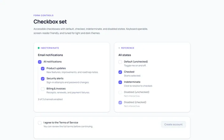
Checkbox Set Toggle
Originaldefault/checked/indeterminate/disabled checkboxes
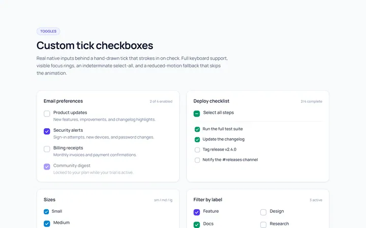
Checkbox Custom Toggle
Originalcustom animated tick checkboxes
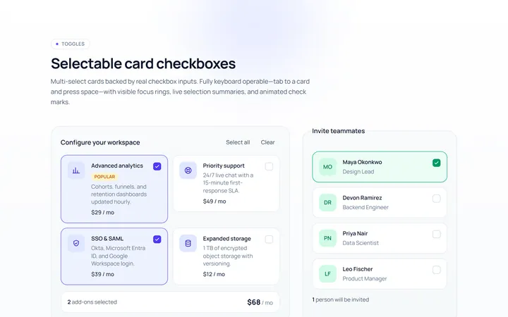
Checkbox Card Toggle
Originalselectable card checkboxes
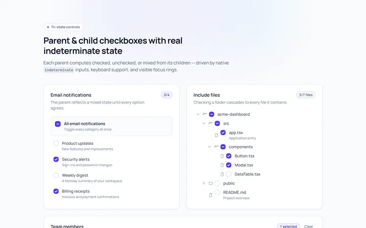
Checkbox Indeterminate Toggle
Originalparent/child indeterminate checkboxes
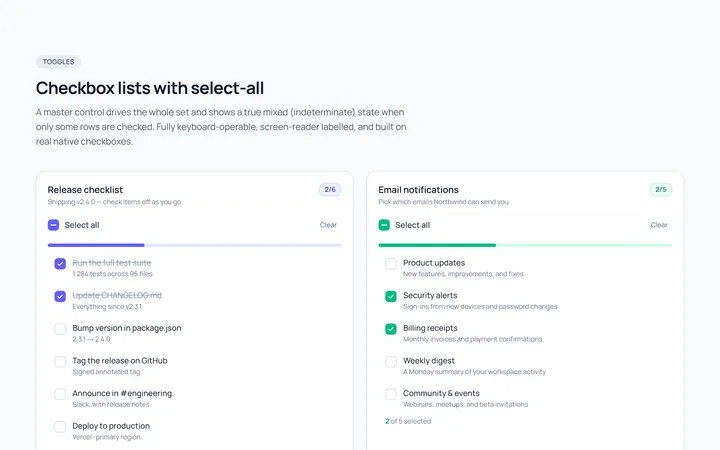
Checkbox List Toggle
Originalcheckbox list with select-all
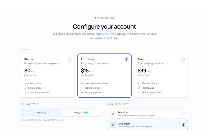
Radio Set Toggle
Originalstyled radio button group
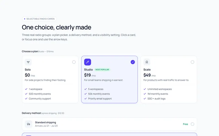
Radio Cards Toggle
Originalselectable radio cards
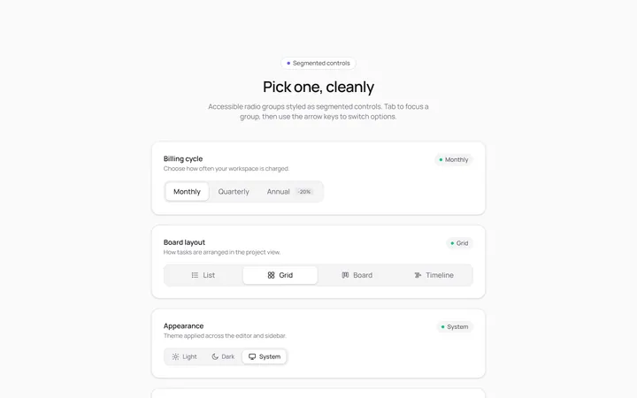
Radio Segmented Toggle
Originalsegmented control radios
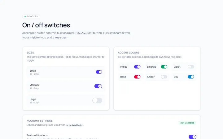
Switch Basic Toggle
Originalbasic on/off switches in sizes
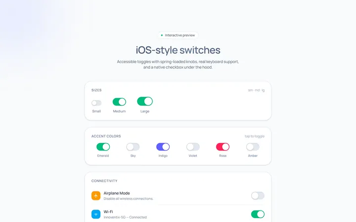
Switch iOS Toggle
OriginaliOS-style switches
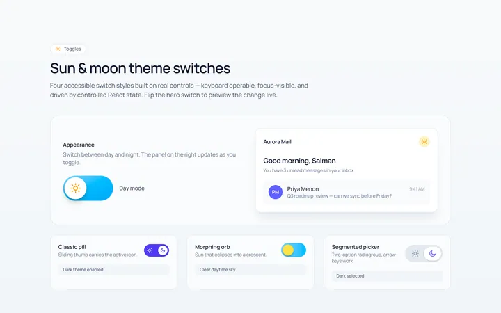
Switch Icons Toggle
Originalswitches with sun/moon style icons
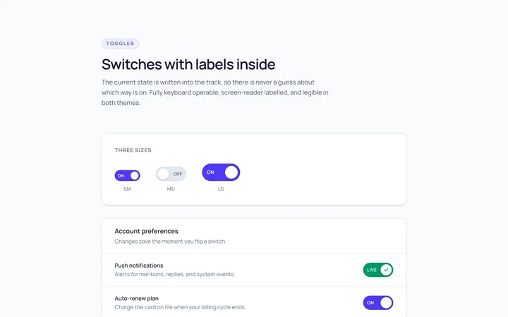
Switch Labels Toggle
Originalswitches with on/off labels inside