

Radio Image Toggle
Original · freeimage option radio picker
byWeb InnoventixReact + Tailwind
tglradioimagetoggles
Copy prompt gives Claude Code, Cursor or v0 a ready-to-paste prompt that recreates this exact component.
npx shadcn@latest add https://webinnoventix.com/r/tgl-radio-image.jsontgl-radio-image.tsx
"use client";
import { useId, useState } from "react";
import { AnimatePresence, motion, useReducedMotion, type Variants } from "motion/react";
type CoverOption = {
id: string;
label: string;
caption: string;
src: string;
alt: string;
};
type AccentOption = {
id: string;
label: string;
swatch: string;
};
type DensityOption = {
id: string;
label: string;
caption: string;
};
const COVERS: CoverOption[] = [
{ id: "aurora", label: "Aurora", caption: "Northern lights", src: "/img/gallery/g06.webp", alt: "Green aurora rippling over a frozen lake at night" },
{ id: "alpine", label: "Alpine", caption: "Dawn ridgeline", src: "/img/gallery/g01.webp", alt: "Snow-dusted alpine peaks glowing at dawn" },
{ id: "coast", label: "Coast", caption: "Turquoise shore", src: "/img/gallery/g02.webp", alt: "Turquoise coastline seen from above" },
{ id: "city", label: "City", caption: "Blue hour skyline", src: "/img/gallery/g03.webp", alt: "City skyline glowing during blue hour" },
{ id: "forest", label: "Forest", caption: "Misty pines", src: "/img/gallery/g04.webp", alt: "Misty pine forest trail in soft light" },
{ id: "dunes", label: "Dunes", caption: "Desert sands", src: "/img/gallery/g05.webp", alt: "Rolling sand dunes under a clear sky" },
];
const ACCENTS: AccentOption[] = [
{ id: "indigo", label: "Indigo", swatch: "bg-gradient-to-br from-indigo-500 to-violet-600" },
{ id: "sky", label: "Horizon", swatch: "bg-gradient-to-br from-sky-400 to-indigo-600" },
{ id: "emerald", label: "Emerald", swatch: "bg-gradient-to-br from-emerald-400 to-emerald-600" },
{ id: "amber", label: "Amber", swatch: "bg-gradient-to-br from-amber-300 to-amber-500" },
{ id: "rose", label: "Rose", swatch: "bg-gradient-to-br from-rose-400 to-rose-600" },
{ id: "slate", label: "Graphite", swatch: "bg-gradient-to-br from-slate-500 to-slate-700" },
];
const DENSITIES: DensityOption[] = [
{ id: "compact", label: "Compact", caption: "More on screen" },
{ id: "comfortable", label: "Comfortable", caption: "Balanced spacing" },
{ id: "spacious", label: "Spacious", caption: "Room to breathe" },
];
const DENSITY_PREVIEW: Record<string, { pad: string; gap: string; row: string }> = {
compact: { pad: "p-3", gap: "gap-1.5", row: "h-2.5" },
comfortable: { pad: "p-5", gap: "gap-3", row: "h-3" },
spacious: { pad: "p-7", gap: "gap-5", row: "h-3.5" },
};
function CheckBadge({ show, reduce }: { show: boolean; reduce: boolean }) {
return (
<AnimatePresence>
{show ? (
<motion.span
key="badge"
initial={{ scale: reduce ? 1 : 0, opacity: reduce ? 1 : 0 }}
animate={{ scale: 1, opacity: 1 }}
exit={{ scale: reduce ? 1 : 0, opacity: reduce ? 1 : 0 }}
transition={{ duration: reduce ? 0 : 0.22, ease: "easeOut" }}
className="tglri-glow pointer-events-none absolute right-2 top-2 z-20 grid h-7 w-7 place-items-center rounded-full bg-indigo-600 text-white shadow-lg shadow-indigo-600/30 ring-2 ring-white dark:ring-slate-900"
>
<svg viewBox="0 0 24 24" className="h-4 w-4" fill="none" stroke="currentColor" strokeWidth={3} strokeLinecap="round" strokeLinejoin="round" aria-hidden="true">
<path d="M20 6 9 17l-5-5" />
</svg>
</motion.span>
) : null}
</AnimatePresence>
);
}
function DensityGlyph({ id }: { id: string }) {
const rows =
id === "compact"
? [5, 12, 19, 26, 33].map((y) => ({ y, h: 3 }))
: id === "spacious"
? [7, 23].map((y) => ({ y, h: 10 }))
: [6, 17, 28].map((y) => ({ y, h: 6 }));
return (
<svg viewBox="0 0 48 40" className="h-10 w-12 text-slate-500 dark:text-slate-400" aria-hidden="true">
{rows.map((r, i) => (
<rect key={i} x={5} y={r.y} width={i === 0 ? 26 : 38} height={r.h} rx={1.5} fill="currentColor" opacity={i === 0 ? 0.9 : 0.4} />
))}
</svg>
);
}
export default function RadioImagePicker() {
const prefersReduced = useReducedMotion();
const reduce = !!prefersReduced;
const uid = useId();
const [cover, setCover] = useState<string>("aurora");
const [accent, setAccent] = useState<string>("indigo");
const [density, setDensity] = useState<string>("comfortable");
const coverOpt = COVERS.find((c) => c.id === cover) ?? COVERS[0];
const accentOpt = ACCENTS.find((a) => a.id === accent) ?? ACCENTS[0];
const densityOpt = DENSITIES.find((d) => d.id === density) ?? DENSITIES[1];
const dp = DENSITY_PREVIEW[density] ?? DENSITY_PREVIEW.comfortable;
const container: Variants = {
hidden: {},
show: { transition: { staggerChildren: reduce ? 0 : 0.08 } },
};
const item: Variants = {
hidden: { opacity: 0, y: reduce ? 0 : 18 },
show: { opacity: 1, y: 0, transition: { duration: reduce ? 0 : 0.5, ease: "easeOut" } },
};
const focusRing =
"peer-focus-visible:outline-none peer-focus-visible:ring-2 peer-focus-visible:ring-offset-2 peer-focus-visible:ring-indigo-500 peer-focus-visible:ring-offset-white dark:peer-focus-visible:ring-offset-slate-900";
return (
<section className="relative w-full overflow-hidden bg-slate-50 px-4 py-16 text-slate-900 dark:bg-slate-950 dark:text-slate-100 sm:py-24">
<style>{`
@keyframes tglri-glow { 0%, 100% { opacity: .6; } 50% { opacity: 1; } }
@keyframes tglri-sheen { 0% { transform: translateX(-120%); } 100% { transform: translateX(220%); } }
.tglri-glow { animation: tglri-glow 2.8s ease-in-out infinite; }
.tglri-sheen::after { content: ""; position: absolute; inset: 0; pointer-events: none; background: linear-gradient(105deg, transparent 34%, rgba(255,255,255,.38) 50%, transparent 66%); transform: translateX(-120%); }
.tglri-sheen:hover::after { animation: tglri-sheen 1.1s ease forwards; }
@media (prefers-reduced-motion: reduce) {
.tglri-glow, .tglri-sheen::after { animation: none !important; }
}
`}</style>
<div
aria-hidden="true"
className="pointer-events-none absolute -top-24 left-1/2 h-72 w-[42rem] -translate-x-1/2 rounded-full bg-indigo-300/25 blur-3xl dark:bg-indigo-600/15"
/>
<motion.div
variants={container}
initial="hidden"
whileInView="show"
viewport={{ once: true, amount: 0.15 }}
className="relative mx-auto max-w-5xl"
>
<motion.header variants={item} className="mb-10 max-w-2xl">
<span className="inline-flex items-center gap-2 rounded-full border border-slate-200 bg-white px-3 py-1 text-xs font-medium text-slate-600 dark:border-slate-800 dark:bg-slate-900 dark:text-slate-300">
<span className="h-1.5 w-1.5 rounded-full bg-indigo-500" />
Profile appearance
</span>
<h2 className="mt-4 text-3xl font-semibold tracking-tight sm:text-4xl">Personalize your workspace</h2>
<p className="mt-3 text-base text-slate-600 dark:text-slate-400">
Pick a cover, an accent, and how tight the layout feels. Each option is a real radio — use the arrow keys to move
through a group.
</p>
</motion.header>
<div className="grid gap-8 lg:grid-cols-[1fr_20rem]">
<div className="space-y-8">
{/* Cover image group */}
<motion.fieldset
variants={item}
className="rounded-2xl border border-slate-200 bg-white p-5 shadow-sm dark:border-slate-800 dark:bg-slate-900 sm:p-6"
>
<legend className="px-1 text-sm font-semibold text-slate-900 dark:text-slate-100">Cover image</legend>
<p className="mb-4 px-1 text-sm text-slate-500 dark:text-slate-400">Shown behind your profile header.</p>
<div className="grid grid-cols-2 gap-3 sm:grid-cols-3">
{COVERS.map((opt) => {
const selected = cover === opt.id;
return (
<label key={opt.id} className="group relative block cursor-pointer">
<input
type="radio"
name={`${uid}-cover`}
value={opt.id}
checked={selected}
onChange={() => setCover(opt.id)}
aria-label={`${opt.label} — ${opt.caption}`}
className="peer sr-only"
/>
<div
className={`tglri-sheen relative aspect-[4/3] overflow-hidden rounded-xl border border-slate-200 transition duration-200 group-hover:-translate-y-0.5 dark:border-slate-700 peer-checked:border-transparent peer-checked:ring-2 peer-checked:ring-indigo-600 dark:peer-checked:ring-indigo-400 ${focusRing}`}
>
{/* eslint-disable-next-line @next/next/no-img-element */}
<img
src={opt.src}
alt={opt.alt}
loading="lazy"
draggable={false}
className="h-full w-full object-cover transition duration-300 group-hover:scale-[1.04]"
/>
<span className="pointer-events-none absolute inset-x-0 bottom-0 z-10 bg-gradient-to-t from-slate-950/75 to-transparent p-2.5 pt-6">
<span className="block text-sm font-semibold text-white">{opt.label}</span>
<span className="block text-xs text-white/75">{opt.caption}</span>
</span>
<CheckBadge show={selected} reduce={reduce} />
</div>
</label>
);
})}
</div>
</motion.fieldset>
{/* Accent color group */}
<motion.fieldset
variants={item}
className="rounded-2xl border border-slate-200 bg-white p-5 shadow-sm dark:border-slate-800 dark:bg-slate-900 sm:p-6"
>
<legend className="px-1 text-sm font-semibold text-slate-900 dark:text-slate-100">Accent color</legend>
<p className="mb-4 px-1 text-sm text-slate-500 dark:text-slate-400">Used for buttons, links, and highlights.</p>
<div className="grid grid-cols-3 gap-3 sm:grid-cols-6">
{ACCENTS.map((opt) => {
const selected = accent === opt.id;
return (
<label key={opt.id} className="group relative block cursor-pointer">
<input
type="radio"
name={`${uid}-accent`}
value={opt.id}
checked={selected}
onChange={() => setAccent(opt.id)}
aria-label={opt.label}
className="peer sr-only"
/>
<div
className={`relative aspect-square overflow-hidden rounded-xl border border-slate-200 transition duration-200 group-hover:-translate-y-0.5 dark:border-slate-700 peer-checked:border-transparent peer-checked:ring-2 peer-checked:ring-offset-2 peer-checked:ring-slate-900 peer-checked:ring-offset-white dark:peer-checked:ring-white dark:peer-checked:ring-offset-slate-900 ${focusRing}`}
>
<span className={`block h-full w-full ${opt.swatch}`} />
<CheckBadge show={selected} reduce={reduce} />
</div>
<span className="mt-1.5 block text-center text-xs font-medium text-slate-600 dark:text-slate-400 peer-checked:text-slate-900 dark:peer-checked:text-slate-100">
{opt.label}
</span>
</label>
);
})}
</div>
</motion.fieldset>
{/* Density group */}
<motion.fieldset
variants={item}
className="rounded-2xl border border-slate-200 bg-white p-5 shadow-sm dark:border-slate-800 dark:bg-slate-900 sm:p-6"
>
<legend className="px-1 text-sm font-semibold text-slate-900 dark:text-slate-100">Layout density</legend>
<p className="mb-4 px-1 text-sm text-slate-500 dark:text-slate-400">How tightly content is packed.</p>
<div className="grid grid-cols-3 gap-3">
{DENSITIES.map((opt) => {
const selected = density === opt.id;
return (
<label key={opt.id} className="group relative block cursor-pointer">
<input
type="radio"
name={`${uid}-density`}
value={opt.id}
checked={selected}
onChange={() => setDensity(opt.id)}
aria-label={`${opt.label} — ${opt.caption}`}
className="peer sr-only"
/>
<div
className={`relative flex flex-col items-center gap-2 rounded-xl border border-slate-200 bg-slate-50 p-4 transition duration-200 group-hover:-translate-y-0.5 dark:border-slate-700 dark:bg-slate-800/60 peer-checked:border-indigo-500 peer-checked:bg-indigo-50 dark:peer-checked:border-indigo-400 dark:peer-checked:bg-indigo-500/10 ${focusRing}`}
>
<DensityGlyph id={opt.id} />
<span className="text-center">
<span className="block text-sm font-semibold text-slate-800 dark:text-slate-100">{opt.label}</span>
<span className="block text-xs text-slate-500 dark:text-slate-400">{opt.caption}</span>
</span>
<CheckBadge show={selected} reduce={reduce} />
</div>
</label>
);
})}
</div>
</motion.fieldset>
</div>
{/* Live preview */}
<motion.aside variants={item} className="lg:sticky lg:top-8 lg:self-start">
<div className="overflow-hidden rounded-2xl border border-slate-200 bg-white shadow-sm dark:border-slate-800 dark:bg-slate-900">
<div className="relative h-28">
{/* eslint-disable-next-line @next/next/no-img-element */}
<img
src={coverOpt.src}
alt={coverOpt.alt}
loading="lazy"
draggable={false}
className="h-full w-full object-cover"
/>
<div className="absolute inset-0 bg-gradient-to-t from-slate-950/45 to-transparent" />
<span className={`absolute -bottom-5 left-4 h-10 w-10 rounded-xl ring-4 ring-white dark:ring-slate-900 ${accentOpt.swatch}`} />
</div>
<div className={`${dp.pad}`}>
<div className="mt-3 flex items-center justify-between">
<div>
<p className="text-sm font-semibold text-slate-900 dark:text-slate-100">Jordan Ellery</p>
<p className="text-xs text-slate-500 dark:text-slate-400">Product designer</p>
</div>
<button
type="button"
className={`rounded-lg px-3 py-1.5 text-xs font-semibold text-white shadow-sm transition active:scale-95 ${accentOpt.swatch}`}
>
Follow
</button>
</div>
<div className={`mt-4 flex flex-col ${dp.gap}`}>
<span className={`${dp.row} w-full rounded bg-slate-200 dark:bg-slate-700`} />
<span className={`${dp.row} w-5/6 rounded bg-slate-200 dark:bg-slate-700`} />
<span className={`${dp.row} w-2/3 rounded bg-slate-200 dark:bg-slate-700`} />
</div>
</div>
</div>
<dl className="mt-4 space-y-2 rounded-2xl border border-slate-200 bg-white p-4 text-sm shadow-sm dark:border-slate-800 dark:bg-slate-900">
<div className="flex items-center justify-between">
<dt className="text-slate-500 dark:text-slate-400">Cover</dt>
<dd className="font-medium">{coverOpt.label}</dd>
</div>
<div className="flex items-center justify-between">
<dt className="text-slate-500 dark:text-slate-400">Accent</dt>
<dd className="flex items-center gap-2 font-medium">
<span className={`h-3 w-3 rounded-full ${accentOpt.swatch}`} />
{accentOpt.label}
</dd>
</div>
<div className="flex items-center justify-between">
<dt className="text-slate-500 dark:text-slate-400">Density</dt>
<dd className="font-medium">{densityOpt.label}</dd>
</div>
</dl>
<p aria-live="polite" className="sr-only">
Cover {coverOpt.label}, accent {accentOpt.label}, density {densityOpt.label} selected.
</p>
</motion.aside>
</div>
</motion.div>
</section>
);
}Dependencies
motion
Licence
Built by Web Innoventix. Free for personal and commercial use, no attribution required.
Built by Web Innoventix
Need a custom interface, a full website, or SEO that gets you cited by AI? We design, build and rank it end to end.
Get a free quoteSimilar components
Browse all →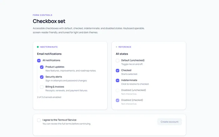
Checkbox Set Toggle
Originaldefault/checked/indeterminate/disabled checkboxes
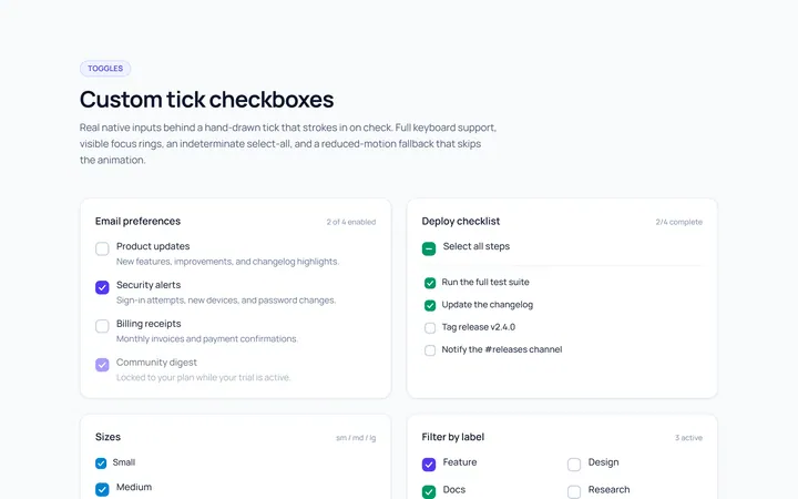
Checkbox Custom Toggle
Originalcustom animated tick checkboxes
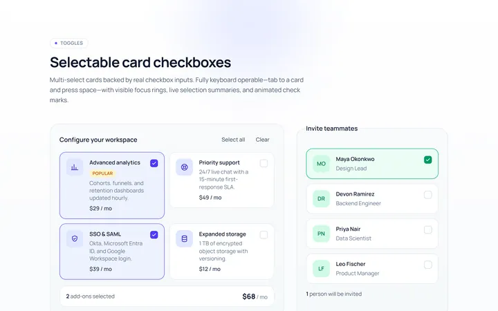
Checkbox Card Toggle
Originalselectable card checkboxes
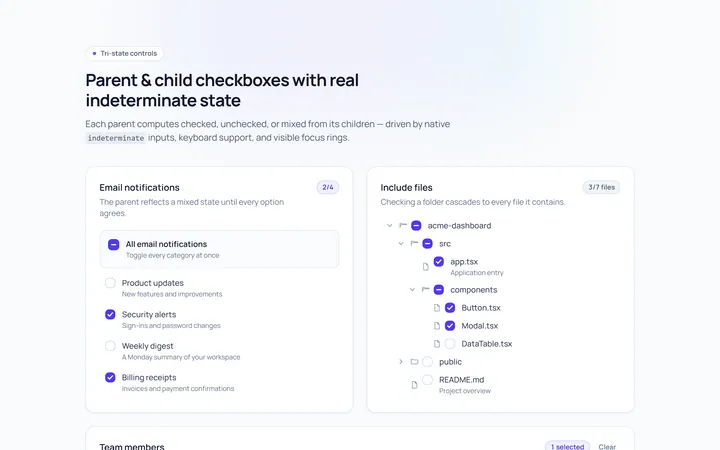
Checkbox Indeterminate Toggle
Originalparent/child indeterminate checkboxes
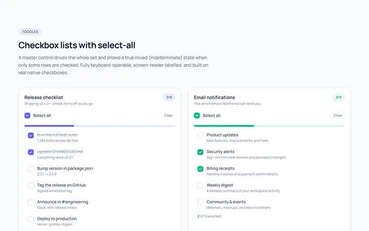
Checkbox List Toggle
Originalcheckbox list with select-all
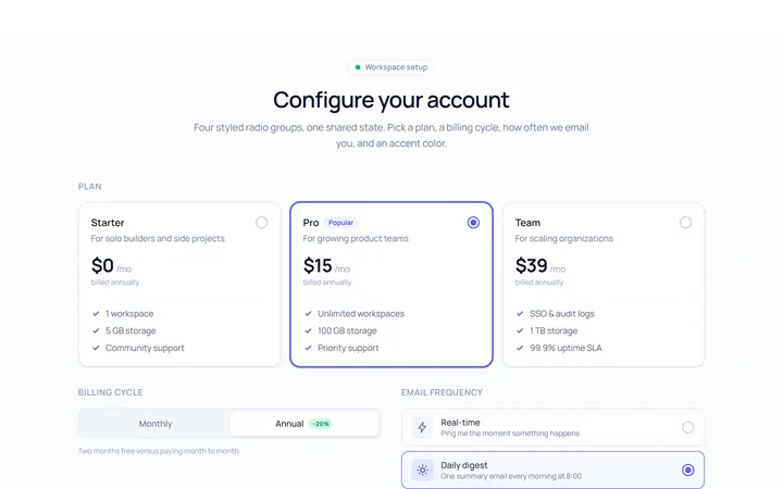
Radio Set Toggle
Originalstyled radio button group
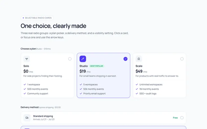
Radio Cards Toggle
Originalselectable radio cards
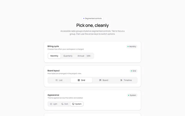
Radio Segmented Toggle
Originalsegmented control radios
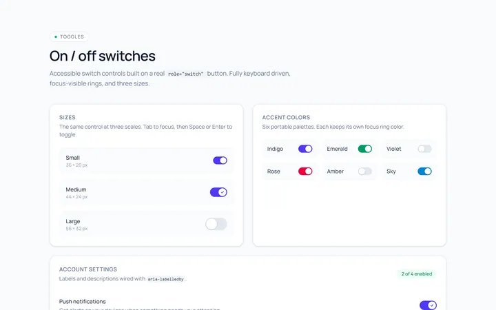
Switch Basic Toggle
Originalbasic on/off switches in sizes
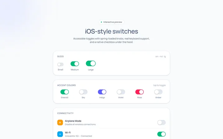
Switch iOS Toggle
OriginaliOS-style switches
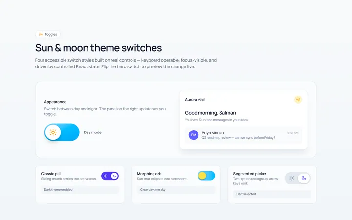
Switch Icons Toggle
Originalswitches with sun/moon style icons
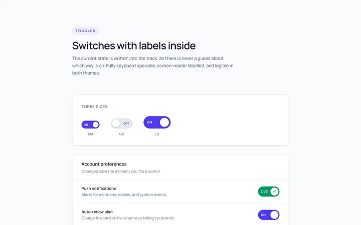
Switch Labels Toggle
Originalswitches with on/off labels inside