

Switch Loading Toggle
Original · freeswitch with a loading state
byWeb InnoventixReact + Tailwind
tglswitchloadingtoggles
Copy prompt gives Claude Code, Cursor or v0 a ready-to-paste prompt that recreates this exact component.
npx shadcn@latest add https://webinnoventix.com/r/tgl-switch-loading.jsontgl-switch-loading.tsx
"use client";
import {
useCallback,
useEffect,
useId,
useRef,
useState,
type KeyboardEvent as ReactKeyboardEvent,
type ReactNode,
} from "react";
import { motion, useReducedMotion } from "motion/react";
type NetworkMode = "fast" | "slow" | "flaky";
type ToggleStatus = "idle" | "loading" | "error";
interface SettingDef {
id: string;
label: string;
description: string;
defaultOn: boolean;
icon: ReactNode;
}
const MODES: { id: NetworkMode; label: string; hint: string }[] = [
{ id: "fast", label: "Fast", hint: "~1.0s" },
{ id: "slow", label: "Slow 3G", hint: "~1.7s" },
{ id: "flaky", label: "Offline", hint: "fails" },
];
const SETTINGS: SettingDef[] = [
{
id: "twofa",
label: "Two-factor authentication",
description:
"Require a one-time code from your authenticator app at every sign-in.",
defaultOn: true,
icon: (
<svg
viewBox="0 0 24 24"
fill="none"
stroke="currentColor"
strokeWidth={1.8}
strokeLinecap="round"
strokeLinejoin="round"
className="h-5 w-5"
aria-hidden="true"
>
<path d="M12 3l7 3v5c0 4.4-3 7.6-7 9-4-1.4-7-4.6-7-9V6l7-3Z" />
<path d="M9 12l2 2 4-4" />
</svg>
),
},
{
id: "deploy",
label: "Auto-deploy the main branch",
description: "Ship to production automatically whenever main passes CI.",
defaultOn: false,
icon: (
<svg
viewBox="0 0 24 24"
fill="none"
stroke="currentColor"
strokeWidth={1.8}
strokeLinecap="round"
strokeLinejoin="round"
className="h-5 w-5"
aria-hidden="true"
>
<path d="M12 20V5" />
<path d="M6 11l6-6 6 6" />
<path d="M7 20h10" />
</svg>
),
},
{
id: "alerts",
label: "Deployment alerts",
description:
"Post to #eng-releases in Slack when a deploy starts or fails.",
defaultOn: true,
icon: (
<svg
viewBox="0 0 24 24"
fill="none"
stroke="currentColor"
strokeWidth={1.8}
strokeLinecap="round"
strokeLinejoin="round"
className="h-5 w-5"
aria-hidden="true"
>
<path d="M18 8a6 6 0 1 0-12 0c0 7-3 8-3 8h18s-3-1-3-8" />
<path d="M13.7 21a2 2 0 0 1-3.4 0" />
</svg>
),
},
{
id: "tokens",
label: "Personal access tokens",
description:
"Let scripts and CI jobs authenticate to the REST API on your behalf.",
defaultOn: false,
icon: (
<svg
viewBox="0 0 24 24"
fill="none"
stroke="currentColor"
strokeWidth={1.8}
strokeLinecap="round"
strokeLinejoin="round"
className="h-5 w-5"
aria-hidden="true"
>
<circle cx="8" cy="15" r="4" />
<path d="M10.8 12.2 20 3" />
<path d="M16 3h4v4" />
<path d="M15 9l2 2" />
</svg>
),
},
];
const labelOf = (id: string): string =>
SETTINGS.find((s) => s.id === id)?.label ?? id;
interface ToggleSwitchProps {
checked: boolean;
status: ToggleStatus;
reduce: boolean;
labelledBy: string;
describedBy: string;
onToggle: () => void;
}
function ToggleSwitch({
checked,
status,
reduce,
labelledBy,
describedBy,
onToggle,
}: ToggleSwitchProps) {
const loading = status === "loading";
const error = status === "error";
const thumbX = loading ? 12 : checked ? 24 : 0;
const trackClass = error
? "bg-rose-500"
: loading
? "bg-indigo-500"
: checked
? "bg-emerald-500"
: "bg-zinc-300 dark:bg-zinc-600";
return (
<button
type="button"
role="switch"
aria-checked={checked}
aria-busy={loading}
aria-labelledby={labelledBy}
aria-describedby={describedBy}
onClick={onToggle}
style={
error && !reduce ? { animation: "tglld_shake 0.4s ease" } : undefined
}
className={`tglld-anim relative inline-flex h-7 w-[3.25rem] shrink-0 cursor-pointer items-center rounded-full px-0.5 ring-1 ring-inset ring-black/5 transition-colors duration-300 focus-visible:outline-none focus-visible:ring-2 focus-visible:ring-indigo-500 focus-visible:ring-offset-2 focus-visible:ring-offset-white dark:ring-white/10 dark:focus-visible:ring-offset-zinc-900 ${
loading ? "cursor-wait" : ""
} ${trackClass}`}
>
{loading && (
<span
className="tglld-anim pointer-events-none absolute inset-0 rounded-full ring-2 ring-indigo-300"
style={
reduce
? undefined
: { animation: "tglld_pulse 1.2s ease-in-out infinite" }
}
aria-hidden="true"
/>
)}
<motion.span
animate={{ x: thumbX }}
transition={
reduce ? { duration: 0 } : { type: "spring", stiffness: 520, damping: 34 }
}
className="relative z-10 grid h-6 w-6 place-items-center rounded-full bg-white shadow ring-1 ring-black/5"
>
{loading ? (
<svg
viewBox="0 0 24 24"
className="tglld-anim h-3.5 w-3.5 text-indigo-600"
style={reduce ? undefined : { animation: "tglld_spin 0.7s linear infinite" }}
aria-hidden="true"
>
<circle
cx="12"
cy="12"
r="9"
fill="none"
stroke="currentColor"
strokeWidth="3"
className="opacity-20"
/>
<path
d="M12 3a9 9 0 0 1 9 9"
fill="none"
stroke="currentColor"
strokeWidth="3"
strokeLinecap="round"
/>
</svg>
) : checked ? (
<svg
viewBox="0 0 24 24"
className="h-3.5 w-3.5 text-emerald-600"
aria-hidden="true"
>
<path
d="M5 13l4 4L19 7"
fill="none"
stroke="currentColor"
strokeWidth="3"
strokeLinecap="round"
strokeLinejoin="round"
/>
</svg>
) : null}
</motion.span>
</button>
);
}
export default function ToggleSwitchLoading() {
const reduce = useReducedMotion() ?? false;
const uid = useId();
const [networkMode, setNetworkMode] = useState<NetworkMode>("fast");
const [values, setValues] = useState<Record<string, boolean>>(() =>
Object.fromEntries(SETTINGS.map((s) => [s.id, s.defaultOn])),
);
const [statuses, setStatuses] = useState<Record<string, ToggleStatus>>(() =>
Object.fromEntries(SETTINGS.map((s) => [s.id, "idle"])),
);
const [errorTo, setErrorTo] = useState<Record<string, boolean>>({});
const [liveMessage, setLiveMessage] = useState("");
const timeouts = useRef<Record<string, ReturnType<typeof setTimeout>>>({});
const modeRefs = useRef<(HTMLButtonElement | null)[]>([]);
useEffect(() => {
const pending = timeouts.current;
return () => {
Object.values(pending).forEach((t) => clearTimeout(t));
};
}, []);
const attempt = useCallback(
(id: string, desired: boolean) => {
clearTimeout(timeouts.current[id]);
setStatuses((s) => ({ ...s, [id]: "loading" }));
setErrorTo((e) => {
const next = { ...e };
delete next[id];
return next;
});
setLiveMessage(`Saving ${labelOf(id)}…`);
const delay = networkMode === "slow" ? 1700 : 1000;
timeouts.current[id] = setTimeout(() => {
if (networkMode === "flaky") {
setStatuses((s) => ({ ...s, [id]: "error" }));
setErrorTo((e) => ({ ...e, [id]: desired }));
setLiveMessage(
`Couldn't update ${labelOf(id)}. Network error — the switch was rolled back.`,
);
} else {
setValues((v) => ({ ...v, [id]: desired }));
setStatuses((s) => ({ ...s, [id]: "idle" }));
setLiveMessage(`${labelOf(id)} turned ${desired ? "on" : "off"}.`);
}
}, delay);
},
[networkMode],
);
const handleToggle = (id: string) => {
if (statuses[id] === "loading") return;
attempt(id, !values[id]);
};
const handleRetry = (id: string) => {
const desired = errorTo[id];
if (desired === undefined) return;
attempt(id, desired);
};
const handleModeKey = (
e: ReactKeyboardEvent<HTMLButtonElement>,
index: number,
) => {
let next = -1;
if (e.key === "ArrowRight" || e.key === "ArrowDown")
next = (index + 1) % MODES.length;
else if (e.key === "ArrowLeft" || e.key === "ArrowUp")
next = (index - 1 + MODES.length) % MODES.length;
else if (e.key === "Home") next = 0;
else if (e.key === "End") next = MODES.length - 1;
if (next < 0) return;
e.preventDefault();
setNetworkMode(MODES[next].id);
modeRefs.current[next]?.focus();
};
return (
<section className="relative w-full bg-zinc-50 px-4 py-16 dark:bg-zinc-950 sm:py-24">
<style>{`
@keyframes tglld_spin { to { transform: rotate(360deg); } }
@keyframes tglld_pulse { 0%, 100% { opacity: 0.4; } 50% { opacity: 0.9; } }
@keyframes tglld_shake {
0%, 100% { transform: translateX(0); }
25% { transform: translateX(-3px); }
75% { transform: translateX(3px); }
}
@media (prefers-reduced-motion: reduce) {
.tglld-anim { animation: none !important; }
}
`}</style>
<div className="mx-auto w-full max-w-xl">
<div className="overflow-hidden rounded-2xl border border-zinc-200 bg-white shadow-sm dark:border-zinc-800 dark:bg-zinc-900">
{/* Header */}
<div className="border-b border-zinc-100 px-6 py-6 dark:border-zinc-800 sm:px-8">
<span className="text-xs font-semibold uppercase tracking-[0.18em] text-indigo-600 dark:text-indigo-400">
Workspace
</span>
<h2 className="mt-2 text-xl font-semibold tracking-tight text-zinc-900 dark:text-zinc-50">
Security & delivery settings
</h2>
<p className="mt-1.5 text-sm leading-relaxed text-zinc-500 dark:text-zinc-400">
Every change is confirmed with the server before it takes effect.
Pick a connection profile to see how each switch behaves under
load.
</p>
{/* Network profile radio group */}
<div
role="radiogroup"
aria-label="Connection profile"
className="mt-5 inline-flex rounded-xl border border-zinc-200 bg-zinc-50 p-1 dark:border-zinc-700 dark:bg-zinc-800"
>
{MODES.map((mode, i) => {
const selected = networkMode === mode.id;
return (
<button
key={mode.id}
ref={(el) => {
modeRefs.current[i] = el;
}}
type="button"
role="radio"
aria-checked={selected}
tabIndex={selected ? 0 : -1}
onClick={() => setNetworkMode(mode.id)}
onKeyDown={(e) => handleModeKey(e, i)}
className={`rounded-lg px-3 py-1.5 text-sm font-medium transition-colors focus-visible:outline-none focus-visible:ring-2 focus-visible:ring-indigo-500 focus-visible:ring-offset-2 focus-visible:ring-offset-zinc-50 dark:focus-visible:ring-offset-zinc-800 ${
selected
? "bg-white text-zinc-900 shadow-sm dark:bg-zinc-950 dark:text-zinc-50"
: "text-zinc-500 hover:text-zinc-800 dark:text-zinc-400 dark:hover:text-zinc-200"
}`}
>
{mode.label}
<span className="ml-1.5 text-xs font-normal text-zinc-400 dark:text-zinc-500">
{mode.hint}
</span>
</button>
);
})}
</div>
</div>
{/* Settings list */}
<ul className="divide-y divide-zinc-100 dark:divide-zinc-800">
{SETTINGS.map((setting) => {
const status = statuses[setting.id];
const checked = values[setting.id];
const labelId = `${uid}-${setting.id}-label`;
const descId = `${uid}-${setting.id}-desc`;
const errId = `${uid}-${setting.id}-err`;
const isError = status === "error";
const describedBy = isError ? `${descId} ${errId}` : descId;
return (
<li
key={setting.id}
className="flex items-start gap-4 px-6 py-5 sm:px-8"
>
<span className="mt-0.5 grid h-9 w-9 shrink-0 place-items-center rounded-lg bg-zinc-100 text-zinc-600 dark:bg-zinc-800 dark:text-zinc-300">
{setting.icon}
</span>
<div className="min-w-0 flex-1">
<p
id={labelId}
className="text-sm font-semibold text-zinc-900 dark:text-zinc-100"
>
{setting.label}
</p>
<p
id={descId}
className="mt-0.5 text-sm leading-relaxed text-zinc-500 dark:text-zinc-400"
>
{setting.description}
</p>
{isError && (
<div
className="mt-2 flex flex-wrap items-center gap-2"
id={errId}
>
<span className="inline-flex items-center gap-1.5 text-xs font-medium text-rose-600 dark:text-rose-400">
<svg
viewBox="0 0 24 24"
className="h-3.5 w-3.5"
fill="none"
stroke="currentColor"
strokeWidth={2}
strokeLinecap="round"
strokeLinejoin="round"
aria-hidden="true"
>
<path d="M12 8v5" />
<path d="M12 16h.01" />
<circle cx="12" cy="12" r="9" />
</svg>
Network error — reverted.
</span>
<button
type="button"
onClick={() => handleRetry(setting.id)}
className="rounded-md px-1.5 py-0.5 text-xs font-semibold text-indigo-600 underline-offset-2 hover:underline focus-visible:outline-none focus-visible:ring-2 focus-visible:ring-indigo-500 focus-visible:ring-offset-2 focus-visible:ring-offset-white dark:text-indigo-400 dark:focus-visible:ring-offset-zinc-900"
>
Retry
</button>
</div>
)}
</div>
<div className="mt-0.5 shrink-0">
<ToggleSwitch
checked={checked}
status={status}
reduce={reduce}
labelledBy={labelId}
describedBy={describedBy}
onToggle={() => handleToggle(setting.id)}
/>
</div>
</li>
);
})}
</ul>
{/* Footer */}
<div className="border-t border-zinc-100 bg-zinc-50/60 px-6 py-4 dark:border-zinc-800 dark:bg-zinc-950/40 sm:px-8">
<p className="text-xs leading-relaxed text-zinc-500 dark:text-zinc-400">
Toggling a setting sends a{" "}
<code className="rounded bg-zinc-200 px-1 py-0.5 font-mono text-[0.7rem] text-zinc-700 dark:bg-zinc-800 dark:text-zinc-300">
PATCH /api/workspace
</code>{" "}
request. On the Offline profile the request fails and the switch
rolls back to its last saved value.
</p>
</div>
</div>
{/* Live region for assistive tech */}
<p
role="status"
aria-live="polite"
className="mt-3 min-h-[1.25rem] px-1 text-center text-xs text-zinc-500 dark:text-zinc-400"
>
{liveMessage}
</p>
</div>
</section>
);
}Dependencies
motion
Licence
Built by Web Innoventix. Free for personal and commercial use, no attribution required.
Built by Web Innoventix
Need a custom interface, a full website, or SEO that gets you cited by AI? We design, build and rank it end to end.
Get a free quoteSimilar components
Browse all →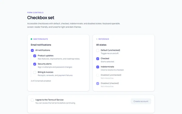
Checkbox Set Toggle
Originaldefault/checked/indeterminate/disabled checkboxes
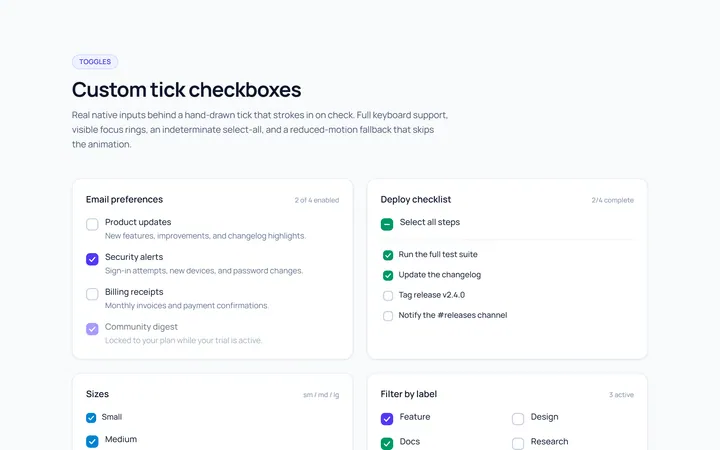
Checkbox Custom Toggle
Originalcustom animated tick checkboxes
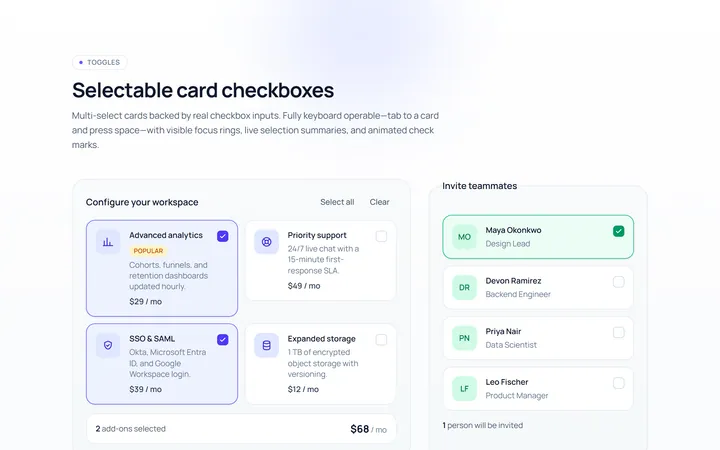
Checkbox Card Toggle
Originalselectable card checkboxes
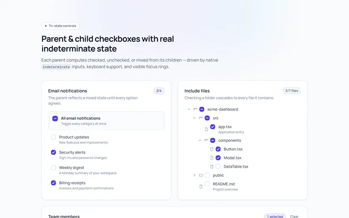
Checkbox Indeterminate Toggle
Originalparent/child indeterminate checkboxes
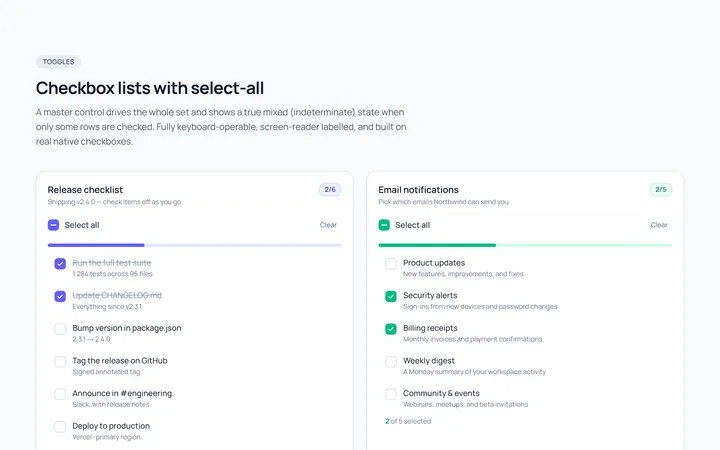
Checkbox List Toggle
Originalcheckbox list with select-all
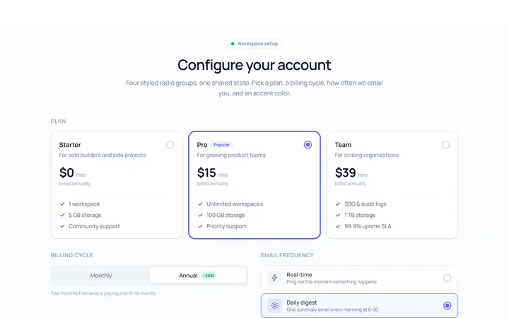
Radio Set Toggle
Originalstyled radio button group
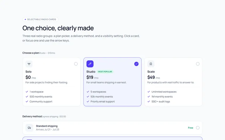
Radio Cards Toggle
Originalselectable radio cards
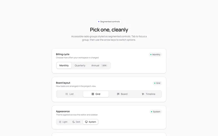
Radio Segmented Toggle
Originalsegmented control radios
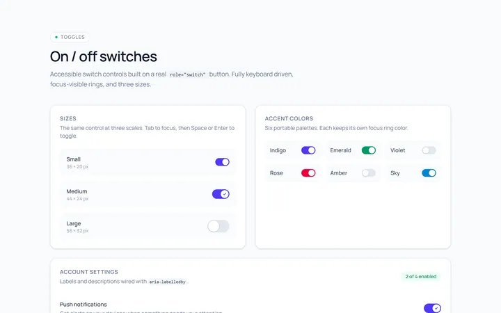
Switch Basic Toggle
Originalbasic on/off switches in sizes
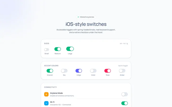
Switch iOS Toggle
OriginaliOS-style switches
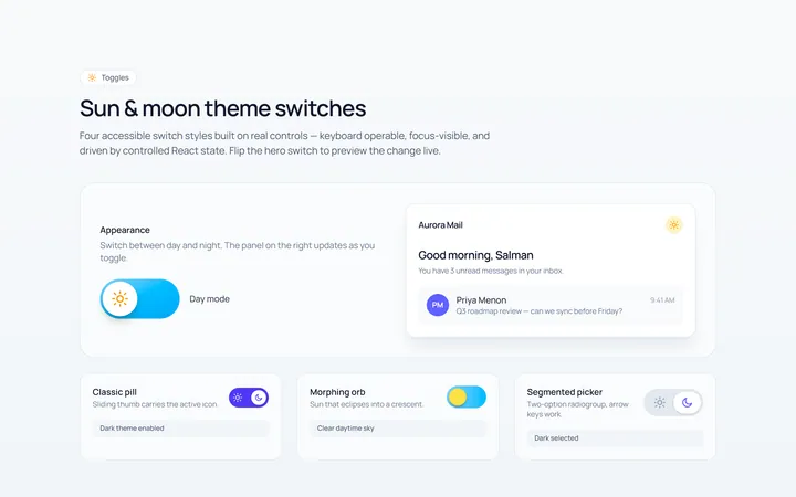
Switch Icons Toggle
Originalswitches with sun/moon style icons
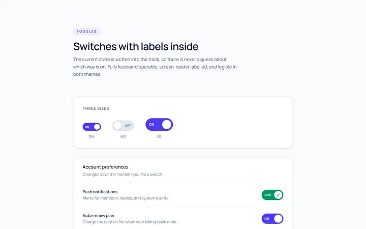
Switch Labels Toggle
Originalswitches with on/off labels inside