

Theme Toggle Toggle
Original · freeanimated light/dark theme toggle
byWeb InnoventixReact + Tailwind
tglthemetoggletoggles
Copy prompt gives Claude Code, Cursor or v0 a ready-to-paste prompt that recreates this exact component.
npx shadcn@latest add https://webinnoventix.com/r/tgl-theme-toggle.jsontgl-theme-toggle.tsx
"use client"
import { useEffect, useId, useState } from "react"
import type { ReactElement } from "react"
import { AnimatePresence, motion, useReducedMotion } from "motion/react"
import type { Transition } from "motion/react"
type Mode = "light" | "dark" | "system"
type Star = { top: string; left: string; size: number; delay: string }
const STARS: Star[] = [
{ top: "20%", left: "14%", size: 3, delay: "0s" },
{ top: "34%", left: "30%", size: 2, delay: "0.6s" },
{ top: "58%", left: "20%", size: 2, delay: "1.2s" },
{ top: "24%", left: "44%", size: 2, delay: "0.9s" },
{ top: "48%", left: "40%", size: 3, delay: "0.3s" },
{ top: "66%", left: "34%", size: 2, delay: "1.5s" },
]
function SunIcon({ className }: { className?: string }) {
return (
<svg viewBox="0 0 24 24" fill="none" className={className} aria-hidden="true">
<circle cx="12" cy="12" r="5" fill="currentColor" />
<g stroke="currentColor" strokeWidth="2" strokeLinecap="round">
<path d="M12 2v2.2" />
<path d="M12 19.8V22" />
<path d="M2 12h2.2" />
<path d="M19.8 12H22" />
<path d="M4.9 4.9l1.6 1.6" />
<path d="M17.5 17.5l1.6 1.6" />
<path d="M19.1 4.9l-1.6 1.6" />
<path d="M6.5 17.5l-1.6 1.6" />
</g>
</svg>
)
}
function MoonIcon({ className }: { className?: string }) {
return (
<svg viewBox="0 0 24 24" fill="none" className={className} aria-hidden="true">
<path
d="M20 14.5A8 8 0 0 1 9.5 4a0.5.5 0 0 0-.7-.6 9 9 0 1 0 11.8 11.8.5.5 0 0 0-.6-.7Z"
fill="currentColor"
/>
<circle cx="14.5" cy="9.5" r="1" fill="currentColor" opacity="0.45" />
<circle cx="17" cy="13" r="0.7" fill="currentColor" opacity="0.35" />
<circle cx="11.5" cy="14" r="0.9" fill="currentColor" opacity="0.4" />
</svg>
)
}
function SystemIcon({ className }: { className?: string }) {
return (
<svg viewBox="0 0 24 24" fill="none" className={className} aria-hidden="true">
<rect x="3" y="4" width="18" height="12" rx="2" stroke="currentColor" strokeWidth="2" />
<path d="M9 20h6M12 16v4" stroke="currentColor" strokeWidth="2" strokeLinecap="round" />
</svg>
)
}
const OPTIONS: { value: Mode; label: string; icon: (c: { className?: string }) => ReactElement }[] = [
{ value: "light", label: "Light", icon: SunIcon },
{ value: "dark", label: "Dark", icon: MoonIcon },
{ value: "system", label: "System", icon: SystemIcon },
]
export default function TglThemeToggle() {
const reduce = useReducedMotion()
const groupId = useId()
const [mode, setMode] = useState<Mode>("light")
const [systemDark, setSystemDark] = useState<boolean>(false)
useEffect(() => {
const mq = window.matchMedia("(prefers-color-scheme: dark)")
setSystemDark(mq.matches)
const onChange = (e: MediaQueryListEvent) => setSystemDark(e.matches)
mq.addEventListener("change", onChange)
return () => mq.removeEventListener("change", onChange)
}, [])
const isDark = mode === "system" ? systemDark : mode === "dark"
const knobT: Transition = reduce
? { duration: 0 }
: { type: "spring", stiffness: 320, damping: 26 }
const faceT: Transition = reduce ? { duration: 0 } : { duration: 0.35, ease: "easeOut" }
const layoutT: Transition = reduce
? { duration: 0 }
: { type: "spring", stiffness: 380, damping: 30 }
const toggle = () => setMode(isDark ? "light" : "dark")
return (
<section className="relative w-full bg-slate-50 px-5 py-16 text-slate-900 dark:bg-slate-950 dark:text-slate-100 sm:px-8 sm:py-24">
<style>{`
@keyframes tgl-twinkle {
0%, 100% { opacity: 0.25; transform: scale(0.7); }
50% { opacity: 1; transform: scale(1.15); }
}
@keyframes tgl-float {
0%, 100% { transform: translateX(0); }
50% { transform: translateX(5px); }
}
@keyframes tgl-rays {
0%, 100% { opacity: 0.7; transform: scale(1); }
50% { opacity: 1; transform: scale(1.06); }
}
.tgl-star { animation: tgl-twinkle 3.2s ease-in-out infinite; }
.tgl-cloud { animation: tgl-float 7s ease-in-out infinite; }
.tgl-rays { animation: tgl-rays 4s ease-in-out infinite; transform-origin: 50% 50%; }
@media (prefers-reduced-motion: reduce) {
.tgl-star, .tgl-cloud, .tgl-rays { animation: none !important; }
}
`}</style>
<div className="mx-auto max-w-5xl">
<header className="mb-10 max-w-xl">
<span className="inline-flex items-center gap-2 rounded-full border border-slate-200 bg-white px-3 py-1 text-xs font-medium text-slate-500 dark:border-slate-800 dark:bg-slate-900 dark:text-slate-400">
<span className="h-1.5 w-1.5 rounded-full bg-emerald-500" />
Appearance
</span>
<h2 className="mt-4 text-2xl font-semibold tracking-tight sm:text-3xl">
Choose how the interface looks
</h2>
<p className="mt-2 text-sm leading-relaxed text-slate-500 dark:text-slate-400">
Flip the switch and watch the preview respond. Every control is keyboard
accessible and stays in sync with your system preference.
</p>
</header>
<div className="grid gap-6 lg:grid-cols-[1.1fr_0.9fr]">
{/* Controls column */}
<div className="flex flex-col gap-6">
{/* Variant 1 — Skyline pill switch */}
<div className="rounded-2xl border border-slate-200 bg-white p-6 dark:border-slate-800 dark:bg-slate-900">
<div className="mb-5 flex items-center justify-between gap-4">
<div>
<h3 className="text-sm font-semibold">Skyline switch</h3>
<p className="mt-0.5 text-xs text-slate-500 dark:text-slate-400">
Day and night, in one tap
</p>
</div>
<span className="rounded-md bg-slate-100 px-2 py-1 text-[11px] font-medium tabular-nums text-slate-500 dark:bg-slate-800 dark:text-slate-400">
{isDark ? "Dark" : "Light"}
</span>
</div>
<button
type="button"
role="switch"
aria-checked={isDark}
aria-label="Toggle dark mode"
onClick={toggle}
className="group relative block h-20 w-44 overflow-hidden rounded-full border border-black/5 shadow-inner outline-none transition-colors focus-visible:ring-2 focus-visible:ring-indigo-500 focus-visible:ring-offset-2 focus-visible:ring-offset-white dark:focus-visible:ring-offset-slate-900"
>
{/* Sky backdrops */}
<motion.span
aria-hidden="true"
className="absolute inset-0 bg-gradient-to-b from-sky-300 via-sky-400 to-indigo-300"
animate={{ opacity: isDark ? 0 : 1 }}
transition={faceT}
/>
<motion.span
aria-hidden="true"
className="absolute inset-0 bg-gradient-to-b from-indigo-950 via-slate-900 to-slate-950"
animate={{ opacity: isDark ? 1 : 0 }}
transition={faceT}
/>
{/* Stars (night) */}
<motion.span
aria-hidden="true"
className="absolute inset-0"
animate={{ opacity: isDark ? 1 : 0 }}
transition={faceT}
>
{STARS.map((s, i) => (
<span
key={i}
className="tgl-star absolute rounded-full bg-white"
style={{
top: s.top,
left: s.left,
width: s.size,
height: s.size,
animationDelay: s.delay,
}}
/>
))}
</motion.span>
{/* Clouds (day) */}
<motion.span
aria-hidden="true"
className="absolute inset-0"
animate={{ opacity: isDark ? 0 : 1 }}
transition={faceT}
>
<span className="tgl-cloud absolute bottom-3 right-6 h-3 w-10 rounded-full bg-white/85" />
<span className="tgl-cloud absolute bottom-6 right-3 h-2.5 w-7 rounded-full bg-white/70" style={{ animationDelay: "1.4s" }} />
</motion.span>
{/* Knob */}
<motion.span
aria-hidden="true"
className="absolute left-2 top-2 h-16 w-16"
animate={{ x: isDark ? 96 : 0 }}
transition={knobT}
>
<span className="relative block h-full w-full overflow-hidden rounded-full shadow-lg shadow-black/25">
{/* Sun face */}
<motion.span
className="absolute inset-0 grid place-items-center rounded-full bg-gradient-to-br from-amber-200 to-amber-500"
animate={{ opacity: isDark ? 0 : 1, rotate: isDark ? -80 : 0, scale: isDark ? 0.6 : 1 }}
transition={faceT}
>
<SunIcon className="tgl-rays h-9 w-9 text-amber-50" />
</motion.span>
{/* Moon face */}
<motion.span
className="absolute inset-0 grid place-items-center rounded-full bg-gradient-to-br from-zinc-100 to-slate-300"
animate={{ opacity: isDark ? 1 : 0, rotate: isDark ? 0 : 80, scale: isDark ? 1 : 0.6 }}
transition={faceT}
>
<MoonIcon className="h-8 w-8 text-slate-500" />
</motion.span>
</span>
</motion.span>
</button>
</div>
{/* Variants 2 & 3 side by side */}
<div className="grid gap-6 sm:grid-cols-2">
{/* Variant 2 — Icon morph */}
<div className="flex flex-col justify-between rounded-2xl border border-slate-200 bg-white p-6 dark:border-slate-800 dark:bg-slate-900">
<div className="mb-5">
<h3 className="text-sm font-semibold">Icon morph</h3>
<p className="mt-0.5 text-xs text-slate-500 dark:text-slate-400">
Compact for toolbars
</p>
</div>
<button
type="button"
role="switch"
aria-checked={isDark}
aria-label="Toggle dark mode"
onClick={toggle}
className="relative grid h-12 w-12 place-items-center overflow-hidden rounded-xl border border-slate-200 bg-slate-50 text-slate-700 outline-none transition-colors hover:bg-slate-100 focus-visible:ring-2 focus-visible:ring-indigo-500 focus-visible:ring-offset-2 focus-visible:ring-offset-white dark:border-slate-700 dark:bg-slate-800 dark:text-slate-200 dark:hover:bg-slate-700 dark:focus-visible:ring-offset-slate-900"
>
<AnimatePresence initial={false} mode="wait">
{isDark ? (
<motion.span
key="moon"
initial={reduce ? false : { rotate: -90, opacity: 0, scale: 0.5 }}
animate={{ rotate: 0, opacity: 1, scale: 1 }}
exit={reduce ? { opacity: 0 } : { rotate: 90, opacity: 0, scale: 0.5 }}
transition={faceT}
className="absolute grid place-items-center text-violet-500"
>
<MoonIcon className="h-6 w-6" />
</motion.span>
) : (
<motion.span
key="sun"
initial={reduce ? false : { rotate: 90, opacity: 0, scale: 0.5 }}
animate={{ rotate: 0, opacity: 1, scale: 1 }}
exit={reduce ? { opacity: 0 } : { rotate: -90, opacity: 0, scale: 0.5 }}
transition={faceT}
className="absolute grid place-items-center text-amber-500"
>
<SunIcon className="tgl-rays h-6 w-6" />
</motion.span>
)}
</AnimatePresence>
</button>
</div>
{/* Variant 3 — Tri-state segmented */}
<div className="rounded-2xl border border-slate-200 bg-white p-6 dark:border-slate-800 dark:bg-slate-900">
<div className="mb-4">
<h3 className="text-sm font-semibold">Preference</h3>
<p className="mt-0.5 text-xs text-slate-500 dark:text-slate-400">
Light, dark, or follow system
</p>
</div>
<div
role="radiogroup"
aria-label="Theme preference"
className="flex gap-1 rounded-xl border border-slate-200 bg-slate-100 p-1 dark:border-slate-700 dark:bg-slate-800"
>
{OPTIONS.map(({ value, label, icon: Icon }) => {
const active = mode === value
const id = `${groupId}-${value}`
return (
<label
key={value}
htmlFor={id}
className="relative flex flex-1 cursor-pointer items-center justify-center rounded-lg py-2 text-xs font-medium outline-none has-[:focus-visible]:ring-2 has-[:focus-visible]:ring-indigo-500 has-[:focus-visible]:ring-offset-1 has-[:focus-visible]:ring-offset-slate-100 dark:has-[:focus-visible]:ring-offset-slate-800"
>
<input
id={id}
type="radio"
name={groupId}
value={value}
checked={active}
onChange={() => setMode(value)}
className="sr-only"
/>
{active && (
<motion.span
layoutId={`${groupId}-pill`}
transition={layoutT}
aria-hidden="true"
className="absolute inset-0 rounded-lg bg-white shadow-sm dark:bg-slate-950"
/>
)}
<span
className={`relative z-10 flex flex-col items-center gap-1 ${
active
? "text-slate-900 dark:text-slate-100"
: "text-slate-500 dark:text-slate-400"
}`}
>
<Icon className="h-4 w-4" />
{label}
</span>
</label>
)
})}
</div>
<p className="mt-3 text-[11px] text-slate-400 dark:text-slate-500">
{mode === "system"
? `Following system · currently ${systemDark ? "dark" : "light"}`
: `Locked to ${mode}`}
</p>
</div>
</div>
</div>
{/* Live preview column */}
<div className="rounded-2xl border border-slate-200 bg-white p-6 dark:border-slate-800 dark:bg-slate-900">
<div className="mb-4 flex items-center justify-between">
<h3 className="text-sm font-semibold">Live preview</h3>
<span className="flex items-center gap-1.5 text-[11px] text-slate-500 dark:text-slate-400">
<span
className={`h-1.5 w-1.5 rounded-full ${isDark ? "bg-violet-400" : "bg-amber-400"}`}
/>
{isDark ? "Night" : "Day"}
</span>
</div>
<div
className={`rounded-xl border p-5 transition-colors duration-500 ${
isDark
? "border-slate-700 bg-slate-950 text-slate-100"
: "border-slate-200 bg-slate-50 text-slate-900"
}`}
>
<div className="flex items-center gap-3">
<span
className={`grid h-11 w-11 place-items-center rounded-full text-base font-semibold ${
isDark ? "bg-violet-500/20 text-violet-300" : "bg-indigo-100 text-indigo-600"
}`}
>
AK
</span>
<div>
<p className="text-sm font-semibold leading-tight">Aria Kensington</p>
<p
className={`text-xs ${isDark ? "text-slate-400" : "text-slate-500"}`}
>
Product Designer · Berlin
</p>
</div>
</div>
<p
className={`mt-4 text-sm leading-relaxed ${
isDark ? "text-slate-300" : "text-slate-600"
}`}
>
Contrast, spacing and every accent color shift the moment you pick a
mode. This card is the exact surface your users will read on.
</p>
<div
className={`mt-4 flex items-center justify-between rounded-lg px-3 py-2.5 text-xs ${
isDark ? "bg-slate-900" : "bg-white"
}`}
>
<span className={isDark ? "text-slate-400" : "text-slate-500"}>
Auto-save
</span>
<span
className={`rounded-md px-2 py-0.5 font-medium ${
isDark ? "bg-emerald-500/15 text-emerald-300" : "bg-emerald-100 text-emerald-700"
}`}
>
Enabled
</span>
</div>
<div className="mt-5 flex gap-2">
<button
type="button"
className={`flex-1 rounded-lg px-3 py-2 text-sm font-medium outline-none transition-colors focus-visible:ring-2 focus-visible:ring-offset-2 ${
isDark
? "bg-violet-500 text-white hover:bg-violet-400 focus-visible:ring-violet-400 focus-visible:ring-offset-slate-950"
: "bg-indigo-600 text-white hover:bg-indigo-500 focus-visible:ring-indigo-500 focus-visible:ring-offset-slate-50"
}`}
>
Publish changes
</button>
<button
type="button"
className={`rounded-lg border px-3 py-2 text-sm font-medium outline-none transition-colors focus-visible:ring-2 focus-visible:ring-offset-2 ${
isDark
? "border-slate-700 text-rose-300 hover:bg-slate-900 focus-visible:ring-rose-400 focus-visible:ring-offset-slate-950"
: "border-slate-200 text-rose-600 hover:bg-white focus-visible:ring-rose-500 focus-visible:ring-offset-slate-50"
}`}
>
Discard
</button>
</div>
</div>
<p className="mt-4 text-[11px] leading-relaxed text-slate-400 dark:text-slate-500">
The preview reflects the resolved theme{" "}
{mode === "system" ? "from your operating system" : "you selected"}.
</p>
</div>
</div>
</div>
</section>
)
}Dependencies
motion
Licence
Built by Web Innoventix. Free for personal and commercial use, no attribution required.
Built by Web Innoventix
Need a custom interface, a full website, or SEO that gets you cited by AI? We design, build and rank it end to end.
Get a free quoteSimilar components
Browse all →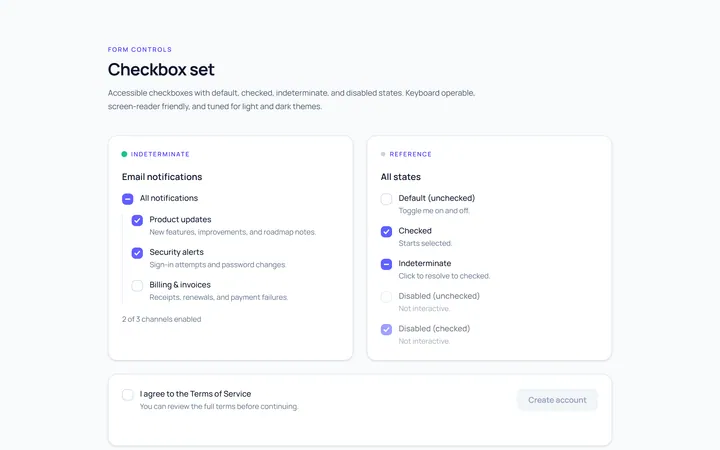
Checkbox Set Toggle
Originaldefault/checked/indeterminate/disabled checkboxes
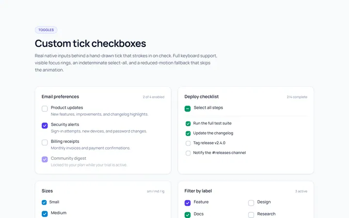
Checkbox Custom Toggle
Originalcustom animated tick checkboxes
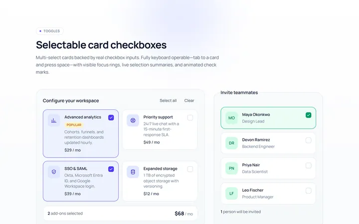
Checkbox Card Toggle
Originalselectable card checkboxes
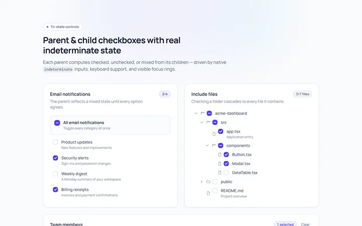
Checkbox Indeterminate Toggle
Originalparent/child indeterminate checkboxes
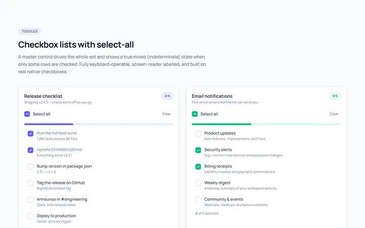
Checkbox List Toggle
Originalcheckbox list with select-all
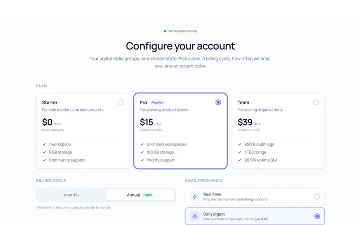
Radio Set Toggle
Originalstyled radio button group
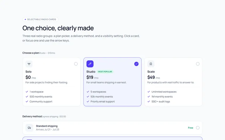
Radio Cards Toggle
Originalselectable radio cards
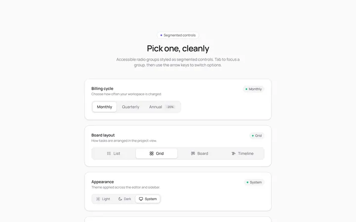
Radio Segmented Toggle
Originalsegmented control radios
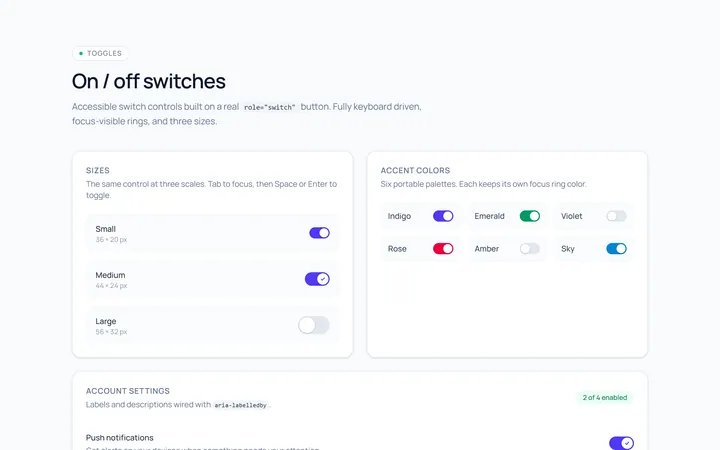
Switch Basic Toggle
Originalbasic on/off switches in sizes
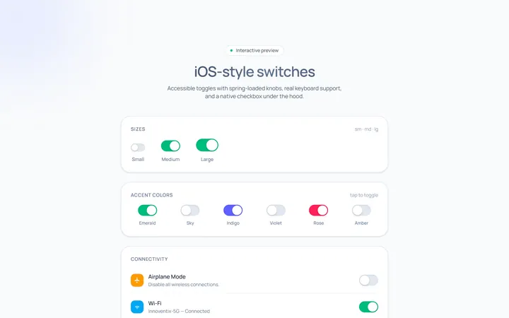
Switch iOS Toggle
OriginaliOS-style switches
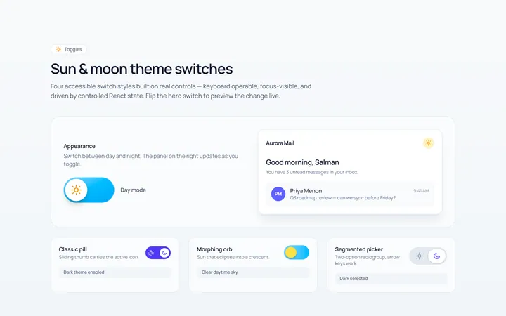
Switch Icons Toggle
Originalswitches with sun/moon style icons
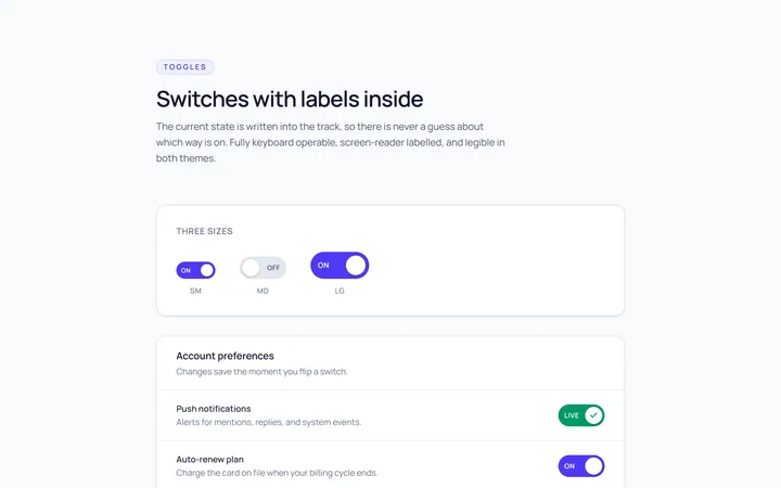
Switch Labels Toggle
Originalswitches with on/off labels inside